10,000 search results
(0.026 seconds)
- Singularity Type by Davide Mascioli,
$15.00 Singularity Type is a Modern sans-serif Geometric font with homogeneous thickness, based on essential geometric shapes. Built around 4 different widths, ranging from Extra Light up to Bold, the font contains 744 glyphs and supports more than 30 Latin alphabet languages. Singularity Type is Designed by Davide Mascioli ©2021
 - Baby Garden by Hrz Studio,
$12.00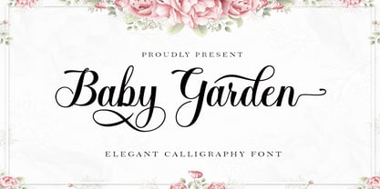 Baby Garden is a beautiful light handwritten font with a unique feel and a stunning impact. It will add a luxury spark to any design project that you wish to create! This font is PUA encoded which means you can access all of the amazing glyphs and ligatures with ease!
 - Victoria Signate by Letterena Studios,
$9.00 Victoria Signate is a beautiful and light handwritten font with a unique feel and a stunning impact. It will add a luxury spark to any design project that you wish to create! This font is PUA encoded which means you can access all of the amazing glyphs and ligatures with ease!
 - Bohemaz by Malgorzata Bartosik,
$29.00 Bohemaz is a typeface inspired by the Art Deco typography from the 1930s. It contains 4 styles - Thin, Light, Regular and Bold - Latin, Greek and Cyrillic alphabet, diacritics from Western, Central and South Eastern Europe and many decorative ligatures. Bohemaz is both classic and modern, so it can be widely used.
 - AT Move Straw by André Toet Design,
$39.95 STRAW The inspiration for this capital alphabet came from those beautiful haystacks you see in summer and the old fashioned Mikado game! We wanted to create a light, fragile and airy typeface with an optical effect. And here it is ... it’s just STRAW ! Concept/Art Direction/Design: André Toet © 2017
 - Sparkling Winter by Creaditive Design,
$14.00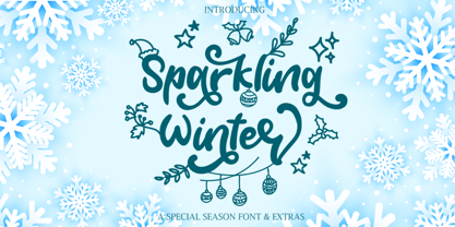 Sparkling Winter is a beautiful and light handwritten font with a unique feel and a stunning impact. It will add a luxury spark to any design project that you wish to create! Sparkling Winter is PUA encoded which means you can access all of the glyphs and swashes with ease!
 - Tecna Wide by Descarflex,
$20.00 The Tecn@ Wide family was designed so that its characters are legible and easy to interpret in any writing in its headers or titles to cover more space; For example, the descriptive memory of Plans or Instructions. Tecn@ Wide complements the Tecn@ Background Light and Dark Square Triangle font family.
 - Katelyn by Kimmy Design,
$10.00 Katelyn is a sans serif font that reflects a straight and perfect handwritten note. In being in the middle of a sans serif font and completely handwritten, it will bring and lightness and playfulness to any design. Included in the face is a set of Ornaments that enhances the youthful font.
 - Fun Play by FunFont,
$17.00 Fun Play is A Fun and Playful display typeface family with 5 wights variant; from Light to Bold. Comes with many features; Multilingual Support, Ligatures, Stylistic Alternate and more. Each character represents a child's joy. ‘Fun Play’ can be used for branding, packaging, headline and all styles of children-related design.
 - Gravelia Helani by TM Type,
$12.00 Gravelia Helani is a beautiful and light handwritten font with a unique feel and a stunning impact. It will add a luxury spark to any design project that you wish to create! This font is PUA encoded which means you can access all of the amazing glyphs and ligatures with ease!
 - Bright Melody by Zeenesia Studio,
$17.00 Bulgaria Script is a beautiful and light handwritten font with a unique feel and a stunning impact. It will add a luxury spark to any design project that you wish to create! This font is PUA encoded which means you can access all of the amazing glyphs and ligatures with ease!
 - Arista 2.0 by Zetafonts,
$29.00 Arista is a soft round font, perfect for 2.0 logos and contemporary headlines. Arista 2.0 is the definitive release of Arista, with extra characters and corrected kerning. It includes a light version, a extrafilled version for 2.0 style fat borders, and an Alternate version with a lot of style changes.
 - Freaky Prickle by ParaType,
$25.00Freaky Prickle script was written using ink and various wooden sticks and digitized/ Autor’s target was to create the spontaneous, light, flying script with dynamics and energy at the same time. Upright and cursive styles are available. The type was planned for use as headline in fiction and display matter. - Bill Corporate Medium by OGJ Type Design,
$35.00 Bill Corporate is a geometric typeface with generous capitals. A modern classic, based on Max Bill’s lettering work, its straightforward and uncompromising construction can be both edgy and sublime. With minimalist letterforms, pointy apexes instead of flat ones, and archetypal proportions, this font family doesn’t follow any trends but strives to achieve a timeless formal vocabulary. The skeleton of its letters is based heavily on the famous primary shapes of the Bauhaus: square, circle, and triangle. This makes for quite wide uppercase and much narrower lowercase letters. The contrast between uppercase and lowercase benefits inexperienced users, who will be able to get appealing results quickly. At the same time, it’s a powerful tool for seasoned designers, who can employ either case selectively to set the desired typographic course. Bill Corporate Medium’s 16 styles (including a set of eight lighter-than-light fonts from “Two” to “ExtraLight”) are an excellent choice for editorial design, branding, headlines, and even short to mid-length copy in a wide range of applications and industries. The uppercase letters in particular—with their varied widths and lavish dimensions—are suitable for cosmopolitan and stylish logotypes and wordmarks. Whenever a timeless, staid, and classy look is demanded, choose Bill Corporate.
 - TX Signal Signifier by Typebox,
$39.00Eight designers present a set of icons that indicate the fun and fantastic world of signage. Each collaborator's solution represents a completely different interpretations on signage vernacular. Akira Kobayashi's "Subsumption", obscured by foliage, offers a perspective that signs on Japanese roads can be vague and beautiful. M.A.D.'s "People Signs" is a graphical association of people signage with a variety of well known situation symbols. Cynthia Jacquette's "Honest Arrows" are a series of arrows that attempts to honestly tell you how to get from point A to Point B in a big, confusing city. Mike Kohnke's "Road Kill" and the "Bump & Bruise" highlight how signs make for perfect targets when unloading a round of buckshot, and the licking a contruction barrier often endures. Joachim Muller-Lance's "Traffic Blends" places faces on things! Hey, didn't you give your first car a nickname? Cars are alive, you know - they guzzle and smoke all day. Jean-Benoît Lévy's "Inner-State" was inspired while reading the California driver handbook to pass a driver's test. Kevin Roberson's "Tail Lighting" reminds us to drive carefully and not to forget to signal. Diana Stoen's "Drivers Out There" shows us "driver personality archetypes", including the lil'ol lady that everyone tries to avoid. - Acorde by Willerstorfer,
$95.00 Please note: Acorde webfonts are exclusively available at willerstorfer.com Acorde is a reliable workhorse for large, demanding design projects. It was designed to be perfectly suited to all different sizes, from small continuous text to large headlines and big signage. The typeface’s name is derived from ‘a’ ‘cor’porate ‘de’sign typeface, however Acorde is not only suitable for corporate design programmes but for information design and editorial design purposes as well. Acorde’s inception was in early 2005 as Stefan Willerstorfer’s final project in the Type and Media course at the Royal Academy of Art in The Hague (NL). It is a humanist sans serif with noticeable diagonal contrast and shows clear influences of the broad nib pen, especially in the Italics. Acorde’s characterful details give it a distinctive appearance in large sizes and contribute to its high legibility in small sizes. It comes in 14 styles – seven weights in Roman and Italic each. While the proportions of the Regular style were chosen to guarantee optimal legibility without being too space consuming, the heavier the weight gets the more suitable it is for headline purposes. The heavy weights are relatively narrower than the lighter ones, which gives them a strong appearance. The huge character set contains 925 glyphs per font and covers a vast range of latin-based languages. Various accented letters, small caps, eleven figure-sets, superscript and subscript are all included. OpenType features allow for a comfortable use of the large set. Acorde was honored with the 2010 Joseph Binder Bronze award for type design by DesignAustria.
 - Agilita by Linotype,
$29.99 Created by German designer Jürgen Weltin, Linotype’s Agilita is a contemporary humanist sans serif family with a wide variety of weights, including both ultra thin hairline options and heavier, dark type. Agilita has rather classical proportions; its clear ascenders and descenders lend more distinct word shapes. Weltin’s design has a dynamic, yet strong and very functional appearance with a fine but clear emphasis on the horizontals. This traditional approach makes it a versatile typeface for large-scale text setting, but it can also be used in complex information design projects, and orientation systems, for example. Hence it was developed carefully into a wide range type family system consisting of 32 styles. This even covers the requirements for display and headline setting. Corresponding condensed weights are suitable where horizontal space is scarce, as in narrow columns and tables, for example. The Agilta Hairline and Agilta Ultra Thin styles were especially made for display use. These fonts should be set at a minimum size of 20 pt for printed project, and about 40 pt on output to laser printers, depending on the paper used. Agilita’s character sets include special symbols and signs that may be used in dictionaries; like arrows for lemmata and signs for cross references, idioms or colloquial language. There are two sets of arrows available in each weight for use in orientation systems. Each font in the Agilta family is built according to Linotype’s Extended European character set guidelines. These offer support for more than 48 Latin-based languages used in Western, Central, and Eastern Europe, including Baltics and Turkey.
 - Blacker Sans Pro by Zetafonts,
$39.00 Blacker Sans Pro is a complete redesign and development of the original family designed by Francesco Canovaro in 2019 as a sans-serif variant of the successful Blacker created by Cosimo Lorenzo Pancini and Andrea Tartarelli. The original idea of Blacker Sans was to create a versatile pairing for Blacker, parting with its spiky wedge serifs but keeping its dark, elegant character and extending its weight range to 20 weights including italics. This Blacker Sans Pro family did also differ in contrast from the original Blacker family, choosing a more even and monolinear, almost grotesque approach. This choice that favored versatility over elegance left some of the original uses of Blacker not covered by its sans counterpart, and so two subfamilies were added, applying to the same skeleton varying degrees of contrast, from the readability-optimized medium contrast of Blacker Sans Text to the extreme variations of Blacker Sans Display, with its elegant juxtapositions of thin curves and thick black slabs. The original signature details of Blacker, like the hook shape of lowercase "f", have been complemented by new alternate forms, ligatures and swashes, with stylistic sets providing options to easily make logos and headings stand out. The wide range of OpenType features (that includes also small caps, positional numbers, and alternate punctuation) is applied to all the 60 weights of the family, each with over 1600 characters offering language support for 220+ languages using Latin, Cyrillic and Greek alphabets. Ready to make your text look gorgeous? Ditch your usual sans-serifs and try Blacker Sans Pro!
 - Swiss 721 WGL by Bitstream,
$49.00 Swiss 721™ is a sans serif family that ranges in style from thin to black while mixing in a few unexpected, but beautifully made and ironically flattering, outline weights that spice up the grotesque design. Couple these upstanding letterforms with matching italic styles and you have yourself a beautiful tool that is as legible on screen as it is off, has the technical prowess to conquer even the trickiest of design riddles and will work in a myriad of projects. Swiss 721 is a staple sans serif that you’ll never be sorry you have in your library. It’s been said that a simple sans serif is one of the most difficult typefaces to design. This is because when letters are reduced to their most basic details, irregularities and inconsistencies in design become immediately visible. The Swiss 721 typeface family is a quintessential example of letterforms distilled to their essence while still possessing warmth and verve. Based on mid-century sans serif typefaces, Swiss 721 is a versatile family of weights and proportions ideally suited to a wide variety of print and interactive design projects and is equally at home as headlines on billboards as it is navigation content on small screens. Swiss 721 takes the essence of mid 20th century sans serif typefaces and melds it with modern design consistency and a systematic weight range. OpenType® fonts of Swiss 721 also benefit from a rich character set and a range glyphs supporting most Western European and many Eastern European languages.
 - FF Child's Play by FontFont,
$62.99 British type designer John Critchley created this script FontFont in 1993. The family has 7 weights, and is ideally suited for advertising and packaging, editorial and publishing as well as poster and billboards. FF Child's Play provides advanced typographical support with features such as ligatures and alternate characters. It comes with a complete range of figure set options – oldstyle and lining figures, each in tabular and proportional widths.
 - MB NOIR by Ben Burford Fonts,
$30.00 MB NOIR is a 4 weight with italics font family that visually has different layers of style, at first glance its a modern clean geometry based face with some nice retro touches, it also has hints of the vintage about it, with a nod to the art deco style, with alternates and ligatures it gives a lot of scope for its uses and works very well at large and small sizes.
 - Berlin Sans by Font Bureau,
$40.00 Berlin Sans is based on a brilliant alphabet from the late ’20s, originally released by Bauer with the name Negro, the very first sans that Lucian Bernhard ever designed. Assisted by Matthew Butterick, David Berlow expanded this single font into a series of four weights, all complete with expert character sets, plus a dingbat font. Imaginative & little-known, it promises enticing opportunities to the adventurous typographer; FB 1994
 - Soprano by TypeThis!Studio,
$54.00 A well-polished typeface is like the sweet sound of a melodious voice. Soprano is designed for elegant and luxury design elements. Whether it's brands for watches, jewelry, cars or fine wines, Soprano adds the undeniable and outstanding beauty of a professional designed elegant typeface. Soprano offers 5 weights and a full set of upper & lowercase letters, ligatures, old-style & lining figures as well as broad Latin language support. www.typethis.studio
 - Skinny Joe by Creativemedialab,
$20.00 Inspired by Bell Bottoms pants which are trending through the disco days of the 80s Skinny Joe features a reverse contrast style with a retro and vintage look. That’s simply ideal for summer theme concepts such as posters, book covers, t-shirts, branding, logo, and many more. Consists of 5 weights from thin to bold and a variable format. Skinny Joe also has alternatives for more decorative and unique looks.
 - NATRON by Posterizer KG,
$25.00 NATRON is rounded and condensed sans serif typeface, designed for tight-fitting text. Supports Latin and Cyrillic codepages for Western, East and Central European, and Baltic countries. The NATRON family has two weights, medium and bold, and a collection of thematic adapted pictograms (for food product packaging and textile industry). This typeface has been designed for all type of visual communication projects and especially for labels and packaging and accompanying declarations.
 - Slantinel by Illunatic,
$9.95 Slantinel is a versatile sans-serif type family with lots of personality! It consists of 9 fonts coming with 3 weights in 3 versions each and supports many international languages. Slantinel works best in small to medium sizes and is useful in a wide variety of settings such as childrens books, packaging designs, greeting cards and much more due to its handwritten feel and its many distinct details.
 - Village Hall JNL by Jeff Levine,
$29.00 A 1918 poster issued during World War I from the YWCA encouraged women to pitch in to the war effort by joining the “United War Work Campaign”. The Art Nouveau hand lettering of that poster was a slight throwback to the “Western” or “Victorian” style of typography because of the characters having split serifs. This is now available as Village Hall JNL, in both regular and oblique versions
 - Titanium by Ascender,
$29.99 Titanium is a geek-ed out, über-technoid specimen of plasma-type. Designed by Steve Matteson, this typeface is the perfect display font for your star cruiser or the weekend interplanetary lander. Like its namesake, Titanium is the strongest design for its weight capable of withstanding the jump to lightspeed without paradoxical distortions. Titanium is now available for use on home world computing devices to capture the essence of galactic travels.
 - FF Screenstar by FontFont,
$41.99 German type designers Steffen Sauerteig, Kai Vermehr and Svend Smital created this display FontFont in 2003. The family has 5 weights, ranging from Regular to Bold and is ideally suited for logo, branding and creative industries, music and nightlife, small text, software and gaming as well as web and screen design. FF Screenstar provides advanced typographical support with features such as ligatures. It comes with tabular lining and proportional lining figures.
 - Kesto by Valentino Vergan,
$16.00 Kesto is an elegant Art Nouveau style typeface. The idea for the Kesto came from the early Nouveau type designs. Kesto is designed with creative letters, which makes it perfect for creating nostalgic and retro designs such as: posters, magazines, logos and much more. Kesto also has a variable version, which makes it easy to manually adjust the weight and slant. I hope you enjoy using the Kesto typeface.
 - Kuunari Rounded by Melvastype,
$16.00 Kuunari Rounded is the rounded version of Kuunari. it is a structured square sans type family of 42 fonts. It has three widths and seven weights in both upright and italic versions. The base form is a round-cornered rectangle, and this form constructs the glyphs throughout the fonts. Kuunari Rounded is a straightforward sans serif. It doesn't make any fuss about itself; it just does the job proudly and confidently.
 - P22 Cigno by IHOF,
$24.95 P22 Cigno is a new digitization of the 1950s Italian typeface by Aldo Novarese for the Nebiolo foundry. This semi-formal script has a definite mid-century European flavor suitable for menus, invitations and poster work. Along with the accurate rendition of the regular weight, designer Colin Kahn has added a lighter companion font for another variation on Cigno. Both fonts feature a full Western European character set.
 - Uno by Ahmet Altun,
$24.00 Uno font family comes in two weights and two styles. Generally, rounded fonts seem funny and pretty. This feature is valid for also Uno Font Family but although the characters of Uno Font Family are rounded, they seem masculine and serious. It is legible in small type sizes. With its decorative view, you can get matchless products in typographic works, t-shirt prints, posters, logos and every kind of graphic works.
 - Catseye by Device,
$39.00 A casual sans that harks back to the very English style of book jacket and poster art of the late 50's and early 60's. The turned-in terminals are reminicent of Stephenson Blake's Grotesque 9, and the italic provides unique cursive versions of the lowercase characters. Available in a "narrow" version as well as two standard weights, this face lends itself to the wider letterspacing that evokes hot metal.
 - SF Khaled by Sultan Fonts,
$19.99 About this font family: Khaled Typeface for different titles and manchites. Khaled is An Arabic typeface for desktop applications, for websites. Khaled font family is Modern style and contains 3 weights: Regular, Medium and Bold. The font includes support for Arabic, Persian, and Urdu. It also includes proportional and tabular numerals for the supported languages. Khaled typeface comes with many opentype features. Designer: Sultan Maqtari Design date: 2019 Publisher: Sultan Fonts
 - Novaletra Serif CF by Connary Fagen,
$35.00 Legibility. Flexibility. Personality. No need to pick two; Novaletra Serif CF has it all. Liven up body text, captions, and headlines with Novaletra’s smooth, low-contrast design set across seven weights with italics. Versatile and easy to read at any size, Novaletra includes useful features like wide language support across Latin and Cyrillic scripts, international currency symbols, fractions, tabular numbers, and more. Includes lifetime updates, technical support and feature additions.
 - Addington CF by Connary Fagen,
$35.00 Addington CF is a graceful and reliable serif, useful in any application. Beautiful and practical, Addington is designed for excellence at small point sizes, while doubling as a capable, bold display typeface. Includes roman and italic sets across seven weights. Addington CF pairs nicely with simple, bold headline typefaces, like Greycliff CF and Articulat CF. All typefaces from Connary Fagen include free updates, including new features, and free technical support.
 - JetJaneMono by Ingrimayne Type,
$9.00 JetJaneMono is a large family of sans-serif faces which are monospaced. It is very plain (plain=plane=jet). The font family has two widths and three weights, with each upright style paired with an italics style. These twelve fonts are then duplicated with another set in which small caps replace the lower-case letters. The typeface was created in 1994 and in 2021 the condensed widths were added.
 - Hamis Pro by Fo Da,
$9.00 Hamis Pro is a display font of 12 weights: Regular, Shadow, Solid, Book, Book Shadow, Book Solid & Italics. Hamis Pro is an advanced typographical support with features such as ligatures, case-sensitive forms, fractions, super and subscript characters, and stylistic alternates. It's ideally suited for advertising and packaging, festive occasions, editorial and publishing, logo, branding and creative industries, posters and billboards as well as web and screen design.
 - Bandbox by Sean Thorenson,
$22.00 Inspired by classic sport logo lock-ups, Bandbox delivers with its heavy, streaming cursive letterforms. Bandbox's wide, gently-sloped script comes bundled with a collection of ligatures and 18 athletic swash banners, perfect for logotype, posters and t-shirt designs. Here's what's included in the single-weight typeface Bandbox: Upper (A-Z) and lower case (a-z) characters Numbers (0-9) Standard punctuation and glyphs Alternates, Ligatures and Swashes Multilingual support