5,844 search results
(0.035 seconds)
- Oleandro by Balpirick,
$15.00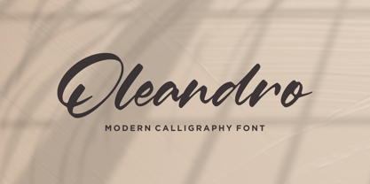 Oleandro is a Modern Calligraphy Font. Oleandro is a unique and elegant handwritten font. It looks beautiful on a variety of designs requiring a personalized style, such as wedding invitations, thank you cards, weddings, greeting cards, logos and so on. Oleandro also multilingual support. Enjoy the font, feel free to comment or feedback, send me PM or email. Thank you!
 - Dancinglove by Balpirick,
$15.00 Dancinglove is a Modern Calligraphy Font. Dancinglove is a unique and elegant handwritten font. It looks beautiful on a variety of designs requiring a personalized style, such as wedding invitations, thank you cards, weddings, greeting cards, logos and so on. Dancinglove also multilingual support. Enjoy the font, feel free to comment or feedback, send me PM or email. Thank you!
 - Angels Cookie by Balpirick,
$15.00 Angels Cookie is a Modern Fat Handbrushed Font. Angels Cookie is a fun and sweet brushed handwritten font. Whether you’re looking for fonts for Instagram or calligraphy scripts for DIY projects, this font will turn any creative idea into a true piece of art! Angels Cookie also multilingual support. Enjoy the font, feel free to comment or feedback, send me PM or email.
 - Gingle Snowland by Balpirick,
$15.00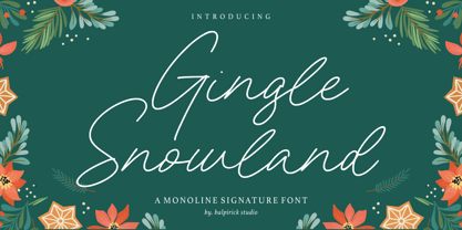 Gingle Snowland is a Monoline Signature Font. Gingle Snowland is a gorgeous monoline script font. This amazing typeface is perfect for product packaging, branding project, magazine, social media, wedding invitations, or just used to express words above the background. Gingle Snowland also multilingual support. Enjoy the font, feel free to comment or feedback, send me PM or email. Thank you!
 - Scenarie by Genetype,
$16.00 Introducing Scenarie Display Typeface: Streamlined Elegance Redefined Unveil the art of sophistication with Scenarie Display – a condensed sans serif font meticulously designed to streamline your designs. From sleek logos to space-efficient layouts, Scenarie Display offers a modern and refined touch. Embrace the power of condensed typography Enjoy the font, feel free to comment or feedback, send me PM or email. Thank you!
 - Pelita by Lafontype,
$25.00 Pelita is a sans serif family which is divided into 2 sub-families, Regular and Grande. Pelita is designed with a terminal that forms a curved angle on one side so as to give the impression of representing firmness and softness. The grande version is a modified version of the main version, but is designed more streamlined with curves and more extreme angles.
 - Chicola Smoothy by Allouse Studio,
$16.00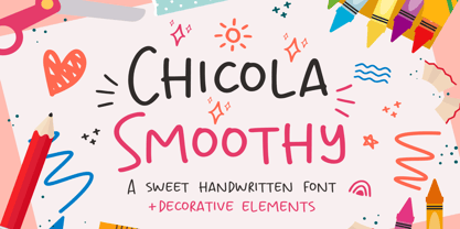 Proudly Presenting, Chicola Smoothy a Sweet Handwritten Font plus Decorative Elements. Chicola Smoothy is perfect for any titles, logo, product packaging, branding project, megazine, social media, wedding, or just used to express words above the background. Chicola Smoothy also come with Multi-Lingual Support. Enjoy the font, feel free to comment or feedback, send me PM or email. Thank You!
 - Antiokhia by Allouse Studio,
$16.00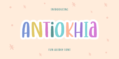 Antiokhia a Playful Quirky Font that will give you an playful, lovely and young impression. Antiokhia is perfect for any tittles, logo, product packaging, branding project, megazine, social media, wedding, or just used to express words above the background. Antiokhia also come with Multi-Lingual Support. Enjoy the font, feel free to comment or feedback, send me PM or email. Thank You!
 - Masmuseh by Allouse Studio,
$16.00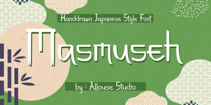 Proudly Presenting, Masmuseh a Handdrawn Japanese Style Font that bring an Japanese feel. Masmuseh is perfect for any tittles, logo, product packaging, branding project, megazine, social media, wedding, or just used to express words above the background. Masmuseh also come with Multi-Lingual Support. Enjoy the font, feel free to comment or feedback, send me PM or email. Thank You!
 - Raeling by Volcano Type,
$19.00Raeling is a display font inspired by a visit to Luxembourg, capturing shadows falling intricately from park railings appearing as broken-script lettering. A mixture of manmade / natural, traditional / new, ugly / beautiful reflecting the paradox and contradictions of the city. A single curve and stroke developed into a grid block from which characters emerged and broke free of their barriers and conformity. - Sweet Harley Script by madeDeduk,
$19.00 Really excited to introduce Sweet Harley Script, a beautiful hand lettering font! Sweet Harley is perfect for poster design, book covers, merchandise, fashion campaigns, newsletters, branding, advertising, magazines, greeting cards, album covers, quote designs and more. Features UPPERCASE lowercase Number & Symbol International Glyphs Alternative lowercase Ligature If you need anything else just shoot me on email at: dedukvic@gmail.com Happy designing.
 - Gloomy Mummy by Allouse Studio,
$16.00 Proudly Presenting, Gloomy Mummy a Handdrawn Halloween Typeface with two styles! Gloomy Mummy is perfect for any titles, logo, product packaging, branding project, megazine, social media, wedding, or just used to express words above the background. Gloomy Mummy also come with Multi-Lingual Support. Enjoy the font, feel free to comment or feedback, send me PM or email. Thank You!
 - Golden Dates by Balpirick,
$15.00 Golden Dates is a Modern Calligraphy Font. Golden Dates is a stylish and trendy script font. It looks stunning on wedding invitations, thank you cards, quotes, greeting cards, logos, business cards and every other design which needs a handwritten touch. Golden Dates also multilingual support. Enjoy the font, feel free to comment or feedback, send me PM or email. Thank you!
 - Lovelove by Aminmario Studio,
$20.00 Introducing Lovelove Font Lovelove is a lovely script font. Its charm makes it appear wonderfully, readable, and, ultimately, incredibly versatile. Comes in Regular and Italic styles. Equipped with beginning and ending love tail. This font will look outstanding in any context, whether it’s being used on busy backgrounds or as a standalone headline! Thank you for the purchase. Happy creating design :)
 - Garp Miska by madeDeduk,
$11.00 Gary Miska is a cute font with two style neu and regular fun happiness look and will makes this font suitable for your any project design. Feature Uppercase & Lowercase Number & Symbol International Glyphs Multilingual support ligature Feel free to drop us a message any time and follow my shop for upcoming updates Shoot me on email at: dedukvic@gmail.com Hope you enjoy it.
 - Cerita Cinta by Aminmario Studio,
$20.00 Introducing Cerita Cinta Font Cerita Cinta is a casual handwriting font. Its charm makes it appear wonderfully, readable, and, ultimately, incredibly versatile. Comes in Regular and Italic styles. Equipped with beginning and ending tail. This font will look outstanding in any context, whether it’s being used on busy backgrounds or as a standalone headline! Thank you for the purchase. Happy creating design :)
 - Etruria by Dima Pole,
$34.00 Font Etruria is based on a real Etruscan inscriptions and realistic accurately simulates the writing of the Etruscans. The idea of the font Etruria is to give an opportunity for anyone to touch the past of mankind! The character of the Etruscan alphabet involves the creation of a font with only uppercase letters. However, I did not limit this font by that. Etruria has not only a lowercase is different from uppercase, but an additional sets of alternative characters. In General, the main characteristic of Etruscan writing is randomness and diversity of characters. Differs from lowercase to uppercase is only the first step on the road to make randomness effect. Next to the aid of the OT features. To recreate the randomness effect, in Etruria there are several OT features (Contextual Alternates, Stylistic Alternates and Stylistic Sets), which built a script to simulate randomness. Additionally, another script creates the effect of random positioning. Together they create incredibly realistic Etruscan inscription. Thus, any of these features can be disabled at will. I also used a small line spacing, because it is characteristic of the Etruscan writing. Actually the Etruscan writings is a mirror of the writings compared with the current European alphabets. I didn't use this feature all the letters, because this would make the font difficult to perceive, but to make the font characteristic of the Etruscan style, Etruria has a few letters in mirror image. However, if for someone it may seem unusual, mirrored letters can be disabled instead of them will appear more familiar to them. Another feature of Etruscan writing is the use instead of a space dotacentered. Font Etruria has this feature, there is a OT feature Stylistic set ss03. Naturally, it also can optionally be disabled. All these features can be used together, separately, or turn it off. The main goal achieved! The text typed in Etruria, creates full impression of these Etruscan inscriptions.
 - MMC Insignia Pro by MMC-TypEngine,
$42.50 MMC INSIGNIA PRO, is an Iconic & Emblematic Neogothic Geometric Display… Assembled by Trivial Squares and Diagonals Symbols Pattern from a puzzled grid Aftermath!! Includes Small Caps & Stylistic Alternates!! +Extra Monospaced Figures. In 22 styles, with Obliques, both for single display and layer Typesetting, plus OpenType Features & Bonus Blocks Fonts! MMC Insignia Pro, is the cursive version of MMC Insignia and the default or main lowercases in ‘SC’ feature plus cursive stylistic alternates and sets such as Monospaced figures… Its atmosphere stands by on both Corporative to Decorative, Modern & Fashion, Federalist, Bohemian, Romantic, Ludic, Treasured Look, Etc. This Display font-family is the result of the repeated applications of this unique infamous Icon or Symbol, of two counterpointed triangles, implicit as hourglasses, in order to compose an innovative and unprecedented typographic pattern and modulation concept through the letterforms, in an extremely Geometric style. The Graphic Sign used throughout this type, is a remarkable trend used already in Logos of different businesses, whose most famous case refers to a famous International Bank, which doesn’t need to be mentioned, as it is instantly associated! This characteristic innovation was the main motivation while creating this type. Usage Suggestions: Type Fancy Titling texts, Display Remarkable Logos, Branding Projects, Labels, Emblems, Fashion Patterns, or in everything Noble and designed for Excellence as a type of Insignia, or distinguished marks and attributes of Royalty and Power!! That’s also forwardly, the reason why it was named MMC Insignia… TIPS: 1-Combine styles into innumerous possibilities of Chromatic Typesetting, by ‘central pasting’ layers… You may dislocate layers for improvisations! 2-USE BLOCK “FREE-STYLES” 1 & 2 also to add default 3D! Change 3D directions by switching Block 1 to Block 2, that way you can Zig-Zag words and lines. *Also shift the block layer up to bottom limit, it makes the 3D direction turn upside down. Greetings! André, MMC-TypEngine.
 - Happy Phantom - Personal use only

- Play Day Stencil JNL by Jeff Levine,
$29.00 The typography on a 1964 children’s activity book published by Whitman entitled “Build with Stencils” was in a bold, condensed design. The only problem was that the ‘rails’ [the parts that divide a letter into stencil pieces] were too narrow and would disappear at smaller point sizes. Widening the ‘rails’ just a bit greatly improved the appearance of the stencil characters. Play Day Stencil JNL is now available in both regular and oblique versions. In its day, the Whitman Publishing Company of Racine, Wisconsin published dozens of activity books for children, including a number of them with stencils. The company was a division of Western Publishers from the early 1900s through the 1970s, but went through a number of sales and name changes. Currently [as Whitman once again] it is owned by Anderson Press, and is known for its line of coin folders and books on coin collecting.
 - Bastliga by Madhaline Studio,
$24.00 Bastliga is a signature font that has its own uniqueness and characteristics from a signature font, because it is handwritten manually, so it has the impression of a true signature. This font is carefully crafted with a modern touch. This font looks elegant, luxurious, natural with a beautiful signature touch. Bastliga would perfect for photography, watermark, social media posts, advertisements, logos & branding, invitation, product designs, label, stationery, wedding designs, product packaging, special events or anything that need signature taste. Your download will include 4 font files; ~ Bastliga One, Two, Three, Four and Five A hand-made, all characters brush font which has a complete set of A-z characters. Includes a range of multilingual support, punctuation, ligature & alternate. ~ Bastliga Tail A bonus set of 52 Uppercase & Lowercase with tail. Simply select this font and type any A-Z & a-z character to create one of the bonus elements.
 - "Wizards Magic" is a font that seems to encapsulate the enchanting essence of the mystical and magical world, inspired by the rich tapestry of fantasy literature, movies, and folklore that involve wi...
- As of my last knowledge update in April 2023, there's no widespread recognition or specific information about a font named "COnsume." However, given the intricate nature of font design and typography...
- PykesPeakZero - 100% free

- Mr Eaves Modern by Emigre,
$59.00 Mr Eaves is the often requested and finally finished sans-serif companion to Mrs Eaves, one of Emigre’s classic typeface designs. Created by Zuzana Licko, this 2009 addition to the Emigre Type Library expands the versatility of the original Mrs Eaves with two complimentary families: Mr Eaves Sans and Mr Eaves Modern. Mr Eaves was based on the proportions of Mrs Eaves, but Licko took some liberty with its design. One of the main concerns was to avoid creating a typeface that looked like it simply had its serifs cut off. And while it matches Mrs Eaves in weight, color, and armature, Mr Eaves stands as its own typeface with many unique characteristics. The Sans version relates most directly to the original serif version, noticeably in the roman lower case letters a, e, and g, as well as in subtle details such as the angled lead in strokes, the counter forms of the b, d, p, and q, and the flared leg of the capital R, the tail of the Q. The distinctly loose-fitting letter spacing of Mrs Eaves was applied also to the Sans version. This, together with generous built-in line spacing due to a small x-height and extended ascenders and descenders, renders the same kind of lightness and airiness when setting text that is so characteristic of Mrs Eaves. Deviations from the original Mrs Eaves are evident in the overall decrease of contrast, as well as in details such as the flag and tail of the f and j, and the finial of the t, which were shortened to maintain a cleaner, sans serif look. And the lower case c had to be balanced out differently after it lost its top ball terminal. And with the loss of serifs, Mr Eaves set width is slightly narrower. Mr Eaves Italic also carries over many forms from its Mrs Eaves model, most notably the v, w, and z, which are unusually flamboyant for a sans italic design. It also utilizes lead in and terminal tails that are reminiscent of the serif italic. The biggest departure here is the width of the characters. The extra narrow gauge and delicate features seemed more appropriate for the Serif than the Sans. To allow for a comfortable fit, Mr Eaves Italic has a more robust design and wider character width. Meanwhile, the Modern family provides an overall less humanistic look, with simpler and more geometric-looking shapes, most noticeably in the squared-off terminals and symmetric lower case counters. This family has moved furthest from its roots, yet still contains some of Mrs Eaves’ DNA. The Modern Italic is free of tails, and overall the Modern exhibits more repetition of forms, projecting a cleaner look. This provides stronger differentiation from the serif version whenever a more contrasting look is desired. Each version (Sans and Modern) contains its own set of alternates providing unique options for applications such as headlines, word logos, letterheads, pull quotes, and other short text settings. Both the Sans and Modern come in six weights. The simpler forms of a sans-serif provide the opportunity of more weights than do serif letter forms, which are more complex in structure, making it difficult to accommodate additional weight without distortions. Regular and Bold match the original Mrs Eaves weights, while the Heavy provides an additional weight for extra emphasis.
 - Mr Eaves Sans by Emigre,
$59.00 Mr Eaves is the sans-serif companion to Mrs Eaves, one of Emigre’s classic typeface designs. Created by Zuzana Licko, this 2009 addition to the Emigre Type Library expands the versatility of the original Mrs Eaves with two complementary families: Mr Eaves Sans and Mr Eaves Modern. Mr Eaves was based on the proportions of Mrs Eaves, but Licko took some liberty with its design. One of the main concerns was to avoid creating a typeface that looked like it simply had its serifs cut off. And while it matches Mrs Eaves in weight, color, and armature, Mr Eaves stands as its own typeface with many unique characteristics. The Sans version relates most directly to the original serif version, noticeably in the roman lower case letters a, e, and g, as well as in subtle details such as the angled lead in strokes, the counter forms of the b, d, p, and q, and the flared leg of the capital R, the tail of the Q. The distinctly loose-fitting letter spacing of Mrs Eaves was applied also to the Sans version. This, together with generous built-in line spacing due to a small x-height and extended ascenders and descenders, renders the same kind of lightness and airiness when setting text that is so characteristic of Mrs Eaves. Deviations from the original Mrs Eaves are evident in the overall decrease of contrast, as well as in details such as the flag and tail of the f and j, and the finial of the t, which were shortened to maintain a cleaner, sans serif look. And the lower case c had to be balanced out differently after it lost its top ball terminal. And with the loss of serifs, Mr Eaves set width is slightly narrower. Mr Eaves Italic also carries over many forms from its Mrs Eaves model, most notably the v, w, and z, which are unusually flamboyant for a sans italic design. It also utilizes lead in and terminal tails that are reminiscent of the serif italic. The biggest departure here is the width of the characters. The extra narrow gauge and delicate features seemed more appropriate for the Serif than the Sans. To allow for a comfortable fit, Mr Eaves Italic has a more robust design and wider character width. Meanwhile, the Modern family provides an overall less humanistic look, with simpler and more geometric-looking shapes, most noticeably in the squared-off terminals and symmetric lower case counters. This family has moved furthest from its roots, yet still contains some of Mrs Eaves' DNA. The Modern Italic is free of tails, and overall the Modern exhibits more repetition of forms, projecting a cleaner look. This provides stronger differentiation from the serif version whenever a more contrasting look is desired. Each version (Sans and Modern) contains its own set of alternates providing unique options for applications such as headlines, word logos, letterheads, pull quotes, and other short text settings. Both the Sans and Modern come in three weights. The simpler forms of a sans-serif provide the opportunity of more weights than do serif letter forms, which are more complex in structure, making it difficult to accommodate additional weight without distortions. Regular and Bold match the original Mrs Eaves weights, while the Heavy provides an additional weight for extra emphasis.
 - Famous Cars - Personal use only

- Grunge - Unknown license

- Kingthings Petrock Light - Unknown license

- ACED IT - Personal use only

- Mailart - Personal use only

- Grootesk - Unknown license

- Monofill - Unknown license

- Impossible Ornaments by Gerald Gallo,
$20.00 Impossible Ornaments was inspired by the designs of Swedish artist Oscar Reutersvärd and Dutch artist M. C. Escher whose drawings may initially appear feasible yet cannot be physically constructed, therefore impossible. There is an assortment of 47 ornaments all located under the character set keys.
 - Bobbin by Typoforge Studio,
$19.00 To design a font Bobbin I was inspired by a You And Me Monthly published by National Magazines Publisher RSW Prasa that appeared from Mai 1960 till December 1973 in Poland. In the Bobbin family, every variety contains 3 alternative characters with automatic replacement.
 - RM Tubes by Ray Meadows,
$19.00 This is an unusual family of 3D designs that will add impact to your design. Due to the modular nature of this design there may be a very slight lack of smoothness to the curves at extremely large point sizes (around 100 pt and above).
 - Gothic Herbarium by 2D Typo,
$32.00 Ornamental font based on the Gothic Revival ornaments developed by Augustus Pugin (1812-1852). This is a collection of ornamental plants and flowers arranged in a convenient font file that may be always at hand. Decorate your projects with high quality and interesting ornaments!
 - RM Squarial by Ray Meadows,
$19.00 Based loosely on a square, this hair line design works best at 24pt and above. Due to the modular nature of this design there may be a slight lack of smoothness to the curves at very large point sizes (around 100 pt and above).
 - Agony by Talavera,
$60.00 This condensed type is based on Roman calligraphy and (through having several alternates on both upper and lower case, plus some non-standard ligatures) your text may look like it’s written or handmade. You can combine this font with Ecstasy, also available on MyFonts.
 - Morevibe - Personal Use - Personal use only


