10,000 search results
(0.017 seconds)
- Wudoo Mono by Vishnu Sathyan,
$19.00 A font inspired by the classic typewriter fonts of yesteryear. With its unique design and vintage feel, Wudoo Mono is perfect for adding a touch of nostalgia to your next design project. Its monospace style ensures that your text is always neatly aligned, while its simple and legible design makes it easy to read.
 - Heart Choise by Lucky Type,
$12.00 Heart Choise is the newest handwriting font made with pen brush, to help you create stunning handwriting looks.Heart Choise comes with alternate characters, punctuation marks, numbers. Also included is the added bonus, perfectly crafted for headlines and short text. Use for magazines, films, t-shirts, packaging, logos, advertisements, quotes, posters, editorials, cover art, websites, etc.
 - Dalena by Beary,
$5.00 Dalena is for those of you who are needing a touch of elegance and modernity for your designs, this font was created for you! Dalena has the added bonus of having 'multiple personalities'! It has 2 sets of extra alternate lowercase letters, which allow you to create different feels for different projects. Happy Creating!
 - Statendam by Hanoded,
$15.00 Statendam is an all caps Art Deco font. It reminds me of the bold lettering used for cruise ship posters from the interbellum, especially those used for the Holland America Line (HAL) ads. It is not a recreation of a particular typeface; merely my salute to a bygone era. Statendam comes with all diacritics.
 - Pageantry by Jonahfonts,
$40.00 Pageantry is very suitable for Packaging, greeting cards, magazines, posters, and Advertising Ads. Designed in four weights from light to heavy including italics, covering a large range of editorial and advertising applications. Inspired by 'Souvenir' a popular font in the 1900s. I designed 'Pageantry' with a more rounded appearance, giving it a more softer appearance.
 - Lazy Boutique by Bogstav,
$17.00 Lazy Boutique is and exciting and beautiful piece of work. It's 100% handmade and slightly irregular in an organic way. I've added X different versions: Regular, Line, Fill and Curl - mix and match to find your favourite kind of look . Use Lazy Boutique for your products that needs a handmade, organic and exciting look!
 - De Hyang Script by Wacaksara co,
$16.00 De Hyang Script is a hand lettering script font. Perfect for adding a unique impression that looks natural like manual handwriting when opentype is active. This font is great for your next creative project such as Logotype, printed quotes, invitations, cards, product packaging, headers, letterhead, poster, apparel design, label, book cover and etc ~ Wacaksara Co
 - Gestack by Almarkha Type,
$35.00 Hello Introducing, Gestack - Stylish Display Serif is an unique font that uses ligatures to smoothly link letters. Perfect for adding a unique twist to word-mark logos, monograms or pull quotes. Gestack has 11 ligatures as well as numbers and punctuation making it super fantastic. Ligature can be turned off if required standard writing needs.
 - Pedrita by PintassilgoPrints,
$24.00 Sometimes you want to go unnoticed, sometimes you don't. This font is definitely for the second option. Pedrita is a generous type, a bit bold, somewhat showy, quite authentic. When you need that extra-something, go with caps and turn on the stylish interlocking pairs: added eye-catchingness guaranteed. And let the good times roll!
 - Magical Smiles by Tlatous Type,
$19.00 Introducing Magical Smiles by Tlatoustype A fancy and fun handcrafted font that create to impress your audience and make your branding shine. Make your projects dance with this elegant and wonderful font wherever you use it. Use it for your headings, logos, ads, printed quotes, packaging, and even your website or social media branding.
 - Handkick by Letteralle,
$18.00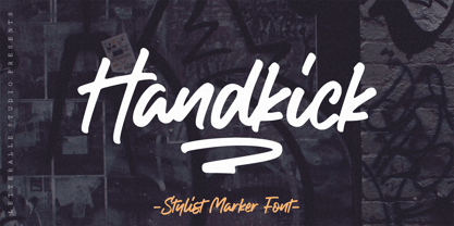 Introducing, Handkick! a smooth and silky handwritten font. handkick is equipped with multilingual support, ligature, and also a swash underline. To access swash you only need to type "_1" - "_3". Handkick is very suitable for various design needs such as merchandise, packaging, social media, ads, T-shirts, logos, events, and many more. Thank you!
 - Radar.one by Srdjan Kuzmanovic,
$50.00I started creating this font at my university while studying graphic design. It's constructed using nails in different sizes and various parts of floppy-disks. It's a highly decorative font and the best way of using it is for posters, flyers and ads. It can also be used for your own website; see example below. - Grape Feud by PizzaDude.dk,
$17.00 The name Grape Feud is obviously a wordplay, and is derived of the, sometimes, mistaken of the orange and the (often) purple fruits. But Grape Feud is also a playful and charming no-nonsense comic style font. The x-height is quite unpredictable, and I've added ligature for the most common double letter combinations.
 - Arhoky by Product Type,
$17.00 If you are looking for a unique and unique gothic blackletter font that will set your project apart from the rest, look no further! ARHOKY is the perfect font for adding a touch of elegance to all kinds of creative work - including wedding invitations, tattoos, and packaging designs. Use it immediately to realize amazing projects!
 - Party Trick by PizzaDude.dk,
$15.00 Party Trick is loosely based on the capital letters of a classic typewriter, but I have added a bit sugar and spice to the letters - making them more funky and loose. Another great thing is the contextual alternates, which gives you 6 different versions of each letter - and they automatically changes as you type!
 - Laurentian by Monotype,
$29.99 Maclean's is a weekly Canadian newsmagazine with a broad editorial mission. A typical issue covers everything from violence on the other side of the globe to the largest pumpkin grown in a local county. In 2001, Maclean's invited Rod McDonald to become part of the design team to renovate" the 96-year-old publication. The magazine wanted to offer its readers a typographic voice that was professional, clean, and easy to read. Above all, the typeface had to be able to speak about the hundreds of unrelated subjects addressed in each issue while remaining believable and uncontrived. A tall order, perhaps? Now add in that this would be the first text typeface ever commissioned by a Canadian magazine. McDonald, who some have called Canada's unofficial "typographer laureate," took on the challenge. McDonald used two historic models as the basis for Laurentian's design: the work of French type designer Claude Garamond, and that of the English printer and type founder, William Caslon. From Garamond Laurentian acquired its humanist axis, crisp serifs and terminals that mimic pen strokes. Caslon's letters are less humanistic, with a more marked contrast in stroke weight and serifs that appear constructed rather than drawn. These traits also made their mark on Laurentian. Using these two designs as a foundation, McDonald drew Laurentian with the narrow text columns and small type sizes of magazine composition in mind. He gave his letters strong vertical strokes and sturdy serifs, a robust x-height and a slightly compressed character width A tall order, per McDonald's genius is evident in the face's legibility, quiet liveliness and in the openness of the letters. The result is a typeface that not only met Maclean's demanding design brief, but also provides exceptional service in a wide variety of other applications. Laurentian is available in three weights of Regular, Semi Bold and Bold, with complementary italics for the Regular and Semi Bold, and a suite of titling caps."
 - Caryn by Typodermic,
$11.95 Y’all, have you met Caryn? She’s a typeface that’s as friendly as a front porch conversation on a sunny day. With her short brush strokes and swooping flourishes, she’ll make your words sing with genuine warmth and charm. Caryn is like a cozy quilt or a hot apple pie, bringing a homemade touch to everything she touches. Whether you’re crafting a wedding invitation, designing a logo for your farm stand, or just writing a letter to a friend, she’ll help you express your message with a down-to-earth grace. And here’s the best part: Caryn doesn’t put on airs. She’s unassuming and approachable, like a neighbor who always has a smile and a kind word. You don’t need fancy design skills or a big budget to make Caryn work for you. She’ll fit right in with your homespun style and make you look like a pro. So if you want to add a touch of warmth and hospitality to your next project, give Caryn a try. She’s the perfect typeface to welcome your readers, customers, or loved ones with open arms. Most Latin-based European writing systems are supported, including the following languages. Afaan Oromo, Afar, Afrikaans, Albanian, Alsatian, Aromanian, Aymara, Bashkir (Latin), Basque, Belarusian (Latin), Bemba, Bikol, Bosnian, Breton, Cape Verdean, Creole, Catalan, Cebuano, Chamorro, Chavacano, Chichewa, Crimean Tatar (Latin), Croatian, Czech, Danish, Dawan, Dholuo, Dutch, English, Estonian, Faroese, Fijian, Filipino, Finnish, French, Frisian, Friulian, Gagauz (Latin), Galician, Ganda, Genoese, German, Greenlandic, Guadeloupean Creole, Haitian Creole, Hawaiian, Hiligaynon, Hungarian, Icelandic, Ilocano, Indonesian, Irish, Italian, Jamaican, Kaqchikel, Karakalpak (Latin), Kashubian, Kikongo, Kinyarwanda, Kirundi, Kurdish (Latin), Latvian, Lithuanian, Lombard, Low Saxon, Luxembourgish, Maasai, Makhuwa, Malay, Maltese, Māori, Moldovan, Montenegrin, Ndebele, Neapolitan, Norwegian, Novial, Occitan, Ossetian (Latin), Papiamento, Piedmontese, Polish, Portuguese, Quechua, Rarotongan, Romanian, Romansh, Sami, Sango, Saramaccan, Sardinian, Scottish Gaelic, Serbian (Latin), Shona, Sicilian, Silesian, Slovak, Slovenian, Somali, Sorbian, Sotho, Spanish, Swahili, Swazi, Swedish, Tagalog, Tahitian, Tetum, Tongan, Tshiluba, Tsonga, Tswana, Tumbuka, Turkish, Turkmen (Latin), Tuvaluan, Uzbek (Latin), Venetian, Vepsian, Võro, Walloon, Waray-Waray, Wayuu, Welsh, Wolof, Xhosa, Yapese, Zapotec Zulu and Zuni.
 - Steinweiss Script by Alphabet Soup,
$59.00 Steinweiss Script began its journey towards daylight when Michael Doret was asked by Taschen Publishing to do cover lettering for the huge commemorative edition they were putting together on the work of Alex Steinweiss—“The Inventor of the Modern Album Cover”. The lettering was to be created to appear similar to the famous “Steinweiss Scrawl” the calligraphy that Steinweiss had used on countless album covers. While designing this piece of lettering, Michael realized that there was great potential for a font that was designed in the spirit of that famous “scrawl”. Through his contacts at Taschen Publishing, he was fortunate enough to be able to contact the Steinweiss family, and get the official Steinweiss approval to proceed with his “Steinweiss Script” project. Michael decided that in addition to giving the font his name as an homage, that he would donate a portion of the proceeds from the sale of this font to the man himself: Alex Steinweiss. Read more about the background of Steinweiss Script in Steven Heller’s article in Imprint. Steinweiss Script is a family of fonts in three weights: Light, Medium, and Bold. Additionally, within each weight there are three variations: Simple, Fancy, and Titling. These variations relate to the size/ratio of the caps to the lowercase, the complexity of those caps, and the size of the ascenders/descenders on the lowercase characters. These variations add usefulness to the font, making it accessible not just for headlines, but for longer passages of text as well. For a better understanding of its unique features please download The Steinweiss Script Users Guide from the Gallery section. PLEASE NOTE: the three Steinweiss Script fonts are cross-platform fonts which depend to some extent on certain advanced OpenType features, therefore they can be used to their full potential only with programs that support those features. When setting Steinweiss Script one should almost ALWAYS select the “Standard Ligatures" and “Contextual Alternates” buttons in your OpenType palette. See the “Read Me First!” file in the Gallery section.
 - Tight by Typodermic,
$11.95 Get ready to boogie down with Tight, the typeface that channels the groovy vibes of vintage tee shirt lettering. Inspired by the iconic disco era of the mid to late 1970s, Tight is the perfect way to celebrate those dancing days. Our retro disco t-shirt typeface is based on old, worn-out samples of Dean Morris’ Quicksilver, the Helvetica of disco. With its misaligned characters and distressed texture, Tight captures the spirit of the era in all its glory. To achieve an even more authentic look, Tight features custom letter pairs that mimic the way real vintage tees looked. And with OpenType-savvy programs, you can swap out certain letter combinations to achieve the perfect look. Just be sure to turn off the “standard ligatures” function to disable the effect and get that true vintage feel. So whether you’re designing a poster for a disco-themed party, creating a retro-inspired logo, or just looking to add some funk to your designs, Tight is the typeface for you. Most Latin-based European writing systems are supported, including the following languages. Afaan Oromo, Afar, Afrikaans, Albanian, Alsatian, Aromanian, Aymara, Bashkir (Latin), Basque, Belarusian (Latin), Bemba, Bikol, Bosnian, Breton, Cape Verdean, Creole, Catalan, Cebuano, Chamorro, Chavacano, Chichewa, Crimean Tatar (Latin), Croatian, Czech, Danish, Dawan, Dholuo, Dutch, English, Estonian, Faroese, Fijian, Filipino, Finnish, French, Frisian, Friulian, Gagauz (Latin), Galician, Ganda, Genoese, German, Greenlandic, Guadeloupean Creole, Haitian Creole, Hawaiian, Hiligaynon, Hungarian, Icelandic, Ilocano, Indonesian, Irish, Italian, Jamaican, Kaqchikel, Karakalpak (Latin), Kashubian, Kikongo, Kinyarwanda, Kirundi, Kurdish (Latin), Latvian, Lithuanian, Lombard, Low Saxon, Luxembourgish, Maasai, Makhuwa, Malay, Maltese, Māori, Moldovan, Montenegrin, Ndebele, Neapolitan, Norwegian, Novial, Occitan, Ossetian (Latin), Papiamento, Piedmontese, Polish, Portuguese, Quechua, Rarotongan, Romanian, Romansh, Sami, Sango, Saramaccan, Sardinian, Scottish Gaelic, Serbian (Latin), Shona, Sicilian, Silesian, Slovak, Slovenian, Somali, Sorbian, Sotho, Spanish, Swahili, Swazi, Swedish, Tagalog, Tahitian, Tetum, Tongan, Tshiluba, Tsonga, Tswana, Tumbuka, Turkish, Turkmen (Latin), Tuvaluan, Uzbek (Latin), Venetian, Vepsian, Võro, Walloon, Waray-Waray, Wayuu, Welsh, Wolof, Xhosa, Yapese, Zapotec Zulu and Zuni.
 - FS Shepton by Fontsmith,
$80.00 Handy Andy Andy Lethbridge had only just completed his graphic design BA at the University of Portsmouth when he was spotted by Jason, who’d seen Andy’s exquisite hand lettering at his degree show and on Instagram. Keen to push the handwritten theme further, having recently launched a digitally-created, chalky script font (FS Sammy), Jason offered Andy a job and the chance to develop a suite of more stylised, truly hand-drawn fonts. Andy duly got out his pads, pencils and pens, and started experimenting with styles and textures. Magic followed. Imperfection perfected Most ‘handwritten’ typefaces are created entirely digitally. Not FS Shepton. From the start, the intention was to create a collection of alphabets of similar character but different texture and style – 100% hand-drawn and purposely imperfect, with the kind of inconsistent, organic shapes and textures of market stall signs, dashed off in chalk or paint. FS Shepton Regular, drawn with a wet brush pen, is solid with a rough outer edge and a casual but controlled feel. The dry brush used to create FS Shepton Light gives it more inner texture and a more formal, slanted, calligraphic style. FS Shepton Bold, drawn using a wider, looser dry brush pen, has a woody grain in the middle of its broad strokes and greater solidity where the brush moves more slowly. Fresh as a daisy Think of FS Shepton not as a family of three weights of the same font so much as a collection of three fonts penned by the same author. All of them – the light, regular and bold – were created independently as display fonts that offer something different to labelling, packaging, point-of-sale and advertising. Lovingly crafted by hand, they’re a good match for products and settings that share the same artisinal qualities: organic foods, drinks and healthcare products, as well as premium chocolate, coffee and condiments.
 - FS Emeric by Fontsmith,
$60.00 Right now! FS Emeric reconciles a pair of seemingly opposing approaches: the systematic but chilly functionalism of early modernist typography, trapped in time, and a warmer, more emotional, more optimistic spirit. What Fontsmith created was something that marries precision with expression, geometry with movement, functionality with humanity. FS Emeric has a sharp, kinetic edge that cuts across design disciplines – graphic, fashion, product, automotive. It’s about what’s happening right now. Contemporary, optimistic, distinctive – a classic working sans serif. Appetite Discussions with some of Fontsmith’s design studio clients had revealed an appetite for a new kind of typeface that could express mid-century modernist principles in a fresh, contemporary voice. As he crafted the letterforms that would form FS Emeric, Phil Garnham was guided by two central ideas. First, there was Jan Tschichold’s contention that a good letter is “one that expresses itself, speaking with the utmost distinctiveness and clarity”. Second was a belief that a font can be personally expressive without compromising its functionality. These provided the fuel that drove the project to its conclusion. Posters To mark the launch of FS Emeric, Fontsmith asked 11 eminent design studios from around the world – the likes of Pentagram, Studio Dumbar, Bibliotheque, Non-Format and Build – to create a limited edition A1 poster. Each poster celebrated a different weight of FS Emeric, and just 50 of each were screen-printed by Dan Mather onto 175gsm Colorplan stock. “We gave away a randomly selected poster every time two or more weights of the FS Emeric were purchased,” says Phil Garnham. “They’ve now become somewhat of a collector’s item in their own right.” Superfamily In the spirit of Univers, the original font superfamily, FS Emeric now comprises 22 Roman and italic typefaces overall, making it one of the most versatile and functional modern fonts across all kinds of media, as well as one of the most distinctive.
 - Minicomputer by Typodermic,
$11.95 Minicomputer is an exceptional typeface that pays homage to the antique look of computer fonts from the mid-20th century. It is a magnetic ink typeface, characterized by a versatile range of seven weights and italics, which is perfect for graphic design themes. Minicomputer also includes OpenType fractions and numeric ordinals, as well as an array of mathematical symbols that can add depth to any design. With its OpenType old-style numerals feature, Minicomputer enables users to evoke the original MICR E-13B numerals, the very numerals that were once used in bank checks. Back in the 1950s, the MICR E-13B numerals were printed in magnetic ink and were associated with the innovative technology of the time. But that didn’t stop Leo Maggs from creating Westminster, a typeface that emulated the look of the MICR E-13B. Soon after, dozens of magnetic typefaces appeared and quickly became fashionable. By the 1980s, home computers emerged, and the once fashionable magnetic typefaces became outdated. They were replaced with pixel fonts and dot matrix typefaces, which gave a fresh look to digital designs. However, designers today are reviving the magnetic typeface trend in a new context. Magnetic typefaces are now associated with a vintage look that has a unique and synthetic feel and an association with 1960s fashion trends. Despite the half-century since the first magnetic typefaces appeared, designers had limited choices when it came to using them, mainly having to rely on digitized versions of analog fonts from the 1990s. Minicomputer offers an exciting and modern take on the magnetic ink typeface and is a must-have for any designer or writer looking to add a touch of the past to their work. Most Latin-based European, Vietnamese, Greek, and most Cyrillic-based writing systems are supported, including the following languages. Afaan Oromo, Afar, Afrikaans, Albanian, Alsatian, Aromanian, Aymara, Azerbaijani, Bashkir, Bashkir (Latin), Basque, Belarusian, Belarusian (Latin), Bemba, Bikol, Bosnian, Breton, Bulgarian, Buryat, Cape Verdean, Creole, Catalan, Cebuano, Chamorro, Chavacano, Chichewa, Crimean Tatar (Latin), Croatian, Czech, Danish, Dawan, Dholuo, Dungan, Dutch, English, Estonian, Faroese, Fijian, Filipino, Finnish, French, Frisian, Friulian, Gagauz (Latin), Galician, Ganda, Genoese, German, Gikuyu, Greenlandic, Guadeloupean Creole, Haitian Creole, Hawaiian, Hiligaynon, Hungarian, Icelandic, Igbo, Ilocano, Indonesian, Irish, Italian, Jamaican, Kaingang, Khalkha, Kalmyk, Kanuri, Kaqchikel, Karakalpak (Latin), Kashubian, Kazakh, Kikongo, Kinyarwanda, Kirundi, Komi-Permyak, Kurdish, Kurdish (Latin), Kyrgyz, Latvian, Lithuanian, Lombard, Low Saxon, Luxembourgish, Maasai, Macedonian, Makhuwa, Malay, Maltese, Māori, Moldovan, Montenegrin, Nahuatl, Ndebele, Neapolitan, Norwegian, Novial, Occitan, Ossetian, Ossetian (Latin), Papiamento, Piedmontese, Polish, Portuguese, Quechua, Rarotongan, Romanian, Romansh, Russian, Rusyn, Sami, Sango, Saramaccan, Sardinian, Scottish Gaelic, Serbian, Serbian (Latin), Shona, Sicilian, Silesian, Slovak, Slovenian, Somali, Sorbian, Sotho, Spanish, Swahili, Swazi, Swedish, Tagalog, Tahitian, Tajik, Tatar, Tetum, Tongan, Tshiluba, Tsonga, Tswana, Tumbuka, Turkish, Turkmen (Latin), Tuvaluan, Ukrainian, Uzbek, Uzbek (Latin), Venda, Venetian, Vepsian, Vietnamese, Võro, Walloon, Waray-Waray, Wayuu, Welsh, Wolof, Xavante, Xhosa, Yapese, Zapotec, Zarma, Zazaki, Zulu and Zuni.
 - Posterama by Monotype,
$40.99 The Posterama™ typeface family contains 63 fonts and is a true journey through space and time. Designed by Jim Ford, each Posterama family contains 7 weights from Thin to Ultra Black, in 9 distinct families. What makes Posterama so unique and versatile are the eight alternative display families. By making use of a collection of alternative glyphs, Posterama sets an evocative flavor to visualize an entire century of futuristic reference points from art, architecture, poster design and science fiction into one family. Posterama Text is the base family. It has the most robust character set including upper and lowercase glyphs and pan-European language support (including Greek and Cyrillic). Note: all the other Posterama variants described below do not have lowercase letters or Greek and Cyrillic support. Posterama 1901 recalls the decoratively geometric style of Art Nouveau from the turn of the 20th century. Letterforms such as the slender, snaking ‘S’, the high-waisted ‘E’ and the underlined ‘O’ revive the spirit of Charles Rennie Mackintosh and the designers of the Viennese Secession. Posterama 1913 pays homage to the Armory Show, or 1913 Exhibition of Modern Art, which brought the revolutionary work of European artists such as Picasso, Duchamp and Kandinsky to the US for the first time to the shock and astonishment of press and public. Near-abstract, angular characters such as the ‘A’, ‘E’ and ‘N’ hint at cubism’s jagged and clashing planes. Posterama 1919 uses a small, but important, variation to set a tone when the Bauhaus was founded, and the surge in radical European typography that followed. The straight-sided, roundheaded ‘A’ adds a flavor of 1919 – this style of ‘A’ can still be seen in the Braun logo, designed in 1934. Posterama 1927 captures the year of Metropolis, The Jazz Singer and Paul Renner’s pioneering, geometric Futura typeface from 1927, which had a profound influence on design in the US and Europe. Posterama 1933 – With its low-waisted, sinuous designs, the Posterama 1933 typeface family echoes lettering of the Art Deco period, which in turn had its roots in Art Nouveau, the key influence on Posterama 1901. The two fonts make a great team and can be used interchangeably. Posterama 1945 features a few Cyrillic characters to conjure up an era when Russian art and political posters made their mark in cold war propaganda, espionage and also giant aliens and monsters. Posterama 1984 takes its typographic influences from George Orwell’s classic novel, publicity for the dystopian action and sci-fi movies (Blade Runner, Videodrome and Terminator) and games like Space Invaders and Pac-Man that made an impact at that time. Posterama 2001 was inspired by Stanley Kubrick’s science fiction masterpiece, which made extensive use of the Futura typeface. Posterama 2001 finds its cosmic orbit with its nosecone-style ‘A’ from NASA’s much-missed ‘worm’ logotype. There’s an echo, too, in Bauhaus designs from as early as 1920, whose minimalist, geometric lettering also featured a crossbar-less ‘A’.
 - Standard Request by Bogstav,
$18.00 Standard Request is 100% handmade, and was inspired by both grafitti and comic book lettering. When viewed at large sizes, the handmade look and feel really stands out - at the same time, Standard Request, is super legible even at really small sizes. I've added 5 slightly different versions of each letter, and they automatically cycle as you type!
 - Nuovo Deco by Ben Burford Fonts,
$20.00 Following from the continued popularity of the original MB Deco, here is Nuovo Deco, its new and improved big brother. Nuovo Deco comes in three weights, Light, Regular and Bold. A full character set of Caps and lower case letters, alternate characters, plus some very nice Ligatures to give some added art deco style and a much wider scope.
 - Ventoux by Wiescher Design,
$39.50 The highest and windiest mountain of Provençe is the Mont Ventoux. That is where I saw a pretty windy signpost in a very windy typeface that inspired me to design Ventoux. I recently added a Small-Caps style to it and overhauled the font a little bit without destroying its shaky appearance. Your not so windy Gert Wiescher
 - Baraquiel by Scriptorium,
$18.00Baraquiel is based on an interesting style of calligraphic script we found in a turn-of-the-century magazine ad. It is much more acutely slanted than most scripts, and has pretty dramatic variations in weight. Nonetheless it has high readability and works well in combination with many of our text fonts, particularly Evadare and Albemarle. - Stangith by Mokatype Studio,
$19.00Hello Introducing, stangith - Ligatures modern Serif is an elegant, unique font that uses ligatures to smoothly link letters. Perfect for adding a unique twist to word-mark logos, monograms or pull quotes. stangith has 45 ligatures and 10 Alternates as well as numbers and punctuation making it super fantastic.Ligature can be turned off if required standard writing needs. - Aldus Nova by Linotype,
$50.99 Hermann Zapf and Akira Kobayashi redeveloped Palatino for the 21st Century, creating Palatino nova. The Palatino nova family also includes revised versions of Aldus (now called Aldus nova). A bold weight is added into the font family. The character set support is similar to Palatino nova, but Greek and Cyrillic are not available in book weight fonts.
 - Taka Sans by FSodic.com,
$15.00 Taka is a font that can be used in all situations, be it Articles, News, Titles and so on. We will be adding variants of the font in the coming weeks which will make this font even more complete. This font is only sold by Monotype and its subsidiaries, make sure you get the original only here!
 - Tulip Algarve by Brenners Template,
$19.00 Tulip Algarve font family showcases elegant and trendy glamour through a bold contrast between horizontal and vertical stems. The basic glyph design was inspired by the beautiful silhouette of a tulip flower, and a classical beauty was added to the typeface system. With a modern display sans serif personality, this type system will interact well with any layout design.
 - Old Letterhand by JOEBOB graphics,
$24.00 'Old letterHand' is a very legible handwritten script font, created with a fine brush pen. The font was made with old style lettered ads in mind but it is has a modern look. It features a couple of ligatures, alternate characters and a few swashes for you to play around with. Related fonts are fourHand and blackHand.
 - Pannartz by Suomi,
$29.00 I happened to come across a facsimile of a sample of text with typeface made by Sweynheim & Pannartz in 1476. I scanned the sample, and redraw all the available glyphs from the sample in RobFog. After that I added the missing characters by copying and pasting the forms of the original characters, and filling in the missing parts.
 - Skippy Sharp by Chank,
$99.00 Skippy Sharp was drawn by Skippy McFadden in 1995 and faxed to Mister Chank Diesel. Chank completed the character set, added extensive kerning and created a very friendly, informal marker handwriting font. The font is also enhanced for OpenType use with Contextual Alternates for a more natural and organic handwriting style, and true Small Caps, too.
 - Balmind by Letteralle,
$19.00 Introducing! Balmind Font! a casual aa cursive font that is natural and beautiful in every curve. The style of this font imitates wet ink strokes and creates a casual and relaxed feel. Balmind is very suitable to fill your design needs such as, branding, social media, merch, ads, book title, packaging, etc. Enjoy the Font, Thank You!
 - Pismo Clambake NF by Nick's Fonts,
$10.00This stylish stout script was originally issued in the 1930s under the name “Fulgor” by the spanish foundry Fundición Gans. Cursory research suggests that Saks-Fifth Avenue found it suitably snooty to use extensively in its newspaper ads of that period. Perhaps somewhat ironically, this version takes its name from one of comedian W. C. Fields' many odd aliases. - Yerk by That That Creative,
$15.00 Yerk is another modern Y2K inspired font. This retro font comes in 3 styles regular italic and slanted. Its bold weight, squared-off letters with slightly rounded corners make it perfect for adding big impact and a bit of personality to your design. It is perfect for logos, branding, magazines, Instagram, and whatever project you are looking for.
 - Darwin Pro by Los Andes,
$26.00 Darwin Pro, the sequel to Darwin, is ready to leave port and start new adventures. The font was redrawn, the language support was extended and a new set of figures was added. Darwin Pro comes in 7 weights plus italics and includes alternative characters available as an OpenType feature as well as oldstyle figures, numerators and denominators.
 - Cruz Script Brush Pro by Cruz Fonts,
$32.00 The three Script fonts: Brush Pro, Ballpoint Pro and Calligraphic Pro were derived from the original Ballpoint design. A custom Brush and Calligraphic texture was added to complete the family and twenty-two clip-art illustrations were created for each style. The 3-font package with illustrations is available in the Buying Choices of any of the three fonts.
 - Space Majestic by ahweproject,
$10.00 Space Majestic is a retro display font that is a perfect blend of boldness and uniqueness. Its bulky letters are slightly unbalanced, adding an extra layer of charm and personality. It’s perfect for designs that require a vintage touch with a modern twist. This font is PUA encoded which means you can access all glyphs and swashes effortlessly!