5,261 search results
(0.013 seconds)
- TheAntiqua by LucasFonts,
$49.00 Although the members of the Thesis family have proven to work well as text faces, nothing beats a medium-contrast oldstyle for comfortable immersive reading. Hence TheAntiqua, an all-purpose text face whose name refers to the traditional Dutch/German word for oldstyle.
 - Truncheon by Cool Fonts,
$24.00 Truncheon is a grunge font with hair on its chest. Like its namesake it beats you over the head with enough attitude to leaves you confused and spinning. Upper and Lower case characters have variations like filled counters to keep things random.
 - KG Empire Of Dirt by Kimberly Geswein,
$5.00 Neat feminine handwriting drawn with a marker.
 - Agatho by Andfonts,
$29.00 Agatho is a beatiful modern Serif font.
 - Janda Everyday Casual by Kimberly Geswein,
$5.00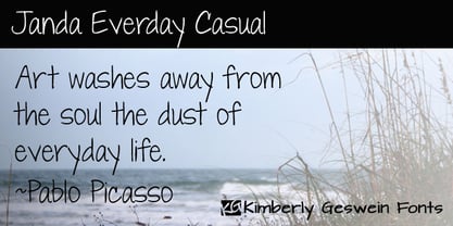 Neat, pretty feminine handwriting for everyday usage.
 - B Complex by Chank,
$99.00 The best things in life begin with a B. Bikes, Burgers, Beers, Babes. The B Complex font is a picture font by illustrator Adam Turman that shows his drawings of some of the things he draws best.
 - Pabellona (B) Dúplex - Personal use only

- Reaktif by Plasebo Studio,
$14.90 Reaktif type family has been created with a new and modern approach to the popular geometric sans serif type. It has a very legible, multifunctional, contemporary and dynamic design. Sharp-angle details in minuscule letters “a, b, d, f, g, m, n, p, q, r, t, u” boosts its' characteristics in the Reaktif font family. Reaktif type family contains 24 fonts and 550+ glyphs. Stylistic alternatives come with 30+ ligatures and many opentype features. It can meet your needs in many medium such as Reaktif branding, editorial, web and printing.
 - Linotext by Linotype,
$29.99Linotext was designed by Morris Fuller Benton in 1901 and first appeared with the name Wedding Text with American Type Founders in Jersey City, where its metal forms were cut by hand. The font was so popular that its forms soon began appearing with other font foundries under different names, Elite Kanzlei with D. Stempel AG, Comtesse with C.F. Rühl, etc. Its ornamental forms are not considered very legible by today’s standards and Linotext should therefore be used for headlines and short texts in point sizes 12 or larger. - Aldus by Linotype,
$29.99 Aldus was designed by Hermann Zapf and appeared with the font foundry D. Stempel AG in Frankfurt am Main in 1954. Zapf named this font after the famous Venetian printer Aldus Manutius, whose work is among the most important of the Renaissance period as well as Zapf’s inspiration for Aldus. Linotype Aldus was introduced by Linotype Library as a text font lighter than Palatino. Zapf’s goal with his Palatino and Aldus was to create a new form of Old Face typeface. This font gives text the feeling of elegance which was typical of the Renaissance.
 - Display Explicit by Gerald Gallo,
$20.00 Display Explicit is a display font not intended for text use. It was designed specifically for display, headline, logotype, branding, and similar applications. Display Explicit has an uppercase alphabet located under the shift+character set keys with alternate characters for A, B, C, D, E, F, G, J, K, M, N, P, Q, R, and W located under the option+character and shift+option+character set keys. Under the character set keys are condensed uppercase characters. There are sets of numbers matching each of the uppercase sets, and punctuation.
 - Checker by Shinntype,
$29.00 Checker is an all-cap ‘three-D’ font which automatically alternates white letters on black tiles with black letters on white tiles, by means of the Contextual Alternates feature. Checker is an attention grabber suitable for logos, titles and short headings. With its tiled construction, it's a natural for colorful interpretation. The letters are properly italicized and back-slanted, and adjusted for maximum readability within the constraints of the font’s concept. The letter style is bold grotesque, so Checker will mix smoothly with any other fonts in a layout.
 - Multipa by Hurufatfont,
$22.00 Multipa takes inspiration from old-style grotesque fonts and reinterprets them for the present. Its contrast structure distinguishes it from other sans serif fonts. Thanks to style sets, letters like t, b, d, k, l are synchronized with capitalization height. It allows you to create powerful typographic designs with body text and heading styles. It is equipped with rich opentype features, style sets and ligatures for professional typography designs. Ideal for packaging, labels, routing designs, mobile applications, brand designs, logos, all kinds of presentation and editorial designs, indoor and outdoor printing works.
 - RMU Gilgengart by RMU,
$30.00 RMU Gilgengart is a revival of Hermann Zapf’s beautiful calligraphic blackletter font which was cut and first released by Stempel in 1952. This font comes with fine ligatures and swash letters. Before working with this font it is recommended to activate both OT features Standard and Discretionary Ligatures in order to get access to all ligatures. RMU Gilgengart contains the following swash letters: D, L, h, f, g, k, round s, and t, whereby you should use the small letters at the end of a word or slogan only.
 - Sistina by Linotype,
$29.99Sistina, designed by Hermann Zapf in 1950 was first named Aurelia Titling. It is a heavy supplement to the Michelangelo Titling based on studies of inscriptions in Rome. First release in hotmetal at D. Stempel AG, Frankfurt in 1951. Sistina was originally an all caps font. The digital version from Linotype contains small caps. Hermann Zapf together with Akira Kobayashi, type director from Linotype had made a new revised version of Sistina now named as Palatino Imperial" in the Palatino nova type family, a Platinum Collection product from Linotype." - Fine Food by Jeff Levine,
$29.00 A 1942 photograph showing the exterior of the famous Hollywood restaurant Sardi’s and it’s unusually lettered sign was the inspiration for Fine Food JNL. Classically Art Deco, the Sardi’s sign had an ‘S’ looking like an inverted ‘J’ with a flat tail, a traditional ‘A’ replaced by a triangle and the ‘R’ composed of a ‘D’ with a diagonal extension. These elements were balanced against more traditional [but complementary] characters to retain the novel charm of the original signage. Fine Food JNL is available in both regular and oblique versions.
 - Larch by Mans Greback,
$29.00 Larch is a clear and crisp high quality script typeface. It consists of five weights: White, Bright, Shaded, Dark & Black. Each style is working great separately, but they make the perfect combination together. Larch is designed by Måns Grebäck in 2016. The font supports hundreds of languages. It contains contextual and stylistic alternates, swashes and ligatures. Write # after any lowercase letter to make swashes! You can also write % after the following letters to make left swashes: b d f h i j k l t Example: Black% Lar#ch
 - Eckhardt Dualine JNL by Jeff Levine,
$29.00 While searching online for vintage type inspirations, an image was spotted of an old letterhead for a steel manufacturing company. The hand lettering of the word 'Ludlum' only offered D,L,M and E as visual examples, but from this Jeff Levine has designed Eckhardt Dualine JNL - a Deco-flavored dual-line type font. As with a number of other releases that emulate hand-lettering or sign painting, Jeff has named this font in honor of his good friend, the late Albert Eckhardt, Jr.; who ran Allied Signs in Miami from 1959 until his passing.
 - Gutenberg Gotisch by RMU,
$30.00 Gutenberg Gotisch is a redesign of an inhouse font released by Bauer in 1885, and it is a predecessor of Princess Engraved. So both fonts make a perfect match. The long s can be reached by typing the integral sign or turning the round s into the long s by using the historical OT feature. In this font, you have the possibility to turn I, V, X, L, C, D, and M into Roman numerals by activating the salt feature. Finally I recommend to use both ligature features.
 - Dragon Fang by astroluxtype,
$20.00 Dragon Fang is a headline display font set. The style suggests Medieval font forms but in a contemporary sense. The font contains uppercase and lowercase letterforms which include a few alternate characters. Look for the swash “B” and “D” to give your design project a special look. Influenced by everything from Rick Griffin and Linotext to tribal tattoo art this font will bring a contemporary edge to your design project. Fantasy book cover art, album covers, even that horror movie will find many uses for astroluxtype’s Dragon Fang.
 - Killarney by Fontdation,
$15.00 Introducing our new font Killarney. A bold and heavy display font that inspired by the vintage/classic letterforms used in old-advertisements. Mouse-crafted with high attention to details; clean lines, sharp edges and tempting curves. Its square and blocky letterforms make Killarney a great for headlines and space killer. Packed with 500+ glyphs, Killarney composed of slanted version, standard upper/lower case characters, numerals, punctuations, some multilingual letters, alternate characters, stylistic sets, ligatures, etc. This font is a must have item for your designing arsenal. Go get yours now while it's hot. :D
 - Awardos by upirTYPO,
$6.00 Awardos is a complete solution for awards, badges and all kind of certificates. This font allows to mix various borders, laurels and icons to create a very unique badges. To quickly create an unique badge, type any number, any uppercase character and any lowercase character, for example 0Aa, 5Gk, 9Kl, 7Fr etc. To add starfield, start with a symbol (!"#$%&'()*+,). Glyphs included: 12x starfields - characters: ! " # $ % & ' ( ) * + , 16x borders - characters: 0 1 2 3 4 5 6 7 8 9 : ; < = > ? 36x laurels and outer elements - characters: A B C D E F G H I J K L M N O P Q R S T U V W X Y Z À Á Â Ã Ã Ä Å Ç È É Ê 12x crown icons - characters: a b c d e f g h i j k l 12x cup icons - characters: m n o p q r s t u v w x 12x number one digits - characters: y z à á â ã ã ä å ç è é ê It is not required to use a symbol from every category. For example only laurel with crown icon can be used, or only starfield with the cup icon. Awardos Inverse is an inversed version. The outline borders are still included, used symbols are: [ \ ] ^ _ { | } ~ ¢ £ ¤ ¥ ¦ § €
 - CorpusCare, designed by the prolific Canadian type designer Ray Larabie, stands out as a distinct and innovative font that marries accessibility with aesthetic appeal. Larabie, known for his vast and...
- Hello Sunday by Throndsen,
$5.00 Hello Sunday Funday! Best day of the week.
 - Medieval Dragons by Deniart Systems,
$15.00 The beasts of mythological and medieval times. From semi-dragons like lindorms and wyverns to classical and serpent-like dragons, this package features 52 unique medieval beasts that are sure to add a little fire to all your presentations.
 - Falbench by Realtype,
$17.00 Falbench is a manual written font to get the best texture for each letter. Each letter character will make your design strong and dazzling, while challenging the eyes. Each letter and symbol is simply painted using the best brushes and ink.
 - Pleasant Valley Sundae JNL by Jeff Levine,
$29.00 It seems only fitting that Pleasant Valley Sundae JNL, a typeface re-drawn from hand lettering on a piece of vintage sheet music, should take its name as a pun on another song's title from a different era. "Pleasant Valley Sunday" was a 1967 hit for the Monkees and was written by the legendary songwriting team of Carole King and the late Gerry Goffin; inspired in turn by a street they'd lived on named Pleasant Valley Way, in West Orange, New Jersey. The record made it to #3 on the pop charts.
 - KG This Is Not Goodbye by Kimberly Geswein,
$5.00 Neat, calligraphy-style handwriting using a chisel-tipped marker.
 - KG Thinking Out Loud by Kimberly Geswein,
$5.00 A neat upright font with a small x-height.
 - FT Military Dingbats by Fenotype,
$19.00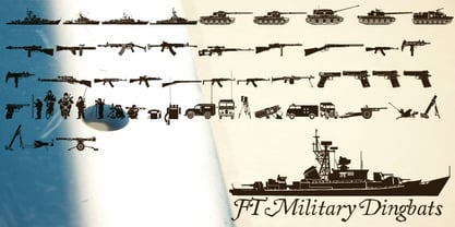 Pictograms of military boats, personnel, firearms and other weapons.
 - PB Carolingian Xc by Paweł Burgiel,
$32.00 PB Carolingian Xc is a font face designed for imitate Carolingian minuscule (from the region of the German southeastern scribal schools) found in 10th century manuscripts. All characters are handwritten by use ink and quill pen, scanned, digitized and optimized for best quality without lost its handwritten visual appearance. Character set support codepages: 1250 Central (Eastern) European, 1252 Western (ANSI), 1254 Turkish, 1257 Baltic. Include also additional characters for Cornish, Danish, Dutch and Welsh language, spaces (M/1, M/2, M/3, M/4, M/6, thin, hair, zero width space etc.), historical characters (overlined uppercase Roman numerals, many mediaeval abbreviations, d-rotunda, r-rotunda, I-longa, e-caudata, historical ligatures for “nomina sacra”) and wide range of ancient punctuation. OpenType TrueType TTF (.ttf) font file include installed OpenType features: Access All Alternates, Localized Forms, Fractions, Ordinals, Superscript, Tabular Figures, Proportional Figures, Case-Sensitive Forms, Stylistic Alternates, Contextual Alternates, Stylistic Set 1-11, Historical Forms, Historical Ligatures, Standard Ligatures. Include also kerning as single ‘kern’ table for maximum possible backwards compatibility with older software. Historical ligatures for additional glyphs are mapped to Private Use Area codepoints. OpenType features automatically exchange some default glyphs by stylistic alternates and create ligatures for better historical appearance.
 - Victorian Orchid by Dharma Type,
$19.99 Victorian Orchid is a gorgeous vintage flower. Victorian Orchid is a beautiful, organic serif font family available for both text and display. Its bizarre serifs for A and other diagonal letterforms came from decorative types and letterings in old Victorian era. These unusual serifs support and enhance the horizontal flow of the eyes and vertical alignments. Very eye-catching lowercase g also came from the Victorian era and this is one of the most dramatic letterform of this font. Lowercase such like n and d also have horizontal serifs which designed in the same theory. Victorian Orchid is somewhat organic, humanistic and soft-impression font like Transitional Serif as typified by Times New Roman. But at the same time, this font has horizontal serif and vertical stressed letterform like Modern Serif. They make this font sharp, handsome and neat. In addition, Victorian Orchid has low contrast and the serifs are not too flat and not too coved. By them, Victorian Orchid create strong and casual impression like Slab Serif fonts. Victorian Orchid family consist of 5 weights from Light to Bold including about 500 glyphs, international accented letters, some OpenType features. Italics are "True" italics which designed very carefully to match Romans.
 - Anuschka by Anomali Creative,
$10.00 Introducing **ANUSCHKA** - Faux Cyrillic Display Font Faux Cyrillic, pseudo-Cyrillic, pseudo-Russian or faux Russian typography is the use of Cyrillic letters in Latin text, usually to evoke the Soviet Union or Russia, though it may be used in other contexts as well. It is a common Western trope used in book covers, film titles, comic book lettering, artwork for computer games, or product packaging which are set in or wish to evoke Eastern Europe, the Soviet Union, or Russia. A typeface designed to emulate Cyrillic is classed as an ethnic typeface. **ANUSCHKA** came with that protest and propaganda vibe. It's contain a complete Simple Latin Glyphs, with extra ligatures, D-Ligature, Stylistic set for the main character to make it stencil look and distressed look. --- This font can be used with all software that can read standard fonts. Check out my instagram: https://www.instagram.com/anomalicreatype/ Thanks so much for checking out my shop! All the best, **Krisna Teja** Anomali Creatype #typeface #Stencil #FauxCyrillic #Cyrillic #Military #Protest #Poster #vintage #Extreme #design #Vintage #graphic #calligraphy #Retro #typography #propaganda #Poster #blackletter #retrostyle #illustration #Russian #socialist #character #set #uppercase #decorative #black #classic #Uppercase #handmade #capital #bold #number #modern #tattoo #english #art #label #logo #middle #typographic #antique #sign #letterhead #fashion #filmtitles #russia #comicbooklettering #videogames #computergames
 - Nurnberg Schwabacher by Intellecta Design,
$29.95"I digitized and to revitalize NurnbergSchwabacher by the extinct Haas'sche Schriftgiesserei, a German/Swiss foundry established in 1790 and based in Basel/Münchenstein. Many of its shares were acquired by D. Stempel in 1927. On the Luc Devroye site this foundry is listed on the Extinct Foundries of the 18th century page. This design is very similar to another Intellecta best seller: Hostetler Fette Ultfraktur Ornamental, both drawn from the classical type specimen book from Hostetler. The ornamental frame that completes the font is a fantastic baroque ornament that I found in another old book, unfortunately lost now. Luc Devroye, whose book is the source for all of my fonts, writes this about Rudolf Hostettler: He was a Swiss type designer, author of “The Printer’s Terms” designed by Jan Tschichold, of "Technical Terms of the Printing Industry" (5th edition was printed in 1995), and of "Type: eine Auswahl guter Drucktypen; 80 Alphabete klassischer und moderner Schriften" (Teufen, Ausser-Rhoden: Niggli, 1958). He also wrote "Type: A Selection of Types" (1949, fgm books, R. Hostettler, E. Kopley, H. Strehler Publ., St. Gallen and London) in which he highlights type made by European houses such as Haas, Enschedé, Deberny and Nebiolo. Jost Hochuli wrote his biography. - Proba Pro by Mint Type,
$- Proba Pro is a geometric sans with lowered x-height, prominent ascenders and descenders and a subtle humanist touch. It comes in 7 weights + matching italics each supporting numerous Latin-based languages as well as major Cyrillic languages. It is packed with OpenType features like ligatures, small caps, 4 sets of digits, 2 stylistic sets, superiors and inferiors, fractions, ordinals, and respective punctuation varieties including all-cap punctuation. There are also language-specific alternates for Romanian Ș/ș, Catalan punt volat, and correct small-cap versions for i/ı in Turk languages. Some of the styles of Proba Pro can be found in Mint Type Editorial Bundle together with other fonts which make some great pairs. Check it out!
 - Bhatary by Anomali Creative,
$5.00 Bhatary is a Retro Vintage Serif Font. This Bhatary is suitable to use, if you want to get a more vintage and retro impression in your typography project, but still maintain a modern style in it. Bhatary with a distinct appearance of Retro, 50's era. the golden era. It works well in posters, CD Cover, T-shirt / merchandise design, magazine,the possibilities are endless! #Retro #Groovy #Vintage #Serif #70s #60s #80s #90s #Psychedelic #RetroFont #VintageFont #1970s #1960s #Bubble #Funky #Funk #ArtNouveau #ArtModern #Retrowave #RetroType #HippyFont #LogoFont #PosterMockup #TrippyFont #WavyFont #GroovyFont #60sFont #HippieFont #Wavy #BohoFont #Hippie #Retro70sFont #Retro90s #Retro80sFont #RetroModern #Modern #Nostalgia #Nostalgic #Bubbly #DisplayFont #Ligature #Ligatures #Alternates #Fonts #Sporty #Baseball #CalligraphyFont
 - Drogheda by Fontdation,
$20.00 Introducing our latest font release: Drogheda. A reversed-contrast slab serif with a strong but flexible personality. Crafted with high attention to the details, gives you the best designing experience. Suits best for poster designs, headlines, quote writings, etc. THANKS AND ENJOY!
 - The Shredded font by Dieter Schumacher is a dynamic and impactful typeface that embodies a raw and energetic aesthetic. This font is characterized by its distinctive, torn appearance, as if the lette...
- Book& by Holland Fonts,
$30.00A design reminiscent to school script and handwriting, yet slightly off beat, with a gracious and elegant motion. Originally designed for invitations for a book store, the typeface likes to think it refers refers to book typography of the 40s and 50s of the last century. - Untitled-1 - Unknown license


