10,000 search results
(0.039 seconds)
- Sofya by Gaslight,
$30.00 This funny script font based on the logo which we did. It will look great on the package, restaurant menus, logos and magazine headlines. A large number of ligatures help you vary your design.
 - Angkasa Script by Struggle Studio,
$16.00 Looking for vintage script fonts? Angkasa is a vintage handwritten font inspired by traditional Calligraphy, Angkasa font includes a full set of Classic upper and lower case letters, multilingual symbols, numbers, punctuation and ligatures.
 - Display Dots Six by Gerald Gallo,
$20.00 Display Dots Six is a display font not intended for text use. It was designed specifically for display, headline, logotype, branding, and similar applications. Display Dots Six has an uppercase alphabet, numbers, and punctuation.
 - Gmuender Antiqua Pro by RMU,
$40.00 Inspired by the former hot-metal fonts of Imprimatur, Gmuender Antiqua Pro is a fresh designed versatile and multilingual serif font family. All five styles contain three different forms of numbers and small caps.
 - Omega by Thinkdust,
$10.00 Omega is a display font designed by Diogo Pisoeiro. Although Omega only has a limited number of characters, this display face with a unique style will work well for graphic design and display work.
 - Display Crisp by Gerald Gallo,
$20.00 Display Crisp is a display font not intended for text use. It was designed specifically for display, headline, logotype, branding, and similar applications. Display Crisp has tall and short cap alphabets, numbers, and punctuation.
 - Monssla by Jadatype,
$12.00 Monssla is a display font that comes with a block bold style. suitable for posters, tshirt, branding, social media, and so on. contains standard English letters, numbers, punctuation, and several accents that support multilingualism.
 - Donuto by Roman Melikhov,
$12.00 Donuto is a bold rounded font. It's suitable for create logos and branding of food, children's and eco-products. The font contains a number of alternate characters, which allows you to create unique combinations.
 - Night Forest by Rometheme,
$25.00 Introducing Night Forest – Vintage Font Perfect for logotype, labels and packaging, branding, or any vintage-themed projects! Features: - Basic Latin A-Z and a-z - Numbers - Symbols - Stylistic Set - Ligature - PUA Encode - Multilanguage Support
 - Juvenile Handwriting by Create Big Supply,
$15.00 Darling Moods is a sleek and elegant script font. It has a beautiful, natural handwriting style that will leave an authentic impression on your designs! Features: Uppercase Lawercase Numbers and punctuation Multilingual PUA Encoding
 - Bame by Typebae,
$15.00 BAME is a display typeface. Has a distinct curve and a lively personality. Ideal for projects that require a distinct personality. What's Included? Stylish & Standard Caps Numbers & Punctuation 14 Ligatures Multilingual Support PUA Encoded
 - Christmas Celebration by Yoga Letter,
$14.00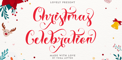 "Christmas Celebration" is a beautiful and unique handwritten font. This font features uppercase, lowercase, lowercase alternative, swashes, titling, multilingual support, binders, numbers, and punctuation. great for Christmas, weddings, invitations, promotions, social media, and more.
 - Neloqa by Jadatype,
$15.00 Neloqa is a display font that comes with a vintage inscription vibe. suitable for product, branding, social media, notes and so on. contains standard English letters, numbers, punctuation, and several accents that support multilingualism.
 - Wire Mesh JNL by Jeff Levine,
$29.00Wire Mesh JNL is an outline variation of the same design that produced Shady Characters JNL (lettering printed over a simulated halftone). This time around, the end effect gives the impression of looking at lettering cut out of a mesh screen. - Cantoria by Monotype,
$29.99Cantoria was designed by Ron Carpenter in 1986. It is a serif font with characteristics of stone cut letters. Distinguished by its open forms and large capitals and available in 10 weights, Cantoria offers a wide range of possible applications. - French Stencil Sans JNL by Jeff Levine,
$29.00 French Stencil Sans JNL is another typeface based on vintage French tin/zinc stencils. Slightly rounded corners and a "hand-cut" look add an interesting and charming variation that breaks away from the "standard" design of other metal stencil sets.
 - Shadowlawn JNL by Jeff Levine,
$29.00 If you like a rough-hewn, rugged and vintage typeface, then Shadowlawn JNL will certainly please you. Re-drawn from vintage examples of a hand-cut wood type, the rustic charm of this typeface brings a reminiscence of Old West themes.
 - Muthiara by Abo Daniel,
$17.00 Muthiara is a beautiful script font and perfect for lettering project like cutting vinyl, silhouettes, t-shirt design, mugs, advertisements, book covers, posters, business cards, social media and more. It includes 51 ligatures, support for multiple languages and offers PUA encoding.
 - Nutnik by Hanoded,
$20.00 Nutnik was made using cut out cardboard letters, black paint and some brushes. The result is a highly legible, yet grungy font. It comes with all the diacritics you could possibly wish for and stylistic alternates for the lower case letters.
 - Shinn by Red Rooster Collection,
$45.00 Designed by Nick Shinn. Digitally engineered by Steve Jackaman. Humanist sans serif with a calligraphic cut and tall ascenders. Light, Medium and Extra Bold designed by Nick in 1985 for Typsettra; Steve added the Book and Bold weights, and the Italics.
 - Bunday Slab by Buntype,
$22.50 The new Bunday™ Slab Font Family consist of three main states with different moods: the crisp and distinctive slab serif, the cute script styled italic and the matching upright italic. All states of Bunday™ Slab share the same contemporary, clear and open base forms and create a space-saving and pretty homogeneous text colour with good legibility. The font was manually hinted and contains extensive handcrafted kerning tables to ensure perfect appearance in all media. Bunday™ Slab ships with 9 standard, 9 upright italic and 8 italic styles from a considerable thin “Hair” to a pretty fat “Heavy” weight. It supports at least 99 languages and provides OpenType® features for ligatures, alternative glyphs, localised forms and more. Please take a look at the other members of the Bunday superfamily: Bunday™ Clean Bunday™ Slab Further information: Bunday Slab Specimen PDF Feature Summary: 9 weights: Hair, Light, Thin, SemiLight, Regular, SemiBold, Bold, ExtraBold and Heavy 3 Moods: Sans, Upright and Upright Italic Overall width: Narrow or Space-Saving Advanced “f” ligature set* “s” and “c” ligatures* Alternates Characters: a, ç, e, f, g, l, t, y and more* Capital German Esszett* Supports at least 99 Languages * Only available applications with advanced OpenType® support
 - 1925 My Toy Print Deluxe Pro by GLC,
$42.00 This family was created inspired from two French (one so common and a very rare large one) "toy print" boxes, named Le petit imprimeur, with rubber stamp characters from the 1920's. The big difference from our 1920 My Toy print is that this font is complete, with upper and lower cases, accented, complete punctuation and some symbols. The doubly of each usual character in each style (A-Z/a-z and numerals) allow to give a rich and variously uneven appearance, looking like the results of the real use of those old rubber stamps, with bad kernings and alignement. The font is containing West (including Celtic), Central, East European, Turkish and Cyrillic characters. The bold style may be used as a reinforcement, mixed with normal style without disadvantage, allowing finally four choices for each usual letter... The original size is 6mm (about 17 pts).
 - Supernova Std by Martina Flor,
$79.00 Supernova is a new family that combines the spontaneity of a script typeface with the versatility of multiple weights and cuts. The development of script typefaces has largely been limited to variations in shape and proportion (and with the advent of OpenType technology, the addition of alternate letterforms). Their application has continued to be primarily linked to their emotional attributes, while roman types predominate in body texts. Supernova takes a step in a different direction and was conceived as a script typeface family comprised of several weights and cuts, including a versatile, eye-catching display version and a highly legible body-text version with five weights.
 - Reba Samuels by Samuelstype,
$24.00 Reba Samuels is based on the 2007 release Rebecca Samuels. While Rebecca was largely intended for text use Reba aims to be more versatile with an extended weight scope and added cut varieties. While Rebecca’s slab character is developed in the Reba serif, the ’seriffed’ italic of Rebecca is abandoned in favor of a simple italic sans, better matching the serif in plain text. The weight extremes are very useful for headlines while the middles do better in text. The robust and angular shapes of the serif matches the straightforward sans. The extreme contrast between the thin and the black cuts opens up great opportunities in any design project.
 - Toy Story by Shape Studio,
$10.00 We are proud to present our new font. Name of the font is TOY STORY. Toy Story is a fun handwritten font filled with handwritten charm and personality! It is the perfect choice for crafters with lawn mowers, as it is extremely smooth for optimal cutting performance. Toy Story is a fun font that's bold and smooth enough to cut with the Cricut & Silhouette crafting machine, for Titles for children's books, scrapbooks, logos, icons, phrasesor quotes for winter greeting cards (Halloween or New Year holidays), photo overlays, short phrases, children's books, gift shop tags, presentations on social media Pinterest, Instagram, Facebook, or others. Thank you!
 - Maintenance Stencil JNL by Jeff Levine,
$29.00 In the opening scenes of the 1938 Three Stooges comedy “Tassels in the Air” the Stooges are working as maintenance men inside an office building. Their immediate job requirement is to paint the tenants’ business names on the corresponding office doors with pre-cut stencils. Of course, they get it all wrong. Nonetheless, the stencils appear to be a hand cut sans serif design in a squared or ‘block’ style with rounded corners, and some of the applied lettering made for an interesting challenge to recreate as a typeface. The end result is Maintenance Stencil JNL, which is available in both regular and oblique versions.
 - ITC Digital Woodcuts by ITC,
$29.99ITC Digital Woodcuts font is the work of Timothy Donaldson. Although made on a computer, each character has the look of a block of wood with a character cut into it. The forms are made entirely of lines, typical of how the result would be if they were truly cut into wood. ITC Digital Woodcuts is a capital letter alphabet including both white letters on a black background and black letters on a whitish background which looks as though the bark of the piece of wood was chiseled away for the effect. Donaldson suggests alternating the black version with the white to create a three dimensional effect. - Bouncer by Ingrimayne Type,
$6.95 The letters in Bouncer are round because they all begin as a ball and then have parts of the ball cut away. Bouncer was one of the earliest typefaces from Ingrimayne Type. Lower-case letters are smaller versions of the upper-case letters. BouncerTwo, designed twenty years after the original Bouncer, continues playing with the idea of making letters by cutting out parts of a circle, but in this case the circles are interlocking. All letters are upper-case but some of those on the lower-case keys differ from those on the upper-case keys. BouncerTwo is eye-catching but not highly legible.
 - Sliced by ArtyType,
$29.00 The name of this robust typeface is adopted quite literally from the slice taken out of certain characters. The same sliced angle is also applied to many of the terminals, creating a clean-cut styling throughout the family. Tilted versions emphasise the descriptive name further, with an implied cutting stance. Wider versions go even further still, taking on a more thrusting, squat dynamic compared to the condensed styles. The standard Sliced family is complemented by Sliced Open, a lighter, more open set which extends the versatility and design flexibility of the typeface and comprises a total of 14 font styles, all with extended European character sets.
 - Madurai by insigne,
$24.75 The rounded forms found in Chennai have proven to be one of insigne's more popular designs for web-based company logotypes. Now, insigne's new superfamily Madurai takes its popular predecessor to a new level, offering a wide range of complementary fonts. Madurai removes Chennai's rounded stems and then adjusts the character width to account for its reduction in geometry, resulting in a balanced sans-serif face with humanist touches that works well for extended text. The Madurai family has a full range of six weights from thin to black and includes Condensed and extended options for a total of 36 fonts. All members of the Madurai series include a wide variety of OpenType alternates. Madurai is equipped for complex professional typography, including alternates, small caps and plenty of alts, including "normalized" capitals and lowercase letters that include stems. The face also has a number of numeral sets, including fractions, old-style and lining figures with superiors and inferiors. OpenType-capable applications such as Quark or the Adobe suite can take full advantage of automatically replacing ligatures and alternates. You can find these features demonstrated in the .pdf brochure. Madurai also includes the glyphs to support a wide range of languages, including Central, Eastern and Western European languages. In all, Madurai supports over 40 languages that use the extended Latin script, making the new addition a great choice for multi-lingual publications and packaging. For your next project, explore the fantastic potential of Madurai.
 - Katarine by Suitcase Type Foundry,
$75.00From today's point of view Katarine has a rather unusual origin. Initially an all-caps display face, what was to become the Medium weight of the family was augmented with a lower case, then the character set was completed by adding all the missing glyphs. The next step was the creation of the Light and the Bold weights with matching Italics. This working method compromised the relationships between the characters across the different weights After some consideration the decision was made to start over and draw the complete family from scratch. This time the "conventional" process was followed — first the Light and Bold weights were designed. Those extremes were used to interpolate the Regular, Medium and Semibold weights. When compared to the original, the glyphs of the new fonts are slightly wider. The construction of the letters is sturdy, with an x-height that varies from the heaviest to the lightest weights. The relationship of the stem weight between the horizontal and vertical strokes is carefully balanced. Characters are open and firm; the italics have room to breathe. The original fonts included two sets of small caps — Small Caps and Petite Caps. However neither set were suited for emphasis, with the Small Caps being too tall and the Petite Caps too short. We decided to replace them both with one set of traditional small caps, slightly taller than the x-height, perfectly suited for emphasis in text usage. The original version of Katarine was partly incorporated into the new OpenType versions. Thus most of the original arrows, frames and boxes can be found in the new Katarine. Each individual weight now contains 830 glyphs, nine sets of numerals, small caps, numerous ligatures and fractions. An additional font named Numbers contains numerals in circles and squares, and is now augmented with accented caps and a number of terminal alternatives, which can easily be accessed through stylistic sets. We also added two extra variants, Experts Regular and Experts Black (in inverted form). Katarine Std preserves the solid construction and excellent legibility of the original family, but has now become a fully featured OpenType typeface. Katarine is suited for a broad range of applications, from simple layouts to intricate corporate systems. It is the typeface of choice where the cold, austere character of modern sans serifs are inappropriate, yet simple shapes and good legibility are required. - VVDS The Dickens Tale by Vintage Voyage Design Supply,
$10.00 The Dickens's Fairytale – it's a new chapter of VVDS products - The collections of fancy display fonts which will include many typefaces that will be perfectly combined not only with each other, but also with other collections of this series. As a result, you will get a large collection of beautiful fonts and graphics that will help you create beautiful designs without having to look for anything else. All these collections are inspired by classic books design of XIX and XX centuries like Franklin's Library Classic Collection and modern publishing houses like Barnes & Nobel Collectible Editions. This collection is the first one and including 12 font files. The Serif presented in two styles - cutted and normal. The cutted style has two weights - Regular and Bold. Also, there are two types of shadows - block and offset. Plus decor for cutted serif. The cherry on top - curly calligraphic Script with Swirl calligraphy elements for decoration. The both of types has many Open Type Features as Oldstyle Figures, Fractions, Stylistic Alternates and ending lowercase letters for script. • OTF & WEB • Multilingual
 - Tuned Rompies by Balevgraph Studio,
$12.00 Tuned Rompies is a retro and bold display font. It would look great on headlines, magazines, logos, branding and so much more! What's Included? Uppercase & Lowercase Numbers & Punctuation Alternates Multilingual Support Regular & Slant PUA Encoded
 - Coastline by Alcode,
$20.00 Coastline is a solid version of kiptide. Coastline comes with a set of upper and lowercase letters, numbers, alternative styles for some lowercase characters are also available, which makes your text and designs more attractive.
 - Display Squares Two by Gerald Gallo,
$20.00 Display Squares Two is a display font not intended for text use. It was designed specifically for display, headline, logotype, branding, and similar applications. Display Squares Two has upper and lowercase alphabets, numbers, and punctuation.
 - Display Dots One by Gerald Gallo,
$20.00 Display Dots One is a display font not intended for text use. It was designed specifically for display, headline, logotype, branding, and similar applications. Display Dots One has upper and lowercase alphabets, numbers, and punctuation.
 - Display Dots Seven by Gerald Gallo,
$20.00 Display Dots Seven is a display font not intended for text use. It was designed specifically for display, headline, logotype, branding, and similar applications. Display Dots Seven has upper and lowercase alphabets, numbers, and punctuation.
 - Farland by Rillatype,
$15.00 Introducing, Farland. a bold script font that carries the vintage feel. This font is perfect for logo, headline, signage, packaging, branding, etc. Features : uppercase & lowercase numbers and punctuation multilingual alternates / swashes and ligatures PUA encoded
 - Eckhardt Centerline JNL by Jeff Levine,
$29.00 This typeface is one of a number of sign painter-oriented fonts named in honor of Jeff Levine's good friend Albert Eckhardt, Jr. (who ran Allied Signs in Miami Florida from 1959 until his passing).
 - Sign Man JNL by Jeff Levine,
$29.00Sign Man JNL is a reworking of Sign Shop JNL, with a lighter font weight and a number of changed characters (including extended horizontal crossbars on the B,E,F,H,K,P and R).