10,000 search results
(0.239 seconds)
- Art Nouveau 2 BA by Bannigan Artworks,
$19.95This is an original font designed in the Art Nouveau style. - KG Life Is Messy by Kimberly Geswein,
$5.00 A messy, markered, painted font in pure whimsical and messy style.
 - Palatino Nova Paneuropean by Linotype,
$67.99Palatino® Nova is Prof. Hermann Zapf's redesign of his own masterpiece, Palatino. The original Palatino was cut in metal by August Rosenberger at D. Stempel AG typefoundry in Frankfurt, and released in 1950. Palatino was later adapted for mechanical composition on the Linotype machine, and became one of the most-used typefaces of the 20th Century. Palatino was designed for legibility, and has open counters and carefully weighted strokes. The type was named after Giambattista Palatino, a master of calligraphy from the time of Leonardo da Vinci. Palatino is a typeface based on classical Italian Renaissance forms. A modern classic in its own right, Palatino is popular among professional graphic designers and amateurs alike, working well for both text and display typography. Hermann Zapf and Akira Kobayashi redeveloped Palatino for the 21st Century, creating Palatino Nova. Released by Linotype in 2005, the Palatino Nova family is part of Linotype's Platinum Collection. Palatino Nova includes several weights (Light, Regular, Medium, and Bold), each with companion italics. Four styles (Regular, Italic, Bold, and Bold Italic) have Greek and Cyrillic glyphs built into their character sets. The Palatino Nova family also includes revised versions of Aldus (now called Aldus Nova), as well as two titling weights. The first titling weight, Palatino Nova Titling, is based on Hermann Zapf's metal typeface Michelangelo, including Greek glyphs from Phidias Greek. The heavier titling weight, Palatino Nova Imperial, is based on Sistina. The fonts in the Palatino Nova family support all 48 Western, Central, and Eastern European languages. Additional features: ligatures and historical ligatures, Small Caps, ornaments, and a range of numerals (proportional & tabular width lining and Old style Figures, fractions, inferiors, and superiors)." - Palatino Nova by Linotype,
$50.99 Palatino® Nova is Prof. Hermann Zapf's redesign of his own masterpiece, Palatino. The original Palatino was cut in metal by August Rosenberger at D. Stempel AG typefoundry in Frankfurt, and released in 1950. Palatino was later adapted for mechanical composition on the Linotype machine, and became one of the most-used typefaces of the 20th Century. Palatino was designed for legibility, and has open counters and carefully weighted strokes. The type was named after Giambattista Palatino, a master of calligraphy from the time of Leonardo da Vinci. Palatino is a typeface based on classical Italian Renaissance forms. A modern classic in its own right, Palatino is popular among professional graphic designers and amateurs alike, working well for both text and display typography. Hermann Zapf and Akira Kobayashi redeveloped Palatino for the 21st Century, creating Palatino Nova. Released by Linotype in 2005, the Palatino Nova family is part of Linotype's Platinum Collection. Palatino Nova includes several weights (Light, Regular, Medium, and Bold), each with companion italics. Four styles (Regular, Italic, Bold, and Bold Italic) have Greek and Cyrillic glyphs built into their character sets. The Palatino Nova family also includes revised versions of Aldus (now called Aldus Nova), as well as two titling weights. The first titling weight, Palatino Nova Titling, is based on Hermann Zapf's metal typeface Michelangelo, including Greek glyphs from Phidias Greek. The heavier titling weight, Palatino Nova Imperial, is based on Sistina. The fonts in the Palatino Nova family support all 48 Western, Central, and Eastern European languages. Additional features: ligatures and historical ligatures, Small Caps, ornaments, and a range of numerals (proportional & tabular width lining and Old style Figures, fractions, inferiors, and superiors)."
 - Bauer Bodoni by Linotype,
$45.99 Giambattista Bodoni (1740-1813) was called the King of Printers; he was a prolific type designer, a masterful engraver of punches and the most widely admired printer of his time. His books and typefaces were created during the 45 years he was the director of the fine press and publishing house of the Duke of Parma in Italy. He produced the best of what are known as "modern" style types, basing them on the finest writing of his time. Modern types represented the ultimate typographic development of the late eighteenth and early nineteenth centuries. They have characteristics quite different from the types that preceded them; such as extreme vertical stress, fine hairlines contrasted by bold main strokes, and very subtle, almost non-existent bracketing of sharply defined hairline serifs. Bodoni saw this style as beautiful and harmonious-the natural result of writing done with a well-cut pen, and the look was fashionable and admired. Other punchcutters, such as the Didot family (1689-1853) in France, and J. E. Walbaum (1768-1839) in Germany made their own versions of the modern faces. Even though some nineteenth century critics turned up their noses and called such types shattering and chilly, today the Bodoni moderns are seen in much the same light as they were in his own time. When used with care, the Bodoni types are both romantic and elegant, with a presence that adds tasteful sparkle to headlines and advertising. The Bauer Bodoni was done by Heinrich Jost for Bauer Typefoundry in 1927. This version has finer details of the original Bodoni types. It works well for headlines, logos, advertising.
 - Halogen by Positype,
$29.00 Who doesn't want or need an expansive contemporary extended sans that has a sense of style and swagger… what if it had a lowercase, small caps and various numeral options… how could you say no? This was the foundational argument I made for myself when I drew the initial alphabet on my birthday last year (something I do each year, draw a new font, kind of a fun OCD thing). I wanted to see a wide, utilitarian sans that had more to it than just a basic character set and didn't resemble standard geometric models. As I continued sketching, the letterforms were being influenced more by my 'lettering tendencies' than the normal mechanical trappings of drawing flat, wide letters. The letters have retained aspects of letters created by hand — stresses, modulation, naturally ending terminals. Truncation and quick clipping of strokes became antithetical to the letterforms I drew, so I continued this once I brought the design into the computer. I kept it precise and dependable, but made every attempt to keep a conscientiously crafted typeface and not let it devolve into a grid-based drone. As such, it works just as well looking back in time as much as it does assuming a lead role in a sci-fi movie. Halogen does deliver and opts not to take a short cut and provide an anemic offering of glyphs — a modern typeface offered today must provide more than just the basics and this one does — lowercase, smallcaps, old style numerals, tabular forms, stylistic and titling alternates, fractions, case-sensitive features, and even an alternate uppercase ordinal set is included. So go make cool print and digital things with it, now.
 - Palsam Arabic by Abjad,
$45.00 Since the beginning, Palsam was intended to be a super multilingual family, with a real cursive Arabic companion, and a display cut. The typeface was designed to be used for setting text and titles of contemporary Arabic content, specially magazines, and websites. The Arabic and Latin scripts were designed at the same time, to make a true authentic bilingual typeface. Both scripts have affected each other in several ways through the entire design process, which happened within ten years. Palsam has an inviting, approachable, fashionable and humanist look. Thanks to its low contrast, open apertures, detailed calligraphic strokes, and smooth counters, which also make it easy to read at smaller sizes. The main highlight for Palsam was the Cursive companion. For the first time, the calligraphic Ijaza style was used as a model for designing the Arabic cursive. Since the Ijaza is a hyper combination of Naskh and Thuluth, which makes it perfect to be a companion for the upright Naskh. Moreover this script was used in margins, and to highlight specific content inside a paragraph in older manuscripts. With true cursive companions in five weights, and many opentype features, Palsam grants all the tools needed to set complex information and editorial designs applications. More than 1000 characters are included per weight, including small caps, fractions, old style and lining numbers, ligatures, contextual ligatures, and discretionary ligatures. It supports over 40 languages that use the Latin extended, as well as Arabic, Farsi, and Urdu Languages. PalsamArabic only covers the Arabic script. The latin script was designed in collaboration with the Slovenian type designer Alja Herlah.
 - BMX Radical by Eclectotype,
$15.00 BMX Radical is inspired by the titles of the cult 1980s BMX movie "Rad". The characters R, A and D were designed after this, with the rest of the character set being completely made up. The font is uppercase only, but with two different alphabets. In OpenType-capable applications, engaging contextual alternates will make the alphabets automatically switch between each other, meaning double letter combinations always contain two different glyphs to give the text a much more handmade feel. It is a very versatile brush font. It can look cheesy and retro in bright colors with outlines or gritty and modern in more muted palettes.
 - Little Ribbon by IKIIKOWRK,
$17.00 Introducing Little Ribbon - Cutie Type, created by ikiiko. Little Ribbon is a beautiful handwritten typeface with bold shapes combining simple lines. This letter is suitable if you want to show a cheerful impression or playful design with solid color. This typeface is perfect for an kids stuff like ads, poster, flyer, or email blast. And also good for packaging product, food & beverages, quotes, or simply as a stylish text overlay to any background image. What's included? Uppercase & Lowercase Number & Punctuation Stylistic & Swashes Multilingual Support Get also a good offer & FREEBIE at our site : www.ikiiko.com Enjoy our font and if you have any questions, you can contact us by email : ikiikowrk@gmail.com
 - Nouveau Rose by Jeff Levine,
$29.00 In the July 24, 1915 issue of “Dry Goods Reporter” is a demonstration of hand lettering rendered with the use of a “speed pen”. Two suggested examples cited in the accompanying article were the Payzant pen and the then-new Speedball pen. An ornate Art Nouveau serif alphabet is displayed, with some examples having delicate floral elements entwining the letters. The initial alphabet was auto-traced, then cleaned-up and modified to recreate the core design of the basic (unadorned) letters. The numerals, punctuation and all additional characters were then made from scratch. Nouveau Rose JNL is the finished result, and is available in both regular and oblique versions.
 - Frostbite by Comicraft,
$19.00 If you're feeling a chill in your bones and the grass is a little crunchy under your feet after looking at this font, you might like to put your feet in warm water when you get home if to stave off a little Frostbite. This remastered font family is a chip off the old block, and will help you thaw out before your skin starts to freeze and flake. We recommend you melt Frostbite cubes in the warm water too to ensure you don't stick to the ice. We also recommend you don't lick the letterforms, as we know our customers are wont to do.
 - Advertising Gothic by Scriptorium,
$12.00Advertising Gothic is based on a style of fonts from the 1920s which was commonly used in advertising and poster design. The style is clearly influenced by the Art Deco movement. It combines deco style decorated initials with dramatic capital letters. The font comes in two different versions. Advertising Gothic Plain features initials which do not have the deco decorations and less fancy letter forms. Advertising Gothic Deo features deco embellishments on the initials and more elaborate versions of the main letter forms. - Smokers by Vozzy,
$5.00 A vintage look layered label font named "Smokers".Typeface includes six styles (including effect styles), for sample look at 4th preview. This font will good viewed on any retro design like poster, t-shirt, label, logo etc. For using effects layers: - Type your text in Regular. - Copy that and paste at the same position. - Change the style to Shadow or Texture. - Alternates in first letters - just type letter in caps. For alternates in last letters - just use alternates for small letters. Thank you!
 - Cotton Candy by Gassstype,
$25.00 Hello Everyone, introduce our new product Font Cotton Candy it is Quick Brush Font.This is a Textured Natural Style and classy style with a clear style and dramatic movement. This font Cotton Candy is great for your next creative project such as logos, printed quotes, invitations, cards, product packaging, headers, Logotype, Letterhead,special events or anything that need handwritting taste. That is has charming, authentic and relaxed characteristic more natural look to your text. You can activate 17 Ligatures glyphs OpenType panel.
 - Byte 205 by Talbot Type,
$15.00 Byte 205 is a modular font, resulting from experiments in creating a practical, legible font from a minimum set of geometric components on a uniform grid. It has full upper and lower case character sets and includes all accented characters for Western and Central European languages. It's available in three styles – 105, 205 and 305. Each style has different corners, 105 is square, 205 is bevelled and 305 is round. Each style is available in three weights, Light, Medium and Bold.
 - Enjoika by Fontiko,
$10.99 Enjoika serif font family Enjoika is an elegant and neat font inspired by the Petrykivka painting (traditional Ukrainian decorative painting style) distinctive features of this folk art style are its flower patterns and Art Nuevo style by Alphonse Mucha with the floral and nature thematic and the swirls. This font looks luxury, stylish, elegant and clean and . This font is great for logo branding & invitations, photography, quotes, wedding design, business cards, posters, watermark, holiday cards, special events and much more.
 - Odenburgh by Mans Greback,
$59.00 Odenburgh is a Medieval-style calligraphy typeface. Hand-drawn by Måns Grebäck during 2018-2020, this high-quality lettering is inspired by historical Gaelic, British and Irish handwriting. It comes as a regular, clean style as well as the additional Odenburgh Deco style. The typeface is perfect for calligraphic headlines, products and logotypes in Middle Ages projects. The font supports all European, Latin-based languages. In addition to that, it contains numbers and all punctuation and symbols you'll ever need.
 - Classist by Sohel Studio,
$10.00 Classist sans serif is a bold font style with a classic and modern touch . There are 4 different styles that you can apply in your design projects. This font is designed with a curved and bold style so it is very perfect for branding projects, logos, business cards, t-shirts, clothing, magazines, product branding, advertisements, posters, quotes etc. Classist Features: · 4 Weights font (Regular,Italic,Bold,Outline) · Uppercase · Numerals & Punctuation · Accented characters · Multilingual Support Thanks and have a wonderful day
 - Gubia by Graviton,
$20.00 Gubia font family has been designed for Graviton Font Foundry by Pablo Balcells. It is a geometric, sans serif typeface with a slightly condensed design. It has been conceived to be most suitable for all sized headlines, as well as short and middle length text blocks. The standard styles give texts a classic appearence while alternate styles give texts a playfull one. Gubia consists of 8 styles, 4 weights plus alternates, each containing small caps and glyph coverage for several languages.
 - Neo mameo by Kaidosan,
$10.00 Neo mameo is a Japanese Style typeface that is ideal for projects that require a distinctly Japanese touch. This typeface will add uniqueness and creativity to your work with a beautiful style and eye-catching look. This font character is taken from Japanese traditional Japanese style. This font will leave a lasting impact and quickly grab the attention of potential customers. This font provides a vivid visual effect. I hope this font can provide solutions in your business and activities.
 - Orgon Slab by Hoftype,
$49.00 Orgon Slab complements the Orgon family with its clear, unexcited appearance. It offers high readability both for desktop and web applications. The Orgon Slab consists, as does the Orgon family, of 16 styles and is well suited for ambitious typography. It comes in OpenType format with extended language support. All weights contain ligatures, small caps, superior characters, proportional lining figures, tabular lining figures, proportional old style figures, lining old style figures, matching currency symbols, fraction- and scientific numerals and matching arrows.
 - Sweet Cupcake by MlkWsn,
$15.00 Sweet Cupcake fun fonts with 4 styles and can be applied to many of your precious moments, this font is specially designed in layered style, equipped with multi-language and OpenType, don't forget there are also alternative letters and ligature that make this font so fun. There are more additions dashed line that you can enter manually to look different styles and there are dozens of additional doodle & badges completing this font. You can make as posters, titles, games, packaging, invitations and more.
 - Carat by Hoftype,
$49.00 Carat is a contemporary interpretation of a classic serif type. Fresh and clean in appearance. Straight, unsentimental and objective. Ideally suited for text but also with crisp details in display. Well-equipped for ambitious typography, the Carat family consists of 12 styles, comes in OpenType format with extended language support for more than 40 languages. All weights contain small caps, proportional lining figures, tabular lining figures, proportional old style figures, lining old style figures, matching currency symbols, fraction- and scientific numerals.
 - Nirotica by TRF,
$23.00 Nirotica is a serif font that comes with very beautiful changing characters that will bring in your projects a touch of luxury and style. The modern style is perfect to be applied in various formal forms such as invitations, labels, restaurant menus, logos, fashion, branding, make up, stationery, novels, magazines, books, greeting / wedding cards, packaging, labels or any type of advertising purpose. Nirotica has 1129 glyphs and 736 alternative characters, including various language support. With OpenType features with alternative styles and elegant ligatures.
 - Equip Slab by Hoftype,
$49.00 Equip Slab, a new hardline, serif dominated face designed on the same geometric base as the rest of the Equip family. With its clarity it appears strong, imperative and straight forward. The Equip Slab family comprised 16 styles and is well suited for ambitious typography. It comes in OpenType format with extended language support. All weights contain ligatures, proportional lining figures, tabular lining figures, proportional old style figures, lining old style figures, matching currency symbols, fraction- and scientific numerals and matching arrows.
 - Byte 105 by Talbot Type,
$15.00 Byte 105 is a modular font, resulting from experiments in creating a practical, legible font from a minimum set of geometric components on a uniform grid. It has full upper and lower case character sets and includes all accented characters for Western and Central European languages. It's available in three styles – 105, 205 and 305. Each style has different corners, 105 is square, 205 is bevelled and 305 is round. Each style is available in three weights, Light, Medium and Bold.
 - Alinea Incise by Présence Typo,
$36.00Alinea is a typeface in 3 styles (Sans, Incise, and Serif) conceived for being mixed in the same document. Alinea incise is a flare serif (incise in French). It finds its origin in the roman letters carved in stone. The great advantage of such a style is that it can be associated to any other style of typeface. The most famous flare serifs are: Optima of Hermann Zapf, Pascal of José Mendoza, Amerigo of Gerard Unger and Alinea Incise of course! - Voyager Mono by Anton Kokoshka,
$29.00 Voyager Mono is a geometric monospaced grotesque family. It has two width styles - Voyager Mono (630em) and Voyager Mono Cond (580em). Available in 7 weights plus matching italics and alternate styles without slope with italic letters "a" and "g". Particular attention was paid to the problematic letters for monospaced fonts - "m" and "w". The optimal solution was found so that all signs looked good even in black style. Voyager Mono is perfect for the brand design, advertising, logo, gaming and packaging.
 - Guess Who by Gassstype,
$23.00 Hello Everyone, introduce our new product Font Guess Who is a Fun Display Typeface .This is a Textured Natural Style and classy style with a clear style and dramatic movement. This font Guess Who is great for your next creative project such as logos, printed quotes, invitations, cards, product packaging, headers, Logotype, Letterhead, Poster, Design this font is great for your creative projects such as watermark on photography. You can activate 8 Ligatures glyphs and 8 Alternates glyphs OpenType panel.
 - Pacardo by Luxfont,
$18.00 Introducing a clean geometric font family in Modernism style. Neat and at the same time provocative font attracts attention with its forms. New-fashioned font with original letters will perfectly complement both trendy abstract designs and designs in a retro style. Constructing letters with a bias towards heavier weights and contrast. Versatility of the typeface works well with designs in different styles. Features: Geometric and Modern 6 fonts in family: - Thin, Thin Italic - Regular, Italic - Bold, Bold Italic Kerning ld.luxfont@gmail.com
 - Thillends by Wacaksara co,
$16.00 Thillends is a fancy handlettering typeface with a clear style, good mood, and dramatic movement. It allows you to create beautiful hand-made typography in an instant. It’s suitable for headlines, logotype, editorial design, branding, letterhead, poster, apparel design, product packaging, label or anything that need handlettering style. Thillends comes with many variations on each character, including uppercase, lowercase, numerals & punctuation, stylistic styles, ligatures, discretionary ligatures, and titling. You will also discover extras swash added to give that finishing touch to your texts.
 - HWT Bulletin Script Two by Hamilton Wood Type Collection,
$29.95 Bulletin Script was a style offered by several American wood type manufacturers in the late 19th Century. It may actually be one of the most iconic styles of the late 1960 Psychedelic era when Victorian revival was in full swing. The style known as "Bulletin Script No. 2” varies from the more commonly seen Bulletin in that its bottom strokes have a concave swash to them rather than rounded bulbous bottom terminals. This new digitization features over 300 glyphs including Central European characters.
 - Plasto by Eko Bimantara,
$19.00 Plasto is a complete grotesk sans serif family. The quirky letterforms and its slight width variation characterized the typeface as fun and playful as "plastic" in a graphic layout, fit for various design spaces, fit for both informal or functional purposes, fit for large display and also small text. Plasto complete family contains 54 styles with two axes; Weight and Width. The weight consists of 18 styles from Thin to Black, and the width consists of 3 styles, condensed, normal and expanded.
 - Paralex by Tipo Pèpel,
$27.00 Paralex is a complete typeface family of 12 fonts with geometric-slab style. The edges of shapes are rounded to give a smoother appearance. It contains several OpenType functionality, such as initial and final decorative forms, old style numerals and an extensive set of geometric style ornaments. The character set supports Central and Eastern European as well as Western European languages. Despite the robustness of its forms has a warm appearance, and good readability that make it useful for a variety of situations.
 - Cala by Hoftype,
$49.00 Cala is a reflection of Venetian Renaissance types but with a contemporary look. It has an energetic profile, achieved through soft outlines and a flowing rhythm. It is lively, remains stable in small sizes and is beautiful in display sizes. Cala comes in eight styles, in OpenType format and with extended language support. All weights contain standard and discretional ligatures, small caps, proportional lining figures, tabular lining figures, proportional old style figures, lining old style figures, matching currency symbols, fraction- and scientific numerals.
 - Casthago by BustanType,
$24.00 Casthago is a transitional, humanist serif typeface family, comes with some contrast in the stroke and medium curve braketed serif that creates a very classic and traditional feel. Casthago designed for body text, creating a steady and readable rhythm, made for immersive reading. Some Character comes with alternate style 'a,h,m,n' that inspirated by Carolingian manuscript that was popular in medieval European period. Casthago consists of 16 styles from Extralight to black including italic styles and 2 variable fonts addition.
 - Mangan Nova by Hoftype,
$49.00 Mangan Nova is the semi-condensed version of Mangan. Designed for strong headlines but with slender and economical proportions, it fosters space saving text applications while permitting very pleasant reading. Mangan Nova, as does also Mangan, comprises 14 styles and is well suited for ambitious typography. It comes in OpenType format with extended language support. All weights contain small caps, ordinals, ligatures, proportional lining figures, tabular lining figures, proportional old style figures, lining old style figures, matching currency symbols, fraction- and scientific numerals.
 - Handy Pen by Gassstype,
$23.00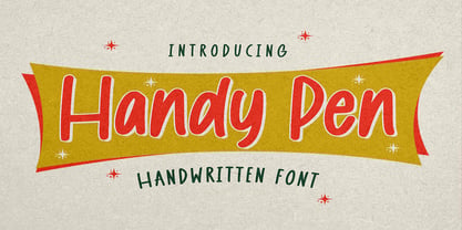 Hello Everyone, introduce our new product Font Handy Pen it is Handwritten Font,This is a Textured Natural Style and classy style with a clear style and dramatic movement. This font Handy Pen is great for your next creative project such as logos, Logotype, Letterhead, Poster, Design this font is great for your creative projects such as watermark on photography, and perfect for logos & branding, invitation,advertisements,product designs, stationery, wedding designs,label ,product packaging, special events or anything that need handwritting taste.
 - Anko by Eko Bimantara,
$22.00 Anko is a mix of Old Style Roman Serif styles. The glyphs are formed in extend width, smooth strokes, moderate stem contrast and soft edges to pursue clarity, quick recognizable text and warm personality. The italics style is 8 degree low slanted with redrawned lowercase which shown in more organic and flowy forms. Anko contains 8 weights with more than 450 glyphs that support extended latin language and opentype features such as standard and discretionary ligature and a variation of numeral figures.
 - Byte 305 by Talbot Type,
$15.00 Byte 305 is a modular font, resulting from experiments in creating a practical, legible font from a minimum set of geometric components on a uniform grid. It has full upper and lower case character sets and includes all accented characters for Western and Central European languages. It's available in three styles – 105, 205 and 305. Each style has different corners, 105 is square, 205 is bevelled and 305 is round. Each style is available in three weights, Light, Medium and Bold.