10,000 search results
(0.071 seconds)
- Yesterday Night by Mans Greback,
$59.00 Yesterday Night is a lively handwriting font that captures the essence of an active and cute brush style. This handmade calligraphy font is perfect for fashion projects, adding a sense of energy and excitement to your designs. The font family's handbrushed appearance brings an authentic, personal touch to your creative work, making it feel warm and approachable. The Yesterday Night font family includes four engaging styles to suit various design needs: Regular: A balanced and energetic style for everyday use Regular Italic: Adds a playful touch and a sense of movement Bold: Offers a bolder, more assertive presence for impactful designs Bold Italic: Combines the strength of bold with the flair of italic Built with advanced OpenType functionality, Yesterday Night ensures top-notch quality and provides you with full control and customizability. It includes stylistic alternates, ligatures, and other features to make your designs truly unique. The font offers extensive lingual support, covering all Latin-based languages, from Northern Europe to South Africa, from America to South-East Asia. It contains all the characters and symbols you'll ever need, including all punctuation and numbers.
 - Swollen - Unknown license

- Austin Pen by Three Islands Press,
$29.00 Empresario Stephen F. Austin (1793-1836) is considered by many the “Father of Texas” for leading the first Anglo-American colony into the then-Mexican territory back in the 1820s. A few years later, while on a diplomatic mission to Mexico City, Austin was arrested on suspicion of plotting Texas independence and imprisoned for virtually all of 1834. During this time he kept a secret diary of his thoughts and musings—much of it written in Spanish. Austin Pen is my interpretation of Austin’s scribblings in this miniature prison journal (now in the collection of the wonderful Dolph Briscoe Center for American History, in the Texas city that bears his name). The little leather-bound book is filled with notes in ink and pencil—some of the faded penciled pages traced in ink years later by Austin’s nephew Moses Bryan. A genuine replication of 19th century cursive, Austin Pen has two styles: a fine regular weight, along with a bold style that replicates passages written with an over-inked pen. Each is legible and evocative of commonplace American penmanship of two centuries ago.
 - Buckwheat TC by Tom Chalky,
$12.00 Introducing the Buckwheat Font Collection; Each and every font within the Buckwheat Collection was carefully created to be timeless, super versatile, and effortlessly cohesive. An essential kit to come back to time and time again for any number of design projects; from clean and modern, to rough and organic. What's Inside? - Buckwheat TC Regular: A condensed heading/titling font boasting real small caps (along with numerals, currency glyphs and more to match the small caps). - Buckwheat TC Sans: A rounded sans-serif font with several stylistic alternatives for various capitals (A, B, G, H, J, K, P, and R). - Buckwheat TC Script: Tying everything together, a simple yet effective monoline script font designed to look great big or small. - Rough and Smooth Styles: All of the aforementioned fonts are available in both smooth and textured styles. The textures are consistent throughout the collection, improving the cohesion of the fonts and eliminating the need to texture them yourself. - All of the typefaces within this collection include multilingual support and a full western character glyph range.
 - P22 Glaser Houdini by P22 Type Foundry,
$24.95 Milton Glaser commented about this type family: “The typeface is called Houdini after the famous American magician. I wanted to produce a letterform that would gradually disappear as one line after another was removed.” The various versions of Houdini presented by P22 include those originally offered as phototypesetting fonts, plus a solid and an outline version—a variation of which was used for Sesame Place children’s park in 1980. These Houdini variations can all be layered on top of each other for a range of chromatic effects. Each of the Houdini fonts contains over 375 characters for full European language coverage. The family is taken to its logical conclusion with the bonus font “P22 Glaser Houdini Vanished.” This font shares the same spacing and kerning as all of the Houdini font but lacks all visible outlines. Over the years there have been many typefaces that borrowed heavily from the Glaser designs, but these are the only official fonts approved by Milton Glaser Studio and the Estate of Milton Glaser.
 - FS Renaissance by Monotype,
$52.99 FS Renaissance is a display stencil typeface by the Monotype Studio. A collaboration between lettering artist and designer Craig Back and Creative Type Director Pedro Arilla, the single style font explores the intersection between art and design. With artist and designer working hand in hand, each letter was crafted as a standalone piece of art, while working harmoniously together as a functioning typeface. The typeface is inspired by the Renaissance period symbolised by flourishing progress in the arts, sciences, learning, and philosophy. The typeface is not a traditional stencil design: the cuts are not rigid but interactions that are hand crafted between each element, emphasising the idea of a typeface as a piece of art or sculpture. Pedro Arilla’s aim was to take the core DNA of Craig's lettering and apply it to a typographic base with a solid internal consistency, balanced with an external elegance. Pedro and Craig worked closely together to make sure the original concept was not compromised and this is reflected in the finished design which strikes the perfect balance between functionality and art.
 - Recta by Canada Type,
$24.95 Recta was one of Aldo Novarese’s earliest contributions to the massive surge of the European sans serif genre that was booming in the middle of the 20th century. Initially published just one year after Neue Haas Grotesk came out of Switzerland and Univers out of France, and at a time when Akzidenz Grotesk and DIN were riding high in Germany and Gill Sans was making waves in Great Britain, it was intended to compete with all of those foundry faces, and later came to be known as the “Italian Helvetica”. It maintains traditional simplicity as its high point of functionality, while showing minimal infusion of humanistic traits. It shows that the construct of the grotesk does not have to be rigid, and can indeed have a touch of Italian flair. While the original Recta family lacked a proper suite of weights and widths, this digital version comes in five weights, corresponding italics, four condensed fonts, and small caps in four weights. It also includes a wide-ranging character set for extended Latin language support.
 - Hatmaker by ITC,
$29.99Jean Evans' interest in type design dates back to her third-grade fascination with fancy script writing. Years later, work at a sign-painting school she found in the Yellow Pages® cemented her relationship with letterforms. Evans went on to study with master calligraphers and type designers, including the likes of Donald Jackson, Hermann Zapf and Matthew Carter. Evans' designs have been exhibited and collected around the globe, and her distinctive calligraphic style has been lauded by leading trade organizations, annuals and publications. Hatmaker, one of Evans' more popular typefaces, was originally developed for the Boston-based broadcast design firm of the same name. Inspiration for the design came from Ben Shahn's famous hand-constructed alphabet. Shahn's alphabet, however, was limited to capital letters. Daunted by the idea of designing a lowercase that would measure up to Shahn's capitals, I developed a second set of caps-simple, quirky, yet almost classic-to work as 'lowercase' with the Shahn-like caps," explains Evans. Mixing the two in Hatmaker, creates a lively interplay of light and dark." - Sam Suliman by K-Type,
$20.00 Sam Suliman is a condensed display face supplied in three weights – Regular, Medium and Bold – plus a set of handy italics (obliques). All six fonts are included in the value family pack. The fonts are inspired by lowercase lettering on a Sarah Vaughan album cover designed by Sam Suliman in 1962, a style which contrasts sharp tight outer corners with soft rounded counters. The letters were perhaps influenced by a Solotype font called Herald Square, but without that font’s aversion to diagonals, and adding distinctive perky ascenders/descenders on the lowercase r, a, u, g and n. The Sam Suliman fonts also add the nubs to d, m, p, and q. Suliman was born in Manchester, England in 1927. After working for McCann Erikson in London, he moved to New York where he took on freelance work designing album covers, particularly celebrated are his striking minimalist designs for jazz records. He moved back to England in the early 1960s, designing many book jackets, film titles and fabrics, also working in Spain and India before settling in Oxford in the 1980s.
 - Magneta by Positype,
$25.00 To describe what inspired Magneta would be to add a little Dwiggins, throw in some Benton with a hint of Austin, wrap it up in a crisp, contemporary package and serve. The skeleton of the family is a Garalde (like my earlier Epic) but with a desire to produce something much more transitional and contemporary, I sought to simplify, simplify, simplify. Cap and ascenders share the same height, the x-height is slightly larger than expected which should make a functional typeface for editorial, headlines or where more visually complex systems are needed. The modulation is much more intentional than historical and creates some interesting interactions between the various weights. There are both Normal and Condensed widths available with 6 different weights and matching italics, small caps, oldstyle figures, swashes, stylistic and discretionary ligatures (that includes some fun majuscule ligatures in the roman styles), there is no lack of typographic goodness for the designer. To add some spice, a set of Decorative Ornaments have been created that include geometric, floral, curvilinear patterns and much more.
 - Beatnik by Type Innovations,
$39.00 I was working at Bozell Worldwide, an advertising agency, on their yearly promotional pitch. An art director was looking for a condensed informal headline treatment to be used on one of the new ad campaigns. I took several different font designs and started to condense and scale the proportions in the hopes of finding several good solutions. They finally settled on a version of Times Roman, scaled horizontally to about 50 percent proportions. I liked the look so much that I later went back to the drawing board and refined the concept by adding slanted serifs and a varying alignment on all the letter forms giving the typeface a very casual and informal appearance. At about that time, I was reading a book by Jack Kerouac, and was so inspired by his writings on the ‘beat generation’ that I decided to name the font ‘Beatnik’. Afterwards, I added a set of true small capitals and old style figures. I'm currently working on additional weights and variations to expand this ‘hip’ new font series. Groovin' baby.
 - Fenomen Sans by Signature Type Foundry,
$38.00 Geometrical drawing of Fenomen Sans typeface goes back to the roots of the Bauhaus aesthetics and the entire architectural and design avant-garde of the 20th century. It is still a symbol of functional rationality, clean aesthetics in relation to shape, and of progressive thinking. Its popularity is timeless and permanent. The set contains eight basic alphabets of a square pattern, eight semicondensed, eight condensed and eight extremely condensed alphabets, all in Latin and Cyrillic alphabets. Every font of the family has four types of numerals, small caps and variant letters. The typesetting can fluently use all fonts simultaneously. The typeface originated between the years 2011–2014 and was subjected to a series of tests for the fluent legibility of narrow fonts even in extreme conditions. Narrow fonts provide this set with the maximum use also for newspaper typesetting. The typeface has an elegant, delicate design in thin fonts and sufficient legibility in bold. Mutual contrast produces creative tension. Font name acronyms described: SCN = SemiCondensed CN = Condensed XCN = ExtraCondensed
 - Dumper by LetterStock,
$25.00 Introducing "Dumper" - Your Original Hand-Drawn 60's Retro Bold Font Step into the bold and vibrant world of "Dumper," a font that seamlessly blends original hand-drawn craftsmanship with the iconic style of the 60's retro era. Ideal for posters, headlines, and vintage-themed branding projects, this font exudes a dynamic energy that adds a bold statement to your designs. Key Features: Original Hand-Drawn Craftsmanship: Each character in "Dumper" is crafted by hand, bringing a unique and authentic touch to your creations. 60's Retro Bold Vibes: Immerse your designs in the bold and lively spirit of the 60's, making "Dumper" a perfect choice for projects seeking a retro aesthetic. Why Choose "Dumper": Craft posters and headlines that command attention with bold and dynamic lettering. Design branding materials that transport your audience back to the vibrant 60's era. Establish a brand presence with a font that effortlessly captures the essence of retro boldness. Download "Dumper" Now and Let Your Designs Boldly Embrace the 60's Retro Vibe!
 - P22 Marcel by P22 Type Foundry,
$24.95 The font Marcel is named in honor of Marcel Heuzé, a Frenchman who was conscripted into labor during World War II. During the months Marcel was in Germany, he wrote letters to his beloved wife and daughters back home in rural France. Marcel’s letters contain rare first-person testimony of day-to-day survival within a labor camp, along with the most beautiful expressions of love imaginable. The letters — stained and scarred with censor marks — were the original source documents used by designer Carolyn Porter to create a script font that retains the expressive character of Marcel Heuzé’s original handwriting. The result of years of research and design work, P22 Marcel Script features more than 1300 glyphs. The font is a highly readable running script that includes textural details that capture the look of ink on paper. The font Marcel Caps is a hand-lettered titling face intended as a companion to the Script. Marcel EuroPost One and Two each feature more than 200 postmarks, cancellation and censor marks, and other embellishments found on historical letters and documents.
 - Magneta Condensed by Positype,
$25.00 To describe what inspired Magneta would be to add a little Dwiggins, throw in some Benton with a hint of Austin, wrap it up in a crisp, contemporary package and serve. The skeleton of the family is a Garalde (like my earlier Epic) but with a desire to produce something much more transitional and contemporary, I sought to simplify, simplify, simplify. Cap and ascenders share the same height, the x-height is slightly larger than expected which should make a functional typeface for editorial, headlines or where more visually complex systems are needed. The modulation is much more intentional than historical and creates some interesting interactions between the various weights. There are both Normal and Condensed widths available with 6 different weights and matching italics, small caps, oldstyle figures, swashes, stylistic and discretionary ligatures (that includes some fun majuscule ligatures in the roman styles), there is no lack of typographic goodness for the designer. To add some spice, a set of Decorative Ornaments have been created that include geometric, floral, curvilinear patterns and much more.
 - Treatise by Zephyris,
$- Treatise was born in a notebook at the back of a boring lecture on immunology with the simple thought of “How can I make a serif more fun?” When writing a scientific treatise, there are not many options for making it enjoyable. However, some little quirks and fun features in the font can take the serious edge off the writing.... Treatise is a light and open serif with some design quirks, which give it a slightly calligraphic feel; a single -storey “a” and “g,” a visible stroke mark on the “o,” and a curved arm on the “k.” These features are subtle enough to fit into a paragraph of text but bold enough to give a title some character. The Treatise family includes a true italic and a heavy-struck style bold, and several OpenType features; standard and discretional ligatures, contextual alternatives, and different figure styles. The character coverage includes Basic Latin, Latin-1 Supplement, and Latin Extended-A and will support most Latin-alphabet languages, including languages with more exotic characters such as Icelandic and Maltese.
 - Huckleberry by Canada Type,
$24.95Huckleberry is a revival and expansion of a 1973 typeface called Mark Twain, which was G. Jaeger's reaction to the popularity of VGC's Eightball (also digitized and expanded as Orotund by Canada Type) from across the ocean. Jaeger's reaction was typical German efficacy, with majuscules that surpass their inspiration in art and humour, and minuscules that could have been just the thing if one wanted to make the Eightball lowercase friendlier. Back in its day, this font reached its own heights of popularity in Western Europe, but in the Americas it was less known because art nouveau faces were being made by the hundreds in the 1970s. Round, happy and bouncy, Huckleberry comes as a timely response to public demand for big and cheerful letters. Huckleberry is also very effect-friendly. Stretch it a bit, drop-shadow it, warp it, and it will still keep its cheer and communicate the message with a smile. Huckleberry comes in all popular formats, and contains plenty of alternates sprinkled throughout the character set. - Pandilla by Typozon,
$39.00 Pandilla was inspired from personal sketches and letters developed by the past of the years making graffiti art. the forms of this typeface are related with the graffiti and street scenes of the different cities around the world and takes traits and elements of the Handstyle, Classic graffiti, Brazilian Pichação and different urban letters. This font has a variety of objectives, the first is to create a legible version of the graffiti inscriptions and use this typography for different print pieces, the second objective is to give back the essence of the meaning of the word "Pandilla", this word has been transformed for the past of the decades and now is associated with negative things. The original meaning of this word is a group of people who feel a close relationship, which usually have a friend or close interaction with ideals or common philosophy among members. Pandilla is to be used in different print purposes and graphic pieces like: Posters, Brochures, Magazines, Business cards and different stuff that uses big type sizes and big display formats.
 - Strikt by NaumType,
$25.00 Strikt is a variable modular font family with 2 axes, build on a 3x3 grid. It was designed by Peter Bushuev and released in August of 2020. It was inspired by the idea of utilizing the variable font technology to make a font with build-in animation potential. Strikt has 2 variable axes: weight and animation. The first one is self-explanatory, but the animation axis is the main feature of the font. It allows you to morph any glyph to a 3x3 dot array and back. In Strikt Plus modification, this array is the same for each letter, which gives the possibility to transform one glyph to the other. Strikt is also a very sturdy and unique display font. In "Plus" modification it gives even more sci-fi and techno vibes. And in light weights, Strikt becomes more architectural and gives the possibility to make unusual ornamental layouts. Get Strikt to jazz up your design! Try variable versions for kinetic typography and motion graphic. Strikt is a bold choice for posters, album covers, experimental identity and packaging, games, and editorial design.
 - Caliche by Ahmad Jamaludin,
$13.00 Say hello to CALICHE! The font that's as vintage and handdrawn at the same time! CALICHE's typeface is inspired by the rustic charm of vintage craftsmanship, infused with the laid-back vibes of a tropical summer. This font brings you not one, but two families to choose from: Regular and Slant, offering versatility for your design projects. Whether you're aiming for a rugged look, modern vintage aesthetics, or the essence of summer, CALICHE has got you covered. It's the perfect companion for all your graphic design needs, crafted with care to bring that unique touch to your creations What's Included? Caliche Main File Regular and Slant version Instructions (Access special characters, even in Cricut Design) Unique Letterforms Works on PC & Mac Simple Installations Accessible in Adobe Illustrator, Adobe Photoshop, Microsoft Word even Canva! PUA Encoded Characters. Fully accessible without additional design software. Language Support: Danish, English, Estonian, Filipino, Finnish, French, Friulian, Galician, German, Gusii, Indonesian, Irish, Italian, Luxembourgish, Norwegian Bokmål, Norwegian Nynorsk, Nyankole, Oromo, Portuguese, Romansh, Rombo, Spanish, Swedish, Swiss-German, Uzbek (Latin)
 - Happy Land by Yumna Type,
$15.00 It can be a real challenge to deliver messages through designs due to the very ordinary display fonts lacking prominent characters. Let us present you the Happy Land, a prominent display font to add firm touches to any of your designs. The letters made all in capital can enhance certain effects on your designs. The font’s simple shapes with strong contrasts affect the legibility. As a result, it is suitable to apply for big text sizes. In addition, this font provides a clipart bonus for you. Enjoy the available features available here. Features: Stylistic Sets Multilingual Supports PUA Encoded Numerals and Punctuations Happy Land fits best for various design projects, such as brandings, posters, banners, headings, magazine covers, quotes, printed products, merchandise, social media, etc. Find out more ways to use this font by taking a look at the font preview. Thanks for purchasing our fonts. Hopefully, you have a great time using our font. Feel free to contact us anytime for further information or when you have trouble with the font. Thanks a lot and happy designing.
 - Intro Script by Fontfabric,
$19.00 Intro Script carries with it ideas of resurgence, renewal and unconditional freedom. An updated and expanded version of the Intro Rust sub-family, itself developed from the popular Intro type system, Script comes with 8 different weights and a whole slew of goodies and additional features for you to tinker with. These consist of 3 supplementary fonts with ready-made words, patterns and even banners, so you can put the spark back into your project. The set includes a large number of ligatures and contextual alternates, including both lower and upper case versions, as well as positional variations. The latter allow for symbols to connect at different joints, and help you dodge unnecessary voids, resulting in an efficient work process and a more natural flow. With its broad language support and wide range of OpenType features, Intro Script’s friendly, hand-crafted appearance makes it a suitable and flexible choice for any design. Features: • An updated and polished version of the famous multifaceted bundle • 8 refined monoline styles; • Extended language support; • Supplementary goodies - words, patterns, banners; • Additional ligatures and contextual alternates; • Stylistic positional variations;
 - Mosquito by Monotype,
$29.99Éric de Berranger likes to multitask, and often works on two typeface families at once. Such was the case with Mosquito, a jaunty sans that was developed at the same time he was creating the more traditional Maxime. Mosquito represented a sort of recreation," says de Berranger. "When I grew tired of working on one design I could work on the other and then come back to the first, full of courage and desire!" Mosquito is built from simple, straightforward shapes, but its distinctive stroke terminals and slight oblique weight stress distinguish the design from more conventional sans serif faces. The relatively large x-height and open counters add to the legibility of the design. The capitals are straightforward (with just a hint of Peignot), while the lowercase has a softer, more inviting demeanor. "I drew Mosquito with the hope that it would be pleasant to look at and to read," says de Berranger. "I think the end result is almost feminine." Mosquito comes in three weights, with complementary italic designs and a suite of small caps, old style figures and alternate characters." - Mayonez by Sardiez,
$29.00 Mayonez is a typeface with rational structure and axis but softened with rounded contours and cupped serifs, getting as result a balance between seriousness and friendliness. The shapes have a soft appearance but without lacking definition. A more fluid structure influenced by calligraphy is proposed for the italic variants, in this case the uppercase letters adopted a simplified semiserif structure that works better with the lowercase letters. Also the figures are very different from the roman version and follow more faithfully the italic style. In an attempt to give Cyrillic lowercase romans a fresh look, symmetrical serifs inherited from the versal tendency are mostly avoided thus getting simpler structures closer to the latin forms. This type is good for commercial and editorial uses like advertising, packaging and pages with showy headlines where a warm touch wants to be given. The character set includes a group of figures and currency symbols with standard height and another suited to match better with lowercase letters. Mayonez was selected to be part of the Communication Arts Typography annual in 2015.
 - Houschka Pro by G-Type,
$72.00 Houschka was named after Georg Houschka, a sadly defunct confectioner’s shop in Salzburg, Austria, which had a wonderful 1930’s frontage and distinctively rounded letterforms in the sign above the door. Houschka Pro is the follow up to the original Houschka type family which first appeared back in 1999. Character shapes have been improved, kerning and spacing refined, and OpenType features include CE, Baltic, Turkish & Cyrillic language support plus small caps, 3 stylistic sets, contextual alternates, ligatures and 4 sets of numerals. Houschka is a clean and legible modern sans serif typeface which shares the humanist qualities of Gill Sans and Johnston but retains a uniquely charming character of its own (particularly in signature glyphs A, G, Q, W, u & w). The monolinear structure, rounded corners and rolling curves give Houschka a soft and friendly appearance. Houschka Alt Pro is a carbon copy of the Houschka Pro family with one key difference: the rounded signature glyphs A & W on the default positions swap places with their straight alternates.
 - Backstroke by Eclectotype,
$50.00 Normal and upright italic script fonts line a well-trodden path; left-leaning fonts (or "rightalics" as they're confusingly called), on the other hand, are a rarity. Here at Eclectotype Fonts we don't like to do things too conventionally, so here's Backstroke, a laid back script with a unique voice. With contextual alternates for start and end forms of certain characters, swash versions of L, Q and Z (surely the most used initial caps!), and a handful of stylistic sets, Backstroke is a restrained script. Stylistic sets are: 1. the start forms of i, j, m, n, and p are used always instead of only at word starts. 2. lower case ascenders get a whole lot loopier. 3. alternate versions of G, N and Y. 4. swash L, Q and Z. 5. swaps the default Polish script lslash for a more familiar version While fonts that lean the wrong way may be a bit more difficult to fit into your layouts than boring old regular italics, they will reward you with their individuality. Why not give it a go?
 - Nostalgic Typewriter by Typehead Studio,
$10.00 Nostalgic Typewriter is a typewriter font that exudes classic vintage charm with an irresistible allure. Inspired by the iconic typewriters that once dominated the world of manual typing, this font brings forth warm nostalgia and timeless appeal in every character. Key Features: Classic Aesthetics: Every letter in the Nostalgic Typewriter is meticulously crafted to create a classic look that harks back to bygone eras of manual writing. Vintage Power: The font captures invaluable retro vibes in its design, with rough edges and character placement that evoke an authentic feel from yesteryears. Character Diversity: Nostalgic Typewriter boasts a variety of characters, including uppercase, lowercase, numbers, and special symbols. All are designed to cater to your diverse design needs. Ease of Use: This font is ready to enhance a wide range of projects, such as poster designs, stickers, greeting cards, t-shirts, and more. With flexible licensing, you can confidently use it for personal or commercial projects. High-Quality: Nostalgic Typewriter is crafted with attention to detail and top-notch quality, ensuring that your printed or digital output will always captivate.
 - Plumber's Gothic - Unknown license

- Alpha Flight - Unknown license

- Adoha by Letterena Studios,
$17.00 Proudly present Adoha Typeface. A modern and classic serif typeface featuring its own unique style & modern look. This typeface is perfect for an elegant & luxury logo, book or movie title design, fashion brand, magazine, clothing, lettering, quote, and so much more.
 - Nemade by Lemonthe,
$16.00 Nemade is a modern and elegant display font. Its unique, clean, and flowing letterforms add a luxurious and striking impression to every design project. The perfect choice for logos, branding, posters, magazines, printing, advertising, packaging, headlines, titles, web design, etc.
 - Overline Stencil by WAP Type,
$15.00 Overline Stencil font is perfect for your up coming projects. Such as logo branding, editorial design, fashion, stationery design, sport design, blog design, modern advertising design, card invitation, art quote, home decor, book/cover title, special events and any more.
 - Belisha by Nissa Nana,
$20.00 Belisha is a beautiful script with a modern vibe. It has a classy, elegant, and modern look which can be used for logos, branding, invitations, stationary, wedding designs, social media posts, and any other design in need of a handwritten touch.
 - Tropicollo by OzType.,
$16.00 Tropicollo is a handwritten mono weight cursive font. Its super clean and tidy design will turn any idea into a true standout end result! Works great applied to logos, prints, quotes, magazine headers, clothing, advertisements, product designs, labels, and much more!
 - Esquina by Green Type,
$37.00 Esquina is a family of octagonal slab serif fonts. Designed for use in outdoor advertising, branding, packaging. Esquina is also ideal for sports related materials such as team logos, flyers, posters and more. Esquina contains Latin, Cyrillic and Greek glyphs.
 - Jungoat by BonjourType,
$12.00 Give your designs an authentic handmade feel. The Jungoat font is perfect for stationery, logos, social media or just using the word background above. Featured fonts: Uppercase, Lowercase, Numbers, Symbols, Accents, Alternative Styles, Swash, and also supports multilingual Thank you!
 - Arthouse Display Pro by FHFont,
$19.00 Arthouse is a display font with a vintage style. It includes OpenType features such as standard ligatures, discretionary ligatures, stylistic sets, decorative elements, and is suitable for various designs, and weddings, events, t-shirts, logos, badges, stickers, and awesome work.
 - Strash by Sesa Grafika,
$15.00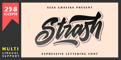 Strash is is designed with a natural expressive handwriting style. This font is perfect for Logo Branding, tshirt design, posters and so much more! Remember that the font is PUA encoded, meaning you can access all delightful glyphs and swashes effortlessly.
 - The Glamz by Just Font You,
$16.00 Meet The Glamz, a brand new auto-chic font. Designed to fulfil your trend-catching things with the edgy style and undeniable artsy look. Perfectly fit for your fashion branding stuff, handwriting logo, inspirational quote poster, oh well you name it.
 - Spooky Witch by Arkrist Letter,
$13.00 Spooky Witch is the latest Halloween font from Arkrist Letter studio. A serif font designed with elegant characters, but looks scary. Spooky Witch font is suitable for design, logo, greeting card, invitation, etc. make your day more spooky with Spooky Witch!


