10,000 search results
(0.031 seconds)
- Gymkhana by Typodermic,
$11.95 Introducing Gymkhana, a clean and simple sans-serif typeface that brings a touch of architectural elegance to your design. Inspired by twentieth-century American lettering, Gymkhana is the perfect typeface for your next project. Gymkhana’s clarity is immediately evident in its design. The typeface’s large x-height and generous width make it incredibly easy to read, even at small sizes. With its clear lines and easy-to-read characters, Gymkhana adds a feeling of solemn clarity and friendly professionalism to any message. But Gymkhana isn’t just easy to read; it’s also versatile. With old-style numerals, tabular (monospaced) numerals, and old-style tabular numerals in OpenType-capable applications, you can customize the typeface to suit your needs. Gymkhana comes in six weights and italics, so you can choose the perfect style for your project. Whether you’re designing a logo, a website, or a printed document, Gymkhana has you covered. So why wait? Try Gymkhana today and experience the power of clear, clean typography in your design. Most Latin-based European, Vietnamese, Greek, and most Cyrillic-based writing systems are supported, including the following languages. Afaan Oromo, Afar, Afrikaans, Albanian, Alsatian, Aromanian, Aymara, Azerbaijani, Bashkir, Bashkir (Latin), Basque, Belarusian, Belarusian (Latin), Bemba, Bikol, Bosnian, Breton, Bulgarian, Buryat, Cape Verdean, Creole, Catalan, Cebuano, Chamorro, Chavacano, Chichewa, Crimean Tatar (Latin), Croatian, Czech, Danish, Dawan, Dholuo, Dungan, Dutch, English, Estonian, Faroese, Fijian, Filipino, Finnish, French, Frisian, Friulian, Gagauz (Latin), Galician, Ganda, Genoese, German, Gikuyu, Greenlandic, Guadeloupean Creole, Haitian Creole, Hawaiian, Hiligaynon, Hungarian, Icelandic, Igbo, Ilocano, Indonesian, Irish, Italian, Jamaican, Kaingang, Khalkha, Kalmyk, Kanuri, Kaqchikel, Karakalpak (Latin), Kashubian, Kazakh, Kikongo, Kinyarwanda, Kirundi, Komi-Permyak, Kurdish, Kurdish (Latin), Kyrgyz, Latvian, Lithuanian, Lombard, Low Saxon, Luxembourgish, Maasai, Macedonian, Makhuwa, Malay, Maltese, Māori, Moldovan, Montenegrin, Nahuatl, Ndebele, Neapolitan, Norwegian, Novial, Occitan, Ossetian, Ossetian (Latin), Papiamento, Piedmontese, Polish, Portuguese, Quechua, Rarotongan, Romanian, Romansh, Russian, Rusyn, Sami, Sango, Saramaccan, Sardinian, Scottish Gaelic, Serbian, Serbian (Latin), Shona, Sicilian, Silesian, Slovak, Slovenian, Somali, Sorbian, Sotho, Spanish, Swahili, Swazi, Swedish, Tagalog, Tahitian, Tajik, Tatar, Tetum, Tongan, Tshiluba, Tsonga, Tswana, Tumbuka, Turkish, Turkmen (Latin), Tuvaluan, Ukrainian, Uzbek, Uzbek (Latin), Venda, Venetian, Vepsian, Vietnamese, Võro, Walloon, Waray-Waray, Wayuu, Welsh, Wolof, Xavante, Xhosa, Yapese, Zapotec, Zarma, Zazaki, Zulu and Zuni.
 - The Jellyka BeesAntique Handwriting font, designed by the talented Jellyka Nerevan, is a captivating and unique typeface that evokes a sense of nostalgia and intimate expression often found in person...
- Proxemic by Sarid Ezra,
$15.00 Proxemic is a bold sans based font with unique lowercase that will make your logo and design looks advance and modern. With the unique characteristic lowercase, this font can make your logo even more stunning only with simple steps. You can use this font for any purpose, especially to make logotype. You can mix and match the uppercase and lowercase to make your logo more advanced. This font also comes with number, symbol, and multilingual support!
 - Lighters by Sarid Ezra,
$15.00 Lighters is a light and minimalist logo font family with unique lowercase that will make your logo and design looks more clean and simple. With three weight styles that you can use together will make your design more cool . You can use this font for any purpose, especially to make logotype and poster design. You can mix and match the uppercase and lowercase to make your logo more advanced. This font also comes with number, symbol, and multilingual support!
 - Super Chango 94 by Nomaszebras,
$10.00 GREAT FOR: Logos, Headlines, Titles, Branding, Magazine, Architecture and Packaging.
 - Whisk by Jonahfonts,
$39.00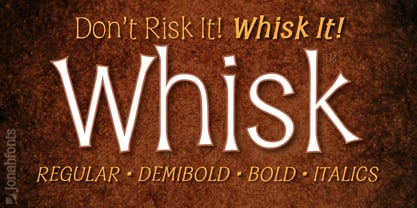 A whimsical font for packaging, logos, captions and greeting cards.
 - Octane MF by Masterfont,
$59.00 Perfect for high contrast, slanted stylistic headlines, signage and logos.
 - Selfie Neue Sharp by Lián Types,
$29.00 INTRODUCTION When I started the first Selfie back in 2014 I was aware that I was designing something innovative at some point, because at that time there were not too many, (if any) fonts which rescued so many calligraphy features being at the same time a monolinear sans. I took inspiration from the galerías’ neon signs of my home city, Buenos Aires, and incorporated the logic and ductus of the spencerian style. The result was a very versatile font with many ligatures, swashes and a friendly look. But… I wasn’t cognizant of how successful the font would become! Selfie is maybe the font of my library that I see the most when I finally go out, (type-designers tend to be their entire lives glued to a screen), when I travel, and also the font that I mostly get emails about, asking for little tweaks, new capitals, new swashes. Selfie was used by several renowned clients, became part of many ‘top fonts of the year’ lists and was published in many magazines and books about type-design. These recognitions were, at the same time, cuddles for me and my Selfie and functioned as a driving force in 2020 to start this project which I called Selfie Neue. THE FONT "Selfie for everything" Selfie Neue, because it’s totally new: All its glyphs were re-drawn, all the proportions changed for better, and the old and somehow naive forms of the first Selfie were redesigned. Selfie Neue is now a family of many members (you can choose between a Rounded or a Sharp look), from Thin to Black, and from Short to Tall (because I noticed the feel of the font changed notoriously when altering its proportions). It also includes swashy Caps, which will serve as a perfect match for the lowercase and some incredibly cute icons/dingbats (designed by the talented Melissa Cronenbold, see also Selfie Neue Rounded for more!) which, as you see in the posters, make the font even more attractive and easy to use. You'll find tons of alternates per glyph. It's impossible to get tired with Selfie! Like it happened with the old Selfie, Selfie Neue Sharp was thought for a really wide range of uses. Magazines, Book-covers, digital media, restaurants, logos, clothing, etc. Hey! The font is also a VF (Variable Font)! So you can have fun with its two axes: x-height and weight, in applications that support them. Let me take a New Sharp Selfie! TECHNICAL If you plan to print Selfie Neue VF (Rounded or Sharp), please remember to convert it to outlines first. The majority of the posters above have the "contextual" alternates activated, and this makes the capitals a little smaller. I'd recommend deactivating it if you plan to use Selfie for just one word. Use the font always with the "fi" feature activated so everything ligatures properly. The slant of the font is 24,7 degrees, so if you plan to have its stems vertical, you may use Selfie with that rotation in mind. THANKS FOR READING
 - Bullpen 3D - Unknown license

- Dream Orphans - Unknown license

- Colourbars - Unknown license

- Cuomotype - Unknown license

- Delta Hey Max Nine - Unknown license

- Koorkin by Monotype,
$29.99 “I originally drew the primary characters with a felt tip marker, scanned them and then proceeded to noodle on the computer,” says George Ryan of his new typeface, Koorkin. “Over the years, I’ve designed many original typefaces, but Koorkin has become one of my favorites. I’ve worked on hundreds of highly structured text faces. For the most part, the roots of all of them can be found in the handwritten letterforms we learn as children. I enjoy going back to these shapes whenever the opportunity presents itself. ”The happy result of Ryan‘s felt tip marker sketches and his love of simple letterforms is a new family of upright and italic scripts in medium and bold weights.
 - Rundigsburg by Ingrimayne Type,
$9.95 Is Rundigsburg a calligraphic face morphing into sans serif or sans serif reverting back to a medieval, calligraphic face? The letters are angular and some retain traces of older letter forms, but the ornamentation is gone. Rundigsburg is decorative but also very legible, suitable for both display and some text purposes. The family has four weights, each with an italics style. There are two shadowed versions and each has an "inside" style designed for uses in layers with its shadowed style to add color. These "inside" style are similar to the light style but the spacing matches its shadowed complement. Among Rundigburgs OpenType features are a few basic fractions and some alternative letter forms.
 - Manly Beard by Mightyfire,
$15.00 Introducing Manly Beard , the typewriter font. Typewriter font is a timeless and iconic typeface, seamlessly bridges the realms of nostalgia and functionality. Inspired by the mechanical simplicity of traditional typewriters, this font exudes a distinct charm that harks back to an era when the written word was synonymous with the rhythmic clatter of keys striking paper. Characterized by monospacing, each letter and symbol occupies the same amount of horizontal space, mirroring the uniformity of characters produced by the typewriter's fixed-width mechanical arms. The result is a text that maintains a deliberate and organized appearance, evoking a sense of order and precision. We're honored and proud if Manly Beard can be the part of your special masterpiece. Thankyou! :)
 - Rusticana by Linotype,
$29.99Rusticana is a part of the 1990 program Type before Gutenberg, which included the work of twelve contemporary font designers and represented styles from across the ages. Linotype offers a package including all these fonts on its web page, www.fonts.de. Rusticana was designed by Adrian Frutiger and appeared with Linotype in 1993. Its historical roots go back to the Roman Capitalis, the all caps engraved writing of ancient Rome which reached its peak in the first century. From this style evolved other Roman forms, and one, Rustica, proved particularly good for text on bronze, as opposed to in stone. The Rusticana of Frutiger has open, seemingly irregular forms which lend a distinctive rhythm to text. - Metropolis SG by Spiece Graphics,
$39.00 The revival of this 1932 classic design by W. Schwerdtner for the Stempel Foundry in Germany brings back the fashion and culture of those bygone days. Wedge-shaped vertical strokes are thicker at the top than at the bottom while serifs are somewhat elongated, thin, and pointy. Here is an excellent choice for large display settings where capturing the spirit of the 1920s and 30s is important. Metropolis SG is also available in the OpenType Std format. Some new characters have been added to this OpenType version. Advanced features currently work in Adobe Creative Suite InDesign, Creative Suite Illustrator, and Quark XPress 7. Check for OpenType advanced feature support in other applications as it gradually becomes available with upgrades.
 - Fiona Pro by Monday Type,
$15.00 Fiona Pro is the Extra Condensed answer to the beautiful didones of this world with a modern twist. It is made for brave designers who are not afraid to design big attention grabbing designs, whether it be on screen or in print. The recognition value of Fiona Pro is its biggest asset in world of uniformity. Fiona Pro's strong contrast is an homage to the great times of graphic design and makes it so elegant. Equipped with an italic version as well as a back slanted version for every style there is nothing you can't design with this beauty. MondayType can't wait to see the beautiful designs you are going to create with our Fiona Pro.
 - Founder by Serebryakov,
$19.00 Founder is a neutral sans-serif font family consisting of 6 weight categories. The font was created for use on his own website, but eventually the account went on public sale. The original purpose of the font was not intended to be a multi-tool. However, now everything necessary has been added to it so that it can be safely used in projects. Founder supports more than 50 Latin-based languages, as well as Belarusian, Russian and Ukrainian Cyrillic. Gothic sans aesthetics give Founder a natural and relaxed feel that business fonts lack today. The font is perfect for cases when you need to dilute the silence of modern digital environment or just to complement the author's illustrations.
 - Reimbrandt by IKIIKOWRK,
$19.00 Proudly Present Reimbrandt - Art Nouveau Type, created by ikiiko. Reimbrandt is a classic typeface that is a perfect representation of the timelessness and romance of the past, inspired by the beautiful Art Nouveau era. This alluring typeface transports you back to a time when elegance and grace were the norm. This font exudes beauty and romance with its simple, decorative shapes reminiscent of the painstaking craftsmanship of the Art Nouveau era. This typeface is perfect for an vintage vibes, classic & vintage poster layout, fashion look book, book cover, packaging, food & beverages and also good for quotes, or simply as a stylish text overlay to any background image. What's included? Uppercase & Lowercase Number & Punctuation Multilingual Support Works on PC & Mac
 - Rieven by Delve Fonts,
$29.00 Designer Steven Skaggs wanted a versatile uncial typeface that was not simply decorative. Traditionally, a true uncial is a majuscule form, entirely lacking in ascenders and descenders. However, by designing Rieven Uncial, Skaggs found a way to use the true uncial as inspiration but retained a lowercase look and feel. Typically, uncials do not have italic forms but in order for Rieven to be a truly versatile face, it was imperative that it should be accompanied by an italic. The italic form owes much to the historical roots in the letra antigua cursiva of the 15th century humanist masters. Rieven Uncial was awarded a Certificate of Excellence in Type Design in the 2010 TDC2.
 - Caniste by Ilham Herry,
$20.00 The vintage typeface returns with the Caniste typeface family. My passion for something with a vintage aesthetic is one reason I created Caniste. Inspired by antique ephemera such as cigar box labels that were common in the 19th century, it harkens back to the beauty of typographic design at that time. The Caniste font family is an all-caps serif font with uppercase titling. It comes in 6 weights: Extra Light, Light, Regular, Semibold, Bold, and Ultra Bold. It also has very user-friendly Extras, such as scrolls, ornaments, and panels, and allows you to create beautiful ornamentation to suit your needs. I hope you enjoy using the Caniste fonts. Thank you!
 - Dave Gibbons Lower by Comicraft,
$49.00 Other guys may imitate him, but the original is still the greatest! Get in with the In Crowd and check out the font created by Mister Fontastic for Dave Gibbons Original Graphic Novel, The, ah, The Originals. Yes, Dave Gibbons now comes in lower case, it's not just what he does when he gets back from the off license. Be sure and pick up The Originals from Amazon -- now available in paperback, and probably still available as a hard case, much like Dave. After the crack about the case of beer above, I'm guessing you'll find me with a broken spine in the remainder pile. See the family related to Dave Gibbons Lower: Dave Gibbons Journal & Dave Gibbons .
 - Jumble by Laura Worthington,
$29.00 Jumble is friendly and cute treat for the eyes. Jumble draws you in with its thick, curvy strokes, jaunty counters, and a whimsical variety of counterforms with no two alike. For even more variety, Jumble includes 104 alternates for plus a handful of ligatures. Jumble conveys humor and warmth without being silly; its lack of straight lines and sharp edges makes it perfect for evoking tasty treats like frosted cakes or pies, or child-friendly toys and games. See what’s included! http://bit.ly/1RDnJjY This font has been specially coded for access of all the swashes, alternates and ornaments without the need for professional design software! Info and instructions here: http://lauraworthingtontype.com/faqs/
 - Machin by Hanoded,
$15.00 Machin is a French word meaning 'thing'. Apparently, it is also a species of macaque from the Philippines, but I named this font after the French word! Machin is based on a really old font I made back in the day. It was called Whynot and (because I didn't know a thing about making fonts at the time) I could not get it to work properly, so it had its 15 minutes of fame before it was pulled off of the internet. Machin was made using the recycled glyphs from Whynot and it does work. It comes with extensive language support (yes, Vietnamese and Sami too), some handy ligatures and a lot of scribbly panache.
 - Blackberry by Los Andes,
$25.00 Blackberry is a display typographical family inspired on the design of vintage packaging, old fashion ads and show business marketing campaigns. This font brings back Woodtype characteristics such as angular serifs, and light and diagonal curves, which make it a fresh and current proposal for contemporary design needs. Blackberry has a dynamic system of layers that include 3D extrusions, shadows, outline and inline graphics, as well as a series of dingbats and flags. The system is supported for over 200 Latin-based languages. In total, the 10 Blackberry fonts provide a wide array of combinations and possibilities for high impact graphics, such as labels, packaging, posters, branding, record and movie covers, among others.
 - Thread Starter by Colllab Studio,
$19.00 "Hi there, thank you for passing by. Colllab Studio is here. We crafted best collection of typefaces in a variety of styles to keep you covered for any project that comes your way! Not being able to communicate trustworthiness, authority and professionalism? Is your brand lacking personality too? That’s where Thread Starter come in. Our fonts have been exclusively designed to communicate trustworthiness, authority, and professionalism. We are here to serve you with the right fonts to help your brand stand out. Use Thread Starter to communicate trustworthiness, authority and professionalism straight into your audience’s heads. Your ideal clients will love the unique and high perceived quality of your brand on its own merit. A Million Thanks www.colllabstudio.com
 - Fermo TRF by TipografiaRamis,
$20.00 Taking into consideration some complaints about lack of capital letters and deficiency of heavier weight styles, the Fermo typeface was redesigned to replace the existing font, dated 2002. New Fermo includes two subfamilies—Fermo TRF and Fermo-Uni TRF. Both fonts now consist of three weight styles—light, regular and bold—with significant contrast. During the updating process some minor glyph shape adjustments and changes have been made. Fermo TRF's main distinctions from the previous font are the new capital letters and additional weight (light) style. Fermo-Uni TRF is a unicase font with an additional lightweight style. Fermo is recommended for use as a display font. In large size settings negative tracking is recommended.
 - Gothic Grotesk JNL by Jeff Levine,
$29.00 In a specimen book from Stevens, Shanks & Sons, Ltd. of London (circa1930s) “Royal Gothic” was their version of a classic grotesk sans that had been in use as far back as 1899 when the Keystone Foundry called it “Charter Oak”. The terms "gothic" and "grotesk" were equally applied to early sans serif typefaces – at first not well embraced by printers as being too ugly (grotesque) for use. One familiar characteristic of early grotesk fonts (such as this one) is the numerous variations of character widths and shapes. By combining those two terms into a font name, the digital version of this design is called Gothic Grotesk JNL, and is available in both regular and oblique versions.
 - Honey Dew by Hanoded,
$15.00 Right now it is melon time: the supermarkets are full of them: Galia, Honey Dew, Piel de Sapo… Back in Casa Hanoded we're quite happy with the abundance of melons! So, when I created this cute little font, naming it was easy. Honey Dew is a shaky all caps font with different upper and lower case glyphs. I created alternate letters for both upper and lower case closed glyphs (like a, b, d, o, etc.) - including their accented brethren (aacute, abreve, acircumflex), etc. There is an alternate & and @, plus the Æ, Œ, Ø, æ, œ, ø, þ and Þ. You should have guessed by now that Honey Dew comes with a whole stack of diacritics.
 - American Uncial by Linotype,
$40.99American Uncial™ was designed by Victor Hammer in 1943. Uncial typefaces consist of letter forms of the Capitalis Monumentalis and the majescule cursive. The origins of Uncial faces date back to the 5th century. In 1953, American Uncial was expanded to include some new figures, also designed by Hammer, and was rereleased by Klingspor with the name Neue Hammer Unziale. The forms are based on old scripts in books of antiquity and the early Middle Ages and the font is a new variation of a classic. Neue Hammer Unziale font has been a favorite for certificates and diplomas and is recommended for headlines and shorter texts in a point size of 12 or larger. - Horatio by ITC,
$29.00British designer Bob Newman's Horatio family is a delightful look back into the modernists experiments of the 1920s. This geometric sans serif design was created in 1971, and was originally released by Letraset. We are please to offer the family in digital form, in light, medium, and bold weights. Many designers during the 1920s were interested in reforming the alphabet, and wanted to reconcile letterforms with the machine and manufacturing technology of the age. Herbert Bayer at the Bauhaus was one of many designers who developed a universal alphabet," creating letters using only the simplest of geometric forms. Similar experiments in 1920s-style revivals were also created during the 1970s, most notably Herb Lubalin's ITC Avant Garde Gothic." - Fake Fury by Bogstav,
$14.00 Actually there is nothing furious about this font. There are no sharp edges and absolutely nothing harmful at all. The name plays tricks on you, because it's a cool laid back font with ounces of possibilities. I'd say you can use the Fake Fury font for posters, flyers, comics, invitations, commercials, toys, candy, clothing, packaging ... ahhh, the list goes on and on! Each letter was carefully handdrawn and soften a bit with rounded edges. And each letter has a total of 6 different versions: upper- and lowercase, and then 4 alternate versions. And the magic happens AS you type, because the font is programmed to automatically cycle through all the different letter variations!
 - Josephine by Scholtz Fonts,
$25.00Josephine, named for Josephine Baker, the legendary dancer of the 1930s, is a twenty first century sans serif typeface that harks back to the earlier part of last century. Although very modern, it has been greatly influenced by the many art deco fonts produced during the twenties and thirties of the twentieth century.In it I have tried to capture the art deco spirit in a modern humanist font. Josephine is exceptionally readable and yet completely characteristic of the Art Deco period. It can be used for text passages as well as display in posters, advertising, labels and packaging. It is professionally finished and contains all upper and lower case characters as well as all special characters, punctuation and symbols. - Bowline Script by Andrew Footit,
$22.00 Bowline Script is a classic monoline cursive script font. This family of 3 fonts has 2 weight options and a Vintage version. Bowline Script is inspired by classic cursive handwriting, the great thing about Bowline Script is its versatile use, it can be used in a retro way or a more modern, clean approach. Anchor script was created with the designer in mind by including some useful stylistic alternates and some swash elements that compliment the font. Use Bowline Script in a range of items like packaging, posters, logotypes, branding, book covers, magazines, wedding stationery and much more. You have the options to keep it clean and modern or take it back to a vintage era.
 - Electric Eden by Hipfonts,
$17.00 Electric Eden is a strikingly retro font that oozes nostalgia and vintage vibes. This font is reminiscent of the 1970s and 1980s, with its bold and vibrant curves that exude an electric energy. The font's name is derived from the famous rock festival of the 1970s, and its design is a tribute to that era. The letters have a hand-drawn feel, giving it a touch of personality and uniqueness. The Electric Eden font is perfect for designing posters, album covers, and other creative projects that require a bit of edginess and flair. With its vibrant colors and eye-catching design, this font is sure to transport you back in time to the heyday of rock and roll.
 - DT Squished Stuff by Dragon Tongue Foundry,
$15.00 DT Squished Stuff is a font made for fun. This uneven simple blocky sans-serif font has wonky letters that adapt automatically and change shape to fit against their neighbours. Use with contextual ligatures turned on to allow Squished Stuff to operate correctly. If a particular letter decides to do something that you don’t want it to, turn ‘contextual ligatures’ off for that letter. But do remember to turn it back on afterwards. This font lives and breathes when ‘contextual ligatures’ are turned on. Also, there are easter eggs and quirky surprises hidden inside. Watch it squish and move to fit together. This is a wacky, crazy, fun, mad, party, toonified font. Enjoy
 - Beurre by Wilton Foundry,
$29.00 In thinking about a way to express the character of this script, it occurred to me that the splitting of the main downstrokes in the caps is almost like when knife cuts into butter. Picture a butter knife that slices into butter, slowly wedging the cut wider so that when it is pulled back, the remaining shape would resemble the main downstroke of any capital letter. The lowercase characters have an almost roundhand-like character but with a slightly more formal presence. Available in Postscript, Truetype and Opentype for both Mac and Windows, Beurre is ideal for Menu's, Invitations and pretty much anywhere you need a reasonably strong, but friendly legible script. Enjoy!
 - WT Arthas by Wraith Types,
$50.00 Inspired by the « lettres bastardes », Arthas is a modern interpretation of ancient letterforms dating far back, before type even existed. It has been subtly adapted for better readability in 2020. The sharpness of the design creates an elegant contrast between old and new, ancient and futuristic, and will add an ominous, regal mood to your graphic design projects. This typeface is meant mostly for display use, but we can’t wait to receive a picture of someone using it for introductory text, at the start of a book…. Maybe that’s you? As all of our releases, it will be updated at time goes on. Those updates will always be free for people having already purchased the font(s).


