10,000 search results
(0.031 seconds)
- Piccadilly Circus by Type Innovations,
$39.00 Piccadilly Circus is an original design by Alex Kaczun. Piccadilly Circus takes you back to Old London and is reminiscent of billboards and neon signs which made the area famous. It's a busy spot, and it is said that a person who stays long enough at Piccadilly Circus will eventually bump into everyone they know. So, take a stroll down the historic downtown shopping district and enjoy the shops, boutiques and pubs. This whimsical font is great for display posters, banners and carnival signs and is sure to captivate your audience. A decorative and cute alternative to any advertisement.
 - Bosento by Gatype,
$12.00 Hi everyone, come back from us The Bosento font is perfect for Your projects today are branding, poster design, t-shirts, invitations, designs for children, and editorial design. You will find a lot of glyphs, including ligatures, to look elegant in this bold serif. OpenType features include style sets, character variants, starting and ending forms, and multilingual support. Important information: To access the alternatives, you must have access to an older version of Photoshop to copy/paste the glyphs from the included PSD, OR the Glyphs Panel, which can be found in Photoshop CC or any Version of Adobe Illustrator. Cheer!
 - Authority by RetroSupply Co.,
$19.00 Inspired by public fonts in New York in the 1970s. Authority pays tribute to the almost unnoticed but powerful effect type have on our lives. From waiting on a cold morning to catch the 307 to Morton West High School, to the rain and snow worn stencil on a postal box. Public typography is a part of the little spaces in your lives where life actually happens. Government designed fonts were chosen to communicate authority and help grease the gears of the day-to-day grind. Authority beckons back to these days with it's mildly condensed feel, squared corners and weight presence.
 - Planetary Steam by PizzaDude.dk,
$15.00 Are you ready for the 1MB processing powerful performance? Step into the future with my wanna-be retro 8-bit powerful performance digital grafitti inspired computer font from the future...or rather...the past! I was inspired by old posters and commercials for old 8-bit computers from the late 70-ies and 80-ies. Despite the lack of powers (compared to computers and phones today) they seemed to be able to both rule the world and ease your everyday jobs. Well, the thought of all that, combined with my love for grafitti and comic text, inspired me to do this font!
 - The Amsterday by Jinan Studio,
$15.00 Introducing The Amsterday, a captivating and versatile Bold Retro Script Font that effortlessly transports your designs back in time while adding a touch of modern flair. This typeface exudes nostalgia and is perfectly suited for a wide range of creative projects, especially those with a vintage theme in mind. The Amsterday timeless elegance and a multitude of alternate characters make it a go-to choice for designers looking to infuse their work with a sense of yesteryear charm. Features A set of uppercase and lowercase glyphs Number, symbol, and punctuation Multilingual Support Alternates & Ligatures Extrude Version
 - Azuza by Parkinson,
$20.00 In the 1990s I drew a text face for the San Francisco Chronicle. It was based on W. A. Dwiggins’ Electra and incorporated many features of the Linotype Legibility Series: More compact, with a taller lowercase X-height, etc. That type was called Electric and it was the Chronicle’s text face for nearly a decade, surviving several redesigns. From that, I made Azuza, a more detailed and sensitive style. Azuza was recognized in the TDC2 type competition in 2001. Then it went into hibernation as a Type 1 font family. Today it is back. Six fonts. Open Type.
 - Chesterfield by ITC,
$39.00Alan Meeks designed Chesterfield in 1977. Chesterfield is a retro typeface, harkening back to decorative design from the turn of the century. There are many subtle art nouveau traits and curves in Chesterfield, and a hint to Frederic Goudy's work as well. Chesterfield is a display typeface, and should not be used in sizes below 12 point. This typeface would be a great fit for newsletter headlines, or signs for country stores. There are two styles of Chesterfield available: Chesterfield, and Chesterfield Antique. Chesterfield Antique is a more antiquated version of the typeface, and its letters appear slightly corroded. - Old Stefan by 066.FONT,
$9.99 Old Stefan is a display font that simulates the appearance of typewritten text. Each letter in Old Stefan has been carefully designed to resemble the effect you get with a typewriter. This effect adds a sense of nostalgia to the text, as if it were from a bygone era, adding an authentic charm to the designs. Old Stefan retains its varied and extravagant style, giving the text a lightness and a certain nonchalance. Its distinctive and daring letters make it ideal for projects that strive for a unique look, while harking back to the typewriter vibe of the past. Remastered in 2022.
 - ArchiType by Archiness,
$10.00 With the famous and much used Eurostile and Bank Gothic in my mind I wanted to design a mono-line font as simple and legible as possible. A square with rounded corners, i.e., the letter ‘o’ as its basis. From there on back to basics, so straights remained simple straights with 90° endings, whatever the angle. Numbers are monospaced. The result seems to be a pleasantly balanced and neutral font. Excellent for display purposes and surprisingly legible in even small sizes. This perhaps typical approach by an architect led to the name of the font: ArchiType.
 - Morning News by Wiescher Design,
$39.50 Morning News is the sister font of Evening News which I designed some years ago for use with my local newspaper Abendzeitung. Morning News is an adaption, a little bit rounder, which gives the font a much softer touch. The general design dates back to the pre-Hitler era, the time when Germany had already lost the first World War and was taking a short deadly breath to start the second big war. Lets hope there will be a day when there will never be another war in Europe (or elsewhere!). Another new peaceful font by your pacifistic designer, Gert Wiescher.
 - ND Raster by NeueDeutsche,
$20.00 Transport yourself back to the year 1994, a time when MS DOS games ignited the imagination of an impressionable young boy. Enchanted by the pixelated wonders of that era, he embarks on a journey that will shape his creative destiny. As the boy loses himself in the captivating landscapes of Commander Keen, the strategic depths of Warcraft: Orcs & Humans, and the mysterious quests of The Secret of Monkey Island, a seed is planted in his mind. The beauty of these games' typography, crafted pixel by pixel, captivates his young heart and fuels a passion for design.
 - MyPimp by Type Associates,
$45.00 The concept of a bold connected script with a hand lettered feel has been on my bucket list for decades. I imagined a pretentious, ornate, swashy look, a variety of word-end embellishments, heaps of ligatures and underscores. It took a weekend workshop on Python Scripting at Type@Cooper in San Francisco reinforcing the smarts of Opentype to make it happen. Hand drawn on paper using broad pen strokes for reference, the design was the easy part. The real work was in the back-end and self-imposed rigorous testing. Download a comprehensive pdf User Guide at this link.
 - Nightclubber by Device,
$29.00 The late 70s and early 80s is sometimes considered to be the period when headline typography went off the rails. Growing up in that period, some designers may beg to differ. Many geometric designs were available in dry-transfer and for the typositor, and were used everywhere a youth-culture look was appropriate - annuals, comics, club flyers, high-street boutiques, TV-advertised compila tion albums. Nightclubber is a fond homage to the excesses of the period, and should be used back-lit in pink neon or at a rakish 45 degree slant across a blurred photograph of a glitter ball.
 - Nesuka Faux by Twinletter,
$15.00 Nesuka is a display font with a laid-back and playful vibe. This typeface is ideal for projects that demand a more natural and unique handwriting style than typical. Of course, your project will seem fun and lovely if you use this font. Logotypes, food banners, branding, brochure, posters, movie titles, book titles, quotes, and more may all benefit from this font. Of course, using this font in your various design projects will make them excellent and outstanding; many viewers are drawn to the striking and unusual graphic display. Start utilizing this typeface in your projects to make them stand out.
 - Cardillac by Hoftype,
$49.00 Cardillac, named after E.T.A. Hoffmann’s literary figure, refers back to classical Didonesque, yet presents unique details which set it apart from historic models by adding a new flavour. Its clarity, noble appearance and cool elegance predestine it for magazines and newspapers. The Cardillac Family consists of 14 styles, provides many features which allow its application for ambitious typography. It comes in OpenType format with extended language support. All weights contain small caps, ligatures, superior characters, proportional lining figures, tabular lining figures, proportional old style figures, lining old style figures, matching currency symbols, fraction- and scientific numerals, matching arrows and alternate characters.
 - Ingrid Mono by Jörg Schmitt,
$35.00 The birth of the monospaced types dates back to the past. There was a need for the creation of typesets for typewriters. The difficulty was to align the different glyphs in the same width. This led to particular problems with letters like "M" and "l"; the former seemed to be squeezed into the same width of all letters and the second one appeared way too stretched. Despite - or perhaps because of - the impression of the typewriter it is still popular with Graphic Designers. The Ingrid Mono font family with a high range of glyphs and symbols has that special appearance.
 - Better Kamp by Ingrimayne Type,
$6.00 BetterKamp was originally constructed in 1995-6. It was not constructed to meet any specific purpose but out of curiosity, to see what the result would be if two quite different faces were blended. KampIngriana is the offspring of BetterTypeRight, which has characteristics of a typewriter face without the monospacing, and KampFriendship, which mimics a serifed face drawn by hand. The original blending had many oddities that I did not clean up until 2020 when I also added the semi-bold weights. BetterKamp lacks polish and elegance, but it is very readable at small point sizes.
 - Bergie Seltzer by Hanoded,
$15.00 It could be you’ve never heard of Bergie Seltzer - and neither had I. Basically, Bergie Seltzer is the fizzing sound an iceberg makes when it melts. We are having a bit of a heat wave right now, so I needed to give this font a ‘cool’ name! Bergie Seltzer font is a cool, all caps display font. It has a slightly eroded look (like a melting iceberg if you will) and a laid back attitude. Use it for your summer magazines, your ultra-cool websites and your bottles of fizzy drink! Just don’t melt the polar cap!
 - Letterpress by FaceType,
$18.00 Meet the Letterpress! Jakob Erbar’s Phosphor was released by the Ludwig & Mayer Foundry before 1923. The origins of Aurora date back to 1912 (Johannes Wagner Foundry). Permanent Headline was designed by Karlgeorg Hoefer, also known simply as Headline. It was fun making a mix out of the three classics – with Letterpress Bastard you will quickly get astounding results. To complete the family we added a font containing random symbols we also found in the metal type boxes. Please note that we provided loads of ligatures for double-letters to make your design look as authentic as possible.
 - Brolachess by Almarkha Type,
$35.00 Hello Introducing, Brolachess - Luxury Ligatures Serif is an elegant, unique font that uses 30 ligatures to smoothly link letters. inspired by the famous minimalist logo, perfect for the purposes of designing templates, brochures, videos, advertising branding, logos and more. Perfect for adding a unique twist to word-mark logos, monograms or pull quotes.
 - Trick Or Treating by Graphicxell,
$19.00 inspired by the famous minimalist logo perfect for the purposes of designing templates, brochures, videos, advertising branding, logos, invitation, layout design, elegant crafting, beauty design and other
 - Plans by Graphicxell,
$19.00 inspired by the famous minimalist logo perfect for the purposes of designing templates, brochures, videos, advertising branding, logos, invitation, layout design, elegant crafting, beauty design and other
 - Gorgeous Cultural by Graphicxell,
$19.00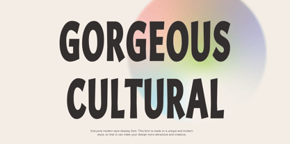 inspired by the famous minimalist logo perfect for the purposes of designing templates, brochures, videos, advertising branding, logos, invitation, layout design, elegant crafting, beauty design and more.
 - FF Pastoral by FontFont,
$50.99 A sturdy workhorse with the grace of a gazelle, the FF Pastoral typeface family marries pure craftsmanship with rapturous excesses of form. With his fifteenth release under the FontFont brand, prolific French designer Xavier Dupré has filled a typographic toolbox with plentiful options ranging from a tender, feathery Thin to a robust, healthy Black. At a glance, FF Pastoral appears deceptively simple, particularly in the middle weights. That surface serenity is intentional and allows for easy reading and quick comprehension of short blocks of copy. Upon closer inspection, FF Pastoral is complex and nuanced, carrying a balanced tension in its forms. This plays particularly well in magazine spreads and corporate logos, where uniqueness is a virtue. In creating his latest design, Dupré drew inspiration from a tasteful mix of references, combining diverse elements with a deft hand. While its letter shapes were informed by humanist-geometric hybrid Gill Sans, FF Pastoral’s proportions have been optimized for contemporary typography. Slightly condensed but generously spaced, FF Pastoral features a tall x-height, open counters, and subtle, sprightly italics slanted at just 5°. Proportional oldstyle figures are the default in the family, with tabular and lining numbers and fractions accessible through OpenType features. Elegant details evocative of calligraphy judiciously pepper the FF Pastoral glyph set. The ‘e’ bears an oblique crossbar, while the right leg of the ‘K’ and the ‘R’ are insouciantly curved in both the upright and italic variants. Further flourishes appear throughout the italics, notably in the ‘T’ and the ‘Z’, the gloriously looped tail of the ‘G’, and an extraordinary ampersand. Sharp-eyed fans of Dupré’s work may feel like they’re in familiar territory, and they would be right. An early version of FF Pastoral sprang to life in 2017 as Malis, a family in four weights on the heavier side of the spectrum. Over time, Dupré refined his original design, expanding it with four lighter styles and including true italics for all. The lightest weights are ethereal, with exquisitely delicate strokes drawing the eye in and across a line of type. The most substantial styles are tremendous in their power, allowing text to make a deep impression in print or on screen. Fully fleshed out, FF Pastoral works sublimely in a vast array of text and display settings. Dupré sees his latest FontFont offering as a ‘cultural’ typeface, perfect for the pages of an oversized coffee-table book or business communications where warmth and informality will win the day. Born in Aubenas, France (1977), Xavier Dupré is a gifted user of type as well as an award-winning type designer and lettering artist. After training in graphic design in Paris, Dupré studied calligraphy and typography at the Scriptorium de Toulouse. Since releasing FF Parango in 2001, Dupré has published such FontFont classics as the FF Absara and FF Sanuk superfamilies, FF Megano, FF Tartine, and FF Yoga. A designer of Khmer fonts as well as Latin typefaces, Dupré splits his time between Europe and Asia.
 - Golden Decades by Dharma Type,
$19.99 Back to the basics. In the last ten years, type design has been confronting chaotic scene. The font market is flooded with a mixture of wheat and chaff and typography becomes increasingly complex. But one golden straight path exists. The path began from the industrial revolution, passing through swiss style, now we walk along the path as a matter of course. It is sans-serif. The decades from the Swiss style, namely "less is more age" to the contemporary basic style "Less, but better age", we call it golden decades. In those decades, type design met modernism. Go back to a theory in the golden decades, we redesigned new geometric, minimal sans-serif. Less is more and better. We added cool and calm spices to the modernism in the golden decades. As a result, letterform has a contemporary, sharp, and neutral atmosphere, and geometric rounded bowls and counters create a nice rhythm. Golden Decades consists of 8 weights and their matching Italics for a wide range of usages. Farther, Golden Decades is supporting international Latin languages and basic Cyrillic languages including Basic Latin, Western Europe, Central and South-Eastern Europe. Also, Golden Decades covers Mac Roman, Windows1252, Adobe1 to 3. This wide range of international characters expands the capability of your works. Lowercase "a" has OpenType stylistic alternate for advanced typography.
 - Sicero by Konstantine Studio,
$12.00 Back in 1800 - 1900, the Serif fonts or known as Roman styles were very popular. Used in so many media, came from calligraphic technique and refined till it became a solid style even so many sign painters use this letter style back in that era. And today, these kinda style still got their fans who love the elegant yet clean solid style. That's what this came for. Please welcome, Sicero Duo Fonts. Its a dynamic duo fonts that came in Serif and Sans-Serif style which is perfectly fit to each other. Bring the old vibes instantly to your project with them :) Sicero Roman A Serif style font with implementations of old-era style, clean and done in click-by-click to fulfil your perfectionist personal. And it comes in Old Style Numbering too, to make the vibes stronger in the whole vintage design when using it. Sicero Sans A Sans-Serif font to make a good pair with Sicero Roman still holding those old vibes but a little bit modern touch in here to reach wider range of trends. Use it all alone is still good to go if you want something different with not pairing it with Sicero Roman as well. Available in OTF, TTF, and Webfonts. Enjoy it more. Have some fun with it, Oldsport :) Cheers, Konstantine Studio
 - Calgera by TRF,
$20.00 Calgera, is a typeface designed by Teuku Riski Firmana. Calgera is a contemporary serif typeface with a distinctive look. Calgera creates an unique character, with different stylistic sets you can change the feel of your design from more organic to more standard. with 9 weights ranging from Thin to Black. This is an elegant font, with beautiful and harmonious alternate, which makes it ideal for use in magazines, in the fashion industry, branding, logo design, dynamic packaging and countless other projects. When starting this project, we wanted to try to draw a modern serif with the precisely verified shapes and detailed elaboration of each character, making your text look great both on paper and on the screens. Calgera in numbers: • 108 styles and 1 variable fonts • 843 glyphs and 441 characters in each style • Support for more than 48+ languages • 27 OpenType features in each style • Amazing Manual TrueType Hinting • 4 variable exes (Weight, Width, Slant, Contrast) Useful OpenType features: Access All Alternates, Historical Forms, Stylistic Alternates, Stylistic Set 1, Stylistic Set 2, Stylistic Set 3, Stylistic Set 4, Stylistic Set 5, Stylistic Set 6, Stylistic Set 7, Stylistic Set 8, Fractions, Oldstyle Figures, Ordinals, Numerators, Small Capitals, Discretionary Ligatures, Standard Ligatures, Small Capitals From Capitals, Case-Sensitive Forms, Denominators, Scientific Inferiors, Subscript, Superscript, Kerning. Calgera language support: Acehnese, Afrikaans, Albanian, Basque, Bosnian, Catalan, Croatian, Czech, Danish, Dutch, English, Estonian, Faroese, Filipino, Finnish, French, Galician, German, Hungarian, Icelandic, Indonesian, Irish, Italian, Latvian, Lithuanian, Malay, Norwegian Bokmål, Polish, Portuguese, Romanian, Slovak, Slovenian, Spanish, Swahili, Swedish, Turkish, Welsh, Zulu, Tagalog, Serbian, Zazaki, West Frisian, Breton, Gagauz, Scottish Gaelic, Northern Sami, Esperanto, Latin.
 - Gotti by Resistenza,
$39.00 Introducing Gotti. Where Timeless Precision Meets Seventies Flair We are thrilled to unveil our latest creation, Gotti font family, born and meticulously crafted during an inspiring journey to Goteborg. This typeface seamlessly fuses the Bauhaus essence with the spirited vibes of the seventies, resulting in a font that's not just a visual treat but a design experience. Gotti draws its creative fuel from the geometric elegance of the Bauhaus movement, prioritising functional simplicity and razor-sharp lines. However, its design journey doesn't end there. Imbued with the unmistakable energy of the Seventies, Gotti emerges as a font family that encapsulates both nostalgic charm and contemporary boldness. At its core, Gotti boasts a geometric skeleton that has been intricately designed to redefine precision. Ranging from light to black, the weight variations offer a broad spectrum of expressive possibilities. Gotti is perfect for display use, advertising, and branding, it transforms your creative vision into a visual masterpiece. Stand out with confidence, whether it's a captivating logo, a compelling headline, or an unforgettable advertisement. Elevate your brand identity with Gotti. It brings strategic branding to life, communicating sophistication and modernity. Your advertising materials become memorable works of art, leaving a lasting impression on your audience. Curious about the magic Gotti can bring to your designs? Our showcase reveals real-world applications, demonstrating its adaptability and aesthetic appeal. See for yourself how this font family turns ordinary designs into extraordinary visual experiences. Follow us on social media for updates, inspiration, and a glimpse behind the scenes. Have questions or just want to share your thoughts? We're here for you!
 - Natom Pro by Mostardesign,
$25.00 A family of fonts with rhythm. Natom Pro is a modern and geometric font family adapted to the professional requirements of graphic designers, web designers and mobile application developers. Comprised of 19 styles including 8 styles designed especially for the design of headlines, Natom Pro is a very versatile family of fonts that can be used in many projects such as editorial design, branding or corporate identity creation, design of posters or logos, the creation of websites or the development of mobile applications. This font, with a resolutely contemporary aspect, also hides a unique typographic design since it has 2 distinct styles (Title and Roman) which have 2 different typographic rhythms in order to graphically differentiate the appearance of titles, subtitles and long paragraphs. With this design of rhythmically differentiated glyphs according to the styles, the headlines have a very graphic aspect while the long texts have a more classic aspect in order to keep optimal readability in all scenarios. Its architecture is also very modern since it was designed and drawn with particular attention to the geometry of the forms with clear and open endings cut at 90 degrees. The number of styles has also been simplified with the most used thicknesses (Extra Light, Light, Regular, Medium, Bold and Black) in order to speed up your graphic design process. For the more experienced designers, Natom Pro is also available in a variable version. Natom Pro is also equipped with powerful OpenType features like case sensitivity, true small caps, full ligature set, tabular figures for tables, « old styles figures » to elegantly insert figures into your sentences, numbers circled or even alternative characters to satisfy the most demanding professionals.
 - Flink by Identity Letters,
$25.00 The joy of pure geometry, revisited. Geometric typefaces are a staple in every typographer’s toolbox since the 1920s. It was a time when iconic faces such as Futura, Erbar, and Kabel appeared on the scene and turned the world of type upside-down. Inspired by those early giants as well as later epigones with a legacy of their own (such as 1970’s Avant Garde Gothic), Flink is the Identity Letters take on this genre, characterized by a clean and focused appearance. With neat shapes and the look of pure geometry, Flink adapts to a vast range of applications and topics, from the fine print in contract to website body copy to logo design to billboard-size slogans. Its x-height is considerably larger than in classic geometric sans-serif fonts; its proportions are harmonized as opposed to strictly constructed. This makes for a more contemporary look, setting it apart from the classics. To further reduce the rigidity of a purely geometric composition, you can replace some letters with more humanist alternates, such as a, g, j, etc. This font family comes along in 8 weights from Thin to Black. Each weight consists of an Upright and Italic version. There are more than 750 characters per style, including two stylistic sets that offer variations to the look and feel of Flink, making it even more versatile. Plenty of additional Open Type Features like ligatures, case sensitive forms, old-style figures, and symbols make Flink a valuable tool for the discerning typographer. Flink is the reimagination of a classic genre, designed to suit the needs of our time. ––––– Please note: There is an upgraded Version available: Flink Neue
 - Trakya Rounded by Bülent Yüksel,
$19.00 Thrace (/θreɪs/; Greek: Θράκη, Thráki; Bulgarian: Тракия, Trakiya; Turkish: Trakya) is a geographical and historical region in Southeast Europe, now split among Bulgaria, Greece, and Turkey, which is bounded by the Balkan Mountains to the north, the Aegean Sea to the south, and the Black Sea to the east. It comprises southeastern Bulgaria (Northern Thrace), northeastern Greece (Western Thrace), and the European part of Turkey (East Thrace). Trakya Rounded is a modern sans serif with a geometric touch. It has a modern streak which is the result of a harmonization of width and height especially in the lowercase letters to support legibility. Trakya Rounded is softer and rounder than it's sibling Trakya Sans. They're both ideally suited for advertising and packaging, editorial and publishing, logos, branding and creative industries, posters and billboards, small text, way-finding and signage as well as web and screen design. Trakya Rounded provides advanced typographical support for Latin-based languages. An extended character set, supporting Central, Western and Eastern European languages, rounds up the family. The designation “Trakya Rounded 500 Regular” forms the central point. The first figure of the number describes the stroke thickness: 100 Thin to 900 Bold. "Trakya Rounded" comes in 5 weights and italics and has the company of "Trakya Rounded Alt" that also comes in 5 weights and italics for a total of 20 styles. The family contains a set of 630+ characters. Case-Sensitive Forms, Classes and Features, Small Caps from Letter Cases, Fractions, Superior, Inferior, Denominator, Numerator, Old Style Figures are easily accessible in all graphic programs. Trakya Rounded is the perfect font for web use. Enjoy using it.
 - Finocchio by The Ampersand Forest,
$45.00 Finocchio (yes, we know — wink) has the playful, round shapes of a French Ronde with the sharp angles of Italian Futurism. It's a bold, fun, excellent branding face — wherever you need some gusto or brio or forza! Finocchio comes with a large number of ligatures for fluidity. It also comes with a solid, readable set of non-script small caps, so all you need for that sign is one coordinated font! It also comes with loads of fun alternates! Finocchio is made with love in The Ampersand Forest.
 - Grosen by Hurufatfont,
$23.00 Grosen Typeface Family is designed by Oğuzhan Cengiz in the years 2017-2019. It has a grotesque structure that contains humanistic effect. Although it is designed upon the basic geometric structure, it shows own style with expansion that makes a reference to serif at start and finish of round letters. Grosen Typeface Family has fourteen styles with seven weights and theirs real italics. These have advanced OpenType features; like small capitals, case sensitive signs and math symbols, alternative characters (a, g, M, J, &), automated fractions, oldstyle figures, tabular linings, proportional numbers...
 - Hardipe by Sarid Ezra,
$15.00 Hardipe is logo fonts with unique side that will make your logo and design looks more simple and stylish. With the unique characteristic lowercase, this font can make your logo even more stunning. You can use this font for any purpose, especially to make logotype. You can mix and match the uppercase and lowercase to make your logo more stand out. Hardipe also comes with italic version that have different vibes. This font also comes with number, symbol, and multilingual support!
 - Arta by Olivier Blanc,
$34.00 ARTA is an ArtDeco style font, inspired by classic font like Newport Classic with elongated typeface with high waisted uppercase letters which curve in an geometric and elegant way. It consisted of really condensed lettering which had little space available. It's a well complet font with 315 Glyphs for most latin languages as "English, French, Spanish, German, Icelandic, Afrikaans, Catalan, Czech, Esperanto, Hungarian, Latin, Latvian, Lithuanian, Maltese, Northern Sami, Polish, Serbo-Croatian, Slovak, Slovene, Sorbian, Turkish and Welsh". ARTA will give to your design an chic presentation, you will be able to generate beautiful writings,thanks to 3 differents type "Light, Regular & Bold". It can be used for Shop, Restaurant, Jewelry, Cosmetic, Press identity & more. I started to work on this typeface at the creation of a logo in 2017 for the butcher shop of my uncle in Luchon in France named "Le Louchébem". I always had in mind to complete & share it. So after some years, I decided that it was time to finish it. This was my first Typography creation and I wanted to make it as an Art Deco typeface. I really love this elegant, high & classy lettering style. I want to bring this 1910's vibes back to be more use in our days.
 - Ah, EnglishTowne-Normal, the font that transports you back to a time when feather quills were the peak of writing technology, candlelight was the latest trend in ambient lighting, and sending a messa...
- Love Pica by Sipanji21,
$16.00 Love Pica is a lovely Typeface with Ligature inside. It features gorgeous hearts in each letter which give it an incredibly romantic feel. this font suitable for valentine day poster, logo, t shirt, event banner and etc. you can use this font for any design, apparel, kids logo, logo type, with many Ligature for make your design awesome.
 - Thiny Cupid by Sipanji21,
$15.00 Thiny Cupid is a lovely display font that radiates charm. It features gorgeous hearts in each letter which give it an incredibly romantic feel. this font suitable for valentine day poster, logo, t shirt, event banner and etc. you can use this font for any design, apparel, kids logo, logo type, with many swash for make your design awesome.
 - OBITRUK by Twinletter,
$17.00 Meet Obitruk, a powerful display font with a superhero style that will take your projects to a new level. Whether you’re working on a movie, a game, or a design with a strong and bold theme, Obitruk is the perfect solution. With its strong, bold appearance, this font exudes confidence and draws attention. Distinctive superhero style adds fun and adventure to your creations, making them stand out from the crowd. Obitruck not only looks amazing but is also packed with features that will enhance your designs. Ligature and alternative characters provide flexibility and creative possibilities, allowing you to customize and add unique touches to your typography. Plus, multilingual support ensures your message is accessible to a global audience. Show the power of Obitruk and bring your projects to life. Get ready to make a bold statement with this dynamic font that embodies strength, thickness, and a fearless spirit. Improve your designs with Obitruk and leave a lasting impression on your audience. What’s Included : File font All glyphs Iso Latin 1 Alternate, Ligature Simple installations We highly recommend using a program that supports OpenType features and Glyphs panels like many Adobe apps and Corel Draw so that you can see and access all Glyph variations. PUA Encoded Characters – Fully accessible without additional design software. Fonts include Multilingual support
 - Victoria Smitters by Din Studio,
$29.00 It is critical to ensure that your design appearance represents the messages you deliver. However, it can be such a difficult task and time wasting to create a personal, lovely design. Therefore, Victoria Smitter is the answer to what you need. Victoria Smitter is a visually beautiful handwriting font which is perfect to show modern, elegant impressions in a personalized design to impress your customers and to make your messages more prominent than the others. It is designed in a cursive way in which the letters are connected to each other. Details on each letter and cursive wipes on the edges show high contrasts. Furthermore, this font is suitably applicable for big text sizes for better legibility. In addition, you can enjoy the available features here. Features: Stylistic Sets Ligatures Swashes Multilingual Supports PUA Encoded Numerals and Punctuations Victoria Smitter fits best for various design projects, such as brandings, posters, banners, invitations, greeting cards, magazine covers, quotes, printed products, merchandise, social media, etc. Find out more ways to use this font by taking a look at the font preview. Thanks for purchasing our fonts. Hopefully, you have a great time using our font. Feel free to contact us anytime for further information or when you have trouble with the font. Thanks a lot and happy designing.