10,000 search results
(0.029 seconds)
- King Cool KC Pro by CheapProFonts,
$10.00 A funny and quirky handwritten script - with an original "monoheight" letter design. It is cute and adorable, and now available for setting text in most latin-based languages. ALL fonts from CheapProFonts have very extensive language support: They contain some unusual diacritic letters (some of which are contained in the Latin Extended-B Unicode block) supporting: Cornish, Filipino (Tagalog), Guarani, Luxembourgian, Malagasy, Romanian, Ulithian and Welsh. They also contain all glyphs in the Latin Extended-A Unicode block (which among others cover the Central European and Baltic areas) supporting: Afrikaans, Belarusian (Lacinka), Bosnian, Catalan, Chichewa, Croatian, Czech, Dutch, Esperanto, Greenlandic, Hungarian, Kashubian, Kurdish (Kurmanji), Latvian, Lithuanian, Maltese, Maori, Polish, Saami (Inari), Saami (North), Serbian (latin), Slovak(ian), Slovene, Sorbian (Lower), Sorbian (Upper), Turkish and Turkmen. And they of course contain all the usual "western" glyphs supporting: Albanian, Basque, Breton, Chamorro, Danish, Estonian, Faroese, Finnish, French, Frisian, Galican, German, Icelandic, Indonesian, Irish (Gaelic), Italian, Northern Sotho, Norwegian, Occitan, Portuguese, Rhaeto-Romance, Sami (Lule), Sami (South), Scots (Gaelic), Spanish, Swedish, Tswana, Walloon and Yapese.
 - Undecapped Vinyl Pro by CheapProFonts,
$10.00 Time to grunge it up again with another detailed masterpiece from Guillaume Séguin. Character set has been greatly expanded, ready for some rough and tough designs in many languages. Rock on! ALL fonts from CheapProFonts have very extensive language support: They contain some unusual diacritic letters (some of which are contained in the Latin Extended-B Unicode block) supporting: Cornish, Filipino (Tagalog), Guarani, Luxembourgian, Malagasy, Romanian, Ulithian and Welsh. They also contain all glyphs in the Latin Extended-A Unicode block (which among others cover the Central European and Baltic areas) supporting: Afrikaans, Belarusian (Lacinka), Bosnian, Catalan, Chichewa, Croatian, Czech, Dutch, Esperanto, Greenlandic, Hungarian, Kashubian, Kurdish (Kurmanji), Latvian, Lithuanian, Maltese, Maori, Polish, Saami (Inari), Saami (North), Serbian (latin), Slovak(ian), Slovene, Sorbian (Lower), Sorbian (Upper), Turkish and Turkmen. And they of course contain all the usual "western" glyphs supporting: Albanian, Basque, Breton, Chamorro, Danish, Estonian, Faroese, Finnish, French, Frisian, Galican, German, Icelandic, Indonesian, Irish (Gaelic), Italian, Northern Sotho, Norwegian, Occitan, Portuguese, Rhaeto-Romance, Sami (Lule), Sami (South), Scots (Gaelic), Spanish, Swedish, Tswana, Walloon and Yapese.
 - Celebrate The Day Pro by CheapProFonts,
$10.00 The freeflowing and quite feminine style of this script appealed to me, but it needed a bit of taming. Quite a few of the letterforms have been normalized - to better accommodate the diacritics. :) All fonts from CheapProFonts have very extensive language support: They contain some unusual diacritic letters (some of which are contained in the Latin Extended-B Unicode block) supporting: Cornish, Filipino (Tagalog), Guarani, Luxembourgian, Malagasy, Romanian, Ulithian and Welsh. They also contain all glyphs in the Latin Extended-A Unicode block (which among others cover the Central European and Baltic areas) supporting: Afrikaans, Belarusian (Lacinka), Bosnian, Catalan, Chichewa, Croatian, Czech, Dutch, Esperanto, Greenlandic, Hungarian, Kashubian, Kurdish (Kurmanji), Latvian, Lithuanian, Maltese, Maori, Polish, Saami (Inari), Saami (North), Serbian (latin), Slovak(ian), Slovene, Sorbian (Lower), Sorbian (Upper), Turkish and Turkmen. And they of course contain all the usual "western" glyphs supporting: Albanian, Basque, Breton, Chamorro, Danish, Estonian, Faroese, Finnish, French, Frisian, Galican, German, Icelandic, Indonesian, Irish (Gaelic), Italian, Northern Sotho, Norwegian, Occitan, Portuguese, Rhaeto-Romance, Sami (Lule), Sami (South), Scots (Gaelic), Spanish, Swedish, Tswana, Walloon and Yapese.
 - Pirates Gold Pro by CheapProFonts,
$10.00 This stylish swashbuckling typeface had a very limited character set, but with the CheapProFonts treatment this buried treasure is ready to be rediscovered. Character map included. "Arrr! Shiver me timbers!" ALL fonts from CheapProFonts have very extensive language support: They contain some unusual diacritic letters (some of which are contained in the Latin Extended-B Unicode block) supporting: Cornish, Filipino (Tagalog), Guarani, Luxembourgian, Malagasy, Romanian, Ulithian and Welsh. They also contain all glyphs in the Latin Extended-A Unicode block (which among others cover the Central European and Baltic areas) supporting: Afrikaans, Belarusian (Lacinka), Bosnian, Catalan, Chichewa, Croatian, Czech, Dutch, Esperanto, Greenlandic, Hungarian, Kashubian, Kurdish (Kurmanji), Latvian, Lithuanian, Maltese, Maori, Polish, Saami (Inari), Saami (North), Serbian (latin), Slovak(ian), Slovene, Sorbian (Lower), Sorbian (Upper), Turkish and Turkmen. And they of course contain all the usual "western" glyphs supporting: Albanian, Basque, Breton, Chamorro, Danish, Estonian, Faroese, Finnish, French, Frisian, Galican, German, Icelandic, Indonesian, Irish (Gaelic), Italian, Northern Sotho, Norwegian, Occitan, Portuguese, Rhaeto-Romance, Sami (Lule), Sami (South), Scots (Gaelic), Spanish, Swedish, Tswana, Walloon and Yapese.
 - Storyville by Canada Type,
$29.95 This is the redrawn and expanded version of an alphabet Rebecca Alaccari made back in 2009 as a bespoke font for a tourism agency looking to recapture the appeal of New Orleans after the hurricane Katrina disaster robbed it of its core industries. The brief back then was to "revive the unique spirit of what always made Nola great for new adults, which is the excellent combination of history, romance, food and music." No word of a lie, the brief actually contained "new adults." Storyville contains two interchangeable sets of forms drawn in the doodly, loose and organic way now conspicuously popular with today's young designers, almost every one of whom thinks they will get to design something for a boutique coffee bar somewhere. Well, this whole thing perhaps means freedom, youth, fun, happiness, good stuff like that. But just in case, a little caution doesn't hurt: Use this font only if you know what you're doing. We don't want to go back to the 1990s. Please. We were nearly done for by that exposure the first time around. The ligatures feature in this font does some pseudo-randomization, so the forms in doubled letters don't repeat. Serious fun can be had by also applying the stylistic alternates feature, or picking a letter in the middle of a setting and disabling the ligatures feature. Or various sequences of all that. If you don't like any of that stuff, just forget about it. Uh, wutever.
 - Anuschka by Anomali Creative,
$10.00 Introducing **ANUSCHKA** - Faux Cyrillic Display Font Faux Cyrillic, pseudo-Cyrillic, pseudo-Russian or faux Russian typography is the use of Cyrillic letters in Latin text, usually to evoke the Soviet Union or Russia, though it may be used in other contexts as well. It is a common Western trope used in book covers, film titles, comic book lettering, artwork for computer games, or product packaging which are set in or wish to evoke Eastern Europe, the Soviet Union, or Russia. A typeface designed to emulate Cyrillic is classed as an ethnic typeface. **ANUSCHKA** came with that protest and propaganda vibe. It's contain a complete Simple Latin Glyphs, with extra ligatures, D-Ligature, Stylistic set for the main character to make it stencil look and distressed look. --- This font can be used with all software that can read standard fonts. Check out my instagram: https://www.instagram.com/anomalicreatype/ Thanks so much for checking out my shop! All the best, **Krisna Teja** Anomali Creatype #typeface #Stencil #FauxCyrillic #Cyrillic #Military #Protest #Poster #vintage #Extreme #design #Vintage #graphic #calligraphy #Retro #typography #propaganda #Poster #blackletter #retrostyle #illustration #Russian #socialist #character #set #uppercase #decorative #black #classic #Uppercase #handmade #capital #bold #number #modern #tattoo #english #art #label #logo #middle #typographic #antique #sign #letterhead #fashion #filmtitles #russia #comicbooklettering #videogames #computergames
 - Brahma Rounded by Tall Chai,
$15.00 Brahma Rounded is a modern geometric rounded sans-serif font family with weights ranging from Thin (100) to Black (900). It is a sibling of the Brahma font family. Features: Available in 9 weights Over 550 glyphs supporting extended Latin Ideal for display texts: Titles, Logos and Headlines etc. Perfect for branding and rebranding Supports OpenTypes features like Ligatures and Stylistic Alternates Tabular Numerals included Symbols for 10 major currencies including Bitcoin provided in all weights Description: The name comes from Brahmā who is known as the god of creation. And manifesting the same spirit, the Brahma font family focuses on modern creativity. With its smooth and polished curves, Brahma Rounded provides friendly, casual vibes to all its characters. Every character effortlessly integrates with current design standards and interfaces. The fonts are professional yet have a hint of informal personality in them. This makes Brahma Rounded perfect for use in modern apps and websites. Brahma Rounded is built for the influencing, designing and marketing squads. It has a trendy geometric characteristic which is ideal for any branding and rebranding. Brahma has lot of OpenType features (like ligatures and tabular numerals) and the Extended Latin character set supports over a hundred languages. Start Creating!
 - Adero by Eko Bimantara,
$22.00 Adero is a futuristic and versatile display font family designed to meet the needs of modern design projects. With its wide and minimalist style, Adero offers designers a unique blend of futuristic and functional design elements that make it a perfect choice for a wide range of applications. Featuring nine weights, from Thin to Black, and matching obliques, Adero provides designers with a wide range of options to choose from when creating designs. The font’s letterforms are carefully crafted with attention to detail, resulting in a modern, clean look that is both attractive and easy to read. Adero’s minimalist design makes it ideal for a variety of design applications, including branding and logo design, product design, advertising, web and various digital design. The font’s wide proportions and large x-height make it a great choice for bold and attention-grabbing designs, while its sleek and functional style makes it perfect for more understated design applications. Whether you’re creating a futuristic poster or a sleek website design, Adero is a versatile and powerful tool that can help you achieve your design goals. With its unique blend of wide proportions, minimalist design, and futuristic style, Adero is an excellent choice for any modern design project.
 - Swingly Lours by Jolicia Type,
$21.00 Meet Swingly Lours, the epitome of serif elegance enriched with magnificent ligatures and a plethora of alternates. This font transforms your typography into a visual symphony, striking the perfect balance between classic sophistication and contemporary creativity. Swingly Lours is not just a typeface, it's a versatile tool for crafting unique and captivating designs. Elevate your projects with the charm of this serif font, where every detail tells a story of timeless sophistication and customizable creativity.
 - HD Arnie by HyperDeluxe,
$30.00 HD ARNIE is a unique little typeface. It has a combination of brutalist angles mixed with soft shapes and ink traps to create a truly unique viewing experience. The many alternates give you the flexibility and customisation to treat ARNIE as you wish and create a combination just right for you & your brand. ARNIE has many extras as well as Variable support to make this a must have font of 2022 (and beyond!).
 - Debora Celina Script by Gatype,
$5.00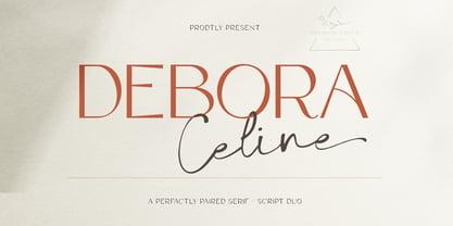 Debora Celina is a font Duo Script and Serif that is simple and unique looking.This customizable font will look great on a variety of design ideas such as Christmas themes,valentines, posters, invitations, weddings, branding projects, social media posts, magazines, book covers and more. This will add a fun and friendly touch to any of your projects.This font is PUA encoded which means you can access all the glyphs and sweeps easily.
 - TT Travels by TypeType,
$35.00 TT Travels useful links: Specimen | Graphic presentation | Customization options About TT Travels: TT Travels is a geometric grotesque with wide proportions and peculiar shapes of circles and brackets. TT Travels incorporates two stylistic sets which add completely different characters to the type family. The first set ss01 (aka salt) makes the font more humanistic, thanks to the ductal and smooth design of the characters defining the style. And if you want to work with the futuristic version of TT Travels, we recommend that you enable the second set (ss02). In this set, most of the characters defining the style change to characters possessing experimental forms of graphemes. For the convenience of the TT Travels font family use and for working within a complex text hierarchy, we've created 9 weights (Thin, X-Light, Light, Regular, Medium, DemiBold, Bold, X-Bold, Black) and added 9 true Italics. TT Travels also implements standard and discretionary ligatures, oldstyle figures, slashed zero, and much more. The full list of OpenType features used in TT Travels is: ordn, sups, sinf, numr, dnom, onum, tnum, pnum, liga, dlig, salt, ss01, ss02, case, frac, zero. TT Travels language support: Acehnese, Afar, Albanian, Alsatian, Aragonese, Arumanian, Asu, Aymara, Banjar, Basque, Belarusian (cyr), Bemba, Bena, Betawi, Bislama, Boholano, Bosnian (cyr), Bosnian (lat), Breton, Bulgarian (cyr), Cebuano, Chamorro, Chiga, Colognian, Cornish, Corsican, Cree, Croatian, Czech, Danish, Embu, English, Erzya, Estonian, Faroese, Fijian, Filipino, Finnish, French, Friulian, Gaelic, Gagauz (lat), Galician, German, Gusii, Haitian Creole, Hawaiian, Hiri Motu, Hungarian, Icelandic, Ilocano, Indonesian, Innu-aimun, Interlingua, Irish, Italian, Javanese, Judaeo-Spanish, Judaeo-Spanish, Kalenjin, Karachay-Balkar (lat), Karaim (lat), Karakalpak (lat), Kashubian, Khasi, Khvarshi, Kinyarwanda, Kirundi, Kongo, Kumyk, Kurdish (lat), Ladin, Latvian, Laz, Leonese, Lithuanian, Luganda, Luo, Luxembourgish, Luyia, Macedonian, Machame, Makhuwa-Meetto, Makonde, Malay, Manx, Maori, Mauritian Creole, Minangkabau, Moldavian (lat), Montenegrin (lat), Mordvin-moksha, Morisyen, Nahuatl, Nauruan, Ndebele, Nias, Nogai, Norwegian, Nyankole, Occitan, Oromo, Palauan, Polish, Portuguese, Quechua, Rheto-Romance, Rohingya, Romanian, Romansh, Rombo, Rundi, Russian, Rusyn, Rwa, Salar, Samburu, Samoan, Sango, Sangu, Scots, Sena, Serbian (cyr), Serbian (lat), Seychellois Creole, Shambala, Shona, Slovak, Slovenian, Soga, Somali, Sorbian, Sotho, Spanish, Sundanese, Swahili, Swazi, Swedish, Swiss German, Swiss German, Tagalog, Tahitian, Taita, Tatar, Tetum, Tok Pisin, Tongan, Tsonga, Tswana, Turkish, Turkmen (lat), Ukrainian, Uyghur, Vepsian, Volapük, Võro, Vunjo, Xhosa, Zaza, Zulu.
 - Passport48 by Coniglio Type,
$19.95 Passport48 exclusively in otf. opentype format, originally debuted in 1997 as Passport, close to the beginning of the indie typographer boom. Almost 25 years have passed since it was introduced at MyFonts as PS1 and later in 2003 in TT TrueType.** It was designed by Joseph Coniglio of Coniglio Type as a revival. Historically, Passport was digitized from a shiny black enamel 1948 Royal Silent Deluxe portable. Kept on the ship of merchant marine, Captain John O’Learn, it was a salty manual typewriter with no intrinsic value as a collectable, even though it is awash as a work horse and a fine communicator of it’s time.. **NOTE: Little Passport family leaves the nest: The old weight variations, styles and formats have been eliminated to allow the original face to be stand alone, on its own attributes. For those purchasing their first typewriter fonts and to our diehard collectors as well, Passport presents a friendly new port-of-entry. A simple set, that is freed of many of the normal distressed points and paths that had made most “typewriters” authentic looking, but difficult to print and manipulate in layouts back in the day. It’s smooth nature comes from its impressions struck directly onto a piece of carbon paper bypassing the silk ink ribbon and going directly from metal to carbon paper transferring to a piece paper with very little tooth. Examine the glyphs to be certain you have what you need from this minimalist set, Passport48 is intended for ease of use and affordability. This is a warm font in a cold cruel world and a real port in the storm! It is versatile in today’s layouts with 24 years of worldwide sales. …Please enjoy the fruits of its travels, hoping your destinations and explorations into graphic design and letter composition are happy ones. -Joe Coniglio, the Pacific Northwest (2021).
 - Sangli by insigne,
$- It started in 2007 with Chennai, the first of a three-part series of sans that I envisioned with slab serif counterparts. Each font would differ from the others in how the stem terminals were expressed. The initial font was extremely well received, and a revitalized and remastered Chennai made its appearance two years later, complete with new weights and new, novel OpenType features. Then came Madurai, a variation of Chennai based on the same core, only without the rounded stems. Chennai’s rounded stems made it distinctive and great for headlines but left it lacking appeal as copy--a problem that Madurai easily solved. And now comes Sangli, the final iteration of my original 2007 vision. Sangli is a happy medium. Like Chennai, it’s great for headlines--but not too distinct for copy. Sangli keeps the same core structure as the other two, but new less sharp forms give this latest font a friendlier look that’s more versatile than the original Chennai and less formal than Madurai. The font includes a whole range of six weights from light to black, along with condensed and extended options as well for a total of 54 fonts. There are plenty of OpenType features, including small caps. Alternates include normalized capitals and lowercase letters that include stems for when you want a more traditional look or when you’re writing copy. Sangli also supports over 70 languages that use the extended Latin script. Use Chennai, Madurai, and their slab serif variants interchangeably with Sangli, too, for even more options in your work. All three complement one another well. So when you need a balanced font that stands boldly on the page and commands your reader’s attention, look within and find your Sangli.
 - Dingocitta by Erwin Krump,
$32.00 Dingocittà with its 12 fonts, contains a large amount of features like small capitals, different figure sets, automated fractions, ordinals, standard ligatures, contextual alternates (generates letter combinations to avoid form collisions by simultaneous maintaining word fugue) and discretionary ligatures. Dingocittà is suitable for a wide range of applications and can be readily combined with other fonts.
 - Raker by Wordshape,
$20.00 Raker is a science fiction-inspired geometric sans serif text typeface family with a humanist influence and solid spacing/kerning. Regular, Display, stencil, and display stencils versions are included. Think NASA. Think the Space Race. Think Geometric. Think “works with text, too.” Detailed spacing, Western and Eastern European language support, and automated ligatures. Think hidden glyphs.
 - Lust Text by Positype,
$29.00 Yes, finally. This one took the most time and the most restarting. Years went into imagining what Lust Text should look like and how it should structurally behave in order to truly improve upon a setting that includes any of the Lust typefaces. I approached it as much from the side of the type designer, as I did a potential user. The flow, the warmth, the personality needed to be there, but all of the excess had to be removed responsibly. In the process, and in need of inspiration, I looked backward to historical artifacts and precedent. In each early Lust Text approach, the solution was lackluster and/or vanilla and not actually a ‘Lust’ typeface. The exercise was not in vain though. By exploring past examples, I found my footing drawing for media now and how it might be used later—all the while, producing seamless, elegant curves and restrained indulgence (that sounds almost silly to say, but I like it). The Lust Collection is the culmination of 5 years of exploration and development, and I am very excited to share it with everyone. When the original Lust was first conceived in 2010 and released a year and half later, I had planned for a Script and a Sans to accompany it. The Script was released about a year later, but I paused the Sans. The primary reason was the amount of feedback and requests I was receiving for alternate versions, expansions, and ‘hey, have you considered making?’ and so on. I listen to my customers and what they are needing… and besides, I was stalling with the Sans. Like Optima and other earlier high-contrast sans, they are difficult to deliver responsibly without suffering from ill-conceived excess or timidity. The new Lust Collection aggregates all of that past customer feedback and distills it into 6 separate families, each adhering to the original Lust precept of exercises in indulgence and each based in large part on the original 2010 exemplars produced for Lust. I just hate that it took so long to deliver, but better right, than rushed, I imagine.
 - Lust Stencil by Positype,
$39.00 When you hear that name, you likely ask yourself, ‘why?!’ I did too, but the number of requests could not be ignored. Once I finally decided to move forward with it, the only way to solve the offering would be to adhere to the same theme of indulgence, I planned for the same number of optical weights AND Italics. Yeah, italic stencils… ok, why not? It’s not a new concept. One thing to note and a creative liberty I assumed during the design. Lust Stencil would not be just a redaction or removal of stress to produce a quick stencil. To do that, would just be a cheap solution. Strokes had to resolve themselves correctly and/or uniquely to the concept of the stencil format. And, it had to be heftier. For it it to look correctly, it needed about 8% additional mass to the strokes for it to retain the effervescent flow of the curves and the resolute scalloped lachrymals. The Lust Collection is the culmination of 5 years of exploration and development, and I am very excited to share it with everyone. When the original Lust was first conceived in 2010 and released a year and half later, I had planned for a Script and a Sans to accompany it. The Script was released about a year later, but I paused the Sans. The primary reason was the amount of feedback and requests I was receiving for alternate versions, expansions, and ‘hey, have you considered making?’ and so on. I listen to my customers and what they are needing… and besides, I was stalling with the Sans. Like Optima and other earlier high-contrast sans, they are difficult to deliver responsibly without suffering from ill-conceived excess or timidity. The new Lust Collection aggregates all of that past customer feedback and distills it into 6 separate families, each adhering to the original Lust precept of exercises in indulgence and each based in large part on the original 2010 exemplars produced for Lust. I just hate that it took so long to deliver, but better right, than rushed, I imagine. It would have taken even longer if not for font engineer and designer, Potch Auacherdkul. Thanks Potch.
 - Decima Mono by TipografiaRamis,
$39.00 Decima Mono – condensed geometric monospaced Sans Serif typeface, released back in 2009 and quite successful ever since (MyFonts Rising Star, February 2009). This new edition is an upgraded version of Decima Mono and Decima Mono X, combining both into one edition. New version supports more Latin languages with an extension to glyph amounts. Also, six more alternate styles have been added to the original six styles.
 - Syom by Luxfont,
$38.00 Take a trip back in time with our unique color font family Syom! The rounded and inflated shapes of the letters embody the atmosphere of decades of the last century, while remaining relevant in modern design. Features: - Real 3D effect - Extras - Multilingual - Ability to adapt 3D letters to other languages - Kerning IMPORTANT: - Check the glyphs in the font before buying! - SVG fonts contain raster letters.
 - Poster Casual JNL by Jeff Levine,
$29.00 Poster Casual JNL is based on the hand lettered title on the cover of the 1929 sheet music for the song "Give Yourself a Pat on the Back"; touted at the time as being "the cheer-up song of England". Available in both regular and oblique versions, the font is perfect for applications where a less-formal look is desired in headlines or brief text.
 - Sixties Flashback by Mysterylab,
$15.00 Here's a lettering style that just might be exactly on your wavelength. Add just the right dose of vintage freak-a-delia to your retro graphics with this original psychedelic-style design. Great for music posters, album graphics, book titles, etc. Evoke a warpy, wavy, whimsical vibe that harks back to the carefree 1960s or early 1970s era with Sixties Flashback; it's pure hippie, trippy fun!
 - Pixel Pants by PizzaDude.dk,
$18.00 Pixel Pants is my wanna-be 1980-ies pixelfont. Well, it really looks like a pixel font, but it's kid of fake - at larger sizes you will notice the wacky and uneven lines, but it sure do bring back memories of the 80-ies! I've made 5 different versions of each letter - just to break the monotony of the usual pixel font! Insert coin and enjoy!
 - Deco Redux JNL by Jeff Levine,
$29.00 A long-set aside Art Deco typeface design begun (but not completed) may or not have been from a vintage source, but its roots go well back into Art Deco lettering. Taking the existing letters and thickening their weights, removing the counters and ending up with a completely new, solid alphabet design resulted in Deco Redux JNL, which is available in both regular and oblique versions.
 - Nouveau Handlettered JNL by Jeff Levine,
$29.00 The roots of Nouveau Handlettered JNL go back to the sheet music cover for the 1917 song "(Someday) Somebody's Gonna Get You". This simple style of sans serif titling has the casual, imperfect charm of the pen and ink lettering so prevalent in the decades before metal type and other technical advancements made the craft almost obsolete. The typeface is available in both regular and oblique versions.
 - Perigord by Scriptorium,
$18.00Perigord has mixed origins. It was inspired by Gutenberg’s capitals and by lettering developed by German designer Ernst Bentele, but its calligraphic antecedents go back to French initials of the Carolingian period. The result of this is a formal, attractive and antique look which we hope you'll like. The full version includes alternate forms for many of the letters, as well as numbers and punctuation. - Driven Unicase Extended by Typekirk,
$12.00 Driven Unicase Extended is sleek and modern, yet hearkens back to the first advertising to catch my eye as a kid in the glorious 1970s – automobile ads that captured the thrill of speed, for sports cars I dreamed of experiencing. Driven is available in 6 individual weights or as a family of 6 fonts, plus ornaments. Includes accented characters supporting for many European languages.
 - Hackbot by Typefactory,
$14.00 Hackbot is a font which is both retro-inspired and amusing to the eye. The gaps between the letterings allows you to feel vintage and travel back to the old times. It’s a font which uses a sans serif style of writing, but uses a retro design to make an overall unique font. It’s flawlessly suitable for promoting games, creating quotes, retro designs and much more.
 - MFC Arteaga Borders Three by Monogram Fonts Co.,
$19.95 The inspiration source for Arteaga Borders Three is a collection of the embroidery and beading patterns from a vintage embroidery patterns catalog dating back to 1865. The original collection of patterned sides has been expounded upon to create matching corners that continue the fluidity of the ornate forms. Download and view the “MFC Arteaga Borders Three Guidebook” if you would like to learn a little more.
 - PiS Creatinin Pro by PiS,
$38.00 PiS Creatinin pro is based on a vintage ABC learning game for kids found in my grandparents attic. The narrow and high hand-drawn letters combine delicacy and chunkyness in a wonderful way, so it can be used both in huge display sizes and in small text sizes. PiS Creatinin pro - Makes you want to go back to school and learn the alphabet all over again!
 - NS Gibswing by Novi Souldado,
$35.00 Gibswing born based on the reference of old fancy lettering, vintage illustration, and victorian calligraphy. The Gibswing decorative style make it as an instant time machine to the era from 1800-1900 victorian visual style of the products, printed advertising, and signs back in the day. It will be a perfect companion of your classic visual direction for decorative sign, labels, branding, logotype, you name it.
 - Skyline Hotel by Open Window,
$19.95 Skyline Hotel is a brand new hand painted font from Dathan Boardman of Open Window. It utilizes Art Deco structures but is greatly amplified by organic paint brush strokes. The font would be best used in designs that require an organic degraded look and feel. Skyline Hotel… optimal for back alley graffiti mural or a poster to begin a political revolution. Geometric essentials betrayed by fluid expression.
 - RM Almanack by Ray Meadows,
$19.00 Based on William Caslon’s design (c1720) which was itself based on Dutch Baroque typefaces. The old saying “when in doubt, use Caslon.” can now be updated ... “use RM Almanack instead!” Includes: Western European, Central European, Baltic & Turkish sets Due to the modular nature of this design there may be a slight lack of smoothness to the curves at very large point sizes (around 100 pt and above).
 - Song Publisher JNL by Jeff Levine,
$29.00 Song Publisher JNL features a design based on the 1945 Art Deco-era hand lettered sheet music title "When the Old Gang's back on the Corner (Singin' Sweet Adeline Again)". It's a good thing sheet music wasn't sold by the word count found in song titles, because this twelve word example would have been more costly than titles such as "Nola", "Tenderly" or "Ciribiribin".
 - Nuevo Litho by Hackberry Font Foundry,
$24.95 NuevoLitho is my first successful font design. It was designed for use in the heads and subheads of my first book, “Printing in a Digital World” back in 1994. It’s a very loosened play on Lithos, Carol Twombly’s fashionable font of the period. However, I added a complete lowercase set, several special characters, and all the other fun stuff I do with my fonts.
 - Sheldrake JNL by Jeff Levine,
$29.00 Sheldrake JNL is the second in a series of display fonts modeled from actual water-applied decals that were manufactured by the Duro Decal Company of Chicago (now Duro Art Industries). The font's name derives from the actual phone exchange for Duro, back in the days when a telephone listing had a name-number assignment for recognition. In this case, their number began as "SH(eldrake)-3".
 - Bugleboy by Stiggy & Sands,
$29.00 Bugleboy started as a digitized version of "Wood Grotesk," a 1970s film typeface by LetterGraphics. It started with a bare bones character set which we added swash alternates for Capitals, Stylistic Alternates for a Unicase look, and crafted a Sans version without serifs. The Sans style lacks swashes but keeps Stylistic Alternate Unicase forms. See the last graphic for a comprehensive character map preview.
 - Bedford by Stereo Type Haus,
$25.00 Inspired by mosaic lettering by Heins & LaFarge, architects of the IRT (Interborough Rapid Transit) in New York City. Bedford hints at the station names on platform walls which date back to 1904 but modernize it through a rigid grid system and rounded corners. The family consists of two styles, Bitmap for web usage with a perfect pixel snap, and Rounded for a softer and bolder look.
 - MFC Arteaga Borders One by Monogram Fonts Co.,
$19.95 The inspiration source for Arteaga Borders One is a collection of the embroidery and beading patterns from a vintage embroidery patterns catalog dating back to 1865. The original collection of patterned sides has been expounded upon to create matching corners that continue the fluidity of the ornate forms. Download and view the “MFC Arteaga Borders One Guidebook” if you would like to learn a little more.
 - Augustea Open by ITC,
$29.00Augustea was designed by Alessandro Butti and Aldo Novarese and is one of the most popular classical, monumental letterforms featureing a stone cut effect. This font is based on the classic proportions of Capitalis, which dates back to the first century AD during the reign of Augustus. It should be set with a widely spaced bias. Augustea is distinguished by its balanced, classic and majestic image.