5,947 search results
(0.149 seconds)
- Eligra by Eliezer Grawe,
$- Eligra is a modern and elegant sans-serif typeface family inspired by old and new classics like Helvetica and Gotham. Its geometric and precise strokes create a versatile and timeless font. However, Eligra has unique features, like its subtle swirls and curves, that add a dash of personality while still maintaining the font's simplicity and clarity. Eligra has more than 800 glyphs, with a large set of Latin, Cyrillic and Greek characters, several alternates, and different styles of numerals. It is clean, clear, stable, and contemporary, making it a perfect choice for branding projects, websites, advertisements, documents, presentations or any other occasion where you want to convey evenness while maintaining a contemporary and innovative look.
 - Rotis Semi Sans by Monotype,
$40.99 Rotis¿ is a comprehensive family group with Sans Serif, Semi Sans, Serif, and Semi Serif styles, for a total of 17 weights including italics. The four families have similar weights, heights and proportions; though the Sans is primarily monotone, the Semi Sans has swelling strokes, the Semi Serif has just a few serifs, and the Serif has serifs and strokes with mostly vertical axes. Designed by Otl Aicher for Agfa in 1989, Rotis has become something of a European zeitgeist. This highly rationalized yet intriguing type is seen everywhere, from book text to billboards. The blending of sans with serif was almost revolutionary when Aicher first started working on the idea. Traditionalists felt that discarding serifs from some forms and giving unusual curves and edges to others might be something new, but not something better. But Rotis was based on those principles, and has proven itself not only highly legible, but also remarkably successful on a wide scale. Rotis is easily identifiable in all its styles by the cap C and lowercase c and e: note the hooked tops, serifless bottoms, and underslung body curves. Aicher is a long-time teacher of design and has many years of practical experience as a graphic designer. He named Rotis after the small village in southern German where he lives. Rotis¿ is suitable for just about any use: book text, documentation, business reports, business correspondence, magazines, newspapers, posters, advertisements, multimedia, and corporate design.Today Rotis ia also available with pan european caracter set.
 - Rotis Semi Sans Paneuropean by Monotype,
$92.99Rotis¿ is a comprehensive family group with Sans Serif, Semi Sans, Serif, and Semi Serif styles, for a total of 17 weights including italics. The four families have similar weights, heights and proportions; though the Sans is primarily monotone, the Semi Sans has swelling strokes, the Semi Serif has just a few serifs, and the Serif has serifs and strokes with mostly vertical axes. Designed by Otl Aicher for Agfa in 1989, Rotis has become something of a European zeitgeist. This highly rationalized yet intriguing type is seen everywhere, from book text to billboards. The blending of sans with serif was almost revolutionary when Aicher first started working on the idea. Traditionalists felt that discarding serifs from some forms and giving unusual curves and edges to others might be something new, but not something better. But Rotis was based on those principles, and has proven itself not only highly legible, but also remarkably successful on a wide scale. Rotis is easily identifiable in all its styles by the cap C and lowercase c and e: note the hooked tops, serifless bottoms, and underslung body curves. Aicher is a long-time teacher of design and has many years of practical experience as a graphic designer. He named Rotis after the small village in southern German where he lives. Rotis¿ is suitable for just about any use: book text, documentation, business reports, business correspondence, magazines, newspapers, posters, advertisements, multimedia, and corporate design.Today Rotis ia also available with pan european caracter set. - Rotis Semi Serif Paneuropean by Monotype,
$92.99Rotis¿ is a comprehensive family group with Sans Serif, Semi Sans, Serif, and Semi Serif styles, for a total of 17 weights including italics. The four families have similar weights, heights and proportions; though the Sans is primarily monotone, the Semi Sans has swelling strokes, the Semi Serif has just a few serifs, and the Serif has serifs and strokes with mostly vertical axes. Designed by Otl Aicher for Agfa in 1989, Rotis has become something of a European zeitgeist. This highly rationalized yet intriguing type is seen everywhere, from book text to billboards. The blending of sans with serif was almost revolutionary when Aicher first started working on the idea. Traditionalists felt that discarding serifs from some forms and giving unusual curves and edges to others might be something new, but not something better. But Rotis was based on those principles, and has proven itself not only highly legible, but also remarkably successful on a wide scale. Rotis is easily identifiable in all its styles by the cap C and lowercase c and e: note the hooked tops, serifless bottoms, and underslung body curves. Aicher is a long-time teacher of design and has many years of practical experience as a graphic designer. He named Rotis after the small village in southern German where he lives. Rotis¿ is suitable for just about any use: book text, documentation, business reports, business correspondence, magazines, newspapers, posters, advertisements, multimedia, and corporate design. Today Rotis ia also available with paneuropean caracter set. - Rotis Semi Serif by Monotype,
$40.99 Rotis¿ is a comprehensive family group with Sans Serif, Semi Sans, Serif, and Semi Serif styles, for a total of 17 weights including italics. The four families have similar weights, heights and proportions; though the Sans is primarily monotone, the Semi Sans has swelling strokes, the Semi Serif has just a few serifs, and the Serif has serifs and strokes with mostly vertical axes. Designed by Otl Aicher for Agfa in 1989, Rotis has become something of a European zeitgeist. This highly rationalized yet intriguing type is seen everywhere, from book text to billboards. The blending of sans with serif was almost revolutionary when Aicher first started working on the idea. Traditionalists felt that discarding serifs from some forms and giving unusual curves and edges to others might be something new, but not something better. But Rotis was based on those principles, and has proven itself not only highly legible, but also remarkably successful on a wide scale. Rotis is easily identifiable in all its styles by the cap C and lowercase c and e: note the hooked tops, serifless bottoms, and underslung body curves. Aicher is a long-time teacher of design and has many years of practical experience as a graphic designer. He named Rotis after the small village in southern German where he lives. Rotis¿ is suitable for just about any use: book text, documentation, business reports, business correspondence, magazines, newspapers, posters, advertisements, multimedia, and corporate design. Today Rotis ia also available with paneuropean caracter set.
 - Santhen by Wacaksara co,
$10.00 Introducing Santhen! A handlettering styles brush font inspired by classic styles of paint stripped typography. It's the perfect choice for personal branding projects, handwritten quotes, homeware designs, product packaging or simply as a modern & stylish text overlay to any background image. Santhen is available in two styles. Santhen also comes with uppercase, lowercase, numerals, punctuations, common ligatures and also additional swash to let you customise your designs.
 - Underland by Wacaksara co,
$10.00 Underland is a rough brush script font with a clear style and dramatic movement this font is great for your next creative project such as logos, printed quotes, invitations, cards, product packaging, headers, Logotype, Letterhead, Poster, Apparel Design, Label, and etc. Underland comes with 4 styles also with uppercase, lowercase, numerals, punctuations, common ligatures and also additional swash to let you customise your designs.
 - Chantal by Device,
$29.00 A loose, casual felt-pen script, Chantal comes in three weights plus italics, and a Cyrillic version too. Alternate versions are available in the upper and lower case keys, so settings can be customised according to taste. Chantal communicates a hand-drawn light touch with character. Originally designed to letter the RoboHunter series that Peter Hogan and Rian Hughes produced for the comic 2000AD.
 - Tektype by Arkitype,
$30.00 Tektype has been designed as a one weight display don't font which makes it simple and easy to use, it has been specifically created for the designer to do very little customisation. Tektype has additional alternates which makes it versatile in use. Create Logos and unique identities, aimed at the tech industry this font can create a slick look and feel to any branding.
 - Suddenly by Sarid Ezra,
$13.00 Suddenly classic signature family! Suddenly is signature script with three style that contain stylistic alternate, swash, etc to create your own customised signature or logo design. This font is also support multi language. It's available in three style! For another questions, please send a mail to saridezra@gmail.com. Thank You! PS: Type underscore + number (from 1 to 5). Or copy Some_5thing in preview bellow..
 - Beauty One by Attype Studio,
$15.00 Introducing Beauty One, a stylish monoline script style font. This beautiful script font offers your personal touch to your latest art project with fresh, curvy and beautiful look. Beauty One offers is perfect for many different project such as logo, branding, invitation, flyer, posters, social media posts, advertisements, product packaging, product designs, label, photography, special events or anything that need monoline script taste.
 - Balian by Alit Design,
$24.00 The BALIAN font is inspired by Balinese style carvings, because it is made in Bali and the Balinese also make it. The unique and beautiful engraving forms create a display font with character. The Balian font is perfect for classic and unique themed designs, besides that this font is perfect for t-shirt designs, poster titles, text headers or logotype designs.
 - Rocksolid by Aah Yes,
$9.95Rocksolid's appearance is somewhere between a font resembling large, carved blocks of stone and a negative outline grunge font, and it is surprisingly responsive to simple effects in graphics programs. Mostly it is intended for titles, display and headlines. There's an extensive set of accented characters and punctuation. The zip contains both OTF and TTF versions - install either OTF or TTF, not both. - Lore by Dawnland,
$13.00 Lore - A handwritten Old English font for past, present & future Tomes, Bibles & Grimoires! Lore comes in 3 variants x 2 (regular & hollow) with different upper case letters: Nokturnia - ordinary Pandemonia - fiery swirls and curls Nekromantea - straight and harsh. The hollow versions, preferably used for headlines and display text, are the original hand drawn versions with more anchor points and intentional uneven line work.
 - Arqua by DubbioGusto,
$15.00 I took Arquà’s curvy lines from some details in art nuveau posters from late 1800 / early ‘900, then I added to the mix a little bit of elegance with some weird contrast (look at the S). One hour in the hoven and a modern looking display font came out in 2 weights: Goodboy and the doppelganger Badboy perfect to mix up.
 - Wurstwagen NF by Nick's Fonts,
$10.00The pattern for this typeface was suggested by a poster for beer, designed by German artist Ludwig Hohlwein around 1920. The plump curvy serifs suggested a great complement to beer, hot dogs, and thus the name translates roughly to “weiner wagon.” Prosit! Both versions of this font include the complete Latin 1252 and CE 1250 character sets, with localization for Romanian and Moldovan. - Kwark by Hanoded,
$15.00 Kwark is a nice, cartoonesque outline font with a bit of grunginess. Yes, it is an all caps font, but upper- and lowercase letters differ in shape, so you can mix and match. The name is not really related to the way the font looks: kwark means 'curd' in Dutch. You think that sounds delicious? Well, then give Kwark a try!
 - Ashley Bergamote by Letterday Studio,
$19.00 Ashley Bergamote is a superb handwritten font that will make your work stand out through its elegant and curvy lines. It is perfect for product packaging, branding project, magazine covers, social media, wedding, or just used to express words above the background. This font is PUA encoded which means you can access all of the glyphs and swashes with ease!
 - Sparkster by Putracetol,
$24.00 Sparkster - Futuristic Font Introducing Sparkster, a bold and sleek futuristic font inspired by modern digital technology. This typeface is designed to create a cutting-edge and futuristic vibe for your design projects. The Sparkster font family includes both uppercase and lowercase characters, with Opentype features such as alternates and ligatures for a more customized look. The idea behind Sparkster was to create a typeface that captures the essence of digital technology and future-oriented design. With its bold and sleek appearance, it is perfect for a wide range of design projects, including logos, covers, posters, branding, UI, titles, and more. Whether you're designing for a tech company or a forward-thinking brand, Sparkster is sure to make a statement. For a futuristic and modern look, try using Sparkster for your branding and packaging projects. Its bold and sleek appearance is perfect for creating a cutting-edge and futuristic feel that will make your brand stand out. You can also use Sparkster for album covers, posters, and social media graphics to give your designs a high-tech and futuristic vibe. Sparkster comes with a range of features, including uppercase and lowercase characters, Opentype alternates and ligatures, and multilanguage support. It also includes numbers, punctuation, and symbols to make it versatile for a range of design projects. In the font package, you will receive three different file types: Sparkster OTF, Sparkster TTF, and Sparkster WOFF. This ensures that you can use the font on a range of devices and software programs. In summary, Sparkster is a bold and sleek futuristic font that is perfect for creating a cutting-edge and modern look for your design projects. With its unique and customizable features, you can make your designs stand out and make a statement. Try using Sparkster for your branding, packaging, logos, album covers, posters, and social media graphics to create a high-tech and futuristic feel.
 - Remora Sans by G-Type,
$39.00 Remora is an extensive new humanist sans serif which comes in 2 style variations, the effervescent Remora Sans and its corporate business partner Remora Corp . Both styles include 5 individual width sets ranging from the condensed W1 to the extra-wide W5. Furthermore, with an impressive 7 weights (Thin to Ultra) and true matching italics in each pack Remora is an ultra versatile super family comprising 140 individual fonts, perfect for any typographic assignment or design brief. Remora was designed by G-Type founder Nick Cooke. Both the Sans and Corp families share the same proportions, with the exception of certain key characters that change the overall appearance. Remora Sans is an exuberant and characterful typeface while Remora Corp, as its name suggests, is a businesslike typeface more suited to corporate typography. Quite early on in the design process Nick decided to give Remora Corp equal billing instead of incorporating these glyphs as alternates or a stylistic set that may get overlooked. “I created two separate families after learning a valuable lesson with one of my earlier typefaces, Houschka”, says Nick. “Houschka contained distinctive rounded A’s W’s and w’s, with ‘straight’ styles as character alternates. Even though style sets and alternates are easy to activate they are rarely used, so after many requests for customised versions of the fonts with the straight characters as defaults it was decided to create the separate ‘Alt’ family. So I cut straight to the chase with the two Remora variants and created two complementary families.” Both sets contain many shared letterforms, but it is the alternate characters that significantly alter the appearance of each font. Remora has been carefully designed for optimum legibility at large and very small sizes. Although fairly monolinear in appearance, especially in the lighter weights, particular attention has been paid to optical correction like the overshoots of the curved characters. Open counters and painstaking attention to detail (e.g. weight contrast between horizontal and vertical strokes, junctions of shoulders and stems etc) all boost readability and make Remora a great choice across all media. Remora Sans and Corp are ‘humanist’ rather than ‘geometric’ in style, meaning they’re not strictly based on rectangles and circles, resulting in a warm and friendlier feel. The slightly ’super-elliptical’ rounded forms create generously attractive curves. Remora has very distinctive italics in that they are only inclined by 8 degrees, but are not just based on slanted uprights. The italic styles are very alluring when used for display at large sizes and the good news is they come bundled free with their respective uprights. Each family also contains many OpenType features including proportional and tabular numbers, small caps, discretionary ligatures, plus five stylistic sets for ultra versatile typography.
 - Girasol by Lián Types,
$35.00 This is a cute story about a mother and her son. :) About a decade ago my own mother got very interested in my work. She used to say my letters had so many swirls and dazzling swashes, and suggested my job seemed to be very fun. She wondered if she could ever try to make her own alphabet... Well, she is a civil engineer and a maths teacher, and appeared to be a little tired of exact sciences... I remember answering this, while she was listening with her typical tender look: -"Mamá... While type-design may be a really enjoyable thing to do, it also involves having a great eye and knowledge about the history of letters: nice curves and shapes require a meticulous study and, like it happens in many fields, practice makes perfect"-. Well, she raised her eyebrows at me. -"and so what?"- She didn't have any experience neither in the field of art nor in the field of graphic design so, I told her that if she really wanted to get into this she should borrow some of my calligraphic books from my beloved shelves in my office. So... she did. Some weeks after that, she came to me with many sketches made with pencils and markers: some letters where very nice and unique while others naturally needed some work. I remember she added ball terminals to all of her letters (even if they didn't need them) because that was one of the rules she imposed. After some back and forth, we had the basis for what would be today, ten years later, the seed of this lovely font Girasol. Her proposal was nice, something I was not accustomed to do, that’s why many years later I decided to watch it with fresh new eyes and finished it. While she was in charge of making the lowercase letters, I helped with the uppercase and also added my hallmark in the alternates, already seen in others of my expressive fonts. The result is an upright decorative font that follows the behavior of the copperplate nib with a naive touch that makes it really cute and useful for a wide range of products. Many alternates per glyph make Girasol a very fun to use font which will delight you. Above posters are a proof of that! This font is a gift for my mother, Susana, who, in spite of her exacts academic background, taught me that beauty can also be found in the imperfect. 1 NOTES (1) In my fonts I'm always in seek of the perfect curve. When I designed Erotica and Dream Script, I read about Fibonacci’s spirals!
 - Remora Corp by G-Type,
$39.00 Remora is an extensive new humanist sans serif which comes in 2 style variations, the effervescent Remora Sans and its corporate business partner Remora Corp. Both styles include 5 individual width sets ranging from the condensed W1 to the extra-wide W5. Furthermore, with an impressive 7 weights (Thin to Ultra) and true matching italics in each pack Remora is an ultra versatile super family comprising 140 individual fonts, perfect for any typographic assignment or design brief. Remora was designed by G-Type founder Nick Cooke. Both the Sans and Corp families share the same proportions, with the exception of certain key characters that change the overall appearance. Remora Sans is an exuberant and characterful typeface while Remora Corp, as its name suggests, is a businesslike typeface more suited to corporate typography. Quite early on in the design process Nick decided to give Remora Corp equal billing instead of incorporating these glyphs as alternates or a stylistic set that may get overlooked. “I created two separate families after learning a valuable lesson with one of my earlier typefaces, Houschka”, says Nick. “Houschka contained distinctive rounded A’s W’s and w’s, with ‘straight’ styles as character alternates. Even though style sets and alternates are easy to activate they are rarely used, so after many requests for customised versions of the fonts with the straight characters as defaults it was decided to create the separate ‘Alt’ family. So I cut straight to the chase with the two Remora variants and created two complementary families.” Both sets contain many shared letterforms, but it is the alternate characters that significantly alter the appearance of each font. Remora has been carefully designed for optimum legibility at large and very small sizes. Although fairly monolinear in appearance, especially in the lighter weights, particular attention has been paid to optical correction like the overshoots of the curved characters. Open counters and painstaking attention to detail (e.g. weight contrast between horizontal and vertical strokes, junctions of shoulders and stems etc) all boost readability and make Remora a great choice across all media. Remora Sans and Corp are ‘humanist’ rather than ‘geometric’ in style, meaning they’re not strictly based on rectangles and circles, resulting in a warm and friendlier feel. The slightly ’super-elliptical’ rounded forms create generously attractive curves. Remora has very distinctive italics in that they are only inclined by 8 degrees, but are not just based on slanted uprights. The italic styles are very alluring when used for display at large sizes and the good news is they come bundled free with their respective uprights. Each family also contains many OpenType features including proportional and tabular numbers, small caps, discretionary ligatures, plus five stylistic sets for ultra versatile typography.
 - Waba by Lewis McGuffie Type,
$40.00 Waba Pronounced ‘Vah-bah’, is a font family that I designed. The name comes from a historical variation on the Estonian word ‘vaba’ – meaning ‘free’, or 'at liberty'. Back in 2017 I visited the Estonian Print & Paper Museum in Tartu to see its great collection of type (well worth a visit!). While I was there I saw some big woodcut blocks of Reklameschrift Herold - a super Art Nouveau/Jugendstil style display font. The Print & Paper Museum's collection covers both Latin and Cyrillic faces and as a foreigner in these parts I'm kind of fascinated by the exoticism of Cyrillic. How it is different but the same to the Latin letters I take for granted (as a humble Englander – no excuses). Not to mention, Jugendstil with its imitation of natural form, reverse-weights and looping-delicious curves (like you've left the window open all summer and the garden plants are climbing in). This mix of Jugendstil, Cyrillic letters and the beautiful historical border town of Tartu inspired me to start drawing Waba. Trimming the serifs from Herold, simplifying those angles and expanding the category of weights, then taking look at the magical logic of Berthold Block and doing a few things that just seemed right at the time – Waba is a bit of love letter to Estonia, the Baltics and the visual history of Eastern Europe. Waba Monogram Waba also contains a monogram face, which allows you to create any monogramming latin and cyrillic. Simply type out your 2-3-4 characters in Waba Monogram, making sure Contextual Alternates is turned on them voila! Monograms can be customised manually using the OpenType select-pop-up in Adobe. Also included are a few Discretionary Ligatures for Mc, De, Von etc. Monograms work best when Contextual Alternates is turned on.
 - TT Ricordi Allegria by TypeType,
$29.00 Please note! If you need OTF versions of the fonts, just email us at commercial@typetype.org TT Ricordi Allegria useful links: Specimen | Graphic presentation | Customization options TT Ricordi Allegria is a sleek and intelligent contemporary Florentine grotesque inspired by the half-erased lettering in Basilica di Santa Croce, Florence. TT Ricordi Allegria was drawn by Antonina Zhulkova and reflects in its graphics the transitional stage between the classic serif with varying proportions, gravitating towards the Roman capital type, and the Florentine sans serif. The font is characterized by variability in the proportions of characters, contrast between strokes, wedge-shaped triangular characters, and the absence of traditional serifs. The main visual feature of the typeface is its diversity and the ability, using different stylistic sets, to completely change the character and perception of the typeface. The drawing of the characters from the main set is strict, thanks to which the font looks stern, as if the inscription in the font was really carved out of stone. And with the help of another set, we can add roundness, or even smoothness, to the font. This is due to the fact that the letters (E R K Q J Y in Latin, and Л К Ж Э in Cyrillic) from the second set have either very noticeable "curls" or smooth, rounded "legs". In addition, the typeface includes a set of beautiful ligatures for use in display inscriptions, such as large headlines. An interesting moment when working on the typeface was the creation of the Cyrillic typeset, since the Cyrillic alphabet does not so easily fit into the concept of the Florentine grotesque and stressed semi-serif. The most difficult thing in working on the Cyrillic alphabet was to create a system of spacing for characters, as it was done in the Latin alphabet, and to make sure that when typing in Cyrillic, the drawing of the text remained beautiful. That is why the letters Д Л У Ы appearing in the font family are somewhat unusual to the eye, and the proportions of other characters in Cyrillic are not quite “classic” either. In general, the Cyrillic set looks more display than its Latin prototype, but at the same time it lacks the sense of historicity or legacy of the Soviet past, which often comes to the foreground when working on the design of the Cyrillic alphabet in this type of serifs. TT Ricordi Allegria consists of two weights (Regular and Bold) and one variable font. Each style includes over 750 characters, as well as 19 OpenType features. Interesting features of the typeface include three stylistic sets that greatly change the perception of the font, a set of bright display ligatures, a few neat icons that are suitable for breaking text and will emphasize the visual language of the font. Please note! If you need OTF versions of the fonts, just email us at commercial@typetype.org FOLLOW US: Instagram | Facebook | Website
 - TE HAFS2 Tharwat Emara by Tharwat Emara,
$39.00 Introducing "Te Hafs tharwat Emara" - An Exquisite Arabic Font for the Holy Quran Unveil the beauty and elegance of Arabic calligraphy with "Te Hafs tharwat Emara," a meticulously crafted font designed specifically for typing the Holy Quran. This magnificent typeface pays homage to the rich cultural heritage of Arabic script while embracing modern design elements, resulting in a captivating blend of tradition and innovation. With its unique and enchanting aesthetic, "Te Hafs tharwat Emara" captures the essence of Islamic art and typography, making it an ideal choice for any project related to the Holy Quran. Whether you're designing Quranic verses, Islamic manuscripts, or educational materials, this font will elevate your work to new heights and leave a lasting impression on your audience. The essence of "Te Hafs tharwat Emara" lies in its harmonious balance of form and function. Every letter has been meticulously crafted to ensure legibility and clarity, even at smaller sizes. The thoughtful spacing and meticulous attention to detail make this font a delight to read, enhancing the overall reading experience of the Holy Quran. One of the standout features of "Te Hafs tharwat Emara" is its ornate and intricate calligraphic strokes. Each character is a masterpiece in itself, reflecting the skill and expertise of traditional Arabic calligraphers. The fluidity of the strokes and the subtle curves create a sense of rhythm and grace, evoking a sense of reverence and spirituality. The versatility of "Te Hafs tharwat Emara" allows it to adapt effortlessly to various design contexts. Whether you're working on printed materials, digital platforms, or even signage, this font will maintain its beauty and legibility, ensuring your message is conveyed with utmost clarity and impact. To further enhance its usability, "Te Hafs tharwat Emara" includes a comprehensive set of Arabic ligatures, diacritical marks, and punctuation, enabling you to accurately represent the intricacies of the Arabic language. These thoughtful additions ensure that your typography remains authentic and faithful to the traditions of Arabic script. When it comes to font selection, readability is of utmost importance. "Te Hafs tharwat Emara" has been meticulously optimized for digital and print environments, ensuring exceptional legibility in both mediums. Each character has been carefully tested and refined to guarantee optimal reading comfort, making this font an excellent choice for long passages of text. Moreover, "Te Hafs tharwat Emara" supports a wide range of OpenType features, granting you creative control over your typography. From alternate character forms to contextual alternates, swashes, and ligatures, this font offers a plethora of options to customize and elevate your design. With such flexibility at your fingertips, your creativity knows no bounds. Beyond its technical prowess, "Te Hafs tharwat Emara" is a font with a story. It symbolizes a rich cultural heritage, embodying the devotion and reverence associated with the Holy Quran. Its elegant curves and intricate details evoke a sense of spirituality, making it a perfect choice for projects aimed at preserving and celebrating Islamic traditions. In conclusion, "Te Hafs tharwat Emara" is more than just a font; it is a celebration of Arabic calligraphy, Islamic art, and the beauty of the Holy Quran. With its exquisite design, unparalleled legibility, and versatile application, this font is an invaluable asset for any project related to Islamic typography. Embrace the artistry of "Te Hafs tharwat Emara" and elevate your designs to new heights of beauty and elegance.
 - TE HAFS1 Tharwat Emara1 by Tharwat Emara,
$39.00 Introducing "Te Hafs1 tharwat Emara1" - An Exquisite Arabic Font for the Holy Quran Unveil the beauty and elegance of Arabic calligraphy with "Te Hafs1 tharwat Emara1," a meticulously crafted font designed specifically for typing the Holy Quran. This magnificent typeface pays homage to the rich cultural heritage of Arabic script while embracing modern design elements, resulting in a captivating blend of tradition and innovation. With its unique and enchanting aesthetic, "Te Hafs1 tharwat Emara1" captures the essence of Islamic art and typography, making it an ideal choice for any project related to the Holy Quran. Whether you're designing Quranic verses, Islamic manuscripts, or educational materials, this font will elevate your work to new heights and leave a lasting impression on your audience. The essence of "Te Hafs1 tharwat Emara1" lies in its harmonious balance of form and function. Every letter has been meticulously crafted to ensure legibility and clarity, even at smaller sizes. The thoughtful spacing and meticulous attention to detail make this font a delight to read, enhancing the overall reading experience of the Holy Quran. One of the standout features of "Te Hafs1 tharwat Emara1" is its ornate and intricate calligraphic strokes. Each character is a masterpiece in itself, reflecting the skill and expertise of traditional Arabic calligraphers. The fluidity of the strokes and the subtle curves create a sense of rhythm and grace, evoking a sense of reverence and spirituality. The versatility of "Te Hafs1 tharwat Emara1" allows it to adapt effortlessly to various design contexts. Whether you're working on printed materials, digital platforms, or even signage, this font will maintain its beauty and legibility, ensuring your message is conveyed with utmost clarity and impact. To further enhance its usability, "Te Hafs1 tharwat Emara1" includes a comprehensive set of Arabic ligatures, diacritical marks, and punctuation, enabling you to accurately represent the intricacies of the Arabic language. These thoughtful additions ensure that your typography remains authentic and faithful to the traditions of Arabic script. When it comes to font selection, readability is of utmost importance. "Te Hafs1 tharwat Emara1" has been meticulously optimized for digital and print environments, ensuring exceptional legibility in both mediums. Each character has been carefully tested and refined to guarantee optimal reading comfort, making this font an excellent choice for long passages of text. Moreover, "Te Hafs1 tharwat Emara1" supports a wide range of OpenType features, granting you creative control over your typography. From alternate character forms to contextual alternates, swashes, and ligatures, this font offers a plethora of options to customize and elevate your design. With such flexibility at your fingertips, your creativity knows no bounds. Beyond its technical prowess, "Te Hafs1 tharwat Emara1" is a font with a story. It symbolizes a rich cultural heritage, embodying the devotion and reverence associated with the Holy Quran. Its elegant curves and intricate details evoke a sense of spirituality, making it a perfect choice for projects aimed at preserving and celebrating Islamic traditions. In conclusion, "Te Hafs1 tharwat Emara1" is more than just a font; it is a celebration of Arabic calligraphy, Islamic art, and the beauty of the Holy Quran. With its exquisite design, unparalleled legibility, and versatile application, this font is an invaluable asset for any project related to Islamic typography. Embrace the artistry of "Te Hafs1 tharwat Emara1" and elevate your designs to new heights of beauty and elegance.
 - Turquoise by Resistenza,
$59.00 Many calligraphers agree that Roman Capitals is one of the most beautiful yet difficult hands to master. Its beauty lies in its simplicity of form and structure, yet understanding and applying these skillfully can take years of mindful practice. My goal was to design Roman Capitals that were smoothly designed with a brush, not carved. The main concept was based on the fundamental strokes that are commonly studied when you practice Roman letters. That’s why many Serifs have these unfinished terminal serifs. I created the Turquoise typeface based on my Capitalis Romana practice with a flexible broad edged brush and gouache. During the lowercase process I was still following Foundational calligraphy with a flat brush. My Turquoise Capitals were then adjusted and redesigned at the Tipobrda calligraphy workshop in Slovenia. Turquoise contains small caps, many discretionary ligatures, ornaments, swashes as well as several brushy nature-inspired ornaments, accessible via OpenType. Ideally suited for headlines or body text in advertising, packaging and visual identities, its delicate shapes, curves and endings give projects a harmonious elegance and stylistic feel in unique Turquoise style. My inspiration for this font showcase is one of the richest islands in the Mediterranean, the place where my parents are from, Sicily. This southern Italian region has so many unique spots: Stromboli, part of the Aeolian Islands, and the Pelagie Islands is one of my favorite places in Sicily. The pictures I used were taken there this year. So enjoy the sun, the serifs, the water and its Turquoise colors. The brush is mightier than the sword. Opentype Features: https://www.rsztype.com/article/how-to-use-opentype-features-adobe-microsoft-pages Turquoise works very well with Nautica Check also Turquoise Inline
 - Epidemic by Gatype,
$10.00 Epidemic is a bold display font that is simple and unique looking.This customizable font will look great on a variety of design ideas such as Christmas themes,valentines, posters, invitations, weddings, branding projects, social media posts, magazines, book covers and more.This will add a fun and friendly touch to any of your projects.This font is PUA encoded which means you can access all the glyphs and sweeps easily.
 - Homela by Gatype,
$12.00 Homela is a bold script font that is simple and unique looking. This customizable font will look great on a variety of design ideas such as Christmas themes, valentines, posters, invitations, weddings, branding projects, social media posts, magazines, book covers and more! This will add a fun and friendly touch to any of your projects! This font is PUA encoded which means you can access all the glyphs and sweeps easily.
 - Sklow by Andfonts,
$14.00 Elevate your designs with Sklow, a sleek and modern sans font designed to bring versatility to your creative projects. With a wide array of alternates, Sklow empowers you to craft unique logos that seamlessly blend standard characters with distinctive alternatives. Unleash your creativity and make a lasting impression with Sklow's refined and customizable aesthetic. Explore the perfect fusion of modern simplicity and individuality—download Sklow and redefine your design possibilities today.
 - Thessallone by Wacaksara co,
$16.00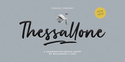 Thessallone is a handwritten brush script font. Perfect for adding a unique impression that looks natural like manual handwriting when opentype is active. This font is great for your next creative project such as Logotype, printed quotes, invitations, cards, product packaging, headers, letterhead, poster, apparel design, label, book cover and etc. Thessallone comes with uppercase, lowercase, numerals, punctuations and so many ligatures variation to let you customise your designs. Thanks
 - Guadalajara JNL by Jeff Levine,
$29.00 Hand lettered, the title on the sheet music for a 1940s hit song "Ti-Pi-Tin" inspired Guadalajara JNL. The melody and original Spanish lyrics were written by Maria Grever, one of Mexico's first successful female composers, with English lyrics supplied by Raymond Leveen. This decorative and fun type face brings to mind fiestas South of the border, and emanates the charm of Mexico's music, dance and colorful costumes.
 - Blacker Valentine by Letterara,
$12.00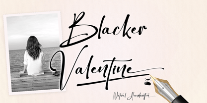 Blacker Valentine is a elegant handwritten font that is simple and unique looking. This customizable font will look great on a variety of design ideas such as Christmas themes, valentine's, posters, invitations, weddings, branding projects, social media posts, magazines, book covers, and more! This will add a fun and friendly touch to any of your projects! This font is PUA encoded which means you can access all glyphs and sweeps easily.
 - Vallenta by Letterara,
$14.00 Vallenta is a bold script font that is simple and unique looking. This customizable font will look great on a variety of design ideas such as Christmas themes, valentine's, posters, invitations, weddings, branding projects, social media posts, magazines, book covers, and more! This will add a fun and friendly touch to any of your projects! This font is PUA encoded which means you can access all glyphs and sweeps easily.
 - Scastea by Madatype Studio,
$19.00 Scastea is a modern stylish Serif font that will make your designs stand out from the crowd. This font features unique ligatures and alternates that add elegance and flair to your texts. Whether you are looking for a font for fashion and beauty designs, logos, headlines, posters, magazines, or any other creative project, Scastea will give you the perfect look. Scastea is easy to use and customize. You can access the ligatures and alternates through OpenType features or by using a glyphs panel. You can also mix and match the uppercase and lowercase letters to create stunning combinations. Scastea comes with a full set of characters, including numbers, punctuation, symbols, and multilingual support. Scastea is more than just a font. It is a statement of style and sophistication. It is a font that will impress your audience and elevate your brand. It is a font that you will love to use and enjoy. Download Scastea today and discover the beauty of this modern stylish Serif font.
 - Belarya Script by Gian Studio,
$12.00 Belarya Script is a modern calligraphy font with the current handwriting style, this font is perfect for branding, wedding invites, magazines, mugs, business cards, quotes, posters, and more, you can try first if you want to buy this font. Belarya Script is equipped with 592 glyphs. and by having many of these glyphs there will be able to choose the letters according to your likes, lots of variations and options for each letter, so you can customize on your design choices. to use a variety of flying machines, you need a program that supports OpenType features such as Adobe Photoshop Cs / Adobe Photoshop CC, Adobe Illustrator CS / Adobe Illustrator CC, Adobe Indesign and Corel Draw and many more programs that support OpenType. If you do not have a program that supports OpenType, you can access all the alternate glyphs using Font Book (Mac) or Character Map (Windows) Thank You for purchase! Designers: Afri Giani Publisher: Gian Studio
 - Stefian Script by Mightype,
$17.00 Stefian Script is a modern calligraphy font with the current handwriting style. This font is perfect for branding, wedding invites, magazines, mugs, business cards, quotes, posters, and more, you can try it first if you want to buy this font. Stefian Script is equipped with 526 glyphs and has 97 ligatures. By having so many glyphs you will be able to choose the letters according to your tast and needs. With lots of variations and options for each letter, you can customize on your design needs. You need a program that supports OpenType features such as Adobe Photoshop Cs / Adobe Photoshop CC, Adobe Illustrator CS / Adobe Illustrator CC, Adobe Indesign and Corel Draw and many more programs that support OpenType. If you don't have a program that supports OpenType, you can access all the alternate glyphs using Font Book (Mac) or Character Map (Windows) If you have any question, do not hesitate to contact me by email mightype89@gmail.com Thanks and happy designing :-)
 - Oliviar Sans by Adam Fathony,
$10.00 Oliviar Sans Variable is a modern sans serif with Grotesque touch. It's my experimental to study the new trends for the future fonts that is Variable Fonts. Inspired by a Geometrical fonts and also Humanist Sans serif. Created with 8 Masters that export to the traditional OTF to 28 Styles!. On the Applications that support variable fonts such as Adobe Illustrator & Photoshop, you can get more than only 28, you can customize the Weight, Width and Slant. Weight created from Thin (100) to Bold (900), Width created from Standard (100) to Expanded (900) and Slant based on degree angle from 1˚ to 10˚. There is a new slider icons for accessing this features Check on Last Display Image. Another advantage on the Variable fonts are you just need 1 files to install to your computer and it will install all the styles available. All of the Fonts are support for Multilanguage, Carefully Crafted.
 - Bellvyne by Krafted,
$10.00 Looking for an elegant but unique serif font that looks equally great on screen as well as on paper? Introducing Bellvyne - A Serif Font. Stylish with a touch of modern, Bellvyne is perfect for making your brand stand out. It’s a great choice for web pages, apps, ads, banners, promotions, printed cards, packaging, and pretty much anything else your project needs. What you’ll get: Multilingual & Ligature Support Full sets of Punctuation and Numerals Compatible with: Adobe Suite Microsoft Office Keynote Pages Software Requirements: The fonts that you’ll receive in the pack are widely supported by most software. In order to get the full functionality of the selection of standard ligatures (custom created letters) in the script font, any software that can read OpenType fonts will work. We hope you enjoy this font and that it makes your branding sparkle! Feel free to reach out to us if you’d like more information or if you have any concerns.
 - Love Hellena by Hrz Studio,
$15.00 Love Hellena Fresh & modern Love scripts with handcrafted calligraphy styles, decorative characters and dancing baselines! Very pretty for invitations such as greeting cards, branding materials, business cards, quotes, posters and more!! Love Hellena comes with 450 glyphs. Alternative characters are divided into several Open Type features such as Swash, Stylistic Sets, Stylistic Alternate, Contextual Alternate. The Open Type feature can be accessed using Open Type savvy programs such as Adobe Illustrator, Adobe InDesign, Adobe Photoshop version of Corel Draw X, and Microsoft Word. And this Font has provided PUA unicode (custom coded font). so that all alternative characters can be easily accessed in full by a craftsman or designer. Love Hellena: Uppercase & Lowercase Letters International Languages & Symbols Support Punctuation & PUA Numbers Unicode Range Standard Alternative Style If you don't have a program that supports OpenType features such as Adobe Illustrator and CorelDraw X Versions, you can access all the alternative glyphs using Font Book (Mac) or Character Map (Windows). Thank You