10,000 search results
(0.12 seconds)
- Bunny Flowers by Gilar Studio,
$16.00 Bunny Flower a Handwritten Display Font With 3 Style (Regular,Outline and Shadow) You Can Mix And Match for Your Awesome Project This fonts is ideal for crafting, branding and decorate your any project. This fonts are perfect for wedding invitation or your blog. Also with their help, you can create a logo or beautiful frame for your home. Or just use for your business, book covers, stationery, marketing, magazines and more. FEATURES : Uppercase & Lowercase Number & Punctuation More than 248 of glyphs Multilingual Language PUA Encode 9 Ligatures Alternate 7 OpenType features were detected in the font (aalt dlig frac liga ordn salt sups kern) Support for 67 languages detected The alternative characters were divided into several Open Type features can be accessed by using Open Type savvy programs such as Adobe Illustrator, Adobe InDesign, Adobe Photoshop Corel Draw X version, And Microsoft Word. And this Font has given PUA unicode (specially coded fonts). so that all the alternate characters can easily be accessed in full by a craftsman or designer. If you don't have a program that supports OpenType features such as Adobe Illustrator and CorelDraw X Versions, you can access all the alternate glyphs using Font Book (Mac) or Character Map (Windows). Check my other Font here : https://gilarstudio.com/ Thanks and happy designing :-)
 - FF Kievit Slab by FontFont,
$65.99FF Kievit Slab is an industrial strength, do anything, go anywhere, kind of design. Its exceptional legibility and straightforward strength contrasts with a friendly humanistic underpinning. Michael Abbink and Paul van der Laan carefully revised character shapes and stroke contrast of FF Kievit, when they adapted them to FF Kievit Slab. The result is that the striking and powerful FF Kievit Slab easily complements the other members of the FF Kievit super family, that also includes FF Kievit and FF Kievit Serif, and stands on its own in as a multi-talented design. Though created from the sans, FF Kievit Slab is not FF Kievit with slabs serifs tacked on. The family is the fruit of a four-year collaboration between Abbink and Van der Laan, to make the perfect companion to the FF Kievit family. Each glyph was painstakingly adjusted and to achieve proper density, contrast, and balance, while remaining a perfect companion to its sans serif and oldstyle cousins. Its nine weights and italics also harmonize perfectly with the original FF Kievit design. Each of the FF Kievit styles is a typographical all-rounder that is equally at home in headlines as it is in text copy. Together, the three designs of the FF Kievit super family span a wide and deep typographic universe in which they support one another perfectly. These fonts will help you achieve your typographic goals, no matter how lofty. Featured in: Best Fonts for Websites - White Rabbit - Unknown license

- Pronto by Sudtipos,
$59.00 Pronto is a fast and breezy calligraphic handwriting font that moves to a timeless beat. Its catchy rhythm and casually artful forms make it a choice font not only for packaging, but also for signs and café bistro boards and menus. Alternative forms for almost every letter are provided within the font. Pronto is a single feature-rich font that includes extra alternate characters, as well as a wide range of Latin-based languages, including Turkish and the languages of Central and Eastern Europe and the Baltic region. To take advantage of all the OpenType features included in the font, please use within programs that support such advanced typography. Designed by Koziupa and digitized by Ale Paul.
 - Orthotopes Oblique - Personal use only

- Orthotopes - Personal use only

- Prismatic Spirals by MMC-TypEngine,
$93.00 PRISMATIC SPIRALS FONT! The Prismatic Spirals Font is a decorative type-system and ‘Assembling Game’, itself. Settled in squared pieces modules or tiles, embedded by unprecedented Intertwined Prismatic Structures Design, or intricate interlaced bars that may seem quite “impossible” to shape. Although it originated from the ‘Penrose Square’, it may not look totally as an Impossible Figures Type of Optical Illusions. More an “improbable” Effect in its intertwined Design, that even static can seem like a source of Kinetical Sculptures, or drive eyes into a kind of hypnosis. Prismatic Spirals has two related families, its “bold” braided version Prismatic Interlaces and the Pro version. While the default is simpler or easier to use, as all piece’s spin in same way, PRO provides a more complex intricate Design which requires typing alternating caps. Instructions: Use the Map Font Reference PDF as a guide to learn the 'tiles' position on the keyboard, then easily type and compose puzzle designs with this font! All alphanumeric keys are intuitive or easy to induce, you may easily memorize it all! Plus, often also need to consult it! *Find the Prismatic Spirals Font Map Reference Interactive PDF Here! (!) Is recommended to Print it to have the Reference in handy or just open the PDF while composing a design with this typeface to also copy and paste, when consulting is required or when it may be difficult to access, depending on the keyboard script or language. As a Tiles Type-System, the line gap space value is 0, this means that tiles line gaps are invisibly grouted, so the user can compose designs, row by row, descending to each following row by clicking Enter, same as line break, while advances on assembling characters. Background History: The first sketches of my Prismatic Knots or Spirals Designs dates back then from 2010, while started developing hand-drawn Celtic Knots and Geometric Drawings in grid paper, while engage to Typography, Sacred Geometry and the “Impossible Figures” genre… I started doing modulation tests from 2013, until around 2018, I got to unravel it in square modules or tiles from the grid, then idealized it as fonts, along with other Type projects. This took 13 years to come out since the first sketches and 6 months in edition. During the production process some additional tiles or missing pieces were thought of and added to the basic set, which firstly had only the borders, corners, crossings, nets, Trivets connectors or T parts and ends, then added with nets and borders integrations. Usage Suggestions: This type-system enables the user to ornate and generate endless decorative patterns, borders, labyrinthine designs, Mosaics, motifs, etc. It can seem just like a puzzle, but a much greater tool instead for higher purposes as to compose Enigmas and use seriously. As like also to write Real Text by assembling the key characters or pieces, this way you can literarily reproduce any Pixel Design or font to its Prismatic Spirals correspondent form, as Kufic Arabic script and further languages and compose messages easily… This Typeface was made to be contemplated, applied, and manufactured on Infinite Decorative Designs as Pavements, Tapestry, Frames, Prints, Fabrics, Bookplates, Coloring Books, Cards, covers or architectonic frontispieces, storefronts, and Jewelry, for example. Usage Tips: Notice that the line-height must be fixed to 100% or 1,0. In some cases, as on Microsoft Word for example, the line-height default is set to 1,15. So you’ll need to change to 1,0 plus remove space after paragraph, in the same dropdown menu on Paragraph section. Considering Word files too, since the text used for mapping the Designs, won't make any literal orthographical sense, the user must select to ignore the Spellcheck underlined in red, by clicking over each misspelled error or in revision, so it can be better appreciated. Also unfolding environments as Adobe Software’s, the Designer will use the character menu to set body size and line gap to same value, as a calculator to fit a layout for example of 1,000 pts high with 9 tiles high, both body size and line gap will be 111.1111 pts. Further Tips: Whenever an architect picks this decorative system to design pavements floor or walls, a printed instruction version of the layout using the ‘map’ font may be helpful and required to the masons that will lay the tiles, to place the pieces and its directions in the right way. Regarding to export PNGs images in Software’s for layered Typesetting as Adobe Illustrator a final procedure may be required, once the designs are done and can be backup it, expanding and applying merge filter, will remove a few possible line glitches and be perfected. Technical Specifications: With 8 styles and 4 subfamilies with 2 complementary weights each (Regular and Bold) therefore, Original Contour, Filled, Decor, with reticle’s decorations and 2 Map fonts with key captions. *All fonts match perfectly when central pasted for layered typesetting. All fonts have 106 glyphs, in which 48 are different keys repeated twice in both caps and shift, plus few more that were repeated for facilitating. It was settled this way in order for exchanging with Prismatic Spirals Pro font which has 96 different keys or 2 versions of each. Concerning tiles manufacturing and Printed Products as stickers or Stencils, any of its repeated pieces was measured and just rotated in different directions in each key, so when sided by other pieces in any direction will fit perfectly without mispatching errors. Copyright Disclaimer: The Font Software’s are protected by Copyright and its licenses grant the user the right to design, apply contours, plus print and manufacture in flat 2D planes only. In case of the advent of the same structures and set of pieces built in 3D Solid form, Font licenses will not be valid or authorized for casting it. © 2023 André T. A. Corrêa “Dr. Andréground” & MMC-TypEngine.
 - Scripps College Old Style by Monotype,
$49.00The story of Scripps College Old Style is a heart-warming and inspiring chronicle about a young librarian, a handful of students, a wealthy grandmother, a dedicated educator -- and two eminent American type designers. The story begins in 1938, when Dorothy Drake, the newly hired librarian at Scripps College, a small women's college in southern California, became an impromptu dinner companion of the American type designer Fred Goudy. By the 1990s, the original fonts that Goudy had created for Scripps College in the 1940s had become prized -- but they were seldom-used antiques. Scripps needed digital versions of the metal fonts. This goal posed two immediate challenges: finding a designer familiar with letterpress printing who was skilled at creating digital fonts, and locating the money to commission the designer's services. The first challenge was the easiest to conquer. Sumner Stone was my first and only choice," recalls Kitty Maryatt, the current curator of the Scripps College Press. "I knew he had letterpress experience, was an accomplished calligrapher, and that his typeface designs were simply exquisite. The choice was easy."The second challenge was more difficult. It took the dedication, hard work and tenacity of Maryatt to bring the beautiful Goudy designs into the twenty-first century. While Stone was eager to begin work on the project, the college had no more money for new typeface designs in the 1990s than it did in the1930s. Years of lobbying, cajoling and letter writing were necessary to obtain the college's approval for the design project. Once she had the necessary funding, the design brief posed yet a third challenge. Goudy had provided two sizes of type to the Press: 14 point and 16 point. Which would serve as the foundation for Stone's work? In addition, the Goudy fonts were quite worn. Should Stone use printed samples as his design master, or base his work on the original Goudy renderings? The 14-point master drawings were the ultimate choice, with the stipulation that the finished fonts would provide both a seamless transition from the worn metal versions and a faithful representation of the original Goudy designs. Once the budget and design brief were established, the process of converting the original Goudy drawings into digital fonts took just a little over two months. Stone delivered finished products to Scripps in the fall of 1997. The first official use of the fonts was to set an announcement for a lecture by Stone at Scripps in February of 1998. But the story is not quite finished. Maryatt was so pleased with the new digital fonts, she wanted to share them with the graphic design community. At Stone's suggestion, she contacted Monotype Imaging with the hope that the company would add the new designs to its library. An easy decision! Now Monotype Imaging is part of the story. We are proud to announce the release of Scripps College Old Style as a Monotype Classic font. The once exclusive font of metal type is now available in digital form for designers around the world. " - Take Note by wearecolt,
$9.00 Take Note Craft Handwritten Display Introducing Take Note, a beautiful and playful handwritten font. Using ligatures and stylistic alternatives for a natural flow and feel. A cute handwritten font for logotype, blog heading or even Instagram quotes.
 - Ginger Mate MS by Redcollegiya,
$8.00 Ginger Mate is a handwritten funny font duo which makes it great for Christmas cards or advertising, as well as for any children's design. Each of these fonts include latin and cyrillic characters, diacritics, numbers and punctuation.
 - Bagusih by Twinletter,
$15.00 Bagusih is the perfect font for anyone who wants to bring their designs to life with a bold, unique look that’s sure to stand out from the crowd. With its retro-inspired design, this font is perfect for those who want to create a 60s-inspired aesthetic, or who want to give their designs a retro feel. And with its bold and geometric design, Bagusih is also perfect for those who want to create a geometric look with lots of impacts. So whether you’re looking for a retro or geometric look, Bagusih is the perfect font for you.
 - Sadio by Abo Daniel,
$21.00 introducing SADIO - the extended signature - This font is created specifically for logotypes. Yes, this font is only suitable for making logos or headline text. This font is not suitable for use in subtitles or main content. It is great for branding, business card, signature, and more. I also created the lowercase swash to completed this product. You can combine the standard character and the swash. It is perfect. Very easy to access the lowercase swash, you only need to add underscore twice after the lowercase characters. For example a_ _ it will be a with swash. Features: Uppercase Lowercase Number & Punctuations Swash PUA encoded
 - Segoe Chess by Microsoft Corporation,
$29.00Segoe™ Chess font is part of the Segoe family of fonts from Microsoft. The Segoe Chess font contains the chess figurines and symbols for creating chess diagrams. Segoe Chess was designed by Jim Ford and is a symbol-encoded font. - The Night Lamp by Putracetol,
$28.00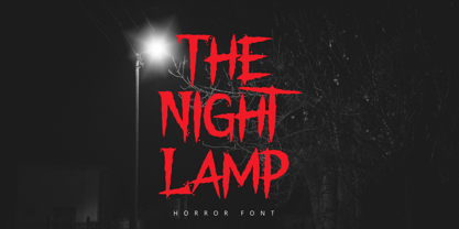 The Night Lamp is a horror style display font. Inspired from horror thriller movie. This font designed for Halloween, Horror, Thriller and Scary theme projects. The Night Lamp would be perfect for logo, quotes, apparel, comic, cover books, cards, posters, or anything that requires a horror or scarylook!
 - Parto by Naghi Naghachian,
$78.00 Parto Font family is designed by Naghi Naghashian. This Font is developed on the basis of specific research and analysis on Arabic characters and definition of their structure. This innovation is a contribution to modernization of Arabic typography, giving the font design of Arabic letters real typographic arrangement and providing more typographic flexibility. It enables, moreover, the use of this typeface for decorative headlines. This step was necessary after more than two hundred years of relative stagnation in Arabic font design. Parto supports Arabic, Persian, and Urdu. It also includes proportional and tabular numerals for the supported languages. Parto Font is available in Regular and Bold. Parto design fulfills the following needs: A Explicitly crafted for use in electronic media fulfills the demands of electronic communication. Parto is not based on any pre-digital typefaces. It is not a revival. Rather, its forms were created with today’s technology in mind. B Suitability for multiple applications. Gives the widest potential acceptability. C Extreme legibility not only in small sizes, but also when the type is filtered or skewed, e.g., in Photoshop or Illustrator. Parto's simplified forms may be artificial obliqued in InDesign or Illustrator, without any loss in quality for the effected text. D An attractive typographic image. Parto was developed for multiple languages and writing conventions. E The highest degree of geometric clarity and the necessary amount of calligraphic references. This typeface offers a fine balance between calligraphic tradition and the contemporary sans serif aesthetic now common in Latin typography.
 - Paperboard by Anastasia Kuznetsova,
$14.00 I present my funny and very cute font "Paperboard" Great for sweet greeting cards and invitations, for playful branding and quotes, for unusual packaging and much more! This font is unique and lightweight:) Font Features • character set A-Z; • 1 languages (English) It is recommended to use it in Adobe Illustrator or Adobe Photoshop Made with love ♡ Thank you for stopping by, and I wish you a creative day!
 - Brandan by Andfonts,
$69.00 If you're looking for the perfect font to make your logo stand out, then look no further than Brandan font. This modern and cool font is sure to give your logo, text, or any other design element a unique and eye-catching look. Whether you're looking for a font for a logo, lettering, website, or something else entirely, Brandan font has got you covered. Plus, it looks great on both light and dark backgrounds, so you know your design is going to look nice no matter where it's seen. Check out Brandan font today and give your design a professional edge!
 - Golga by Gassstype,
$23.00 Here comes a New font, Golga is Unique Bold Display Font this is strong Font, that is written casually and quickly amazing. Then crafted carefully drawn into vector format. This font is great for your next creative project such as logos, printed quotes, invitations, cards, product packaging, headers, Logotype, Letterhead, Poster, Label, and etc.It is perfect for any design project as Invitation,logo, book cover, craft or any design purposes.this font is great for your creative projects such as watermark on photography, and perfect for logos & branding.
 - Bellyman by Alit Design,
$19.00 Introducing Bellyman Typeface The Bellyman Typeface is made with the concept of a modern font display that gives a unique impression because it has a curvy shape like waves that is charming and unique. The serif style adopted by the Bellyman font is a 2022 style font, has a unique swash alternative, has a large selection of ligatures. In addition. Serif typefaces such as “ Bellyman typeface” are very easy to apply to any design, especially those with an elegant and smooth concept, besides that this font is very easy to use both in design and non-design programs because everything changes and glyphs are supported by Unicode (PUA). The Bellyman typeface contains 623 glyphs with many unique and interesting alternative options. In the poster preview all the letters are in the Mongkeg typeface.
 - Mankey by Alit Design,
$18.00 Introducing Mankey Typeface The Mankey Typeface is made with the concept of a modern font display that gives a unique impression because it has a curvy shape like waves that is charming and unique. The serif style adopted by the Mankey font is a 2022 style font, has a unique swash alternative, has a large selection of ligatures. In addition. Serif typefaces such as “ Mankey typeface” are very easy to apply to any design, especially those with an elegant and smooth concept, besides that this font is very easy to use both in design and non-design programs because everything changes and glyphs are supported by Unicode (PUA). The Mankey typeface contains 704 glyphs with many unique and interesting alternative options. In the poster preview all the letters are in the Mankey typeface.
 - Versailles LT by Linotype,
$57.99 The origins of the font Versailles go back to the 19th century in France when, with the introduction of lithography, alphabets could contain freer forms. The basic forms are Modern Face with triangular serifs. The direct influence for Versailles was the writing on the back of the memorial to Charles Garnier, the architect of the Paris Opera. Versailles is a classic font for advertisements, perfect for shorter texts and titles/headlines and it makes an impression of elegance and strength.
 - Parsi by Naghi Naghachian,
$105.00 Parsi Font family is designed by Naghi Naghashian. This Font is developed on the basis of specific research and analysis on Arabic characters and definition of their structure. This innovation is a contribution to modernization of Arabic typography, gives the font design of Arabic letters real typographic arrangement and provides more typographic flexibility. This step was necessary after more than two hundred years of relative stagnation in Arabic font design. Parsi supports Arabic, Persian, and Urdu. It also includes proportional and tabular numerals for the supported languages. Parsi Font is available in Light, Regular and Bold. Parsi design fulfills the following needs: A Explicitly crafted for use in electronic media fulfills the demands of electronic communication. Parsi is not based on any pre-digital typefaces. It is not a revival. Rather, its forms were created with today’s technology in mind. B Suitability for multiple applications. Gives the widest potential acceptability. C Extreme legibility not only in small sizes, but also when the type is filtered or skewed, e.g., in Photoshop or Illustrator. Parsi's simplified forms may be artificial obliqued in InDesign or Illustrator, without any loss in quality for the effected text. D An attractive typographic image. Parsi was developed for multiple languages and writing conventions. E The highest degree of geometric clarity and the necessary amount of calligraphic references. This typeface offers a fine balance between calligraphic tradition and the contemporary sans serif aesthetic now common in Latin typography.
 - Tallove by Attype Studio,
$16.00 Tallove is lovely script font with swash on beginning & ending word. This font perfect for valentine & wedding theme design. Combine it with Tallove beginning, ending swash & ligatures to make perfect design for yor projects. Tallove perfect for valentine promotion, wedding invitation, branding, logo, invitation, stationery, social media post, product packaging, merchandise, blog design, game titles, cute style design, Book/Cover Title and more. What's Included : - Tallove Font - Beginning Swash - Ending Swash - Ligature - Multilingual Support --- Hope you enjoy with our font! Attype Studio
 - Industria by Linotype,
$40.99Brody’s fonts borrow elements from both Art Deco and non-Western styles. His designs received international recognition for their innovative, computer-oriented style, reaching almost cult status. Four original Brody fonts are available from Linotype Library GmbH: Insignia, Industria-Solid, Industria Inline and Arcadia. For your convenience, we have gathered all four into one package. Industria is a font which speaks of mechanical exactness, cool and reserved. Industria Inline is a lighter version of Industria Solid. - Obla by LetterPalette,
$20.00 The Obla font family is a modern serif typeface accompanied by appropriate italic in seven weights. Sketches of letters were drawn manually, using thick marker for creating shape and pencil for finishing details. Calligraphic origin of shapes is revealed beneath strained curves drawn on computer. All of the weights were carefully adjusted to each other. Obla is equipped with some basic OpenType features and supports Cyrillic and Latin script. Using Obla in small sizes is very convenient, because of its large x-height, and Obla is a very readable typeface. It seduces the reader with its vivacious character. The typeface is also suitable for usage in large sizes. The best choice for headlines is using the heaviest (Black) and the lightest (Thin) weight. There are two smaller family packages in offer: Obla Basic Set contains Regular, Italic, Bold and Bold Italic, while Obla Light Set contains Light, Light Italic, SemiBold and SemiBold Italic. These two sets are the most appropriate for working with small text. Other weights can be bought separately, or within the whole family. Obla is an awarded typeface. It got Special Mention in Cyrillic Typefaces category in Granshan 2016 competition and it was chosen as a Merit Winner in Print’s Typography and Lettering Awards competition. At that time, before publishing, the typeface was named Petra.
 - Pinmold by Letterhend,
$17.00 Introducing, Pinmold, a modern stencil display font suitable for military theme design, urban street style, or even for gaming title for a war game. This type of font also perfectly made to be applied especially in logo, headline, signage and the other various formal forms such as apparel, novel, label / packaging, and various advertising purposes. Features : numbers and punctuation multilingual PUA encoded regular and rough version We highly recommend using a program that supports OpenType features and Glyphs panels like many of Adobe apps and Corel Draw, so you can see and access all Glyph variations.
 - Merside by Putracetol,
$28.00 Merside - Premium Serif Font Merside - Premium Serif Font is a stunning typeface that exudes sophistication and elegance. The font's clean and crisp lines make it a versatile choice for various design projects, from high-end branding to classic book covers and posters. The font was crafted with the utmost care and attention to detail, resulting in a timeless typeface that will elevate any design. Merside - Premium Serif Font is the perfect choice for designers who want to convey a sense of luxury and exclusivity in their work. The font's classic serif style adds a touch of refinement, while the clean lines give it a modern twist. Whether you are designing a logo for a luxury brand, creating marketing materials for a high-end fashion label, or designing a product packaging, Merside will add a touch of elegance and sophistication to your project. One of the standout features of Merside - Premium Serif Font is its OpenType features, which include alternates and ligatures. These features give designers more creative freedom, allowing them to customize the font and create unique and eye-catching designs. The font also includes uppercase and lowercase letters, as well as number, punctuation, and symbol glyphs. Additionally, Merside supports multiple languages, making it an excellent choice for global brands. The font is compatible with a wide range of design software and platforms. You can easily install and use Merside - Premium Serif Font on your computer or device, making it a convenient and accessible choice for designers. If you are looking for a premium serif font that will make your design stand out, Merside - Premium Serif Font is an excellent choice. With its elegant and refined style, it is perfect for creating luxury branding, elegant design, and high-end fashion. This font will give your project a timeless and classic look that will never go out of style. In summary, Merside - Premium Serif Font is a stunning and versatile font that is perfect for designers who want to create high-end and sophisticated designs. With its classic serif style, OpenType features, and multilanguage support, it is a font that will elevate any design project.
 - Blockography - Personal use only

- AZ Kiss by Artist of Design,
$20.00 AZ Kiss font is inspired from sketches. This font is designed for use as a worn and antiqued headline or subheadline.
 - DIVERGENT - Personal use only

- Comic Tantrum by David Engelby Foundry,
$25.00 Comic Tantrum is a versatile font – you can use it for headline posters, for infographics, for web pages or other media, when you need an expressive comic font. And you can skew it and squeeze it. It also has many special designed alternates, swash versions and ligatures. Have fun!
 - Birani by Attype Studio,
$16.00 Birani is lovely script font with swash on beginning & ending word. This font perfect for valentine & wedding theme design. Combine it with Birani beginning, ending swash & ligatures to make perfect design for yor projects. Birani perfect for valentine promotion, wedding invitation, branding, logo, invitation, stationery, social media post, product packaging, merchandise, blog design, game titles, cute style design, Book/Cover Title and more. What's Included : - Birani Family Font - Ligature - Multilingual Support - Beginning & Ending Swash
 - Akagi by Positype,
$25.00 Akagi started as a rough sketch while on a really long plane ride to Tokyo in 2007. I wanted to develop a sans that was a complete departure from my successful Aaux Pro (now Aaux Next) sans serif family. Whereas Aaux and its siblings are rather unforgiving and stark in their presentation, I wanted this new sans serif to "smile" at you when it's on the page. When the plane landed and I realized I did not sleep through the 15 hour trip, my brain shut off, the laptop closed and I hopped in the car to the hotel—forgetting the "new sans" folder on my desktop. Fast forward a few months and I found myself seeing a lot of crisp, rigid, robot-like sans serif typefaces everywhere... I enjoy these new crop of faces but wanted to see something "friendlier" and remembered my earlier sketch work. The groundwork was there screaming at me to complete and Akagi arose from the ashes. To be truly satisfied with it personally, a great deal of time was spent trying to create a harmony between line and curve in an attempt to show that you can be crisp, clean and legible and still keep some personality. The Light and Fat weights (regular and italic) are my favorites and I hope to see them as the workhorses of the typeface.
 - Wood Type DIY by TypoGraphicDesign,
$19.00 The typeface Wood Type DIY is designed from 2016–2022 for the font foundry Typo Graphic Design by Manuel Viergutz. The display font based on the original wood letter from flea market. The font started from 50 wood letters (analog) and was finally digitalize and extended to 300+ glyphs (digital). 4 font-styles (Rough, Clean, Mix, Impact) with 320 glyphs incl. decorative extras like icons, arrows, dingbats, emojis, symbols, geometric shapes (type the word #LOVE for ❤️ or #SMILE for 🙂 as OpenType-Feature dlig) and stylistic alternates (9 stylistic sets). For use in logos, magazines, posters, advertisement plus as webfont for decorative headlines. The font works best for display size. Have fun with this font & use the DEMO-FONT (with reduced glyph-set) FOR FREE! Font Specifications ■ Font Name: Wood Type DIY ■ Font Styles: 4 (Rough, Clean, Mix, Impact) + DEMO (with reduced glyph-set) ■ Font Category: Display for headline size ■ Font Format:.otf (Mac + Win, for Print) + .woff (for Web) ■ Glyph Set: 320 glyphs incl. extras like icons (decorative extras like arrows, dingbats, emojis, symbols) ■ Design Date: 2016–2022 ■ Type Designer: Manuel Viergutz
 - Voltexa by Ardyanatypes,
$10.00 Voltexa is a sans-serif font that offers 10 thickness levels, ranging from thin to extra black. Designed with a bold and firm style, it aims to provide a broad range of options for every designer. What sets Voltexa apart are its sharp curves in each letter, creating an elegant and modern yet strong impression. Tailored to meet diverse design needs, Voltexa can adapt to various contexts. With 10 available thickness levels, designers have the freedom to express their creativity limitlessly. This font also comes with OpenType features for ease of use and flexibility. Voltexa also supports multilingual use, allowing it to be utilized in various languages. Let's bring forth inspiring and powerful designs using the Voltexa font. With its 10 available thickness levels, this font offers designers the opportunity to create unique and standout works. The distinctiveness of each letter will enhance the aesthetic value of every design project. Use Voltexa to add an elegant, modern, and assertive touch to your creative works. With its comprehensive features and multilingual capabilities, this font will be a loyal partner in expressing your design ideas and visions into extraordinary works. Features: A – Z Character Set a – z Characters set Numerals & Punctuations Ligatures & Alternates Multilingual
 - Penabico by Intellecta Design,
$23.90 After 13 months of hard work, Iza W and Intellecta Design are proud to announce Penabico. This is a free interpretation of the copperplate script styles to be found in the Universal Penman . London, 1741 , the monumental publication of engraved work by George Bickham (along with collaborators Joseph Champion, Wellington Clark, Nathaniel Dove, Gabriel Brooks, William Leckey and many others). This enhanced OpenType version is a complete solution for producing documents and artworks which need this kind of calligraphic script: 100s of stylistic alternates for each letter (upper- and lowercase), accessed with the glyph palette; 250 ornaments and fleurons (mostly in the copperplate roundhand renaissance style) encoded in the dingbats range and accessed with the glyph palette (plus a special set with over 50 of these ornaments accessed with the ornaments feature); an extensive set of ligatures (100s of stylistic and contextual alternates plus discretionary ligatures) providing letterform variations that make your designs really special, resembling real handwriting on the page; complete, intricate, ready-made calligraphic words; abbreviations (in many languages). The principal font contains the complete Latin alphabet, including Central European, Vietnamese, Baltic and Turkish with all diacritic signs, punctuation marks (including interrobang ). The German ‘ß’ (germandbls, eszett, sharp s) even has over six different alternate forms. And we don't forget to add the unconventional germandbls uppercase. In non-OpenType-savvy applications it works well as an English commercial script style font. Because of its high number of alternate letters and combinations (over 1500 glyphs), we suggest the use of the glyph palette to find ideal solutions to specific designs. The sample illustrations will give you an idea of the possibilities. You have full access to this amazing stuff using InDesign, Illustrator, QuarkXpress and similar software. However, we still recommend exploring what this font has to offer using the glyphs palette. Two last things — we have placed some of the ornaments, catch-words and other material in supplementary fonts, for easier access in non-OpenType-savvy programs. They are: Penabico Words (see the pdf user guide in “Gallery”), Penabico Abbreviations (free font), and Penabico Extras (free font). And, when buying Penabico you get the 'Penabico EPS Bonus Set", a gift pack containing various highly intrincated frames in EPS format, easy and ready to work with your preferred vector design software like Corel or Illustrator (see the pdf in the Gallery). Know too our other superscript font : Van den Velde Script at http://new.myfonts.com/fonts/intellecta/van-den-velde-script/
 - Mreyboll by Twinletter,
$17.00 The ideal display font for sporting goods is MREYBOLL. This amazing sports typeface is available in a range of styles, and the little contemporary cutouts that are highlighted at each corner give it a dynamic tilt. Perfect for games, titles, sports designs, logos, and car projects. This typeface can also be used for contemporary text or a monogram. Unlike other sports fonts, Mreyboll is superior and has a highly manly, crisp feel that gives it more force and speed effect. Check it out and purchase it soon for a distinctive design experience. It was created to be a strong, dynamic font with a little different font style. What’s Included : - File font - All glyphs Iso Latin 1 - Alternate, Ligature - Simple installations - We highly recommend using a program that supports OpenType features and Glyphs panels like many Adobe apps and Corel Draw so that you can see and access all Glyph variations. - PUA Encoded Characters – Fully accessible without additional design software. - Fonts include Multilingual support
 - Weird Words by Sarid Ezra,
$15.00 Weird Words is a weird and trendy font based sans that have unique looks. This font contains uppercase and lowercase that have different form. You can use the lowercase and uppercase in the same word that will make your text more stand out! You can use this font for the social media post, poster, and suitable for headline. This font also support multi language.
 - IM FELL French Canon - Unknown license

- Cutmark by J Foundry,
$25.00 INDUSTRIAL-STRENGTH UTILITY. Designed for function. Cutmark fonts features common 45˚ chamfered corners, flattened ink traps and wide apex forms. Customize the look with alternates including an Angled Set, Straight Set, Beam I, single-story a, and hooked l. The OpenType version includes 10 weights in 3 widths with matching italics. Variable Font Cutmark Variable contains the full family of styles in a single file! Select variations along width, weight and slant axes. Test and explore at jfoundry.com. Cutmark Variable is included in the complete package at no additional cost. Use which ever font format you prefer! Please email hello@jfoundry.com for any questions. Variable Fonts require MacOS 10.14 or higher. For browser and software support visit: v-fonts.com/support


