10,000 search results
(0.077 seconds)
- DS Kolovrat - Unknown license

- Breathy Signature by Nathatype,
$29.00 Reveal your very best design result that makes everyone brainstorming easily with Breathy Signature. It's a versatile monoline signature font. The brushstrokes and curves style applied to the characters that resemblance to actual handwriting gives this font natural yet elegant feels. This font also easy to read and will look great in a variety of sizes. Features: Stylistic Sets Ligatures Swashes Numerals and Punctuations PUA Encoded It can be used for many design projects, such as poster, logo, book cover, branding, heading, printed product, merchandise, quotes, social media campaign, etc. Get more inspiration about how to use it by seeing the font preview. Thank you for purchasing our fonts. Please don’t hesitate to contact us, if you have any further question or issues. We’re happy to help. Happy Designing.
 - Dancing In The Rain by Pen Culture,
$14.00 Proudly present "Dancing In The Rain" Dancing in the rain is a simply nostalgic font that will always remind us of the 80s and 90s. This font has a smooth curve in both the regular and italic versions. This font can be used for both headlines and body text. you can also apply it for various other needs such as fashion, skincare, and much more. This font is has full of uppercase and lowercase letter, number, punctuation. This font also has multilingual support and of course it is PUA Encoded. I really hope you enjoy it – please do let me know what you think, comments & likes are always hugely welcomed and appreciated. More importantly, please don’t hesitate to drop me a message if you have any issues or queries. Thank you
 - Fibra One by Los Andes,
$26.00 Fibra One looks like a “soft” version of the Fibra font, but it is actually more than that—the second part of its name suggests that it is a reinterpretation of the original typeface. While this new version maintains the overall structure of Fibra and influence of the Avant Garde font, its shapes are different from those found in its predecessor—Fibra One features both soft corners and smooth transition between curved and straight sections. This gives the font a more dynamic and playful personality. Fibra One keeps the original contrast between curves and straight lines in glyphs such as ’n’ and ‘h’ (not found in rounded glyphs such as ‘a’ and ‘d’); details of display characters (e.g. three upper terminals in ‘W’ and projection off the stem in ‘A’); and exaggerated terminal in ‘R’. All these features give Fibra One a strong personality—a typeface that ‘gives you the chills’. Fibra One was specially designed for display use. The font has a very generous x-height that allows for use in corporate text, thanks to its good readability. Fibra One comes with 2 subfamilies—a more ’normal’ Basic family, with a smaller amount of stylistic features, for use in subheadings or any other type of text that requires formality, and an Alt family that shows off the true potential of the font, making it the perfect choice for magazine headlines, posters and logotypes.
 - Moonie Eyes by IKIIKOWRK,
$19.00 Proudly present Moonie Eyes - Graffiti Type, created by ikiiko. Moonie Eyes is a handwritten font with spontaneous curves inspired by street art markings. The letters bubble and pile up on each other to become strong characters in this graffiti letters. You can play with separate characters or overlapping each other. This type is very suitable for making a streetwear brand, poster or magazine layout, fashion design, quotes, or simply as a stylish text overlay to any background image. What's Included? Uppercase & Lowercase Numbers & Punctuation Multilingual Support Works on PC & Mac Enjoy our font and if you have any questions, you can contact us by email : ikiikowrk@gmail.com
 - Pawmor by Jipatype,
$27.00 ขอแนะนำ Pawmor ฟอนต์ sans-serif ใหม่ที่น่ารักและขี้เล่น ซึ่งจะเพิ่มความน่ารักให้กับงานออกแบบของคุณ! แบบอักษรนี้เหมาะสำหรับโปรเจ็คที่เกี่ยวข้องกับสัตว์เลี้ยงหรือสัตว์ต่างๆ ด้วยขอบที่โค้งมนและส่วนโค้งที่นุ่มนวล ให้ความรู้สึกอบอุ่นและเป็นกันเองจนยากจะต้านทาน Pawmor มีให้เลือกถึง 18 แบบ ให้คุณได้เลือกใช้ตามความต้องการของคุณ ด้วย Pawmor คุณสามารถสร้างงานออกแบบที่สะดุดตาสำหรับธุรกิจเกี่ยวกับสัตว์เลี้ยง งานกิจกรรมต่างๆ เกี่ยวกับสัตว์ โดยรวมแล้ว Pawmor เป็นตัวเลือกที่สมบูรณ์แบบสำหรับทุกคนที่ต้องการเพิ่มความแปลกใหม่และความสนุกสนานให้กับงานออกแบบของคุณ Introducing Pawmor, the adorable and playful new sans-serif font that will add a touch of cuteness to your designs! This font is perfect for any project that revolves around pets or animals. With its rounded edges and soft curves, it exudes a warm and friendly vibe that's hard to resist. Pawmor comes in 18 different styles, giving you plenty of options to choose from. With Pawmor, you can create eye-catching designs for pet-related businesses, animal-themed events. Overall, Pawmor is the perfect choice for anyone looking to add a touch of whimsy and playfulness to their designs
 - Alfazine Script by Mysterylab,
$24.00 Alfazine Script is a bold and spirited script with extensive ornate detailing. This versatile font is evocative of antique signpainters' letters, circus wagon & carnival booth graphics, groovy 1960s psychedelic scripts, and even sportswear team insignias, all combined with a modern approach towards lively curlicues and ball finial stroke ends. As with all other font offerings from Mysterylab Designs, we take great care with artful kerning and weight-matching of glyphs to allow this font to be used not only at attention-grabbing headline and logo sizes, but also at small body copy sizes in extended passages. Alfazine also features an extruded shadow version that's very useful for designing logos and customized layered lettering.
 - 750 Latin Uncial by GLC,
$38.00 This font was inspired by the Latin script used in European monasteries from circa the 5th to 8th centuries, before the Carolingian “Caroline” (look at our 825 Karolus). It was a regular script, rounded, written slowly, used mainly for specially meticulous books, with a few ligatures, legible, but only with lowercase. The capitals consisted of enlarged lower cases, but here, we have preferred to use two slightly different patterns. Our lower cases are a synthesis from a lot of variants (mainly from the “First Bible” of Charles The Bald), the upper cases were mainly inspired from a 700’s manuscript from the abbey of Fécamp (France). We have adapted the font for contemporary users, differentiating between U and V, I and J, which has no relevance for ancient Latin scribes, and naturally with Thorn, Oslash, Lslash, K, W... punctuation and the usual accented characters which did not exist at the time. It can be used with 799 Insular Title.
 - Lenga by Eurotypo,
$29.90 Lenga is a kind of beech originally from South America. The explorers who discovered this beech in Tierra del Fuego, thought it looked like a tree from their home country and named it 'Lenga'. Like many of southern hemisphere beeches, the Lenga beech is fast growing and hardy, making it an ideal timber tree. It regenerates easily after fires. The wood has good quality, moderate durable, and easy to work. The Lenga fonts were inspired in the nobility, robustness and flexibility of those trees. They have a distinctive personality within contemporary atmosphere. These fonts are quite appropriate for headlines, subheadings and with its text flow works very well for long texts. Their legibility is suitable for editorial purposes mainly in newspapers and magazines. Lenga comes in 16 styles carefully done in OpenType format. All styles contain standard and discretional ligatures, proportional lining figures, lining old style figures, scientific superior/inferior figures. The complete set supports Western European, Central and Eastern European languages.
 - Cenizas by Sudtipos,
$79.00 Cenizas is another masterpiece of rough-and-tumble script from the prolific Argentine duo of Koziupa and Paul. Although the overall 'wildness' of Cenizas is reminiscent of popular mid-twentieth-century English display scripts, Koziupa's Latin brush humor and ingenuity remain evident in the underlying structure of the design. Casual, care-free and adventurous, Cenizas can be a great choice for design applications relating to active behavior, like outdoor sports and travel. It also is enough of a rough script to be quite useful in a variety of other design contexts, such as the covers of art books or historical novels, museum literature, music sleeves and posters, or even map designs.
 - Amerika Pro - 100% free

- Kylemott by Typotheticals,
$10.00Kylemott was developed from an earlier font called Quadlateral. It was a look at the curve and line used in an angular fashion. - Capellina by Outras Fontes,
$35.00 Capellina is a responsive type family comprised of four styles – two script fonts and two small caps romans – built to work together in typographic compositions intended to catch the eye. The fonts will work in your app as you can see in the presentation above. They can be seen as some kind of lettering machines programed to take advantage of swashes (specially at the beginning and and at the end of text lines) and to avoid stroke collisions. Because of the Contextual Alternates feature, the letters will change while you’re writing. Just use any OpenType-compatible software, keep this feature activated and the font’s algorithm will do the rest. In Capellina Script and Capellina Rough you can also use the stylistic alternates / stylistic sets feature if you want to explore some extra letterforms.
 - Vincenza Display by The Rare Form,
$35.00 Vincenza Display is a modern high-contrast semi-sans with sharp edges and sleek curves. A distinctive typeface for exquisite headlines. Winner, Gold Award, Graphis 2018 Typography 4. http://www.graphis.com/entry/f6b469fe-c5d3-4bea-87e3-796c1d727b3c/ We felt there was a missing in the world of fashion-forward high-contrast typefaces, so we created Vincenza Display. Based loosely on the proportions of Bodoni, Vincenza features stylized curved descenders and unique semi-serifs, bringing a bold and distinct look to your headlines. The typeface has several alternates and ligatures, and is spaced for all caps as well as sentence case executions. It also contains a robust number of special characters. Vincenza Display is the debut typeface from the team at The Rare Form.
 - Mr Palker by Letterhead Studio-YG,
$35.00 A slab serif Mr Palker and grotesque Mr Palkerson build one superfamily together. These are blank types. In a way even the display ones. Typefaces for newspapers, announcements, cheap advertising and police posters. Mr Palker and Mr Palkerson will turn every language into a fence. And due to six types of faces one can choose what material should the fence be made from — from Thin steel rods to the Black stone blocks. In their simplest appearance Mrs P&P are intended for the solid blank composition in victorian or industrial style. They are quite decent, a bit old-fashioned slab serif and grotesque with closed aperture. All my types have layers. Walker and Palkerson also do. Besides the standard set of symbols, they have 4 add-ons. 1. Alternate glyphs, including unicase ones. 2. Ligatures with A letter. 3. Extra tall small caps. 4. Two-storey ligatures. All this options are intended for the complex composition. The additional letters are rather eccentric as their main function here is to imitate the victorian oddities. Imitate, parody, just not repeat. There are lower-case As and Es in the set in height of small caps and uppercases. They can turn every writing into the unicase. The lower-case A (as well as uppercase and small caps version of it) has deliberately by my taste grown a ludicrous tail. To compensate it I’ve built all the possible ligatures - ад, ал, ая. There are 35 of this ligatures all together. Take a closer look at the Russian letters D, L, K, Ya from the main set as well as their alternates. The additional glyphs are one more comic than the other — on purpose to imitate (not to repeat!) the victorian set. This sets have lowercase numbers. And small caps numbers as well. What a modern typeface without them. They also have an У-letter with a generously curvy tail. As if before the WWI. The Latin of course has alternates as well. It has letters to make the perfect French sound more like the russian provincial version of it. The tails of Js and Ts can be made a little bit more open — or a little bit closed. My favorite feature here, an invention of a kind - extra tall small caps. It allows to compose logos with the small caped uppercases directly from the keyboard. The small caps of this typefaces are usually much taller than the customary ones. This is the kind of small caps that Palker and Palkerson have. More to that, the strokes’ weight and the letters width are corresponded to the uppercases. Just a ready set for making a logo a la 1913 style. With a unicase, one has to mind! One more trick with the tall small caps is a possibility to make them work like lower uppercases. Their height is just in between of lower- and uppercases. Isn’t it great to have an additional set of uppercase working ponies in stock for the case of emergency. And finally — the trademark of Palkers family, two-storey ligatures. They are made in the height of uppercases and turn every writing into an ornament or a puzzle of a kind, while at the same time making them much shorter. Each face has 90 of them. Mainly those are twins: CC, BB, DD and so on. ll this things are for the unhasty compositing, even for lettering. Which means that for the things which are not there you always should have Command+Option+O and some patience. Also — among the two storey ligatures one also can find some belvedere villas. All my types are glasses from the one kaleidoscope. The P&Ps family was preliminary part of the victorian set, which already has 1 Cents and Clarendorf - optionally one can add Costro, Gordoni, Handy, Guardy, Surplus, Red Ring, Red Square, Babaev to the list. And also Sklad, Odessa, Dreamland, Romb, Platinum - here, at Letterhead’s, every second one is victorian. All together our typefaces can allow one to set advertisement of any kind, even the trickiest one, and compose everything, from the coffee place’s menu to the antiquarian magazine.
 - Mr Palkerson by Letterhead Studio-YG,
$35.00 A grotesque Mr Palkerson and slab serif Mr Palker build one superfamily together. These are blank types. In a way even the display ones. Typefaces for newspapers, announcements, cheap advertising and police posters. Mr Palker and Mr Palkerson will turn every language into a fence. And due to six types of faces one can choose what material should the fence be made from — from Thin steel rods to the Black stone blocks. In their simplest appearance Mrs P&P are intended for the solid blank composition in victorian or industrial style. They are quite decent, a bit old-fashioned slab serif and grotesque with closed aperture. All my types have layers. Walker and Palkerson also do. Besides the standard set of symbols, they have 4 add-ons. 1. Alternate glyphs, including unicase ones. 2. Ligatures with A letter. 3. Extra tall small caps. 4. Two-storey ligatures. All this options are intended for the complex composition. The additional letters are rather eccentric as their main function here is to imitate the victorian oddities. Imitate, parody, just not repeat. There are lower-case As and Es in the set in height of small caps and uppercases. They can turn every writing into the unicase. The lower-case A (as well as uppercase and small caps version of it) has deliberately by my taste grown a ludicrous tail. To compensate it I’ve built all the possible ligatures - ад, ал, ая. There are 35 of this ligatures all together. Take a closer look at the Russian letters D, L, K, Ya from the main set as well as their alternates. The additional glyphs are one more comic than the other — on purpose to imitate (not to repeat!) the victorian set. This sets have lowercase numbers. And small caps numbers as well. What a modern typeface without them. They also have an У-letter with a generously curvy tail. As if before the WWI. The Latin of course has alternates as well. It has letters to make the perfect French sound more like the russian provincial version of it. The tails of Js and Ts can be made a little bit more open — or a little bit closed. My favorite feature here, an invention of a kind - extra tall small caps. It allows to compose logos with the small caped uppercases directly from the keyboard. The small caps of this typefaces are usually much taller than the customary ones. This is the kind of small caps that Palker and Palkerson have. More to that, the strokes’ weight and the letters width are corresponded to the uppercases. Just a ready set for making a logo a la 1913 style. With a unicase, one has to mind! One more trick with the tall small caps is a possibility to make them work like lower uppercases. Their height is just in between of lower- and uppercases. Isn’t it great to have an additional set of uppercase working ponies in stock for the case of emergency. And finally — the trademark of Palkerson family, two-storey ligatures. They are made in the height of uppercases and turn every writing into an ornament or a puzzle of a kind, while at the same time making them much shorter. Each face has 90 of them. Mainly those are twins: CC, BB, DD and so on. ll this things are for the unhasty compositing, even for lettering. Which means that for the things which are not there you always should have Command+Option+O and some patience. Also — among the two storey ligatures one also can find some belvedere villas. All my types are glasses from the one kaleidoscope. The P&Ps family was preliminary part of the victorian set, which already has 21 Cents and Clarendorf - optionally one can add Costro, Gordoni, Handy, Guardy, Surplus, Red Ring, Red Square, Babaev to the list. And also Sklad, Odessa, Dreamland, Romb, Platinum - here, at Letterhead’s, every second one is victorian. All together our typefaces can allow one to set advertisement of any kind, even the trickiest one, and compose everything, from the coffee place’s menu to the antiquarian magazine.
 - Mahameru by NamelaType,
$29.00 Mahameru is the name of the peak of Mount Semeru, mean "The Great Mountain" in Sanskrit. This font gives a firm and soft character, with the terminal point on straight and curved strokes. The family has 9 weights ranging from Thin to Black and offers a lot of features flexibility that will help you find the best typographic color for your project.
 - RM Serif by Ray Meadows,
$19.00 A modern classic which will readily find a place in your font folder. Great effort has been taken to ensure the balance of color and weight for every glyph to promote flowing legibility. Due to the modular nature of this design there may be a slight lack of smoothness to the curves at very large point sizes (around 100 pt and above).
 - Pellegrie Signature by Krakenbox Studio,
$17.00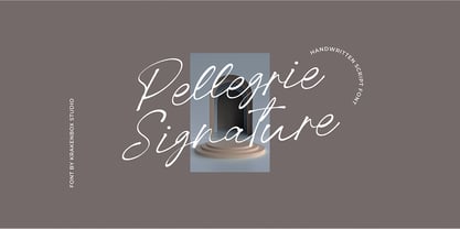 Pellegrie Signature is a fashionable sophisticated signature-style script with its own unique curves and an elegant inky flow.. Its elegant, classy, and modern look makes it a fantastic choice for fashion, signature, album covers logos, branding, magazines, social media posts, advertisement, and many more. Use this display font to add that special cool touch to any design idea you can think of!
 - Sunday Rain by Krakenbox Studio,
$17.00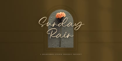 Sunday Rain is a fashionable sophisticated-style script with its own unique curves and an elegant inky flow.. Its elegant, classy, and modern look makes it a fantastic choice for fashion, signature, album covers logos, branding, magazines, social media posts, advertisement, and many more. Use this display font to add that special cool touch to any design idea you can think of!
 - Oblygasi by Wildan Type,
$14.00 Oblygasi is a modern serif font with a unique ligature and aletrnate style. A simple serif with a touch of curves on the top and bottom of the stemp gives a special impression. Combaine with high contrast and slat style perfect for feminine logo signs, fashion heads & editorial designs, branding projects, Clothing Branding, packaging, magazine headings, advertising, T-shirts, postcards and much more.
 - Breathney by MJB Letters,
$19.00 Breathney a beautiful, natural handwritten font that exudes charm. With its soft, curved lines, it captures the uniqueness of human handwriting, adding a personal touch to graphic designs. Ideal for feminine, friendly projects like wedding invites, logos, and posters, Breathney brings warmth and authenticity. Enhance your designs with its gentle, organic aesthetic, conveying a heartfelt message. File Included : Ligature PUA Encoded Multilanguage Support
 - Mary Read by Melli Diete,
$50.00 Mary Read is a modern handwritten Display Font, showing its fancy curves best in headlines as well as short texts. For typographic variety the typeface offers a range of features and extras. Give your texts a quite playful and handwritten note. Being chi chi is not a crime, don’t hesitate to pepper some sweetness in the midst of people’s attention.
 - Paradise Point by Swell Type,
$20.00 Surf's up! Take an unforgettable adventure to the sparkling shores of Paradise Point. Ride our 25 majestic weights, from tranquil tall & thin to thunderous wide & heavy. Expand your horizons with the versatile Variable font to select any spot between. One-of-a-kind activities: Drop in a thrilling Inline weight for stylistic flair. Overlay with the matching Heavy for striking color effects. Discover hidden wonders! Stylistic Alternates will take you to the scenic heights of uppercase in a friendly lowercase style. Or immerse your text in interlocking Discretionary Ligatures for an authentic Tiki Type island experience. Enchanting views: Two versions of each letter and number automatically rotate for a natural, hand-drawn appearance. The Light weights have round ends to simulate a single pen stroke, which matches the center of the Inline weights for a perfect pairing. Explore! If you venture into unknown territory, each weight of Paradise Point contains 775 glyphs for stress-free support of over 200 languages. An all-inclusive getaway: Each weight of Paradise Point includes the features above, and can set readable body text as well as create striking logos and headlines. Use it for restaurant menus, surf and skate brands, or any design project where you want to convey lively, friendly, stress-free fun.
 - NamesakeNF - 100% free

- TwoForJuanNF - 100% free

- SpeedballNo3 - 100% free

- HutSutRalston - 100% free

- CircuitBoredNF - 100% free

- AltamonteNF - 100% free

- GradoGradooNF - Unknown license

- RicksAmericanNF - 100% free

- PinballWhizNF - 100% free

- HeavyTripp - Unknown license

- MidlandRailNF - 100% free

- AmsterdamTangram - Unknown license

- TroglodyteNF - Unknown license

- MinstrelPosterWHG - 100% free

- VinnieBoomBahNF - Unknown license

- ShangriLaNF - 100% free


