10,000 search results
(0.46 seconds)
- JT Collect by OGJ Type Design,
$35.00 JT Collect is a hybrid sans-serif typeface for the 21st century that takes a playful approach to the type design heritages of Germany and Switzerland. Confidently built on a geometric structure and infused with elements from traditional grotesque typefaces, it hits the sweet spot between geo and grot. I developed JT Collect purely digitally, drawing from years of experience with analog type design. The letters aren’t based on one particular source but seek to merge different type genres from the first half of the 20th century and lift them to a contemporary quality level. JT Collect is less reserved than strictly geometric designs and brings some industrial workmanship and honesty into the game. The six weights plus three optical sizes of JT Collect offer what you need to make an impact. While cool and elegant in the Light weight, the fonts show more presence on the page as they grow bolder. To this end, I drew the letterforms with a slightly unrefined, brawny air in the bolder weights. This sets them apart from the perceived purity of more geometric designs. The Book weight is ideal for short texts and medium-length copy, and the forceful Bold makes wordmarks look crisp and lets headlines radiate cosmopolitan self-confidence. JT Collect is suitable as a primary typeface for branding, advertising, packaging, stationery, posters, documents, and websites from trades and industries as diverse as food & fashion, media & makers, culture & creators, games & gems, sports & startups. Use JT Collect for film titles or watch faces, for leaflets or store signs, for business cards or billboards: this font family is as adaptable as a chameleon (and like a chameleon, it’s never boring). Try it in different contexts. You won’t be disappointed. Its adaptability also makes JT Collect a great starting point for poised and persuasive font combinations. Even a sans/sans pairing is possible due to hybrid nature of JT Collect—something that’d be hard to achieve with most other sans-serif typefaces on the market. You can add to it a heavy slab from the OGJ library, like Temper Wide. You might go for a geometric or a grotesque typeface as secondary (text) typeface. Or you could set your body copy in a classic serif typeface such as Caslon, Sabon, or Plantin. That’s right: JT Collect is a true team player. Whether you need a grotesque or a geometric sans: try JT Collect. You can get the best of both worlds.
 - Brown Amsonia by Nathatype,
$29.00 Brown Amsonia is a lovely script font of which letters are in handwriting to express unique, personal nuances in your designs. Such a handwriting font is available in high contrasts having noticeable differences between the bright and the dark letter parts to produce clear, firm displays making the designs look professional and modern. Besides, Brown Amsonia can express personal, artistic displays to create more interesting, noticeable designs. The letters are interconnected and their details show sharp, curvy scratches on the edges. Due to the complex font style details, this font is better to apply for big text sizes. In addition, you may enjoy the available features here. Features: Ligatures Stylistic Sets Multilingual Supports PUA Encoded Numerals and Punctuations Brown Amsonia fits best for various design projects, such as brandings, invitations, greeting cards, name cards, quotes, printed products, merchandise, social media, etc. Find out more ways to use this font by taking a look at the font preview. Thanks for purchasing our fonts. Hopefully, you have a great time using our font. Feel free to contact us anytime for further information or when you have trouble with the font. Thanks a lot and happy designing.
 - Bozon by ROHH,
$39.00 Bozon™ is a modern, minimalist geometric grotesk typeface. Letter shapes are crafted with the highest care for proportions and legibility. This clean, sharp sans serif is a great choice for all kinds of modern projects including branding, logo design and display use. Bozon™ family consists of 10 weights with corresponding italic styles, that give total of 20 styles. Italic styles were hand drawn to get sharp and fine letter shapes. The family has extended language support, as well as broad number of OpenType features, such as small caps, case sensitive forms, ligatures, stylistic sets, contextual alternates, lining, oldstyle, tabular, circled and small cap figures, slashed zero, fractions, superscript and subscript, ordinals, currencies and symbols.
 - Dutch Mediaeval Pro ST by Canada Type,
$49.95 Dutch Mediaeval Pro ST is a special version of the popular Dutch Mediaeval Pro family, engineered specifically for science writing. It is equipped with SciType, a combination of additional characters and OpenType programming included in the fonts to help in typesetting science text. For more information about SciType, please consult the SciType FAQ available in the Gallery section of this page. The Dutch Mediaeval design is the historically renown one made in 1912 by S. H. de Roos. It stands out as one of the most classic Dutch text faces. This digital version comes in two weights and their italic counterparts. Aside from the SciType additions, all the fonts contain OpenType features for small caps and caps-to-small-caps, ligatures, ordinals, automatic fractions, seven kinds of figures, and a few ornaments. For details about the functionality of Dutch Mediaeval Pro ST, please consult its Access Chart PDF available in the Gallery section of this page.
 - CA Recape by Cape Arcona Type Foundry,
$49.00 CA Recape is a weird and beautiful vintage script family with two styles. It’s an excellent choice for creating logotypes, headlines, signs, poster and any design that requires a custom-made feeling. The basic inspiration for CA Recape comes from American 50s lettering. But instead of reviving one special style, it is a kind of “Best of”-Remix. It takes the weirdest and most beautiful letterforms of a weird and beautiful time and merges them into one font. The outcome is a charming bastard. Guess what it looks like: Weird and beautiful. CA Recape is packed with a lot of OpenType features like underlining swashes, Stylistic, Discretionary, Titling and Contextual Alternates and Ligatures for use in OpenType savvy programs. It also comes with some nice Ornaments. Derived from the original typeface, Cape Arcona Type Foundry also offers a Raw style that has the distressed look of a poorly printed raw font. See the specimen PDF in the Gallery for all OpenType features and instructions.
 - Hyperflow by Dirtyline Studio,
$15.00 Hyperflow Script was inspired by contemporary fashion and streetwear in combination with Hand Lettering style. I've made every single curve with a personality touch. I hope this can inspire you for your work. Hyperflow Script has a very bouncy baseline. It has a perfectly paired complimentary marker font , and a super handy set of bonus Swash. Ideal for logos, handwritten quotes, product packaging, header, poster, merchandise, social media & greeting cards.
 - Vintage Loving by Lunas Type,
$19.00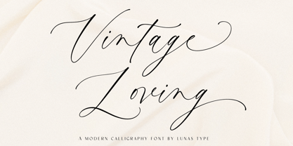 Introducing, Vintage Loving! Vintage Loving is a vintage and luxury calligraphy font. Vintage Loving have a chic and natural curves to add charm impression for your design. VIntage Loving is perfect for many design needs such as merch, T-shirts, signature logo, wedding, book covers, social media posts, websites, events, and many more. What’s you get : – Ending Swashes & beginning swashes. – Numeral & Punctuation. – ligature. – Multilingual Support. Enjoy Designing! Thanks! Lunas Type
 - Hand of Linda by Lunas Type,
$19.00 Introducing, Hand of Linda! Hand of Linda is a signature notes and handwritten font. Hand of Linda have a chic and natural curves to add charm impression for your design. Hand of Linda is perfect for many design needs such as merch, T-shirts, signature logo, wedding, book covers, social media posts, websites, events, and many more. What's you get : - Numeral & Punctuation. - ligatures. - Multilingual Support. Enjoy Designing! Thanks! Lunas Type
 - Alice by Mirror Types,
$25.00 Alice is a formal fantasy font. It’s inspired in the fairy tales and magical lands that my mother used to tell me as a child when I went to sleep. The capitals are really nice and complex, while the minuscules are cleaner for easier reading. The style Curly uses some features of the normal uppercase letters in the lowercase ones. There are some minor, yet noticable, flaws in a number of characters that will need correction for signage/vinyl letter cuts (characters appx. 2-1/2" and larger).
 - Harlan by Trial by Cupcakes,
$29.00 Harlan is from another place and time. But not just one specific place or time– with its barely-there, knife's-edge serifs, and its smooth curves and flourishes, Harlan feels both vintage and modern; both feminine and masculine. Inspired by the Baltimore bar "WC Harlan", which in turn was inspired by the old candle-lit bars of France, the tucked-away osterias of Italy, and the antique books and journals one might find in a patron's hand. It's a font you'll reach for when you're looking for something refined and elegant, but not too stylized or stuffy.
 - Merilux by Pixesia Studio,
$23.00 Introducing Merilux - Modern Luxury Serif Merilux is a sleek and modern serif font that offers a touch of luxury to any design. With its sleek lines and elegant curves, Merilux is perfect for creating sophisticated and stylish designs for branding, logos, heading, magazines, product packaging, invitation, monograms, merchandise, poster book title, movie title or pull quote, social media, headers, editorial content, and more. FEATURES - Stylistic Alternates - Ligatures - PUA Encoded - Uppercase and Lowercase letters - Numbering and Punctuations - Multilingual Support - Works on PC or Mac - Simple Installation - Support Adobe Illustrator, Adobe Photoshop, Adobe InDesign, also works on Microsoft Word Hope you Like it. Thanks.
 - Athlone by Fontdation,
$15.00 Athlone, a display font that inspired by the vintage/classic letterforms. Mouse-crafted with high attention to details; clean lines, sharp edges and tempting curves. Available in slanted version too, gives you more options too play with. Suits best for title/headline, logo/logotype, packaging/label designs, etc.Packed with 300+ glyphs, Athlone gives you standard upper/lower case characters, numerals, punctuations, some multilingual letters, alternate characters, stylistic sets, ligatures, etc. This font is a must have item for your designing arsenal.
 - Realistic Theory by Figuree Studio,
$18.00 Introducing Realistic Theory! Realistic Theory! is strong hand-drawn brush font that combines attractive curves with a fresh urban edge; delivering a stylish brush font that is guaranteed to add an eye-catching appeal to your logo designs, brand imagery, handwritten quotes, product packaging, merchandise, social media post, or website font.
 - The Marbler by Nathatype,
$29.00 Are you looking for a handwritten font? Do you dream of creating headings that stand out and inspire creativity, imagination, and endless fun? Wait no more, we will give you the best choice. The Marbler-A Handwritten Font The Marbler is a handwritten font with retro look. Inspired from 1960s style. Every stroke and curve was created to entice happiness and elegance. The best choice to ensure a great font match for your designs and projects! Well suited to titles, poster designs, branding, quotes, and logos. Our font always includes Multilingual Options to make your branding globally acceptable. Features: Ligatures Stylistic Sets Swashes PUA Encoded Numerals and Punctuation Thank you for downloading premium fonts from Natha Studio
 - Blinsithar by Hanzel Space,
$25.00 introduce our font "Blinsithar" font Happy! finally this font has been released in 2023, with full of new ideas having new character for each letter. It has beautiful curves that enhance the appearance of the font which is no less attractive. Complete with lowercase and uppercase letters, punctuation, swash and ligature. By creating this font, we hope to help your design type needs, to support your business and your business. This font is very suitable for use as branding, logos, slogans, websites, weddings, products and so on. Full Set of standard alphabet and punctuation Extra set of ending swashed lowercase Handwritten ligatures Thanks so much for checking out my shop! Happy creating! Cheers! Hanief - Hanzel Space
 - Colonia Deco by Typerookie,
$10.00 Named after Cologne, the city it was born, Colonia Deco is a modern Art Deco inspired display font. The mono line Sans Serif with a touch of vintage is a perfect choice for designs with a luxurious but minimalist look and feel. Used in headlines, logos or product packaging it will match beautifully with curly script fonts. The typeface can be used as an all caps version or by blending in the lower case glyphs - which function as real small capitals by design. Giving the "New Golden Twenties" a modern retro look this elegant typeface also comes with multilingual support and a variety of special characters, as well as two weight variations.
 - Cervino by Typoforge Studio,
$29.00 Did you know that Cervino is the Italian name for one of the highest and most beautiful mountain in Europe - Matterhorn? Just like this majestic peak, our new family is HUGE. Cervino family consist of three width masters, with nine weights in each of them, giving the total amount of 54 instances. It is full of different features - from the wide set of numerals and math signs, by small caps to subscript and superscript. It covers full latin and Cyrillic script. Cervino would be a perfect choice for headlines, newspapers and for the longer texts as well.
 - Flexo Soft by Durotype,
$49.00 Flexo Soft is the soft companion of Flexo. In Flexo Soft, the sharp edges of Flexo's characters have been tempered by a moderate rounding—creating a softer and friendlier typeface. Flexo Soft has a squarish design, making it stand out in many uses. It will shine in both headlines and text. It is well suited for graphic design and corporate identity design. Flexo Soft has sixteen styles, extensive language support, eight different kinds of figures, sophisticated OpenType features—so it’s ready for advanced typographic projects. For more information about Flexo Soft, download the PDF Specimen Manual.
 - Habano ST by Sudtipos,
$39.00 Habano is an eleganty flowing bold script with some very surprising traits. Taking its roots in both the art deco style and the kind of lettering used for pop culture, its minuscules are classy yet obedient, and its majuscules and figures are playfully round and memorable. This contrast in character between cases makes for an appealing display face that can turn simple words into images that are hard to forget. Once again, the unique lettering talent of Angel Koziupa makes itself evident through an alphabet that leaves the memory of its soft touch for long after it is initially perceived.
 - Emoticons - Personal use only

- Spaceboy by Drewfonts,
$15.00Originally conceived from the basic sign writers brush stroke pattern and heavily influenced by the songs of David Bowie this style has developed into an organic Futurist face, kind of post modern retro, catch my drift? - Faber Fraktur by Ingo,
$22.00 A modern black-letter, so to speak. Composed of a few basic elements with a wide-quill ductus. Faber Fraktur was based on the idea that it must be possible to create a modern black-letter type. The typeface is ”constructed“ according to the same principles as a script without serifs: as few varied basic forms as possible, omission of frills which make the type difficult to read and repetition of similar forms. The typical contrasting strokes of the original handwritten black-letter script are retained nonetheless. The elements of this typeface were even pre-formed with the quill. All characters are reduced to their basic skeleton. The fanciness and manifold ”breaks“ or fractures typical of black-letter typefaces are considerably reduced to just a few essentials. Faber Fraktur is a very legible type perfectly suitable for long texts. It does not appear nearly as foreign and archaic as the old black-letter fonts. The capital letters especially have a charm of their own radiating a kind of playfulness in spite of their severe form.
 - Calmingly by Nathatype,
$29.00 Calmingly is an elegant display serif font suitably applied to express charmingly aesthetic designs and to give more feminim touches to any of your designs. Its simple designs and letter height and line thickness variations make this font legible. Additionally, another characteristic of this font is the curvy letter edges added to some of the letters. Enjoy Calmingly’s lovely features to beautify your designs. Features: Stylistic Sets Multilingual Supports PUA Encoded Numerals and Punctuations Calmingly fits for various design projects, such as posters, banners, logos, magazine covers, quotes, headings, printed products, invitations, name cards, merchandise, social media, etc. Find out more ways to use this font by taking a look at the font preview. Thanks for purchasing our fonts. Hopefully, you have a great experience using our font. Feel free to contact us for further information when you have a problem using the font. Thank you. Happy designing.
 - Magnat by René Bieder,
$29.00 Magnat is a contrasting sans drawing inspiration from designs from the early twenties century and expands them into an elegant and distinctive contemporary design. Playful elements such as the curvy ear on the lowercase g or the long tail on the uppercase Q break the strictness and add character. The combination of closed apertures with the contrasting strokes create an elegant and distinctive overall appearance. The Magnat family is available in 36 weights including matching italics, divided into 3 subfamilies: Poster, Head and Text. Each has been designed for its individual range of text sizes. The Poster and Head styles with their tight spacing and luxurious shapes are made for impactful headlines and short paragraphs, whereas the text weights are either a great addition for small text sizes or, when set in large sizes, perfectly work as a robust standalone font with a lot of character. Each font style is equipped with many opentype features such as alternate characters, different number sets or case sensitive shapes making it a perfect choice for professional type setting in branding, editorial or digital design.
 - Qiproko by Nootype,
$42.00 Qiproko is a typeface with semi-modular and geometric shapes. The squared curves remind the shape of the cathode ray tube monitor, giving a retro feel to the characters. It’s unusual stencil version makes a direct reference to the electronic circuit, which gives a very technological aspect. Each font includes OpenType Features such as Tabular Figures and Capital alignement. The fonts have an extended characters set to support Central, Eastern and Western European languages. Qiproko is perfectly suitable for headlines or epigraphs, but works in text too.
 - HF Monorita by HyFont Studio,
$29.00 HF Monorita is the first monospace we have created. It is perfect for coding, display and design. The subtle curves on the diagonal strokes create a friendly vibe and can create a better reading flow for the users.
 - Escuela by Cuchi, qué tipo,
$9.95 Escuela typeface is born in an attempt to reflect so many current influences of modern grotesque fonts that are trying to better reflect the values of today's world. Its compact proportions and high x-height, but at the same time with sort kind of modulation and open inktraps, propose a visual game that is worth enough to use it many places; Escuela can be striking and ideal for headlines in large text and heavy weights, but at the same time serious and readable in smaller bodies or regular and fine weights. Its wide range of characters, which includes a set of emoticons ideal for signage, work and evaluation documents, as well as inclusive, is ideal for educational centers, whether they are more playful (schools) or more pragmatic (universities). In fact, "Escuela" means “School” in English. For this reason, Escuela is your best ally when it comes to preparing texts that transcend students through a contemporary and different, but functional, character. Designed by Carlos Campos www.cuchiquetipo.com Dummy text from wikisource.org (1911 Encyclopædia Britannica/Universities).
 - Spinat by Bogstav,
$16.00 Spinat is spinach in danish. I like all kinds of things with spinach: salads, lasagne, fish, burgers and even with spinach! Yes, I love spinach so much I can eat it without anything else! :) I hope you too like spinach or even Spinat - it has 5 different versions of each letter and multilingual support.
 - CompassOne by Ingrimayne Type,
$9.00 CompassOne was a design I began in 1990 or so, but did not bother to finish until five years later. Its name comes from the fact that all the letters could have been drawn with a compass (which draws circles) and a straight edge. The typeface Demotte was a further development of this design idea.
 - Heaven Wanders by Letterhend,
$17.00 Introducing, Heaven Wanders, a unique handwritten typeface. There are two style with regular and slant. As you can see, this typeface has playful and fun look which is perfectly made to be applied especially in storybook cover, comics, cartoon characters, kids theme design, etc. Features : uppercase & lowercase numbers and punctuation multilingual alternates PUA encoded We highly recommend using a program that supports OpenType features and Glyphs panels like many of Adobe apps and Corel Draw, so you can see and access all Glyph variations. How to access opentype feature : letterhend.com/tutorials/using-opentype-feature-in-any-software/ Email us to letterhend@gmail.com if you need something! Happy Designing!
 - China Market by Pelavin Fonts,
$20.00 The initial characters in China Market were created in 1996 for a logo featuring the Temple of Heaven in Beijing where emperors from the Ming and Qing dynasties worshiped heaven and prayed for abundant harvests. The font was completed in 2010. It is composed of a regularly positioned curved and straight components as if part of a decorative grillwork or other architectural detail. While its influences and origins are clear, its appearance is relies more upon the geometry of its basic elements and the modular structure than a specific stylistic idiom.
 - Hakim Ghazali by Linotype,
$155.99Hakim Ghazali, designed by Hakim Ghazali in 2005, is an Arabic typeface in the style of Maghribi and a winner in Linotype’s first Arabic Typeface Design Competition. This style, which originated in western North Africa, is characterized by a strong baseline and long, fluid, and curvaceous curves. It can be used in headlines or in text and gives a very fresh and calligraphic look. The font includes a matching Latin design and support for Arabic, Persian, and Urdu. It also includes proportional and tabular numerals for the supported languages. - Ingo by Up Up Creative,
$16.00 Introducing Ingo, a sultry display font with smooth curves and high contrast. Featuring an ultra-modern and experimental yet highly readable "deconstructed serif" style, Ingo is perfect for your next editorial, advertising, branding, book, or invitation project. Ingo includes approximately 440 glyphs. OpenType features include multilingual support (including multiple currency symbols - for kicks I even included a Bitcoin symbol in there), standard and discretionary ligatures, and two ampersand variants. The OpenType features can be very easily accessed by using OpenType-savvy programs such as Adobe Illustrator and Adobe InDesign.
 - Winery JNL by Jeff Levine,
$29.00 A rubber stamp printing set from the 1930s (or possibly earlier) was the model for Winery JNL. Containing a pleasant serif font, it also provided a few little touches unusual for such toy sets of the time. The horizontal crossbar of the H has a diamond embellishment, as does the horizontal stroke of the number 3. Additionally, the lower right tail of the G curves away from the letter and the Q has a spiral tail. Re-drawn from scans of the original stamp impressions, this typeface is available in both regular and oblique versions.
 - Maree by Ashton,
$5.00 If you want to write something sincere and genuine but not too formal then this is the font for you. It is based on real handwriting, not some artificial calligraphy made to be either too haphazard or spiky or have loads of elegant flourishes but an ordinary person's writing, and designed to look as natural and as close to the original lettering as possible. Like any person's writing it is individual and distinctive, but so easy going on the eye those differences sit comfortably with you. It is friendly and open with easy to read glyphs both as lowercase and uppercase. The letters are relatively wide with clearly shaped distinct outlines. This font may be ideal for projects where you expect a wide readership with different reading abilities from young to old. When you are using this font a slightly bigger point size usually gives a better result so for a standard letter or similar you should size up to 15 points or more. Maree has been individually crafted to the smallest detail. To create a realistic handwriting font that looks relatively simple but works in a wide variety of languages requires a complexity and attention to detail most fonts will never require. This font in any ordinary business environment would never have been made, the effort required to make it too great, the length of time too long. There have been no shortcuts in this font, no automatic scanning or tracing, no automatic generation, no class kerning. Not only is each glyph individual but the width of letters, the height, the accents and the positions of the accents are all different. Even the line weight of the letters is designed to have natural variation but yet similar enough that the font appears as though it were written effortlessly in the same pen. And in order to keep the spacing consistent even though the letters have different widths, heights, lengths of descenders and so on, there are a vast number of kerning pairs, letter to letter, number to number, letter to number... All kerning has been individually assessed with an eye to proportionality taking in character shape, size and weight. For instance if you write a telephone number the numbers all sit close together but if you write a number before a letter such as in a UK post code or before a unit of measurement an extra little bit of space has been added which makes the number more distinct and therefore readable. That space is so natural to the eye that you don’t even know it is there. However even in the spacing allowance has been made for the fact it can’t be too perfect because when you write by hand the spacing is inconsistent. There have to be some letters which are too close or far apart otherwise the font would look artificial. For similar reasons if you are going to print out this font for a letter, etc, check the print version before you make any letter spacing changes because with the zoom functions in modern applications that uneven spacing and lettering can seem more pronounced than it actually is. When this font is printed out you will find it is surprisingly neat. This font is what it is, simple clear handwriting. You will not go wow. But if you want something unique and different and looks good on the page you won’t be disappointed. This font is not a work of art but it is a work of love. This font has a soul. How many fonts can you say that about?
 - International by Yes Please,
$45.00 International is an homage to mid-century modernist trilines. Offering contemporary, well-balanced proportions and a lack of heavily dated styling affectations, International brings a uniquely modern sensibility to the triline style. International features OpenType standard ligatures, discretionary ligatures and stylistic alternates as well as a standard set of accents and symbols to provide a versatile end-user experience. International has played hard for Nike Women's Training, Nike Running, Nike Sportswear, Target, Showtime and more.
 - Billion Miracles by Din Studio,
$29.00 Want to transport your audience to a world of gorgeous, elegant, versatile, yet modern? Looking for a font that makes your projects to spark happiness? Then, you go to the right path. Introducing Billion Miracles- A Monoline Signature Font A modern and stylish handcrafted signature font that’ll make your audience swoon and enhance your projects. Every stroke and curve was created to capture the essence of modernity and style. This gorgeous and stylish font can be used for a host of different content needs and projects. Ideal for social media posts and ads, printed quotes, t-shirt designs, packaging, or even as a modern text overlay to any background image. Billion Miracle includes Multilingual Options to make your branding globally acceptable. Features: Standard Ligatures Stylistic Sets Multilingual Support (84 languages) PUA Encoded Numerals and Punctuation Thank you for downloading premium fonts from Din Studio
 - Gia by XO Type Co,
$40.00 Gia is 7 weights, true small caps and unicase options, designed after iconic letterforms of the 1960’s to 1980’s. In the early years of the American tech revolution, when Silicon Valley was more closely identified with Dallas, Texas, a curious type of letterform began to appear—strict in geometry, and curiously minimal in geometry and stroke, making it easier to be read by machine-readers, and people more used to reading machine-generated typography. Coders! As the years went on, this kind of sinewy, curved letterform began popping up in logotypes and music videos and upright video games: NASA, The Buggles, Atari, Pong, Sega, Namco, Stern, Devo, Apple. Gia pays homage to that letterform, and is named after Gia Carangi, the iconic face of early 1980’s pop fashion.
 - American Gothic by MADType,
$24.00 A blocky and bold geometric sans with inner angles and outer curves. No ascenders; lower case characters are as big as the upper case. Mix cases for variety.
 - Linguista by Rockboys Studio,
$23.00 Linguista is a gorgeous monoline script, full of personality and curves. It features a natural flow that makes it perfect for any project that requires a handwritten feel.
