7,596 search results
(0.033 seconds)
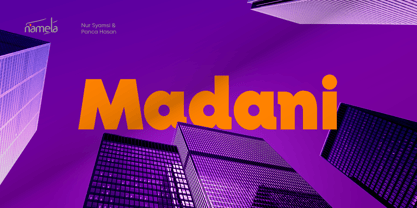
- Madani by NamelaType,
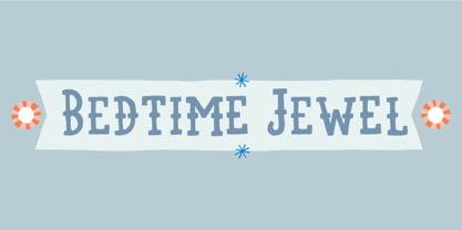
$49.00 - Bedtime Jewel by PizzaDude.dk,
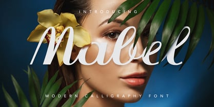
$19.00 - JH Mabel by JH Fonts,
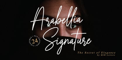
$40.00 - Arabellia Signature by MJB Letters,
$17.00 - Embossing Tape 1 (BRK) - 100% free
- Fatboy Slim BLTC (BRK) - Unknown license
- Quantum Round Hollow (BRK) - Unknown license
- Embossing Tape 2 (BRK) - Unknown license
- Fatboy Slim BLTC 2 BRK - 100% free
- Chemical Reaction B (BRK) - Unknown license
- Lucid Type A (BRK) - Unknown license
- Lucid Type A Outline BRK - Unknown license
- Lucid Type B Outline BRK - Unknown license
- Kirby No Kira Kizzu BRK - 100% free
- Chemical Reaction A (BRK) - Unknown license
- Head-Ding Maker BRK - Unknown license
- Quantum Flat Hollow (BRK) - Unknown license
- Mini Kaliber O TT BRK - Unknown license
- Chintzy CPU Shadow (BRK) - Unknown license
- Entangled Layer B (BRK) - Unknown license
- 10.15 Saturday Night R BRK - Unknown license
- 10.15 Saturday Night (BRK) - Unknown license
- Hand Me Down O BRK - Unknown license
- Embossing Tape 3 (BRK) - 100% free
- Mini Kaliber S TT BRK - Unknown license
- Lucid Type B (BRK) - Unknown license
- Yoshi's Story game text BRK - Unknown license
- Hand Me Down S BRK - 100% free
- Entangled Layer A (BRK) - Unknown license
- 8-bit Limit BRK - Unknown license
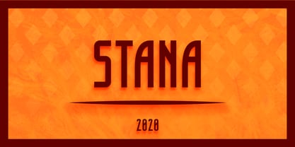
- Stana by Wirtu,
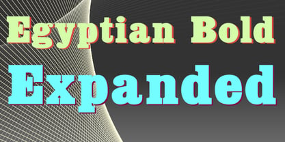
$9.00 - Egyptian Bold Expanded by Wooden Type Fonts,
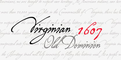
$15.00 - P22 Virginian by IHOF,
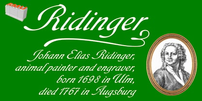
$24.95 - Ridinger Pro by RMU,
$30.00 - Ridinger by RMU,
$30.00 - Tolkien Tengwanda Namarie by Deniart Systems,
$15.00 - Ornamental Versals - Personal use only
- kaufhalle - 100% free
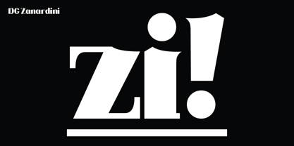
- DG Zanardini by DubbioGusto,
$35.00 - Ecolier - Unknown license
