10,000 search results
(0.022 seconds)
- Brute Sans by Wiescher Design,
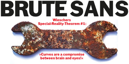
$15.00»Brute Sans« is a classic Sans typeface that looks like it has been designed by a chainsaw. »Brute Sans« looks really crude only in big sizes, the smaller the font gets the more it looks like any other Sans typeface. »Brute Sans« prints very fast, because there are no curves to compute, but that is just a side effect. »Brute Sans« is the typeface you should use if you need a really different look, since Sans typefaces tend by design to look very similar. This one is different. I always wanted to do this font, but then other projects crept up so I pushed »Brute Sans« to the end of the line. Enjoy! - Paperclip Wire by Blackout,
$20.00Paperclip Wire is a great font for anyone looking to have a straightforward yet elegant look. All letters consist of Capitals yet the uppercase letters are exaggerated. Because of the nature of the font I suggest using it in no less than 20 pt. font. However, because it is simple it can easily be read when printed. This typeface was developed loosely based on a paper clip itself. the x-height was determined based off the size ratio of the clip and the cap height was based off of a paper clip as it is folded open. The overall shape is straight lines and subtle curves, all relating to each other to allow for a constant flow of letters. - Lunation by Ditatype,
$29.00Lunation is a versatile script font that marries the charm of script fonts with a contemporary twist. Crafted with a fairly bold weight to command attention. Its slightly reduced contrast ensures that each character stands out clearly, providing optimal readability in various design applications. The defining characteristic of Lunation is its carefully crafted swinging endings. These artistic flourishes gracefully embellish specific letters, lending an air of sophistication to your text. The subtle yet distinctive curves and sweeps add a playful rhythm. Lunation fits in headlines, logos, posters, flyers, invitations, branding materials, print media, editorial layouts, and many more designs. Find out more ways to use this font by taking a look at the font preview. - Beletrio by Storm Type Foundry,
$29.00Beletrio was made as companion to Beletria, it has many shapes in common. We already have plenty of sans-serif fonts with classical proportions in the Stormtype library, such as John Sans, Sebastian or Andulka, but Beletrio is certainly the most peaceful of the bunch – it shares not only the feel of its serif originator, but its soft curves provide lovely visual caress as well. The smooth endings are not visible at first, they are balanced for easy reading as they solve some critical relations such as "rv, ry, rt", but in larger sizes you'll fully enjoy the picturesque details. It handles the smallest point sizes as well as large billboards, fashion magazines and philosophic tractates. - Dettreon Smith by Letterena Studios,
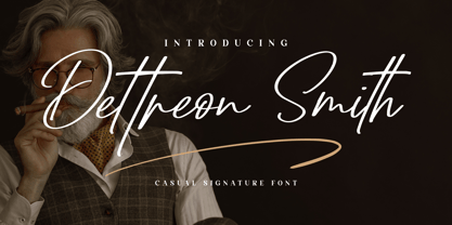
$10.00Looking for the perfect font to use on invitations or branding? Hoping to travel your audience to a world of gorgeous, elegant, versatile, yet modern? Then, you go to the right path. Introducing Dettreon Smith - A Signature Font Dettreon Smith is a modern and elegant handcrafted signature font to embrace your audiences or guests. Every stroke and curve was created to capture the essence of elegance and style. Perfect for social media posts and ads, printed quotes, t-shirt designs, packaging, or even as a modern text overlay to any background image. Dettreon Smith includes Multilingual Options to make your branding globally acceptable. Features: Ligatures Swash Multilingual Support PUA Encoded Numerals and Punctuation - Airam by Linotype,
$29.99Maria Martina Schmitt was born in Vienna, Austria in 1950. Since 1998, she has been working as a freelance designer, focusing on cultural collateral, economic publications, illustration, type design, and logo design. Airam blends contemporary legibility with historic blackletter forms, creating a contemporary text face that speaks to the old European past. Airam certainly appears darker than most other contemporary text faces. Airam’s letterforms are slightly broken, too. They display angled joints in lieu of smooth curves. This “broken” aspect actually aids legibility at smaller point sizes. While Airam may not be suitable for setting whole books or newspapers, this font will add a splendid touch to short tracts of small text. Additionally, Airam looks superb in large headlines. - Nigelina by Pixesia Studio,
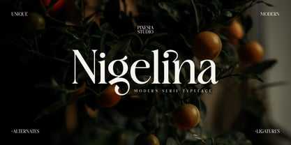
$19.00Introducing Nigelina - a Modern and Vintage Serif Font Nigelina is a modern and vintage serif display font that looks unique, feminine and give a luxurious feel. This modern font has soft swasher and smooth curves that give any project an extra touch class. This typeface would look great embossed on logos & branding, invitations, stationery, wedding designs, social media posts, advertisements, printed quotes, product packaging, product designs, labels, photography, watermarks, special events or even magazine layouts. FEATURES - Stylistic Alternates - Ligatures - PUA Encoded - Uppercase and Lowercase letters - Numbering and Punctuations - Multilingual Support - Works on PC or Mac - Simple Installation - Support Adobe Illustrator, Adobe Photoshop, Adobe InDesign, also works on Microsoft Word Hope you Like it. Thanks. - Ambigane by IbraCreative,
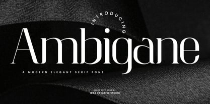
$17.00Ambigane is a modern and elegant serif font that seamlessly blends sophistication with contemporary design. Its refined, timeless aesthetic is characterized by the subtle curves and clean lines of its letterforms, exuding a sense of luxury and professionalism. Ambigane strikes a harmonious balance between traditional serif elements and a fresh, modern twist, making it versatile for a range of design applications. With its well-crafted serifs and balanced proportions, Ambigane communicates a sense of refinement and style, making it an ideal choice for projects that require a touch of sophistication and a contemporary edge. Whether used in print or digital media, Ambigane conveys a sense of timeless elegance that elevates any visual composition. - Josefov by Ingo,
$28.00A narrow, modern Slab Serif. JOSEFOV is directly derived from the sans serif text font ”Hedwig“. Therefore, of course, it pairs best with “Hedwig”. The basic thought was to create a font with heavy rounded serifs in the style of ”Clarendon“ but which hardly reminds one of that particular font. The form principle of rounded serifs is applied whenever possible — for example at the points where the individual strokes of the characters join one another. JOSEFOV seems very technical, very constructed (and truly is). In order to soften up the rigid impression, the serifs are applied at some points contrary to the tradition handed down, as with the upper case A C G K M V W and the lower case a b d h i j k l s t. Historically there is no example of the laterally oriented serifs of capital and small s (S) and C G. On the other hand, the double-sided serifs on the stems of b d h k l appear at the beginning of modern times in the very first serif types from five hundred years ago. The double-sided serifs of A M V W were also customary in the first decades of printing. JOSEVOV is particularly suitable for topics such as nature, folklore, culture, music, nutrition. - Sassoon Infant by Sassoon-Williams,
$48.00An upright typeface family developed to meet the demand for letters to produce pupil material for handwriting as well as for reading. Upright letters with extended ascenders and descenders are ideal on screen. They facilitate word recognition. The exit strokes link words together visually, and in handwriting they lead to spontaneous joins along the baseline leading logically to a joined-up hand. Teachers can print desk strips, charts of letter families and alphabet friezes, as well as consistent material across the curriculum. Together these typefaces provide a valuable resource for special needs teachers. When starting point and stroke direction has been learned, the arrow font (Tracker B) can be dropped and the simpler Tracker font used. Tracker B font, with its direction arrows helps pupils to start in the correct place. Motor movements can be refined by keeping inside the line. When starting and direction is no problem, the arrow can be dropped and the plain Tracker font used. When starting point and stroke direction have been learned, the arrow font (Dotted B) can be dropped and the simpler Dotted font used. Free to download resources How to access Stylistic Sets of alternative letters in these fonts Purchasers of this font package may use their Order Number to receive a free Copybook PDF by Rosemary Sassoon recommended for effective teaching - Pagnol by Typorium,
$15.00The Pagnol typeface has been designed with a principle developed by A. M. Cassandre in 1937, when the great French designer created the Peignot typeface following paleographic studies on the evolution of letterforms. Researches in the history of writing have proved that the lowercase "a" is at its origin nothing but the "A" shape transformed through centuries by scribes until the invention of printing. A large number of lowercases meanwhile kept their original shapes. If the scribes’ hand didn’t find the necessity to simplify them, it is only because these letters could be easily written. Integrating the classical shapes of capitals to the lowercases has already been used, keeping the lowercases which are only a deformation of capitals. Nevertheless, the respect of readability imposes to keep ascendants and descendants from traditional lowercases which serve as optical focus points in a text and make reading easier. The particularity of Pagnol is to use rounded shapes on top and bottom of pointed capital letters to make them fit with corresponding lowercases (Aa, Mm, Nn, Vv, Ww, Zz). Lowercases proportions are wide, to be in tune with classic lowercase shapes in order to optimize readability. Five weights in roman and italic have been designed to offer a wide palette of typographic possibilities in all sizes and all paper and screen supports. - Vendetta by Emigre,
$69.00The famous roman type cut in Venice by Nicolas Jenson, and used in 1470 for his printing of the tract, De Evangelica Praeparatione, Eusebius, has usually been declared the seminal and definitive representative of a class of types known as Venetian Old Style. The Jenson type is thought to have been the primary model for types that immediately followed. Subsequent 15th-century Venetian Old Style types, cut by other punchcutters in Venice and elsewhere in Italy, are also worthy of study, but have been largely neglected by 20th-century type designers. There were many versions of Venetian Old Style types produced in the final quarter of the quattrocento. The exact number is unknown, but numerous printed examples survive, though the actual types, matrices, and punches are long gone. All these types are not, however, conspicuously Jensonian in character. Each shows a liberal amount of individuality, inconsistency, and eccentricity. My fascination with these historical types began in the 1970s and eventually led to the production of my first text typeface, Iowan Old Style (Bitstream, 1991). Sometime in the early 1990s, I started doodling letters for another Venetian typeface. The letters were pieced together from sections of circles and squares. The n, a standard lowercase control character in a text typeface, came first. Its most unusual feature was its head serif, a bisected quadrant of a circle. My aim was to see if its sharp beak would work with blunt, rectangular, foot serifs. Next, I wanted to see if I could construct a set of capital letters by following a similar design system. Rectangular serifs, or what we today call "slab serifs," were common in early roman printing types, particularly text types cut in Italy before 1500. Slab serifs are evident on both lowercase and uppercase characters in roman types of the Incunabula period, but they are seen mainly at the feet of the lowercase letters. The head serifs on lowercase letters of early roman types were usually angled. They were not arched, like mine. Oddly, there seems to be no actual historical precedent for my approach. Another characteristic of my arched serif is that the side opposite the arch is flat, not concave. Arched, concave serifs were used extensively in early italic types, a genre which first appeared more than a quarter century after roman types. Their forms followed humanistic cursive writing, common in Italy since before movable type was used there. Initially, italic characters were all lowercase, set with upright capitals (a practice I much admire and would like to see revived). Sloped italic capitals were not introduced until the middle of the sixteenth century, and they have very little to do with the evolution of humanist scripts. In contrast to the cursive writing on which italic types were based, formal book hands used by humanist scholars to transcribe classical texts served as a source of inspiration for the lowercase letters of the first roman types cut in Italy. While book hands were not as informal as cursive scripts, they still had features which could be said to be more calligraphic than geometric in detail. Over time, though, the copied vestiges of calligraphy virtually disappeared from roman fonts, and type became more rational. This profound change in the way type developed was also due in part to popular interest in the classical inscriptions of Roman antiquity. Imperial Roman letters, or majuscules, became models for the capital letters in nearly all early roman printing types. So it was, that the first letters in my typeface arose from pondering how shapes of lowercase letters and capital letters relate to one another in terms of classical ideals and geometric proportions, two pinnacles in a range of artistic notions which emerged during the Italian Renaissance. Indeed, such ideas are interesting to explore, but in the field of type design they often lead to dead ends. It is generally acknowledged, for instance, that pure geometry, as a strict approach to type design, has limitations. No roman alphabet, based solely on the circle and square, has ever been ideal for continuous reading. This much, I knew from the start. In the course of developing my typeface for text, innumerable compromises were made. Even though the finished letterforms retain a measure of geometric structure, they were modified again and again to improve their performance en masse. Each modification caused further deviation from my original scheme, and gave every font a slightly different direction. In the lower case letters especially, I made countless variations, and diverged significantly from my original plan. For example, not all the arcs remained radial, and they were designed to vary from font to font. Such variety added to the individuality of each style. The counters of many letters are described by intersecting arcs or angled facets, and the bowls are not round. In the capitals, angular bracketing was used practically everywhere stems and serifs meet, accentuating the terseness of the characters. As a result of all my tinkering, the entire family took on a kind of rich, familiar, coarseness - akin to roman types of the late 1400s. In his book, Printing Types D. B. Updike wrote: "Almost all Italian roman fonts in the last half of the fifteenth century had an air of "security" and generous ease extremely agreeable to the eye. Indeed, there is nothing better than fine Italian roman type in the whole history of typography." It does seem a shame that only in the 20th century have revivals of these beautiful types found acceptance in the English language. For four centuries (circa 1500 - circa 1900) Venetian Old Style faces were definitely not in favor in any living language. Recently, though, reinterpretations of early Italian printing types have been returning with a vengeance. The name Vendetta, which as an Italian sound I like, struck me as being a word that could be taken to signifiy a comeback of types designed in the Venetian style. In closing, I should add that a large measure of Vendetta's overall character comes from a synthesis of ideas, old and new. Hallmarks of roman type design from the Incunabula period are blended with contemporary concerns for the optimal display of letterforms on computer screens. Vendetta is thus not a historical revival. It is instead an indirect but personal digital homage to the roman types of punchcutters whose work was influenced by the example Jenson set in 1470. John Downer. - Novelty Script by HiH,
$10.00Novelty Script is a bold dynamic script, sharply delineated, yet fluid. Most of the lower case letters and many of the upper case letters have joins. The typeface was designed by Nicholas J. Werner and Gustave F. Schroeder and patented in March 1893. The original release was by the Central Type Foundry of St. Louis, Missouri. Although a part of ATF from 1892, the Central Type Foundry continued to operate under its own name until 1895. Novelty Script uses our new encoding, as noted in the All_customer_readme.txt. The Euro symbol has been moved to position 128 and the Zcaron/zcaron have been added at positions 142/158 respectively. Otherwise, Novelty Script has our usual idiosyncratic glyph selection, with the German ch/ck instead of braces, Western European accented letters, lower case “o” and “u” with Hungarian umlaut and our usual Hand-in-Hand symbol. But that is not all. With the takeover of the Central Type Foundry by ATF, a group of special characters appeared. All are included in this font, except the “&Co” and the "'s", for a total of nine in all. The “Ch” and “nd” ligatures are especially interesting because of the impact they have on the color and overall appearance of the page. Download the PDF Type Specimen for locations. This is a fun font to use. Its strength is print, where it gives a page a refreshing look. The joins sometimes have difficulty on the screen, in spite of extensive hinting. Playing around with small changes on the point size can pay dividends. Not for the faint-of-heart. Are you up to the challenge? - Ostbahnhof by Sylvain Mazas,
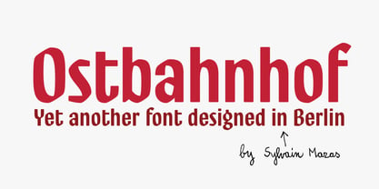
$14.99Ostbahnhof is a headline font inspired by both german blackletter and hand-painted signs. The 4 weights can be combined together to achieve a fancy letterpress effect, where slightly rounded corners are not proportional to the font size. Not sure what I'm talking about? Have a look at the examples. youtube video - Theater Lobby JNL by Jeff Levine,
$29.00A vintage photo (circa 1950s) taken outside one of the movie houses owned at the time by Miami-based Wometco Theaters showed a small hand lettered sign with the word “Wometco” painted in a stylized Art Deco alphabet. This inspired Theater Lobby JNL, which is available in both regular and oblique versions. - HT Trattoria by Dharma Type,
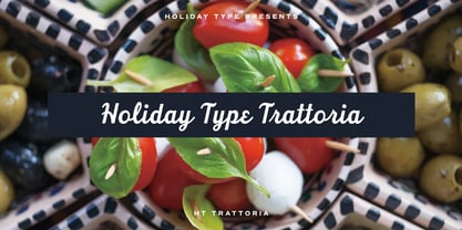
$19.99HT Trattoria is a lovely brush script with authentic and organic feel.It works best for packaging, magazines, marketing, labels, film and clothing. Holiday Type Project offers retro hand drawing scripts. Inspired by retro script on shopfront lettering, wall paint advertisements in Italy around 1950s. Check out the script fonts from Holiday Type! - Fastbrag by Konstantine Studio,
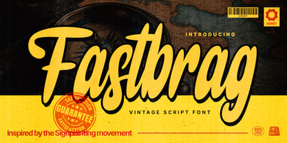
$17.00Fastbrag was inspired by the vintage sign painting culture in the early 1900s. We talk about visuals from the building-sized messages, billboards, storefronts, windows, doors, and menus. A shot to deliver the heritage and historical vibes of storytelling, and branding. To give a strong persona and character to your graphic design projects. - Tote Bag JNL by Jeff Levine,
$29.00Totebag JNL continues the stencil font series from Jeff Levine originally inspired by classic lettering stencils of the 1940s and 1950s. This particular design is common amongst "painting stencils", the individual letters used for marking and identification. Some characters are solid shapes while others have the more traditional "breaks" in the letters. - Oily Brush by Pseudo,
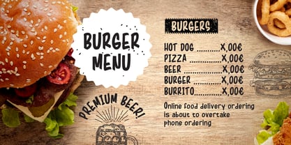
$21.00Oily Brush is the mix of funny, communicative, comic and sketchy directions. The font ist perfect in use with the food, doodle or the cartoon themes and has the small nuance from the oil-painting. This script designed to be informal, casual and easy in the perception and includes confidently positive emotions. - Wide Chamfer JNL by Jeff Levine,
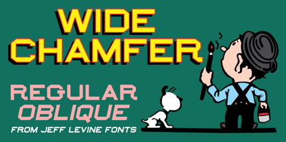
$29.00Inside the pages of an untitled sign painting textbook (circa 1902) was an example of the classic chamfered sans serif alphabets used by tradesmen of the time. This version was wider than most, and perfect for a digital version called Wide Chamfer JNL, which is available in both regular and oblique versions. - Painters Display by limitype,
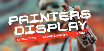
$20.00Painters Display is a font with a brutal style but still modern and fun, inspired by paint splashes and scratches, suitable for your fun, free and cool designs, This font can be applied at large sizes for optimal results such as headlines, posters, banners, etc. Painters display available with Allcaps, Symbol & Number - P22 Zebra by IHOF,
$24.95Zebra was originally designed by Karlgeorg Hoefer in 1965 for the Stempel foundry in Germany. This unique font was designed as a two-color script face and is now available digitally for the first time. The P22/IHOF release presents six separate fonts based on the original painted drawings and Stempel proofs. - Stuntman by Vozzy,
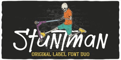
$10.00Introducing a hand-crafted label font duo named Stuntman. All available characters you can see at the screenshots. This family have two fonts - Script and Stencil; and for each included two styles - Clean and Paint (dripping effect). This font will good viewed on any retro design like poster, t-shirt, label, logo etc. - P22 DeStijl by P22 Type Foundry,
$24.95The Dutch De Stijl movement (1917-1931) sought to create an art which took abstraction to its logical extreme, as exhibited in the paintings of Piet Mondrian. Inspired by the movement's philosophy of pure form, P22's De Stijl set features three rigid, balanced, and angular fonts and a set of geometric extras. - HT Farmacia by Dharma Type,
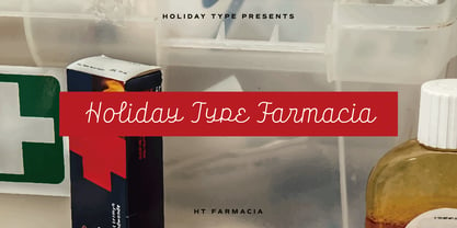
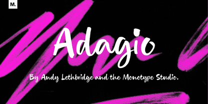
$19.99This is a monoline script without descenders. Its tail gives us cute and lovely impression, but it is also methodical and punctual. Holiday Type Project offers retro hand drawing scripts. Inspired by retro script on shopfront lettering, wall paint advertisements in Italy around 1950s. Check out the script fonts from Holiday Type! - Adagio by Monotype,
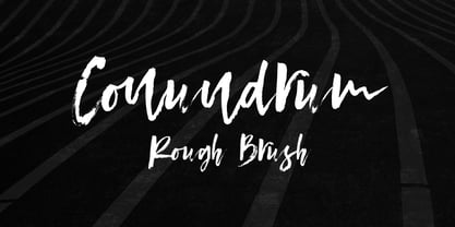
$15.99 - Conundrum by Atom,
$14.00Conundrum is a cool, rough brush font, quickly painted on paper, so it looks natural and organic. If you want a font character that is unique and different than others, Conundrum is worth a try. With this bold concept it would be suitable if used for movie titles, magazine titles, covers, posters, etc. - CircusKS by Baseline Fonts,
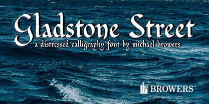
$24.00CircusKS is a new, original typeface based on carnival and circus posters from the late 1800s. Extended Character set for multilanguage support. - Gladstone Street by Michael Browers,
$25.00 - PR Dim Sum by PR Fonts,
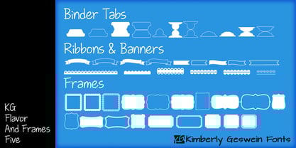
$8.00 - KG Flavor And Frames Five by Kimberly Geswein,
$5.00 - Jam Grotesque by JAM Type Design,
$25.00 - Plasterboard by K-Type,
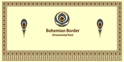
$20.00 - Bohemian Border by 2D Typo,
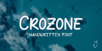
$28.00 - Crozone by Lemonthe,
$14.00 - Zega Text by Isaco Type,
$24.00Zega Text is a top-heavy sans family, inspired in the imprecisions of letterpress printing. Zega has 14 versions that give to your text (printed or on screen) a delicious sense of old printing. Give an exclusive touch to your text with normal versions, without losing reading clarity. Try the heavier versions and add a nice impact to your titles! The family consists of 14 styles, 7 weights plus their respective italic versions. The fonts are available in OpenType PS and have extended character set to support CE, Baltic, Turkish as well as Western European languages. You can test Zega Text downloading the free trial font in Semibold version (TT only). This trial file supports only Western languages. - Lumend by Craft Supply Co,
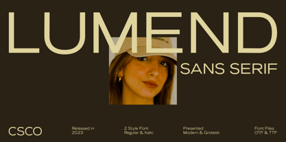
$20.00Lumend Modern Sans Serif Font Sleek and Contemporary Design Introducing Lumend, a modern sans serif font with a unique grotesque twist. Its minimalist aesthetic is defined by clean lines and unadorned forms, offering a fresh, contemporary look. Versatility in Application Remarkably versatile, Lumend Modern Sans Serif Font is adept in both text and title settings. Its legibility in lengthy paragraphs is impressive, while its boldness in headlines commands attention, making it ideal for a variety of design projects. Optimized for All Mediums Crafted for both digital and print use, Lumend’s clarity excels on screens and maintains crispness in print. This adaptability makes it suitable for web design, printed materials, and everything in between. - ITC Aspera by ITC,
$29.99ITC Aspera is the product of graphic experimentation. Olivera Stojadinovic, who designed the face, recalls, Over the last 15 years, I have made several small prints using Cyrillic characters. Often, I made my first sketches with a special pointed brush which was difficult to manipulate well, but once tamed, gave me interesting results." Stojadinovic decided to see if she could reproduce the unique brush quality in digital form. "The idea was to preserve the look of strokes made by my brush, so I kept the scanned shapes as close as possible to the originals, making interventions just to maintain consistent proportions, slope and weight." While this typeface is not a connecting script, Stojadinovic did create a number of letters, such as the 'o' and 's' that are natural connecting characters. She also drew a set of ligatures and matching ornaments to accompany the design." - Cute Letters by Harald Geisler,
$68.34Cute Letters is a hand drawn font family in two styles with extensive character sets. Cute Letters - Hearted is a vibrant happily singing script, all capital as well as some lowercase letters are decorated with heart shapes. Second: Cute Letters - Heartless is still as vivid as it’s sister Hearted but a little less briskly, some straightened forms and without the decorative hearts. Both styles are readable and suitable for longer texts in medium point sizes. Cute Letters Hearted & Heartless is a part of the Light Hearted Font Collection that is inspired by a recording of Jean Baudrillard with the title, "Die Macht der Verführung" (The Power of Seduction) from 2006. Further inspiration came from the article, "The shape of the heart: I'm all yours". The heart represents sacred and secular love: a bloodless sacrifice. by British writer Louisa Young printed in EYE magazine (#43) London, 2002. - Sunshine by Chank,
$49.00Sunshine is the unlikely alphabet collision of Gobbler and Liquorstore. Chank's napkin scrawl smashed into the letters commonly found on signage at the neighborhood liquor store. Gobbler's blotchy textures fragmented Liquorstore's uniform stroke. It began as a hideous lumpy thing with random vector points everywhere. Chank came to the rescue with his Alphabetician's first aid kit. He smoothed the blunt corners with a few hammer blows. He wrapped the font in extra strokes, in a sans serif Roman style, to increase its contrast. His industrial influence helped stabilize Gobbler's gloppy qualities and his grunge aesthetic softened Liquor store's checkerboard rigidity. The end result is a font with a solid structure and a painterly wiggle that creates a dirty display or a slightly clumsy text face. Because of its many detailed strokes, it tends to look a little better in print than on the web. All organic. Earthy.
