10,000 search results
(0.027 seconds)
- Regan Alt by The Northern Block,
$32.00 An informal sans serif typeface carefully cut from the template of Regan and Regan Slab. Smooth curves are combined with simple angles to form a modern, legible font with a charming personality. Regan Alt is ideally suited to wide range of applications including advertising, fashion, retail and the web. Details include 10 weights with italics, 540 characters, 5 variations of numerals, small caps, stylistic alternatives, manually edited kerning and Opentype features.
 - ITC Vinyl by ITC,
$29.99 ITC Vinyl was designed by J. Keith Moore, who was born in Germany but raised in Colorado. The typeface is a hybrid of Art Nouveau, street attitude, and 1950s design and was created with pen, ink, and French curves before being converted into digital fonts with Adobe Illustrator. ITC Vinyl is a family of four display faces in outline and solid designs with corresponding sawtooth" variants for each."
 - Vintage Loving by Lunas Type,
$19.00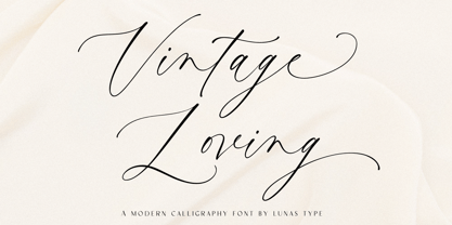 Introducing, Vintage Loving! Vintage Loving is a vintage and luxury calligraphy font. Vintage Loving have a chic and natural curves to add charm impression for your design. VIntage Loving is perfect for many design needs such as merch, T-shirts, signature logo, wedding, book covers, social media posts, websites, events, and many more. What’s you get : – Ending Swashes & beginning swashes. – Numeral & Punctuation. – ligature. – Multilingual Support. Enjoy Designing! Thanks! Lunas Type
 - Somia by Creativemedialab,
$22.00 Somia font is a modern, attractive and beautiful font. It has many alternates characters with nice curves that you can arrange to create a nice logo lettering or use as a poster display. Add a few alterations to it to make beautiful eye-catching words. Somia font is best for logo lettering, headlines, product packaging, t-shirt design, wedding theme, poster, book covers, wedding invitations, Christmas and more.
 - Miraversa by Caligrafê,
$15.00 Miraversa is a display font inspired by calligraphic capitals. It's a typeface with characters of remarkable width, delicate serifs, and beautiful contrast. Most of the letterforms are round, with generous curves. It works as charming drop caps, beautiful titles, and nostalgic compositions. You can use this font on book/cover title designs, product labels, logos, posters and stationery. Features: Basic Alphabet All Uppercase and Punctuation Numbers and Symbols Language Support
 - Funkadelity by PizzaDude.dk,
$18.00 Funkadelity is a funky breed between 60ies poster typography and 80ies grafitti. Maybe even inspired a bit by comic book lettering! Funkadelity wants to burn off the dance floor and show off the fancy dance moves - at the same time, it want to show off the smooth and clean lines of the letters. Originally handdrawn, but I digitally remastered every single letter, leaving the curves smooth and clean!
 - Herzchen by Font-o-Rama,
$25.00Herzchen is a well developed sans serif font. The curving and swinging letter forms remind a little of serif fonts, on closer inspection, however, they rather remind of upright italics. Playful details give charm to the typeface and make Herzchen lively and distinctive. With four cuts the typeface is suitable for simple corporate and editorial design projects. In addition there are many ligatures in the expert-set for individual use. - Erangle by Gatype,
$14.00 Erangle is an elegant serif typeface inspired by a vintage type specimen I found recently at an art fair. Thin to thick contrasting lines and elegant curves make Beginta the perfect font for this type of logo and display purposes. Hope you enjoy it Feel free to contact you with any questions or concerns you may have and I will get back to you as soon as I can.
 - Schoiffer Sans by Jeremie Hornus,
$20.00 Schoiffer Sans is a contemporary humanist sans serif, inspired by the historical font Enschedé English-bodied Roman N0.6. also known as the Scheffers (or Quentell) types. Schoiffer Sans displays warmth through its rounded and curved letterforms, and modernity while respecting the structure of the historical model. It has an extended Latin languages support and comes in 3 roman styles with one italic, all with fractions and multiple figures sets.
 - Qidango by Sealoung,
$21.00 Introducing, Qidango is a serif typeface created with elegance and luxury, exuding femininity and glamour, but also a side of beauty with many alternatives to help you create endless variations for your creative needs. Featuring an italic style with striking contrasts and subtle details, as well as luxurious strokes and voluptuous curves, it creates a beautiful and powerful statement for any typographic composition, combining glamor with a contemporary aesthetic.
 - Retrotype by Luxfont,
$18.00 Introducing retro font Retrotype. Family's vintage style will suit both 50s-80s cartoon illustrations and wild west designs. Retro family has 2 types of styles, complete with different curves. Carefully constructed glyph shapes look great in both large amounts of text and single words in headings. Ideal for vintage and retro designs. Features: - Vintage style. - Uppercase and lowercase the same size. - Numbers & basic Punctuation. - 4 fonts in family. - Kerning. ld.luxfont@gmail.com
 - Amiza by Azzam Ridhamalik,
$18.00 Introducing Amiza, a captivating and versatile font inspired by psychedelic and experimental typefaces. With its mesmerizing curves and intricate details, Amiza effortlessly combines elegance and audacity, making it the perfect choice for creating visually stunning compositions. Whether used for branding, editorial design, or eye-catching headlines, Amiza demands attention and leaves a lasting impression. Elevate your designs with the enigmatic allure of Amiza and stand out in today's competitive design landscape.
 - CCS Levior by Creative Corner Studio,
$19.00 CCS Levior is a classic modern font that is both stylish and unique with Narrow smooth curves and beautiful ligatures, tons of special alternative glyphs, ornament and multilingual support. It's a very versatile font that works great in large and small sizes. CCS Levior is perfect for branding projects, Logo design, Clothing Branding, product packaging, magazine headers, or simply as a stylish text overlay to any background image.
 - Hand of Linda by Lunas Type,
$19.00 Introducing, Hand of Linda! Hand of Linda is a signature notes and handwritten font. Hand of Linda have a chic and natural curves to add charm impression for your design. Hand of Linda is perfect for many design needs such as merch, T-shirts, signature logo, wedding, book covers, social media posts, websites, events, and many more. What's you get : - Numeral & Punctuation. - ligatures. - Multilingual Support. Enjoy Designing! Thanks! Lunas Type
 - Emosia by Gatype,
$14.00 Emosia is an elegant serif typeface inspired by a vintage type specimen I found recently at an art fair. Thin to thick contrasting lines and elegant curves make Beginta the perfect font for this type of logo and display purposes. Hope you enjoy it Feel free to contact you with any questions or concerns you may have and I will get back to you as soon as I can.
 - HU Specialmovie KR by Heummdesign,
$25.00 HU SpecialmovieKR is a retro, wide square typeface, characterized by streamlined, narrow stroke ends such as 'ㄴ,ㅅ,ㅈ'. The first consonants are designed to be large with full modules to improve readability. The grapheme 'ㅇ', which is the face of the font, is in the form of a square in harmony with straight lines and curves, expressing a solid and simple feeling overall. HU SpecialmovieKR includes Korean.
 - Lioney by Surotype,
$25.00 Lioney is a display typeface with dynamic curve ,very suitable as to make a design choice for Headline, Movie Title, packaging, branding and more other creative project. Over 350 glyphs Lioney's also has alternative characters such as Stylistic Alternates, Stylistic Set, and Swash variant. To enable the OpenType Stylistic alternates, you need a program that supports OpenType features such as Adobe Illustrator CS, Adobe Indesign & CorelDraw X6-X7. and more
 - Real Brush by Garisman Studio,
$20.00 Real Brush hand-brush font combines attractive curves with a fresh urban edge; delivering a stylish script which is guaranteed to add an eye-catching appeal to your logo designs, brand imagery, handwritten quotes, product packaging, merchandise and social media posts. - Simple installation - Works for PC and MAC - Multilingual Support (available for 23 Language) - Detailed dry brush - Support for Adobe Illustrator, Photoshop, Corel Draw, or Procreate (New Updated)
 - Levato by Linotype,
$29.99 Levato, the first font designed by Felix Bonge, is an Antiqua that is full of character and is refined but by no means sterile. This typeface provides for a wide range of options for creating individual designs. It was not really Felix Bonge's intention to create a whole font family when, as a second year student, he began several exercises in contrast and proportion as part of the typeface design course of Professor Veljovi? at Hamburg University of Applied Sciences. However, these initial studies developed into a project that Bonge persisted with over the following years while working towards his degree. He continually had new insights and ideas that he was able to exploit for his font. Of particular importance, he claims, was a calligraphy seminar, which prompted him to completely rework his concept. It took him several years before his extensive font Levato™ was ready. Although the forms of Levato are ultimately derived from Renaissance Antiqua, Bonge has slightly increased the relative contrast in his version. This gives the font a graceful appearance that is further emphasized by the reduced x-height and the associated prominence of the ascenders. And, in addition, the relatively fine serifs, which are almost linear at their ends, infuse Levato with a hint of classical Antiqua á la Bodoni. At the same time, Bonge cleverly compensates for the sterilising tendency of this font form. Soft and rounded serif attachments and rounded line apexes offset the severe nature of the font and provide it with an aura of vivacity. This effect is promoted by the calligraphic-like foot of the lowercase h, n and m and the not quite horizontal bars of the uppercase E and F. Overall, Bonge has succeeded in creating a refined and yet very dynamic typeface. Levato is available in five weights; Light, Regular, Medium, Bold and Black, in each case with the corresponding italic versions. Bonge treats Levato Italic as a genuine cursive typeface. Its letters are thus slightly narrower than the analogous upright letters and their forms are considerably more curvilinear. All the versions of Levato boast an enormous range of characters to meet all possible requirements. In addition to four sets of minuscule and majuscule numerals for tabular and proportional typesetting, there are also small caps, numerous ligatures, ornamental characters and even swash variants of letters. With their generous, sweeping curves, the swash variants (available as OpenType versions) can be used for striking titling effects or as initials.
 - Indie by Lián Types,
$37.00 A FEW THOUGHTS Indie is a trendy script, result of the wide range of possibilities that can be achieved using a pointed brush. (1) “You Only Live Once” say The Strokes, (to me, symbols of indie music) so, what would represent that sensation of volatility better than a brush? As you may already know, this time inspiration came from hipsters and indies around us: We may sometimes criticise them, we may sometimes want to be like them, but the truth is that the universo gráfico they generated these past years is gigantic, full of colour and variations. (2) Brush lettering and Sign painting are fields I've been fond of since I started as a designer. Nowadays, these styles are getting a lot of attention and maybe it’s due to the undeniable mark of life that is materialised when using a brush. This tool is so expressive that shows the passions and fears of the artist, and materialises that idea of “living the present”, so popular in this era. When you see Indie, you think of skaters, rollers, surfers, hiphop dancers, street artists, summer, and why not? California beaches. So if you feel life is only one, it’s high time you got Indie into your fonts' collection! STYLES Indie comes in 4 styles plus another one which consists only in capitals. Indie; Indie Shade; Indie Shade Solo; Indie Inline are all open-type programmed and have exactly the same glyphs and metrics, so you can combine them without probem. (I.E. You may use Indie Inline, then write the same word using Indie Shade Solo, and finally put them together). In applications such as Adobe Illustrator, the font has nice results when fi ligatures is activated. However, if you want a more casual look, activate the contextual and the decorative ligatures. NOTES 1. After several years of practicing calligraphy I can say that to me, there’s nothing more satisfying than being able to create fonts out of your own handlettering. I owe a lot of this brush-style to Carl Rohrs. He was the very first calligrapher who taught it to me. His style is unique and what he can do with a brush is truly marvelous. I'm serious. 2. In spite of some particular cases, I can say I'm happy to live in a present in which Typography is living a kind of Renaissance along with Lettering. Like it happened with W. Morris a hundred years ago, handcrafts are being revalued/reborn, and some of this may be happening thanks to these indie designers that, trying to be unique, gave new/fresh air to different areas of graphic design.
 - Thang by Fenotype,
$30.00 Aint’ nuthin but the Thang. Thang is a street cred script family with big initial caps and tight flow. Thang is great for flashy headlines or as a logotype. Thang family comes with three weights. Thang Extras is a pack of strokes and dots that can be used to decorate your texts typed with Thang. Thang Extras can also be combined with Thang letters for custom Swash. Thang is packed with several OpenType features: keep on Standard Ligatures and Contextual Alternates for smooth flow. Try Swash, Stylistic or Titling Alternates for alternate characters to create customised lettering works. Check out Glyph Palette for even more alternate characters and go wild the Thang.
 - India Snake Pixel Labyrinth Game by TypoGraphicDesign,
$19.00 CONCEPT/CHARACTERISTICS The curly, pixelated, edgy and futuristic character, gives the typeface a high recognition value and uniqueness. APPLICATION AREA The fancy, videogame like, vintage and sci-fi font „india snake pixel labyrinth game“ would look good at logos, display size for poster, flyer, comics and graphic novel lettering, headlines in magazines or websites, packaging, music covers or webbanner etc. TECHNICAL SPECIFICATIONS Headline Font | Display Font | Sci-Fi Font „india snake pixel labyrinth game“ OpenType Font with & 275 glyphs & 4 styles (regular, bold, light & 3d). Alternative letters, symbols and ligatures (with accents & €) KONZEPT/BESONDERHEITEN Der ausgefallene, videospielartige, retro und futuristische Charakter, geben der Schrift eine hohe Wiedererkennung und eine gewisse Einzigartigkeit.
 - Mojodelic by Mysterylab,
$21.00 Looking for a font with that certain... umm... special mojo? Mojodelic might just be the niche font that you need to create that unique statement — one that really pops off the page. While this typeface certainly grooves with the 1960s – 1970s vintage psychedelic and pop art look, it's also a perfect fit with retro 1990s party-way-too-hard youth culture graphics. With its ultra-bold reverse-contrast design and whimsical little curlies, this one's got equal parts silliness and swagger. Try it on skateboard graphics, retro message t-shirts, apparel logos, beverage labeling, candy packaging, teen/tweener marketing, greeting cards... you name it. Enjoy.
 - Sunbest Mora by Ekahermawan,
$20.00 Sunbest Mora is a curly designed serif family font that consists of 9 weights from Thin to Black. Sunbest Mora also includes a bunch of alternate characters (PUA Encoded) and ligatures characters to give you a wide range for creating attractive typographic design results for many different projects such as logo, branding, poster, magazines, labels, merchandise, invitation, presentation, advertising, quotes and so much more! FEATURES: OpenType support Playful to use (with ligatures and alternates options) Multilingual support PUA Encoded If you need support or more information about this item, please kindly contact me: ekahermawanputu@gmail.com Thank you so much...I really hope you enjoy when using it!
 - Destrubia by Keristyper Studio,
$14.00 The Destrubia is made with the concept of a modern contemporary font display that gives a unique impression because it has a curvy and distortion shape. This font is good for logo design, Social media, Movie Titles, Books Titles, short text even long text letters, and good for your secondary text font with the script, sans, or serif. Featured: Standard Uppercase & Lowercase Numeral & Punctuation Multilingual : ä ö ü Ä Ö Ü ß ¿ ¡ Alternate & Ligature PUA encoded We recommend programs that support the OpenType feature and the Glyphs panel such as Adobe applications or Corel Draw. so you can use all the variations of the glyphs. Hope you enjoy our fonts!
 - Hellosin by Keristyper Studio,
$14.00 Hellosin is a sans serif-based typeface that has curly and elegant looks with a bunch of alternates that will make your design even more stunning and stand out. This font is good for logo design, Social media, Movie Titles, Books Titles, short text even long text letters, and good for your secondary text font with sans or serif. Featured: Standard Uppercase & Lowercase Numeral & Punctuation Multilingual : ä ö ü Ä Ö Ü ß ¿ ¡ Alternate & Ligature PUA encoded We recommend programs that support the OpenType feature and the Glyphs panel such as Adobe applications or Corel Draw. so you can use all the variations of the glyphs. Hope you enjoy our fonts!
 - Nula by Tour De Force,
$25.00 Nula is humanist sans serif family equipped with 22 font files - 11 weights and italics - from Thin to Heavy. It is modern, functional and distinctive, ideal for multiple purposes. Curvy diagonal stems and endings characterize Nula as typeface with lively elegant and soft touch, but stable, well structured typeface at same time. Nula font family is fully legible in any size and with it's variety of weights recommends itself for publishing or online magazine. Nula includes stylistic alternate letters, tabular and old style numerals, fractions, numerators and denominators, alternate forms of numerals and bunch of applicable symbols with arrows that are exchangeable in all weights, following weight thickens.
 - Tournedos by Hanoded,
$10.00 The other day, I was cooking a curry and I suddenly realised that we, as a family, eat a lot of meat. At home we do like meat, but given the state our world is in right now, we cannot continue eating meat like there is no tomorrow. As a result, I am hunting the internet right now for good vegetarian recipes (if you have one you’d like to share, then please contact me!). Tournedos is a beefy font family: a chunky all caps set of fonts - and a leaner set to counter and complement this rather heavy dish. And do eat your greens!
 - CCS Calma by Creative Corner Studio,
$29.00 Calma is a new bold display font that is perfect for projects that need a bold, playful, and energetic look with a retro 80s vibe. It features slightly expanded stroke endings combined with curvy letterforms, giving it a sense of movement and excitement. It also includes a large number of ligatures and special characters, giving users even more flexibility and creativity when using the font. Calma can be used for a variety of purposes, including headlines, titles, posters, packaging, and branding. It is also well-suited for use in digital applications, such as websites and social media. Calma is the font that will make your next project pop!
 - Bread Store by HansCo,
$15.00 Bread Store is a fun script font duo designed with an iconic curly and comical style. It perfectly represents elegance with its clean lines and modern swashes. Bread Store is the perfect font for making original and outstanding designs. Its casual charm makes it appear wonderfully down-to-earth, readable and, ultimately, incredibly versatile. Bread Store font will look outstanding in any context, whether it’s being used on busy backgrounds or as a standalone headline! Comes with a full uppercase, lowercase, numbers and punctuation + standard multilingual support. It’s great for branding, logo designs, lettering, logotype, craft, posters, packaging and much more. We recommend using Adobe Illustrator or Photoshop.
 - Pink Lemonade by Nicky Laatz,
$22.00 A new fresh, bold brush font from Nicky Laatz. Pink Lemonade is Sweet, Casual and curvy...with subtle brush texture left in- perfect for head-turning statements and eye-catching branding. Pink Lemonade includes 45 natural-looking Opentype ligatures - perfect for making your words look freshly lettered, and like less of a font. Try alternating between having the ligatures active and not active for an even more natural look. Pink Lemonade will work wonderfully for beauty, posters, music brands, magazines, cosmetics, cook books, culinary art, book covers, sporting brands, bold headliners, and websites. Enjoy more inspiration using all Nicky Laatz's fonts on Instagram - @nickylaatz.
 - JBCursive stands as an exquisite exemplification of artistry harmonized with utility, a font that transcends mere text to become a visual melody. With its roots deeply entrenched in the tradition of ...
- Hamburger Heaven NF Pro by CheapProFonts,
$10.00 A stylish retro script where I have completely redone the spacing to make the text look more even. All of the diacritics have been redone, too - and the character set expanded in our usual fashion. So now this little gem from Nick Curtis is ready for the big time! Nick Curtis says: “This font is basically a design exercise, influenced by a number of contemporary fonts, but unique in its own way. The gentle, fluid motion reminded me of diner lettering from the 30s and 40s, hence the name.” ALL fonts from CheapProFonts have very extensive language support: They contain some unusual diacritic letters (some of which are contained in the Latin Extended-B Unicode block) supporting: Cornish, Filipino (Tagalog), Guarani, Luxembourgian, Malagasy, Romanian, Ulithian and Welsh. They also contain all glyphs in the Latin Extended-A Unicode block (which among others cover the Central European and Baltic areas) supporting: Afrikaans, Belarusian (Lacinka), Bosnian, Catalan, Chichewa, Croatian, Czech, Dutch, Esperanto, Greenlandic, Hungarian, Kashubian, Kurdish (Kurmanji), Latvian, Lithuanian, Maltese, Maori, Polish, Saami (Inari), Saami (North), Serbian (latin), Slovak(ian), Slovene, Sorbian (Lower), Sorbian (Upper), Turkish and Turkmen. And they of course contain all the usual “western” glyphs supporting: Albanian, Basque, Breton, Chamorro, Danish, Estonian, Faroese, Finnish, French, Frisian, Galican, German, Icelandic, Indonesian, Irish (Gaelic), Italian, Northern Sotho, Norwegian, Occitan, Portuguese, Rhaeto-Romance, Sami (Lule), Sami (South), Scots (Gaelic), Spanish, Swedish, Tswana, Walloon and Yapese.
 - LiebeRuth by LiebeFonts,
$29.90 LiebeRuth is your 100 percent hand-made organic type. She absolutely loves to be typeset in large *and* small sizes, because Legibility is her middle name. (Yes, we know it’s not a typical girl’s name.) She is friendly and polite, but she also has a few quirks. Her friends are impressed with how natural she manages to look every day. Her four weights ensure that Ruth has the right boldness for any context: birthday invitation, personal correspondence, photo album, or billboard ad. During the creation of this font, her designer ate plenty of healthy, organic foods. We think this is the reason why Ruth looks so fresh and lively. And of course Ruth has been designed with lots of Liebe (which is German for “love”—and she speaks many other languages, too). One more thing Ruth is marvelous at: showing off her curly-swirly swashed alternative letterforms that can be activated via OpenType. (Please make sure your software supports OpenType if you wish to use the advanced features.) Each style contains more than 560 gluten-free glyphs—now that is great value! If you like this font, you may want to look at LiebeRuth’s bolder sister LiebeDoni and our best-sellers LiebeErika and LiebeKlara. Or add in some LiebeOrnaments to prepare a curly-licious feast. By the way: LiebeRuth also gets along great with our wide range of illustrative fonts, including LiebeCook, LiebeFish, and LiebeTweet.
 - Erotica by Lián Types,
$49.00 “A picture is worth a thousand words” and here, that’s more than true. Take a look at Erotica’s Booklet; Erotica’s Poster Design and Erotica’s User’s Guide before reading below. THE STYLES The difference between Pro and Std styles is the quantity of glyphs. Therefore, Pro styles include all the decorative alternates and ligatures while Std styles are a reduced version of Pro ones. Big and Small styles were thought for better printing results. While Big is recommended to be printed in big sizes, Small may be printed in tiny sizes and will still show its hairlines well. INTRODUCTION I have always wondered if the circle could ever be considered as an imperfect shape. Thousands of years have passed and we still consider circles as synonyms of infinite beauty. Some believe that there is something intrinsically “divine” that could be found in them. Sensuality is many times related to perfectly shaped strong curves, exuberant forms and a big contrasts. Erotica is a font created with this in mind. THE PROCESS This story begins one fine day of March in 2012. I was looking for something new. Something which would express the deep love I feel regarding calligraphy in a new way. At that time, I was practicing a lot of roundhand, testing and feeling different kinds of nibs; hearing the sometimes sharp, sometimes soft, sound of them sliding on the paper. This kind of calligraphy has some really strict rules: An even pattern of repetition is required, so you have to be absolutely aware of the pressure of the flexible pen; and of the distance between characters. Also, learning copperplate can be really useful to understand about proportion in letters and how a minimum change of it can drastically affect the look of the word and text. Many times I would forget about type-design and I would let myself go(1): Nothing like making the pen dance when adding some accolades above and below the written word. Once something is mastered, you are able to break some rules. At least, that’s my philosophy. (2) After some research, I found that the world was in need of a really sexy yet formal copperplate. (3) I started Erotica with the idea of taking some rules of this style to the extreme. Some characters were drawn with a pencil first because what I had in mind was impossible to be made with a pen. (4) Finding a graceful way to combine really thick thicks with really thin hairlines with satisfactory results demanded months of tough work: The embryo of Erotica was a lot more bolder than now and had a shorter x-height. Changing proportions of Erotica was crucial for its final look. The taller it became the sexier it looked. Like women again? The result is a font filled with tons of alternates which can make the user think he/she is the actual designer of the word/phrase due to the huge amount of possibilities when choosing glyphs. To make Erotica work well in small sizes too, I designed Erotica Small which can be printed in tiny sizes without any problems. For a more elegant purpose, I designed Erotica Inline, with exactly the same features you can find in the other styles. After finishing these styles, I needed a partner for Erotica. Inspired again in some old calligraphic books I found that Bickham used to accompany his wonderful scripts with some ornated roman caps. Erotica Capitals follows the essentials of those capitals and can be used with or without its alternates to accompany Erotica. In 2013, Erotica received a Certificate of Excellence in Type Design in the 59th TDC Type Directors Club Typeface Design Competition. Meet Erotica, beauty and elegance guaranteed. Notes (1) It is supossed that I'm a typographer rather than a calligrapher, but the truth is that I'm in the middle. Being a graphic designer makes me a little stubborn sometimes. But, I found that the more you don't think of type rules, the more graceful and lively pieces of calligraphy can be done. (2) “Know the forms well before you attempt to make them” used to say E. A. Lupfer, a master of this kind of script a century ago. And I would add “And once you know them, it’s time to fly...” (3) Some script fonts by my compatriots Sabrina Lopez, Ramiro Espinoza and Alejandro Paul deserve a mention here because of their undeniable beauty. The fact that many great copperplate fonts come from Argentina makes me feel really proud. Take a look at: Parfumerie, Medusa, Burgues, Poem and Bellisima. (4) Some calligraphers, graphic and type designer experimented in this field in the mid-to-late 20th century and made a really playful style out of it: Letters show a lot of personality and sometimes they seem drawn rather than written. I want to express my sincere admiration to the fantastic Herb Lubalin, and his friends Tony DiSpigna, Tom Carnase, and of course my fellow countryman Ricardo Rousselot. All of them, amazing.
 - Boatman by YdhraStudio,
$20.00 Boatman Font – 3 Styles + Extras We introduce our new font called Boatman. Boatman is a (All Caps) vintage display font inspired from classic whiskey labels, vintage labels and sing painting. Boatman comes with 3 styles (Regular, Outline and Stamped) that extends the possibilities when you design something. Boatman also has the Stylistic Set. With the Stylistic Set, Boatman gives you so many options to create something awesome. Mix and match the alternate characters to add an attractive message to your design. Furthermore the Boatman includes a Set of Ornament Labels which perfectly complement text compositions. You can see it on my presentation examples. Boatman is great for Logotype, Branding Design, Logo Design, Badges, Digital Lettering Arts, T-Shirt/Apparel, Headline, Posters, Magazine, Signs, Advertising Design, and any vintage design needs. Boatman Features : - All Caps Characters, Punctuation, Numerals. - Opentype Feature such as Stylistic Set. - Fully accessible without additional design software. - Includes a range of multilingual characters. - Ornament Labels You can access all those alternate characters by using a program that supports OpenType features such as Adobe Illustrator CS, Adobe Indesign & CorelDraw X6-X7. Guides to access all alternates glyphs : http://adobe.ly/1m1fn4Y
 - Sqwared by Monotype,
$25.00 Sqwared is a square sans serif type family... with flares! This typeface has a retro, hand-painted quality – the slight flaring of its verticals evoke the steady brush of a signwriter. Sqwared benefits from large, open counters and a generous x-height that aids clarity and legibility, while a wide footprint gives these fonts a degree of stature and an air of confidence. Each character was drawn while immersed in a late sixties/early seventies vibe, but there’s no reason why Sqwared can’t be used for your contemporary designs. There are 16 fonts altogether, ranging from Thin to Ultra weights in both roman and italic. It has a Latin character set that covers all Latin European languages. Sqwared will dazzle in headlines, add flair and distinction to your logo designs, bring flamboyance to your branding material, and your body text will most definitely be unique! Variable fonts are included in this family, so you can tune the weight of each font to your exact preference. Key features: 8 weights in Roman and Italic Old Style Figures included Full European character set (Latin only) 440 glyphs per font.
 - Calaveras by Design is Culture,
$29.00 In August of 2009, I was commissioned by Zoo York, a New York City based skateboard company, to visit Buenos Aires to study and document street typography. As soon as my taxi driver took the bustling street Entre Ríos, it was clear that the city and I were going to be good friends. Many of the independently owned businesses on Entre Ríos are adorned with handmade signage. These signs are painted in a style called Fileteado which is a century-old Argentinian type of lettering and floral ornamentation. Nowadays, Fileteado is still a prominent part of the city’s landscape, coloring the façades of restaurants, bars and coffee shops. Calaveras and Diablitos are two new typefaces that were inspired by Fileteado. Stylistically, the fonts are a return to a rhythmic and playful sensibility reminiscent of Vitrina and Cuba, two fonts that I designed in 1996. Along with dynamism and dance, these new fonts incorporate a rigor and functionality essential to labelling any font a ‘workhorse.’ The names Calaveras and Diablitos, came from the name of a song by the infamous Buenos Aires rock band, Los Fabulosos Cadillacs. —Pablo A. Medina
 - Various by Ahmad Jamaludin,
$17.00 Say hello to VARIOUS! Completely unique and custom font with a 00s style, inspired by vintage and hand-painted retro signs :D Various is a font with a delightful retro touch perfect for capturing the essence of the 60s, 70s, 80s, 90s, and even Y2K designs! Its unique characteristics will transport you to those iconic eras, adding a nostalgic vibe to your creative projects. Various come in two versions - Regular and Outline. With two different style fonts, you can easily create eye-catching designs without any extra effort This font is perfect for a retro 00s theme and can be used for cover magazines, brochures, logos, headlines or quotes, stand-alone displays, and short paragraphs or content. Each font in the family is dynamic and authoritative on its own, making it perfect for any display project. What do you get? Various Various Outline Alternates and Ligatures Instructions ( Access special characters, even in circuit design ) Letters, numbers, symbols, and punctuation No special software is required to use this typeface even work in Canva Multilingual Support Let Various take you on a journey through time Enjoy your day! Dharmas Studio
 - VLNL Beatbox by VetteLetters,
$30.00 VLNL Beatbox is a solid tech heavy straight stencil-face with a lot of character. It was originally designed as a logo for dj Markus Schultz back in 2004, who rejected it. His management couldn't read it, or thought people wouldn’t be able to read it. But Chef Donald DBXL found the concept interesting enough to finish it and has used it in many projects since. It was the identity font for the Battle of Amsterdam, a talent showcase in beat boxing and other skills. Beatboxing is a style of hiphop music (beats) made with the mouth and a microphone. A box is a handy container to store stuff. Like food, or fonts. We use a lot of boxes at the VetteLetters office. VLNL Beatbox is best deployed big, like in logos or headlines. Or flyers, album covers, posters and signage. As a display and headline typeface it’s got a lot of character. We could definitely see it painted on the side of a tank, or an airplane. It’s heavy, but not at all dangerous. Use it without risk. VLNL Beatbox comes in two variations; Regular and Small (smallcaps)