10,000 search results
(0.024 seconds)
- Herbie by The Infamous Foundry,
$49.00 Herbie is a uppercase display font with alternates on every character (upper/lowercase), based only on circles and geometric lines. Herbie is inspired by, as the name might indicate, Herb Lubalin’s work and the decorative style and kerning of his era.
 - Vintage Whiskey by Vozzy,
$10.00 Introducing a vintage look layered label typeface named "Vintage Whiskey". This typeface includes six styles (including effect styles), for sample look at 4th preview. This font will good viewed on any retro design like poster, t-shirt, label, logo etc.
 - Augustin by Ludwig Type,
$45.00 Augustin is an elegant and legible typeface inspired by the classic letter forms of the renaissance, namely the type of Nicolas Jenson made in Venice in 1470. The style-linked family includes oldstyle and lining figures both tabular and proportional.
 - Dear Nathan by Arendxstudio,
$12.00 Introducing my latest font is Dear Nathan, a handwritten font which is very elegant and modern for you to use and your design interests be it for logos, branding names, posters, podcasts and so on. This is perfect for you all.
 - Crimsons by Piñata,
$8.00 Fontfamily Crimsons unique and very unusual. It combines modern grotesque, medieval motifs and serif proportions. These fonts will be a useful part of a collection designers. Crimsons is ideal for short and emotional inscriptions. Titles, names, logotypes - this is his element.
 - Lui by Joachim Frank,
$22.00 The German typeface designer Joachim Frank designed this font 2022. The name stands for his youngest grandson Lui. Naturalness and harmony, soft lines and uniqueness are the characteristics of this font. This font is ideal for logos, advertising, branding, posters, billboards.
 - Escuela by Cuchi, qué tipo,
$9.95 Escuela typeface is born in an attempt to reflect so many current influences of modern grotesque fonts that are trying to better reflect the values of today's world. Its compact proportions and high x-height, but at the same time with sort kind of modulation and open inktraps, propose a visual game that is worth enough to use it many places; Escuela can be striking and ideal for headlines in large text and heavy weights, but at the same time serious and readable in smaller bodies or regular and fine weights. Its wide range of characters, which includes a set of emoticons ideal for signage, work and evaluation documents, as well as inclusive, is ideal for educational centers, whether they are more playful (schools) or more pragmatic (universities). In fact, "Escuela" means “School” in English. For this reason, Escuela is your best ally when it comes to preparing texts that transcend students through a contemporary and different, but functional, character. Designed by Carlos Campos www.cuchiquetipo.com Dummy text from wikisource.org (1911 Encyclopædia Britannica/Universities).
 - Sleepy Bear by Missy Meyer,
$12.00 I've been learning to read Cyrillic and Greek letters lately, mainly because I've been playing the game GeoGuessr. (If you haven't played it, I highly recommend! It plops you down somewhere in the world in Google Street View, and you have to figure out where you are.) Cyrillic shows up in so many more places than Russia! You can see it in Bulgaria, Mongolia, Serbia, Montenegro, Kyrgyzstan, and more. Because of that, I made sure to include a fun double-uppercase version of those alphabet sets in Sleepy Bear. They're styled the same way as the Latin characters: all uppercase height, with some lowercase-styled letters thrown in at that same height for a fun look for all ages. I've also made two weights of Sleepy Bear: a plump and smooth regular weight, and a lighter weight that's built to stack on top of the regular (though you can use it on its own). Just type out a word in Sleepy Bear, copy it, and then change the copy to Sleepy Bear Light. You'll get a great outline look in seconds! All characters are extensively cleaned up, with smooth curves and rounded ends. Sleepy Bear is great for all print projects, and also cuts out of all materials like a dream. It's a cute and quirky monoline font family that's great for all of your family's designs. Each font contains over 850 glyphs, and includes: - Latin and extended Latin characters to support over 100 languages; - Cyrillic and Greek double-uppercase alphabet sets; - 18 fractions; - Punctuation galore; - 38 double-letter ligatures for variety (including international pairs like KK and II); - And a half-dozen alternates for even more variety!
 - Mathias by Bisou,
$15.00 Except doodling on your notebook, what a better occupation would you have while the teacher tries to explain physics on the blackboard ? Create an awesome font ? Mathias is a font created in class by a lazy designer named Mathias. The result is one of the most complete font made by Bisou. Mathias font is retro. It will catch the attention of the reader in a blink of an eye. Exclusively recommended for titles, this bold font will suite perfectly your company name on a big truck, your old school car spare parts sign, the logo for a brand of cigarettes, alcoholics or shoe polish.
 - Vagary JNL by Jeff Levine,
$29.00 For many decades, the fashion magazine “Vogue” featured superbly illustrated covers before photography became more commonplace. During the 1930s and 1940s those illustrations were accompanied by many creative styles of hand lettering for its monthly issues. The January, 1930 cover had the magazine’s name lettered in an Art Deco geometric monoline, which became the inspiration for Vagary JNL, which is available in both regular and oblique versions. A vagary [in a simple sense] is when something or someone changes in an erratic or unexpected way (as the wind’s direction or in a person’s mood or whim)… and thus seemed the fitting name for this type style.
 - Gerucht 2.0 by Rumors Foundry,
$11.00 Gerücht Typeface is a family of digital fonts designed in 2019 by Gabriele Bellanca for Rumors Foundry in three different weights and their corresponding slanted versions. All rights reserved. Gerücht (in English rumor) is the name of the font-family: today the name of a font is part of the graphic design itself, unlike in the past, where it usually consisted of a simple retrospective description (such as in the case of Gothic Condensed No.2) of its characteristics. It's a "one-word advertising slogan", writes Tobias Frere-Jones, which serves to build an idea and a charm to associate with that type of character.
 - Uncle Edward by Hanoded,
$15.00 First of all, I don’t have an uncle called Edward, nor do I know anyone by that name. When I had finished this font, it had a strong ‘Uncle Edward’ feeling to it, so the name stuck. Uncle Edward is a handmade script font. I used a Japanese brush pen and some rough paper to create that ‘vintage’ look. Use Uncle Edward for your book covers, your invitations or your product packaging. Create labels for your vintage record collection with it, or print a guest list for your Christmas dinner party. Uncle Edward gives you his blessing. Comes with ligatures for double letters and a whole bunch of accents.
 - Southwark by Hanoded,
$15.00 London is one of my favourite cities, so it was about time I named a font after it. Well, technically, I named a font after one of London’s districts. Southwark comes from the Anglo-Saxon word Suthriganaweorc, which means ‘Fort of the men of Surrey’. The font Southwork is a handmade Clarendon. I used a Japanese brush pen to create the outlines. I gave the glyphs texture by filling them in with a brush and Chinese ink. Southwark, therefore, has an uneven look and a brushy texture. It looks good on just about anything, but posters, greeting cards and product packaging come to mind.
 - Eckhardt Bold JNL by Jeff Levine,
$29.00 Eckhardt Bold JNL continues a series of sign painter-inspired type designs and is named in honor of the late Al Eckhardt, a talented sign man who was a good friend of Jeff Levine for about 18 years until his passing. The font is available in both regular and oblique versions and was inspired by an example found in the 1928 edition of E.C. Mattthews' "How to Paint Signs and Sho' Cards". Both squat and wide for maximum use in wall and window applications, the original name for the design is "Heavy Plug". Plug was the sign painter's term at the time for describing this type of letter form.
 - Jali Arabic by Foundry5,
$26.00 Jali is a humanist sans serif typeface particularly suited for wayfinding. Jali comes in versions that support Arabic, Greek, and Latin. The name ‘Jali’ means clear in the Arabic language. The design of Jali reflects the ethos of its name. The combination of low-contrast strokes, ample counters, dots, and distinguishable marks make Jali a versatile typeface. With its humanistic voice and clear letterforms, Jali aims at offering a warm and efficient reading experience. Similar to other wayfinding type families, Jali is also well suited for demanding typographic environments. Jali has received two renowned awards: TDC Certificate in Typographic Excellence and Granshan’s 1st Prize, Arabic & Latin Category in 2019.
 - Floridium Pro LV by No Bodoni,
$35.00 Floridium grew out of an affection for the old wood types of the 1800s. Painters Roman* was the initial inspiration. It was the source for the �banana� and �snake head� serifs. But the design�released by Adobe as Juniper�was too quirky to be useful. I tried to make it more sophisticated and modern while keeping the original personality of the 19th century types. The name resulted from a trip to Miami while the initial drawings were being made. Not the best way to name a typeface, but while we were in Miami Beach there was this tall blonde in a bright yellow bikini sitting on this bright yellow Porsche and...
 - Heart on a string by PizzaDude.dk,
$15.00 "Heart on a string" is from a song by Paul McCartney, and is one of his romantic ones. I tried to do the same by creating a font that has the same romantic feeling.
 - Ambroise Std by Typofonderie,
$59.00 An exquisite Didot font in 18 series Ambroise is a contemporary interpretation of various typefaces belonging to Didot’s late style, conceived circa 1830, including the original forms of g, y, &; and to a lesser extent, k. These unique glyphs are found in Gras Vibert, cut by Michel Vibert. Vibert was the appointed punchcutter of the Didot family during this period. It is the Heavy, whom sources were surest that Jean François Porchez has been used as the basis for the design of the typeface family. In the second half of the 19th century, it was usual to find fat Didots in several widths in the catalogs of French type foundries. These same typefaces continued to be offered until the demise of the big French foundries in the 1960s. Ambroise attempts to reproduce more of what we see printed on paper in the 19th century; a more accurate representation of Didot punches. So, the unbracketed serifs are not truly square straight-line forms but use tiny transitional curves instead. The result on the page appears softer and less straight, particularly in larger sizes. The illustrious Didot family of type founders and printers Every variation of the typeface carries a name in homage to a member of the illustrious Didot family of type founders and printers. The condensed variant is called Ambroise Firmin. The extra-condensed is called Ambroise François. Ambroise Pro brought back to life: fifteen years in the making! Club des directeurs artistiques, 48e palmarès Bukva:raz 2001
 - Lisboa Hebrew by Vanarchiv,
$52.00 Lisboa Hebrew is humanist sans-serif typeface base on the same design as the original Lisboa (2005). The main structure is more close to the Sephardic proportions, where the letterforms contains reverse contrast and the terminals following the same calligraphic approach (Humanist). There are some characters and figures designed as small caps which have the same proportions from Hebrew. Latin transliteration characters were also included.
 - Calmingly by Nathatype,
$29.00 Calmingly is an elegant display serif font suitably applied to express charmingly aesthetic designs and to give more feminim touches to any of your designs. Its simple designs and letter height and line thickness variations make this font legible. Additionally, another characteristic of this font is the curvy letter edges added to some of the letters. Enjoy Calmingly’s lovely features to beautify your designs. Features: Stylistic Sets Multilingual Supports PUA Encoded Numerals and Punctuations Calmingly fits for various design projects, such as posters, banners, logos, magazine covers, quotes, headings, printed products, invitations, name cards, merchandise, social media, etc. Find out more ways to use this font by taking a look at the font preview. Thanks for purchasing our fonts. Hopefully, you have a great experience using our font. Feel free to contact us for further information when you have a problem using the font. Thank you. Happy designing.
 - Sempione by CAST,
$45.00 Sempione is a spanking new sanserif family suitable for publishing and advertising that looks great in small and large sizes. Its two main styles, Grotesk and Modern, are inspired by the early grots and 20th-century sanserifs. They come in seven weights with the matching italics, Grotesk Cursive and Modern Slanted. The considerable variety of letterforms and styles, along with some peculiar stylistic sets, will be appreciated by designers looking for more freedom of choice.
 - Abigail Script by Roland Hüse Design,
$15.00 Abigail Script is a handwritten, monoline cursive font. All the uppercase letters has stylistic alternates and some lowercase letters as well, ligatures and positional forms. Also have a few ornaments in place of numbers 1-9 best fit under words up to 5-6 characters long. See the gallery for preview. It contains Eastern and Western European accented characters. I hope you like this font, good luck with your project and let the creativity flow!
 - Barito by Authentype,
$14.00 The Barito Serif 9 font is full of cursive typefaces with sharp, bold lines that create an optical illusion that appears to intimidate the reader. Barito serif font comes with many languages like Cyrillic • Greek • Latin and is perfect for designing books, magazines, titles for online advertising media websites and much more. The barito serif font not only comes with 9 weights, but is also accompanied by an italic for complement and confirmation.
 - Australis Pro Swash by Latinotype,
$29.00 Australis Swash is a new variant that adds to the family of Australis Pro and it brings a touch of whimsy and mannerism to the shape of the cursive letters. Its purpose is purely playful because Australis Swash has some useful Opentype features as standard ligatures, discretionary ligatures and contextual alternates to use them in headlines or as a base for brands and lettering in general. Designed by Francisco Gálvez Pizarro in 2013.
 - TT Neoris by TypeType,
$39.00 The future of Neo-Grotesques is now! Introducing TT Neoris—a new ambitious font from TypeType. TT Neoris is an ideal sans with: 21 font styles: 10 upright, 10 italics, and 1 variable font; 1832 characters; 41 OpenType features; 14 stylistic sets with Soft character and Upright cursive in Latin and Cyrillic character sets; 230+ languages support; Special condensed italics designed to create a 'highlighting' effect when used in specific text segments.
 - Younglines by Maulana Creative,
$12.00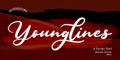 Younglines is a cursive script font. With contrast bold stroke, slanted and fun character with a bit of ligatures. To give you an extra creative work. Younglines font support multilingual more than 100+ language. This font is good for logo design, Social media, Movie Titles, Books Titles, a short text even a long text letter and good for your secondary text font with sans or serif. Make a stunning work with Younglines font. Cheers, MaulanaCreative
 - Lieberates by Maulana Creative,
$14.00 Lieberates is a cursive script font. With high contrast stroke, fun character with a bit of ligatures. To give you an extra creative work. Lieberates font support multilingual more than 100+ language. This font is good for logo design, Social media, Movie Titles, Books Titles, a short text even a long text letter and good for your secondary text font with sans or serif. Make a stunning work with Lieberates font. Cheers, MaulanaCreative
 - ITC Bookman by ITC,
$40.99 ITC Bookman font was designed by Edward Benguiat, whose goal was to design a typeface that had a clear resemblance to previous Bookman faces but was different and more versatile. This typeface retains all the traits of the original and adds a large x-height and moderate stroke contrast for optimal legibility. ITC Bookman font also has italics which are true cursive forms, as opposed to oblique roman characters. Featured in: Best Fonts for Tattoos
 - Postman by Juan I. Siwak,
$20.00 Postman is a typeface inspired by old documents, banknotes and leading product brands. It has cursive and elegant capital letters and its lowercase letters are actually small caps of geometric shapes as if they were made of metal and nailed with bolts. It is ideal for classic products that consider nobility and tradition among their virtues. It evokes classic products that lasted over time. Includes OpenType features, like ligatures, alternates, and more.
 - Cosbycorwin by Maulana Creative,
$11.00 "Cosbycorwin" is a slanted cursive script font. With light contrast stroke, fun character with a bit of ligatures. To give you an extra creative work. "Cosbycorwin" font support multilingual more than 100+ language. This font is good for logo design, Social media, Movie Titles, Books Titles, a short text even a long text letter and good for your secondary text font with sans or serif. Make a stunning work with "Cosbycorwin" font. Cheers, MaulanaCreative
 - 1880 Kurrentshrift by GLC,
$38.00 This font was inspired by the old form of the so called "Kurrentschrift" German handwriting, based on late medieval cursive. It is also known as "Alte Deutsche schrift" ("Old German script"). It was taught in German schools until 1941, when Adolf Hitler decided to forbid it. As it is a little hard to read, we are proposing here two versions: the "pure" Kurrentschrift, and an adapted "Easy" one, with simplified difficult characters.
 - Panhandler by SparkyType,
$19.00With a hand-inked look, Panhandler flows like decorative but unfussy cursive writing. The font has automatically substituting glyphs and ligatures to avoid some of the problems other connnecting scripts encounter. It also includes a set of swash capital letters and a decorative swash ending lowercase set. Panhandler is available in the OpenType format (both flavours) and will work with on all standard platforms and software. Advanced features will require OpenType compatible software. - Hillside by Namara Creative Studio,
$14.00 Introducing! Hillside Modern Font Duo A perfect blend of simplicity and elegance! This font duo features a clean and minimalist display font, which is ideal for creating a modern look. Additionally, the cursive script font style exudes sophistication and elegance, making it a great choice for personalized and decorative designs. The Sans & Script font duo is versatile and can be used for various design projects such as logos, branding, invitations, packaging, and more.
 - Marshfield by Adam Fathony,
$10.00 Monoline Fonts with strong identity for an outdoor design, camping, wild, journey, adventure, masculine, and etc. Opentype features are available on Marshfield such as Ligatures, Stylistic Alternates (Up to 6 Alternates), Contextual alternates, and Terminal Alternates. Marshfield Comes with 2 Type of Fonts, Script and Cursive. On each type of fonts have 3 different style, Clean (sharp corner), Round (Rounded Corner), and Rough (Rough Version). 6 Fonts in Total for completing your design style.
 - Pimpin by Eurotypo,
$48.00 Pimpin, is a speedy cursive typeface that can express a fresh atmosphere of casual style. The Pimpin fonts come in four styles: Regular, Bold, Italic and Bold Italic; Included diacritics for CE languages. They were carefully hand-drawn, with different letter shapes, full of ligatures, and stylistic alternates that will provide great flexibility for your designs. Pimpin may fit perfect for advertising, packaging design, flyers, posters, children books and many other purposes.
 - Glider Girls - Unknown license

- Neue Aachen by ITC,
$40.99 Impressed by the quality of the Aachen typeface that was originally designed for Letraset in 1969 and extended to include Aachen Medium in 1977, Jim Wasco of Monotype Imaging has extended this robust display design to create an entire family. Derived from the serif-accented Egyptienne fonts dating to the early 20th century, Aachen has serifs that are very solid but considerably shorter than those of its precursor. The incorporated geometrical elements, such as right angles and straight lines, provide the slender letters of Aachen with a slightly technological, stencil-like quality. Despite this, the effect of Aachen is by no means static; its dynamism means that this typeface, originally designed for use in headlines, has come to be used with particular frequency in sport- and fitness-related contexts. Jim Wasco, for many years a type designer at Monotype Imaging, recognized the potential of Aachen and decided to extend the typeface to create an entire typeface family. He appropriated the existing Aachen Bold in unchanged form and first created the less heavy cuts, Thin and Regular. Wasco admits that he found designing the forms for Thin a particular challenge. It took him several attempts before he was able to achieve consistency within the glyphs for Thin and, at the same time, retain sufficient affinity with the original Aachen Bold. But he finally managed to adapt the short serifs and the condensed and slightly geometrical quality of the letters to the needs of Thin. The weights Light, Book, Medium and Semibold were generated by means of interpolation. Supplemented by Extralight and Extrabold, the new Neue Aachen can now boast a total of nine different weights. Wasco initially relied on his predilection for genuine cursives in his designs for the Italic cuts. But it became apparent with these first trial runs that the soft curves of cursives did not suit Aachen and led to the loss of too much of its original character. Wasco thus decided to compromise by using both inclined and cursive letters. Neue Aachen Italic is somewhat narrower than its upright counterparts; the lower case 'a' has a closed form while the 'f' has been given a descender, but the letters have otherwise not been given additional adornments. The range of glyphs available for Neue Aachen has been significantly extended, so that the typeface can now be used to set texts not only in Western but also Central European languages. Wasco has also added a double-counter lowercase 'g' while relying on the availability of alternative letters in the format sets for the enhancement of the legibility of Neue Aachen when used to set texts. The seven new weights and completely new Italic variants have enormously increased the potential applications of Aachen and the range of creative options for the designer. While the Bold weights have proved their worth as display fonts, the new Book and Regular cuts are ideal for setting text. And the subtlety of Ultra Light will provide your projects with a quite unique flair. The new possibilities and opportunities in terms of design and applications that Neue Aachen offers you are not restricted to print production; you can also create internet pages thanks to its availability as a web font.
 - Acolyte by Altered Ego,
$45.00An elegantly refined typeface with a subtle wedge serif, the character shapes of Acolyte STF set a rhythm of light and dark like windows in a cathedral. Standing tall (as in condensed!) and respectful, Acolyte STF is aptly named as a companion to any design, packaging and advertising. Acolyte will illuminate your designs with a display typeface reminiscent of European 20th century letterforms. Its distinctive letterforms are slightly chiseled and angular with curves in just the right places. Wrapped in an aura of mystery, Acolyte's origins are from condensed typefaces, with an understated gothic feel. Available for Macintosh and Windows, Acolyte will set an edgy tone for all of your design needs. Complete with an Adobe-standard character set, this font also includes the Euro and is cross-platform compatible. - Houschka Rounded Alt by G-Type,
$72.00 Houschka Rounded Alt is a carbon copy of the Houschka Rounded family with one key difference: the rounded signature glyphs A & W on the default positions swap places with their straight alternates. Houschka was named after Georg Houschka, a sadly defunct confectioner’s shop in Salzburg, Austria, which had a wonderful 1930s frontage and distinctively rounded letterforms in the sign above the door. OpenType features include CE, Baltic, Turkish & Cyrillic language support plus small caps, 3 stylistic sets, contextual alternates, ligatures and 4 sets of numerals. Houschka Rounded Alt is a clean and legible modern sans serif typeface which shares the humanist qualities of Gill Sans and Johnston but retains a uniquely charming character of its own. The monolinear structure, rounded terminals and rolling curves give Houschka Rounded Alt a soft and friendly appearance.
 - Feuerfeste Outline - Unknown license


