10,000 search results
(0.065 seconds)
- Cristone by Blankids,
$28.00 Introducing of our new product the name is Cristone Blackletter Font. Cristone inspired by original handlettering blackletter style this font is a fun theme very good for display, tshirt design, craft, quote sign, logotype and etc FEATURES : Uppercase Lowercase Number Punctuation Multilingual PUA Encode Opentype
 - MarkusLow by The Northern Block,
$16.70 This typeface is named after Markus Low, the designer of the 1965 award-winning font Basilea. The design pays close attention to the original work combining romanesque styling with clean lines and functionality. Details include a complete character set, manually edited kerning and Euro symbol.
 - Horror Metal by Letterara,
$14.00 Horror Metal is a brush font with a bold weight font that’s perfect for any horror or metal designs! As its name suggests, Horror Metal is not a font for the faint-hearted. In fact, using this metal-style display font requires courage and bravery.
 - Sennetarium JNL by Jeff Levine,
$29.00Jeff Levine first designed Sennetarium JNL back in 2004; based on the large drop caps found on intertitle cards from an old Charlie Chaplin film. The font’s name is a nod to Mack Sennett, king of the screwball comedies of the silent film era. - Hollywood and Vine JNL by Jeff Levine,
$29.00 A condensed type design with Art Deco influences was used for titles within the February, 1938 issue of Modern Screen Magazine. The digital version is named for the famous “Tinsel Town” street intersection. Hollywood and Vine JNL is available in both regular and oblique versions.
 - Deliosa by Blankids,
$22.00 Introducing of our new product the name is Deliosa a Quirky Font. Deliosa inspired by Quirky Handwritten style this font is a fun theme very good for display, tshirt design, craft, quote sign, logotype and etc FEATURES : Uppercase Lowercase Number Punctuation Multilingual PUA Encode Opentype
 - SK Kalender by Salih Kizilkaya,
$9.99 SK Kalender is a sans serif and mono weighted font. It was designed by Salih Kızılkaya in 2020. The name of the font comes from the word “kalender”, which means humble, unpretentious and simple living. SK Kalender has three different versions, regular, medium and bold.
 - Bratt Graner by Balpirick,
$15.00 Bratt Graner is a modern brush font that is perfect for any title, shop name and logo. and also very suitable for product packaging, branding projects, magazine, social media, or just used to express words over the background. This font includes OTF and multilingual support.
 - Chinese Song JNL by Jeff Levine,
$29.00 The unusual hand lettering found on the 1945 sheet music for “Chinese Song” provided not only the design inspiration but the font’s name as well. A hybrid of Asian and Art Deco influences, Chinese Song JNL is available in both regular and oblique versions.
 - Cindoy Script by Realtype,
$12.00 Cindoy Script, with a soft style and elegant nuances, is classy and natural. It is perfect to add a more charismatic impression or unique touch to your projects such as branding, greeting cards, wedding, banners, name cards, lettering, pairing with other fonts, and more.
 - Clarendon Jordan by Wooden Type Fonts,
$25.00 Clarendon is the name of a slab-serif typeface that was released in 1845 by Thorowgood and Co. (or Thorowgood and Besley) of London, a letter foundry often known as the Fann Street Foundry. This current design is a somewhat condensed version of the font.
 - Fort Courage JNL by Jeff Levine,
$29.00 Fort Courage JNL is a bold slab serif wood type in the French Clarendon genre, taking its name as a tongue-in-cheek reference to the cavalry fort populated by a number of post-Civil War misfits in the 1960s television comedy "F Troop".
 - Cidrella by Gleb Guralnyk,
$12.00 Presenting an elegant calligraphic script font named "Cidrella". It's a cider brew themed typeface, perfectly suited for label design and stuff. This font has a lot of ligatures and multilingual support (check out the screenshots with available characters). Thank you and have a nice day!
 - Cosmic Lager by Vozzy,
$5.00 A vintage look label font named "Cosmic Lager".Typeface includes four styles for clean version and four styles for rough version, for sample look at 4th preview. This font will good viewed on any retro design like poster, t-shirt, label, logo etc. Thank you!
 - Almeida Script by Blankids,
$24.00 Introducing of our new product the name is Almeida Girly Script Font. Almeida inspired by modern calligraphy style this font is a fun theme very good for display, tshirt design, craft, quote sign, logotype and etc FEATURES : Uppercase Lowercase Number Punctuation Multilingual PUA Encode Opentype
 - Matt Antique by Bitstream,
$29.99A solid calligraphic letter designed by John Matt in the middle 1960s. The typeface did not see use until Compugraphic copied a set of the sketches in the late 1970s, naming the result Garth Graphic in honor of Bill Garth, late president and founder. - Airneo by Blankids,
$19.00 Introducing of our new product the name is Airneo Graffiti Font, Airneo inspired by graffiti style with a fun theme very good for graffity poster, Hip Hop music, kids poster, flyer, childrenbook, cartoon, comic etc FEATURES : Uppercase Lowercase Number Punctuation Multilingual PUA Encode Opentype
 - Outer Space by Vozzy,
$10.00 Introducing a vintage look label font named "Outer Space". You can see all available characters on the posters. This font have 4 styles (including layered shadow effect style). Outer Space will do well on any retro design like poster, t-shirt, label, logo etc.
 - Schoon Negen by Schoon Ontwerp,
$15.99 Negen is the dutch word for the number nine. This big and bold font is based on a 9 connected squares, hence the name negen. The squares not used in the characters are left in place so there is almost no space in between.
 - Pretty Willie by Yoga Letter,
$16.00 "Pretty Willie" is a very beautiful and romantic font name. "Pretty Willie" is very beautiful and elegant. This is a handwritten font that is very suitable for beautifying your work. Equipped with uppercase, lowercase, ligatures, swash, titling, uppercase alternates, numerals, punctuation, and multilingual support
 - Deckled by Blankids,
$23.00 Introducing of our new product the name is Deckled Rounded Script Font inspired by bouncy script style this font is a fun theme very good for display, tshirt design, craft, quote sign, logotype and etc FEATURES : Uppercase Lowercase Number Punctuation Multilingual PUA Encode Opentype
 - Page Five Fifteen NF by Nick's Fonts,
$10.00 The name says it all—another offering from the William H. Page Woodtype Company, spruced up (ouch!) and ready to dress up your next project. Both flavors of this font feature the 1252 Latin, 1250 Central European, 1254 Turkish and 1257 Baltic character sets.
 - Jackers by ErlosDesign,
$17.00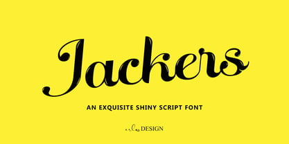 Jackers - An Exquisite Shiny Script Font by erlosDESIGN Jackers is an exquisite shiny script font. Whether you are using it for designs, quotes, titles, brand names, book covers, posters, or just any creation that requires a touch of beauty, this font is a great choice.
 - Palace Script by Monotype,
$29.99 Palace Script is a formal English script from the 1920s. This typeface, inspired by centuries-old copperplate engravings, could add the perfect touch to any number of holiday cards. You could also make cute little names tags for all of your presents with Palace Script.
 - Coptek by ITC,
$29.00 Coptek is the work of David Quay and gets its name from the high tech look imposed on the design of copperplate script. The capitals are initials which fit well with a lower case alphabet whose letters join in the style of true handwriting.
 - Brockers by Blankids,
$15.00 Introducing of our new product the name is Brockers Urban Graffiti Font, Brockers inspired by graffiti style with a fun theme very good for graffity poster, Hip Hop music, kids poster, flyer, childrenbook, cartoon, comic etc FEATURES : Uppercase Lowercase Number Punctuation Multilingual PUA Encode Opentype
 - Bilestone by Fortunes Co,
$16.00 Bilestone inspired from vintage baseball, sign painting, and labeling, is suitable for logos, product names packages, labels, old fashioned coffee shops, bars and everything with specific characteristics of past times. Bilestone is a great combination to create something good and with a vintage feel.
 - CA Gothique Superfat by Cape Arcona Type Foundry,
$44.00 The name says it all. It is aesthetically located between American Gothics and European Grotesques and features small caps, a Central European character set and four number formats plus small caps numerals. This makes it not only a heartbreaking headline font, but also extremely versatile.
 - LCD by ITC,
$29.99Alan Birch created the LCD font in 1981. Its name is an abbreviation of the words Liquid Crystal Display," the display technology used in digital watches and clocks the world over. LCD is a great choice when a futuristic, high-tech look is desired. - Vampire Zone by Blankids,
$24.00 Introducing of our new product the name is Vampire Zone a Bouncy Spooky Font, Vampire Zone inspired by Bouncy horror style with a fun theme very good for horror, scary, spooky and halloween theme design. FEATURES : Uppercase Lowercase Number Punctuation Multilingual PUA Encode Opentype
 - HARBER by bb-bureau,
$60.00 The name ‘HARBER’ comes from the first letters drawn. It is a sans serif family designed of dots on a grid, that gives it this round and rhythmic aesthetic. Only dots grow, approaching or moving away, changing the aspect of letters but keeping its characteristics.
 - Aviation Cocktail by Vozzy,
$5.00 Introducing a vintage look label font named "Aviation Cocktail". All available characters you can see at the screenshot. This font have 6 styles (including layered shadow effect style). This font will good viewed on any retro design like poster, t-shirt, label, logo etc.
 - Belgetha by Blankids,
$24.00 Introducing of our new product the name is Belgetha a Handwritten Font. Belgetha inspired by signature style this font is a fun theme very good for display, tshirt design, craft, quote sign, logotype and etc FEATURES : Uppercase Lowercase Number Punctuation Multilingual PUA Encode Opentype
 - Antique Show Card JNL by Jeff Levine,
$29.00 The very first Speedball-Lettering Book was published in 1915, and within its pages was a rough-hewn example of lettering with the name "Rapid Sho-Card Style". The design is now available as Antique Show Card JNL, in both regular and oblique versions.
 - Sandcastle JNL by Jeff Levine,
$29.00 Based on a popular design of the 50s-60s, Sandcastle JNL has the retro-casual charm of many prints ads of that era. It lends itself well to headlines, price tags, announcements, name plates and just about anything that recreates the mid-century panache.
 - Glyphstream - 100% free

- Loxley by Canada Type,
$24.95 Drawn shortly before Jim Rimmer's passing in 2010, Loxley was designed to be used in a fine press edition of the folklore story of Robin Hood. It was named after the cited birthplace of the story's classic hero. Loxley's shapes were inspired the same early Roman faces (such as Subiaco from the late 1400s) that influenced Frederick Goudy's Aries, Franciscan and Goudry Thirty types. It exhibits the preculiarities of Jim's left-handed calligraphy, as well as his outside-the-box thinking with exit strokes and serif variations. Loxley was remastered for the latest technologies in 2013. Now it comes with a character set of over 450 glyphs, including plenty of stylistic alternates, a full compliment of f-ligatures, a Th-ligature, basic fractions, ordinals, a long s for historic setting, comprehensive class-based kerning, and extended Latin language support. 20% of this font's revenues will be donated to the Canada Type Scholarship Fund, supporting higher typography education in Canada.
 - Linotype Tetria by Linotype,
$29.99Tetria was designed by Martin Jagodzinski, who says that the font came from the need for a compact, constructivist typeface. Tetria combines the expression of simplicity of the 'norm' typefaces like DIN Mittelschrift with elements of Old Face typefaces which optimize legibility. It therefore contains old style figures and a larger stroke contrast, which makes the font legible even in smaller point sizes." Sources of inspiration for Tetria were the designs of Joost Schmidt and Herbert Bayer as well as the norm typefaces. The name comes from the Greek word for 'four', tetra. "Four is the number of many simple and useful objects, four wheels on a car, four corners of a book. Also, the basic forms of Tetria come from the simple geometric form of the square." The space-saving Tetria is well-suited to a variety of uses, from corporate typeface to text to display on posters, flyers or onscreen." - Strak by Kustomtype,
$25.00 Strak is a font that was born out of admiration for the work of E. Vermeulen, a Belgian artist known for his tight, precise line and an unseen masterpiece that is spread around the world. He has published and exhibited his work in London, Liverpool, Angoulême, New York, Geneva, Amsterdam, Lyon and Turku (in Finland) and he even signed for the New York Times. Based on a few characters, a complete font was composed by Kustomtype. After a few sketches, Strak came to life. The name Strak, in this case, refers to the slender, beautiful woman with the correct waistlines and proportions. The font is designed this way; it is completely hand-drawn, digitized and can be used in all modern and graphic media. Strak is available in 8 different styles, has class and will make many people's mouth water when they see it on your designs. Do you want quality and style? Then Strak is the font-perfect solution!
 - Nosara by Never Better,
$9.00 Inspired by a trip to Costa Rica and named after its famous beach town, Nosara is a layered vector font that's perfect for projects that require a realistic, hand-painted desert-island look. It comes in three styles: Regular, Outline, and Fill. The styles can be layered to create authentic-looking hand-painted letters and icons—in vector! You can create outlines from this font in order to customize to your heart's desire. Millions of bespoke combinations are possible. This typeface was made by hand, meaning each letter was painted with real paint and digitized, not created on an iPad, which is why this font looks great and has a warm natural quality even at large sizes. Nosara is perfect for packaging, parties, signage, and even looks great in long-form text! Nosara Xtra is a set of pictograms, also in 3 styles that can be layered for the same effect, evoking the imagery and happy vibes of a sunny tropical vacation.
