10,000 search results
(0.036 seconds)
- Opus Pix - Personal use only

- OZH - Personal use only

- Nymph - Unknown license

- Soulmine by Gatype,
$12.00 Soulmine Script is a modern calligraphy font, each letter is carefully crafted to make your text look beautiful. With a modern script style, this font will suit a variety of projects, for example: invitations, greeting cards, posters, business cards, quotes, blog headers, branding, logos, fashion, clothing, letters, stationery and more! Soulmine including OpenType Stylistic alternates, ligatures and international language support. To enable the OpenType Stylistic alternative, you need a program that supports OpenType features such as Adobe Illustrator CS, Adobe Photoshop CC (With Glyphs Panel), Adobe Indesign & CorelDraw X6-X7, Microsoft Word 2010 or later versions. Encoded PUAs are also supported. Access font characters compatible with Silhouette Studio, Cricut Design Space. Simply copy and paste alternate characters using Character Map (Windows), Nexus Font (Windows), Font Book (Mac) or a software program such as PopChar (for Windows and Mac)
 - Fettura by Gatype,
$10.00 Fettura Signature is a modern calligraphy font, each letter is carefully crafted to make your text look beautiful. With a modern script style, this font is suitable for a variety of projects, for example: invitations, greeting cards, posters, business cards, quotes, blog headers, branding, logos, fashion, clothing, letters, stationery and more! Fettura includes Stylistic OpenType alternatives, ligatures, and international language support. Fettura . OT Fettura . TF To enable the OpenType Stylistic alternative, you need a program that supports OpenType features such as Adobe Illustrator CS, Adobe Photoshop CC (With Glyphs Panel), Adobe Indesign & CorelDraw X6-X7, Microsoft Word 2010 or later versions. Coded PUAs are also supported. Access font characters compatible with Silhouette Studio, Cricut Design Space. Just copy and paste alternative characters using Character Map (Windows), Nexus Font (Windows), Font Book (Mac) or a software program like PopChar (for Windows and Mac)
 - Hollywood Revue JNL by Jeff Levine,
$29.00 Hollywood Revue JNL gets its design inspiration and name from a vintage movie poster for "The Hollywood Revue of 1929". The letter style shows early Art Deco influences, yet the hand lettering was done in the late 1920s toward the end of the Art Nouveau period. MGM produced this early "talkie" all-star musical with a cast that included Jack Benny, John Gilbert, Conrad Nagel, Laurel and Hardy, Buster Keaton, Joan Crawford, Norma Shearer, Polly Moran and many others. This is the motion picture where Cliff ("Ukelele Ike") Edwards introduced "Singin' in the Rain" (composed by Arthur Freed and Nacio Herb Brown). Years later, Freed was a producer at MGM and gathered up many of the songs he and Brown wrote during the 1920s to form the musical core of the 1952 Gene Kelly-Debbie Reynolds-Donald O'Conner musical "Singin' in the Rain".
 - Shynta by Malindo Creative,
$10.00 Shynta is a modern hand-based typography, This font is made up of irregularly flowing letters, both between top-down and with subsequent letters, which makes it suitable for Logotype, posters, businness cards, merchandise, wedding invitations, greeting cards, banners blogs, clothing, water-based paint designs / prints, correspondence, quotes and more! This Font Equipped: -Uppercase -Lowercase -Figures & Punctuation -Accented -Stylistic Alternatives -Ligatures -Additional currency symbols To enable the OpenType Stylistic alternates, you need a program that supports OpenType features such as Adobe Indesign, Adobe Illustrator CS & CorelDraw X6-X7, Microsoft Word 2010 or later versions. -This font is PUA encoded which means you can access all of the glyphs and swashes with ease! -If you have any questions, please contact me at. malindocreative@gmail.com. -Thanks for Support -Feel free to contact me if you have any questions, I am happy to help you.
 - Key Largo JNL by Jeff Levine,
$29.00Key Largo JNL is a serif treatment of the lettering found in Gummed Letters JNL. - Southern Flight by Intellecta Design,
$9.00typeface based on old lettering by an 1930's advertise lettering in a Flight Magazine - Deutsche Poster Steinschrift by Intellecta Design,
$19.90inspired in plakat stijl, a german style of lettering used in 30's advertise lettering - Dionisio by CastleType,
$49.00 Dionisio, a CastleType original, takes its inspiration from one of the overlooked treasures of the CastleType library: Ransahoff. The latter is extremely condensed and very elegant. I particularly like its hairline slab serifs and cross-bars. I decided to use it as a starting point for a new design, but to make the proportions more classic and to make it more sensuous with gentler curves and bracketed cross-bar serifs. The result is very Bodoni-like, but less extreme and more contemporary looking. Meanwhile, Dionisio maintains a hint of Ransahoff with condensed letterforms and very fine serifs. Dionisio brings together the best of both, making it the perfect choice where a slender, sophisticated typeface is needed. Dionisio is available in two widths: normal and condensed, five fonts each. Includes an extensive character set and OpenType features.
 - Semilla by Sudtipos,
$79.00 I spend a lot of time following two obsessions: packaging and hand lettering. Alongside a few other minor obsessions, those two have been my major ones for so many years now, I've finally reached the point where I can actually claim them as “obsessions” without getting a dramatic reaction from the little voice in the back of my head. When you spend so much time researching and studying a subject, you become very focused, directionally and objectively. But of course some of the research material you run into turns out to be tangential to whatever your focus happens to be at the time, so you absorb what you can from it, then shelf it — like the celebrity bobblehead that amused you for a while, but is now an almost invisible ornament eating dust and feathers somewhere in your environment. And just like the bobblehead may fall off the shelf one day to remind you of its existence, some of my lettering research material unveiled itself in my head one day for no particular reason. Hand lettering is now mostly perceived as an American art. Someone with my historical knowledge about lettering may be snooty enough to go as far as pointing out the British origins of almost everything American, including lettering — but for the most part, the contemporary perspective associates great lettering with America. The same perspective also associates blackletter, gothics and sans serifs with Germany. So you can imagine my simultaneous surprise and impatience when, in my research for one of my American lettering-based fonts, I ran into a German lettering book from 1953, by an artist called Bentele. It was no use for me because it didn't propel my focus at that particular time, but a few months ago I was marveling at what we take for granted — the sky is blue, blackletter is German, lettering is American — and found myself flipping through the pages of that book again. The lettering in that book is upbeat and casual sign making stuff, but it has a slightly strange and youthful experimentation at its heart. I suppose I find it strange because it deviates a lot from the American stuff I'm used to working with for so long now. To make a long story short, what’s inside that German book served as the semilla, which is Spanish for seed, for the typeface you see all over these pages. With Semilla, my normal routine went out the window. My life for a while was all Bezier all the time. No special analog or digital brushes or pens were used in drawing these forms. They're the product of a true Bezier process, all starting with a point creating a curve to another point, which draws a curve to another point, and so on. It’s a very time-consuming process, but at the end I am satisfied that it can get to pretty much the same results easier and more traditional methods accomplish. And as usual with my fonts, the OpenType is plenty and a lot of fun. Experimenting with substitution and automation is still a great pleasure for me. It is the OpenType that always saves me from the seemingly endless work hours every type designer must inevitably have to face at one point in his career. The artful photos used in this booklet are by French photographer and designer Stéphane Giner. He is very deserving of your patronage, so please keep an eye out for his marvelous work. I hope you like Semilla and enjoy using it. I have a feeling that it marks a transition to a more curious and flexible period in my career, but only time will tell.
 - Juvenis by Storm Type Foundry,
$32.00Designs of characters that are almost forty years old can be already restored like a historical alphabet – by transferring them exactly into the computer with all their details. But, of course, it would not be Josef Tyfa, if he did not redesign the entire alphabet, and to such an extent that all that has remained from the original was practically the name. Tyfa published a sans-serif alphabet under the title Juvenis already in the second half of the past century. The type face had a large x-height of lower-case letters, a rather economizing design and one-sided serifs which were very daring for their time. In 1979 Tyfa returned to the idea of Juvenis, modified the letter “g” into a one-storey form, narrowed the design of the characters even further and added a bold and an inclined variant. This type face also shows the influence of Jaroslav Benda, evident in the open forms of the crotches of the diagonal strokes. Towards the end of 2001 the author presented a pile of tracing paper with dozens of variants of letter forms, but mainly with a new, more contemporary approach: the design is more open, the details softer, the figures and non-alphabetical characters in the entire set are more integral. The original intention to create a type face for printing children’s books thus became even more emphasized. Nevertheless, Juvenis with its new proportions far exceeds its original purpose. In the summer of 2002 we inserted all of this “into the machine” and designed new italics. The final computer form was completed in November 2002. All the twelve designs are divided into six variants of differing boldness with the corresponding italics. The darkness of the individual sizes does not increase linearly, but follows a curve which rises more steeply towards the boldest extreme. The human eye, on the contrary, perceives the darkening as a more fluent process, and the neighbouring designs are better graded. The x-height of lower-case letters is extraordinarily large, so that the printed type face in the size of nine points is perceived rather as “ten points” and at the same time the line spacing is not too dense. A further ingenious optical trick of Josef Tyfa is the figures, which are designed as moderately non-aligning ones. Thus an imaginary third horizontal is created in the proportional scheme of the entire type face family, which supports legibility and suitably supplements the original intention to create a children’s type face with elements of playfulness. The same applies to the overall soft expression of the alphabet. The serifs are varied; their balancing, however, is well-considered: the ascender of the lower-case “d” has no serif and the letter appears poor, while, for example, the letter “y”, or “x”, looks complicated. The only serif to be found in upper-case letters is in “J”, where it is used exclusively for the purpose of balancing the rounded descender. These anomalies, however, fit perfectly into the structure of any smoothly running text and shift Juvenis towards an original, contemporary expression. Tyfa also offers three alternative lower-case letters *. In the case of the letter “g” the designer follows the one-storey form he had contemplated in the eighties, while in “k” he returns to the Benda inspiration and in “u” adds a lower serif as a reminder of the calligraphic principle. It is above all the italics that are faithful to the tradition of handwritten lettering. The fairly complicated “k” is probably the strongest characteristic feature of Juvenis; all the diagonals in “z”, “v”, “w”, “y” are slightly flamboyant, and this also applies to the upper-case letters A, V, W, Y. Juvenis blends excellently with drawn illustrations, for it itself is modelled in a very creative way. Due to its unmistakable optical effect, however, it will find application not only in children’s literature, but also in orientation systems, on posters, in magazines and long short-stories. - Kotadaila by Gatype,
$17.00 Kotadaila is a script font that includes a complete set of uppercase and lowercase letters, multilingual symbols, numbers, punctuation, alternatives and ligatures. This font has a Modern Elegant Style, perfect for branding, logos, invitations, masterheads and more. Kotadaila features OpenType style alternatives, International binders and support for most Western Languages included. To enable the OpenType Stylistic alternative, you need a program that supports OpenType features such as Adobe Illustrator CS, Adobe Indesign & CorelDraw X6-X7, Microsoft Word 2010 or later. Thank you very much for viewing and Enjoying it.
 - Ridtype Pro by Ridtype,
$30.00 Ridtype Pro is a custom font for our brand, and later this font will work in all roles in the type of brand we use. both in units of typography, printing, and type texting. This font is equipped with a modern semi-classic category type, so this font can work in all lines of business, both for supporters of implementation in modern and classic business. This font has been designed as best as possible, both in terms of letter design and the type of weight that is made to be compatible in all roles.
 - Cheltenham by Bitstream,
$29.99 Daniel Berkeley Updike seems to have stimulated the architect Bertram G. Goodhue to design the prototype in 1896 for Ingalls Kimball at the Cheltenham Press. Six years later Morris Fuller Benton at ATF developed it into the design and then the series that we know today. “Owing to certain eccentricities of form,” writes Updike, “it cannot be read comfortably for any length of time.” But he concludes: “It is, however, an exceedingly handsome letter for ephemeral printing.” Mergenthaler bought composing machine rights to the original design c. 1896, but bought the Benton design in 1904.
 - Verlyana by Gatype,
$12.00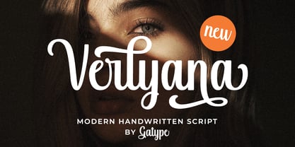 Verlyana is an organic, handwritten font suitable for branding, signatures, wedding invitations, promotions, product packaging, and other needs. This font is modern, simple, but still authentic. You'll get a full set of lowercase and uppercase letters, numbers and punctuation, multilingual symbols, initial and final lowercase swashes, binders, and extra swashes. Verlyana features OpenType style alternatives, International binders and support for most Western Languages included. To enable the OpenType Stylistic alternative, you need a program that supports OpenType features such as Adobe Illustrator CS, Adobe Indesign & CorelDraw X6-X7, Microsoft Word 2010 or a later version.
 - Koch Schrift by Ingo,
$42.00 A heavy blackletter; Rudolf Koch’s first type from 1909. On an old page full of type specimen from the 1930s, the type is described as ”Schwabacher (used by the Deutsche Reichsbahn [German Imperial Railway]).“ As a matter of fact, it is the first print of the Offenbach script master Rudolf Koch, who came out with this typeface in 1909. At that time, it was given the name ”Neudeutsch“ (New German). Later, it became very popular under the name Koch-Schrift, and was at times the official typeface of the Deutsche Reichsbahn (German Imperial Railway).
 - Ragnar by Linotype,
$29.99Ragnar can be called a typeface for compact typography. It is loosely related to the Saga typeface in many ways, even including its name. During discussing on what Saga should be called, the name "Ragnarök" (Twilight of the Gods) was humorously suggested. "Ragnarök" would of course have been unsuitable, since it uses a letter with a diacritic sign, and in many computer systems, that is a deadly sin. But the shorter form, Ragnar, was kept in mind, and later used for this typeface. Additionally, Ragnar is a common male Scandinavian name. - Simpel by Letterhead Studio-IG,
$30.00 This font was made during testing of a neat little application, that traced hand-written letters on the fly. That application was later abandoned, and the font, named Simpel for it's obvious casual simplicity, was finished separately. This story goes up to the year 1998, and recently the font was returned from the archives. SImpel was completly remastered and some useful ligatures were added. It is nice, clean and really, quite simple. Which often comes very handy. It will work well in comic books, magazines and party flyers, for instance.
 - Austen Script by Tanya Cherkiz,
$20.00 Need beautiful letters for your love letter or wedding invitations? Look no more! Austen Script is an elegant and feminine typeface, named after Jane Austen, one of my favorite writers, who wrote so much about love. It includes uppercase and lowercase letters, numerals, punctuation, stylistic alternates, some ligatures and alternate uppercase letters, and multilingual support.
 - Fresh Paint by Graffiti Fonts,
$29.99 Super fresh paintbrush style lettering with a definite graffiti slant. Reverse italic and highly detailed these hand-made letters, splats, swipes, numbers and symbols give an energetic human feel to your custom text. This font is an all-caps style with no real lowercase letters however the single font actually contains 3 full alphabets (78 individual letters) so you can mix and match to create endless unique letter combinations. Fresh Paint also includes several highly detailed paint splatters, brush strokes and swipes to use along with your custom lettering. All glyphs are created from hand made, painted letters, all splatters and strokes are made from real specimens & have sufficient detail to work even at very large sizes.
 - Inola by WildOnes,
$12.00 Inola Hand Lettered Font in modern calligraphy style. It resembles actual handwritten letters that can make a great font for branding, logo design, and graphic identities. Inola includes ligatures and stylistic alternates for some letters and floral symbols to include in your designs, find them all in the glyphs panel. Inola Hand Lettered Font is perfect for logo design, branding, art prints, wedding cards and invitations, packaging, business cards, greeting cards, posters, magazines, social media, home decors, stationary, blogs, and website design, and more. Inola Hand Lettered Font contains all uppercase and lowercase letters from A to Z and numbers from 0 to 9. Latin Extended letters are supported together with other bonus characters.
 - Congrats 36 by Dmitriy Shchetinskiy,
$19.00 Congrats36 font consist of 36 calligraphic greetings letterings. Letterings are original and handwritten. This font makes it possible to use high quality calligraphy in your projects - greeting cards, certificates, invitation cards, letters of commendation etc.
 - Despatxada by Type-Ø-Tones,
$40.00 Despatxada letters are the scans of the alphabet of a manual rubber press. Letter by letter. Real prints. Real textures. You will not find another typeface like this. An heroic font in the digital era.
 - Prospector JNL by Jeff Levine,
$29.00 Prospector JNL is based on a lettering example found in an old Speedball-pen lettering handbook.
 - Cresta by James Todd,
$40.00 Loaded with personality and functionality, Cresta is built to look good while surviving the worst conditions. It is at home on screen and in a magazine. Its six weights are intended to be used everywhere. Unlike most typefaces, Cresta was built without a reference. For this project, everything design choice was based on what worked best for a workhorse sans serif family. Cresta was originally created as the primary typeface for this website. This meant it needed to work in copy, headlines, and navigation across all devices, browsers and operating systems. This meant it needed to be sturdy and have enough character to make it stand out from other UI typefaces. With its large x-height, ample counters, and giant apertures, Cresta is meant for easy utility in rough conditions. Even with all of this, that doesnít mean that its dull; as the weights increase, the style of Cresta becomes more appearant. This style is defined most apparently by the terminals on the lowercase r and the angle of the joins between the curved and straight strokes (such as in the connection on the n).
 - Freitag Display by Zetafonts,
$39.00 Probably as a reaction to the pragmatism of modernist design, the seventies saw an explosion of buoyant, vivacious typography. Psychedelia fueled a return to the melting, lush shapes of Art Nouveau while Pop culture embraced the usage of funky, joyful lettering for advertising, product design and tv titling. New low-cost technologies like photo-lettering and rub-on transfer required new fonts to be expressive rather than legible, pushing designers to produce, bubbly, high-spirited masterpieces, where geometric excess and calligraphic inventions melted joyfully. Freitag is Cosimo Lorenzo Pancini's homage to this era and its typography. His starting point was the design of a heavy sans serif with humanist condensed proportions, flared stems and reverse contrast, that generated both the main family, and a variant display subfamily. The main typeface family slowly builds the tension and design exuberance along the weight axis - a bit like our desire for the weekend increases during the week. In Light and Medium weights the font shows a more controlled, medium-contrast design, tightly spaced for maximum display effect. The Book weight follows the same design but uses a more relaxed letter spacing to allow usage in smaller sizes and short body copy. As weight increases in the Bold weight the style becomes more expressive, with a visible reverse contrast building up and culminating in the Heavy weight with his clearly visible "bell bottoms" feel. In the display sub-family the design is pushed further by introducing variant letterforms that have a stronger connection to calligraphy and lettering. Also, the weight range becomes a optical one, with weights marked as Medium, Large, XLarge, as bringing the contrast and the boldness to the extreme creates smaller counterspaces that require bigger usage sizes. Another important addition of the display sub-family is the connected italics that sport swash capitals and cursive letterforms, developed with logo design and ultra-expressive editorial design in mind. To balance the extreme contrast in the XL weight, contrast of punctuation is reduced, creating a rich, highly-dynamic texture wherever diacritics and marks are used in the text. The full family includes 16 styles + 4 variable fonts, allowing full control of the design over its tree-hugging design space. All 20 fonts share an extended latin charset with open type features including case sensitive forms, single and double story variants and alternate glyphs. According to its creator, "Freitag is the typeface that sounds like an imaginary Woodstock where on the stage with Jimi Hendrix with Novarese, Motter, Excoffon and Benguiat playing onstage with Jimi Hendrix". Jeepers creepers!
 - Lovelace by Zetafonts,
$39.00 Designed by Cosimo Lorenzo Pancini and Andrea Tartarelli with Maria Chiara Fantini, Lovelace is Zetafonts homage to the tradition of nineteenth century “Old Style” typography - a revival of Renaissance hand-lettered shapes driven by the desire to create a less formal and more friendly alternative to Bodonian serifs. While taking inspiration from the letter shapes created by Pheimester or Alexander Kay - with their calligraphic curves and heavy angled serifs that influenced Benguiat and Goudy’s typefaces in the 70s - we also tried to add elegance and contrast by following another 19th century revival style: the Elzevir. This digital homage to victorian typography, aptly named after the algorist daughter of lord Byron, is developed in two optical sizes, both in a six weights range from extralight to extrabold. The text variant offers maximum readability thanks to the generous x-height and screen-friendly design, while the display variant excels in the sharp contrast and thin details needed for editorial and large-size titling use. The italics, strongly influenced by calligraphy, have been complemented with a display script family, including luscious swashes and connected lowercase letters, lovingly designed by Zetafont in-house calligrapher. All the thirty weights of Lovelace cover over 200 languages that use latin, cyrillic and greek alphabets, and include advanced Open Type features as Stylistic Alternates, Standard and Discretionary Ligatures, Positional Numerals, Small Caps and Case Sensitive Forms.
 - Matahari Sans by Studio Sun,
$36.00 Matahari (English : Sun) is the power source of life. The symbol of power and energy that synergies with other part of daily lives. It is one of the most fundamental thing us humans need, just like communication. And like Matahari itself, words are powerful enough to make a living. Referring to Grotesque Font and influenced by the works of Eric Gill, Matahari Typeface is available in 3 widths and 7 weights, also in Oblique version in each font. The font uses oldstyle and transitional letters (double-story ‘a’ and ‘g’). It has a humanist gesture, the thickness of the font is semi-monolinear where the horizontal and vertical size is almost equal, making the font reach its maximum optical readability even in small sizes. The font anatomy refers to the basic geometric square-sized of the letter ‘M’, while the letters of S/C/G/c/e have uneven curve shape which give the sense of humanist and flexibility. This typeface is ideal for various design needs, from Printing to On-Screen/Digital Reading, from Brand Identity, Posters, Caption, Headline, to Body Text. With the numbers of widths available, the font can be used for all kinds of purposes (Label, Signage, Packaging, Website, etc). Supported well over 75+ languages, including Greek & Cyrillic, Matahari Typeface will give you an excellent way in aesthetic communication and message-delivering.
 - Decade by Grype,
$16.00 Straying outside of our usual logo driven typestyles, but remaining within typographic styles that have a strong brandable vibe to them comes our Decade font. Spawned from the 1938 book "Letters and Lettering" by Paul Carlyle and Guy Oring, this display style has been fleshed out into a full blown typeface, rich with a personality that evokes Art Deco and Jazz sensibility yet rooted in Russian Avant Garde Constructivism. Decade has a constructivist feel, yet contains letterforms that take take its appeal to album covers, holiday cards, minimalist corporate branding, and beyond. It adopts a sturdy yet approachable style with its geometric forms and curves, creating a straightforward, powerful presence that creates a solid foundation for designers and design trends. Here's what's included with the Decade typeface: - 368 glyphs per style - including All Capitals, Numerals, Punctuation and an extensive character set that covers multilingual support of latin based languages. (see the 5th graphic for a preview of the characters included) Here's why Decade is right for you: - You're in need of geometric typestyle evocative of the Jazz Era - You love that Constructivist look, but are seeking something "different" - You're looking for an Art Deco Showcard style typeface. - You're looking for a typeface with letter minimalist styled geometry. - You just like to collect quality fonts to add to your design arsenal
 - Leakpaint by Andrew Tomson,
$10.00 Hello friends! Drawing is a great way to pass the time. Sometimes, clumsy people can spill paint on paper or on an already completed drawing. What do we end up with? A ruined drawing or a new work of art? I think the latter. After all, every drawing is unique and a unique thing. Even if you are drawing a stick man! This font presents the opportunity to see what happens if invisible ink is spilled on it. This font is great for your new and unique projects for social media, lettering and just for home use! A little sloppy, a little bouncy, so it's so lively and magical! I wish you good luck and love!
 - Transmogrifier by PintassilgoPrints,
$35.00 Inspired on Cuban posters by the talented and prolific graphic artist Eduardo Muñoz Bachs, Transmogrifier was hand painted with a thin brush, using loose, fast strokes. This font is packed with lots of contextual and stylistic alternates that automatically transmogrifies the letters as you write, when using opentype savvy programs. It's also possible to pick the alternates by hand and set the text the way you like better. The choice is yours, and there are really plenty of alternates to choose from and create original handlettered-looking designs. The font also brings a rough set of pictures based in charcoal sketches from Shniedewend & Lee Company, 1888. These were painted with the same thin brush as the letters, making it a natural complement. So let the transmogrification begin!
 - Tag Hand Graffiti Trash by TypoGraphicDesign,
$1.00 CHARACTERISTICS The fresh and unique character of the typeface are awesome BOOM! The letter-forms are associated urban graffiti tags and pieces. Many Dingbat symbols like microphone, tape deck, ghetto blaster, vinyl, etc. make this font really fresh n HOT! APPLICATION AREA The handwritten, sloppy, square, shaky and fresh urban script font »Tag Hand Graffiti Trash« BANG! would look good at display size for headlines in magazines or websites, movie posters, music covers artworks or music webbanner. TECHNICAL SPECIFICATIONS Headline Font | Display Font | Fancy Font – Tag Hand Graffiti Trash OpenType Font with 393 glyphs - alternative letters and ligatures like Mr, Mrs, Ltd, Co, Dr, Mc, Dj etc. (with accents & €) & 2 styles (regular & fat) + dingbats like diamant, tape deck, microphone, vinyl etc.
 - Sansduski by Ingrimayne Type,
$9.00 Sansduski is a sans-serif decorative/display family. Its very high x-height and tight spacing make it more suitable for use at large point sizes than small point sizes. (There are better options if one wants a readable text font.) It comes in nine weights and one outline style, with an oblique style accompanying each of these ten styles to give a total of 20 styles in the family. The letter O is a rectangle with rounded corners and this shape motif is carried over to other characters that are usually rounded. For a monospaced rather than proportional version of this design idea, see SansduskiMono. Sansduski is appropriate for titles, posters, advertising, and other uses that benefit from simple letter forms that are geometric and clean.
 - Surfside by Victory Type,
$14.00 These are the letters I doodled in the margins of my high school notebooks. As it turns out, a man named Milt Glaser doodled them first. He doodled a lot of other amazing things too. Mr. Glaser called his blocky alphabet Baby Teeth. I think the type looks better when it says Surfside, so that's what I called my incarnation. This version has been digitized and expanded, and is available for Mac and PC. These letters remind me of the 80s and the 90s, of Gotcha shorts, Ocean Pacific shirts and fluorescent windbreakers. Surfside matched my Airwalks. They're big and bold. Clunky and funky. Spices up words. Makes 'em look great! Surfside is cool and available for a low low price... scoop it up today!
 - Aspektogram by PizzaDude.dk,
$20.00A slim, crunchy and slightly worn-looking font. Comes with unique accented letters, ligatures for double letters and numbers along with OpenType alternate letters. You will need to use OpenType supporting applications to use the autoligatures. - Museum Ornaments by T4 Foundry,
$7.00Museum Borders and Ornaments is part of a typographical treasure, the Norstedts type collection in Sweden. Type designer Torbjörn Olsson has painstakingly translated the original 34 Ornament matrices in the collection to Open Type. Among them are several of Granjon's arabesques, as well as symbols from both Swedish and Danish typefoundries. The signs were cut in the 16th, 17th and 18th centuries. The old Swedish name for these "type trademarks" were "rössjor". Museum Borders and Ornaments is an OpenType creation, for both PC and Mac. Swedish type foundry T4 premiere new fonts every month. Museum Borders and Ornaments is our tenth introduction. Museum Borders and Ornaments is part of the growing Museum type family. Museum also includes Museum Tertia Cursive, an exquisite 1700's typeface with modern additions, and Museum Fournier, a set of Rococo capitals designed by Pierre Simon Fournier le Jeune circa 1760. - 1742 Civilite by GLC,
$38.00 In the late medieval period appeared a "semi-cursive" writing, the French "écriture de civilité". Quickly, it is carved and melted down in lead for printing. It is a very elegant running font, with numerous variants, both final than initial characters, many of the accented small characters were present in the model I was inspired by, after “Fournier Le jeune ”, in his catalogue "Modèles des caractères de l'imprimerie et des autres choses nécessaires au dit art nouvellement gravés par Simon-Pierre Fournier le jeune" published in 1742 in Paris. A render sheet, included in the font file, makes all characters easy to identify on keyboard. This font, very attractive and decorative may be used for web-site titles, posters and flyer designs, editing ancient texts, labels, greeting cards... and anything you want! It supports as easily enlargement as small size, remaining elegant and pretty.
 - Quatre by Blank Is The New Black,
$15.00 Quatre is a clean, friendly, monoline display script with a number of subtle but significant features. Originally based on the style of cursive you may or may not have been taught in middle school, Quatre has a clean geometric flow to it while containing a robust set of OpenType features such as ligatures, swash capitals, and stylistic alternates that give it a unique look. With over 700 glyphs, coverage for over 30 languages, arbitrary fractions, contextual alternates and more, Quatre will have you covered for whatever situation you may run into. I mean, probably. I can’t know every single weird way you might be trying to use it. The point is, it’s got all of the bells and whistles you could reasonably hope for. Make sure you open up the OpenType panel in Illustrator, Photoshop, and InDesign to make use of all of those features.


