7,318 search results
(0.019 seconds)
- Curly Jane by Deniart Systems,
$20.00 Curly Jane is a whimsical typeface combining straight lines with a little curl at the ends. Great for headlines, humorous notes, greetings, whatever hits your whimsy because simply said, it's simply Curly. Curly Jane includes a large assortment of extended characters to support many of Europe's languages, including Czech, Danish, Dutch, Esperanto, Finnish, French, German, Italian, Hungarian, Polish, Portuguese, Romanian, Spanish, Swedish, Turkish & Welsh.
 - Curly Babe by Forberas Club,
$16.00 Curly Babe is handwritten font. Recommended to use for children theme, funny theme, comics, cartoon, simple write, poster and display.
 - Curly Gloom by Heyfonts,
$15.00 Curly gloom is an experimental font adapted from a combined groovy font and graffiti that makes its unique character as a display font, this font is very suitable to use as your project design such as a graphic template or clothing.
 - Curly Lady by URW Type Foundry,
$39.99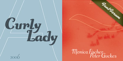
- Curvi Technocrat by Mans Greback,
$39.00 Curvi Technocrat is a rounded, geometric font that captures the essence of speed and forward movement. Inspired by the smooth curves of race cars and the energy of urban graffiti, this heavy, slanted font family adds a touch of dynamism and softness to your designs. The Curvi Technocrat font family offers five weights: Thin, Light, Regular, Bold, and Black, making it a versatile choice for a wide range of design projects that require a modern, geometric touch. The font is built with advanced OpenType functionality and has a guaranteed top-notch quality, containing stylistic and contextual alternates, ligatures, and more features; all to give you full control and customizability. It has extensive lingual support, covering all Latin-based languages, from Northern Europe to South Africa, from America to South-East Asia. It contains all characters and symbols you'll ever need, including all punctuation and numbers.
 - Love Curly by Goodigital13,
$20.00 Perfect use for a logo for branding, typography design, christmas card, product packaging, invitation, quotes, t-shirt design, label poster, special events and anything that need elegant taste. great for Logotype, Branding Design, Logo Design, Digital Lettering Arts, T-Shirt/Apparel, Poster, Magazine, Signs, Advertising Design, and any vintage design needs. Caps only Fonts
 - Curly Luly by FontHaus,
$19.95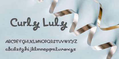
- Curly Valentine by Yoga Letter,
$20.00 "Curly Valentine" is a beautiful and unique curly display font. Equipped with uppercase letters, lowercase letters, numerals, punctuation, and multilingual support. Very suitable for posters, banners, valentines, weddings, gifts, invitations, branding, stickers, Christmas, spring, winter, and others.
 - Aint Nothing Fancy - Personal use only

- Fancy Card Text - Personal use only

- Dance Craze BV - Unknown license

- JI Picket Fence - Unknown license

- Deborah Fancy Dress - 100% free

- LT White Fang - Personal use only

- Dance Number JNL by Jeff Levine,
$29.00 Vintage sheet music for the song "Just Once for All Time" (from the United Artists release "Congress Dances") provided the bold sans that served as the model for Dance Number JNL. This 1932 film was the English language version of the German comedy "Der Kongrefl tanzt" The movie's plot is based around the Congress of Vienna. There, an Austrian commoner is mistakenly thought to be the Tsar of Russia.
 - Dance Time JNL by Jeff Levine,
$29.00 The words “Benny Goodman & His Orchestra” on an appearance poster for the band from 1936 were rendered in a beautiful semi-script style of hand lettering.
 - Aint Nothing Fancy by Hanoded,
$15.00 A nice, ‘normal’ script font without the frills and thrills of my other work. It’s a handwritten typeface with a schoolboy kind of feel to it. Use it for your websites, your letters and product descriptions! Because of its unobtrusive nature, the font won't attract too much attention, so your work will stand out better.
 - Fancy Free JNL by Jeff Levine,
$29.00 Up until the late 1920s, it was a popular habit in American songwriting to use African Americans as the topic of compositions using denigrating themes, words and even exaggerated character illustrations on the covers of the published sheet music. One such example of what was considered "entertainment" for its time was a piece entitled "Little Black Me". While this now socially and morally unacceptable piece of forgettable tripe is collected by some only for the historical documentation of the times they reflected, one good "positive" came out of this negative chapter of our country's musical heritage: The beautiful floral ornamented letters in the song's title has yielded Fancy Free JNL. Originally hand-lettered on an arc, these spurred Roman letters have been re-drawn, and are offered in both the regular design and a companion version with the ornamentation removed for lettering that is less ornate.
 - Centennial Script Fancy by Intellecta Design,
$29.90 Centennial Script Easy is the Intellecta digitization of the classic font from Hermann Ihlenburg in 1876 developed originally for the MacKellar, Smiths & Jordan typefoundry. We decided to digitize only the uppercases to this work, and to create a different version to this anciente design, we joined the uppercase to the lowercase set of another classic font, Pentagraph. This is a fraction of the global project, which is complete with the Centennial Script Fancy and Centennial Ornaments fonts, making a complete ornamental family of lettering solutions with genuine and original art-noveau taste.
 - Barn Dance JNL by Jeff Levine,
$29.00 The hand lettered title on the 1945 sheet music for the song "Louisiana Hayride" is an Art Deco design with a nod to the preceding Art Nouveau era. It is now available as Barn Dance JNL, which is available in both regular and oblique versions.
 - Dance Hall JNL by Jeff Levine,
$29.00 The hand-lettered title of a vintage piece of sheet music is the basis for Dance Hall JNL.
 - Dance Records JNL by Jeff Levine,
$29.00 A record album entitled “Calypso” by the Talbot Brothers had a hand lettered cover with a free form style reminiscent of the early 1960s. This inspired Dance Records JNL, which is available in both regular and oblique versions.
 - Fence Post JNL by Jeff Levine,
$29.00 The inspiration for Fence Post JNL comes out of an early 1900s manual for sign writing. A number of changes were made to make the design more aesthetically pleasing, but it retains its novelty effect of evoking the look of wooden fence posts or Western-themed typography.
 - Wolf Fangs Graffiti by Sipanji21,
$15.00 Wolf Fangs is an incredibly unique and chunky lettered display font with graffiti basic feel, its suitable for logotype, design grafics, e-sport, apparel, wall art, etc. Add this font to your favorite creative ideas and notice how it makes them come alive!
 - Eckhardt Fancy JNL by Jeff Levine,
$29.00 Eckhardt Fancy JNL was named in honor of Al Eckhardt (1929-2005), a talented sign painter and good friend of font designer Jeff Levine. The design was inspired by a vintage alphabet found within a collection of decorative display alphabets from the type collection of the late Dan X. Solo.
 - Dance Moderne JNL by Jeff Levine,
$29.00 A small book entitled “Portfolio of Alphabet Designs for Artists, Architects, Designers & Craftsmen” [published in 1938 by Irene K. Ames] contained a number of pages displaying hand lettered alphabet examples. One sample in particular stood out for its bold Art Deco look and unusual design. This is now available as Dance Moderne JNL, in both regular and oblique versions.
 - Dance Partner JNL by Jeff Levine,
$29.00 The unusual mix of Art Deco lettering with a smattering of Art Nouveau characters found within Dance Partner JNL comes from a movie poster for the 1935 RKO picture "Roberta" starring Fred Astaire and Ginger Rogers. The musical was based on the hit 1933 stage play that introduced the song "Smoke Gets in Your Eyes". The play itself was based on the Alice Duer Miller novel "Gowns by Roberta".
 - Idle Fancy NF by Nick's Fonts,
$10.00This elegant yet playful offering is based on the typeface Domino designed by Alfred Riedel for the German foundry Ludwig & Mayer in 1954. Its large x-height and subtly sinuous curves make it a natural choice for headlines which are both warm and compelling. Both versions of the font include 1252 Latin, 1250 CE (with localization for Romanian and Moldovan). - Fancy Roman JNL by Jeff Levine,
$29.00 A 1925 edition for an orchestral arrangements catalog entitled “Carl Fischer Progressive Orchestra Edition” has the title hand lettered in a bold, stylized Roman type design. This has now become the digital font Fancy Roman JNL; available in both regular and oblique versions.
 - DB Fancy Flourishes by Illustration Ink,
$3.00Use Fancy Flourishes to add formal or shabby chic accents to your scrapbook layouts, handmade greeting cards and other creative lettering projects. Each letter on the keyboard corresponds to its own unique flourish. - Dancing Marathon JNL by Jeff Levine,
$29.00 The hand lettered title found on the cover of the 1932 sheet music for “Dancing Marathon” inspired the digital revival of this unusual lettering as well as the font’s name. This eccentric Art Deco design (with a slight bit of Art Nouveau mixed in) is a thin, monoline typeface. Dancing Marathon JNL is available in both regular and oblique versions. Dance marathons got their start during the Great Depression as people desperate to earn a few dollars would enter into contests that went on for hours until the last couple remained standing on the dance floor.
 - Dancing Girl JNL by Jeff Levine,
$29.00 The poster for the 1930 film “Show Girl in Hollywood” had the title hand lettered in a squared Art Deco style with some angled cross strokes. This became the basis for Dancing Girl JNL, which is available in both regular and oblique versions.
 - Fancy Nouveau JNL by Jeff Levine,
$29.00 The 1907 sheet music for "Take Me Back to Dear Old Dixie" had the song title hand lettered in a decorative serif typeface with strong Art Nouveau influences. This design is now available digitally as Fancy Nouveau JNL, in both regular and oblique versions.
 - Formal Dance JNL by Jeff Levine,
$29.00 A vintage Canadian-published music book circa the 1940s had the title "Strauss Waltzes" hand lettered in a bold Art Deco sans serif that featured block style letters with rounded corners. This was the working model for Formal Dance JNL, which is available in both regular and oblique versions.
 - Fancy Deco JNL by Jeff Levine,
$29.00 This decorative, scalloped thick-and-thin Art Deco type design is one of the many inspirations found within the pages of the 1934 French lettering book “L'Art du Tracé Rationnel de la Lettre”. Now in digital format, Fancy Deco JNL is available in both regular and oblique versions.
 - Fonce Sans Pro by Ryan Ford,
$10.95 Fonce Sans Pro is a mono-weight, Swiss-style typeface with influences from great typefaces like Din, Helvetica, Interstate, and Trade Gothic. Its form is unique and sophisticated with an unmistakable Dutch style. It’s subtle and enjoyable, and works beautifully in both display and body copy.
 - Dance Lesson JNL by Jeff Levine,
$29.00 Dance Lesson JNL is a reinterpretation of the popular "Latin Bold" typeface. The font's name is a reference to the Latin dance craze of the 1950s, when the Cha-Cha, Meringue, Tango, Mambo and even the "Chalypso" - a hybrid of Cha-Cha and Calypso rhythms had everyone moving to the beat of Central and South America.
 - Lance Corporal NF by Nick's Fonts,
$10.00This font was inspired by Arts and Crafts lettering found on the cover of the Austrian journal Ver Sacrum (Sacred Spring), 1898. Primarily an uppercase-only font, there are several variants in lowercase positions. Both versions of the font include 1252 Latin, 1250 CE (with localization for Romanian and Moldovan). - Fancy Kingdom MS by Redcollegiya,
$9.00 Fancy Kingdom is elegant serif font family wich great for wedding invitation, greeting cards, book covers or any fairy design. This kit includes 3 typefaces: - Regular - without curls; - Decorative - uppercase and lowercase with curls; - Combined - uppercase with curls.
 - Dance Band JNL by Jeff Levine,
$29.00 Sheet music for the song "I'm the One That Loves You" has the title hand lettered in a narrow, Art Deco-influenced sans serif, which is now available digitally as Dance Band JNL in both regular and oblique versions. The 1937 composition was popularized by Tommy Dorsey and Sammy Kaye.


