5,471 search results
(0.021 seconds)
- Hostilica by Heypentype,
$20.00 Hostilica is a semi-serif family designed by mixing classic serifs in the age of romanticism era with contemporary modern shape and curves. It gives a warm, friendly, and inviting feeling without losing a formality of text fonts. Every weight was designed carefully to provide a unique look while maintained the unity of the type family. A thin weight gives your content an elegant, luxurious design feel. While the regular weight, designed for body text, gives your content a warm and friendly design feel. The bold weight will make your headlines stand-out with its fat counters and curves. Therefore, Hostilica will accomodate all your design needs, from text to display, from catchy to luxury. The italics of each weight will spice up your design project especially with letter 'f,s,r,k, and y'. Those italic versions paired with alternate and discretional ligatures will add an organic feeling to your designs. The italic styles are designed by emulating a handwriting stroke, and will give a more personal feel while still maintained a formal sense.
 - Wallington Pro by Zeune Type Foundry,
$24.00 Wallington Pro is a decorative-serif font embodying vintage and elegant curves with functional structure. Style is adopted from Old English cultures with their descendants around mid-12th century and Art nouveau in 19th century, it was inspired by natural forms and structures and the curved lines. Crafted with love and easy-to-read letter design. Wallington Pro consists of 721 glyphs including 268 unique ligatures, 30+ catchwords and 10 stylistic sets. All glyphs are divided into several OpenType features such as Ligatures, Contextual alternates, Old Style Numeric and some astonishing special characters that allows you to mix and match pairs of letters to fit your design. This variety encourages unusual and extroverted creation in lettering design. The typeface offers numerous combination possibilities between the basic glyph set and stylistic sets.The stylistic sets are alternate alphabets that you can access by using OpenType savvy programs such as Adobe Illustrator, Adobe Photoshop CC, Affinity Designer, CorelDraw or Adobe InDesign. Wallington is an experimental and versatile font. Suitable for digital lettering, prints, logo, poster, t-shirt, packaging and applicable for some type of graphic design.
 - Vendetta by Emigre,
$69.00 The famous roman type cut in Venice by Nicolas Jenson, and used in 1470 for his printing of the tract, De Evangelica Praeparatione, Eusebius, has usually been declared the seminal and definitive representative of a class of types known as Venetian Old Style. The Jenson type is thought to have been the primary model for types that immediately followed. Subsequent 15th-century Venetian Old Style types, cut by other punchcutters in Venice and elsewhere in Italy, are also worthy of study, but have been largely neglected by 20th-century type designers. There were many versions of Venetian Old Style types produced in the final quarter of the quattrocento. The exact number is unknown, but numerous printed examples survive, though the actual types, matrices, and punches are long gone. All these types are not, however, conspicuously Jensonian in character. Each shows a liberal amount of individuality, inconsistency, and eccentricity. My fascination with these historical types began in the 1970s and eventually led to the production of my first text typeface, Iowan Old Style (Bitstream, 1991). Sometime in the early 1990s, I started doodling letters for another Venetian typeface. The letters were pieced together from sections of circles and squares. The n, a standard lowercase control character in a text typeface, came first. Its most unusual feature was its head serif, a bisected quadrant of a circle. My aim was to see if its sharp beak would work with blunt, rectangular, foot serifs. Next, I wanted to see if I could construct a set of capital letters by following a similar design system. Rectangular serifs, or what we today call "slab serifs," were common in early roman printing types, particularly text types cut in Italy before 1500. Slab serifs are evident on both lowercase and uppercase characters in roman types of the Incunabula period, but they are seen mainly at the feet of the lowercase letters. The head serifs on lowercase letters of early roman types were usually angled. They were not arched, like mine. Oddly, there seems to be no actual historical precedent for my approach. Another characteristic of my arched serif is that the side opposite the arch is flat, not concave. Arched, concave serifs were used extensively in early italic types, a genre which first appeared more than a quarter century after roman types. Their forms followed humanistic cursive writing, common in Italy since before movable type was used there. Initially, italic characters were all lowercase, set with upright capitals (a practice I much admire and would like to see revived). Sloped italic capitals were not introduced until the middle of the sixteenth century, and they have very little to do with the evolution of humanist scripts. In contrast to the cursive writing on which italic types were based, formal book hands used by humanist scholars to transcribe classical texts served as a source of inspiration for the lowercase letters of the first roman types cut in Italy. While book hands were not as informal as cursive scripts, they still had features which could be said to be more calligraphic than geometric in detail. Over time, though, the copied vestiges of calligraphy virtually disappeared from roman fonts, and type became more rational. This profound change in the way type developed was also due in part to popular interest in the classical inscriptions of Roman antiquity. Imperial Roman letters, or majuscules, became models for the capital letters in nearly all early roman printing types. So it was, that the first letters in my typeface arose from pondering how shapes of lowercase letters and capital letters relate to one another in terms of classical ideals and geometric proportions, two pinnacles in a range of artistic notions which emerged during the Italian Renaissance. Indeed, such ideas are interesting to explore, but in the field of type design they often lead to dead ends. It is generally acknowledged, for instance, that pure geometry, as a strict approach to type design, has limitations. No roman alphabet, based solely on the circle and square, has ever been ideal for continuous reading. This much, I knew from the start. In the course of developing my typeface for text, innumerable compromises were made. Even though the finished letterforms retain a measure of geometric structure, they were modified again and again to improve their performance en masse. Each modification caused further deviation from my original scheme, and gave every font a slightly different direction. In the lower case letters especially, I made countless variations, and diverged significantly from my original plan. For example, not all the arcs remained radial, and they were designed to vary from font to font. Such variety added to the individuality of each style. The counters of many letters are described by intersecting arcs or angled facets, and the bowls are not round. In the capitals, angular bracketing was used practically everywhere stems and serifs meet, accentuating the terseness of the characters. As a result of all my tinkering, the entire family took on a kind of rich, familiar, coarseness - akin to roman types of the late 1400s. In his book, Printing Types D. B. Updike wrote: "Almost all Italian roman fonts in the last half of the fifteenth century had an air of "security" and generous ease extremely agreeable to the eye. Indeed, there is nothing better than fine Italian roman type in the whole history of typography." It does seem a shame that only in the 20th century have revivals of these beautiful types found acceptance in the English language. For four centuries (circa 1500 - circa 1900) Venetian Old Style faces were definitely not in favor in any living language. Recently, though, reinterpretations of early Italian printing types have been returning with a vengeance. The name Vendetta, which as an Italian sound I like, struck me as being a word that could be taken to signifiy a comeback of types designed in the Venetian style. In closing, I should add that a large measure of Vendetta's overall character comes from a synthesis of ideas, old and new. Hallmarks of roman type design from the Incunabula period are blended with contemporary concerns for the optimal display of letterforms on computer screens. Vendetta is thus not a historical revival. It is instead an indirect but personal digital homage to the roman types of punchcutters whose work was influenced by the example Jenson set in 1470. John Downer.
 - Faber Gotic by Ingo,
$21.00 A ”modern“ Gothic – designed according to principles of modern form in three variations Faber Gotik is a reminiscence of Gutenberg’s first script from around 1450. The heavily broken forms allow further development in the direction of a modern, strongly geometric and less formal type. It should be possible to push the principle of design so far to the limit that a type is created which, from the very start, extinguishes reminders of a dark past. The characters are composed of squares which are lined up straight or in a more or less slanted manner. The resulting corners similar to serifs were removed so that a sans serif type in the true sense without up and down strokes was created. The principle of ”breaking“ was applied according to the historical model. Even the form of the characters is based on the model from the Middle Ages. Only the characters which cannot be created with the principle described were modeled on today's forms. Faber Gotik includes three variations: - Faber Gotik Text — most similar to the historical model - Faber Gotik Gothic — pushes the applied principle of form the furthest - Faber Gotik Capitals —; a Gothic upper case font, contrary to tradition. 555 years after Gutenberg, interest in black-letter typefaces is nearly extinct. They are especially looked down upon in German-speaking countries because they are still associated with ”Nazi“ scripts. But yet, the very forms of blackletter, Gothic, Schwabacher and especially cursive have enormous potential with regard to the development of new advanced font forms.
 - Technical SCRIPTURE by MMC-TypEngine,
$19.00 ‘Technical Scripture’ 2015-2021 A manuscript look, Pixel labyrinthine Display Type System… Plus, an Optical “Layered Game”, Retro Futuristic Sci-Fi Digital interface evolving placeholder… Now with 3D Styles! It was designed as a pair to its brother font ‘Technical Signature’ a Small Caps Font, both inspired by antique Greek, mosaics zig-zag ornaments “ancient times computer” intentionally as a Romanic variation with same metrics... Searching for Technical Solutions, it resulted in many combined styles by matching the primary ones so there’s plenty variations for multi-purpose texting like layered typesetting or simply monochromatic designs… Plus got accurate streaming resolution, therefore some sub-families like Stamp and Texture implicates greater points for minimum size as Regular and Light is appropriated to Small Optical Text reductions. *The New 3’s Upgraded Edition Improvements consisted of Correct ‘Font Info’ (verified data-debugging) rescaled glyphs, quick design review, better style linking with correspondent renamed fonts, addition of automatic OT features encoding, 3D Styles and Italics. Ps. This actual Typeface was quickly re-edited for technical reasons and hasn’t yet reached the intended design, it will soon receive a more tangible redesign upgrade, mainly in lowercases to enhance cursive style. Due to other priorities. Tip: Give preference to THE LYSERGIC UPPERCASES! Multilanguage Support: Western & Eastern European, Baltic, Turkish, Greek, and Cyrillic. This Type is pleasant to Technician Compositions, Such as Briefs layouts manuscript, Old Engineering & Crafts Logos or Support Text, Op-Art Posters, Stamps, Labels, movies and Cartoons Ludic Scripts, sites and of course Video Games! Try ‘Technical Scripture’ & Have some Power to the Pixel! Padang!
 - Achates by Karandash,
$29.00 Good, faithful Achates… Named after the trusty Trojan that followed Aeneas throughout his adventures, Achates is a humanist sans workhorse well suitable for broad range of design projects. Its soft, delicate and almost cursive shapes define warm and friendly typeface that is legible and easy on the reader's eye. Following into the footsteps of its namesake, it is humble, informal yet stable and trustworthy. Ideally suited for advertising and packaging, editorial and publishing, logo, branding and creative industries, poster and billboards, small text and signage as well as web and screen design. Achates provides a broad range of advanced typographical features such as language localization, alternates, stylistic alternates, extended ligatures, fractions and case-sensitive forms. It comes with a complete figure range set of old-style, lining and tabular figures. The family has extensive multilingual support, covering more than 70 Latin-based languages and specially designed Cyrillic with Bulgarian and Russian localization. As Achates was a humble hero, a devoted friend and faithful companion to Aeneas on his journey to greatness, so this font can be your trusty sidekick on your creative path. The marvelous Agate is also named after the Trojan hero. It is considered as the stone to call on for support when you need stability and grounding in your life. Along with its supportive energy, the Agate stone has been long admired for its incredible beauty. So… a Trojan hero or a thing of beauty – it is up for you to decide… or just maybe both!
 - Arabetics Harfi by Arabetics,
$59.00 Arabetics Harfi is a Latin Serif typeface with a comprehensive support for the Arabetic scripts, including Quranic texts. Careful spacing and kerning was used to enhance resulting text legibility both scripts. Arabetics Harfi fully supports MS 1252 Western and 1256 Arabic code pages, in addition to all transliteration characters required by the ALA-LC Romanization tables. Users can either select an accented character directly or form it by keying the desired combining diacritic mark following an unaccented character. For Arabic, it fully supports Unicode 6.1, and the latest Arabic Supplement and Extended-A Unicode blocks. The Arabic design of this font family follows the Mutamathil Taqlidi type style with connected glyphs, but it emphasizes a horizontal look and feel rather than verticalone, utilizing slightly varying x-heights. The Mutamathil Taqlidi type style uses one glyph per every basic Arabic Unicode character or letter, as defined by the Unicode Standards, and one additional final form glyph, for each freely-connecting letter of the Arabic cursive text. Arabetics Harfi includes the required Lam-Alif ligatures in addition to all vowel diacritic ligatures. Soft-vowel diacritic marks (harakat) are selectively positioned with most of them appearing on similar high and low levels—top left corner—, to clearly distinguish them from the letters. Tatweel is a zero-width glyph. Arabetics Harfi includes both Arabic and Arabic-Indic numerals, in addition to generous number of punctuation and mathematical symbols. It includes two weights, regular and bold, each of which has normal, right slanted Italic, and left-slanted styles.
 - Biro Script Plus by Ingo,
$50.00 An authentic script from the tip of the ball point pen. This hasn’t been seen yet: A typeface which truly looks as if it were handwritten. Calligraphy is, actually, the art of fine writing. And actually, written scripts as typeface for the computer are 100% nonsense. And yet, an obvious thought: Create a typeface which truly derives from everyday handwriting. And since we, if we write at all, utilize practically only a ball point pen anymore, then a modern cursive writing form must look like just that. As a counterpart to the artistic ”handwritings“ which have long been available as typeface, the thought of digitalizing a truly ”ugly“ handwriting is appealing. After all, time and again there is the need for a text to look ”handwritten“. Biró Script is written freehand with a ball point pen. Finally a truly individual script! Biró Script includes more than 300 authentic ligatures in addition to the customary alphabet. By the way, the most convincing effect is obtained with a font size of about 18 to 22 points, at which the thickness of the stroke is now about the same as that of a real ball point pen. There's a difference between the anglo-american forms of some characters (esp. the numerals 1 and 7, but also capitals I and F) and how it's written in the rest of the world. For those of us who aren’t used to the world-wide usual forms, Biró Script includes a US version with the appropriate characters.
 - Guzzo by Monotype,
$50.99 A playful caricature of a midcentury grotesque, Guzzo is a fresh addition to the Monotype Library. Somewhat eccentric and full of surprises, its unmistakable quirk can be found on closer inspection, stemming from details proudly borrowed from brush lettering and calligraphy. The wide range of weights and style can take you through any design space, from the condensed weights squeezing in larger headlines or dense blocks of text with the condensed range, to experimenting with small point sizes, labels or packaging with the extended cut. However, Guzzo’s real charm is probably best expressed through its wonderfully playful shapes, its unusual 'laid-back italics' feature cursive forms and a backslant. The different stylistic sets allow you to decide what you make of Guzzo, with several sets of alternate glyphs steering it in any direction you want. Guzzo is a happy-go-lucky character, and has a warm, humble and painterly quality that - at a glance - may be unrecognizable as a typeface. It can almost pass for hand-lettering. Guzzo pairs exceptionally well with scripts and slab typefaces, and feels most at home in situ with toys, packaging, menus, broadcasting, cartoons and merchandising! Guzzo encourages you to turn up the silliness and is for designers who want to emulate hand-painted and casual motifs. Taking its name from American artist Jeremy Pinc, aka the painter Guzzo Pinc, the typeface channels the quirky, funny and poignant qualities of his paintings - with wacky characters, loosely painted geometric forms and bright colors. For this mid century, authentic, nostalgic typeface - the story is really what you make of it.
 - Ricardo by Bureau Roffa,
$19.00 Rather than confining itself to a single style, Ricardo combines the best of two worlds: the conceptual clarity of a geometric design with the legibility and warmth of a humanist design. Its open counters, crisp joints, and even texture allow for effective use in long-form text settings, while its simple geometric shapes combined with some unexpected details make it highly suitable for display settings such as branding and marketing. Ricardo contains seven carefully chosen weights, ranging from ExtraLight to ExtraBold. The Medium weight functions as a slightly darker alternative to the Regular. Ricardo’s 812 glyphs per style support over a hundred languages, and also include arrows and case-sensitive punctuation. The Ricardo family consists of three subfamilies: Ricardo, Ricardo ALT, and Ricardo ITA. Ricardo contains the most conventional forms, and is the most suitable option for long-form text. Ricardo ALT contains simplified shapes for the a, j, u, and t, which are also accessible through Stylistic Set 2 within Ricardo (in opentype-savvy applications). The cursive-like italics of Ricardo ITA provide a slightly more eccentric alternative to the standard italics. Furthermore, all styles contain stylistic alternates that swap the blunt apexes in A, M, N, V, W, v, w, y, and 1 for pointier ones. These are also accessible through Stylistic Set 1. Other opentype goodness includes: (discretionary) ligatures, smallcaps, case-sensitive forms, fractions, nine sets of numerals, and more. David Ricardo (1772-1823) is considered the first of the classical economists, and combined ground-breaking mathematical abstractions with an understandable down-to-earth way of explaining his ideas.
 - The Throrian Formal font, conceived and designed by Bill Roach, is an artistic masterpiece that vividly brings together the realms of fantasy and traditional calligraphy. This font taps into the ench...
- Oh, nekoFont! Picture this: if fonts were a grand, elegant ball, nekoFont would be the spirited cat that sneaks in, knocks over the vases, plays with the grand chandelier, and yet, somehow, ends up b...
- FruitForEars font is at once playful and imaginative, embodying a refreshing twist on traditional typefaces. Designed to capture the whimsy and joy of summertime orchards, this font features characte...
- Boule Plus by Ingo,
$33.00 CAPITALIZED, geometric, bold and round. If the typographer sees a font like that, it's enough to make his toes curl. But sometimes it just has to be that way. Geometrically constructed fonts do not necessarily have to be pointed and angular; It also works consistently around. And if I say it consistently, then in this case, that's done consistently. The basis for the BOULE is the circle. The letters are drawn with constant line width, the “corners“ and endings all have the same radius, the lines are all the same thickness. The BOULE consists only of capitals. There is only one difference in the use of uppercase and lowercase letters: in the uppercase letters, the round letters are circular, while the lowercase letters are narrow. The character set of the Boule contains all letters and accents to support the Western, Northern, Central and Eastern European languages with Latin alphabet. The BOULE is not only very fat, it also runs very tight; that is, the glyphs are very close to each other. To avoid "holes" due to unfortunate letter combinations, the BOULE contains ligatures for FT, ST, TT and TZ. There are also other versions of the font: BOULE Brillant on the one hand. In this version, simple highlights simulate a light incidence from the top right. These light edges give the font a decorative effect that makes it easy to think of wet sausages or balloons in some shapes. And finally the BOULE Contour. As the name implies, it is the outer contour of the letters, combined with a shadow at the bottom left. The name BOULE (French for ball) says it already: this font is globated. Therefore, it is also very suitable for all three-dimensional alienation effects. With simple light and shadow you can achieve a very convincing 3D effect with little effort.
 - Quirky by Scholtz Fonts,
$19.95 The idea for Quirky was born while I was looking at a book of etchings by British artist Graham Clarke. His signature, crawling spider-like across the page, fascinated me with its casual, almost messy, inky dark and light drama. I started scribbling the alphabet as I imagined he would write it, based on his signature, then continued, adding curls, making the characters more angular, and refining the dramatic play between dark and light. Finally, Quirky appeared. Apparently casual, Quirky is, in fact, a true connected script. Quirky is characteristic of contemporary handwriting: It appears loose, angular, unstructured, and free, while maintaining good form and legibility. Its baseline is varied, creating an impression of impatient handwriting, without losing legibility. Quirky comes in five styles: condensed -- the most dramatic form, with great drama between thick and thin condensed black -- as with condensed but allows the user to provide exceptional emphasis wide -- increased readability wide black -- increased readability and emphasis splat -- messy and ink-blotted -- a hint of grunge Use Quirky for advertising, for humorous greeting cards, for a funky fashion look or tongue-in-cheek spooky media. Quirky is a fully professional font with extensive use of OpenType Ligatures. For example: most common double letter combinations such as "ee" are rendered as two, slightly different shaped "e"s. This variation in letter shapes removes the cues by which the reader identifies that he is viewing a FONT and thus conveys a strong sense of hand-lettered text. Language support includes all European character sets and has been designed to be used with the following languages: Afrikaans, Albanian, Basque, Bemba, Cornish, Danish, Dutch, English, Estonian, Faroese, Filipino, Finnish, French, Galician, Ganda, German, Icelandic, Indonesian, Irish, Italian, Kinyarwanda, Luo, Malagasy, Malay, Manx, Morisyen, North Ndebele, Norwegian Bokmål, Norwegian Nynorsk, Nyankole, Oromo, Portuguese, Romansh, Sango, Shona, Somali, Spanish, Swahili, Swedish, Swiss German and Zulu.
 - Bonobo by Typodermic,
$11.95 Hey there, font fanatics! Have you met Bonobo? This casual-style transitional serif typeface is the perfect addition to your font collection. With its robust uprights adorned with blunt serifs and curls, Bonobo exudes a friendly yet sophisticated vibe. But that’s not all—the italics are flared and laid back, adding a touch of playfulness to your designs. And the best part? Bonobo comes in a variety of weights to suit your every need—Regular, Semibold, Bold, and Italic. So whether you’re crafting a brochure, designing a logo, or just jazzing up your social media posts, Bonobo has got you covered. Why settle for boring fonts when you can add a little personality to your work with Bonobo? Try it out today and see the difference it makes! Most Latin-based European writing systems are supported, including the following languages. Afaan Oromo, Afar, Afrikaans, Albanian, Alsatian, Aromanian, Aymara, Bashkir (Latin), Basque, Belarusian (Latin), Bemba, Bikol, Bosnian, Breton, Cape Verdean, Creole, Catalan, Cebuano, Chamorro, Chavacano, Chichewa, Crimean Tatar (Latin), Croatian, Czech, Danish, Dawan, Dholuo, Dutch, English, Estonian, Faroese, Fijian, Filipino, Finnish, French, Frisian, Friulian, Gagauz (Latin), Galician, Ganda, Genoese, German, Greenlandic, Guadeloupean Creole, Haitian Creole, Hawaiian, Hiligaynon, Hungarian, Icelandic, Ilocano, Indonesian, Irish, Italian, Jamaican, Kaqchikel, Karakalpak (Latin), Kashubian, Kikongo, Kinyarwanda, Kirundi, Kurdish (Latin), Latvian, Lithuanian, Lombard, Low Saxon, Luxembourgish, Maasai, Makhuwa, Malay, Maltese, Māori, Moldovan, Montenegrin, Ndebele, Neapolitan, Norwegian, Novial, Occitan, Ossetian (Latin), Papiamento, Piedmontese, Polish, Portuguese, Quechua, Rarotongan, Romanian, Romansh, Sami, Sango, Saramaccan, Sardinian, Scottish Gaelic, Serbian (Latin), Shona, Sicilian, Silesian, Slovak, Slovenian, Somali, Sorbian, Sotho, Spanish, Swahili, Swazi, Swedish, Tagalog, Tahitian, Tetum, Tongan, Tshiluba, Tsonga, Tswana, Tumbuka, Turkish, Turkmen (Latin), Tuvaluan, Uzbek (Latin), Venetian, Vepsian, Võro, Walloon, Waray-Waray, Wayuu, Welsh, Wolof, Xhosa, Yapese, Zapotec Zulu and Zuni.
 - Ignazio by Figuree Studio,
$18.00 Ignazio is a powerfull sans serif font family with modern touches. A balance of hard lines and smooth curve makes them able to stand on their own dynamically Ignazio includes all-caps fonts Features - Support for MAC or PC - Simple installation for Adobe Illustrator, Corel Draw, Photoshop, or Procreate (New Updated) - Support Multi-language Ignazio works great in any branding, logos, magazines, films. The different styles give you a full range to explore a whole host of applications.
 - Hedgehock by Dirtyline Studio,
$19.00 Hedgehock Script Inspired by Sign painting style and combination with Hand Lettering style. I'm made with personality touch every single curve. I hope this can make inspire you from your work. and a very bouncy baseline It has a perfectly paired complimentary marker font , and a super handy set of bonus Swash. Ideal for logos, handwritten quotes, product packaging, header, poster, merchandise, social media & greeting cards. Opentype Feature Stylistic Alternate Alternative Character Ligature Swash Extended Latin Pro
 - Fragille by Silverdav,
$18.00 Fragille – Modern serif typeface This font is great for designing elegant logos, quotes, magazine covers, wedding cards, invitations, and brands. Its highly contrasting lines are best used in headlines and projects of a large type. Fragille adds timeless beauty, heavenly curves, and a classic look to any project. It is recommended to use Adobe Illustrator or Adobe Photoshop. Hope you enjoy our fonts and if you have any questions feel free to send a message & I’m happy to help
 - Noseig by Pandastock,
$12.00 Kelluhan is a vintage typeface with visual elegance, smooth curves, and beautiful ligatures clear, making your work look true and attractive. A very versatile font that works in both large and small sizes. This font is suitable for a wide variety of projects such as invitations, logos, branding, magazine, photography, card, product packaging, mugs, quotes, poster, labels, signatures and more. A font that is perfect for all business sectors including personal projects, studio, corporate, creative agency, industrial, company, etc.
 - Afrocultures by IKIIKOWRK,
$17.00 Introducing Afrocultures - Exotic Typeface created by ikiiko. A handwriting with unique and exotic line curves typeface with ton of alternatives to choose. This typeface is perfect for an elegant logo, magazine layout, headline font, header page, beauty product, packaging product, quotes, or simply as a stylish text overlay to any background image. What's included? Uppercase & Lowercase Number & Punctuation Alternates & Swashses Multilingual Support Enjoy our font and if you have any questions, you can contact us by email : ikiikowrk@gmail.com
 - Astrone by Skinny Type,
$10.00 Astrone - Classic Retro Font, with very soft curves and lines making this font look beautiful and realistic. With 301 Characters, Astrone is perfect for all your design projects, such as invitation cards, product logos, food brands, logos and more. Astrone is also supported by Ligatures, Stylistic Set 1, Stylistic Set 2, Stylistic Set 3, Stylistic Set 4, Stylistic Set 6, Stylistic Alternate, and Swash which will help you get a beautiful style with your own creations.
 - Biens Dailymo by Imoodev,
$20.00 Biens dailymo is elegant serif fonts with visual elegance, smooth curves, and beautiful ligatures clear, making your work look true and attractive. A versatile font that works in both large and small sizes. This font is suitable for a wide variety of projects such as invitations, logos, branding, magazine, photography, card, product packaging, mugs, quotes, poster, labels, signatures, and more. A font that is perfect for all business sectors including personal projects, studio, corporate, creative agency, industrial, company, etc.
 - Simple Crush by Bogstav,
$15.00 Simple Crush is my down-to-earth-comic-font with no hassle! Well, actually Simple Crush might take you by surprise here and there - because there is no real rules to height, width, curves and thickness…or whatever. When it comes to Simple Crush, you’re in luck - because Simple Crush is legible and stands out as a strong comic font, ready for action…even though the mission is a party invitation, birthday, poster or products for kids and pets!
 - Chiffon by SilkType,
$35.00 Chiffon is a serif, display typeface. With high contrast and elegant curves. Chiffon includes three different versions of ‘c’ and ‘e’, which are carefully placed throughout the typeface, paired seamlessly with the following glyph. However, OpenType features and stylistic sets make the alternate forms available for the user to choose from as they see fit. Velour is available in 5 weights, from Extra light to Semi Bold, and supports Western, Central, and South-Eastern European languages.
 - Ladybird by Laura Worthington,
$19.00 Ladybird is an unabashedly playful face for joyful, summery, and youth-oriented settings. The fittingly named Ladybird sprouts gently arcing ascenders and cutely curved descenders from its cozy, compact letterforms. A sprinkling of ligatures and alternates give this font a sprightly variety. See what’s included! http://bit.ly/2bGRnnR This font has been specially coded for access of all the swashes, alternates and ornaments without the need for professional design software! Info and instructions here: http://lauraworthingtontype.com/faqs/
 - Gillebra by CBRTEXT Studio,
$15.00 Gillebra is a modern calligraphic monoline script font with soft, clean curves. It contains a complete set of uppercase & lowercase letters, a wide variety of punctuation marks, numbers, and multilingual support. Perfect for adding a touch of elegance to your projects and branding. Also with their help, you can make beautiful wedding inscriptions or frames for your home. This font is also suitable to be used to help your business, such as book covers, stationery, marketing, magazines, and more.
 - Burnt Anchor by Imoodev,
$20.00 Burnt anchor is clean serif fonts with visual elegance, smooth curves, and beautiful ligatures clear, making your work look true and attractive. A versatile font that works in both large and small sizes. This font is suitable for a wide variety of projects such as invitations, logos, branding, magazine, photography, card, product packaging, mugs, quotes, poster, labels, signatures, and more. A font that is perfect for all business sectors including personal projects, studio, corporate, creative agency, industrial, company, etc.
 - Merino Equil by Pandastock,
$12.00 Merino Equil is classic serif fonts with visual elegance, smooth curves, and beautiful ligatures clear, making your work look true and attractive. A very versatile font that works in both large and small sizes. This font is suitable for a wide variety of projects such as invitations, logos, branding, magazine, photography, card, product packaging, mugs, quotes, poster, labels, signatures, and more. Font which is perfect for all business sectors including personal projects, studio, corporate, creative agency, industrial, company, etc.
 - Arniek by Pandastock,
$12.00 Arniek is beautiful fonts with visual elegance, smooth curves and beautiful ligatures clear, making your work look true and attractive. A very versatile font that works in both large and small sizes. This font is suitable for a wide variety of projects such as invitations, logo, branding, magazine, photography, card, product packaging, mugs, quotes, poster, label, signature and more. Font which is perfect for all business sectors including personal projects, studio, corporate, creative agency, industrial, company, etc.
 - Bruna by Antonio Lechuga,
$35.00 Its open counters and large x height give it excellent performance in small sizes. On the other hand, its curved diagonals, generous width and soft shapes give it a friendly but functional personality for a wide range of messages and voices. We recommend the four most extreme weights (Thin, ExtraLight, Black, and Heavy) for large sizes starting at 18 points, and the five intermediate weights (Light, Book, Regular, Medium, and Bold) for small sizes starting at 7 points.
 - Bluewind by Nathatype,
$29.00 Bluewind is an elegant script font that is designed to replicate the beauty of a handwritten signature. Every letter in this font is crafted with a subtle and low-contrast approach creating an effortless appearance reminiscent of an artist's signature on paper. The calibrated spacing and graceful curves ensure that it remains not only visually captivating but also easy to read. You can use this font in headlines, logos, posters, invitations, name cards, branding materials, and many more.
 - Agondav by Imoodev,
$20.00 Agondav is a nostalgic font, this typeface has smooth curves and a visual style a can embodies charm and elegance in every lettering, making your work look stunning and attractive. A versatile font that works in both large and small sizes, suitable for a wide variety of projects such as a display for headings, logos, invitations, branding, magazine, photography, card, product packaging, product mockup, mugs, posters, labels, signatures, editorials, art deco, any type of advertising purpose.
 - Boniar by Pandastock,
$12.00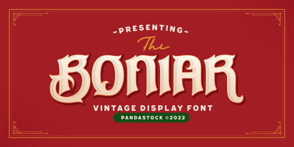 Boniar is vintage font with visual elegance, smooth curves and beautiful ligatures clear, making your work look true and attractive. A very versatile font that works in both large and small sizes. This font is suitable for a wide variety of projects such as invitations, logo, branding, magazine, photography, card, product packaging, mugs, quotes, poster, label, signature and more. Font which is perfect for all business sectors including personal projects, studio, corporate, creative agency, industrial, company, etc.
 - Pro Dunex by Imoodev,
$20.00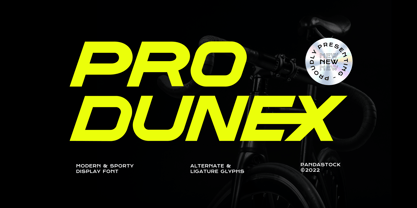 Pro dunex is modern typeface with visual elegance, smooth curves, and beautiful ligatures clear, making your work look true and attractive. A very versatile font that works in both large and small sizes. This font is suitable for a wide variety of projects such as invitations, logos, branding, magazine, photography, card, product packaging, mugs, quotes, poster, labels, signatures, and more. A font that is perfect for all business sectors including personal projects, studio, corporate, creative agency, industrial, company, etc.
 - Fubiox by Nirmana Visual,
$24.00 Introducing Fubiox our exquisite elegant style font, designed to bring sophistication and grace to your designs. With its refined letterforms, delicate curves, and timeless beauty, this font is perfect for projects that require a touch of elegance and class. Inspired by the elegance of classic typography. This font exudes a sense of refined aesthetics. Its graceful strokes and balanced proportions make it an excellent choice for luxury branding, high-end invitations, editorial design, and formal occasions.
 - Sagist by Imoodev,
$20.00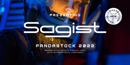 Sagist is modern display fonts with visual elegance, smooth curves, and beautiful ligatures clear, making your work look true and attractive. A very versatile font that works in both large and small sizes. This font is suitable for a wide variety of projects such as invitations, logos, branding, magazine, photography, card, product packaging, mugs, quotes, poster, labels, signatures, and more. A font that is perfect for all business sectors including personal projects, studio, corporate, creative agency, industrial, company, etc.
 - Eko Ringlos by Imoodev,
$20.00 Eko Ringlos is serif fonts, this typeface has smooth curves and a visual style a can embodies charm and elegance in every lettering, making your work look stunning and attractive. A versatile font that works in both large and small sizes, suitable for a wide variety of projects such as a display for headings, logos, invitations, branding, magazine, photography, card, product packaging, product mockup, mugs, posters, labels, signatures, editorials, art deco, any type of advertising purpose.
 - Fime Bonidh by Pandastock,
$12.00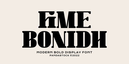 Fime bonidh is bold fonts with visual elegance, smooth curves and beautiful ligatures clear, making your work look true and attractive. A very versatile font that works in both large and small sizes. This font is suitable for a wide variety of projects such as invitations, logo, branding, magazine, photography, card, product packaging, mugs, quotes, poster, label, signature and more. Font which is perfect for all business sectors including personal projects, studio, corporate, creative agency, industrial, company, etc.
 - The Happiest Cruise In Anaheim by Megami Studios,
$7.50 Inspired by the signage of one of the greatest theme park rides in the world (you know, the one with the song that you can't really get out of your head), The Happiest Cruise in Anaheim is sure to bring your small world of fonts closer. Whether a world of wonder or a world of cheer, the playful, quirky and childlike joy of the curves and lines will hopefully set your work on a journey through imagination!