5,744 search results
(0.042 seconds)
- Resonance Love by Andrey Font Design,
$10.00 Resonance Love is a romantic and natural handwritten font, featuring beautiful hearts as ornaments. It is ideal for valentine-themed greeting cards, weddings, and any crafting projects that require a warm touch. This font is PUA encoded which means you can access all of the glyphs and swashes with ease!
 - Kataleya by Larin Type Co,
$14.00 Kataleya - this is a beautiful handwritten font filled with charm and romance. It will fit perfectly into any project, and thanks to alternative substitutes, you can make your design unique, try playing substitutes, and you will get different options for your design. All characters in this font support PUA encoding.
 - Miss You by Beary,
$15.00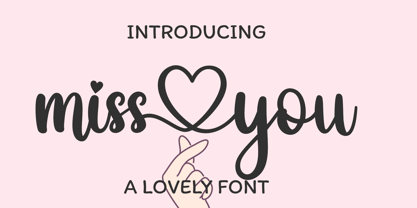 miss you is a romantic and sweet calligraphy typeface with characters that dance along the baseline. It has a casual, yet elegant touch. This font is PUA encoded which means you can access all of the glyphs and swashes with ease! Files Include : - Multilingual Support - Ligature Character - Alternates Character Thanks
 - Poetically Dark by Pitt's Hand,
$10.00 Poetically Dark is a font created to recall a certain type of dark and romantic writing from another century. Well-groomed letters, but written instinctively, as if in the throes of a creative frenzy. In a clash between the refined taste of the past and the ever-present speed of communication.
 - Manfred Klein, a prolific and versatile German type designer known for his wide range of font creations, crafted the Senats-Antiqua typeface, which embodies a blend of historical elegance and contemp...
- Handtalk - Personal use only

- Joe DiMaggio - Unknown license

- Rusticana by Linotype,
$29.99Rusticana is a part of the 1990 program Type before Gutenberg, which included the work of twelve contemporary font designers and represented styles from across the ages. Linotype offers a package including all these fonts on its web page, www.fonts.de. Rusticana was designed by Adrian Frutiger and appeared with Linotype in 1993. Its historical roots go back to the Roman Capitalis, the all caps engraved writing of ancient Rome which reached its peak in the first century. From this style evolved other Roman forms, and one, Rustica, proved particularly good for text on bronze, as opposed to in stone. The Rusticana of Frutiger has open, seemingly irregular forms which lend a distinctive rhythm to text. - Navarone by Stiggy & Sands,
$24.00 A Roman Stylized Font of War. Navarone is a display sans typestyle that was inspired by the movie titling sequence from the 1962 movie "The Guns of Navarone". It's an all capitals typeface that has alternate caps in the lowercase slots to convey all of the roman stylized lettering of the original inspiration. See the 5th graphic for a comprehensive character map preview. Navarone comes with features for customisation options: - An all capitals typeface with alternate capitals in the lowercase slots - A Basic Ligatures feature that swaps out FI and FL ligatures. Approx. 386 Character Glyph Set: Navarone comes with a glyphset that includes standard & punctuation, international language support, and basic ligatures.
 - Guillaume by George Tulloch,
$21.00 Guillaume is a small family of text fonts with its roots in the French sixteenth century. The roman is based on the types of Guillaume Le Bé (c.1525–1598), and the italic on those of Claude Garamont (Garamond) (d. 1561). Garamont’s romans have inspired countless modern interpretations, but his italics, despite their merit, have attracted much less attention. Guillaume offers extensive support for European languages, and is best suited for use in applications that support OpenType. Among its OpenType features are ligatures, small caps, several sets of numerals, contextual alternates, intelligent implementation of long ‘s’ and other period features, and fractions. For more detail, please see the pdf available in the Gallery.
 - Regent Pro by Storm Type Foundry,
$39.00 This modernized rustic Baroque Roman face paraphrases freely its model from the first half of the 18th century. The shape of the letters has been cleared from all unevenness and softness, but has retained its lively expression. It is deliberately rather cooler than the reverently digitized Baroque Roman type faces, since it was necessary to adjust it with regard to the visual experience of the contemporary reader. In addition, it has bold designs and aligning figures, which also considerably extends the range of its application. It is an entirely reliable text type face for the most demanding extensive works. Thanks to its calm expression and excellent legibility it is widely used when printing series of professional literature.
 - Waters Titling by Adobe,
$35.00Waters Titling is the work of lettering artist Julian Waters, a multiple master typeface of classical calligraphic roman capitals. This broad-tipped pen design is related to other historically-based titling alphabets but offers a wider range of weights and widths, making it extremely versatile for movie titles, book jackets, posters, banners, calendars, etc. Waters Titling is based on the timeless Roman monumental inscription forms of almost 2000 years ago, but also has a touch of contemporary vigor and flair. The design displays a strong calligraphic thick/thin stroke weight contrast and flowing, subtly bracketed serifs. In lighter weights, Waters Titling is elegant and delicate, while the bolder weights offer a more substantial sparkle. - Candida by Linotype,
$50.99Candida roman was designed by Jakob Erbar and appeared after his death with the typeface foundry Ludwig & Mayer in Frankfurt am Main in 1936. Due to the original designer’s death, the italic was designed by Walter Höhnisch shortly thereafter. In 1945 the roman was reworked, the breadth of the figures was reduced and the strokes made heavier. The bold weight followed in 1951. Later the typeface was expanded with further weights, which have for the most part fallen out of use. Three weights can still be found in catalogues, available as early as 1937 for the Linotype machine. Candida is a modest text font which retains its legibility even in smaller point sizes. - Apollo by Monotype,
$29.99 Apollo is oddly one of the lesser known typefaces of Frutiger, perhaps due to the extreme fame of some of his other works, like the typefaces Frutiger® and Univers®. Stylistically, the very legible and harmonic Apollo is an old face. Frutiger designed it especially for the photosetting used at the time. The Apollo typeface family consists of the weights roman and semibold and their respective italics as well as expert sets. Frutiger optimized the relation between the two weights so that the roman is robust enough to present a legible text on soft paper but light enough to contrast with the semibold. The clear, elegant Apollo is perfect for headlines as well as long texts.
 - heartfont - Unknown license

- Cantiqe by XdCreative,
$25.00 Cantiqe the rational serif with a circular/ball terminal and strong vertical contrast and fine horizontal hairlines, This makes Cantique a blend of elegant and beautiful. Cantiqe Incredibly versatile is perfect for fashion branding or editorial designs. this font fits a wide pool of designs, elevating them to the highest levels. Add this font to your favourite creative ideas and notice how it makes them come alive! Thank You _xdCreative
 - MFC Semicirculus Monogram by Monogram Fonts Co.,
$19.95 The inspiration source for Semicirculus Monogram is a stylish sans serif letterset from a vintage embroidery publication which combines to create a semi-circular form monogram. Originally intended to adorn handkerchiefs, it has so many other possibilities. Ornaments from numerous antique specimen books were combined with the letter set to accent and complete its form. This is one of many monogram designs for the early 1900s which fall into a two letter format that is either adorned or interwoven with ornamentation. Download and view the MFC Semicirculus Monogram Guidebook if you would like to learn a little more.
 - Harlan by Trial by Cupcakes,
$29.00 Harlan is from another place and time. But not just one specific place or time– with its barely-there, knife's-edge serifs, and its smooth curves and flourishes, Harlan feels both vintage and modern; both feminine and masculine. Inspired by the Baltimore bar "WC Harlan", which in turn was inspired by the old candle-lit bars of France, the tucked-away osterias of Italy, and the antique books and journals one might find in a patron's hand. It's a font you'll reach for when you're looking for something refined and elegant, but not too stylized or stuffy.
 - Ragtime Gal JNL by Jeff Levine,
$29.00 Amongst a batch of antique sheet musical instruction booklets offered for sale online was a piece with Art Nouveau hand lettering on the cover entitled “Seven Musical Travelogues for Piano”. This design served as the inspiration and model for Ragtime Gal JNL, which is available in both regular and oblique versions. The font’s name comes from the line ‘Hello my baby, hello my honey, hello my ragtime gal…’ from the 1899 song “Hello Ma Baby”; a tune that found a new burst of popularity in an odd way within a 1955 Warner Brother’s cartoon [“One Froggy Evening”].
 - Missing Stone by Pesic,
$29.00 Missing Stone features grunge rough, lapidary, antique look inspired by letters carved in stone plates. Capital glyphs are, although damaged, satisfactorily legible, whereas instead of lowercase letters, capital glyphs are placed, also featuring nearly abstract, hardly legible look, cross cut with rough horizontal lines and dots. The overall visual experience is rough, reminiscent of erosion of stone and disintegration. Capitals are legible and of small size, whereas the second group can be used only in bigger size, whereby rendering an interesting text texture in the course of alternate use. The font contains all the Latin accented characters used in European languages.
 - Paestum by Three Islands Press,
$24.00Paestum is a Latin typeface inspired by Greek inscriptions of the 6th and 5th centuries B.C. Its name comes, suitably, from the Latin name for Poseidonia, a former Greek city south of Naples whose two remaining Doric temples have been on antiquities tours since at least the 1700s. Others have scanned this terrain before, of course, but earlier designs failed to supply a lower case. Although Paestum includes complete upper- and lowercase alphabets, diacritics, numerals, and essential punctuation, it does not have many unhistorical glyphs -- such as currency symbols and the @ sign. Paestum comes with three weights: light, medium, and heavy. - Rama Gothic Rounded by Dharma Type,
$19.99 Rama Gothic Rounded is an antiqued sans serif designed inspired by 1800s-style wood type. All glyphs had been designed carefully to be retro-looking of the old time and to fill all with nostalgia. This condensed font family with 42 styles will be the best solution for posters, titles and anywhere you need impact. To complete your work perfectly, Gothic Extras family is ready for free. They include borders, ornaments and frames designed using vintage catalog of Hamilton in 1800's as a model. Be sure to check out the slab serif style of this Rama series named Rama Slab.
 - Origins Smooth by Laura Worthington,
$39.00 Origins is based on letters hand-drawn with a crow quill on parchment paper, a testament to calligraphic grace and antique ambiance. Its tight, energetic angularity can be complemented with swooping swash capitals, alternate ascending and descending letterforms, and graceful ending characters. Origins sings in settings related to food and wine, celebrations, travel, and history. Origins features 120 alternates and swashes, 8 ligatures and 20 ornaments. See what’s included! http://bit.ly/2hsRQ15 This font has been specially coded for access of all the swashes, alternates and ornaments without the need for professional design software! Info and instructions here: http://lauraworthingtontype.com/faqs/
 - Special Elite Pro by Stiggy & Sands,
$29.00 Our Special Elite Pro brings the unique individuality of the Special Elite Type No. NR6 vintage typewriter keyset to the digital age. Antique typewriters would type with a warmth and appeal to them, primarily because of their unpredictable “grunge” results from force of keystrokes to ribbon and paper. The SmallCaps and extensive figure sets add a more serious note to the nature of the typeface. OpenType features include: - SmallCaps. - Full set of Inferiors and Superiors for limitless fractions. - Tabular, Proportional, and Oldstyle figure sets (along with SmallCaps versions of the figures). - Stylistic Alternates for Caps to SmallCaps conversion.
 - ITC Kumquat by ITC,
$29.99ITC Kumquat is the work of American designer Eric Stevens. He started with the logo for his company, Tower of Babel Design, and expanded upon the Mesopotamian look to create a typeface to match. Stevens imagined drawing figures in the sand with a stick and how this method would change the way one usually draws characters, usually with lines replacing curves. Most characters are slim but a few, like the uppercase A and L, were made to contrast with the rest. ITC Kumquat is a great display typeface for anything which should have an antiquated feel."" - TE Thulth Golden by Tharwat Emara,
$99.99 Thulth font (Thulth Tharwat Emara Golden) distinguished by beautiful artistic structures and ready-made sentences to help you design the designer designs and paintings easily. It also retains the beauty of its original Arabic calligraphy. This font can be used in titles of books, magazines and Quranic verses. Also specialized in printing on clothes, Najaf and antiques. It is the first font that you can write complete sentences and Ayat of Quran by beautiful artistic structure like as those written by the calligrapher. It also simulates the handwriting and no need to calligraphy it when you have this font.
 - Regional News JNL by Jeff Levine,
$29.00 A roughened and worn version of Daily Tabloid JNL was originally created as a non-exclusive custom font for a client. The design emulates the look of old letterpress wood type and has now been released commercially as Regional News JNL; available in both regular and oblique versions. A special acknowledgement goes to Michael Hagemann of Font Mesa Fonts who partnered with Jeff Levine Fonts for the original project. His creativity and skill resulted in the textured look needed for the typeface. For some beautiful antique typefaces or fine text face collections, please visit Font Mesa Fonts.
 - MFC Fantasie Monogram by Monogram Fonts Co.,
$169.00 The inspiration source for Fantasie Monogram is another hand-drawn design from a vintage embroidery publication which relies on rigid geometric letterforms on a dynamic slant stepping downwards. This monogram, which evokes visions of it embossed or printed on antique cookie tins, was originally intended to adorn handkerchiefs, but the possibilities of its use are up to your imagination. This is one of many monogram designs from the early 1900’s which fall into a two letter format that is either adorned or interwoven decorative elements. Download and view the MFC Fantasie Guidebook if you would like to learn a little more.
 - Stencil Decor JNL by Jeff Levine,
$29.00 Stencil Decor JNL is loaded with all kinds of antique designs, embellishments and borders to work well alongside your favorite stencil lettering to create a totally retro look. Of course, these designs also make beautiful additions to many other kinds of print and craft projects. PLEASE NOTE: The purchase of this font does not include the right to reproduce the images for resale as stand-alone products (including, but not limited to stencils, ink stamps, stickers, wallpaper, etc.). For this kind of use, contact Jeff Levine Fonts through the email address provided in the EULA to discuss special licensing options and fees.
 - Brimley by Chank,
$49.00This slinky number will seduce you with its linking letters and special ligatures. Brimley's strokes are tight and sharp, and its characters are tied together with slender, whispy hooks. Although its elegance is timeless, this is a style that typifies lettering of last century's late '50s and early '60s. Chank Co. intern Tim Drabandt created Brimley with inspiration from antique type books. He named the font after Wilford Brimley. You know... the chubby old guy who tells you to check your blood sugar and eat your Grape Nuts and Quaker Oats. Haven't you ever seen Cocoon? - Largo EF by Elsner+Flake,
$35.00The typefaces Largo Mager (Light) and Largo Halbfett (Medium) were cast for the first time in 1937 by Ludwig & Mayer based on the designs by Hans Wagner. One weight Largo Licht (Outline) was added in 1956. All fonts were only configured with capitals. The digital version of Largo has pointed serifs and not the slightly rounded ones seen in the hot metal versions which gives the typeface a more elegant note. Largo is often used for fine printing jobs as business cards or formal invitations, or in the fashion and cosmetics fields. Hans Wagner was born in Munich in 1894 and died in 1977 in Altenburg where he had worked as a painter, graphic designer and book designer. In addition to the Largo typeface, he developed, among others, the Altenburger Gotisch (1928), the Welt-Antiqua (1931-1934) and the Wolfram (1930). - Livory by HVD Fonts,
$50.00 Livory is a serif type family of four fonts including small caps, 25 ornaments & 50 ligatures in each style. It was designed by Hannes von Döhren & Livius F. Dietzel between 2005 and 2010. Livory is influenced by the French Renaissance Antiquas from the 16th century. It has an organic look with a warm touch and was especially developed for long texts. With its melted corners and individual serifs, Livory has also a smooth and handcrafted appearance in display sizes. With almost 780 glyphs in each font, Livory is equipped for complex, professional typographic work. The OpenType fonts have an extended character set to support Central and Eastern European as well as Western European languages. Each font includes small caps, fractions, old style-, lining-, tabular numbers, scientific superior/inferior figures, ligatures, ornaments and a set of arrows.
 - Quietism by Michael Rafailyk,
$20.00 A smooth contemplative Antiqua with aspiring to the sky ascenders, inspired by the Quietism philosophy. Clarity of the mind is achieved by bringing the body into a state of calm and contemplation, and this is reflected in the design – the quiet horizontal serifs (body) are opposed to the peaky soaring ascenders (mind). The design also features four optical size subfamilies with different x-height and contrast, oldstyle diagonal stress, oldstyle figures by default, smooth details and slightly dark texture. Video about the Quietism typeface concept: https://www.youtube.com/watch?v=gBqkROHMEAc Scripts: Latin, Greek, Cyrillic. Languages: 480+. The complete list of supported languages: michaelrafailyk.com/quietism The promo images used illustration of Ola Rafailyk, paintings of Pieter Bruegel the Elder and Tom Roberts, photos of Boys in Bristol Photography and Ken Cheung from Pexels, and photo of Rodin's The Thinker at the Musée Rodin.
 - Bremer Presse by Schraube,
$29.00 As most successful German private press, «Bremer Presse» has strongly influenced German book art. It was founded 1911 in Bremen to print and produce books in perfection. The role model of the press’ typeface was the english Doves Press. Willy Wiegand drew three versions of the «Bremer Presse» antiqua font, starting with the regular weight in 16 pt and adding later the regular weights in 11 and 12 pt. The revival of this beautiful font is based on the 12 pt weight. During the design process, the focus was laid on finding the elegance and strength of original prints. As it was designed to print books, the typeface is optimally used for texts. And with the revival’s new weights «medium» and «bold» and OpenType features like ligatures or old style figures, you can design sophisticatedly typographical compositions.
 - Alergia Grotesk by Borutta Group,
$29.00 Alergia Grotesk was made as a hybrid between a classical geometric grotesque and a linear antiqua. This typeface is characterised by a lot of details, which gives it a strong character. Unpredictable cuts in a letters “a” and “s”, or a double “g” in combination with a delicate contrast, makes Alergia Grotesk a good choice for many purposes from headlines to short flowing texts. A big range of width varieties allows to versatile use and can give a nice effect while mixing extreme varieties with each other in one project. The family consists of 10 weights, 3 widths and set of italics – together 60 styles. The whole family has a comprehensive set of characters. In addition to the Latin letters, Alergia Grotesk also has a full set of characters for Vietnamese, extended Cyrillic (with Abkhasian) and Greek.
 - Glandian by TM Type,
$12.00 Glandian is a romantic and sweet calligraphy typeface with characters that dance along the baseline. It has casual yet elegant features. It is perfect for wedding invitations, logo designs, social media, wedding greetings, etc. This font is PUA encoded, which means you can access all of the glyphs and swashes with ease.
 - Internal Display by Typehill Studio,
$17.00 Internal Display attracts a typeface that is smooth, clean, unique, elegant, modern, feminine, sensual, glamorous, simple and very easy to read. Classic style is very suitable to be applied in various formal forms such as invitations, labels, menus, logos, fashion, make up, stationery, letterpress, romantic novels, magazines, books, greeting/wedding cards, packaging, labels.
 - Stinkley by Ditatype,
$29.00 Stinkley is a beautiful, romantic handwritten font, perfect for any design project that you wish to create. Stinkley is incredibly versatile, carefully handcrafted to become a true favorite. Use it to lift your projects to the highest level! Featured : Accents (Multilingual characters) PUA encoded Numerals and Punctuation (OpenType Standard) Full Support Dita Type
 - Morica Script by Mans Greback,
$59.00 Morica Script, designed by Mans Greback, is a delicate and romantic handwritten typeface with a fine touch. Its thin lines and whimsical style bring a sense of elegance and charm to your creative projects. Perfect for wedding invitations, heartfelt letters, and intimate stationery, Morica Script embodies the beauty of naive handwritten communication.
 - Virathers Shine by Ably Creative,
$12.00 Virathes shine font feels equally charming and elegant and romantic script font that features flowing characters. It looks stunning on wedding invitations, thank you cards, quotes, greeting cards, logos, business cards and every other design which needs a handwritten touch. This font is encoded which means you can access all and with ease!


