6,601 search results
(0.029 seconds)
- King Pong by Dan Auer,
$5.00 Inspired by apes and barrels, King Pong is a display font that's heavy, blocky, yet cheerful. Letterforms are brought to life through removal from a single square. Ascenders and descenders bring contrast and interest to the letterforms through a curved form cut at a 45 degree angle. King Pong works great for themes related to video games, technology, and music while the letterforms perform well in low-contrast environments and in very large formats – such as posters.
 - Kelluhan by Pandastock,
$12.00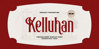 Kelluhan is a vintage typeface with visual elegance, smooth curves, and beautiful ligatures clear, making your work look true and attractive. A very versatile font that works in both large and small sizes. This font is suitable for a wide variety of projects such as invitations, logos, branding, magazine, photography, card, product packaging, mugs, quotes, poster, labels, signatures and more. A font that is perfect for all business sectors including personal projects, studio, corporate, creative agency, industrial, company, etc.
 - Mukoji by Imoodev,
$20.00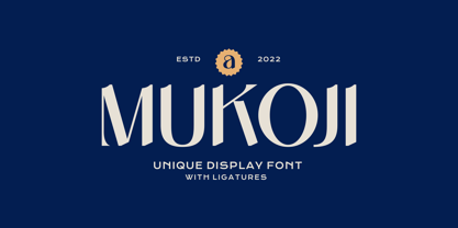 Mukoji is unique elegant font with visual elegance, smooth curves, and beautiful ligatures clear, making your work look true and attractive. A versatile font that works in both large and small sizes. This font is suitable for a wide variety of projects such as invitations, logos, branding, magazine, photography, card, product packaging, mugs, quotes, poster, labels, signatures, and more. A font that is perfect for all business sectors including personal projects, studio, corporate, creative agency, industrial, company, etc.
 - Bloomsburg by Sharkshock,
$115.00 Bloomsburg is a sharp, modern, everyday font with a multitude of uses. This family is characterized by its high legibility, delicate curves, and vertical cuts to most lowercase terminals. Its humanist features are most evident in the lightest versions making it a versatile choice for showcasing warmth and personality. Use Bloomsburg for eye catching headlines or try the Bold version for a company logo. A wide range of languages are supported including European accents and Cyrillic characters.
 - Cisse by Epiclinez,
$18.00 Cisse is a signature script font that has a classy & elegant feel that gives you so many ways to create beautiful typography in your design projects. It's made up of smooth curves, which are also perfect for logos & wedding invitations. Use Cisse script font to make your design stand out! So what’s included : Basic Latin Uppercase and Lowercase Numbers, symbols, and punctuations Ligatures Multilingual Support. Fully accessible without additional design software Simple Installations works on PC & Mac Thank You!
 - Hello Malike by Imoodev,
$20.00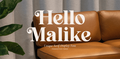 Hello Malike is beautiful serif fonts with visual elegance, smooth curves, and beautiful ligatures clear, making your work look true and attractive. A versatile font that works in both large and small sizes. This font is suitable for a wide variety of projects such as invitations, logos, branding, magazine, photography, card, product packaging, mugs, quotes, poster, labels, signatures, and more. A font that is perfect for all business sectors including personal projects, studio, corporate, creative agency, industrial, company, etc.
 - Fucha by Oliveira 37,
$20.00 Fucha is a typography inspired by the Art Nouveau movement, and by the lettering of Alphonse Mucha's posters. Fucha is a decorative display font in the Art Nouveau style that originated over a century ago. The style showcases in its elaborate, lightweight curves a bold approach to organic lines and luxurious decor. A complete repertoire of Latin Extended-A characters is contained in the font. Supporting 219 Latin languages, which are spoken in different 212 countries.
 - Youtesh by Imoodev,
$12.00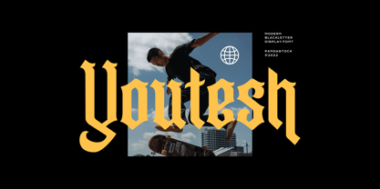 Youtesh is vintage retro fonts with visual elegance, smooth curves, and beautiful ligatures clear, making your work look true and attractive. A very versatile font that works in both large and small sizes. This font is suitable for a wide variety of projects such as invitations, logos, branding, magazine, photography, card, product packaging, mugs, quotes, poster, labels, signatures, and more. A font that is perfect for all business sectors including personal projects, studio, corporate, creative agency, industrial, company, etc.
 - Pawirot by Pandastock,
$12.00 Pawirot is display font style with visual elegance, smooth curves and beautiful ligatures clear, making your work look true and attractive. A very versatile font that works in both large and small sizes. This font is suitable for a wide variety of projects such as invitations, logo, branding, magazine, photography, card, product packaging, mugs, quotes, poster, label, signature and more. Font which is perfect for all business sectors including personal projects, studio, corporate, creative agency, industrial, company, etc.
 - Macis by Stabenfonts,
$30.00 Macis is a real-and-fake-retro-modern font-family containing five weights from thin to black. It is inspired by shop signs, packaging and typography from around the middle of 20th century. Though it is strictly geometrically constructed, it contains some hand-crafted influences as well as some irregularities. Some say, it dances on the baseline, ’cause the bowls and curves reach far out over the stems. Use it in big sizes, especially the extreme weights!
 - The Morydane by Letterhend,
$19.00 Introducing Morydane a script font perfect for designers looking for a modern and casual style. With its clean lines and flowing curves, this font is ideal for adding an interesting touch to your designs,especially in logo, and the other various formal forms such as invitations, labels, logos, magazines, books, greeting / wedding cards, packaging, fashion, make up, stationery, novels, labels or any type of advertising purpose. Features : Uppercase & lowercase Numbers and punctuation Alternates & Ligatures Multilingual PUA encoded
 - Losta Masta by Creativemedialab,
$15.00 Losta Masta - fun and playful serif family. Unique, playful and versatile serif family with 40+ ligatures and 100+ alternates that you can combine to get curves and beautiful shapes just in seconds. Play with the ornaments to create a more stunning display. This font is suitable for use in many design forms, for example magazines, postcards, logos, vintage look, old classic ,60s, 70s, 80s era, wedding projects and many more. We recommend using Adobe Illustrator or Photoshop.
 - Funky Retrovy by IbraCreative,
$17.00 Funky Retrovy is a groovy and energetic font that perfectly captures the essence of retro nostalgia. With its funky and whimsical letterforms, this typeface exudes a vibrant and carefree spirit reminiscent of the colorful era it celebrates. Each letter boasts bold and playful curves, inspired by the iconic designs of the past. Funky Retrovy adds a touch of fun and funkiness to any project, making it ideal for eye-catching posters, vibrant branding, and retro-themed party invitations.
 - Bunga Pro by Graptail,
$15.00 Bunga is a serif typeface that gives a romantic feel to every curve. With 45 ligatures and alternates which are included, it is very helpful in creating the title of each of your projects such as film titles, book covers, branding, logos, packaging, magazines and more. Also supported PUA encoded. Simply copy and paste the alternate characters using the Character Map (Windows), Font Book (Mac) or a software program such as PopChar (for Windows and Mac).
 - Matrike by Pandastock,
$12.00 Matrike is vintage fonts with visual elegance, smooth curves, and beautiful ligatures clear, making your work look true and attractive. A very versatile font that works in both large and small sizes. This font is suitable for a wide variety of projects such as invitations, logos, branding, magazine, photography, card, product packaging, mugs, quotes, poster, labels, signatures, and more. A font that is perfect for all business sectors including personal projects, studio, corporate, creative agency, industrial, company, etc.
 - Mistont by Pandastock,
$12.00 Mistont is beautiful serif fonts with visual elegance, smooth curves and beautiful ligatures clear, making your work look true and attractive. A very versatile font that works in both large and small sizes. This font is suitable for a wide variety of projects such as invitations, logo, branding, magazine, photography, card, product packaging, mugs, quotes, poster, label, signature and more. Font which is perfect for all business sectors including personal projects, studio, corporate, creative agency, industrial, company, etc.
 - Durer Display by iframe,
$28.00 Durer is a modern font, its soft curves and refined details create a sense of elegance. Inspired by the work of Albrecht Dürer (21 May 1471 – 6 April 1528), who was a German painter, printmaker, and theorist of the German Renaissance. Born in Nuremberg, Dürer established his reputation and influence across Europe in his twenties due to his high-quality woodcut prints. 551 Glyphs Upper / lower case, numbers, punctuation Language support: Latin / Greek Designed by iframe type foundry
 - Vokrad by Imoodev,
$20.00 Vokrad is modern vintage font with visual elegance, smooth curves, and beautiful ligatures clear, making your work look true and attractive. A very versatile font that works in both large and small sizes. This font is suitable for a wide variety of projects such as invitations, logos, branding, magazine, photography, card, product packaging, mugs, quotes, poster, labels, signatures, and more. A font that is perfect for all business sectors including personal projects, studio, corporate, creative agency, industrial, company, etc.
 - Riemish by Pandastock,
$12.00 Riemish is blackletter font with visual elegance, smooth curves, and beautiful ligatures clear, making your work look true and attractive. A very versatile font that works in both large and small sizes. This font is suitable for a wide variety of projects such as invitations, logos, branding, magazine, photography, card, product packaging, mugs, quotes, poster, labels, signatures, and more. Font which is perfect for all business sectors including personal projects, studio, corporate, creative agency, industrial, company, etc.
 - Oblonga by Eurotypo,
$28.00 Oblonga shows thin, elegant lines. The continuity of the trace is only suggested through the curves of the letters, a soft effect of bonding that maintains the identity of each character. Oblonga is an Art-Déco font proposed in a modern key, a revival performed without aggression. More than three hundred glyphs (regular and Italic) that ensure legibility in Central-European and Slavic languages, enriched by some appropriate discretionary ligatures that enhance the charme of a time gone away.
 - Argot by K-Type,
$20.00 Argot is inspired by condensed grotesque letterforms and would be a monolinear sans except for an unorthodox disparity between inner and outer shapes. Elegantly curved outlines contrast starkly with austere rectangular counters, suggesting a no-frills functionality, 20th century modernism, or an unsettling discordance. The squared off inner spaces also add clarity and crispness. Argot is available in three widths — Wide, Normal and Narrow. Each width is supplied in three weights — Regular, Bold and Black — with corresponding italics (obliques).
 - Muray House by Flavortype,
$19.00 Muray House is a bold serif font with a rough, balanced look, with beautiful curves and alternate characters. A style that we choose was the natural look hand made, Muray House ha a unique identity. Muray House also comes with alternative characters that are carefully created for adding a minimalist decor of the letters. Stylistic alternates allows versatile design options and works perfectly for Headlines, Posters, Logos Packaging, Branding, T-shirts, Greetings, Presentations and much more.
 - Abdo Misr by Abdo Fonts,
$29.50 Abdo Misr is a geometrical style. This is an OpenType Font supporting Arabic, Persian, Urdu, abd English to and compatible with the various operation systems and modern software. The combination of modern Kufi and Geometrical styles and varying between straight and curved parts made it a beautiful typeface appropriate to the titles and slogans, and able to meet the desire of the user in the design of ads and modern designs of various types of audio and visual.
 - Hello Hoeask by Imoodev,
$12.00 Hello Hoeask is display fonts with visual elegance, smooth curves and beautiful ligatures clear, making your work look true and attractive. A very versatile font that works in both large and small sizes. This font is suitable for a wide variety of projects such as invitations, logo, branding, magazine, photography, card, product packaging, mugs, quotes, poster, label, signature and more. Font which is perfect for all business sectors including personal projects, studio, corporate, creative agency, industrial, company, etc.
 - Brignell Sunday by IB TYPE Inc.,
$40.00 BRIGNELL SUNDAY is an eight font family designed by Ian Brignell. A relaxed, easy-reading companion for any day of the week. A clean, modern, friendly sans serif characterized by an open style with occasionally rounded corners, occasional curved junctures on diagonals and a slightly sloped lower case A. Brignell Sunday was born in 2006 and was inspired by corporate custom font ideas Ian designed for an LG Electronics sub-brand called Best Shop. Extended Latin set.
 - Fustier by Nathatype,
$29.00 Fustier is a script font that captures the beauty of handwriting with a mesmerizing twist. The curves and loops dance across the page, evoking the sensation of ink flowing seamlessly from a skilled hand. With an abundance of swinging details, Fustier ensuring a harmonious flow from letter to letter. The generous spacing between letters maintains readability and legibility, You can use this font in headlines, logos, posters, flyers, invitations, name cards, branding materials, and many more.
 - Accia Flare by Mint Type,
$39.00 Accia Flare is an elegant glyphic typeface with large x-height and low contrast. Its subtle curviness will create a tender but notable image in packaging applications. The font family contains 8 weights from Thin to Extra Bold, with matching true italics. It supports extensive language support including Cyrillic, as well as numerous OpenType features such as small caps, ligatures, several sets of figures, case-sensitive punctuation, ordinals. Accia Flare is a member of Accia Type System. It encompasses five typefaces ranging from sans-serif to expressive serif, giving you the possibility to create sophisticated cohesive designs. Accia Type system consists of Accia Sans, Accia Flare, Accia Piano, Accia Moderato, and Accia Forte.
 - Faery Dream by Andrey Sharonov,
$24.00 Faery Dream is a modern high-contrast display font with bright positive character. Clean forms and a bit curly letter ends creates a friendly mood in any designs. It comes with Regular and Oblique version, Opentype features (stylistic alternates and standard ligatures). The easiest way to get alternate is to add number after character (for example A2, A3) or add Underscore after end character (for example a_ r_). The full set of alternates you can find in font presentation. Faery Dream Display is perfect for headlines, magazines, logotypes, food package, advertising and many others. Multilingual Support: Danish, Dutch, English, Estonian, Faroese, Finnish, French, German, Hungarian, Icelandic, Italian, Norwegian, Polish, Portuguese, Slovene, Spanish, Swedish, Turkish.
 - Smile Peonia by Nathatype,
$29.00 Want to enchant your audiences clients, or guests? If you have a dream to create an awesome branding for your business, work on a poster for an event, or whatever your project is-then we've got what you want. Smile Peonia-A Handwritten Font Smile Peonia is a handwritten font designed with curvy style to add fun style. This font is also support multi languages to make your branding globally acceptable. Smile Peonia can be used for various purposes such as headings, signatures, logos, quotes, wedding invitations, t-shirts, letterheads, signage, labels, posters, badges etc. Features: Ligatures Stylistic Sets PUA Encoded Numerals and Punctuation Thank you for purchasing premium fonts from Natha Studio. Happy Designing!
 - Gardens by The Rivertown Inkery,
$20.00 Gardens is a nostalgic arena font. Inspired by a soon-to-be demolished arena, this font was created to capture the memories and good times this building once contained. Upon hearing the news of the demolition, our team was struck with sadness and nostalgia. As youngsters we can recall attending a wide variety of events, such as hockey games, pro wresting and the circus. Our hope is that others can share in our nostalgic love of this once prominent arena. With curvy retro styling Gardens is unique and will fit in with many retro and vintage logos and design. Wether its t-shirts, posters or digital, Gardens will surely make your work stand out!
 - Jumble by Laura Worthington,
$29.00 Jumble is friendly and cute treat for the eyes. Jumble draws you in with its thick, curvy strokes, jaunty counters, and a whimsical variety of counterforms with no two alike. For even more variety, Jumble includes 104 alternates for plus a handful of ligatures. Jumble conveys humor and warmth without being silly; its lack of straight lines and sharp edges makes it perfect for evoking tasty treats like frosted cakes or pies, or child-friendly toys and games. See what’s included! http://bit.ly/1RDnJjY This font has been specially coded for access of all the swashes, alternates and ornaments without the need for professional design software! Info and instructions here: http://lauraworthingtontype.com/faqs/
 - Okoye by XO Type Co,
$40.00 Okoye occupies a liminal space between the bonkers curviness of 19th-century grotesques and the sandblasted neutrality of 20th-century models. Both extremes are nice, but there’s something to be said for some neutrality with character left in place, yes? Okoye comes in 9 weights, Thin to Black. If you’re using it for interfaces, each weight lines up from 100-900 in the CSS specification you already know, with Regular sitting at 400 and Bold at 700. You’ll see what you expect to see without extra font-weight specification. There’s extensive Latin language support, a set of small caps which mirrors full-size caps (good for control labels), and arrows. Okoye will be your quirkhorse: hardworking, with personality.
 - Colonia Deco by Typerookie,
$10.00 Named after Cologne, the city it was born, Colonia Deco is a modern Art Deco inspired display font. The mono line Sans Serif with a touch of vintage is a perfect choice for designs with a luxurious but minimalist look and feel. Used in headlines, logos or product packaging it will match beautifully with curly script fonts. The typeface can be used as an all caps version or by blending in the lower case glyphs - which function as real small capitals by design. Giving the "New Golden Twenties" a modern retro look this elegant typeface also comes with multilingual support and a variety of special characters, as well as two weight variations.
 - Gimbel Script by Stiggy & Sands,
$39.00 Monolinear Vintage Elegance The Gimbel Script typeface was inspired by a monoline, semi-connected script from a 1930's holiday greeting card. From its ascenders and descenders that stretch high and low to its gentle curviness Gimbel Script exudes the elegance of a bygone era while standing on a thin line between formal and casual lettering styles. See the 5th graphic for a comprehensive character map preview. Gimbel Script Opentype features include: - Swash Alternates for an alternate M and N. - Stylistic Alternates & SS01-SS06 Stylesets for 151 varying forms. - 219 Ligatures for a smoother typesetting experience, along with 181 initial, middle and final forms. - Full set of Inferiors and Superiors for Limitless Fractions. - Proportional, Tabular and Oldstyle figure sets.
 - Periwinkle by Jukebox Collection,
$36.99 Periwinkle is a fun and happy digital revival based on an old photo-typositing face. Filled with 1960s and 1970s charm, Periwinkle contains a full set of alternate swash caps as well as a few lowercase swashes and other alternate glyphs to add typographic variation. This font seems to take us back to our childhoods with its curly cues and slightly modulated baseline. Perfect for any project that needs fun, laughter and liveliness! Jukebox fonts are available in OpenType format and downloadable packages contain both .otf and .ttf versions of the font. They are compatible on both Mac and Windows. All fonts contain basic OpenType features as well as support for Latin-based and most Eastern European languages.
 - Pontina by KaiserType,
$30.00 Pontina is the name of a multilingual didone typeface. Its elegant character is built up of playful and lively strokes combined with high ascenders and high capital letters, that gives the classical forms a modern individual touch. It combines both: legibility and an ornamental curvy look for display purposes. The typeface provides true italic fonts for each weight, which fit harmoniously to the regular fonts. Pontina can be used for headlines and also works well in smaller text sizes. The text styles have slightly lower capitals and ascenders for better legibility. Also the font comes along with a set of different ligatures as well as swash letters and all necessary open-type features.
 - Kyboshed - 100% free

- Goodbye Crewel World NF - Unknown license

- RePublic by Suitcase Type Foundry,
$75.00In 1955 the Czech State Department of Culture, which was then in charge of all the publishing houses, organised a competition amongst printing houses and generally all book businesses for the design of a newspaper typeface. The motivation for this contest was obvious: the situation in the printing presses was appalling, with very little quality fonts existing and financial resources being too scarce to permit the purchase of type abroad. The conditions to be met by the typeface were strictly defined, and far more constrained than the ones applied to regular typefaces designed for books. A number of parameters needed to be considered, including the pressure of the printing presses and the quality of the thin newspaper ink that would have smothered any delicate strokes. Rough drafts of type designs for the competition were submitted by Vratislav Hejzl, Stanislav Marso, Frantisek Novak, Frantisek Panek, Jiri Petr, Jindrich Posekany, and the team of Stanislav Duda, Karel Misek and Josef Tyfa. The committee published its comments and corrections of the designs, and asked the designers to draw the final drafts. The winner was unambiguous — the members of the committee unanimously agreed to award Stanislav Marso’s design the first prize. His typeface was cast by Grafotechna (a state-owned enterprise) for setting with line-composing machines and also in larger sizes for hand-setting. Regular, bold, and bold condensed cuts were produced, and the face was named Public. In 2003 we decided to digitise the typeface. Drawings of the regular and italic cuts at the size of approximatively 3,5 cicero (43 pt) were used as templates for scanning. Those originals covered the complete set of caps except for the U, the lowercase, numerals, and sloped ampersand. The bold and condensed bold cuts were found in an original specimen book of the Rude Pravo newspaper printing press. These specimens included a dot, acute, colon, semicolon, hyphens, exclamation and question marks, asterisk, parentheses, square brackets, cross, section sign, and ampersand. After the regular cut was drafted, we began to modify it. All the uppercase letters were fine-tuned, the crossbar of the A was raised, E, F, and H were narrowed, L and R were significantly broadened, and the angle of the leg and arm of the K were adjusted. The vertex of the M now rests on the baseline, making the glyph broader. The apex of the N is narrower, resulting in a more regular glyph. The tail of Q was made more decorative; the uppercase S lost its implied serifs. The lowercase ascenders and descenders were slightly extended. Corrections on the lower case a were more significant, its waist being lowered in order to improve its colour and light. The top of the f was redrawn, the loop of lowercase g now has a squarer character. The diagonals of the lowercase k were harmonised with the uppercase K. The t has a more open and longer terminal, and the tail of the y matches its overall construction. Numerals are generally better proportioned. Italics have been thoroughly redrawn, and in general their slope is lessened by approximatively 2–3 degrees. The italic upper case is more consistent with the regular cut. Unlike the original, the tail of the K is not curved, and the Z is not calligraphic. The italic lower case is even further removed from the original. This concerns specifically the bottom finials of the c and e, the top of the f, the descender of the j, the serif of the k, a heavier ear on the r, a more open t, a broader v and w, a different x, and, again, a non-calligraphic z. Originally the bold cut conformed even more to the superellipse shape than the regular one, since all the glyphs had to be fitted to the same width. We have redrawn the bold cut to provide a better match with the regular. This means its shapes have become generally broader, also noticeably darker. Medium and Semibold weights were also interpolated, with a colour similar to the original bold cut. The condensed variants’ width is 85 percent of the original. The design of the Bold Condensed weights was optimised for the setting of headlines, while the lighter ones are suited for normal condensed settings. All the OpenType fonts include small caps, numerals, fractions, ligatures, and expert glyphs, conforming to the Suitcase Standard set. Over half a century of consistent quality ensures perfect legibility even in adverse printing conditions and on poor quality paper. RePublic is an exquisite newspaper and magazine type, which is equally well suited as a contemporary book face. - Sigmund Freud Typeface by Harald Geisler,
$29.00 “For those who regret what keyboards and touch screens have done to their penmanship, typographer Harald Geisler has an answer: Sigmund Freud.” — The Wall Street Journal Sigmund Freud was a neurologist who lived from 1856 to 1939. His research and studies led to the foundation of ‘Psychoanalysis’. When I first saw Freud’s century old letters, I was fascinated by the beauty of these historic manuscripts. It made me smile to imagine a person writing his or her shrink a letter set in Freud’s handwriting. I started to plan creating a font based on his manuscripts. I contacted the Sigmund Freud Museum Vienna and Freud Museum London. To start the creation I selected eight handwritten documents from the archive in Vienna – This selection of specimen was my orientation during the design process. The Samples were created between 1883 to 1938 and are of various character such as handwritten scientific papers, personal letters, notes and a telegram. A successful Kickstarter Campaign "The Sigmund Freud Typeface - A Letter to your Shrink" with over 1400 Backers enabled me to visit the archive in Vienna and study the original manuscripts of Sigmund Freud. After a year of preparation and design work, I finished four alphabets based on Freud’s handwriting. What are the different Versions PRO, Kurrent, #1, #2, #3 and #4 about? “This project gives people the convenience afforded by the computer while maintaining the romantic nostalgia, beauty, and character of letter writing with real handwriting.” — Daniel Vahab, The Huffington Post When you write with your hand, every letter looks a little different. When you write a text on your computer every letter looks exactly the same. In order to make type look like handwriting, I chose four different variations of each letter from Freud’s manuscripts, drew and stored them in the font. The font is then programmed to exchange letters while you are typing. This makes the rendered result on your screen or print look like unique handwriting. PRO While you are typing… the PRO Version actively combines all four alphabets and exchanges them automatically. Through this mechanism never the same two o’s will stand next to each other. With every touch a unique look is generated. This works in certain applications i.e. Word 2010(or newer), Pages, TextEdit, Editor(Pre-installed on Windows 7 or newer), InDesign, Illustrator… →Here you can see an animation of what this effect looks like in action. (Please Note: some applications like LibreOffice, OpenOffice do currently not support this feature. Date: December 2013) #1 #2 #3 and #4 The Sigmund Freud Typeface #1, #2, #3 and #4 each hold one individual lowercase alphabet based on Freud’s handwriting. Kurrent Most of Freud’s correspondence was written in German. Until the 1950′s a different handwriting was taught throughout German speaking countries (Switzerland, Austria, Germany). This style is called Kurrent. The name Kurrent and Cursive derive from the Latin word currere - to run, hurry - both styles were designed to write fast. As you can see in the samples above, Freud practiced both Kurrent and when writing english Cursive (Latin script or Joined-up). Kurrent has three significantly different letters (s,h,e). Use Kurrent to render the authentic look of an historic Sigmund Freud letter in German. Bundle On the Top of this page you can get all six fonts of the Sigmund Freud Typeface Family in a bundle. International Typeface All styles of the Sigmund Freud Typeface feature a wide range of accented letters so you can write to all your friends in Sweden (Bjørn) France (Chloé & Zoë), Ireland (Dáirine), Poland (Łucja), Germany (Jörg) and almost everywhere around the globe (Find a complete list in the tech specs). Usage recommendations I hope that this design will be valuable to you and most of all that you have fun with this typeface! 1. Point Size — To reproduce the size of Sigmund Freud’s handwriting adjust the type size between 18-24 point in your word processor. If you are using an imaging software like Photoshop set the resolution to 300dpi and adjust the point size between 18-24. 2. Line Spacing — Narrow the line hight until swashes of capital letters touch the baseline above. This also happens when you write a letter and gives the document a unique handwritten look. 3. Right Aligned — Freud had the habit to write towards the right edge of the page and start loosely on the left. Set your text alignment to ‘right’ to incorporate this dramatic expression also to your documents. What do other People say about the Sigmund Freud Typeface? “Wouldn’t you love to write a letter to your shrink using the Sigmund Freud typeface?” — Dorothy Tan, Design TAXI ''“JUST DON’T WRITE A LETTER TO YOUR MOTHER WITH IT… …until the reader looks a bit closer, and they see 70+ years of modern science weighing in on turn-of-the-century pop psychology."'' — Mark Willson, Fast Company “Doctor, what does it mean if you dream of creating a font of Freud’s handwriting?” — Ayun Halliday, Open Culture “…geekily romantic, at once artistic and scientific” — Edie Jarolim, Freud’s Butcher “…sympathisch” — Jürgen Siebert, Fontblog !WOW! Thank you for reading the complete font description! You are awesome! If you still have a question please contact me through MyFonts or my website haraldgeisler.com. Credits This project was made possible by the help of 1481 Backers on Kickstarter and the kind support of the Sigmund Freud Museum Vienna and the Freud Museum London. Thank you. All of Freud’s Manuscripts shown are © Sigmund Freud Museum Vienna. Poster Image: IN17 - Sigmund Freud, Germany 1932. © Freud Museum London. Flag Image: IN19 - Sigmund Freud 1930’s. © Freud Museum London.

