10,000 search results
(0.055 seconds)
- Sun-kissed by Krafted,
$10.00 “Live in the sunshine. Swim in the sea. Drink the wild air.” ― Ralph Waldo Emerson Hey there sun-kissed beauties! Are you looking for a gorgeous handwritten font that’ll captivate your viewers and make your branding shine as bright as the sun? Introducing Sun-kissed - A Handwritten Font. With every hand-drawn stroke and curve, Sun-kissed will delight and add brightness, modernity, and fun to wherever it’s placed. Impress your party guests with gorgeous invitations, make a statement on your social media banners, and add a little bit of sunshine to your corporate identity. This stylish Handwritten font is also can be used for headings, logos, business cards, printed quotes, cards, packaging, and presentations. What you’ll get: Multilingual & Ligature Support Full sets of Punctuation and Numerals Compatible with: Adobe Suite Microsoft Office KeyNote Pages Software Requirements: The fonts that you’ll receive in the pack are widely supported by most software. In order to get the full functionality of the selection of standard ligatures (custom created letters) in the script font, any software that can read OpenType fonts will work. We hope you enjoy this font and that it makes your branding sparkle! Feel free to reach out to us if you’d like more information or if you have any concerns.
 - Athelas Arabic by TypeTogether,
$89.00 Athelas Arabic, created by talented Iranian designer Sahar Afshar, is an elegant typeface for fine digital and printed books — perfect for Arabic literature’s captivating forms. Originally designed independently, it worked entirely on its own and yet already seemed a good fit for Athelas. So it was decided to give Athelas Arabic a thorough reworking to make them appropriate companions while maintaining the natural aesthetic qualities of Arabic. First, the Arabic letter sizes were readjusted so as to not appear larger next to the Latin, then weight and contrast were changed in the same way. Finally, the spacing and connections in the Arabic were considered to achieve comparable colour as the Latin in a block of text. Ultimately, both the Latin and Arabic are graceful designs based on classic proportions, prioritising the beauty, tranquility, and fluid nature of the wordsmith’s art. With extensive Middle Eastern language coverage and the expected OpenType features, Athelas Arabic is the counterpart for which Athelas Latin, Greek, and Cyrillic have been waiting. The graceful, elegant curves of the Athelas heritage have remained a hallmark in each script. With this release it will only gain a wider and quite appropriate audience. The complete Athelas family has been optimised for today’s varied screen uses, along with our entire catalogue.
 - Burnt Rose by Krafted,
$10.00 Want to transport your audience to a world of wonder with your branding? Want your headings to spark happiness and engagement? Introducing Burnt Rose - A Modern Calligraphy Font. A modern and elegant handcrafted calligraphy font that’ll make your audience swoon and enhance your branding projects, printed materials, and website design. Every stroke and curve was created to capture the essence of elegance and style. Ideal for social media banners; posts, and ads, printed quotes, t-shirt designs, packaging, or even as a modern text overlay to any background image. Burnt Rose includes Ligature & Stylistic Sets as well as Multilingual Support to make your branding globally acceptable. Get ready to engage and captivate your audience with Burnt Rose. What you’ll get: Multilingual & Ligature Support Full sets of Punctuation and Numerals Compatible with: Adobe Suite Microsoft Office KeyNote Pages Software Requirements: The fonts that you’ll receive in the pack are widely supported by most software. In order to get the full functionality of the selection of standard ligatures (custom created letters) in the script font, any software that can read OpenType fonts will work. We hope you enjoy this font and that it makes your branding sparkle! Feel free to reach out to us if you’d like more information or if you have any concerns.
 - Megumi by Eclectotype,
$70.00 Megumi was originally commissioned as a headline face for a fashion and lifestyle magazine with a heavy Japanese influence. The uppercase letters are narrow and have an almost monospaced aesthetic, being influenced by Romaji letterforms. Serifs are severe, and curves sinuous. Although experiments were made with extra weight, it was decided that only this ultra light weight would be developed, to be set large in headlines. The italic has an over-the-top 35° slant (so slanted in fact that the backslash from the italic is the exact same shape as the forward slash in the Roman) and a discretionary ligature feature that can be engaged to add extra interest to headlines. The Roman has a few wide alternate glyphs for round uppercase characters. Both styles have a stylistic set (ss03) feature which switches regular parentheses for angle brackets, which the Art Director thought “looked cool”. In a mess of venture capitalist pull-outs and Covid related issues, the publication never came to be, but the Hipster Japanophile Magazine World’s loss is your gain, as this beautifully crafted, editorial oddity is now available to license. Use it editorially, obviously, but it would also look great on posters, perfumes, postmodern publications, and perhaps some other things that don’t begin with p.
 - Glance Slab by Identity Letters,
$29.00 Dynamic and sportive. A well-balanced experiment for sparkling headlines. Glance Slab is an experimental design that plays on the tension between connection and detachment. In this typeface, serifs may be detached and some strokes may not connect to their stems. This creates a dynamic impression of balance and movement. The elegance of an ice skater and the determination of a quarterback: Glance Sans has it all. Where a curve meets a stem and where serifs seem to “hover” near their respective letters, the nonjoining elements create an impression similar to a stencil typeface. But here, the function of the gaps differs from strictly stencil designs: while the gaps provide a “sparkling” effect in Glance Slab that’s clearly visible in large sizes, they take on the role of ink traps when set smaller, making for surprisingly legible body copy. With its strong visual character, this font family is quickly recognizable, making it perfectly suitable for branding and any large-scale application, such as posters, billboards, and event signage. Glance Slab consists of seven weights from Thin to Black. Each style has a character set of about 570 glyphs, which includes circled numbers and arrows (positive and negative versions), ligatures, extended language support, and many other features.
 - Churchward Typestyle by BluHead Studio,
$25.00 Churchward Typestyle is a clean sans serif font, originally designed as a photo font by Joseph Churchward back in 2002. Under exclusive license, BluHead Studio has digitized this typeface by using his original drawings. We added any missing glyphs, being careful to maintain the aesthetic that makes this a classic Churchward design. Joseph intended this to be a six weight family, so we digitized the Light and Ultra Bold weights and interpolated the middle four. We enhanced the functionality of the family by creating a complimentary set of small caps, as well as creating a 10 degree oblique of each weight, being careful to correct the slanted curve forms of the letters. Churchward Typestyle is now an extensive 12 weight family, ranging in weights from Light to Ultra Bold, making it extremely useful in a broad range of design applications, from text and print, to display, posters and billboards. It’s sanserif design is clean and open, with a few of those characteristic Churchward goodies. Joseph loved his ink traps, so look for many of those! They especially become more apparent in the heavier weights. All of the Churchward Typestyle fonts support the major Western European languages, and have OpenType features for ligatures, smallcaps, tabular figures, superiors, inferiors, fractions, and ordinals.
 - Xpress Rounded by Wiescher Design,
$12.00 »XPress-Rounded« is my new addition to »XPress«, my Sans-Serif that impresses – especially in small sizes – with its outstanding readability. »XPress-Rounded« looks very different, almost like a completely new font. But the rounded version has the same seven precisely calibrated weights from »Thin« to »Heavy« and its corresponding italics make this font-family universally usable. The »XPress« fonts got their bearings from the fabulous American »Gothic« fonts of the twenties of last century. Modern, present day elements, high lowercase letters and infinitesimal elegant slight curves in start- and end strokes make the font family not only great for body copy, but also very useful in advertising. Enjoy! »XPress-Rounded« ist meine neue Erweiterung zur »XPress« Familie, die durch aussergewöhnliche Lesbarkeit auffällt. »XPress-Rounded« sieht jedoch vollkommen anders aus als sein älterer Bruder. »XPress-Rounded« hat jedoch die selben sieben präzise aufeinander abgestimmten Schnitte von »Thin« bis »Heavy« und die dazu passenden Kursiven. Das macht die Schriftfamilie vielseitig einsatzfähig. Die »XPress« Schriften basieren auf der Formensprache der grossen amerikanischen Groteskschriften der zwanziger Jahre des letzten Jahrhunderts. Durch moderne Formelemente, große Mittellängen und unendlich leichte, elegante An- und Abstriche ist die Schrift jedoch nicht nur als Textschrift, sondern auch im gesamten Bereich der Werbung vielseitig einsetzbar. Viel Erfolg!
 - Elvaretta by Create Big Supply,
$15.00 Discover the beauty and elegance of Elvaretta, a stunning script handwriting font designed to add a touch of sophistication to your creative projects. With its graceful curves and flowing strokes, Elvaretta brings a sense of charm and authenticity to your typography. This versatile font features both uppercase and lowercase letters, allowing you to create captivating designs with ease. Whether you're working on invitations, logos, branding materials, or any other project that calls for a stylish handwritten touch, Elvaretta is the perfect choice to elevate your work. In addition to its aesthetic appeal, Elvaretta is designed with practicality in mind. It includes a comprehensive set of numbers and punctuations, ensuring seamless integration of numerical information into your designs. The font also boasts multilingual support, enabling you to communicate your message effectively in various languages and reach a global audience. Elvaretta has equipped with PUA (Private Use Area) encoding, granting access to special characters, ligatures, and alternate letterforms. This feature empowers you to customize your typography and add unique touches to your designs, making them truly one-of-a-kind. Visit our store at MyFont to download Elvaretta and unlock a world of creative possibilities. Enhance your designs with the elegance and charm of this script handwriting font, and let your creativity flourish.
 - Kamber by Studio Buchanan,
$24.00 Kamber is a playful and approachable, neo-grotesque sans-serif with a handful of humanist flourishes. Subtle convex terminals and a curved structure create it's friendly personality and bouncy rhythm. If you're looking for a warm typeface that's affable without straying into cliché, then Kamber is your new best friend – like the labrador of typefaces. Kamber's balanced yet quirky nature makes for a fun and interesting display face, without compromising on legibility at smaller sizes. The lowercase letters have an elevated x-height, sitting at around 70% of the cap height – this means running copy remains clear and readable. Available in 8 weights, each with a corresponding italic, Kamber is a widely functional typeface that can hold it's own, regardless of the use case. It includes all the usual open type features for further adaptation and variation, including small caps, ligatures, stylistic alternates and more. The primary numerals are lining figures, but tabular figures, old style figures, and a combination of both are also included. If you're looking for something to stand out from the sea of overly geometric faces and soulless helvetica variants, then Kamber is ready and waiting. Perfect for editorial design, branding or anywhere you use text – Kamber is the typeface that smiles.
 - Filmstrip BF by Bomparte's Fonts,
$29.00 Imagine words and letters, all caps, cut out of 35mm film. Then imagine Filmstrip BF —a font of film and movie-related catchphrases. They’re all ordered in more or less alphabetical order as seen in a glyph palette, beginning with “A”, which is accessible by typing a number (#) symbol. Numerals zero through nine, however, are mapped to their usual keyboard locations. For a better fit between numbers, be sure to enable the Ligature feature in an OpenType-capable application. All catchwords contained in this font are listed as shown, across the three posters in the slide carousel above. For future reference, you might select and copy all of the glyphs indicated below, paste into your application document, then convert them to Filmstrip BF. This would display all content. #$%&’()*+,./0123456789:;=>?@ABCDEFHIJKLNOPQRSTUVWXYZ[\]^_`abdefghijklmnopqrstuvwxyz{|}~ÄÅÇÉÑÖÜáàâäãåçéèêëíìîïñóòôöõúùûü†°¢£§•ß®©™´¨≠ÆØ∞±≤≥¥∂∑∏πªºæø¿¡¬√≈«»…ÀÃÕŒœ–—“”‘’÷ÿŸ⁄€‹›fifl‡·‚„‰ÂÊÁËÈÍÎÏÌÓÔÒÚÛÙıˆ˜¯˘˙˚¸˝˛ˇÐðŁ¹¼łŠš³¾² When used in a creative way, Filmstrip BF can be successfully incorporated into a variety of projects such as product packaging, logos, posters, signage, headlines and more.
 - Ouido by Hanken Design Co.,
$30.00 The Ouido typeface has tastefully narrow characters with enough default spacing for comfortable reading at small sizes. Equipped with features like letter-spaced small caps and conservatively drawn italics for emphasizing words that maintain the reading speed—providing the reader a pleasant overall experience. Ouido (pronounced as “widow”) is derived from the Portuguese word OUVIR which means to hear or to listen. Ouido refers to the ability to play a song on any musical instrument after listening to it a couple of times and without reading the notes. The Ouido typeface is a modernized nostalgia for music enthusiasts, a whimsical revamp of the classic serif font. It bears resemblance with printed classical music scores, characterized by each letter’s rounded strokes like how one drew clefs with passion. Each dot is a twin of the quarter note minus the stem, so weaving sentences together could feel like composing a melody. Inspired by the astounding phenomenon of absolute pitch, the visual appeal of this typeface may hone your imaginative ability to embellish your creation without needing a reference.
 - Kardinal by Ani Dimitrova,
$30.00 Kardinal is a sans serif humanistic type family. The family has 16 weights, ranging from Thin to Black with extra drawn italics and small caps versions. The Kardinal type family is ideally suites for small text, books and magazines, branding, posters, as well as web and screen design, headlines and more. Kardinal comes in 16 styles with extended language support. All weights contain standard ligatures, proportional figures, tabular figures, old style figure, numerals and arrows, matching currency symbols and fraction. The construction of characters combines clean grotesque style and calligraphic features with humanist fragrance. Out standing for the designs are the small serifs. They are giving the letters movement and freshness, as well as contribute to a better readability in different volume texts and including lots of details that give it a unique personality. The Regular and Medium weights are perfect for body text while the italic give an interesting texture to the text. The range of styles give a good flexibility to this family. The fonts are carefully hinted and perfect for digital use.
 - Ocean Beach by LLW Studio,
$22.00 Ocean Beach is a fun, retro, all-caps Nautical Art Deco headline font. It sports geometric letterforms, perfect circles and highly stylized crossbars with waves on several letters—think the beach, flags rippling in the breeze and Fred and Ginger tap-dancing merrily on the deck of a ship! The inspiration for this font are the many whimsical nautical-themed buildings still to be found dotting the landscapes of America, from South Beach in Miami to hidden gems tucked away in industrial areas of southern California. I was fascinated by some of them when I was growing up, and in doing research on Art Deco styles I found many images of these wonderful buildings sporting portholes, streamlined moderne details and even faux rivets. Ocean Beach is created with a 3-stroke detail, and the complexity of the design will be appreciated better in larger sizes of type (36 pts or larger). Use this font for any application that needs a bold, decorative or Art Deco look; great for signage, magazine layout, illustration, posters and packaging.
 - Neutraface Text by House Industries,
$33.00 Although better known for his residential buildings, Richard Neutra’s commercial projects nevertheless resonate the same holistic ecology—unity with the surrounding landscape and uncompromising functionalism. His attention to detail even extended to the selection of signage for his buildings. It is no wonder that Neutra specified lettering that was open and unobtrusive, the same characteristics which typified his progressive architecture. House Industries brings the same linear geometry to Neutraface without sacrificing an unmistakably warm and human feel. FEATURES AUTOMATIC SMALL CAPS: If you specify “Small Caps”, InDesign and Photoshop will automatically substitute the true small caps charac- ters as well as the corresponding figures and punctuation for any lowercase characters. NEUTRAFACE TEXT ALTERNATES: Neutraface Text contains several stylistic alternate characters. LIGATURES: This feature is on by default. It will substitute a long list of “f” and “t” ligatures. For example, open InDesign or Photoshop and type “ff” or “tt”. Like all good subversives, House Industries hides in plain sight while amplifying the look, feel and style of the world’s most interesting brands, products and people. Based in Delaware, visually influencing the world.
 - Bohemia by Linotype,
$29.99Argentinean designer Eduardo Manso created the Bohemia type family in 2003. Bohemia's cunning and elegant essence shows off refined letters that evoke the Transitional style typefaces like Baskerville, though most Baskerville-like designs tend not to be as curvaceous as Manso's! True to form, Bohemia shines in smaller text sizes, like 9 point and above, while still maintaining a unique character and spirit. Bohemia is a great alternative to better-known text faces. The critics have been raving. Bohemia came to Linotype via its fourth International Type Design Contest (ITDC) [Link] in 2003, where it received one of the three top awards. Under the name Argot, this typeface received a Certificate of Excellence in Type Design from the Type Directors Club of New York in 2004. Bohemia was also selected for inclusion in the 21st International Biennale of Graphic Design 2004 in Brno, Czech Republic, and was later named one of the most relevant works in the Bienal Letras Latinas 2004 exhibition, which traveled through Buenos Aires, San Paolo, Santiago, and Vera Cruz." - Celebrate The Day Pro by CheapProFonts,
$10.00 The freeflowing and quite feminine style of this script appealed to me, but it needed a bit of taming. Quite a few of the letterforms have been normalized - to better accommodate the diacritics. :) All fonts from CheapProFonts have very extensive language support: They contain some unusual diacritic letters (some of which are contained in the Latin Extended-B Unicode block) supporting: Cornish, Filipino (Tagalog), Guarani, Luxembourgian, Malagasy, Romanian, Ulithian and Welsh. They also contain all glyphs in the Latin Extended-A Unicode block (which among others cover the Central European and Baltic areas) supporting: Afrikaans, Belarusian (Lacinka), Bosnian, Catalan, Chichewa, Croatian, Czech, Dutch, Esperanto, Greenlandic, Hungarian, Kashubian, Kurdish (Kurmanji), Latvian, Lithuanian, Maltese, Maori, Polish, Saami (Inari), Saami (North), Serbian (latin), Slovak(ian), Slovene, Sorbian (Lower), Sorbian (Upper), Turkish and Turkmen. And they of course contain all the usual "western" glyphs supporting: Albanian, Basque, Breton, Chamorro, Danish, Estonian, Faroese, Finnish, French, Frisian, Galican, German, Icelandic, Indonesian, Irish (Gaelic), Italian, Northern Sotho, Norwegian, Occitan, Portuguese, Rhaeto-Romance, Sami (Lule), Sami (South), Scots (Gaelic), Spanish, Swedish, Tswana, Walloon and Yapese.
 - Kennedy by Galapagos,
$39.00The Kennedy family is a completely original design, inspired by lettering discovered by George during his exploration of 16th century cartography, some years ago. The charm exhibited by these beautiful artifacts is as much reflected in the letterforms they employ as in the drawing style or content they present. After familiarizing himself with the offerings of the various printing centers of that period, George began work on a design which he called Marconova. This design continued to evolve until it began to take on the look of Dutch Oldstyle typefaces of a later period. At this point George re-christened his work-in-progress Kennedy, and added the Book, Book Italic and Small Cap companion typefaces. Only a small trace of its design ancestry is evident in the resulting typeface family. There is enough, however, to make them a unique entry in the collection of distinguished contemporary designs. - ZT Vollun by Khaiuns,
$29.00 ZT Vollun is a work of awakening from my valley of boredom in making fonts, it is not only a transformation of thickness, but also in terms of theme, aura, shape and beauty. Maybe this is a superstition of adulthood and also as we get older, our taste in cigarettes can change too. And the taste of the coffee is also getting bitter, in fact there is no sugar anymore, but the enjoyment is increasing. ZT Vollun consists of seven weights, starting from the thin one with curves combined with thin strokes, offering a playful aura, to the thickest one with a firm design that will present a thick modern atmosphere. Whether you're working on a branding project, an editorial project, or any other graphic project, ZT Vollun is the perfect choice for a modern, elegant look or any design vibe you can get your hands on. I hope you have fun using ZT Vollun. Thanks for using this font
 - Preta by Lián Types,
$39.00 Preta, portuguese for a very pure kind of black, has its name very related to its concept: I wanted to make the fattest/darkest script ever. People who follow my work may notice its forms are very related to works of my past (1) but this time the challenge was to be very cautious with the white spaces between letters. Not only I followed some rules and ductus of the copperplate style of calligraphy but also I took a lot of inspiration in posters of the early Art Nouveau (specially in Alfred Roller of the Vienna Secession) where letters forms looked like black squares if not looked from a close distance. With Preta, I wanted to achieve that same idea of “darkness” and thanks to the always welcomed question -what if?- the font grew a lot. The result is a very fat font, that looks delicious. Due to possible customer needs, I designed Preta Small, so it can be used in smaller sizes. Preta Ao Sol (which literally means under the sun!) is a style with those lovely tiny details to give the sensation of bright. Preta Ao Sol Solo was made to be used as a layered font with Preta. Finally, Preta Capitals serves as a company for Preta. Hope you enjoy the font as much as I did when designing it: The fact that it’s full of alternates, swashes, ligatures and swirls makes it really pleasurable at the moment of using it. Give it a try and dance with Preta! TIPS For better results, use Preta with the ‘standard ligatures’ feature activated. NOTES (1) Beatle in 2014. Seventies in 2015.
 - Diotima Classic by Linotype,
$29.99Diotima Classic is a total upheaval for the 21st century of Gudrun Zapf von Hesse's mid-20th-century Diotima, one of the most beautiful types ever cast in metal. Its roots lay in a calligraphic sheet written by Gudrun Zapf von Hesse. The text was the Hyperion to Diotima" by Friedrich Hölderlin; Diotima is the name of a Greek priestess in Plato's dialogue about love. In the philosopher's imagination, she should appear slim and beautiful. In 1948, Gudrun Zapf von Hesse finished the typeface's Roman. The Diotima family was released as a metal typeface for hand setting by D. Stempel AG in 1951-53. This original Diotima is a festive design particularly suited to invitations, programs, and poems. The delicate Italic drew attention to text passages that should be emphasized. Linotype's previous digital Diotima only had one weight, which looked great in display sizes, but was too thin for text setting. Diotima Classic has four weights. The new Regular has more robust serifs and thicker hairlines, making it more appropriate for text sizes. The Diotima variation with finer serif remains under the name Light. Gudrun Zapf von Hesse also took the opportunity in 2008 to add an extremely heavy weight to the family. In comparison to the old Diotima, letterforms of the Diotima Classic are more harmonious and balanced. The rhythm of the Italic letters in Diotima Classic is more consistent. The lining figures of the Diotima Classic align with caps, and the letter spacing of the tabular lining figures in Diotima Classic is significantly better. The forms of the figures have been improved as well." - River Stone by Yumna Type,
$16.00 It may be difficult to find a font with characters and legibility rates when creating impactful visual designs. Amid the abundance of ordinary font options, the branding and marketing processes can remain stagnant because the absence of unique fonts will increase the risk of your visual designs getting blended with other people’s designs and be left forgotten. For that reason, we would be glad to introduce you to River Stone, a font to give you assistance to create prominent visual designs quickly and easily. River Stone is an uppercased display font in textured letter shapes with which it shows firm, eye-catchy impressions. The font’s textures can add dimensions to the letters’ displays and live up the design nuances. With the use of uppercases, this font is capable of protruding the desired messages and make the design displays more attractive. Its unique shapes will affect the legibility rate of the font, therefore, you need to use this font for big text sizes for a better legibility reason. In addition, this font provides you a clipart as a bonus and you can make use of the available features here as well. Features: Multilingual Supports PUA Encoded Numerals and Punctuations River Stone fits best for various design projects, such as brandings, posters, banners, headings, magazine covers, quotes, printed products, merchandise, social media, etc. Find out more ways to use this font by taking a look at the font preview. Thanks for purchasing our fonts. Hopefully, you have a great time using our font. Feel free to contact us anytime for further information or when you have trouble with the font. Thanks a lot and happy designing.
 - Rough Owl - Personal use only

- Coventry Garden NF Pro by CheapProFonts,
$10.00 I have improved and added diacritics to this elegant alphabet, and generally cleaned it up to a professional standard. It is well suited to logos, menus, invitations and other things wanting a touch of elegance. Nick Curtis says: "I came across this particular treatment for swash caps in an old book on letterhead design. The original had been handlettered, but I though it might be convenient to have a ready-made font to accomplish the same effect, and here it is. As an extra added feature, the “§” sign is an ampersand with a long tail." ALL fonts from CheapProFonts have very extensive language support: They contain some unusual diacritic letters (some of which are contained in the Latin Extended-B Unicode block) supporting: Cornish, Filipino (Tagalog), Guarani, Luxembourgian, Malagasy, Romanian, Ulithian and Welsh. They also contain all glyphs in the Latin Extended-A Unicode block (which among others cover the Central European and Baltic areas) supporting: Afrikaans, Belarusian (Lacinka), Bosnian, Catalan, Chichewa, Croatian, Czech, Dutch, Esperanto, Greenlandic, Hungarian, Kashubian, Kurdish (Kurmanji), Latvian, Lithuanian, Maltese, Maori, Polish, Saami (Inari), Saami (North), Serbian (latin), Slovak(ian), Slovene, Sorbian (Lower), Sorbian (Upper), Turkish and Turkmen. And they of course contain all the usual “western” glyphs supporting: Albanian, Basque, Breton, Chamorro, Danish, Estonian, Faroese, Finnish, French, Frisian, Galican, German, Icelandic, Indonesian, Irish (Gaelic), Italian, Northern Sotho, Norwegian, Occitan, Portuguese, Rhaeto-Romance, Sami (Lule), Sami (South), Scots (Gaelic), Spanish, Swedish, Tswana, Walloon and Yapese.
 - Feliks Handwriting by SoftMaker,
$7.99 Digitized handwriting fonts are a perfect way to give documents the “very special touch”. Invitations look simply better when handwritten than when printed in bland Arial or Times New Roman. Short handwritten notes look authentic and appealing. There are numerous occasions where handwritten text makes a better impression. Feliks Handwriting is a beautiful typeface that mimics true handwriting closely. Use Feliks Handwriting to create stunningly beautiful designs easily.
 - Jay Handwriting Pro by SoftMaker,
$15.99 Digitized handwriting fonts are a perfect way to give documents the “very special touch”. Invitations look simply better when handwritten than when printed in bland Arial or Times New Roman. Short handwritten notes look authentic and appealing. There are numerous occasions where handwritten text makes a better impression. “Jay Handwriting Pro” is a beautiful typeface that mimics true handwriting closely. Use Jay Handwriting Pro to create stunningly beautiful designs easily.
 - Pascal Handwriting by SoftMaker,
$15.99 Digitized handwriting fonts are a perfect way to give documents the “very special touch”. Invitations look simply better when handwritten than when printed in bland Arial or Times New Roman. Short handwritten notes look authentic and appealing. There are numerous occasions where handwritten text makes a better impression. “Pascal Handwriting” is a beautiful typeface that mimics true handwriting closely. Use Pascal Handwriting to create stunningly beautiful designs easily.
 - Brian Handwriting by SoftMaker,
$7.99 Digitized handwriting fonts are a perfect way to give documents the “very special touch”. Invitations look simply better when handwritten than when printed in bland Arial or Times New Roman. Short handwritten notes look authentic and appealing. There are numerous occasions where handwritten text makes a better impression. Brian Handwriting is a beautiful typeface that mimics true handwriting closely. Use Brian Handwriting to create stunningly beautiful designs easily.
 - Thery Handwriting by SoftMaker,
$15.99 Digitized handwriting fonts are a perfect way to give documents the “very special touch”. Invitations look simply better when handwritten than when printed in bland Arial or Times New Roman. Short handwritten notes look authentic and appealing. There are numerous occasions where handwritten text makes a better impression. Thery Handwriting is a beautiful typeface that mimics true handwriting closely. Use Thery Handwriting to create stunningly beautiful designs easily.
 - Larissa Handwriting by SoftMaker,
$15.99 Digitized handwriting fonts are a perfect way to give documents the “very special touch”. Invitations look simply better when handwritten than when printed in bland Arial or Times New Roman. Short handwritten notes look authentic and appealing. There are numerous occasions where handwritten text makes a better impression. Larissa Handwriting is a beautiful typeface that mimics true handwriting closely. Use Larissa Handwriting to create stunningly beautiful designs easily.
 - Kuno Handwriting by SoftMaker,
$15.99 Digitized handwriting fonts are a perfect way to give documents the “very special touch”. Invitations look simply better when handwritten than when printed in bland Arial or Times New Roman. Short handwritten notes look authentic and appealing. There are numerous occasions where handwritten text makes a better impression. Kuno Handwriting is a beautiful typeface that mimics true handwriting closely. Use Kuno Handwriting to create stunningly beautiful designs easily.
 - Tommi Handwriting by SoftMaker,
$15.99 Digitized handwriting fonts are a perfect way to give documents the “very special touch”. Invitations look simply better when handwritten than when printed in bland Arial or Times New Roman. Short handwritten notes look authentic and appealing. There are numerous occasions where handwritten text makes a better impression. Tommi Handwriting is a beautiful typeface that mimics true handwriting closely. Use Tommi Handwriting to create stunningly beautiful designs easily.
 - Valerian Handwriting by SoftMaker,
$15.99 Digitized handwriting fonts are a perfect way to give documents the “very special touch”. Invitations look simply better when handwritten than when printed in bland Arial or Times New Roman. Short handwritten notes look authentic and appealing. There are numerous occasions where handwritten text makes a better impression. “Valerian Handwriting” is a beautiful typeface that mimics true handwriting closely. Use Valerian Handwriting to create stunningly beautiful designs easily.
 - Turandot Handwriting by SoftMaker,
$7.99 Digitized handwriting fonts are a perfect way to give documents the “very special touch”. Invitations look simply better when handwritten than when printed in bland Arial or Times New Roman. Short handwritten notes look authentic and appealing. There are numerous occasions where handwritten text makes a better impression. Turandot Handwriting is a beautiful typeface that mimics true handwriting closely. Use Turandot Handwriting to create stunningly beautiful designs easily.
 - Guga Handwriting by SoftMaker,
$15.99 Digitized handwriting fonts are a perfect way to give documents the “very special touch”. Invitations look simply better when handwritten than when printed in bland Arial or Times New Roman. Short handwritten notes look authentic and appealing. There are numerous occasions where handwritten text makes a better impression. Guga Handwriting is a beautiful typeface that mimics true handwriting closely. Use Guga Handwriting to create stunningly beautiful designs easily.
 - Murielle Handwriting by SoftMaker,
$15.99 Digitized handwriting fonts are a perfect way to give documents the “very special touch”. Invitations look simply better when handwritten than when printed in bland Arial or Times New Roman. Short handwritten notes look authentic and appealing. There are numerous occasions where handwritten text makes a better impression. “Muriel Handwriting” is a beautiful typeface that mimics true handwriting closely. Use Muriel Handwriting to create stunningly beautiful designs easily.
 - Paolo Handwriting by SoftMaker,
$15.99 Digitized handwriting fonts are a perfect way to give documents the “very special touch”. Invitations look simply better when handwritten than when printed in bland Arial or Times New Roman. Short handwritten notes look authentic and appealing. There are numerous occasions where handwritten text makes a better impression. “Paolo Handwriting” is a beautiful typeface that mimics true handwriting closely. Use Paolo Handwriting to create stunningly beautiful designs easily.
 - Hakon Handwriting by SoftMaker,
$7.99 Digitized handwriting fonts are a perfect way to give documents the “very special touch”. Invitations look simply better when handwritten than when printed in bland Arial or Times New Roman. Short handwritten notes look authentic and appealing. There are numerous occasions where handwritten text makes a better impression. Hakon Handwriting is a beautiful typeface that mimics true handwriting closely. Use Hakon Handwriting to create stunningly beautiful designs easily.
 - Jaz Handwriting Pro by SoftMaker,
$15.99 Digitized handwriting fonts are a perfect way to give documents the “very special touch”. Invitations look simply better when handwritten than when printed in bland Arial or Times New Roman. Short handwritten notes look authentic and appealing. There are numerous occasions where handwritten text makes a better impression. “Jaz Handwriting Pro” is a beautiful typeface that mimics true handwriting closely. Use Jaz Handwriting Pro to create stunningly beautiful designs easily.
 - Burg Handwriting by SoftMaker,
$15.99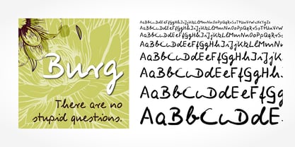 Digitized handwriting fonts are a perfect way to give documents the “very special touch”. Invitations look simply better when handwritten than when printed in bland Arial or Times New Roman. Short handwritten notes look authentic and appealing. There are numerous occasions where handwritten text makes a better impression. Burg Handwriting is a beautiful typeface that mimics true handwriting closely. Use Burg Handwriting to create stunningly beautiful designs easily.
 - Cathy Handwriting by SoftMaker,
$7.99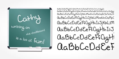 Digitized handwriting fonts are a perfect way to give documents the “very special touch”. Invitations look simply better when handwritten than when printed in bland Arial or Times New Roman. Short handwritten notes look authentic and appealing. There are numerous occasions where handwritten text makes a better impression. Cathy Handwriting is a beautiful typeface that mimics true handwriting closely. Use Cathy Handwriting to create stunningly beautiful designs easily.
