9,032 search results
(0.017 seconds)
- Mochi Peach by Hatftype,
$15.00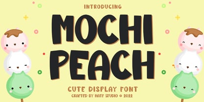 Mochi Peach - Cute Display Font is a font with distinctive handwritten characters perfect for branding projects, logos, wedding designs, media posts, advertisements, product packaging, product designs, labels, photography, watermarks, invitations, stationery, and any project who need handwritten dishes. Features : • Character Set A-Z(only caps) • Numerals & Punctuations (OpenType Standard) • Accents (Multilingual characters) • Ligature. Multilingual Support : Afrikaans, Albanian, Asu, Basque, Bemba, Bena, Catalan, Chiga, Cornish, Danish, English, Estonian, Faroese, Filipino, Finnish, French, Friulian, Galician, German, Gusii, Icelandic, Indonesian, Irish, Italian, Kabuverdianu, Kalenjin, Kinyarwanda, Low German, Luo, Luxembourgish, Luyia, Machame, Makhuwa-Meetto, Makonde, Malagasy, Malay, Manx, Morisyen, North Ndebele, Norwegian Bokmål, Norwegian Nynorsk, Nyankole, Oromo, Portuguese, Romansh, Rombo, Rundi, Rwa, Samburu, Sango, Sangu, Scottish Gaelic, Sena, Shambala, Shona, Soga, Somali, Spanish, Swahili, Swedish, Swiss German, Taita, Teso, Vunjo, Zulu. There it is. I really hope you enjoy it. Comments & likes are always welcome and accepted.
 - Sparkling Sunday by Prestige Artsy Studio,
$19.99 Introducing the newest addition to your font collection — Sparkling Sunday! This font is the perfect combination of vintage and modern, with bold and chunky letters that are sure to make a statement. The font is inspired by the 80s and 90s era, with a touch of modern typography. Each letter is carefully crafted with attention to detail, giving it a unique and eye-catching look. The font is perfect for posters, flyers, logos, and any design that needs a retro touch. It comes in a regular style and an extra including 26 retro graphics to allow versatility in your designs. Simply install the file as a separate and you will get to type them using the alphabets A-to-Z to access them. Get ready to take your designs to the next level with this cute Sparkling Sunday Duo.
 - Sunshine Group by HiH,
$6.00 The Sunshine Group is a series of four closely related fonts that combine a visual rendition of a bright noonday sun with Page No. 508, a wood type designed by William Hamilton Page of Norwich, Connecticut in 1887. Page No. 508 was released in a digital version by HiH and is available from Myfonts.com. Woody Sunshine is the simplest. The name alludes to its wood type roots. The sun shines on the upper case letters only (and the ampersand, which is considered lower case). Double Sunshine has the sun on both upper and lower case. Smiley Sunshine adds a smiley face to the first font. Double Smiley adds it to the second font. Warning: immoderate use of Double Smiley may expose the user to charges of overly aggressive cuteness. Please be careful. The Culture Vultures are lurking in the treetops.
 - Remesterad by Bosstypestudio,
$15.00 Remesterad - Modern & Signature Script Perfect, Font It includes a full set of upper and lower case letters, multilingual symbols, numbers, punctuation marks and 20 ligatures. This font has a smooth ballpoint pen texture. It has a lowercase start and end ligature! This font is PUA coded which means you can easily access all the glyphs full of signatures! It also features many special features including glyphs and alternate ligatures. font designs made for various vector designs, printing such as digital wedding blogs, online shops, social media, while printing can be used in the field of clothing products, accessories, bags, pins, logos, business cards, watermarks and many others... so it can make your product look cute and attractive, and also Multilingual support!!! If you have any other questions, feel free to drop me a message :) happy designing :), Mu Fazzal
 - Merciful by Create Big Supply,
$17.00 Introducing Merciful, a charming and playful sans serif font that brings a touch of fun and uniqueness to your designs. With its cute and lively style, Merciful adds a playful and vibrant element to any project. Whether you're designing greeting cards, children's books, party invitations, or any other creative work, Merciful is sure to capture attention and spread joy. This font features both uppercase and lowercase letters, making it versatile for various design purposes. It also includes numbers and punctuations, allowing you to create engaging typography and eye-catching headlines. Merciful supports multilingual characters, enabling you to express your creativity in different languages. With the added convenience of PUA encoding, accessing all the font's glyphs and swashes is effortless. You can unlock a world of creative possibilities by exploring the various ligatures and alternate characters available in Merciful.
 - Catsy by Fenotype,
$30.00 Catsy is a cute and curly upright script family. Catsy is great for any kind of display use from packaging to poster to headlines. Catsy makes clear word images but if you want more curly action try Swash, Stylist or Titling Alternates on any OpenType savvy software. If that isn’t enough you can manually select from even more alternates from Glyph Palette: Each version of Catsy contains more than 700 glyphs. Keep Standard Ligatures on for smooth flow. Catsy Printed is a texturised version of Catsy. Catsy Printed also has softer features than Catsy. Catsy Ornaments is a pack of 86 extra swashes, badges, ornaments and swirls designed to play with the font, though they work nice on their own as well. For the best price purchase Catsy Family, Catsy Printed Family or Catsy Complete Family.
 - Market Square by Hanoded,
$12.00 I love markets, especially the farmer’s markets with fresh produce and home made cheese. Too bad I need to travel a long way to get to one, as there is only a ‘regular’ market in my hometown - you know, with cheap duvets, ‘local’ fruit like bananas and a guy selling books about the end of times. I thought it would be great to create a font family you could actually use on a market. Hence Market Square. Market Square consists of 4 different fonts (each with its own Italic style), ranging from a fat marker font to a thin, squarish font. Each of them oozes freshness and authenticity and they were designed to complement each other. The cherry on top is the cute doodle font, loaded with fresh produce and seafood - just like you’d see on a Market Square.
 - Blestive Script by Mans Greback,
$59.00 Blestive Script is a cool calligraphy typeface. This marker lettering is provided in Regular, Italic, Bold and Bold Italic. Perfect for a logotype or headline, use this handwritten type to express life and optimism. Use underscore _ anywhere in a word to make a swash underline. Example: Won_der Use # after any word to make a swash letter. Example: Cute# Use multiple underscores after any word to make swashes of different length. Example: Weat___her (Download required.) The font is built with advanced OpenType functionality and has a guaranteed top-notch quality, containing stylistic and contextual alternates, ligatures and more features; all to give you full control and customizability. It has extensive lingual support, covering all Latin-based languages, from Northern Europe to South Africa, from America to South-East Asia. It contains all characters and symbols you'll ever need, including all punctuation and numbers.
 - Cubio Mono by R9 Type+Design,
$38.00 Cubio™ Mono is a new monospaced geometric sans serif inspired by the hexagonal silhouette of isometric cubes. We applied this angular form through all aspects of Cubio™ type design from the overall look of letters and icons down to the small details such as the end of each letter stem and hexagonal dotted lines. This font family comes in 3 weights/styles: 300 (Regular), 500 (Medium), and 700 (Bold). With over 1,500 glyphs, Cubio™ Mono not only supports most Latin-based languages, but also features an extensive set of UX/UI icons, and patterns. Cubio™ Mono is a versatile typeface for both digital and traditional designs. Perfect for packaging design, logo design, print design, store signages, UX/UI web & apps designs. Cubio™ Mono packed with features such as case-sensitive marks, punctuations and math symbols. It also comes with an extensive set of box/compartment drawing glyphs to help you create a unique modern design without even using the line tools. We designed the Cubio™ Mono font system with your convenience in mind. It comes with two sets of hexagonal dotted line and icon positions (Mid Cap Height and Mid X-Height ), so you don’t have to use the baseline shift command to set them to the perfect spots. To find out more about Cubio™ Mono Opentype features and type specimen, please visit www.r9typedesign.com
 - FF Info Pict by FontFont,
$62.99 Erik Spiekermann, working in collaboration with Ole Schäfer, originally designed FF Info® Display for use in the context of wayfinding systems. The variants FF Info™ Text and FF Info™ Correspondence were developed later for text setting and office communication. FF Info Display The sober and clear forms of the sans serif FF Info Display have been deliberately molded to make them perfect for use on wayfinding systems. The font by Ole Schäfer and Erik Spiekermann not only takes the problem of lack of space into account - it is some 15% narrower than comparable typefaces - the characters have also been designed to ensure they remain legible even in adverse conditions for reading. As text on signs often contains words with which readers are unfamiliar and which are thus deciphered letter for letter rather than perceived as whole words, it is essential to provide for a clear differentiation between glyphs. Additional serifs on the lowercase "i" and uppercase "I" and a small arch on the terminal of the lowercase "l" ensure that it is possible to readily discriminate between these particularly problematic letters. Moreover, sharp corners on glyphs can also make it difficult to read signs with backlighting or when driving past. The rounded corners of FF Info Display counteract this effect and make sure that the character forms remain well defined.FF Info Display is available in five carefully coordinated weights, from Regular to Bold. In the corresponding italic variants, the letters appear overall more rounded while the lowercase "a" has a closed form and the "f" has a descender. Also included among the glyphs of FF Info Display are several ligatures and arrow symbols. Pictograms with different themes that complement the typeface are also available in four weights. FF Info Text Thanks to his know-how gained through designing other typefaces, Erik Spiekermann became aware that fonts created for use in problematic environments can be used in many different situations. In smaller point sizes, FF Info Display cuts a fine figure when used to set longer texts. So Spiekermann carefully reworked FF Info Display to produce FF Info Text, a font perfected for use in this context. Not only can the characters be more generously proportioned, certain features, such as additional serifs to aid with the differentiation of problematic letters, are also no longer necessary in textual surroundings. The upright styles have a double-story "g" while Spiekermann has added oldstyle figures and small caps. FF Info Correspondence FF Info Correspondence has also been designed for setting block text although it recalls the style of old typewriter characters and is specifically intended for use in office communication. The characters of this third member of the family are thus more formal, without rounded terminals but with rectangular punctuation marks. The narrower letters are provided with large serifs to give them more space although, at the same time, this reduces the differences in terms of letter width among the alphabet. In contrast with its two siblings, FF Info Correspondence has only three weights, each with corresponding italic.The three styles of the FF Info super family cover an extensive range of potential applications. If the different kerning is adjusted manually, the three styles harmonize happily with each other and can be readily used in combination to set, for example, headlines and texts and also creative display options.
 - Periwinkle by Jukebox Collection,
$36.99 Periwinkle is a fun and happy digital revival based on an old photo-typositing face. Filled with 1960s and 1970s charm, Periwinkle contains a full set of alternate swash caps as well as a few lowercase swashes and other alternate glyphs to add typographic variation. This font seems to take us back to our childhoods with its curly cues and slightly modulated baseline. Perfect for any project that needs fun, laughter and liveliness! Jukebox fonts are available in OpenType format and downloadable packages contain both .otf and .ttf versions of the font. They are compatible on both Mac and Windows. All fonts contain basic OpenType features as well as support for Latin-based and most Eastern European languages.
 - Maleo by Tokotype,
$39.00 Maleo is a contemporary display sans with grotesque roots, taking cues from typefaces such as Benton’s Franklin Gothic & Alternate Gothic and contemporaries such as Obviously & Mars Condensed. Designed by Aditya Wiraatmaja as his debut retail typeface, Maleo is primarily designed with large-size usage in mind. Its tiny flare and angled cut terminal lends itself a friendly and approachable presence. With a family of 14 styles that range from thin to black with matching italics, it is a versatile display type that stands out in headlines, yet one that emits a charming personality. Maleo support various languages and is equipped with many Opentype features including; Old Style Figures, Ligature, Fractions, Numerators and Denominators, and Stylistic Alternates.
 - MVB Verdigris Pro by MVB,
$79.00 Garalde: the word itself sounds antique and arcane to anyone who isn’t fresh out of design school, but the sort of typeface it describes is actually quite familiar to all of us. Despite its age—born fairly early in printing’s history—the style has fared well; Garaldes are still the typefaces of choice for books and other long reading. And so we continue to see text set in old favorites—Garamond, Sabon®, and their Venetian predecessor, Bembo®. Yet many new books don’t feel as handsome and readable as older books printed in the original, metal type. The problem is that digital type revivals are typically facsimiles of their metal predecessors, merely duplicating the letterforms rather than capturing the impression—both physical and emotional—that the typefaces once left on the page. MVB Verdigris is a Garalde text face for the digital age. Inspired by the work of 16th-century punchcutters Robert Granjon (roman) and Pierre Haultin (italic), Verdigris celebrates tradition but is not beholden to it. Created specifically to deliver good typographic color as text, Mark van Bronkhorst’s design meets the needs of today’s designer using today’s paper and press. And now, as a full-featured OpenType release, it’s optimized for the latest typesetting technologies too. With MVB Verdigris Pro Text, Van Bronkhorst has revisited the family, adding small caps to all weights and styles, extensive language support, and other typographic refinements. Among the features: • Support for most Latin-based languages, including those of Central and Eastern Europe. • Precision spacing and kerning by type editor Linnea Lundquist. The fonts practically set beautiful text by themselves. • Proportional and tabular figure sets, each with oldstyle and lining forms with currency symbols to match. • Ligatures to maintain even spacing while accommodating Verdigris’ elegant, sweeping glyphs. • Numerators and denominators for automatic fractions of any denomination. • Useful, straightforward dingbats including arrows, checkboxes, and square and round bullets in three sizes. • Alternative ‘zero’ and ‘one’ oldstyle figures for those who prefer more contemporary versions over the traditional forms. • An alternative uppercase Q with a more reserved tail. • An optional, roman “Caps” font providing mid-caps, useful for titling settings, and for those situations when caps seem too big and small caps seem too small. __________ Sabon is a trademark of Linotype Corp. Bembo is a trademark of the Monotype Corporation.
 - Bunken Tech Sans Wide by Buntype,
$49.00 The Bunken Tech Sans superfamily: A reminiscence of constructed fonts of the modern age designed with considerably cleaner forms. •See other members of the Superfamily: Bunken Tech Sans •For further details, view the Specimen PDF. Bunken Tech Sans Wide follows in the best tradition of the straight-lined and somewhat angular structures of its predecessors while offering a much more open and mild design. The shapes of the letters are therefore reduced to the most essential elements: The spurs on a, b, n and other lower case letters occur just as little as decorative or style details, the lightly rounded inside edges are more pleasing to the eye than certain historic role models and make for a harmonic, flowing style. Use In particular Bunken Tech Sans Wide stands out as an easy, distinctive headline font with its straight-lined, technical design. Open counters and large x-height make it equally suited for use in shorter texts. It is also perfectly complemented by Bunken Sans or Bunken Slab in longer texts (available soon). Features Available in 16 styles with widths ranging from Light to Heavy with associated Italics. All of the styles are very extensive: Support for at least 58 languages, Small Capitals, 9 number sets (e.g. Lining, Oldstyle, Tabular and Small Cap Figures), ligatures, alternate characters, numerous Opentype functions, and lots of other small features that make it more pleasant to work with the font on a daily basis as well as fulfilling typographic desires. Each style contains more than 870 characters! Each style is available in a professional (Pro) standard (Std) and Small Caps (SC) edition with a different range of functions. (Language support, OpenType features and number of glyphs). Details can be found on the respective pages. Bunken Tech Sans Wide is part of the Bunken Tech superfamily and is available in Condensed, Normal and Wide. Also of interest: The slab serif variation Bunken Tech Slab Features in Detail: 16 Weights: -Light -Book -Medium -SemiBold -Bold -ExtraBold -UltraBold -Heavy and corresponding Italics 3 Widths: -Condensed -Normal -Wide Alternate Characters: A, E, F, L, S, e, f, t, s, y, etc. Small Capitals 5 Sets of Figures: -Lining Figures -Old Style Figures -Tabfigures -Old Style Tabfigures -Small Cap Figures Automatic Ordinals Automatic Fractions Extended Language Support and more...
 - Turnkey by wearecolt,
$19.00 Turnkey is a modern grotesque typeface, it could be described as a neo-grotesque with hints of geometric shapes. A workhorse typeface designed to be versatile for both small and large sizes, ink traps have been used as a design feature above 26pt and a technical feature when printing small body text. The combination of 36 weights and styles allows you the freedom to create. Each weight includes extended support for over 90 languages (Including Cyrillic), fractions, tabular figures, arrows, ligatures, alternate glyphs, and more. Demo licenses are available from colttypeco.com In addition to a standard style set, the Turnkey family also has an italic set plus soft versions of both. Turnkey Soft is a slightly rounded version of the standard and italic, which looks more friendly, warm, and soft. It's corporate but with a personality. Current instances are: Turnkey Standard - Thin, Thin Italic, Extra Light, Extra Light Italic, Light, Light Italic, Regular, Regular Italic, Medium, Medium Italic, SemiBold, SemiBold Italic, Bold, Bold Italic, Extra Bold, Extra Bold Italic, Heavy, Heavy Italic. Turnkey Soft - Thin, Thin Italic, Extra Light, Extra Light Italic, Light, Light Italic, Regular, Regular Italic, Medium, Medium Italic, SemiBold, SemiBold Italic, Bold, Bold Italic, Extra Bold, Extra Bold Italic, Heavy, Heavy Italic When used as body type, Turnkey pairs well with: Take Note, Stroom and Markout. Turnkey is perfect for; headings, titles, body copy, logos, magazines, editorial design, corporate branding, brand identity, websites, blogs, apps, games, ebooks, publications, and signage. Turnkey can be found in the Typodarium 2024 OpenType features: Access All Alternates, Glyph Composition / Decomposition, Discretionary Ligatures, Denominators, Fractions, Kerning, Standard Ligatures, Localized Forms, Mark Positioning, Mark to Mark Positioning, Numerators, Proportional Figures, Scientific Inferiors, Stylistic Set 1, Stylistic Set 2, Stylistic Set 3, Subscript, Superscript, Tabular Figures. Support for 95 languages: Belarusian, Russian, Ukrainian, Afrikaans, Albanian, Asu, Basque, Bemba, Bena, Breton, Catalan, Chiga, Colognian, Cornish, Croatian, Czech, Danish, Dutch, Embu, English, Esperanto, Estonian, Faroese, Filipino, Finnish, French, Friulian, Galician, Ganda, German, Gusii, Hungarian, Inari Sami, Indonesian, Irish, Italian, Jola-Fonyi, Kabuverdianu, Kalenjin, Kamba, Kikuyu, Kinyarwanda, Latvian, Lithuanian, Lower Sorbian, Luo, Luxembourgish, Luyia, Machame, Makhuwa-Meetto, Makonde, Malagasy, Maltese, Manx, Meru, Morisyen, North Ndebele, Norwegian Bokmål, Norwegian Nynorsk, Nyankole, Oromo, Polish, Portuguese, Quechua, Romanian, Romansh, Rombo, Rundi, Rwa, Samburu, Sango, Sangu, Scottish Gaelic, Sena, Serbian, Shambala, Shona, Slovak, Soga, Somali, Spanish, Swahili, Swedish, Swiss German, Taita, Teso, Turkish, Upper Sorbian, Uzbek (Latin), Volapük, Vunjo, Walser, Welsh, Western Frisian, Zulu
 - Medieval Sorcerer Ornamental - Unknown license

- Reverse Calendar Blocks JNL by Jeff Levine,
$29.00 Reverse Calendar Blocks JNL is the third typeface from Jeff Levine that allows the user to create a vintage-style calendar. Other versions available are Calendar Blocks JNL and Monthly Calendar JNL. The layout for the font is as follows: Numerals for displaying a year are on the 0-9 keys The 1-31 dates are located on the A-Z and a-e keys The combination dates of 23/30 and 24/31 are located on the f and g keys Days of the week (Sunday through Saturday) are on the keys h though n Months are found on the o through z keys A blank box (for balancing out layouts) is on the period key
 - F2F Mekkaso Tomanik by Linotype,
$29.99The techno sound of the 1990s, a personal computer, font creation software, and some inspiration all came together to inspire the F2F (Face2Face) font series. Alessio Leonardi and his friends had the demand to create new unusual typefaces, which would be used in the leading German techno magazine of the day, Frontpage. Even typeset as small as 6-points, in nearly undecipherable layouts, it was a pleasure for the kids to read and try to decrypt the messages. F2F Mekkaso Tomanik is a font whose letters have had diamond holes punched into them. In fact, so many holes have been punched into the letters that one could ask whether this font is more letterforms, or more holes! - VTF League by VarsityType,
$15.00 "VTF League" is a fully-kerned, hard working, 14-font athletic block display family. Its letterforms feature a synthesis of heavy verticals and lighter horizontals that create a steady visual rhythm, and chiseled terminals to help establish a competitive personality. Although developed for sports branding and similar projects, "VTF League" was inspired by the harmonized mix of sturdy, industrialized, no-nonsense typefaces and the brand uniqueness of local distilleries around Eastern Tennessee during a week-long moonshine tour in February 2018. As of July 2019, "VTF League" has been redeveloped to include a complete alphabet of uppercase, lowercase, and small cap alternates with 7 weights and oblique style variants for each. Enjoy!
 - Malnor Sans by Sikifonts,
$24.00 Malnor Sans is a normal sans serif family of 18 fonts. With modern style or neo-grotesque, Malnor sans has balanced proportions in every letter, and it's clean, minimal and cool. There are several alternative letters that can be used in both upright and oblique styles. Single story 'a' can give a more geometric impression, even though it is not purely geometric. There is also an alternative double story 'a' with a tail, a double story 'g' and an alternative 'l' that can be applied together via the 'salt' or 'stylistic sets' features for a slightly warmer feel. Malnor Sans currently has around 900 glyphs, including diacritical marks, that support a broad Latin-based language.
 - Koorkin by Monotype,
$29.99 “I originally drew the primary characters with a felt tip marker, scanned them and then proceeded to noodle on the computer,” says George Ryan of his new typeface, Koorkin. “Over the years, I’ve designed many original typefaces, but Koorkin has become one of my favorites. I’ve worked on hundreds of highly structured text faces. For the most part, the roots of all of them can be found in the handwritten letterforms we learn as children. I enjoy going back to these shapes whenever the opportunity presents itself. ”The happy result of Ryan‘s felt tip marker sketches and his love of simple letterforms is a new family of upright and italic scripts in medium and bold weights.
 - Happy Brain Creepy Thalamus by TypoGraphicDesign,
$19.00 CONCEPT/ CHARACTERISTICS The base was a head-vein illustration. This served as a design grid. Novel letterforms were sought and found. Hand-drawn analog and digitized later. Experimentally, novel, fresh and an eye-catcher. Completely new insights into the human brain. A font for happy thoughts. ghostly visions, or simply for the next freshen party flyers. APPLICATION AREA The happy, creepy, Horror handmade font »Happy Brain Creepy Thalamus« with many language support would look good at headlines. Magazines or websites, party flyer, movie posters, music Poster, music covers or webbanner. TECHNICAL SPECIFICATIONS Headline Font | Display Font | Handmade Horror Font "Happy Brain Creepy Thalamus" OpenType Font with 283 glyphs, alternative letters and ligatures (with accents & €) & 1 style (regular).
 - Carilliantine by Device,
$39.00 Carilliantine updates the organic curves of Art Nouveau typefaces typified by John F. Cumming's Desdemona, designed around 1886. A contemporary monoline sans reinterpretation rather than a more traditional serif, its high-waisted emphasis lends it an elegance and class. Carilliantine is replete with hundreds of two- and three-letter ligatures that bring a customised uniqueness to any headline. These are on by default, and can be toggled on or off in the Opentype palette of Adobe apps, or chosen individually according to taste from the Glyphs menu. Suitable for upmarket food packaging, wine labels, restaurants, folk bands, sword and sorcery trilogies, cosmetics and fashion brands that nod to the refinement of yesteryear, but are very much of today.
 - Praysire by Letterhend,
$19.00 Praysire is a sophisticated sans serif with beautiful swashes. It has many alternates which you can play around to match your project, whether for a standout headline, or for a tagline, you name it. The unique letterform makes this font one of a kind! Perfectly to be applied to the other various formal forms such as invitations, labels, logos, magazines, books, greeting / wedding cards, packaging, fashion, make up, stationery, novels, labels or any type of advertising purpose. Features : uppercase & lowercase numbers and punctuation multilingual alternates & ligatures PUA encoded We highly recommend using a program that supports OpenType features and Glyphs panels like many of Adobe apps and Corel Draw, so you can see and access all Glyph variations.
 - Blushbutter Fae by Blushbutter,
$45.00I've always loved drawing faeries and I love using them in my scrapbooking pages. So after hunting around for a unique decorative fairy font for my crafts I couldn't quite find what I wanted to use, so I decided to create a whimiscal set of fairy drawings and characters that would suffice. I was influenced in the drawing of the fairies by my love of the 3D poser graphics art,several awesome comics, Alphonse Mucha and several Masters of Art. These decorative Fairy dingbats would be great to use in fabric crafts,textiles, embroidery patterns, scrapbooking, greeting cards, Rubber stamps, name titles, Calligraphy, the possiblities I feel are endless when thinking of craft applications. - Proba Pro by Mint Type,
$- Proba Pro is a geometric sans with lowered x-height, prominent ascenders and descenders and a subtle humanist touch. It comes in 7 weights + matching italics each supporting numerous Latin-based languages as well as major Cyrillic languages. It is packed with OpenType features like ligatures, small caps, 4 sets of digits, 2 stylistic sets, superiors and inferiors, fractions, ordinals, and respective punctuation varieties including all-cap punctuation. There are also language-specific alternates for Romanian Ș/ș, Catalan punt volat, and correct small-cap versions for i/ı in Turk languages. Some of the styles of Proba Pro can be found in Mint Type Editorial Bundle together with other fonts which make some great pairs. Check it out!
 - Elevator Music by PizzaDude.dk,
$16.00 When was the last time you listened to elevator music and found yourself humming along? And perhaps the tune you were listening to, got stuck in your ears for the rest of the day...the rest of the week? That's often what happens with elevator music: maybe you don't notice it - but it is there, and it could most likely be one of your all time favourites! :) My Elevator Music font does somewhat the same: it's nice and pretty harmless - but it works, perhaps even without you noticing! :) I've added 4 slightly different versions of each lowercase letter - and that goes for both Regular and Scratch versions. And they both have multilingual support, because elevator music is universal!
 - Conga Brava by Adobe,
$29.00Conga Brava is the work of type designer Michael Harvey, a combination of the high-minded, purist letterforms of revivalist, modern calligraphers with the mundane, even crude, lettering of warehouse stenciling. The resulting lyrical yet utilitarian forms have a visually exciting graphic effect, which Harvey has frequently used in his book jacket designs. Like his other typefaces, Ellington, Strayhorn, and Mezz, Harvey named his design after a jazz classic, Conga Brava", by Duke Ellington and his trombonist Juan Tizol. The rolling rhythm, polished swing, and stacatto brass treatment of the tune suits the look of this sassy roman design and even more so, its stencil mate. When you need a typeface that radiates sound and motion, think Conga Brava." - Cirkus Fantastiko by PizzaDude.dk,
$17.00 The other day I was at a market with my kids and they had this really retro kind of circus thing. The signs and posters there, were designed in a really sloppy and poor manner - but they all had a lot of naive charm! I was really fascinated by all these uneven letters and I was immediately inspired to do a font like that! And out of the magic hat comes...ta-da-da-da...Cirkus Fantastiko! Planning on throwing a party with a circus theme? Then Cirkus Fantastiko is ready to play the juggling clown while riding the elephant! Play around with the 3 different layers to create that low budget hand painted cirkus posters! :)
 - Imagist by Fenotype,
$35.00 The mystic sadness of the sight Of a far town seen in the night. Like the poetry movement of the early 20th century, from which the font takes its name, Imagist relies on the power of concrete images and brings an organic vibration to the words it forms. Imagist is a lively and decorative serif typeface with prominent features that appear especially in the letters K, R, M, N, W, V, k, w, v and y. Powerful ball terminals also bring recognizable attraction. Imagist contains six weights and corresponding Italics. Italics have a cursive-style letter s for as Stylistic Alternate. Old Style Numerals and Small Caps can be found in all cuts. Poem by T. E. Hulme.
 - Wild About Myself JNL by Jeff Levine,
$29.00 Lettering found on the cover of the 1923 song "I Love Me (I'm Wild About Myself)" can take on various graphical possibilities. Although its design is Art Nouveau in concept, it is somewhat reminiscent of the "bubble letters" most school kids used to doodle on notebook and portfolio covers; yet the lettering style also evokes the 1960s-70s Hippie movement. As a sidebar, a couple of lines from the song's lyrics were used by Jeff Levine's late mother to chastise him as a youth when he got "a little too full of himself". The lyrics were: "I love me! I love me! I'm wild about myself! I love me! I love me! My picture's on the shelf!"
 - Blue Parrot JNL by Jeff Levine,
$29.00The original inspiration for Blue Parrot came from a short scene in the classic film Casablanca. For just a few seconds, the exterior of Ferrari's Blue Parrot night club is shown, complete with a wonderful hand-lettered sign... all in capital letters. Blue Parrot JNL was originally released in 2006, and it wasn't long before a few people noted that the font would also look good with a lower case alphabet. The idea of adding in lower case kicked around for a couple of years until Jeff Levine finally completed a revision of the font. In this version there's also an expanded character set thanks to the creative input of Michael Hagemann of Font Mesa. - YLab Variable by Par Défaut,
$40.00 yLab is geometric typeface compose of 10 fonts (5 weights and oblique declination) Perfect for titles and text, yLab supports many languages (Latin pro..). 11 OpenType Features (Alternative; Fraction; Numerator; Denominator; Superior; Inferior; Tabular figure; Ordinals; Discretionary Ligature; Stylistic Set; Case Sensitive Forms). • Ordinal feature includes the Latin alphabet (Uppercase & Lowercase). • Five Stylistic set for “a”, “g”, "i" and "l", includes accents. • Discretionary Ligature includes “AE”, “IJ”, “OE”, available in lowercase. • Contextual Alternate includes ligatures for arrows : <- -> ^| v| <-> v^| Add parentheses around period, numbers or arrows, add n or d for numerator, denominator. Add n, d or +, for numerator, denominator or case arrows. All Case sensitive characters become after the uppercase and number.
 - Pixelout by Ilhamtaro,
$17.00 PIXELOUT is a display font based on bold serifs combined with a psychedelic style and given a low pixel effect like in a game. With its pixelated stroke characteristics, this font is perfect for different or unique designs such as in games or for bands and music event posters. The uniqueness of this font is psychedelic-pixel, it can be categorized as a vintage font because usually old school games use this style plus it can be used for bands because psychedelic is also found in one genre of music. To enable the OpenType Stylistic alternates, you need a program that supports OpenType features such as Adobe Illustrator CS, Adobe Indesign & CorelDraw X6-X7. Cheers!
 - Aquus by phospho,
$39.00 Aquus is a contemporary all-caps display font that refines the elegance of a classic Didone with experimental interventions. Geometric elements and subtle details are found in its letters, many of which connect to ligatures. Most alternate glyphs can be switched automatically by use of the Stylistic Set function in OpenType-supporting applications, others you can access manually via the glyphs palette. You may try Aquus Linearis as a fashionable outline variant, which reveals its beauty especially when combined with imagery. Use them best for concise strings of characters, such as logotypes, packaging or magazine titles. Aquus Simplex is their sober companion, based on the same letterforms, minus the geometric ornaments and conjunctions.
 - ITC Drycut by ITC,
$29.99ITC Drycut is the work of Vancouver-based designer Serge Pichii and gives a twist to the tradition of heavy, woodcut-like typefaces. The font includes all the realistic features of a true woodcut, sharp edges, white cut marks and black slivers. The slivers around the edges suggest traces left after awkward movements of a knife, which are often visible on old woodcuts...Folk artists often didn't care much about refining their carvings and the slivers would have been left as long as the letters remained readable." The lower case alphabet is actually small caps proportioned to match the capitals. The letters of ITC Drycut have a slight slant to the right which lends the font a dynamic character." - Adhesive Nr. Seven by phospho,
$25.00 This sticky blackletter font owes its street credibility to the texture of torn adhesive tape. Designed to support rehabilitation of the historically tainted Fraktur, its pragmatically shaped majuscules guarantee legibility to a 21st-century readership. They even forgive all-caps usage - a thing you better not try with most blackletter types around. It contains a range of diacritics and ligatures, as well as open type features that substitute alternate glyphs for often repeating characters. With its fine tape strip details you may best use it at poster and headline sizes; at small sizes you interestingly get a nice woodcut appearance. Connoisseurs use it with style, while true blackmetal grimlords curse it for its fashionability!
 - VLNL Wurst by VetteLetters,
$35.00 VLNL Wurst started as a final result in the Typographic Chinese Whispers project for Typeradio.org, in collaboration with the Type & Media master course. A soundtrack of festive Bavarian music accompanied by burping, followed by loud crunching and munching, inspired Alexandre Saumier Demers to create this typeface family. The fraktur letter forms were composed with sausages to form a recipe available in three flavours: Brat, Blut and Bier Wurst. This 'charcuterie typographique' is ideal for an established butcher shop, a local grocery store or a casual BBQ with friends. Wurst is so tasty, you can't get enough of it! A "Wurst Schreiber" script was developed to automatically draw the sausages around the skeleton.
 - F2F Simbolico by Linotype,
$29.99The techno sound of the 1990s, a personal computer, font creation software, and some inspiration all came together to inspire the F2F (Face2Face) font series. Alessio Leonardi and his friends had the demand to create new unusual typefaces, which would be used in the leading German techno magazine of the day, Frontpage. Even typeset as small as 6-points, in nearly undecipherable layouts, it was a pleasure for the kids to read and try to decrypt the messages. Hearts, candles, bombs, and peace signs are just some of the great elements you'll find in F2F Simbolico. This collection of ruggedly drawn symbols is meant to bring a smile to the reader's face. - Ruzicka Freehand by Linotype,
$29.99In 1935, Rudolph Ruzicka approached W.A. Dwiggins at Linotype in the USA and handed him six typeface design sketches. These later led to the typeface family now known as Fairfield. The sketch called Script’ was forgotten until 1993, when sketches and designs were found in Ruzicka’s archives. Ruzicka Freehand was originally a more flowing calligraphy typeface which Ruzicka later developed into this strong and unusual form. The typeface is designed in two weights and their matching italics. The figures are clear, only just indicating the handwritten style in the italic forms, and combine into light and harmonic lines of text. Ruzicka Freehand gives texts a private and personal character and is suitable for middle length texts and headlines.
