5,719 search results
(0.025 seconds)
- Nawin Arabic Ltn by Letterjuice,
$107.00 Nawin is an informal Arabic typeface inspired by handwriting. The idea behind this design is to create a type family attractive and ownable for children but at the same time a design that keeps excellent letter recognition for reading. Handwriting has been a great source of inspiration in this particular typeface. By emulating the movements of the pen, we have obtained letter shapes that express spontaneity. A bright group of letters create a lively and beautiful paragraph of text. To get closer to handwriting and the variety of letter shapes that we draw while writing, this typeface offers a large number of alternative characters, which differ slightly from the default ones. Because we have programed the «Contextual Alternate» feature in the fonts, these alternate characters appear automatically as you set a text on your computer. For instance, in the Arabic variability on vertical proportions between letters Alef and initial Lam, create movement in text and avoid the cold mechanical feel of repetition. In the case of the Latin a part from having an entire alternate basic alphabet, there are also different letterforms for characters with diacritics, this way variability becomes even greater. Nawin is quirky and elegant at the same time. Letter recognition is relevant when reading continuous text. For this reason, in the Arabic, we have added another contextual alternate feature with alternate characters that help to avoid confusion when letters with similar or the same shape repeat inside one word. This is the case of medial «beh and Yeh» repeated three times continuously in the same word. The alternate characters change in shape and length, facilitating distinction to the reader. Since this typeface is inspired by handwriting and the free movement of the hand while writing, we considered ligatures a good asset for this design. The Arabic has a wide range of ligatures that enhance movement and fluidity in text making look text alive, while the Latin achieves this same effect via contextual alternates.
 - Uniform Pro by Miller Type Foundry,
$29.00 THE SPARK Uniform started as a spark of inspiration one day while I was shopping at the store. I was looking at some typography on a can of dog food and the idea popped into my head, “What if there was a geometric typeface with a circular O that when condensed, the O became straight sided, instead of becoming an oval?” I quickly sketched out the concept of Uniform and liked what I saw, the only problem was I was working full time as a graphic designer, and as a newly married husband, I didn’t have any time to make the extensive typeface. LETDOWN A year and a half later, shortly after the birth of my first child, my boss cut my hours in half. Although stressful, I saw this event as an opportunity to finally have time to complete the typeface I had in my head. I spent a couple months putting together a Kickstarter campaign, thinking it would be a smashing success, and I would be able to live off the donations long enough to complete the typeface. Wrong! The campaign was a flop and I was left discouraged and dejected, thinking that the great idea I had in my head would never become a reality... PERSEVERANCE At the end of the year, in December 2013, I decided to go for it and make this new type family no matter what it took. I began waking up a few hours before work each morning (getting only four hours of sleep each night) carefully crafting each individual glyph day by day. After nine months of hard work (and just about killing myself in the process!) in October 2014, I finally had a finished product ready to be released to the public! THE PINNACLE Fast forward a few years and now Uniform has reached it's pinnacle, Uniform Pro. Uniform Pro now offers extended language support including Cyrillic and Greek character sets, integrated italic styles, additional weights, and additional OpenType features.
 - Saturday Script by Nicky Laatz,
$16.00 Say hello to Saturday Script! A a care-free, casual, handwritten script with authentic tell-tale dry brush imperfections. Saturday Script has the added bonus of having 'multiple personalities'! Saturday Script has 2 sets of lowercase stylistic sets, allowing you to make each word look completely unique to the next. Whether you need "flaunty & loud" or "soft & romantic" Saturday Script has the look for you. There are 2 variants of Saturday Script, to add even more flexibility to your designs: Regular, and Oblique
 - Blantic by Zamjump,
$17.00 BLANTIC is a modern and dynamic sans font that contains all caps and alternative fonts. The combination of futuristic and geometric elements creates a modern design. very suitable for use in various logo designs, posters, book covers, films, sports and several other formal designs, very easy to read, try some alternative letters to get the impression of dynamism and harmony between letters. WHAT IS INCLUDED This font contains standard characters, uppercase letters, numbers, punctuation marks. Includes: Uppercase Numbers Punctuation Symbols multilingual support Alternate
 - Aesthetic Vintage by Putracetol,
$26.00 Aesthetic Vintage is a bold vintage script font. In this font I try to combine vintage with luxury/aesthetics. So that this font can be used in various projects with retro/vintage and luxury themes. Such as logos, branding, posters, packaging, book covers, clothes/apparel, quotes, titles and others. This font come with clean and rough font version. Come with Opentype feature with a lot of alternates, its help you to make great lettering. This font is also support multi language.
 - Rainbow Symphony by Violatype,
$14.00 Introducing "Rainbow Symphony" is a cute and unique type of handwritten font, made with hand strokes to produce a unique and cute font shape, this font style is thick and thin so it adds a natural and aesthetic impression. This font is very suitable for design needs such as Branding, Logotype, Magazine, Quotes, Wedding Invitations, and many others, please try it yourself and perfect your design with the Rainbow Symphony font. If you have any questions, don't hesitate to contact us.
 - Positive Feature by PizzaDude.dk,
$15.00 Positive Feature is a handmade, layered font. All layers come with contextual alternates, which means you have 4 different versions of each lowercase letter to play around with. What's cool about the two layer versions is that they mix in a lovely way! Try typing your text with layer 1, copy/paste layer 2 on top in a different color - perhaps even alter the transparency a bit...and all of a sudden a nice effect sees the light of day!
 - Czesko by Sharkshock,
$125.00 Tall, dark, and handsome; Czesko is a fancy display serif with a timeless, yet elegant look. The repetition of key features ensures contrast in line weight to provide high visibility at smaller sizes. Vertical emphasis and tight spacing make it a good choice for areas with limited workspace. Try all caps for a luxury logo or branding in the fashion industry. Other suggested uses include magazines or movie posters. Basic Latin, extended Latin, diacritics, Cyrillic, punctuation, fractions, ligatures, and kerning are all included.
 - Billion Brush by Gatype,
$14.00 Billion Brush is a handwritten font with a rough texture, the process of creating type by stroke with strong, fast strokes on paper to create the rough texture that is characteristic of Billion Brush, so it is a font with a rough, dry brush style. Anything made with this font is sure to be wrapped in ultra-contemporary style and elegance. We made some preview pictures as a guide for designing directions, please check them all Regards and thank you very much..
 - Appelstroop by Hanoded,
$15.00 Appelstroop literally means ‘Apple Syrup’ in Dutch, but it is also know as Apple Butter; a slightly sweet & sour goo that you can use to sweeten things, or, as we do in Holland, spread it on a sandwich. It’s delicious, give it a try! Appelstroop font is a chunky, slightly eroded affair. It is mostly all caps, with a few lower case glyphs thrown in for good measure. Use this sticky font for your product packaging, toys and kids book covers!
 - Stervella by Tatiana Nazarova,
$50.00 Elegant and prickly; smooth and sharp; beautiful, but evil - Stervella - display typeface. Its serifs resemble the twisting branches and thorny thorns of a blackthorn, trying to prick neighboring letters. This font is inspired by the forms of ancient Uncial, combining antique with pointed gothic writing. Изящная и колючая; плавная и острая; красивая, но злая - акцидентная Стервелла. Ее засечки напоминают извилистые ветви и колючие шипы терновника, стремящиеся уколоть соседние буквы. Этот шрифт вдохновлен формами старинного Унциала, совмещая в себе антикву с остроконечным готическим письмом.
 - Insiders by Arterfak Project,
$25.00 Introducing our new brush exploration, Insider. A signature brush font made with the high attention of the brush details. Inspired by the dry brush lettering and signature logo. This font has the feel of handwriting and energetic, which absolutely handy to create a casual and elegant design. Insider complete with alternates characters, ligatures, and swashes that you can apply on T-shirts, labels, titles, books, quotes, logos, logotypes, packaging, and much more! That's all, folks! Thank you for watching and keep it up!
 - Graceful by Alcode,
$23.00 Graceful is a classic font, I built it with my relaxed hands, designing a classic font with modern elements in it, which makes it particularly suitable for wedding media, book covers, greeting cards, logos, branding, business cards and certificates, in fact for any design work that requires a classic, formal and luxury feel. Try Graceful, enjoy the richness of OpenType features and let her fun and elegant excitement make you happy and enhance your creativity! You can use this font very easily.
 - Messaline by Gatype,
$12.00 Messaline is a brush script written in a relaxed and fast way. Letters made with brush pen on paper. It is then carefully scanned and drawn into vector format. That's why Messaline has organic, authentic and relaxed characteristics. Suitable for use on title designs such as book titles, stationery designs, quotes, branding, logos, clothing, invitations, greeting cards, t-shirts, packaging designs, posters, and more. Messaline has a dry brush pen texture and Solid is a slightly cleaner version. Thank You!
 - Farmhand by Adam Ladd,
$25.00 Farmhand is a textured, hand drawn family featuring serif, sans, inline, italic, and extras styles suited for display titling. An all-caps typeface with individually drawn small caps for lowercase. Experiment by mixing and matching the casing for titling effects. Great for packaging and branding. The sans adds a different look but still has the vintage appeal. Try the inline styles to add a little more distinction to your type or the matching catchwords and ornaments to add typographic interest.
 - Crayonize by PintassilgoPrints,
$19.00 Crayonize is a casual handwritten font with a fresh crayon look, available in two weights. Both styles are all-caps with two options for each letter and numeral, for a natural, organic hand-lettered feel. Contextual alternates feature is included, making it easy to cycle the alternates. Crayonize is excellent for display purposes and small chunks of text: packaging, books, apparel, editorial, greetings cards, opening titles, screens, the list has no end. Give it a try, have fun, and keep on creating!
 - Rawkner by Trustha,
$18.00 Rawkner is a sans serif font. Inspired by ink trap. The first concept is the letter "W" and "K", then the other letters refer to both. Come with four styles, regular, oblique, round, and round oblique. Rawkner is perfect for the headline, and subheadline. There are alternative glyphs that you can choose according to your project. Also, the ligature of the uppercase and lowercase will make it more perfect. Rawkner is an option that you should try for your creative project.
 - Orphic by Flawlessandco,
$9.00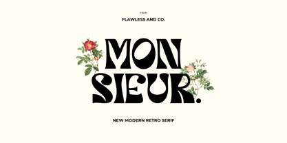 Orphic is a display retro font with a fun and bold style that perfect for your boho-themed projects such as poster design, branding materials, t-shirt, business cards, logo, photography, quotes, and more. Try out some alternate characters for another visual result! This font support for some multilingual. Also contains uppercase A-Z and lowercase a-z, alternate character, numbers 0-9, and some punctuation. If you need help, just write me! Thanks so much for checking out my shop!
 - Batelik by Sulthan Studio,
$10.00 Batelik -This is handwriting on paper using a pen and then we turn it into 3 styles such as regular Batelik which is original or natural handwriting without being cleaned or tidied up in the slightest while Batelik1, or Batelik2 I tidy it up and clean it, it's very modern and minimalist, it's really cool and it's amazing that you can try it for the job you're doing. letters are equipped with uppercase and lowercase letters, punctuation numbers and also language support
 - Gliners by Dumadi,
$25.00 Gliners is a simple stylized font that overlies the center of the glyphs bar in the font. Glyphs font doesn’t have too many, it only offers Uppercase and Multilingual, but don’t worry because its simple shape will make your project look interesting. The Gliners font is very suitable for use as movie titles, movie title poster covers like the review image I shared above. how? are you interested in trying it? Thank You, stay the center of attention and classy!
 - Bohate by Sulthan Studio,
$12.00 Introduce Bohate - is a font from handwriting on paper then made it come alive and I removed some of the smudges to make it look neat with an alternative for each letter that goes up and down differently like the letters b,d,f,g, h, j, k, l, p, t, y etc has a total of 713 glips featuring uppercase, lowercase, numbers, punctuation, language support, swash, alternatives and binders. very natural you can try it and enjoy your work with this handwriting
 - Lush Blooms by Supfonts,
$17.00 I keep experimenting with handwritten fonts, shapes and lines. I want the font to set the tone, the atmosphere, and look like an inscription made in a hurry, but still readable. Try my new font, I think it combines all these qualities. Simple and clear, looks at ease. It is perfect for signatures or design when you do not need a strict style. Includes: Uppercase and lowercase Numbers and punctuation Foreign language support Ligatures Check out my blog: https://www.instagram.com/zloillev pinterest.com/dmitriychirkov7
 - Brushtones by PintassilgoPrints,
$29.00 Freely hand-painted with a flat brush, this font conveys spontaneity both through its typeface design and the numerous alternates it delivers. There are four different glyphs for each lower and uppercase letter and two variations for figures (and yet some punctuation marks). All these alternates are programmed to easily cycle at the click of a button - yes, the absolutely amazing Contextual Alternates one. Brushtones, a bold brush font, nice and handy, just perfect to color your message. Give it a try!
 - Ogonyok by Russian Fonts,
$15.00 Accidental grotesque with a fiery character. Three font styles: Regular, Italic, Retalic. For each typeface an additional ornament was developed. The «Ogonyok» works well in larger sizes. Looks cool on titles, logos, music album covers, posters, packaging and in short texts. Special gorgeous ornaments will complement and enhance any design. Just try to type the text at the bottom of this page and you will see for yourself. Multilingual. Support: Cyrillic, Latin, extended Latin (Western European, Central European, South-East).
 - Northwoods by Cultivated Mind,
$19.00 Northwoods is a simple, handwritten sans serif font family designed by Cindy Kinash. This family includes five weights and italics. Northwoods is a little different than most sans serifs being that it’s handwritten. You can use the fonts in multiple ways such as in design or textually. Try the bolder weights for display text and the lighter/italic weights for textual purposes. Northwoods is great for packaging, magazines, layouts, web design, corporate identity and marketing. Posters designed by Henry Barros.
 - ITC Coolman by ITC,
$40.99Pelle Piano is the stage name for Per Ellstrom, a musician in Stockholm with an interest in irregular and informal lettering. ITC Coolman was inspired by lettering styles of the 1950s. “I have a passion for old '50s type lettering,” says Piano, “as seen on posters from B-movies and pocketbooks and cartoons.” Although ITC Coolman is not a script face, its caps work best with the lowercase, rather than together. The funky, bouncy look of Coolman cries out for beach movies. - Kingfisher by Fenotype,
$25.00 Kingfisher is a bold brush family with Script, casual Caps and Extras. Kingfisher is divided into three styles -regular, distressed and one with stylised cuts that emphasize the brush stroke. Kingfisher is packed with several OpenType features: Contextual Alternates and Standard Ligatures are automatically on to keep the flow. For flashier characters, try Swash or Titling Alternates. Font is PUA encoded so you can access extras from character map in most design software. For the best price, purchase the complete pack!
 - Platinor by Larin Type Co,
$16.00 Platinor this is a beautiful and elegant Display Serif font. You can use this font in the classical style, with it you can highlight exactly what you need. But Platinor can also be more expressive, playful and looking vintage due to the many alternatives and ligatures that are harmoniously combined in this font. Try changing alternatives, ligatures and you will get many options for your project, which will make it unique. This font is easy to use as it has OpenType features.
 - Colfige by Alcode,
$20.00 Collge is a serif typeface with ligatures also complete multilingual glyphs. Collge come with Regular style, it will make this typeface can be used in all design projects and works perfectly for pairing with script typeface or handmade fonts, Headlines, Posters, Packaging, T-shirts, Postcards, Invitation, Wedding Sign, Sign Painting, Signboard, and much more. Try Collge, enjoy the richness of OpenType features and let her fun and elegant excitement make you happy and enhance your creativity! You can use this font very easily.
 - Boxley by Shinntype,
$45.00 The original superellipse typefaces coincided with the emergence of the CRT (cathode ray tube) TV screen, but there is more than this visual analogy of high-tech in play, as the pumped up angularity of the curved components of the genre also informs the quality of set text. In particular, due to the straightness of the round letters’ side stems, there is a neat modularity of vertical letter spacing, which denotes authority, with precision, complementing the tautness of the face’s curves.
 - Farlos by Papermode Co,
$19.00 Farlos is a ink handwritten font, with a unique feel and a stunning impact. It will add a luxury spark to any design project that you wish to create! This font is PUA encoded which means you can access all of the amazing glyphs and ligatures with ease! Try Farlos, enjoy the richness of OpenType features and let her fun and elegant excitement make you happy and enhance your creativity! You can use this font very easily. Included multiligual support and special ligatures
 - DT Skiart by Dragon Tongue Foundry,
$30.00 Looking for something between a Serif and Sans Serif font? Try the DT Skiart font. This high quality, versatile font has the professional feel of a Serif, but has the open readability of a Sans Serif. A smart crisp font with smooth simple lines. It has a medium to strong stroke contrast, with the vertical line being heavier than the horizontal line, and no serifs. The DT Skiart family is made up of 5 weights in both italic and normal.
 - Jugendstil Initials by HiH,
$16.00 Jugendstil Initials were designed by Heinrich Vogeler around 1905, based on the German blackletter tradition. A similar set of initials by Vogeler, but based on roman letters was released by Rudhardsche Geisserei of Offenbach at about this time. I believe the originals were woodcuts. The backgrounds to the letterforms may be seen as examples of Heimatkunst, an art movement within Germany that drew deliberate inspiration from the rural countryside. Like the Arts and Crafts Movement in England a little earlier, Heimatkunst may be seen, in part, as a romantic rejection of urban industrialization, while at the same time representing a back-to-roots nationalism. Like any river, it was fed by many streams. Jugendstil Initials is an experiment with which I am most pleased. It is far and away the most complex font HiH has produced and I was uncertain whether or not it could be done successfully. To oversimplify, a font is produced by creating outlines of each character, using points along the outline to define the contour. A simple sans-serif letter A with crossbar can be created using as few as 10 points. We decided to make a comparison of the number of points we used to define the uppercase A in various fonts. Cori, Gaiety Girl and Page No 508 all use 12 points. Patent Reclame uses 39 and Publicity Headline uses 43. All the rest of the A’s, except the decorative initials, fall somewhere in between. The initial letters run from 48 points for Schnorr Initials to 255 for Morris Initials Two, with 150 being about average. Then there is a jump to 418 points for Morris Initials One and, finally, to 1626 points for Jugendstil Initials. And this was only after we selectively simplified the designs so our font creation software (Fontographer) could render them. The average was 1678, not including X and Y. There was no X and Y in the original design and we have provided simple stand-ins to fill out the alphabet, without trying to imitate the style of the orginal design. We did a lot of looking to find a compatible lower case. We decided that Morris Gothic from the same period was the best match in color, design and historical context. We felt so strongly about the choice that we decided to produce our Morris Gothic font for the purpose of providing a lower case for Jugendstil Initials. The long s, as well as the ligatures ch and ck are provided. at 181, 123 (leftbrace) and 125 (rightbrace) respectively. This font was a lot of work, but I think it was worth it. I hope you agree.
 - Indie by Lián Types,
$37.00 A FEW THOUGHTS Indie is a trendy script, result of the wide range of possibilities that can be achieved using a pointed brush. (1) “You Only Live Once” say The Strokes, (to me, symbols of indie music) so, what would represent that sensation of volatility better than a brush? As you may already know, this time inspiration came from hipsters and indies around us: We may sometimes criticise them, we may sometimes want to be like them, but the truth is that the universo gráfico they generated these past years is gigantic, full of colour and variations. (2) Brush lettering and Sign painting are fields I've been fond of since I started as a designer. Nowadays, these styles are getting a lot of attention and maybe it’s due to the undeniable mark of life that is materialised when using a brush. This tool is so expressive that shows the passions and fears of the artist, and materialises that idea of “living the present”, so popular in this era. When you see Indie, you think of skaters, rollers, surfers, hiphop dancers, street artists, summer, and why not? California beaches. So if you feel life is only one, it’s high time you got Indie into your fonts' collection! STYLES Indie comes in 4 styles plus another one which consists only in capitals. Indie; Indie Shade; Indie Shade Solo; Indie Inline are all open-type programmed and have exactly the same glyphs and metrics, so you can combine them without probem. (I.E. You may use Indie Inline, then write the same word using Indie Shade Solo, and finally put them together). In applications such as Adobe Illustrator, the font has nice results when fi ligatures is activated. However, if you want a more casual look, activate the contextual and the decorative ligatures. NOTES 1. After several years of practicing calligraphy I can say that to me, there’s nothing more satisfying than being able to create fonts out of your own handlettering. I owe a lot of this brush-style to Carl Rohrs. He was the very first calligrapher who taught it to me. His style is unique and what he can do with a brush is truly marvelous. I'm serious. 2. In spite of some particular cases, I can say I'm happy to live in a present in which Typography is living a kind of Renaissance along with Lettering. Like it happened with W. Morris a hundred years ago, handcrafts are being revalued/reborn, and some of this may be happening thanks to these indie designers that, trying to be unique, gave new/fresh air to different areas of graphic design.
 - Castle Fleurons by CastleType,
$29.00 A delightful collection of classic fleurons. Useful for adding a tasteful accent to your documents or for creating borders. Left-facing fleurons are complimented by right-facing ones (and vice versa). Some fleurons have four 90-degree rotations for creating interesting tiling patterns.
 - Tetris - Unknown license

- ASTYPE Ornaments Accolades A by astype,
$28.00 The astype series Accolades A offers the designer a fine balanced set of calligraphic swashes, swirls and floral ornaments. The shapes are in systematic order and harmonize in contrast and detail. The shapes can be combined easily and the advanced designer can build hundreds of sophisticated compositions. No matter, whether packaging lables, invitations or greeting cards - every assignment with the need of a delightful appeal will be served well. Accolades A and A2 share the same base set of ornaments but differ in some of the major shapes. Despite these differences, the total width of the shapes will be always the same. If you are looking for some good companion fonts, give Gracia and Adana a try. Every classic high contrast stroke design like Didot or Bodoni works well. Note: To look perfect, adjust the size of the ornament font to fit in contrast the design of the companion font. So if you use a Bodoni font as companion, try to match the thickness of the thinnest part of a upper case Bodoni letter with the thinnest part of a shape from the ornament. Note 2: Each package comes with a technical documentation and an InDesign2 sample file.
 - Bestorika by Mokatype Studio,
$19.00 Introducing Bestorika Beautiful Modern serif with contrast lines and balanced curves. This font may be conservative and classic, and also may be more playful and modern. A lot of stylish alternates will give you many useful variations for use. Try to play with compositions of curves / alternates letters basic. Like all of my fonts it is inspired by lettering from the good old past, but it still has a strong modern appearance. Its wide range of stylistic alternates allows versatile design options and works perfectly for headlines, logos, posters, packaging, coffee shops, restaurants, magazine's headers, signs or gift/post cards,cafe's and weddings. Try to use it in your beauty or travel blogs, you will see how many options you will have with stylish Bestorika. What's Included : Standard glyphs Ligatures Alternates Web Font International Accent Works on PC & Mac Simple installations Accessible in the Adobe Illustrator, Adobe Photoshop, Adobe InDesign, even work on Microsoft Word. PUA Encoded Characters - Fully accessible without additional design software. Fonts include multilingual support Image used : All photographs/pictures/vector used in the preview are not included, they are intended for illustration purpose only. Thank You
 - Haboro Serif by insigne,
$- The polls are in. Now here by customer request--Haboro Serif, the newest edition of the Haboro Hyperfamily. The Haboro fonts are an outstanding upstart success from the first part of 2016. Following the release of the popular Haboro, Haboro Sans and Haboro Slab have both been welcomed additions to the family, too. Now, Haboro Serif continues to build on the base of these related designs. Serif maintains the unique, script-like terminals of the original. These terminals, along with the optimized stroke weight of this face, make it useful for text settings. Prefer standard serifs? These are also available as OpenType alternates within the font, giving you a wider variety of options without compromising its effectiveness in the same text settings.. Haboro Serif works with many other members of the Haboro family as well. Try the original Haboro for your headlines, and pair your Serif text with Haboro Sans for a balanced design that appeals to the reader. Add Serif to your box today, and try this all-around “Renaissance man” of a typeface for a touch of practical elegance on your next job.
 - Gabby by Bellafonts,
$25.00 Gabby is an authentic handwriting of a First Grader. I took all the papers from her backpack during her first grade year and scanned in various letters, cleaned them up, and turned them into a font. This font is how I captured memories of my daughter's handwriting. This font is perfect for projects requiring the handwriting of a child, such as kid-friendly t-shirts and school projects. Comic Sans can move over because Gabby is readable and authentic. Unlike many decorative fonts, Gabby works well in All Caps or Caps and Lower case. The license allows creative and commercial use, meaning you can use this font on t-shirts, marketing gear, and just about any project you want to do, whether you make money or not. The only stipulation I have is try not to be a jerk with the font. This is my daughter's handwriting, and we would both cringe if we discovered it was used to bully or threaten people. The license attempts to protect religious icons and the US Military, but overall, just don't be mean with the font. If you want to be mean, try Comic Sans.
