4,387 search results
(0.013 seconds)
- Shakehand Brothers by Arterfak Project,
$24.00 Introducing "Shakehand Brothers"! A playful handwritten font. Created with so much fun and solid brush. This font offers a super cool typographic design for your project because the letterform is so natural, and unique. Shakehand Brothers font is so handy to use with lots of alternate characters that you can mix and match to get a perfect combination. Also with swashes, multilingual support, and custom ligatures that will surprise you while typing the letters. Suitable for many project needs and many themes, you can use for quotes, headlines, titles, motion graphics, posters, flyers, decals, apparel, and more! Here's what you'll get : Uppercase Lowercase Numbers Punctuation Stylistic alternates Stylistic set Ligatures Accented characters Swashes PUA Encoded This font is can't wait to have fun with you. So, happy designing!
 - Magister Script by Great Studio,
$23.00 Magister Script is a brush script with original, clean and neat handwriting style, with a touch of personality on each curve. This master script is available in two styles. Magister Script One and Magister Script Two, accompanied by Extrudes to simplify your design. All versions Magister Script have luxurious and elegant Alternative letter characters, both for the final connection letters and Ascander and Descander letters. This typeface works very well for Logo Design, clothing, handwritten quotes, product packaging, headers, posters, merchandise, social media & greeting cards and all your artwork. Features · Basic Latin A-Z and a-z · Numbers · Symbols · Stylistic Set · Ligature · PUA Encode · Multilanguage Support Latin pro If there are problems, questions, or anything about my font, please send an email to greatstudi92@gmail.com. Thank you for viewing our new product, enjoy!
 - Innoxious by Gassstype,
$25.00 Here comes a New font, Introducing INNOXIOUS is a Annoying Rough Brush Font with a natural handwritten feel. This handmade font will make your design has a beautiful natural touch for each details. It is perfect for any design project as Invitation,logo, book cover, craft or any design purposes. This font INNOXIOUS is great for your next creative project such as logos, printed quotes, invitations, cards, product packaging, headers, Logotype, Letterhead, Poster, Design this font is great for your creative projects such as watermark on photography, and perfect for logos & branding, invitation,advertisements,product designs, stationery, wedding designs,label ,product packaging, special events or anything that need handwritting taste. That is has charming, authentic and relaxed characteristic more natural look to your text You can activate Ligatures OpenType panel.
 - Mauritz by Mans Greback,
$59.00 Mauritz is a brush script typeface. A speedy handwriting, Mauritz was drawn and created by Mans Greback in 2021 to be the ultimate set of wild-style scripts for logotypes and branding. This calligraphy family consists of 10 high-quality fonts in a great variety of weights and styles: Mauritz Thin, Light, Regular, Bold and Black, and each one as Italic. The font is built with advanced OpenType functionality and has a guaranteed top-notch quality, containing stylistic and contextual alternates, ligatures and more features; all to give you full control and customizability. It has extensive lingual support, covering all Latin-based languages, from North Europe to South Africa, from America to South-East Asia. It contains all characters and symbols you'll ever need, including all punctuation and numbers.
 - World Series by Mans Greback,
$59.00 World Series is a retro script typeface. Drawn and created by Mans Greback in 2021, this calligraphic lettering has a unique brush style and a confident appearance. Its vintage theme does well as a logotype or any typographic art that needs to look custom made. Use underscore _ to create swashes. Example: Baseballer_ Use multiple underscores to make swashes of different lengths. (Download required) The font is built with advanced OpenType functionality and has a guaranteed top-notch quality, containing stylistic and contextual alternates, ligatures and more features; all to give you full control and customizability. It has extensive lingual support, covering all Latin-based languages, from North Europa to South Africa, from America to South-East Asia. It contains all characters and symbols you'll ever need, including all punctuation and numbers.
 - Melidia by Nantia.co,
$16.00 My first encounter with brush lettering that has turned into a lovely bold font. I really loved the process of hand lettering with ink and I am so pleased how it developed into a lovely font. Melidia Font it’s a multilingual lettering font with Greek (of course), Cyrillic and Extended Latin characters and diacritics. The style of the font is perfect for your modern graphic design needs. For all the typography lovers, this typeface is a must-have. Also, Melidia Font is the ideal typeface for the food industry, for food branding, for restaurant menus and packaging. Additionally, you can use Melidia Font for a lovely wedding and baby shower invitation design. Especially if you are looking for a font for Instagram quote posts or any other social media content, this typeface is for you!
 - Meishu by Create Big Supply,
$15.00 Discover Meishu, a captivating Japanese brush font that combines the beauty of traditional calligraphy with modern design elements. With its strong and natural stroke style, Meishu brings an authentic and artistic touch to your projects. This versatile font is perfect for various applications, including logos, labels, magazines, books, greeting cards, packaging, novels, and advertising materials. Meishu captures the essence of Japanese brushwork, evoking elegance and grace in every character. Its blend of uppercase and lowercase letters adds visual interest and flexibility to your typography. The font also includes numbers and punctuation marks, enabling seamless integration into your designs. In addition to its aesthetic appeal, Meishu ensures multilingual support, allowing you to communicate your message effectively across different languages. Whether you're creating a design for a local or international audience, this font has you covered.
 - DIN Next Stencil by Monotype,
$56.99 The DIN Next™ Stencil suite of designs is DIN with an attitude. It’s even more industrial strength than the original. DIN Next Stencil’s seven roman weights are perfect for projects that require a mechanized, military, or commercial vibe. If you’re looking to create commanding display typography, be it in advertising, apparel, packaging, posters, signage, wayfinding – or crash dummy name tags, DIN Next Stencil can be the perfect typographic enhancement. Based on Akira Kobayshi’s DIN Next with stenciling by Sabina Chipară, the wide range of weights and large complement of diacritical and international characters – including those for Cyrillic and Greek – further expand the design’s capabilities. The DIN Next Stencil fonts are powerful tools in their own right – and provide a distinctive supplement to the DIN Next typographic palette.
 - Soubrette by Arendxstudio,
$16.00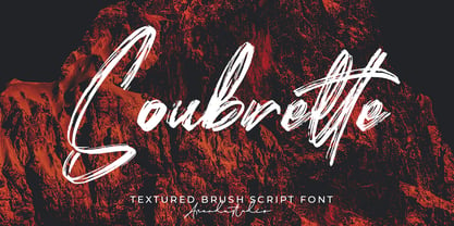 Soubrette - Textured Brush Script Font is a font with distinctive handwritten characters perfect for branding projects, logos, wedding designs, media posts, advertisements, product packaging, product designs, labels, photography, watermarks, invitations, stationery, and any project who need handwritten dishes. Features : • Character Set A-Z • Numerals & Punctuations (OpenType Standard) • Accents (Multilingual characters) • Ligature • Swash Multilingual Support : Afrikaans, Albanian, Asu, Basque, Bemba, Bena, Catalan, Chiga, Cornish, Danish, English, Estonian, Faroese, Filipino, Finnish, French, Friulian, Galician, German, Gusii, Icelandic, Indonesian, Irish, Italian, Kabuverdianu, Kalenjin, Kinyarwanda, Low German, Luo, Luxembourgish, Luyia, Machame, Makhuwa-Meetto, Makonde, Malagasy, Malay, Manx, Morisyen, North Ndebele, Norwegian Bokmål, Norwegian Nynorsk, Nyankole, Oromo, Portuguese, Romansh, Rombo, Rundi, Rwa, Samburu, Sango, Sangu, Scottish Gaelic, Sena, Shambala, Shona, Soga, Somali, Spanish, Swahili, Swedish, Swiss German, Taita, Teso, Vunjo, Zulu There it is! I really hope you enjoy it
 - Angila by Scoothtype,
$10.00 Angila is a fresh, handmade typeface, made with brush and ink. a contemporary approach to natural hand-painted design as well as subtle script combinations. Works perfectly for logos, magazines, menus, books, invitations, wedding / greeting cards, packaging, labels, t-shirts, Like Novel Titles, Apparel, Invitations, Quotes, Book Titles, Stationery Designs, Branding, Logos, Greeting Cards, T-shirts, Packaging Design, Posters and more. Angila includes a complete set of upper and lower case letters, as well as support for multiple languages, numbers, punctuation, ligatures, and alternative characters. Files include: * Angila .TTF How to access all alternate characters, using Windows Character Map with Photoshop: https://www.youtube.com/watch?v=Go9vacoYmBw How to access all the alternate characters using Adobe Illustrator: https://www.youtube.com/watch?v=XzwjMkbB-wQ If you need help or advice, please contact me via email.
 - Grantland by Letterhend,
$19.00 Grantlad is a condensed hand drawn brush font which is purposely made for headline, display or logotype, and signature which need a standout appearing. This font is also suitable to be applied especially in logo, and the other various formal forms such as invitations, labels, logos, magazines, books, greeting / wedding cards, packaging, fashion, make up, stationery, novels, labels or any type of advertising purpose. Features : uppercase & lowercase numbers and punctuation multilingual alternates & ligatures PUA encoded We highly recommend using a program that supports OpenType features and Glyphs panels like many of Adobe apps and Corel Draw, so you can see and access all Glyph variations. How to access opentype feature : letterhend.com/tutorials/using-opentype-feature-in-any-software/ Email us to letterhend@gmail.com if you need something! Happy Designing!
 - Marylebone by Los Andes,
$39.00 Marylebone is a font duo inspired by its namesake neighborhood, located in central London. Marylebone was designed to compose short text for advertisements, blackboards and shop windows in coffee shops, small bookstores, flower shops and local shops. The set is made up of a hand made brush script, composed of 519 characters including ligatures, initials and terminals; as well as a very clean, geometric unicase sans serif with some alternates and ligatures that can double as monograms, it also includes a hand-drawn floral dingbat set. Marylebone allows you to design beautiful compositions for packaging, advertising, quotes, wall art, branding, photography overlays, magazines, motion graphics, scrapbooking, planners, window art, tags, tote bags and much more, thanks to its irregular appearance that gives a unique personality to your design projects.
 - Bluerocks by Zamjump,
$13.00 BLUEROCKS is a rough brush font, created by hand, sketched on paper. This font is designed to make your designs or handwriting look louder and bold with ease. Perfect & Ideal for Logos, Quotes, Packaging, Flyers, Posters, Book Covers, Social Media Banners and Event Merchandise Types. The BLUEROCKS feature comes with Uppercase & Lowercase, Numeral, Punctuation, Swash lines, and also Multi Language Support. Multi Language English, French, Portuguese, Italian, Spanish, Turkish, Dutch, Finnish, Norwegian, Swedish, Danish, Icelandic, Hungarian, Romanian, etc. The BLUEROCKS typeface also comes with a Webfont Kit __________________________________________________________________ If you press a_a (a + underscore + a) (a_a / a_b / a_c / a_d / a_e / a_f / a_g / a_h / a_i / a_j then the line swash will come out. I've included 10 different line swash types. _________________________________________________________________ Feel free to message me if you have any questions. Don't forget the ♥ Like button guys! :)
 - LHF Saratoga Panels 4 by Letterhead Fonts,
$53.00The final collection in the series of 4 fonts. Each font contains 37 expertly drawn panels. All you have to do is add your own text and color for a quick and easy design. All 37 of these panels are exclusive to Letterhead Fonts. Typing each letter generates a different panel. Special Note: Due to the large file size of these fonts, they will not convert for use in Gerber Omega. Instead, Omega users may wish to use an alternate program to type the characters and import them into Omega as .eps files. CorelDraw users should use the "Weld" command rather than "Convert to Curves" command to convert these fonts to vector outlines. Otherwise, the program may crash due to the sheer number of points in each panel. - Xmas Wishes by Resistenza,
$29.00 Xmas Wishes Font - A collection of 55 calligraphic Christmas greetings and 10 Christmas dingbats. All handwritten with different tools like broad nib pen, pointed pen and brush pen which allowed us to create diverse styles. The letterings are written in different languages; English, French, Spanish and Italian. Add the beauty of calligraphy to your layout and create unique gadgets for this Holiday Season like posters, greeting cards, wrapping paper, tags, and much more! You can also use the designs as photo overlays for your blog or social media content. Open the images to see all the details AWESOME FEATURES 'Font in .otf .ttf' '55 Handlettering Xmas words' '10 Hand-drawn Xmas dingbats' 'Languages in use English, French, Spanish and Italian' 'We highly recommend Turquoise Font to combine with the letterings.'
 - ITC Styleboy by ITC,
$29.99 Although ITC Styleboy has a retro feel, it isn't based on any earlier typeface. As far as inspiration goes," says designer Chester Wajda, "I'd have to say comic strips of the '20s and '30s, and silent-film marquee lettering from the '20s - with a hint of a Chinese brush?" He originally created the typeface for a children's book he was working on. "I wanted it to be fun, but still somewhat formal in its underlying structure," he says. "It's largely based on right and 45-degree angles, with slight tucks inward on the stems and bowls, and a few flourishes here and there." Styleboy's top-heavy look is most noticeable in the caps, but it's exaggerated too in the "8" and the lowercase "g." Styleboy is Wajda's first typeface design."
 - WildSong by Scholtz Fonts,
$19.00 WildSong was inspired by the exuberant flight and beautiful song of birds. While most brush scripts take their cue from mid-twentieth century samples, WildSong is a fresh, contemporary alternative. WildSong reflects a dynamic interplay between dark and light, creating a sense of drama while hinting at a calligraphic background. Words suggest a baseline, yet are not bound by it. Letters interweave in a seemingly random dance, sometimes connecting smoothly, then breaking that connection as a calligraphic scribe does intuitively. Exuberant swash alternatives to uppercase letters, as well as ligatures can be accessed through both the type and glyph palettes. The font contains over 235 characters - (upper and lower case characters, punctuation, numerals, symbols and accented characters are present). It has all the accented characters used in the major European languages.
 - Realistic Twilight by Nathatype,
$29.00 Ready to make your branding or project to the highest level? Looking for a font that masterfully designed to travel your audiences to a world of elegance? We've got what you want. Say hello to "Realistic Twilight-A Handwritten Script Font" Realistic Twilight is a gorgeous handwritten font combined with brush style Use this script font to deliver that special elegant and modern touch to any design idea you can think of! This font support multi languages to make your branding can reach global audiences. Realistic Twilight is perfect to be used for invitation, logos, heading, cover, poster,, quotes, header, merchandise, social media & greeting cards and many more. Features: Ligatures Stylistic Sets PUA Encoded Numerals and Punctuation Thank you for purchasing premium fonts from Din Studio! Happy Designing!
 - Just Be by Roland Hüse Design,
$12.00 JUST BE is a playful brush script. Perfect for titles, headings and logotypes for blogs, ads, quote prints, home decor, book title, invitation, birthday, custom product, lifestyle imagery (like quotes and stuff). Character set contains Eastern and Western European Latin accented letters. For additional customisations (for logotypes for example) please email me at contact@rolandhuse.com You MAY NOT sell this font or claim them as your own. You MAY NOT edit or rename this font. You MAY NOT redistribute this font. Thank you I hope you like this font & good luck with your project! Roland Instagram: @rolandhusedesign Background images of "Just Be" main poster by Annie Spratt from unsplash https://unsplash.com/@anniespratt "Your best moments in life are ahead" by Helena Hertz https://unsplash.com/@imperiumnordique paper bag mock up by Graphic Burger https://graphicburger.com"
 - Tropical by Sudtipos,
$49.00 The single-named, multi-talented designer Joluvian now lives in Madrid. But he grew up in the “Caribe” of Venezuela, where thick jungles meet endless beaches, and fecund trees bear juicy fruit – a tropical paradise where music and dance vibrate in the humid air. The Tropical pack, designed by Joluvian and digitized by Ale Paul, echoes the spirit of his birthplace. Its three faces are casually stylish – a bold, wet-looking display script, an inky, textured brush script, and hand-penned capitals with a felt-tip look. Like a fruit cocktail, each ingredient is tasty on its own, but they combine even more deliciously. Sprinkle the included catchwords, shapes, and bursts in your layout to complete the easygoing, Carribbean vibe. Each face includes alternates and support for multiple Latin languages.
 - Tristyn by Arendxstudio,
$12.00 Tristyn is a signature handwritten font package with a personal charm. With a style that I feel is the first time being blended with a different brush so it has a natural hand Tristyn Regular contains upper and lower case letters, numbers and various complete signs. Tristyn Alt includes alternative characters, with capital letters and small that is completely new. Ligatures are available for some lowercase letters (more natural double letters). This can only be accessed through software with different devices or glyph panels, e.g. Photoshop / Illustrator. There it is! I really hope you enjoy it - comments & likes are always welcome and accepted. More importantly, don't hesitate to send a message if you have a problem or question. Now just read this, go there and make it happen :)
 - Razom Script by DizajnDesign,
$39.00 Razom Script is a typeface with deep roots in pointed brush calligraphy that takes advantage of current font technology to go beyond handwriting and reach new limits. A successful blend between printed and handwritten letterforms is visible when comparing upper and lowercase. The weight of the typeface evolve in a way that pushes the limits of a script typeface to suggest new uses. Normally, families are developed in weights, not proportions. Also, having several weights in a script family is rather rare. But in Razon Script, as the fonts gain weight, big differences show up in the font outlines: the thin weight looks soft and delicate but as we examine darker variables, they also seem to get broken. The counters of the letters rotate from vertical to horizontal during this process.
 - Lush Script by Positype,
$59.00 Lush was a formal script until it had a few too many drinks and, as a result, loosened up a little bit. Harkening back to the handlettering of the 40s and 50s, Lush has evolved into a casual, but well-dressed script that maintains a rather aggressive rhythm. Transitions often whip back quickly, forcing the letters to reel from the movement and resolve efficiently. It is not as warm as some scripts, intentionally so, so as to distinguish it from its predecessors. Type and lettering fans will revel in the options afforded to each character—in some cases there are up to 15 different variations with multiple glyph recipes available to produce the most unique and fluid lettering combinations possible. An often overlooked segment of contemporary script fonts, the uppercase letters have at least 3 options to work with that mesh well with the 36 ornamental flourishes to add even further embellishment. In total, there are over 1,650 glyphs in the typeface that includes these OpenType options: Stylistic Alternates, Contextual Alternates, Swashes, Titling, Historical Forms, Initial Forms, Oldstyle Numerals and 3 additional Stylistic Sets. With this release, I have tried to provide as much flexibility and 'forgiveness' within the typeface so the lettering enthusiast can have fun and explore thousands of iterations… and it's pretty easy math to figure this out: with over 970 alternates and 270 ligatures, I intended this typeface to be one that keeps on giving. One important fact to note… this marks the first release of a smooth, non-brushed, non-textured script from me—but it won't be the last. That said, I will have to admit that the brush has influenced many of the characters and their construction. Enjoy :)
 - Hamburger by FontMesa,
$29.00 Our new Hamburger font is based on the old classic Brush Script design with many new additions. We've added many alternates to the design including lowercase swash tail letters, swash underscores and a few alternate uppercase letters. Upright scripts are popular these day so new to this old type design is a near upright script version, a lot of hand work went into producing it. One of the biggest problems with the old Brush Script font is that people use it as all caps, which doesn't look good because of the extended swash on the top left side of the caps letters. We've fixed that problem by making an all caps version where the caps in the lowercase position have the top left swash tucked in to help the letters display better as an all caps font. We've also created a small caps version, again the small caps lowercase have all the top left swashes tucked in to bring the letters closer together for a better display. Also new to this font are two higher x-height versions that are ideal for signage. The first is Hamburger X which stands for extra x-height and the second is Hamburger SPX which stands for super x-height. Both of these higher x-height fonts are suitable for signage on a building, billboard and vehicle lettering where you're looking for faster readability from moving traffic. We've designed a new lowercase b and moved the original to an alternate position. We've also redesigned the uppercase C bringing the bottom up to the baseline and moved the original C to an alternate position. The original lowercase g was open at the top, we've closed it and we're not offering the original g as an alternate.
 - FS Pimlico by Fontsmith,
$80.00 Born in the 70s Personal influences are unavoidable in type design and usually find their way through into finished fonts. At Fontsmith, one period in particular provides inspiration, according to FS Pimlico designer, Fernando Mello. “Jason and Phil have always known that I’m very into the visual language of the 70s. I know that Jason shares my love of the 70s and Phil will sometimes admit to being a fan, too. I think that’s the reason they were both so supportive in the development of this font. “And, of course, we all share an interest in good-humoured and intelligent design. We like to think it’s a Fontsmith characteristic.” Back from black FS Pimlico started in an unusual place: with a tubby, penguin-like lowercase “a” that Fernando Mello had been sketching. From “a” grew the rest of the alphabet – a bubbly, fat, friendly family with a brush-written quality that became FS Pimlico Black. The black weight certainly isn’t the normal starting point for creating a regular and bold weight, but Fernando pressed on, driven by a glut of influences: brush-writing; Letraset and early digital systems catalogues; the type of Herb Lubalin and Tony di Spigna; 70s clothes and vinyl; and 70s revival disco nights in London’s Pimlico and Vauxhall. Natural or flourished Not often do fonts come along that seem to span the ages. FS Pimlico is at home in an office environment providing a fresh clear identity in communications or providing text that’s clear and easy to read. But it likes to party, too, 70s style. With the OpenType features switched on, a designer can totally change the look of their work, and create point-of-sale, headlines and titles that stand out and get noticed.
 - Skill by Lián Types,
$49.00 DESCRIPTION With Skill I wanted to create something wild. Something that splashed the letters with life. To do this, I knew I'd have to break the barrier between analog and digital, so I took my best brush and started to play. Throughout the years as a type-designer I've met and become fan of many calligraphers. My belief that only a good calligrapher can make good typography (1) has become even stronger. I'm now absolutely sure that only practice improves the skill, especially in this field. So, with this in mind, I started a font which was a challenge for me because sometimes the gap between paper and screen can be gigantic. Skill is another of my attemps (2) to capture the spirit of the pointed brush, its expressiveness, the passions and fears of the artist. This font is about freedom. Freedom everywhere. Movement, velocity, passion. To achieve this, many alternates and ligatures per glyph were designed. Use it on magazines, posters, book covers, music albums, t-shirts, skates, tattoos. NOTES (1) This is mostly referred to script fonts, though text fonts made by designers with a deep calligraphic background have at least to me, an extra charm. (2) See my fonts Live and Indie. TIPS Thanks to Open-Type, the font gives the user the chance to play and get many wonderful results: In example, using the font with “discretionary ligatures” activated will give more life to the written word. Some letters will jump of the base, while others will ligate or not with the following (typical of gestural calligraphy). Adobe Illustrator is recommended. STYLES Skill is the most complete style. It has all the alternates and ligatures that can be seen in the posters and more! Skill Standard is a variant with no decorative glyphs. It has the basic alphabet and some ligatures for better legibility.
 - FS Pimlico Variable by Fontsmith,
$249.99Born in the 70s Personal influences are unavoidable in type design and usually find their way through into finished fonts. At Fontsmith, one period in particular provides inspiration, according to FS Pimlico designer, Fernando Mello. “Jason and Phil have always known that I’m very into the visual language of the 70s. I know that Jason shares my love of the 70s and Phil will sometimes admit to being a fan, too. I think that’s the reason they were both so supportive in the development of this font. “And, of course, we all share an interest in good-humoured and intelligent design. We like to think it’s a Fontsmith characteristic.” Back from black FS Pimlico started in an unusual place: with a tubby, penguin-like lowercase “a” that Fernando Mello had been sketching. From “a” grew the rest of the alphabet – a bubbly, fat, friendly family with a brush-written quality that became FS Pimlico Black. The black weight certainly isn’t the normal starting point for creating a regular and bold weight, but Fernando pressed on, driven by a glut of influences: brush-writing; Letraset and early digital systems catalogues; the type of Herb Lubalin and Tony di Spigna; 70s clothes and vinyl; and 70s revival disco nights in London’s Pimlico and Vauxhall. Natural or flourished Not often do fonts come along that seem to span the ages. FS Pimlico is at home in an office environment providing a fresh clear identity in communications or providing text that’s clear and easy to read. But it likes to party, too, 70s style. With the OpenType features switched on, a designer can totally change the look of their work, and create point-of-sale, headlines and titles that stand out and get noticed. - Ghost Terror by Ditatype,
$29.00 Ghost Terror is a captivating display font that will haunt your designs with an eerie allure. Designed in uppercase and bold, this typeface commands attention and exudes an aura of fear. Each letter is meticulously crafted with a rounded shape, and some have sharp edges, adding a sense of unpredictability and suspense. The haunting brush details on each letter further enhance the font's chilling theme, immersing your audience in a world of ghostly terror. With its bold weight and rounded shape, this font brings a sense of familiarity while maintaining an air of otherworldly mystery. The mix of rounded shapes and sharp edges in this font adds a dynamic contrast, giving the font an unsettling and unpredictable appearance. The letters seem to dance between the realms of the living and the undead, capturing the essence of ghostly entities that lurk in the shadows. The brush details in Ghost Terror lend a haunting and handcrafted touch, as if the letters were inscribed by spectral beings. These eerie details add a sense of craftsmanship and an element of horror, creating an atmosphere of supernatural presence. For the best legibility you can use this font in the bigger text sizes. Enjoy the available features here. Features: Alternates Multilingual Supports PUA Encoded Numerals and Punctuations Ghost Terror fits in headlines, logos, movie posters, flyers, invitations, branding materials, print media, editorial layouts, headers, and any horror-themed project. Find out more ways to use this font by taking a look at the font preview. Thanks for purchasing our fonts. Hopefully, you have a great time using our font. Feel free to contact us anytime for further information or when you have trouble with the font. Thanks a lot and happy designing.
 - Turbinado by Aerotype,
$48.00 The ten font Turbinado™ Set was designed to be clear and easy to read with a friendly personality, ideal for advertising and packaging in both text and display settings. Included are three weights of brushed casual script, each with a dry version, two condensed all caps faces, another hand printed caps face and an Elements package with 100 brushed elements that include swashes, botanicals, shells, arrows, repeatable patterns and a few other doodads that play well with the fonts. Like our most recent release Fave, all of the fonts use the OpenType standard ligature feature to automatically differentiate consecutive lowercase letters and numbers, using separate glyphs rather than a single ligature so they can be set on a curve or colored separately, etc. They also automatically differentiate like characters that are separated by another letter when standard ligatures is enabled. The script fonts have alternate characters like swash glyphs for ends of words and a few ligatures too; single crossbar to unite the At and Att letter combinations etc. The two condensed faces also have a third set of less uniform glyphs that can be used to create a more quirky, fun and bouncy effect (see the ‘she sells seashells’ graphic above) when the discretionary ligature feature is on. The script fonts have 10+ lowercase t (and double t) crossbar alternates that can be selected from the OpenType glyph table manually, or you can enable the contextual alternates feature to automatically insert a bigger crossbar as the surrounding letters allow throughout a text box or document. Hello? Are you still there? :) And for those intrepid typographers who would rather fashion their own lowercase t to custom fit a specific design, all of the lowercase t ascenders and crossbars are also available separately in the glyph table, and can be combined manually.
 - Modern Love by Resistenza,
$39.00 Breaking from our catalog of typefaces to create a new handwritten font family, Modern Love was born out of our desire to see what would happen if we took a step back from the norm. We weren’t looking for the perfection of the many calligraphy techniques, but more of a natural way of writing with the same tools. Our escapist experiment into casual lettering culminated into 4 fonts: Modern Love Regular, Grunge, Rough and Caps. Modern Love Regular is a hand-painted script, each glyph individually designed with a pointed brush and walnut ink. The aim was to create an effortless hand-drawn feel while keeping the contrast high density. Playful, yet polished, this font works very well when accentuated with the family’s two distinctive styles: Modern Love Grunge, simulating a washed-out effect, perfect to add a vintage look to your projects; and Modern Love Rough, with its crunchy borders, makes letters visibly rough-around-the edges and gives large letters an unmistakeable pop. All three fonts include a hand-painted set of ornaments, swashes and alternates to limitlessly customize and decorate your texts, accessible through Opentype features. Modern Love Caps is the fourth font, a handwritten Sans Serif that ties the family together with its simplicity and readability. Designed with a pointed nib and Indian ink, this font boasts a different style that perfectly complements Modern Love Regular, Grunge and Rough. The result is a fresh font family perfect to create headlines, posters, DIY hand-lettered artwork, books, holiday cards, wrapping paper, invitations, T-shirts, labels, packaging for cosmetics, fashion supplies, food products, artisanal goods, and an endless array of options for your projects. Modern Love…when brush meets passion. Check out also ‘Modern Love Slanted’ Turquoise Nautica
 - Blank Manuscript by Aah Yes,
$14.95Blank Manuscript allows you to produce sophisticated musical scoresheets even on basic Word Processors - anything from simple plain staves to complex full-page orchestral scores of your own design, to write in the notation yourself. The basic stuff is really easy and straightforward, but there's some quite advanced things you can do as well. So Copy and Save these Instructions. • The main stuff is simple and tends to follow the initial letter. Treble, Bass and Alto clefs are on upper case T B A (there are more clefs, below). The 5 Lines for the clefs are on L or l. • A small v will give a small vertical line (like a bar line) and a Big U will give a Big Upright - these can start or end a line or piece. • Time Signatures - type the following letters: Think of W for Waltz and it's easy to remember that 3/4 time is on W. Then from that they go up or down together like this: V=2/4 W=3/4 X=4/4 Y=5/4 Z=6/4 Compound Times are on H I J K like this: H=3/8 I=6/8 J=9/8 K=12/8 Common Time and Cut Common symbols can be found on semi-colon and colon respectively (all begin with Co- ). 2/2 3/2 are on lower case a and b, 7/4 and 7/8 are on lower case c and d, 5/8 is on small k (think POL-k-A) • Flat signs are on the numbers. Flat signs on LINES 1 to 5 are on numbers 1 to 5. Flat signs on SPACES 1 to 5 are on numbers 6 to 0 (space 1 being above line 1, space 5 being above the top line of the stave). Sharp signs are on the letters BELOW the long-row numbers. Which is q w e r t for the sharp signs on Lines 1 to 5, and y u i o p for sharp signs on spaces 1 to 5. Doing it this way means it works the same for all clefs, whether Treble, Bass, Alto, Tenor or any other. Sharp and Flat Signs always go in this order, depending on how many sharps or flats your key signature requires: Treble Clef Sharps t i p r u o e Flats 3 9 7 4 2 8 6 Bass Clef Sharps r u o e t i w Flats 2 8 6 3 1 7 = Alto Clef Sharps o e t i w r u Flats 7 4 2 8 6 3 1 • Guitar Chord Boxes are on G and g (G for Guitar) Upper Case G has a thick line across the top Lower case g has an open top, for chords up the fretboard TAB symbols are available: Six-string Tablature is on s & S for Six. Four-string Tablature is on f & F for Four. (Lower case has the "TAB" symbol on it, Upper Case has just the lines to continue.) Five-string tablature, is on lower case "j" (as in BAN-j-O) and of course L or l will continue the 5 lines. •RARE CLEF SIGNS including Tenor Clef, are on various punctuation marks, i.e. dollar, percent, circumflex, ampersand & asterisk, above the numbers 4 to 8. NOTE: The important symbols were kept on the letter and number keys, which are fairly standard all over, but some of the less important symbols are on various punctuation keys, which in different countries are not the same as on my keyboard. If it comes out wrong on your system, all I can say is it's right on the systems we've tried, and they'll be in here somewhere, probably on a different key. CLOSING THE ENDS OF THE LINES and BAR-LINES is done with the 3 varieties of brackets - brackets, brace and parentheses - Left/Right for the Left/Right end of the line. Parentheses L/R () which are above 9, 0 give a clef with a small vertical upright (the same as a bar line). Brace L/R and Brackets L/R (both on the 2 keys to the right of P on my keyboard) will close off a staff line with tall upright bars. Brace gives a double upright - one thick, one thin. Brackets give a single tall upright. A Big Upright is on Big U, (Big U for Big Upright) and a small vertical line is on small v (small v for small vertical). The Big Upright is the maximum height, and the small vertical is exactly the same height as a stave. And there's a tall upright Bar, on Bar (which is to the left of z on my keyboard, with Shift,) which is the same height as the bar on upper case U but twice as broad. • There's a staff intended for writing melodies, which is a little bit higher up than an ordinary treble clef giving a space underneath to put lyrics in - on m and M for Melody line. Lower case has the Treble Clef on, Upper case M has just the higher-up staff lines with no clef. (Use mMMMMMMM etc.) However this clef will be in the wrong place to put in sharp and flat signs, key signatures and so on, so if you use this clef you'll have to write the sharps, flats and key signature yourself. There's also a clef that's smaller (less tall) than the ordinary clef, but with the same horizontal spacing so it will align with other standard-sized clefs - on slash (a plain clef) and backslash (with a Treble Clef). • There are some large brackets for enclosing groups of staves, such as you'd use on large orchestral scores, on Upper Case N O P Q R, which can aid clarity. N and O on the left, Q and R on the right. P is a Perpendicular line to be used on both sides to increase the height of the enclosure, in this way but with the staff lines in between: N Q P P P P P P O R OTHERS —————————————— • Repeat marks are on comma (left) and period/full stop (right). • Hyphen is left as a sort of hyphen - it's a thin line like a single staff line, with the same horizontal spacing as ordinary staff lines - in case you want to draw a line across for a Percussion Instrument, or a Title or Lyric Line. • Space is a Space, but with HALF the width or horizontal spacing as ordinary staff lines, so 2 space symbols will be the same width as a clef symbol or line. • Grave (to the left of 1 on the long row, or hold down Alt and type 0096 then let go) gives a staff line that is one eighth the width of an ordinary staff line. • If you want manuscript in a clef and key which requires a flat or sharp sign in the space underneath the 5 lines, they’re on = equals and + plus . SYMBOLS • Many of these symbols will only be useful if you have worked out in advance which bars will need them, but they are here in case you've done that and wish to include them. • Symbols for p and f (piano and forte) are on 'less than' and 'greater than' < > (above comma and full stop) and m for mezzo is on Question, next to them. They can be combined to make mp, mf, ff, pp, etc. These signs -- and other signs and symbols like Pedal Sign, Coda Sign and so on -- can be found on various punctuation mark keys, including above 1, 2, 3 in the long row, and others around the keyboard. There's a sort of logic to their layout, but in different countries the keys are likely to give different results to what is stated here, so it's probably best to just try the punctuation and see if there's any you might want to use. (But on my keyboard a Coda sign is on circumflex - because of the visual similarity. Pedal sign is on underscore. A "Sign" symbol is on exclamation mark.) They were only included in case you really need them to be printed rather than handwritten. • However, a Copyright symbol is deemed necessary, and also included are a "Registered" symbol and a TradeMark symbol. They are found in the conventional places, and can be accessed by holding down ALT and typing 0169, 0174 or 0153 respectively in the numberpad section and letting go. • Staff lines with arco and pizz. above are on capital C and D respectively ---C for ar-C-o. • An empty circle above a staff line (to indicate sections by writing letters A, B, C or 1,2,3 inside for rehearsal marks) is on n. The actual signs for an A, B, C and D in a circle above the staff line can be produced by holding down ALT and typing 0188, 0189, 0190 and 0191 respectively and letting go. • The word "Page", for indicating page numbers, is on the numbersign key. • The two quotes keys, (quote single and quote double) have symbols representing "Tempo is", and "play as triplets", respectively. • INSTRUMENT NAMES There's a whole lot of Instrument Names built in (over a hundred) which can be printed out above the clef, and you do it like this. Hold down Alt and type in the given number in the numberpad section, then let go. For Piccolo it's 0130, for Flute it's 0131, Cornet is on 0154, Violin is on 0193, and the numbers go up to over 0250, it's a fairly complete set. There's also a blank which is used to align un-named clefs on 0096. Put them at the very beginning of the line for the best results. Here they are: WOODWIND Piccolo 0130 Flute 0131 Oboe 0132 Clarinet 0133 Eng Horn 0134 Bassoon 0135 Soprano Sax 0137 Alto Sax 0138 Tenor Sax 0139 Baritone Sax 0140 Saxophone 0142 Contrabassoon 0145 Recorder 0146 Alto Flute 0147 Bass Flute 0148 Oboe d'Amore 0149 Cor anglais 0152 Pipes 0241 Whistle 0242 BRASS Cornet 0154 Trumpet 0155 Flugelhorn 0156 Trombone 0158 Euphonium 0159 Tuba 0161 French Horn 0162 Horn 0163 Tenor Trombone 0164 Bass Trombone 0165 Alto Trombone 0166 Piccolo Cornet 0167 Piccolo Trumpet 0168 Bass Trumpet 0170 Bass Tuba 0171 Brass 0172 VOICES Vocal 0175 Melody 0176 Solo 0177 Harmony 0178 Soprano 0179 Alto 0180 Tenor 0181 Baritone 0182 Treble 0183 Bass 0197 (see also PLUCKED STRINGS) Descant 0184 Mezzo Soprano 0185 Contralto 0186 Counter Tenor 0187 Lead 0206 BOWED STRINGS Strings 0192 Violin 0193 Viola 0194 Cello 0195 Contrabass 0196 Bass 0197 Double Bass 0198 Violoncello 0199 Violin 1 0200 Violin 2 0201 Fiddle 0252 PLUCKED STRINGS Harp 0202 Guitar 0203 Ac. Gtr 0204 El. Gtr 0205 Lead 0206 Bass 0197 Ac. Bass 0207 El. Bass 0208 Slide Gtr 0209 Mandolin 0210 Banjo 0211 Ukelele 0212 Zither 0213 Sitar 0214 Lute 0215 Pedal Steel 0216 Nylon Gtr. 0238 Koto 0239 Fretless 0244 KEYBOARDS + ORGAN Piano 0217 El. Piano 0218 Organ 0219 El. Organ 0220 Harpsichord 0221 Celesta 0222 Accordion 0223 Clavinet 0224 Harmonium 0225 Synth 0226 Synth Bass 0227 Keyboards 0228 Sampler 0249 PERCUSSION and TUNED PERCUSSION Percussion 0229 Drums 0230 Vibes 0231 Marimba 0232 Glockenspiel 0233 Xylophone 0234 Bass marimba 0235 Tubular Bells 0236 Steel Drums 0237 Kalimba 0240 OTHERS Harmonica 0246 Mouth Organ 0247 FX 0251 Intro 0243 Verse 0245 Refrain 0248 Chorus 0250 un-named 0096 (this is a small spacer stave for aligning clefs without a name) ALSO copyright 0169 registered 0174 TradeMark 0153 Rehearsal marks 0188-0191 (giving A, B, C, D in a circle, an empty circle is on n ) Clef signs for Treble Bass Alto without any staff lines 0253-0255 An Alphabetic List of all signs: a 2/2 time b 3/2 time c 7/4 time d 7/8 time e sharp sign, centre line f Tab sign for 4-string tab g Guitar Chord Box, no nut h half-width stave I sharp sign, third space up j Tab sign for 5-string tab k 5/8 time l Lines - 5 horizontal lines for a stave m Melody Clef - a standard clef but placed higher up, with Treble sign n Stave with an empty circle above o sharp sign, fourth space up p sharp sign, space above stave q sharp sign, bottom line r sharp sign, fourth line up s Tab sign for 6-string tab t sharp sign, top line (fifth line up) u sharp sign, second space up v vertical line (bar-line) w sharp sign, second line up x Fretboard, four strings y sharp sign, first space up z Fretboard, five strings A Alto Clef B Bass Clef C “arco” above stave D “pizz.” above stave E Double Vertical Lines F Four Horizontal lines (for 4-string tab) G Guitar Chord Box with nut H 3/8 time I 6/8 time J 9/8 time K 12/8 time L Lines - 5 horizontal lines for a stave M Melody Clef - a standard clef but placed higher up, plain N Bounding Line for grouping clefs - top left O Bounding Line for grouping clefs - bottom left P Bounding Line for grouping clefs - Perpendicular Q Bounding Line for grouping clefs - top right R Bounding Line for grouping clefs - bottom right S Six Horizontal lines (for 6-string tab) T Treble Clef U tall, thin Upright line V 2/4 time W 3 / 4 time X 4/4 time Y 5/4 time Z 6/4 time 1 flat sign, first line up (the lowest line) 2 flat sign, second line up 3 flat sign, third line up 4 flat sign, fourth line up 5 flat sign, fifth line up (the top line) 6 flat sign, first space up (the lowest space) 7 flat sign, second space up 8 flat sign, third space up 9 flat sign, fourth space up 0 flat sign, space above stave - Shinn Kickers JNL by Jeff Levine,
$29.00 Conrad X. 'Cobb' Shinn (Sept. 4, 1887- Jan. 28, 1951) was a Fillmore, Indiana-born post card illustrator who sold a series of successful novelty postcard lines which included (among others) Charlie Chaplin, automobiles and the Dutch culture in the beginning years of the 20th Century. After serving in World War I, Shinn found the market for novelty postcards dwindling, and he also lent his artistic skills to cartoon features and illustrating many children's books [including his own, under the nickname 'Uncle Cobb'] which taught easy step-by-step drawing methods. Some time in the 1920s, he eventually migrated into the field of supplying electrotypes and stereotypes of 'stock cuts' of photos and line art to the printing trade. In the days of letterpress printing, this was the forerunner of paper clip art and its successor, electronic clip art. Purchasing many of his designs from 'journeyman' artists of the time, the diversity of Cobb Shinn's stock cuts library grew with the passing years, reflecting changing times, styles and topics. Some of the illustrators whose signed works were presented in Shinn's 'CUTalogs' [as he called his stock cuts catalogs] include Mary Clemmitt, Louis H. Hippe, E.C. Klinge, Nelson White, Harvey Fuller, Bess Livings, Lois Head, Harvey Peake and Van Tuyl. Upon his passing in 1951, it's not known how long the Indianapolis-based company existed before finally closing its doors. One of the more popular series of cartoons were the line illustrations of men and women affectionately called 'little big head guys' by many modern fans of these cuts because the heads of the characters were drawn somewhat larger than the rest of their bodies. Shinn Kickers JNL is a collection twenty-six of these illustrations, and just like a kick in the shin (as the pun in the name implies), these charming cartoons get your attention.
 - Well, let me paint you a word-picture of the font “Bauer,” crafted by the talented Samuel Park. Imagine, if you will, stepping into a time machine, dialing the year back to a vintage era where typewr...
- Hoofer by Scholtz Fonts,
$15.00 Light and flexible, slightly retro, casual and readable, Hoofer combines 28 brush script, mono line script and sans-serif styles with ornaments into one Mega-Family. The different styles of the Hoofer Mega-family have been chosen to work together and to harmonize in a pleasing way. The Hoofer Mega-Family of fonts can be divided into three sub-families: Hoofer BRUSH subfamily: An eclectic group of five fonts. These are mainly joined scripts. Hoofer LINE subfamily: Seven mono-line scripts with joined letters in a number of weights, widths and styles. Hoofer SANS subfamily: Sixteen casual, Sans-Serif fonts. They are very readable and in a variety of weights & styles The mood of the Hoofer mega-family is light and flexible, slightly retro, casual and readable. It combines script and many sans-serif styles with ornaments into one Mega-Family. The different styles of the Hoofer Mega-family have been chosen to work together and to harmonize in a pleasing way. The Brush Sub-Family is designed for titling, packaging and display purposes, The Line Sub-Family can also be used for titling, packaging and display, however, it is less “showy”, and conveys an air of informality. The Sans Sub-Family is designed to shine as sub-heads and as body text. The wide range of Hoofline styles gives you, the designer, great flexibility in creating just the mood or impression that you want. Most of the fonts can use one or more OpenType Features. These can be accessed in a number of ways. The reason for this is that the major software producers provide different (and often conflicting) ways of accessing OpenType Features. In some cases such software manufacturers provide NO way of accessing certain OpenType Features. We have tried to remedy this by providing a highly flexible family of fonts. OPENTYPE (these OpenType features are only available in the “otf” fonts and not in the “ttf” fonts.) OpenType features that Hoofer makes use of are: Swashes (Word-Begin and Word-End Features); Alternate Numerals; and True Small Caps. ORNAMENTS In addition the Hoofer family has a font containing 94 ornaments. ALTERNATE NUMERALS You can access two sets of figures (numbers) in Hoofer Sans fonts. Both sets are tabular and lining but they differ in the height (but not the width) of the figures. The height of the alternate figures has been chosen so that they are compatible with the small caps. However, these alternate figures are available in ALL Hoofer Sans fonts, whether they feature small cap fonts or not. Hoofer has all the features usually included in a fully professional font. Language support includes all European character sets, Greek symbols and all punctuation. Opentype features include automatic replacement of some characters and discretionary replacement of stylistic alternatives.
 - "Night Club 70s" by Jambo! is an evocative and captivating typeface that immediately transports you into the heart of the 1970s disco era. This unique font perfectly encapsulates the vibrant, high-en...
- Bitcrusher by Typodermic,
$11.95 Bitcrusher is not your ordinary typeface. It is a futuristic, ultra-compact sans-serif font that draws inspiration from the sleek design of automobiles and cutting-edge consumer electronics. Its unique compression capabilities allow you to pack more words into a single line than most techno typefaces can ever dream of. Available in five weights and four widths, Bitcrusher is a versatile font that gives you unprecedented control over your typography. If you need to fit more text into a tight space, Bitcrusher Condensed is the perfect choice. And if you want to push the limits of font compression, Bitcrusher Compressed has already reached the standard limit. For those who demand even more compactness, Bitcrusher Crammed has an abnormally small footprint, while Bitcrusher Crushed has an absurdly high density that defies all conventions. But no matter which variant you choose, you can be sure that Bitcrusher delivers consistent stem, space, and gap widths that allow you to break the rules of scaling and tracking. With Bitcrusher, you have complete control over your typography. Want thicker stems? Simply scale a narrower width to a bigger breadth. Need to go even tighter than Crushed? Make it even thinner. Bitcrusher is a font that cannot be broken. It is the ultimate tool for designers who demand precision and control over their typography. Choose Bitcrusher and discover the power of true compression. Most Latin-based European, Vietnamese, Greek, and most Cyrillic-based writing systems are supported, including the following languages. Afaan Oromo, Afar, Afrikaans, Albanian, Alsatian, Aromanian, Aymara, Azerbaijani, Bashkir, Bashkir (Latin), Basque, Belarusian, Belarusian (Latin), Bemba, Bikol, Bosnian, Breton, Bulgarian, Buryat, Cape Verdean, Creole, Catalan, Cebuano, Chamorro, Chavacano, Chichewa, Crimean Tatar (Latin), Croatian, Czech, Danish, Dawan, Dholuo, Dungan, Dutch, English, Estonian, Faroese, Fijian, Filipino, Finnish, French, Frisian, Friulian, Gagauz (Latin), Galician, Ganda, Genoese, German, Gikuyu, Greenlandic, Guadeloupean Creole, Haitian Creole, Hawaiian, Hiligaynon, Hungarian, Icelandic, Igbo, Ilocano, Indonesian, Irish, Italian, Jamaican, Kaingang, Khalkha, Kalmyk, Kanuri, Kaqchikel, Karakalpak (Latin), Kashubian, Kazakh, Kikongo, Kinyarwanda, Kirundi, Komi-Permyak, Kurdish, Kurdish (Latin), Kyrgyz, Latvian, Lithuanian, Lombard, Low Saxon, Luxembourgish, Maasai, Macedonian, Makhuwa, Malay, Maltese, Māori, Moldovan, Montenegrin, Nahuatl, Ndebele, Neapolitan, Norwegian, Novial, Occitan, Ossetian, Ossetian (Latin), Papiamento, Piedmontese, Polish, Portuguese, Quechua, Rarotongan, Romanian, Romansh, Russian, Rusyn, Sami, Sango, Saramaccan, Sardinian, Scottish Gaelic, Serbian, Serbian (Latin), Shona, Sicilian, Silesian, Slovak, Slovenian, Somali, Sorbian, Sotho, Spanish, Swahili, Swazi, Swedish, Tagalog, Tahitian, Tajik, Tatar, Tetum, Tongan, Tshiluba, Tsonga, Tswana, Tumbuka, Turkish, Turkmen (Latin), Tuvaluan, Ukrainian, Uzbek, Uzbek (Latin), Venda, Venetian, Vepsian, Vietnamese, Võro, Walloon, Waray-Waray, Wayuu, Welsh, Wolof, Xavante, Xhosa, Yapese, Zapotec, Zarma, Zazaki, Zulu and Zuni.
 - Elephantmen by Comicraft,
$19.00 Worn and torn, dry and cracked, resistant to wind and rain... the skin of the elephant is a thing of dry beauty and ancient wisdom... During the gold rush, the phrase “Seeing the elephant” became synonymous with the high cost of each prospector’s dreams and hopes --- not only the prospect of wealth beyond the dreams of avarice in California but also the possibilities of encountering misfortune on the journey. Like the circus elephant, gold was an exotic sight, and seeking it was an unequalled experience, the adventure of a lifetime. Now we've created a font much like the skin of an Elephant and Adventure, Excitement and Really Wild Things are available in the pages of the comic book of the same name, Elephantmen.
 - As of my last update in April 2023, there isn't a specific font universally recognized as "China" within the major font libraries or collections. However, the concept of a font being described with t...
- Clawmark by Putracetol,
$24.00 Clawmark - Strong Brush Font.The modern and powerful hand painted font you've been looking for. Each character is carefully crafted until the result is perfect. A lot of detail is preserved when characters are digitized, so uppercase looks fantastic up close Clawmark combines attractive curves with a fresh urban edge; delivering a stylish script which is guaranteed to add an eye-catching appeal to your story books, illustrations, comic books, t-shirts, posters, greeting cards, logos, branding, stickers, svg, crafting and all for display purposes. The alternative characters were divided into several Open Type features such as Swash, Stylistic Sets, Stylistic Alternates, Contextual Alternates, and Ligature. The Open Type features can be accessed by using Open Type savvy programs such as Adobe Illustrator, Adobe InDesign, Adobe Photoshop Corel Draw X version, And Microsoft Word. This font is also support multi language.
 - Tim Sale by Comicraft,
$39.00 If you're familiar with the work of Eisner Award winning artist Tim Sale, you'll also be familiar with the soft curves and hard edges of the characters he brings so vividly to life in the pages of GRENDEL, BATMAN and SUPERMAN. Now you can get to know a selection of the characters Tim has been working on his whole life, and Comicraft has been kind enough to arrange them in alphabetical order for you! Based on Tim's own hand lettering work in the lost Dark Horse classic, BILLI 99, the Tim Sale font brings together the class and finesse of Hunter Rose, the elegance and charm of Bruce Wayne and the honesty and trustworthiness of Clark Kent. Don't go into the big city alone at night without it. See the families related to Tim Sale: Tim Sale Lower & Tim Sale Brush.