10,000 search results
(0.089 seconds)
- Mantika Informal by Linotype,
$50.99Jürgen Weltin's Mantika Informal is pretty difficult to categorize, but very easy to like. This particularly reader-friendly typeface in regular and bold weights, brings to the table the informal fluidity of a script, the consistency of an inclined italic, and the open and airy forms and contrast of a humanist sans. The result is a warm, approachable, and very legible typeface that is never static and staid, but rather invites an attentive, reading eye. The original idea behind Mantika Informal lay in the challenge to create a typeface for setting children's books. German designer Jürgen Weltin aimed to create a reading typeface for those just starting to learn how to read. On the one hand, it should help create clear word-images; on the other, its letterforms should remain uncomplicated but resist mechanical and industrial sterility. Mantika?s subtle cursive lines stress the printed word's connection with handwriting, in addition to making the transition from school writing exercises to printed texts seamless and effortless. The resulting slightly organic and cursive forms that developed during the design process are so captivating that Mantika Informal may be used for a multitude of unintended applications - anywhere a friendly and informal yet sophisticated character could lend a helping hand, Mantika is there, giving a fresh accent to anything from packaging design to food products. With a broad character set encompassing support for Cyrillic and Green, Mantika Informal's two fonts make for a versatile and dynamic typeface that surely will find its place in a broad range of applications. - Alfie by Monotype,
$29.99Alfie™ is lively, friendly, inviting and easy on the eyes. What more could you want in a script? How about four flavors of the same design? Alfie Script is a delightful connecting script with a touch of comfortable elegance. Use it for everything from social announcements to headlines and packaging. Alfie Casual is a little more laid-back with letters standing on their own. It works great in short blocks of text copy, subheads and navigational links. Alfie Informal has spirited serifs and its own demeanor, while Alfie Small Caps does a fine job of supporting its other siblings. There’s an immediacy to words and messages set in these lighthearted confections. Jim Ford was practicing drawing with a new brush pen when the inspiration for Alfie came to him. He had filled several pages in a notebook with letters and, at one point, realized that there might be a typeface among them. As it turned out, there were four. The process, however, wasn’t choosing one design and modifying it. The makings of all the designs were on the pages. It was just a matter of culling out the right collection of characters to build the foundations for the four flavors of Alfie. Because they share the same family roots, each design in the Alfie family can be paired and intermixed. Ford admits that there’s a hint of Emil Klumpp’s 1950s Murray Hill typeface (https://www.myfonts.com/fonts/bitstream/murray-hill/) in the Alfie family. Just enough to give the design a 50s vibe. (Some fashions never go out of style.) - Teio - Personal use only
- Bohemian typewriter - Personal use only
- Neuropol X Free - Unknown license
- Cake Frosting - Unknown license
- CSAR PARADE DRESS (Display Caps - 100% free
- DS SonOf - Unknown license
- Shonen Punk! custom - Unknown license
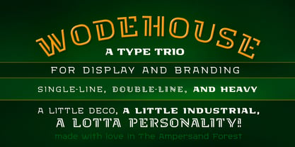
- Wodehouse by The Ampersand Forest,
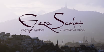
$20.00If you create a lot of designs for display, then you know how invaluable a good, solid, geometric face is. Wodehouse is here to deliver. It has both a vintage, between-the-wars look and feel and a geometry with superelliptical rounds that embrace later, more modular designs. It's a little Deco, a little Moderne, a little Industrial and a lotta personality. Wodehouse has style. Wodehouse stands out. Right ho, Woodhouse! - Geza Script by Mans Greback,
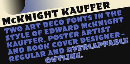
$59.00Geza Script is a wild, calligraphic typeface. It has a foreign look that is hard to put a name on, it could be seen as Eastern inspired or as a forgotten script from the European 1500's. Use Geza Script in a urbane logo or graphic project you want to emit confidence. The font is created by Måns Grebäck and contains an alternate alphabet, ligatures and support for hundreds of languages. - McKnight Kauffer by K-Type,
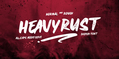
$20.00McKnight Kauffer is a casual sans derived from poster and book cover lettering by the American designer, Edward McKnight Kauffer, who mainly worked in England through the 1920s and 1930s. The style owes much to Louis Oppenheim's Fanfare of 1927, but without the Germanic blackletter inflection. The two display fonts, regular and outline, have a playful art deco feel, and share spacing and kerning so can be overlapped for bicolor effects. - Heavyrust by Invasi Studio,
$12.00Heavyrust is All Aggressive with Brush style font special for your Display Design, which puts a bold on your projects and will inspire you to create something strong and aggressive. Heavyrust will help you to create special and touching typographical designs for bold or strong projects, It is perfect for headings, flyers, greeting cards, product packaging, book cover, printed quotes, logotype, apparel design, album covers. Features: Multilanguage Ligatures Alternates Punctuation - Presidio by Woodside Graphics,
$19.95Presidio is a stylized version of the hand-lettered calligraphy typical of the Mission era of early California. This lettering was often unique to an individual hand, but the characters shared a common style, and had their roots in the Middle Ages when monks and scholars copied whole books one letter at a time. "Presidio" replicates this style with subtle variations in each character, giving the font its authentic charm. - Shady Lady NF by Nick's Fonts,
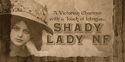
$10.00The 1907 Barnhart Brothers & Spindler type specimen catalog called this unique typeface simply "Umbra". Since that name is already taken, it now has another. Due to the highly ornate nature of this face, the font has a limited character set (all accented characters, but no math operators or fractions). The Opentype version of this font supports Unicode 1250 (Central European) languages, as well as Unicode 1252 (Latin) languages. - Nagaiya by Identitype Co,
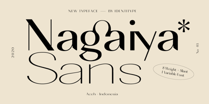
$25.00Designed by Aulia Rahman and Hendra Maulia, Nagaiya is a versatile companion, perfectly usable for a variety of applications. But especially the areas of branding and editorial design. There in particular, the typeface impresses with its look and feel, making the design pleasant and smooth. Take a look at the wonderful lowercase letter /a, or the spiky spurs of the other lowercase letters. That's where the fun begins. - Classic Horror by Mvmet,
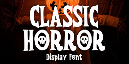
$12.00Classic Horror is a fun and comical horror display font inspired by vintage spooky cartoon. Not only can be used for Halloween theme needs, you can use it too for other things for daily needs. Use it on t-shirts and clothing, book designs, greeting cards, stickers, posters, banners, or anything that needs a fun touch. Try it to create fabulous designs and feel the fun and cool vibes with it! - Tied To A Stick by PizzaDude.dk,
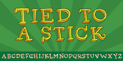
$20.00A serif font with shadow - done with a steady, but yet shaky hand. Make some catchy headlines with Tied To A Stick. Throw in some different colors for the stroke, the letters and the shadow and make it really look like something homemade! I would use this font for for my next handmade craft project - and I advice you to do the same! :) Comes with ligatures which substitutes double letters! - Olympian by Linotype,
$29.99After the Second World War, the Ionic style replaced Modern Face as the favored typeface for newsprint. A couple decades later, it was in turn replaced by the next generation of newspaper fonts, a mix of Old Face, Transitional and Modern Face forms. Olympian itself tends toward the Old Face style but is nevertheless an example of this new generation, a result of a time of change and experimentation. - Arto Condensed by S6 Foundry,
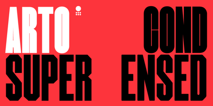
$29.00Arto is a unique super-condensed typeface, ideal for branding projects and editorials headlines. The super tight kerning give this family a distinctive retro feel. The full family is a go to font for making projects distinctive, allowing projects to stand out. Arto Condensed has an extended character set to support Central and Eastern European as well as Western European language. Also available a variable version of the font. - Corton by Greater Albion Typefounders,
$14.00Corton was inspired by the traditional lettering on a gravestone in an English village. While that might sound a rather solemn beginning, Corton has wonderfully lively air, with distinctive lively serifs and beautifully swashed downstrokes. Eight faces are offered: regular and titular each in three weights plus regular condensed. Between them they are ideal signage and display faces, merging 'olde-worlde' charm and fun character, but remaining clear and legible. - Makeba Retro Funky Groovy by Beast Designer,
$15.99Makeba Retro Funky Groovy Font is a fun and funky display font that brings back the spirit of the 70s. Its bold, rounded letters feature groovy curves and playful embellishments that exude a retro vibe. This font is perfect for creating eye-catching titles and headlines for posters, album covers, and other retro-inspired designs. The font’s energetic and upbeat personality is sure to make any project stand out. - The Rouged by Letterhend,
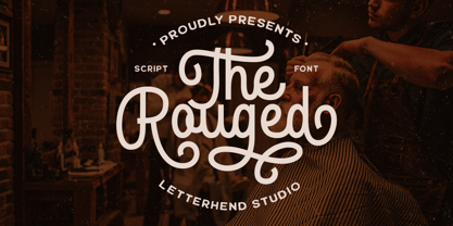
$19.00The Rouged is a display script. This typeface has bold monoline which make it looks stand out, and the unique swashes make you easy to create a nice logotype or cool lettering. This font perfectly made to be applied especially in logo, and the other various formal forms such as invitations, labels, logos, magazines, books, greeting / wedding cards, packaging, fashion, make up, stationery, novels, labels or any type of advertising purpose. - Botija by Tipo,
$69.00With a gentle, modulating effect and very neat from a formal point of view, Botija is ideal for medium sized texts: it is a font family with a unique style. Created initially as a reinterpretation of Bodoni, it maintains a sharp vertical axis and a medium level of contrast, suitable to function in smaller bodies and featuring subtle details which stand out in medium-sized bodies of text. - Overloaded by PizzaDude.dk,
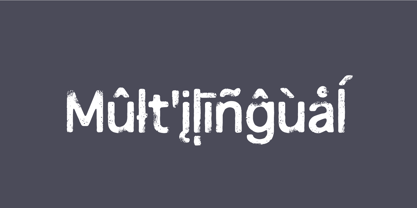
$19.00Overloaded is an excellent font for a wide variety of use - most likely something that needs a kind of worn look. Works well in both large and small sizes, that being headlines and/or display. Surprisingly versatile and will fit tons of different purposes. I put in 3 different versions of the lowercase letters for you to pick as you please, and play around with. Comes with multilingual support - Titanium by Ascender,
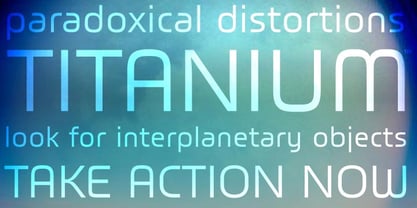
$29.99Titanium is a geek-ed out, über-technoid specimen of plasma-type. Designed by Steve Matteson, this typeface is the perfect display font for your star cruiser or the weekend interplanetary lander. Like its namesake, Titanium is the strongest design for its weight capable of withstanding the jump to lightspeed without paradoxical distortions. Titanium is now available for use on home world computing devices to capture the essence of galactic travels. - Porker by Ingrimayne Type,
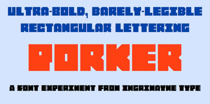
$6.95Porker was an experiment in making a barely readable but very simple and very bold typeface with no curves. It is caps only with some of the letters on the lower-case keys giving alternate versions. Include are three variants, a tall version, a striped version, and a randomized version. The striped version can be placed in a layer above the regular version to give two-colored letters. - De Arloy by Storictype,
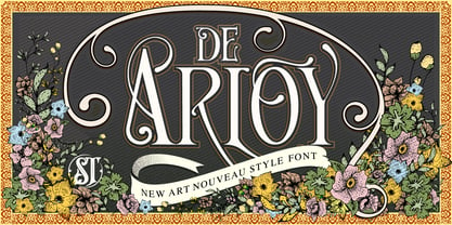
$16.00De Arloy Typeface was inspired by art nouveau style from 1890-1910 which combining classic typography with awesome features bring classic touch on this decade :), it works well with normal size text but it works even better for large displays or short words. this is suit for : wine packaging, labeling, logo, classic shop, coffee shop, movie title, etc De Arloy Features Uppercase Lowercase Numerals & Punctuations Open Type featuring Ligatures - Dahlia Darling by Sulthan Studio,
$12.00This beautiful handwritten font we made very attractive with a natural touch we worked back to clean smudges and into smooth lettering it's easy when you cut as well as print stickers and other cool work you're working on this font has 3 front swashes and 3 back swashes for lowercase and one alternative for uppercase, 98 ligature Fonts include uppercase and lowercase letters, punctuation numbers, and language support - Uno by Ahmet Altun,
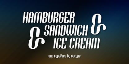
$24.00Uno font family comes in two weights and two styles. Generally, rounded fonts seem funny and pretty. This feature is valid for also Uno Font Family but although the characters of Uno Font Family are rounded, they seem masculine and serious. It is legible in small type sizes. With its decorative view, you can get matchless products in typographic works, t-shirt prints, posters, logos and every kind of graphic works. - SbB Powertrain by Sketchbook B,
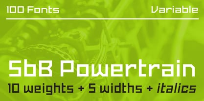
$9.00Bold and angular. SbB Powertrain's glyphs are constructed from simple shapes. All straight edges and lots of right angles, but surprisingly friendly. A wide range of weights and widths make Powertrain perfect for branding projects, posters, logos or any project where you need maximum flexibility. Ten weights and five widths Small caps Stylistic alternatives Opentype figure styles Complete version includes a variable typeface with three axes: weight, width and slant. - Ultra Pro by Stiggy & Sands,
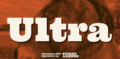
$29.00Our Ultra Pro is an ultra bold slab typeface with nods to wood type styles like Clarendon and Egyptian. Its powerful and dramatic letterforms are both serious in form but friendly in appearance yet it is still easily legible. Perfect for power headlines and titling for impact, the SmallCaps and extensive figure sets only work to further expand the usefulness of the typeface across a wider gamut of design options. - Sweet Gelatos by Abo Daniel,
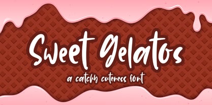
$13.00introducing SWEET GELATOS - a catchy cuteness font - SWEET GELATOS is natural handwritten font. It is great for branding, packaging, quotes, cards, banners, books, cutting, silhouettes, social media content, and anything about your project. This font is unique. The lowercase and uppercase match each other, so you can combine them as you want. Features: Uppercase Lowercase Number & punctuations Ligatures Multilingual PUA encoded I hope you love it. regards, Abo Daniel Studio - Dear Kimberly by Zamjump,
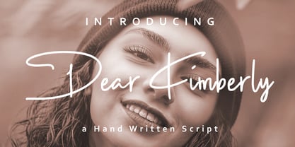
$15.00Introducing the Dear Kimberly it our beautiful handcrafted fonts – original handwritten styles carefully digitized using simple but highly effective methods. This font offers authentic charm and is versatile for a variety of projects, including logos, book covers, wedding invitations, business materials, quotes, and more. Enhance your designs with the charming appeal of our uniquely crafted handwritten fonts, designed to bring a touch of authenticity and elegance to any creative endeavor. - Rochaline by Lemon Studio Type,
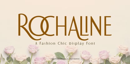
$15.00Rochaline a fashion chic display font. This font was inspired by and for fashion brands in the world. In general, it creates a luxurious and elegant look in design. Add this font to your favorite creative ideas and notice how it makes them stand out! Use this font for your fashion brand, resort, cosmetics, invitations, wedding, branding, packaging, magazines, boutique, social media, restaurant, spa, greeting cards, headers, headline, and many more... - Kinemon by Mightyfire,
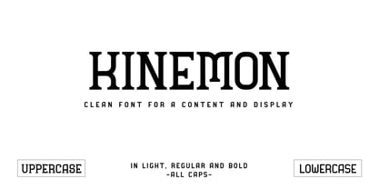
$10.00Kinemon is a font that has modern minimalist looks but still has an uniqueness on it. Look at the letters, each letter has their own characteristic. Firm, clean and modern. Kinemon perfectly use for a magazine, book, headline or even a poster. We have three styles that can cover your needs. We hope and be honored if Kinemon can be the part of your special moment. Thank you! :) - Hexagraph by Red One Graph,
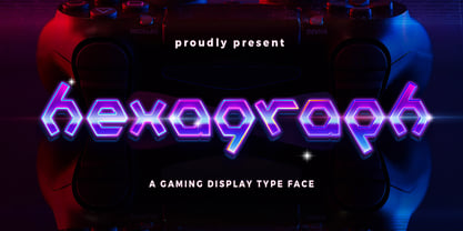
$12.00Thanks for checking out Hexagraph Font! This is my first font and type face in foundry world. Hexagraph inspired by geometrical form of hexagon shape, produces a series of letters that have a sci-fi - technological impression. This font is very unique in that it is entirely an extension of the hexagon shape. You can use this font for magazine cover, game support graphic elements, tech product advertisements, or whatever. - Neon LED V2 by Qaratype,
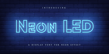
$16.00Neon LED V2 is a New Version of Neon LED Light font, It is a bold, chunky lettered and retro display font. Perfect for quotes, retro style design, logo, logotype, badges, packaging, branding, sign, craft needs, mockup, merchandise, and many more. Add this neon font to your creative ideas and notice how it makes them stand out! Main Features: Uppercase & Lowercase letters Punctuation and special characters Multilingual support OTF - Pontifica by Scriptorium,
$18.00Pontifica is based on ‘protogothic’ calligraphy, a style developed at the monastery of St. Gall in the 12th century to replace Carolingian minuscule with a more efficient and compact system of lettering. Ultimately it became the progenitor of the gothic lettering styles of the late Medieval period. Also available to go with this font is a special swash version with a very different style, but compatible overall appearance. - Antique Stencil Borders JNL by Jeff Levine,
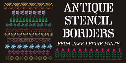
$29.00Antique Stencil Borders JNL collects twenty-six vintage border designs from various sources for complementing copy set in stencil lettering or in stand-alone decorative projects. NOTE: The purchase of this font does NOT include license to replicate the designs as commercial products for resale. To do so, a Derivative Products License must be obtained by contacting Jeff Levine. Contact information is found within the End User License Agreement.


