3,201 search results
(0.015 seconds)
- French Pastry JNL by Jeff Levine,
$29.00 A little ditty from France circa the 1940s called "J'ai Rêvé Dans Tes Bras" (which loosely translated means "I've Dreamed in Your Arms") offered up its title hand lettered in an interesting Art Deco sans. This formed the basis for French Pastry JNL, a tasty typographical tidbit further preserving the wide choice of lettering styles hand-crafted for popular sheet music of past decades.
 - FHA Eccentric French by The Fontry,
$25.00 The curves are vintage and the serifs are big. They're so big that for years I never had the courage to tackle this intimidating font. But when fellow signmaker Frank Smith laid the groundwork for this intriguing typeface by Frank H. Atkinson, I couldn't pass on the opportunity to take it from paper to keyboard. After all, at over 100 years old, I felt this alphabet had never been given a proper, digital treatment. So how did this face survive the last century? Well, for those who don't know the history, it survived in Atkinson's ubiquitous book, Sign Painting, published first in 1908, the generational standard for anyone interested in sign-related type design. The layouts and lettering treatments in this book have influenced countless designers for more than a hundred years, but most haunting to me was this strange face with the big serifs. Well, I'm haunted no more. The work is done, the kerning is complete, and nothing but a mouse-click separates a very old idea from the modern world. It's wide, it's big, and with those crazy serifs, it is definitely eccentric-!!!
 - MPI French Antique by mpressInteractive,
$5.00 French Antique was first shown in the specimen books of William H. Page & Company in 1869. The font is extremely tall and thin, with serifs taller than many character's widths. Lines are straight and clean with no fuss. French Antique can fit a lot of headline into a small space.
 - French Clarendon N2 by Intellecta Design,
$22.90 a revival of a classic wood type font...
 - Crushed Out Girl - Unknown license

- Heartache Teen Crush - Unknown license

- Brady Bunch Remastered - Unknown license

- Punch of Love by Sipanji21,
$15.00 Punch Of Love is a lovely display font that radiates charm. It features gorgeous hearts in each letter which give it an incredibly romantic feel. this font suitable for valentine day poster, logo, t shirt, event banner and etc. you can use this font for any design, apparel, kids logo, logo type, with many swash for make your design awesome.
 - Ranch Hand JNL by Jeff Levine,
$29.00 Ranch Hand JNL is a tall, condensed wood type with slab serifs. The font is somewhat bolder in weight than Nostrand JNL, but like its counterpart, fully captures the spirit and flavor of Nineteenth Century advertising, fliers and notices.
 - Stencil Punch JNL by Jeff Levine,
$29.00Stencil Punch JNL is modeled from lettering examples made by a Diagraph stencil cutting machine. Diagraph was the first company to make the stencil punch machines used in industry and by the military. Thanks to Neal Haynes for his kindness and assistance in providing me with sample cuts direct from the company's machine testing department. - Business Lunch JNL by Jeff Levine,
$29.00 Business Lunch JNL is an extra bold hairline serif font based on Monotype’s Falstaff, which in turn was greatly influenced by Bodoni Extra Bold. Great for posters, menu headers and other forms of headlining, Business Lunch JNL is available in both regular and oblique versions.
 - Club Lunch JNL by Jeff Levine,
$29.00 A 1930s-era hand-lettered sign advertising a club lunch (consisting of soup, salad, dessert and coffee for 35 cents) provided not only the Art Deco lettering style but the name for Club Lunch JNL.
 - Box Lunch JNL by Jeff Levine,
$29.00Just two capital letters from a sign inspired Box Lunch JNL from Jeff Levine. The restaurant - an early 1950s favorite in Miami Beach, Florida specialized in fried chicken meals and other delights of the day - long before the big corporate chains took over the local landscape. - Casual Lunch JNL by Jeff Levine,
$29.00Casual Lunch JNL is a friendly, relaxed typeface that's perfect for headlines where legibility is important, but formality is optional. - Punch Tape JNL by Jeff Levine,
$29.00 Punch Tape JNL emulates the old-style pin-punched paper tapes that were used in everything from ticker tapes to moving electronic signage to early digital typesetting equipment. Pin punch characters were also used in the early days of banking as a secure way of canceling a check so that it was rendered useless if re-submitted. In this version, the "dots" are square rather than round.
 - Ranch Land JNL by Jeff Levine,
$29.00 Ranch Land JNL is based on a classic French Clarendon wood type, many of which were popular in the 1800s and are now associated with either Western motifs or circus events.
 - IM FELL French Canon - Unknown license

- French Stencil Moderne JNL by Jeff Levine,
$29.00 French Stencil Moderne JNL is modeled from an alphabet found in the 1930s publication "100 Alphabets Publicitaires" by M. Moullet, and is available in both regular and oblique versions. Strongly resembling the stencil motif of Futura Black, this French stencil alphabet has enough variations to give it a unique design flavor all its own.
 - French Serif Moderne JNL by Jeff Levine,
$29.00French Serif Moderne JNL gives a slab serif treatment to the lettering comprising Jeff Levine's French Art Initials JNL. The font - containing a full character set - was inspired by a page from an early 20th Century French alphabet book posted online at an image sharing site. - French Slab Serif JNL by Jeff Levine,
$29.00 Another example of 1930s French Art Deco lettering from the 1934 publication L'Art du Tracé Rationnel de la Lettre (which roughly translates to “The Rational Path Art of the Letter”) resulted in the digital typeface French Slab Serif JNL. This bold and slightly eccentric slab serif design is available in both regular and oblique versions.
 - French Art Initials JNL by Jeff Levine,
$29.00The source for these hand-drawn initials was an early 20th Century French alphabet book whose pages were displayed online at an image sharing site. This style typifies the Art Nouveau period, and makes a wonderful paragraph starter or "drop cap" for your printed projects. Some users may still want to compose headlines with this font, but be aware there are no punctuation marks, accents or kerning - just the twenty-six initials. - French Shipping Stencil JNL by Jeff Levine,
$29.00 The hand punched lettering of an antique French shipping stencil was the inspiration for French Shipping Stencil JNL; available in both regular and oblique versions.
 - French Stencil Serif JNL by Jeff Levine,
$29.00 Spotted for sale online, a partial set of antique tin stencils from France had a distinctively handmade look about them. Many of the characters were inconsistently wider than others, some characters were missing and one was damaged. Despite the obvious flaws, the image of these stencils served as the model for a digital font revival once the characters took on a more uniform appearance. French Stencil Serif JNL is available in both regular and oblique versions.
 - French Stencil Sans JNL by Jeff Levine,
$29.00 French Stencil Sans JNL is another typeface based on vintage French tin/zinc stencils. Slightly rounded corners and a "hand-cut" look add an interesting and charming variation that breaks away from the "standard" design of other metal stencil sets.
 - 1920 French Script Pro by GLC,
$42.00 This font was inspired by one of a standard French manual styles in use from the beginning of 1900s to the end of World War II, when people were writing most often with pen holders and metal nibs. This typeface is easily legible as it was used for the lithographic printing of university textbooks. All lower cases from a to z and numerals from 0 to 9 are doubled by a slightly different one to allow a varying manual aspect in texts. We have added a lot of diacritic characters, covering West (including Celtic) and North European, Icelandic, Baltic, Eastern European and Turkish language. A few special glyphs allows to make final loops or underlining.
 - 5 Finger Death Punch - 100% free

- Ecolier - Unknown license

- Georges - Personal use only

- PocketWrench by Deniart Systems,
$20.00 Make a bold statement with this modern, angular design - go wild and use it together with it's partner font, PolkaDot Wrench. This typeface features over 90 extended characters for setting European languages such as Czech, Danish, Dutch, Esperanto, Finnish, French, German, Italian, Hungarian, Polish, Portuguese, Romanian, Spanish, Swedish, Turkish & Welsh.
 - Mireille by TypeThis!Studio,
$54.00Mireille is a typographic homage to french culture. Your journey through gourmet food, classical music, opera and wine tours over 100 romantic alternates and ligatures that allow you to add outstanding elegance to your typography. Take care: you might have a crush on this typeface – La vie, c’est beau! www.typethis.studio - Rougon by VanderKeur,
$30.00 The reason for Nicolien van der Keur to design the Rougon font was the translation of twenty novels written by Emile Zola, a French writer, and translated by Martine Delfos. It follows the lives of the members of the two titular branches of a fictional family living during the Second French Empire (1852–1870) and is one of the most prominent works of the French naturalism literary movement. This series deserved a font with French roots and corresponded to the period in which Zola’s books were written and published, the period between 1870 and 1893, the end of the nineteenth century. Extensive research into French historical typefaces has led to a type specimen from the French type foundry Deberny et Cie in Paris around 1907. It turned out to be good and helpful source as it contained a sample of a typeface that reflected the content and style of the novels, but also represented the period in which the books were written in France. A large part of the novels are about the generations of Rougon, so it seemed a natural choice to give the font that name. It is available in one weight and contains stylized portraits of Emile Zola and the French Marianne. This font also contains various ornaments.
 - XXII Daemon by Doubletwo Studios,
$25.99 The Daemon is the cheap alternative for you to easy create a logo for your band or whatever. It comes with a basic characterset and a little bunch of symbols and signs often used in the extreme music sector – classical stuff from Death- and Blackmetal like pentagrams and crosses, drips, roots and branches.
 - Diet Riot by PizzaDude.dk,
$15.00A crunchy comic font, suitable for both small and large typing. At small sizes the font appears as a "simple" handwriting font, but at larger points the crunchiness appears! - Buddy Tequila by PizzaDude.dk,
$15.00A crunchy tag font. - Astro by Just My Type,
$20.00 When Sputnik launched in 1957, the world was launched into the Space Age, baby! It was rockets and soda shops, souped-up jalopies and Fairlane convertibles with radios blaring. Rock and Roll. American Bandstand and the Race to Space. Astro aims to call back those exciting days with a look that might have graced the sign of your local drive-in or donut shop. The uppercase characters look like they could fly, suggesting spacecraft, UFOs. Use it for Retro future events or business branding. It also seems to work exceptionally well, strangely, with French, Icelandic, Japanese and African names and anything to do with fish.
 - Filmgoer by Bogstav,
$17.00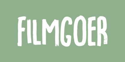 Crunchy brushstrokes and jumpy baseline.
 - Eventually by Bogstav,
$17.00 My crunchy version of my own handwriting!
 - Framboisier by Hanoded,
$15.00 Framboisier means ‘Rasberry Bush’ in French. Even though it’s early spring, I already spotted raspberries at the greengrocers, so I figured a nice raspberry-related name would suit this font just fine. Framboisier is a hand painted script font. It’s a little messy, a little shaky, but legible and cute as well. Comes with all the diacritics and a whole bunch of alternate glyphs.
 - VLNL Wurst by VetteLetters,
$35.00 VLNL Wurst started as a final result in the Typographic Chinese Whispers project for Typeradio.org, in collaboration with the Type & Media master course. A soundtrack of festive Bavarian music accompanied by burping, followed by loud crunching and munching, inspired Alexandre Saumier Demers to create this typeface family. The fraktur letter forms were composed with sausages to form a recipe available in three flavours: Brat, Blut and Bier Wurst. This 'charcuterie typographique' is ideal for an established butcher shop, a local grocery store or a casual BBQ with friends. Wurst is so tasty, you can't get enough of it! A "Wurst Schreiber" script was developed to automatically draw the sausages around the skeleton.
 - Direkteur by Bogstav,
$16.00 A legible and very functional comic book font, with a slightly crunchy edge.


