10,000 search results
(0.046 seconds)
- Rara by Jiaone,
$9.00 Rara is a display font that has a free and energetic expressive character. Rara has a letter shape similar to brushes but solid, this font is suitable for use as a medium that complements passive objects
 - Arnarn by Designsuh,
$12.00 The sight refracted through glass is mysterious. The san serif font was designed to look like it is visible through glass. Try using beautiful fonts. I put a lot of effort into each and every letter.
 - Nouveau Spur JNL by Jeff Levine,
$29.00 The condensed, spur serif hand lettering for the title on the 1906 sheet music cover of “Gee! But this is a Lonesome Town” inspired Nouveau Spur JNL; which is available in both regular and oblique versions.
 - Head Strung by PizzaDude.dk,
$17.00 The Head Strung font is designed with a simple and basic serif structure, but has its oddities and curly lines. It comes with 4 different versions of each letter, and these automatically cycle as you type.
 - Olivera by Artisan Studio,
$15.00 Olivera has Stylistic standard, Stylistic Initial, Stylistic Teminal and ligatures and includes uppercase and lowercase letters, numbers and punctuation marks. Multilingual Support OpenType smart programs such as Adobe Photo Shop, Adobe Illustrator, Adobe Indesign, Corel Draw and Microsoft Office. A total of 462 Glyphs: Ligatures: Ju Ct ff Cl all gh of ck tt ut nt ak ll pp il rt it ot st at rr om mm ar ss as or ox ow on tt ut ut Ct st at ot rt it Cl Swashes access: A B C D E F G H I J K L M N O P Q R S T U V W X Y Z 7 alternative sets access: a b c d e f g h i j k l m n o p q r s t u v w x y z
 - Sassoon Infant by Sassoon-Williams,
$48.00 An upright typeface family developed to meet the demand for letters to produce pupil material for handwriting as well as for reading. Upright letters with extended ascenders and descenders are ideal on screen. They facilitate word recognition. The exit strokes link words together visually, and in handwriting they lead to spontaneous joins along the baseline leading logically to a joined-up hand. Teachers can print desk strips, charts of letter families and alphabet friezes, as well as consistent material across the curriculum. Together these typefaces provide a valuable resource for special needs teachers. When starting point and stroke direction has been learned, the arrow font (Tracker B) can be dropped and the simpler Tracker font used. Tracker B font, with its direction arrows helps pupils to start in the correct place. Motor movements can be refined by keeping inside the line. When starting and direction is no problem, the arrow can be dropped and the plain Tracker font used. When starting point and stroke direction have been learned, the arrow font (Dotted B) can be dropped and the simpler Dotted font used. Free to download resources How to access Stylistic Sets of alternative letters in these fonts Purchasers of this font package may use their Order Number to receive a free Copybook PDF by Rosemary Sassoon recommended for effective teaching
 - Woven by Ingrimayne Type,
$9.00 Woven is a geometrical typeface based on a simple tessellation or tiling pattern. The template for the letters has both vertical and horizontal symmetry and the tiling pattern has four-fold rotational symmetry. Variations of this pattern are popular with quilters and most have a woven look to them. To fit the letters into the template results in some distorted letters but it is the pattern that matters, not the individual elements of that pattern. With proper spacing, a block of text will fit together both horizontally and vertically. Woven is intended to be used with alternating letter sets and the OpenType feature of contextual alternatives does this automatically in applications that support it. The upper-case could be used alone but it unlikely that the lower-case characters could be used by themselves. The typeface is hard to read and would make a challenging font for word-search puzzles.
 - Ryo Display PlusN by Adobe,
$79.00Ryo is a Japanese kana typeface design composed of hiragana, katakana and some punctuation marks. Available in five weights--medium, semibold, bold, extra bold and heavy, Ryo Display has been specifically designed for use when setting copy in larger sizes, such as in headlines or posters. Supplied in the cross-platform OpenType format, this special kana font can be used to supplement or replace the existing kana designs in existing Japanese fonts that contain full character sets. Creative professionals using the Japanese version of Adobe InDesign may use that program's Composite Font tool to easily combine Ryo Display with other typefaces. - Gringo Dingbats by Volcano Type,
$19.00Gringo is a type family that contains 27 different varieties. It is divided into three groups: Sans, Slab, and Tuscan = Europe - Texas. Due to its consistant structure, the single groups can be mixed as you wish. Furthermore every variety comes in Light, Medium, and Bold. There are three widths, from Narrow to Wide. Additionally, there is also a Dingbats font. The concept of Gringo is a fusion and a merging of type cultures to cross borders and create something new. Gringo won 3rd place in the "tdc2 2006 award" by the Type Directors Club New York. - Gringo Slab by Volcano Type,
$29.00Gringo is a type family that contains 27 different varieties. It is divided into three groups: Sans, Slab, and Tuscan = Europe - Texas. Due to its consistant structure, the single groups can be mixed as you wish. Furthermore every variety comes in Light, Medium, and Bold. There are three widths, from Narrow to Wide. Additionally, there is also a Dingbats font. The concept of Gringo is a fusion and a merging of type cultures to cross borders and create something new. Gringo won 3rd place in the "tdc2 2006 award" by the Type Directors Club New York. - Gringo Sans by Volcano Type,
$29.00Gringo is a type family that contains 27 different varieties. It is divided into three groups: Sans, Slab, and Tuscan = Europe - Texas. Due to its consistant structure, the single groups can be mixed as you wish. Furthermore every variety comes in Light, Medium, and Bold. There are three widths, from Narrow to Wide. Additionally, there is also a Dingbats font. The concept of Gringo is a fusion and a merging of type cultures to cross borders and create something new. Gringo won 3rd place in the "tdc2 2006 award" by the Type Directors Club New York. - Gringo Tuscan by Volcano Type,
$29.00Gringo is a type family that contains 27 different varieties. It is divided into three groups: Sans, Slab, and Tuscan = Europe - Texas. Due to its consistant structure, the single groups can be mixed as you wish. Furthermore every variety comes in Light, Medium, and Bold. There are three widths, from Narrow to Wide. Additionally, there is also a Dingbats font. The concept of Gringo is a fusion and a merging of type cultures to cross borders and create something new. Gringo won 3rd place in the "tdc2 2006 award" by the Type Directors Club New York. - Prospera by Alphabets,
$17.95Prospera was designed without reference to existing roman faces. In its initial form, development was partially supported by a grant from the National Endowment for the Arts (Design Project Grant), as a design for use on 'low-res' digital output devices. Early releases had simplified detail in cross-bars and serifs, and hand-tuned bitmaps. As an original design, Prospera draws on principles of letterform developed during my studies of lettercarving (in Wales with Ieuan Rees) and Roman proportion. The design is idiosyncratic, perhaps more akin to Gill's Perpetua than to the monotonous corporate flavors so prevalent today. - Fantastic ML by HiH,
$12.00 Fantastic ML is an exuberant Art Nouveau font. It was originally released as “Modern Style” by Fonderie G. Peignot & Fils, Paris, France sometime before 1903. Since “Le style moderne” was the generic French name for Art Nouveau, it is possible that someone decided a less generic name was needed. The typeface became known as Fantastic. Compared to conventional text letters, it is just that. Fantastic has a whimsical, architectural feel. The typeface reminds me of a cross between Hoffmann’s Palais Stoclet in Brussels and Gaudi’s Sagrada Familia church in Barcelona. The letterforms themselves are similar to those by Ludwig von Zumbusch on the cover of “Jugend” in March, 1896, but with the addition of serifs. Fantastic ML is a decorative, all-cap font intended for display use and functions best at 18 points or larger. There are a total of 306 glyphs. In addition to the standard 1252 Western Europe Code Page with character slots up to decimal position 255, there are glyphs for the 1250 Central Europe, the 1252 Turkish and the 1257 Baltic Code Pages. However, some older applications may only be able to access the Western Europe character set (1252). The zip package includes two versions of the font at no extra charge. There is an OTF version which is in Open PS format and a TTF version which is in Open TT format. Use whichever works best for your applications.
 - Mivron by Aah Yes,
$4.95Mivron is a stand-out type of sans-serif block text especially suited for headlines and display work. There's a wide range of accented characters making this font appropriate for a wide variety of languages. The zip contains OTF and TTF versions - only install one version of a font on the same machine, either the OTF or TTF, but not both as that could cause various conflicts and erratic behaviour. - Speeding Bullet by Comicraft,
$19.00 Introducing... SPEEDING BULLET -- featuring SPEED TRAILS for increasing the, ah, speed of your bullets! Quick as The Flash, slicker than Quicksilver, the latest in our popular line of silver age display fonts could probably outrun a locomotive AND jump buildings in a single bound. It’s ASTOUNDING, it’s STARTLING, it’s ELECTRIFYING, PERAMBULATING, DISCOMBOBULATING and RETROFITTING. It really is Faster than a Speeding Bullet. Try it out for yourself. Under adult supervision, natch'.
 - Cybermoon by Sensatype Studio,
$15.00 Cybermoon is Futuristic Neon Font with Modern shape make your design look unique and stylish A new Display Font that we created special for Headline, Title and more stand out typography needs, with extra ligature that will add your variations. Font ready with: Any options to get creative variations Preview as a inspirations that you can do with this font Ready with Uppercase & Lowercase characters Wish you enjoy our font. :)
 - Discopia by Konstantine Studio,
$17.00 The invasion of futurism is begun. Came out prepared with our latest fonts collection, Discopia. Inspired by the visual of futuristic and techno-based design from the latest and upcoming trends. Perfectly fit for your gaming logo, branding, techno branding, digital assets, game design, UI, UX, synthwave, vaporwave, futuristic poster, contemporary typographic design, techwear apparel, vehicles design, prototype concept, anything you need a boost to the future, Discopia is here.
 - Koutura by Konstantine Studio,
$15.00 Everybody has their own message. Everybody's different, everybody wants to be remarkable. Eyes catch everything from first sight. Fashion is a statement. Elevate your persona higher, classier, with KOUTURA. A tailored high-fashioned font to put make-up on your visual works. Make your fashion branding, logo, poster, clothing, magazine, lookbook, mood board, boutique glam in a secs after you type out the words straight from your keyboard.
 - Al Crushider by Aluyeah Studio,
$90.00 Crushider Brush, inspired by the feeling when we see your crush, and you will see a lot of butterflies and your heart rate goes up. Crush + hider, mixed feelings that are addictive but you also want to get out of the situation. Very suitable for magazine, headline, website, ads, product package and all type of design project you have. Features: OpenType support Multilingual support (15 languages) PUA Encoded
 - Lovelope by Ridtype,
$10.00 Lovelope is a cute handwriten font sans serif style. This font is inspired by the expression of happiness from the activities carried out by a little girl in the expression of joy. So we created these fonts to get and feel what they feel. This font is perfect for stickers, printing, logos and other purposes. Thanks for your support of our product, and using it in your project.
 - Tough Dude by Celebrity Fontz,
$24.99The Tough Dude font is a confident, devil-may-care, tough-guy font with attitude that screams "I don't need no stinkin' penmanship." It conveys a self-assuredness that does not preoccupy itself with trying to be necessarily legible or easy on the eyes but rather pragmatic, fast-flowing, and interested in scribbling the message out fast and moving on to the next task. We're confident you will enjoy it. - Cubby Brush by Letterara,
$10.00 Cubby brush Font is a brush font with a natural flow to help you make designs that are fun and stand out. Features: - Uppercase - Numerals - Punctuations (OpenType Standard) - Accents (Multilingual characters) - Works on PC & Mac - Simple installations - Accessible in the Adobe Illustrator, Adobe Photoshop, Adobe InDesign, even works on Microsoft Word. don't wait anymore, put it in your shopping basket :) and follow me, because there will be many promos!
 - Taurunum Ferrum by Kostic,
$40.00 Taurunum Ferrum is a version of Taurunum family, made to feel like it’s been cast in iron or cut out of steel plates. It is meant to be used in a bold display setting where raw and strong look is a priority. The Iron style has an medieval (blackletter) flavour, while Steel has more of a contemporary look. Taurunum Ferrum has a character set to support Western and Central European languages.
 - Sunydate by RGB Studio,
$15.00 Sunydate is a beautiful handwriting font. Its casual charm makes it appear wonderfully down-to-earth, readable, and, ultimately, incredibly versatile. Sunydate will look outstanding in any context. Files Include : Basic Latin A-Z and a-z Numbers Symbols PUA Encode Multilanguage Support . Thanks and have a wonderful day, If you have any questions, please get in touch with us Don't forget to check out our other products.
 - Elsewhere by Comicraft,
$29.00 Someday, a long time from now, in a galaxy not so very far away, you'll find yourself Suddenly transported to the nether-realms of Elsewhere, bathed in the light of the mystic moons of Meanwhile... While you're waiting for that day, check out this font by John "JG" Roshell. It may not provide you with the same transcendental experience, but JG assures us that it really is the next best thing.
 - Quiche Sans by Adam Ladd,
$25.00 Quiche Sans is a high-contrast, sans serif with monoline stroke endings, angled stems, and geometric proportions. A sibling to the Quiche family, with the ball terminal endings removed. The design is influenced by the serif didone genre, characterized by its elegance and extreme thick/thins, but it removes the serifs for a unique and modern expression and tapers out the stroke endings for a sophisticated monoline appearance.
 - P22 Bauhaus by P22 Type Foundry,
$24.95 The P22 Bauhaus Set includes three type faces designed by Herbert Bayer, including the famous Universal font most commonly associated with the Bauhaus school. A collection of 72 graphic elements inspired by various Bauhaus works rounds out this collection. This set is authorized by the Herbert Bayer Estate. For more typefaces from the Bauhaus, see our Josef Albers set. © 2021 Artists Rights Society (ARS), New York / VG Bild-Kunst, Bonn
 - Frutiger Stones by Linotype,
$29.00In Adrian Frutiger, the discipline of a mathematically exact mind is joined with an unmistakable artistic sense. His independent work possesses the controllable language of letterforms. Personal and intensive, this work is the manifestation of his expressive will. Frutiger's precise sense of outline reveals itself two- or three-dimensionally in wood, stone, or bronze, on printing plates and in the form of reliefs. However, even his independent work can be understood as objectivized signs; in their symbolism, they are embedded in the fundamental questions of human existance. They might have developed in the spirit of playfulness, but their nature is always conceptual, directed towards a complex, yet harmonic, whole. Following function, form also necessarily follows the content of the language. The entire spiritual world becomes readable through letters. Essentially, Adrian Frutiger attempts to fathom the basic, central truth which defines our lives: change, growth, division - beginning and end. In a virtual synthesis, he seems to close the circle in which the world reflects itself in symbolic forms. Frutiger Stones is for Adrian Frutiger the example of his formal artistic sensibility par excellence. Searching for the fundamental elements in nature, he has discovered the pebble, rounded and polished over innumerable years by gently flowing water. And out of this, he has created his complete system, a ruralistic typeface of letters and symbols. It depicts animals and plants, as well as astrological and mythical signs. Because of its unique aura, Frutiger Stones is particularly well-suited to different purposes - in headlines and prominent pictograms, as symbol faces, illustrations, and more. - Ribjoint by Chank,
$39.95 Created by Chank in 1992, Ribjoint was Chank’s first attempt at creating a Egyptian, cursive font on the computer. Writing cursive with a pencil sure is easy, but getting all the letters to link up correctly in computerized font format is a bit tricky. Not the most graceful script in the world, but it works good enough for a BBQ pit.
 - Belgiano Serif by Skypia,
$15.00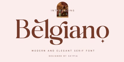 introducing our new "Belgiano" Modern Ligature with Elegant Style this is perfect for branding, logos, invitation, masterheads and more. Belgiano is also included full set of: uppercase and lowercase letters multilingual symbols numerals punctuation Alternates PUA Encoded Ligatures Wish you enjoy our font and if you have a question, don't hesitate to drop message & I'm happy to help :) Thank you, Skypia
 - Kids Rule by PizzaDude.dk,
$13.00 Sometimes you need a lot of text, and that text needs a little bit extra something. Something sweet for the eye, but still legible and not too funky. Maybe that's where Kids Rule comes in. It's a bouncy, but super-legible handmade comic font. It has a lot of attitude, and I have added 5 different versions of each letter!
 - PAG Auto by Prop-a-ganda,
$19.99Prop-a-ganda offers retro-flavored fonts inspired by lettering on retro propaganda posters, retro advertising posters, retro packages all the world over. This is perfect font for your retrospective project. PAG Auto is an ultra black font, but it is readable. A fat typefaces, but is is boorish. It is recommended for use as all kinds of display typography. - Vincente by Dharma Type,
$19.99 Vincente is a contemporary but Didone-look serif with condensed proportion. Inspired by vintage iron works and antique botanical pictorial book. Very simple and orthodox letter forms with some charming accent such as can be seen in "y". Sophisticated curves but they have human warmth as if they are hand-crafted. Consists of six weights and supporting almost all latin languages.
 - Zirkle by Ingrimayne Type,
$9.00 Zirkle is a monoline font in which the upper-case letters were designed from circles or bits of circles, with interior straight lines. It was the first font I designed in Fontographer when Fontographer was still in version 2 and the most advanced Macintosh was the Macintosh II. I have heard from people who like it, but it was designed not to meet some need but to play with the geometry of circle-based letters. ZirkStressed is a “squared” version that was the result of playing with a font distortion program, which in this case produced a result that seemed interesting.
 - Pikelet by Aah Yes,
$14.00Pikelet is a misprinted grunge font ideally suited to headlines, poster and display. As well as irregularities of printing in the actual letters, the ordinary versions contain "print errors" around some of the letters, whereas the Clean versions are identical but without those extra bits of overprint. The All Caps version has 2 sets of capitals which are different to the capitals in the Regular version (and to each other). And the jumbled versions have varying amounts of mis-alignment, but not variations in size. There's also an extensive selection of accented characters for both Western & Eastern European languages, and punctuation and fractions. - Godger by Craft Supply Co,
$20.00 Godger Condensed Sans Serif: Boldness Redefined Step into the bold world of Godger, where strength and simplicity converge. This bold, masculine font is a powerhouse, built for strong, memorable branding. Its condensed form is not only space-efficient but also packs a punch, perfect for headlines that demand attention. Masculine and Commanding Godger’s bold, condensed letters exude a sense of command, making it a go-to for titles needing a masculine touch. Each letter is crafted for high impact, ensuring your words aren’t just read, but felt. This font doesn’t whisper; it shouts with a clear, authoritative voice.
 - Sign Maker JNL by Jeff Levine,
$29.00In 1948, Joseph Struhl pioneered an innovative do-it-yourself sign kit for retail merchants. Die-cut letters and numbers made from flexible sheets of vinyl with the ability to adhere to smooth surfaces by static electricity; his "Magic Master Interchangeable Sign Kits" became a great success. Jeff Levine has paid tribute to this innovative method of in-store advertising with Sign Maker JNL. Because of their die-cut shapes, the design style of the static cling letters have unique characteristics. Companion fonts (based on other Struhl sign kits) are Cling Vinyl JNL and Cling Vinyl Clear JNL. - Secret Scrypt by Canada Type,
$29.95Emulating real handwriting has always been an aim of font designers in the digital age. The standard mainstream scripts and doodles that were available for the longest time have not successfully reached that goal. A letter always looked the same wherever you placed it. Some workarounds, such as letter alternates and ligatures, were used in many fonts, but they were a bit inconvenient to use, and in some cases didn't work correctly because they had to be placed in separate fonts from the main character set. Not until now, with OpenType technology, have we been able to emulate real handwriting, by including multiple character sets in the same font and programming it for smart form changes through letter sequence counting. Secret Scrypt was the first Canada Type font to make it to the bestseller list in the summer of 2004. In early 2005 a New York restaurant chain picked Secret Scrypt to use on its menus and internal signage, but they wanted to look even more like real handwriting, where two or three instances of the same letter used in one word would automatically change and look different from each other. Using OpenType technology, Canada Type produced a Secret Scrypt Pro for that restaurant chain under the direction of Mucca Design in New York City. That initial version contained three different character sets in the same font, and some intelligent programming that determines the sequence of the letters and change their shapes accordingly. Now the retail version of Secret Scrypt Pro is available, with four character sets built into the font for even more variety on the real handwriting theme. Make sure to check out the Secret Scrypt Pro PDF in the MyFonts gallery for tips on using Secret Scrypt Pro. Secret Scrypt is perfect for menus, handwritten notes, theater programmes, charity organization posters, and any design that attempts to get close to people with the personal magic of real handwriting. - Schism One by Alias,
$55.00 Schism is a modulated sans-serif, originally developed from our Alias Didot typeface, as a serif-less version of the same design. It was expanded to three sub-families, with the thin stroke getting progressively heavier from Schism One to Schism Three. The different versions explore how this change in contrast between thick and thin strokes changes the character of the letterforms. The shape is maintained, but the emphasis shifts from rounded to angular, elegant to incised. Schism One has high contrast, and the same weight of thin stroke from Light to Black. Letter endings are at horizontal or vertical, giving a pinched, constricted shape for characters such as a, c, e and s. The h, m, n and u have a sharp connection between curve and vertical, and are high shouldered, giving a slightly square shape. The r and y have a thick stress at their horizontal endings, which makes them impactful and striking at bolder weights. Though derived from an elegant, classic form, Schism feels austere rather than flowery. It doesn’t have the flourishes of other modulated sans typefaces, its aesthetic more a kind of graphic-tinged utility. While in Schism Two and Three the thin stroke gets progressively heavier, the connections between vertical and curves — in a, b, n etc — remain cut to an incised point throughout. The effect is that Schism looks chiselled and textural across all weights. Forms maintain a clear, defined shape even in Bold and Black, and don’t have the bloated, wide and heavy appearance heavy weights can have. The change in the thickness of the thin stroke in different versions of the same weight of a typeface is called grading. This is often used when the types are to used in problematic print surfaces such as newsprint, or at small sizes — where thin strokes might bleed, and counters fill in and lose clarity, or detail might be lost or be too thin to register. The different gradings are incremental and can be quite subtle. In Schism it is extreme, and used as a design device, giving three connected but separate styles, from Sans-Didot to almost-Grotesk. The name Schism suggests the differences in shape and style in Schism One, Two and Three. Three styles with distinct differences, from the same start point.