10,000 search results
(0.063 seconds)
- NeedlePointSew-Plain - Unknown license

- OregonDry-Plain - Unknown license

- Pekin by HiH,
$15.00 Pekin is an unusual design with an oriental flavor. It was originally designed by Ernst Lauschke and released by The Great Western Type Foundry of Chicago as “Dormer,” which is similar to the French verb ‘to sleep,’ not exactly a marketing triumph. Barnhart Bros. And Spindler (independently-operated subsidiary of ATF since 1911) bought Great Western in 1918. According to McGrew, AMERICAN METAL TYPEFACES of the TWENTIETH CENTURY, BB&S renamed the typeface prior printing their 1925 specimen book — guess they wanted something just a tad more exciting. Quirky, distinctive and fun. Pekin ML represents a major extension of the original release, with the following changes: 1. Added glyphs for the 1250 Central Europe, the 1252 Turkish and the 1257 Baltic Code Pages. Added glyphs to complete standard 1252 Western Europe Code Page. Special glyphs relocated and assigned Unicode codepoints, some in Private Use area. Total of 415 glyphs (compared to 218 glyphs in the original release). 2. 652 Kerning Pairs. Note: Ag, Aj and gj will cross unless kerned. Alternative A may also be used. 3. Added OpenType GSUB layout features: onum, salt, liga, dlig, hist, ornm and kern. 4. Revised vertical metrics for improved cross-platform line spacing. 5. Refined various glyph outlines, based on improved scans. 6. Added set of Tabular Numbers at cap height, based on original design; added Old-Style Numbers based on default design. 7. Added a bunch of alternative characters: 18 upper case letters, 10 lower case letters, 1 ampersand and 1 bullet. The alternate c is actually the original design, but I don't like it - easily confused with e. Alt E H M h m n r t are from the original design. I added the rest. 8. 7 Ligatures, 4 Ornaments, 18 Geometric Shapes, 6 Arrows and 12 Misc. Symbols. The zip package includes two versions of the font at no extra charge. There is an OTF version which is in Open PS (Post Script Type 1) format and a TTF version which is in Open TT (True Type)format. Use whichever works best for your applications.
 - Valiety by Din Studio,
$25.00 Valiety is a serif font family to better charm your designing experiences. It consists of eight different levels to add elegant, modern touches to your designs. Valiety has a continuity aspect produced from each small stroke in order to help the eyes smoothly move from one letter to another. Besides, the thickness differences are unnoticeable so that it leaves stable, legible impressions. With such flexibility, you can use it in either bigger- or smaller-sized texts. Include 8 different weight fonts : Valiety Hairline Valiety Thin Valiety Extra Light Valiety Light Valiety Regular Valiety Medium Valiety Semi Bold Valiety Bold Features: Multilingual Supports PUA Encoded Numerals and Punctuation Valiety is best for any design projects, such as posters, banners, logos, book covers, invitations, quotes, headings, printed products, merchandise, social media, etc. Find out more ways to use this font by taking a look at the font preview. Thank you for purchasing our font and happy designing.
 - Geo Deco by Tipo Pèpel,
$28.00 Geodeco font family brings to you the recovery of the typographic forms from the beginning of the 20th century, with a strong ArtDecó flavour but from a new point of view: modernity and geometry. Modernity in the visual contrast between lowercase and capital letters, where rounded shapes are opposed to the breaks and graphic tensions of the strokes of the capital letters. which gives it an enormous originality. Generous doses of internal whites, assure a powerful legibility even with the spite of its short ascending and descending strokes. What we get is a coherent and martial look where fluidity and homogeneity is the main note. Soft and rounded minuscule, with large internal whites for super legibility, bombproof, especially on screens, where Geodeco lives with an astonishing naturalness. The capital letters, used alone as display, or as companions of the minuscule characters, give the family a touch of originality and exotic flavor. Like the spices in the food; a brief but intense note. Breaking the rectangular shapes so that the appearance of the letter comes out benefits from enlarging the internal whites and making them consistent with the white of the lower case. GeoDeco works very well in plain text with the obvious limitation that it is not a type for small bodies, but exceptionality weldon for plain text and signage. Maximum visibility, total beauty on screens. A family of this new century with the flavour of that epoch of experimentation that were the years 20. Extensive multilanguage support and almost all Opentype functionalities. Try it and it will convince you - for sure!
 - Guillermo by Homelessfonts,
$49.00 Homelessfonts is an initiative by the Arrels foundation to support, raise awareness and bring some dignity to the life of homeless people in Barcelona Spain. Each of the fonts was carefully digitized from the handwriting of different homeless people who agreed to participate in this initiative. Please Note: these fonts include only the latin alphabet; no accented characters, no numbers or punctuation. MyFonts is pleased to donate all revenue from the sales of Homelessfonts to the Arrels foundation in support of their mission to provide the homeless people in Barcelona with a path to independence with accommodations, food, social and health care. Guillermo was born in Argentina. And after crossing four continents and travelling in more than twenty countries, he still has his accent. His luck ran out on the streets of Barcelona. But despite his circumstances, he hasn’t lost a bit of his wit or articulacy. “The worst thing about the street is something that touches your heart, your brain. Not being able to have sex, not having any privacy until it leaves you empty.” On the street he follows his passion for art and writing as best he can, using old cardboard when he can’t find paper and listening to the music that comes to him. His way of thinking and expressing himself leaves people wide-eyed and open-mouthed, but even so he admits he’s a solitary man. “Solitude is an individual word. A solitary type like me can’t bring the word solitude to the whole world.”
 - Sleepy Bear by Missy Meyer,
$12.00 I've been learning to read Cyrillic and Greek letters lately, mainly because I've been playing the game GeoGuessr. (If you haven't played it, I highly recommend! It plops you down somewhere in the world in Google Street View, and you have to figure out where you are.) Cyrillic shows up in so many more places than Russia! You can see it in Bulgaria, Mongolia, Serbia, Montenegro, Kyrgyzstan, and more. Because of that, I made sure to include a fun double-uppercase version of those alphabet sets in Sleepy Bear. They're styled the same way as the Latin characters: all uppercase height, with some lowercase-styled letters thrown in at that same height for a fun look for all ages. I've also made two weights of Sleepy Bear: a plump and smooth regular weight, and a lighter weight that's built to stack on top of the regular (though you can use it on its own). Just type out a word in Sleepy Bear, copy it, and then change the copy to Sleepy Bear Light. You'll get a great outline look in seconds! All characters are extensively cleaned up, with smooth curves and rounded ends. Sleepy Bear is great for all print projects, and also cuts out of all materials like a dream. It's a cute and quirky monoline font family that's great for all of your family's designs. Each font contains over 850 glyphs, and includes: - Latin and extended Latin characters to support over 100 languages; - Cyrillic and Greek double-uppercase alphabet sets; - 18 fractions; - Punctuation galore; - 38 double-letter ligatures for variety (including international pairs like KK and II); - And a half-dozen alternates for even more variety!
 - Kendrick by Monotype,
$15.99 A heavy-set but lively font, Kendrick’s dense strokes were hand-painted using a thick wet brush. This all-caps set of letters is bold but brushy, textured and expressive; fun but very much meaning business. Kendrick is streetwise and no-nonsense, but with a big cheesy grin to boot.
 - Circulo by MMD Fonts,
$6.29 Bound to rules, unbound in the usage. Hyper geometric, and minimal contrast. Circulo V1 is based on a font project I originally started because of a client I had. I wanted to create a display and text font for their product design brand, which is all about reducing the amount of necessary materials and production steps. Before I started the course at tipo-g it was called -“REDUCE“ and was more or less finished. The concept was based on the name. How far can letter shapes be reduced to their core geometric concepts and still be identified as letters? But in a way, it lacked a unique approach and was just a generic geometric Sans Serif with a lack of finesse. There was already a glimpse of characteristics visible which would later define Circulo V1. The high focus on geometric shapes was not of the same severity, and the angle on the stems was less intense. Those, as I call them, fake serifs turned out to be a significant factor in legibility and the characteristic of the font. Besides those changes and improvements, I decided to implicate a new feature to the concept, a condensed style. I quickly realised that it is impossible to keep my perfect circles and half-circles in this style without breaking my rules for the font. This „problem“ turned out to be the most crucial feature of the condensed set. Circular-based Letters will ignore the rules and boundaries of the condensed style and stay as they are. This feature allows the user to create a unique rhythm in their texts, and if you use the variable font, you can decide how intense this rhythm will be. In this situation, the user can choose which letters are allowed to keep their shapes and which will be put in their condensed corset. All, some or none of them, you decide.
 - Jobseeker JNL by Jeff Levine,
$29.00 At one time or another, everyone has filled out a job application. Jobseeker JNL emulates a hand-printed alphabet and numerals as one would find on such forms, but it is also useful for any project where a simple handwritten block print is needed.
 - Goodie Bag by Hanoded,
$15.00 The correct spelling, apparently, is Goody Bag. But I like it with an ‘ie’ ending. Goodie bag is a 4 member display font family. Use it for your book designs, magazines or websites - maybe even for the goodie bag you want to hand out!
 - Rookie JNL by Jeff Levine,
$29.00 Rookie JNL is derived from the lettering style found in Directory Board JNL, but with serifs added.
 - Night Scream by Ditatype,
$29.00 Night Scream is a spine-chilling display font that brings a horrifying twist to your designs. With its big letters and bold weight, this font commands attention and instills fear. The details of the letters are carefully crafted to resemble menacing plant roots, adding a nightmarish and eerie touch to the font. Each letter in this font is bold and impactful, demanding to be noticed. The large size of the letters adds to the font's imposing presence. The root-like details in Night Scream give the font an organic and otherworldly appearance, reminiscent of sinister, twisted plant life. These details add an element of the unknown and create an atmosphere of dread, immersing the viewer into a world of dark and chilling horrors. For the best legibility you can use this font in the bigger text sizes. Enjoy the available features here. Features: Multilingual Supports PUA Encoded Numerals and Punctuations Night Scream fits in headlines, logos, movie posters, flyers, invitations, branding materials, print media, editorial layouts, headers, and any project that requires a terrifying touch. Find out more ways to use this font by taking a look at the font preview. Thanks for purchasing our fonts. Hopefully, you have a great time using our font. Feel free to contact us anytime for further information or when you have trouble with the font. Thanks a lot and happy designing.
 - Scary Notes by Ditatype,
$29.00 Scary Notes is a spine-chilling display font designed to evoke fear and horror. With its big letters and bold weight, this font demands attention and is sure to send shivers down your spine. The details of the letters are meticulously crafted to resemble brush strokes, adding an unsettling and handcrafted touch to the font. Each letter in Scary Notes is bold and commanding, creating an impactful presence that cannot be ignored. The big size of the letters adds to the font's intensity. The brush details in this font give the font an organic and chaotic appearance, reminiscent of chilling hand-painted writings. These details add a sense of unpredictability and terror, immersing the viewer into the world of horror and fear. For the best legibility you can use this font in the bigger text sizes. Enjoy the available features here. Features: Multilingual Supports PUA Encoded Numerals and Punctuations Scary Notes fits in headlines, logos, movie posters, flyers, invitations, branding materials, print media, editorial layouts, headers, and any project that requires a terrifying touch. Find out more ways to use this font by taking a look at the font preview. Thanks for purchasing our fonts. Hopefully, you have a great time using our font. Feel free to contact us anytime for further information or when you have trouble with the font. Thanks a lot and happy designing.
 - Featherful by Ditatype,
$29.00 Introducing Featherful, a handwritten brush font that embraces the bold and vibrant strokes of a paintbrush. With Featherful, you have a handwritten brush font that speaks the language of artistry. The characters in Featherful boast generous proportions, ensuring a visually striking impact in any design. The thick weight enhances the font's presence, making it suitable for various creative applications. What sets Featherful apart is its rounded letter shapes, creating a friendly and approachable vibe. The details within each letter mimic the expressive strokes of a paintbrush, adding an authentic and artistic touch. Enjoy the features here. Features: Ligatures Stylistic Sets Multilingual Supports PUA Encoded Numerals and Punctuations Featherful fits in headlines, logos, posters, flyers, branding materials, greeting cards, print media, editorial layouts, and many more designs. Find out more ways to use this font by taking a look at the font preview. Thanks for purchasing our fonts. Hopefully, you have a great time using our font. Feel free to contact us anytime for further information or when you have trouble with the font. Thanks a lot and happy designing.
 - Afrobeat Light by Resistenza,
$39.00 Inspiration The pounding tribal rhythms of Afrobeat music is expressed through this psychedelic brand new font, Afrobeat. Every letter becomes art as every letter is elegantly placed side by side, like music notes, creating music for the eyes. Afrobeat is a musical style performed by many African artists such as Fela Kuti, Femi Kuti, Antibalas and many more, which is a fusion of jazz,funk, and psychedelic rock, originating from the 60s and was based on the political movements of Nigeria. The Font This font is perfect for when you want to use eye-catching big texts for anything from posters and flyers for concerts, events, parties, to CD covers, advertisements, and art, but it´s especially striking for printed projects. Afrobeat Light thinks green Think green. With Afrobeat light you save up to more than 35% of your ink toner. Being green in no longer a luxury, but an an essential. By using Afrobeat light you openly demonstrate that your company integrates the 3 Ps into its operations: People, Planet. Profit. Go ahead - be green! Check out also the original ‘Afrobeat’
 - Epilepsja Round by Mikołaj Grabowski,
$29.00 Here I present Round - a type family that is derived form Epilepsja, which was my first alphabet commercially out. After its release I came to think that there should be other fonts of this design that would enrich the variety of choice. Here comes ‘Epilepsja Round’ which is soft and friendly while the Regular family remains firm and sharp. It supports all Latin-based European and African languages and acts as a multicolour layered font. best for headlines, titles and other display uses.. It is an all-caps alphabet of stencil-sprayed and painted letters found in the city space. The glyphs are simple but unordinary. Every letter has something from Escher-like 3D illusion, but is flat simultaneously. Epilepsja Round consists of three styles: Outline, Solid and Fill. Outline is the base from which the other two styles are created. When you mix Solid with Fill, you can create two-color Outline style. You can even mix it with not-Round Epilepsja! Solid is neat and legible in small sizes. Use it for posters, headlines, magazines, websites or anything you like.
 - East Gates by Nathatype,
$29.00 East Gates is a mesmerizing display font that commands attention. Each letter is a work of art, meticulously crafted to elevate the overall appearance with a perfect blend of visible contrast and intricate details. The characters in East Gates boast a generous size, ensuring a bold and impactful presence. The visible contrast between thick and thin strokes adds a dynamic quality to the font, creating a sense of both strength and delicacy. What sets East Gates apart is the enchanting ornamentation gracing the letters, enhancing the overall beauty with a touch of intricate design. Enjoy the features here. Features: Multilingual Supports PUA Encoded Numerals and Punctuations East Gates fits in headlines, logos, posters, flyers, branding materials, greeting cards, print media, editorial layouts, and many more designs. Find out more ways to use this font by taking a look at the font preview. Thanks for purchasing our fonts. Hopefully, you have a great time using our font. Feel free to contact us anytime for further information or when you have trouble with the font. Thanks a lot and happy designing.
 - Nippon Note by Hanoded,
$15.00 I just returned from a short holiday in Japan. I stayed in hostels and small guesthouses and noticed a peculiar thing they all had in common: they love little notes, telling you where to go, what to do, how to use the microwave oven and when to check out. These notes were sometimes printed, but more often they were handwritten. I found that the Japanese way of writing roman characters is a little, well, unusual. The letters are correct, but they have that typical ‘Japanese look’ - most notably the a and A the b, d and g, the p and P and the t and T. I can’t really tell you what makes them look different, maybe it’s the proportions, but I do know that a Nippon Note is highly recognisable. So, here is Nippon Note, a highly recognisable, handmade font. You don’t really have to be in Japan to use it, but it will give your designs that extra cachet. And don’t forget Nippon Note Kawaii - the cute doodle font which is free if you download the Nippon Note family! Comes with extensive language support, but unfortunately not Japanese…
 - WT Arthas by Wraith Types,
$50.00 Inspired by the « lettres bastardes », Arthas is a modern interpretation of ancient letterforms dating far back, before type even existed. It has been subtly adapted for better readability in 2020. The sharpness of the design creates an elegant contrast between old and new, ancient and futuristic, and will add an ominous, regal mood to your graphic design projects. This typeface is meant mostly for display use, but we can’t wait to receive a picture of someone using it for introductory text, at the start of a book…. Maybe that’s you? As all of our releases, it will be updated at time goes on. Those updates will always be free for people having already purchased the font(s).
 - Alt Gotisch by HiH,
$12.00 Alt-Gotisch Verzierte is a typeface of decorative initials that is Victorian in style and bears a close family resemblance to the many ornamental tuscans cut throughout the nineteenth century by British foundries. Instead of the bifurcated terminals of the archetypical tuscan (see Figgins Tuscan by HiH or Stereopticon by Dan X. Solo), these letters display what Nicolete Gray might call a “wedge and bite” design -- as if they started with the wedge serif of a latin form and someone came along and took a perfectly round bite out of the wedge. We need not dwell on the lack of teeth marks. The calligraphic curls and flourishes are often graceful, sometimes a bit contrived, but always complex. There is a busyness that marks the style of the period. If you ever see an old photograph of a well-appointed Victorian parlor, you will recognize that same quality of busyness. Overdone is a word that frequently comes to mind. Alt-Gotisch Verzierte means “adorned or decorated old gothic.” The typeface is attributed by Alexander Nesbitt to an unidentified German foundry of the nineteenth century (Decorative Alphabets and Initials, Dover, New York 1987, plate 92). The designer is unknown. Our font is supplied with a lower case that is similar to the upper case, but is 15% shorter and is simplified by the omission of the decorative vines. For the lower case, alternate letters A, E, & T; and ligatures LE, OT & LY have been supplied. In addition, a few small decorative vines were planted here and there for optional use. An accented upper case is not part of the original design and is not here supplied. This design is also seen under the name “Sentinel” -- as always, it is worthwhile to compare the completeness of the character set and the faithfulness of the rendering. We believe you will agree that we provide a balance of quality and value that is unmatched in the contemporary marketplace. Alt-Gotisch Einfach is a simplified version of Alt-Gotisch Verzierte. The vine-less lower case of the Verzierte font is the upper case in Einfach. For a lower case for Einfach, the letters were further simplified by stripping away the three-dimensional outline, down to the bare bones and bites, as it were. Einfach, in fact, means “simple” or “plain.” It is interesting to note that this bare bones & bite lower case bears (I have a special license to use two homonyms in the same sentence) a striking resemblance to the 15th & 16th century ornamental letters from Westminster Abbey shown in Plate 47 of Alexander Nesbitt’s Decorative Alphabets and Initials (Dover, New York 1987).
 - Neon LED V2 by Qaratype,
$16.00 Neon LED V2 is a New Version of Neon LED Light font, It is a bold, chunky lettered and retro display font. Perfect for quotes, retro style design, logo, logotype, badges, packaging, branding, sign, craft needs, mockup, merchandise, and many more. Add this neon font to your creative ideas and notice how it makes them stand out! Main Features: Uppercase & Lowercase letters Punctuation and special characters Multilingual support OTF
 - Quarry by A New Machine,
$19.00 Quarry is a beefy slab-serif display font. It is all hand drawn and will give your designs a unique handmade feel. Two complete sets of letter glyphs give a more natural random feel. Contextual alternates will switch out letters automatically in open type-friendly programs. Also included are a number of ligatures for an even greater feel of hand made-ness. Great for use on posters and in headline copy.
 - Quintana by Jonahfonts,
$35.00 Quintana is a font that reflects urgency. Suitable for logos and packaging statements. Invoking the Opentype / CONTEXTUAL variant produces the word terminals for all lower-case letterforms as well as diacritic letters. This can be done individually for each letter as well. (Check out the pdf in the Gallery section for details.) Quintana also contain alternative Swashes and OldStyle numerals. (Opentype-Variants may only be accessible via Opentype-aware applications.
 - Nouveau Riche JNL by Jeff Levine,
$29.00 Within the pages of an early-1900s instructional book on show card lettering was found a marvelous example of an alphabet that typifies the Art Nouveau movement of the era and served as the inspiration for Nouveau Riche JNL. Angular, artistic and reminiscent (in some ways) of ancient Greek lettering, this design has many unusual letterforms. Check out the interpretive K and R for the best examples of this art style.
 - Chorizo PB by Pink Broccoli,
$19.00 An offbeat typeface inspired by some of the wild lettering of comic creator Paul Coker, Jr. This typeface has that "Rankin/Bass" flavor and is tricked out with an extended language set and loads of characters in stylistic alternates & discretionary ligatures to randomize double letters and offer some interesting combinations for sets like La Li LL Lo, etc. Chorizo screams to be played with, and awaits to amuse you!
 - HT Espresso by Dharma Type,
$19.99 The biggest feature of HT Espresso is a mixture of straight line and curve.It is like a cup of espresso with a bite-sized piece of chocolate. You can connect all the letters with thin line and It would attract notice. Holiday Type Project offers retro hand drawing scripts. Inspired by retro script on shopfront lettering, wall paint advertisements in Italy around 1950s. Check out the script fonts from Holiday Type!
 - Adverse Stencil JNL by Jeff Levine,
$29.00If you're old enough to remember having a lettering stencil in school, then you might have tried to save all of the waste paper punched out of the letters and numbers; hoping to do something with them later on. Jeff Levine took his Tramp Steamer JNL stencil font and gave it the look of those waste paper pieces - lined up to form erratic characters with a personality all their own. - Hash And Beans JNL by Jeff Levine,
$29.00Sitting in a diner and looking upon a wall full of nostalgia, there hangs a picture of another older diner in some Northern city. The lettering from it's rooftop sign almost screams "Make a font out of this!"... so Jeff Levine did... "Hash and Beans JNL". - Admercia by Khoir,
$15.00 Admercia is a classic minimalist serif font with lots of variant on each letter, this font is perfect for your design needs like creating eye-catching logos and titles to stand out in any design project. Admercia Uppercase Lowercase 75+ Language 87 Alternates Thank you for seeing
 - Raspberry Script by Mans Greback,
$59.00 Raspberry Script is a tall and characteristic script typeface. It supports hundred of Latin languages, and has several ligatures to maximize the letters' flow. The font is designed and created by Noah Kinard and Måns Grebäck. Also check out its sister fonts: Blueberry Script and Strawberry Script.
 - Blueberry Script by Mans Greback,
$59.00 Blueberry Script is a bold and characteristic script typeface. It supports hundred of Latin languages, and has several ligatures to maximize the letters' flow. The font is designed and created by Noah Kinard and Måns Grebäck. Also check out its sister fonts: Raspberry Script and Strawberry Script.
 - Halloween Island by Letterara,
$12.00 Halloween Island is a unique and bold lettered decorative font. This font comes with cool extras. Add it to your creative Halloween-themed ideas and notice how it makes them stand out! This font is PUA encoded which means you can access all of the glyphs.
 - Love Bug by PizzaDude.dk,
$20.00Yet another one of those romantic looking fonts. The lowercase looks pretty ordinary, while the uppercase swings around with a mixture of tagging / grunge / comicscript and casual handwriting. It works out extremely well with letters and stuff!. For fun, try writing in uppercase only...looks swell!! - Strawberry Script by Mans Greback,
$59.00 Strawberry Script is a stylish and characteristic script typeface. It supports hundred of Latin languages, and has several ligatures to maximize the letters' flow. The font is designed and created by Noah Kinard and Måns Grebäck. Also check out its sister fonts: Raspberry Script and Blueberry Script.
 - Emitha by Supfonts,
$20.00 Meet my new font Emitha DUO! Emitha includes full set of lovely uppercase and lowercase letters, multilingual symbols, numerals, punctuation and ligatures. Also it includes: large set of Swashes and Strokes. This is so perfect for invitations, monograms etc Check out my blog: www.instagram.com/dmitriychirkov pinterest.com/dmitriychirkov7
 - KD Bombarda by Kassymkulov Design,
$9.95 KD Bombarda is a piano-key, stencil and display face that will make your projects stand out from the crowd by introducing some interesting letter shapes. Originally designed in 2013, it's now been edited to provide smoother curves with broader character and feature support including Cyrillic.
 - Alsace by 38-lineart,
$17.00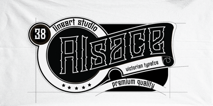 Alsace is a powerful blackletter font. It features a great look and feel and it is perfect for logos, tattoo designs, branding, stationery and much more! vintage styled and assertive display font. Thick lettered and distinct, this font will make each of your designs stand out
 - Malibu by Solotype,
$19.95If you like thematic fonts, this is for you. It appeared in an old lettering book (from the 1930s, if memory serves) and later came out as a film font for photolettering machines. We cleaned it up and drew the missing characters, and here it is. Enjoy. - Bluesman JNL by Jeff Levine,
$29.00 The classic blues album "I'm Jimmy Reed" released on the legendary Vee-Jay label out of Chicago featured title lettering in a bouncy, fun, casual take on the classic Latin Wide style of alphabet. Bluesman JNL offers a full digital typeface based on that album titling.

