10,000 search results
(0.054 seconds)
- Fox Cupid by Fox7,
$16.00 Fox Cupid is a cute and fun color display font. Fall in love with its authentic feel and use it to create gorgeous invitations, beautiful stationary art, eye-catching social media posts, and cute greeting cards. Add this beautiful font to each of your creative ideas, and notice how it makes them stand out. 🌺🌺 Please note that the Canva do not support color fonts! 🌺🌺
 - GFY Handwriting Fontpak #2 by Chank,
$99.00Explore a diverse range of 23 different handwriting styles with the new Go Font Yourself! Volume 2 Fontpak. This is a collection of 23 new, genuine handwriting fonts in OpenType format for Mac or PC. Fancy cursive or extrabold marker, stylish script or sassy scribbles; this fontpack is loaded a lot of personality. And if that's not enough handwriting styles for you, check out the original: GFY Handwriting Fontpak (Volume 1). - Smart Cookie by PizzaDude.dk,
$15.00 Smart Cookie is a happy and handmade font, ideal for packaging, posters or books (especially children's books!) It's highly legible and comes int 3 versions: Regular, Shine and Layer. Mix the Regular and Shine layer (using different colours) to make a cool shiny effect, or use the Shine version where the colours rely on the fore- and background colours...also a nice way of making your text stand out!
 - Valley by Illushvara,
$10.00 Valley is a lovely script font featuring charming, playful characters that seem to dance along the baseline. Add this font to your most creative ideas, and notice how it makes them stand out! Have a Regular & Italic style can be used various purposes such as magazine, logos, wedding invitations, headings, and so much more. If you have any question, don’t hesitate to contact me. Happy Designing !!! Thank You, Bayu Suwirya
 - Nanami by Thinkdust,
$10.00 A font inspired by the oriental flavours of Japan, Nanami a confident font with clear, clean lines which are well defined without being obtrusive. The distinctly sharp edges slice through empty space like Samurai swords, proudly wearing curves and corners like a Samurai wears their traditional ceremonial armour, and just as fierce. If Nanami isn't quite floating your boat why not check out its counterparts Nanami Rounded and Nanami Handmade.
 - Brushflow by Trim Studio,
$15.00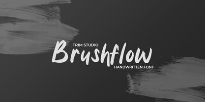 **Brushflow** font is a bold and simple handwritten brush font that is perfect for creating designs with a personal touch. The thick brush strokes of this font give it an impactful and commanding presence, making it perfect for titles, headlines, and other design elements that need to stand out. Thank you for let us be your design partner, If you have any questions please don't **hesitate** to drop me a message
 - Kymer Awon by Brenners Template,
$19.00 The Kymer Awon font family includes 5 weights and 20 styles. Whereas traditional Sans Serif typefaces show low contrast, this family has high contrast. And It brings out modern elegance through curved variations of glyphs with diagonal bars. Alternative fonts with Small Caps inherit the vertical stem width of the default capitals. These elegant and contemporary styles have an affinity to fit into any of your design work.
 - Faber Serif Pro by Ingo,
$42.00 Faber Serif is the Roman typeface which was born out of the sans serif design Faber Sans. The proportions are nearly identical to those of Faber Sans. In comparison, Faber Serif has heavy — although very short — serifs. The character of contrasting strokes is not very pronounced; therefore, this font is closely related to the first Roman typefaces from the 15th century. Faber Serif perfectly matches with Faber Sans!
 - Swifted by Sarid Ezra,
$15.00 Swifted is a modern and stylish typeface with unique details. This font works best in bigger sizes, useful for headlines, titles, or shorter texts. You can see the beautiful details in any characters that will make the font more fashionable. This font contains a bunch of essential ligatures that will make your presentation or logo even more stunning and stand out! Swifted also support Multi Language and already PUA Encoded!
 - Magnesia SF by S6 Foundry,
$24.00 Magnesia Sf is a modern, one-of-a-kind font that will make your designs stand out against the competition. This stylistic semi-block serif comes in 4 styles and has Multi-languages support and the display typeface has what you need for all sorts of projects! Perfectly suited for headlines, large-format prints, brand identities, social media, advertising, editorial design, posters, magazines, logos, headings, digital and more.
 - Pocket Serif by Letradora,
$18.00 Check out other members of the Pocket family: Pocket and Pocket Swash This hand drawn serif font is perfect for giving a fun touch to your projects. It combines a handmade look and rough texture with classic serif forms. It has support for most western and central European languages, and has alternates for most letterforms accessible through Opentype features, allowing for variations that make it look authentically hand-drawn.
 - Alpharain by Supfonts,
$18.00 Alpharain is a modern and at the same time absolutely incredible Serif with reverse contrast. A bright font will give the mood to your project Thanks so much for checking out my shop, and please get in touch if you have any questions! Alpharain Font Features: - Full Set of standard alphabet and punctuation - Handwritten ligatures - PUA Encoded - no special software needed to access extra characters - Multilingual Characters AÁĂÂÄÀĀĄÅÃÆBCĆČÇĊDÐĎĐEÉĚÊËĖÈĒĘẼFGĞĢĠḠHĦIIJÍÎÏİÌĪĮĨJKĶLĹĽĻŁMNŃŇŅÑ OÓÔÖÒŐŌØÕŒPÞQRŔŘŖSŚŠŞȘẞTŤŢȚUÚÛÜÙŰŪŲŮŨVWẂŴẄẀXYÝŶŸỲỸZŹŽŻ aáăâäàāąåãæbcćčçċdðďđeéěêëėèēęẽfgğģġḡhħiıíîïìijīįĩjȷkķlĺľļłmnńňņñoóôöòőōøõœpþ qrŕřŗsśšşșßtťţțuúûüùűūųůũvwẃŵẅẁxyýŷÿỳỹzźžż
 - Neckyn by Craft Supply Co,
$20.00 Introducing Neckyn - Quirky Sans Serif: A playful typeface that embraces individuality with its unique character. With its unconventional shapes and quirky charm, Neckyn adds a distinctive touch to any project, making a charming statement that stands out from the crowd. This typeface is ideal for greeting card, packaging, brand identity, poster, or any purpose to make your design project look eye catching and trendy. Feel free to play with this typeface!
 - Brandford by ahweproject,
$14.00 BRANDFORD is a simple sans serif font with ligatures and alternates. It was purposely crafted to be used in large point sizes, although it doesn’t lose its magic in small point sizes. It is perfectly suited for designing unique logos & brands, bold packaging, powerful website headers, and so much more! With tons of ligatures, alternates, and other features to choose from, you can make your project stand out from the rest.
 - Foda Egypt by Fo Da,
$20.00 Foda Egypt is a sans-serif font family comes with 6 main weights and their italics, with 599 glyphs that support many languages and cover many OTF features such as accents, ligatures, kerning and more … Foda Egypt is a stylish modern sans-serif suited for headlines, newspapers and many purposes thanks to the clean lines and sharp edges that render out so clearly on screens which increases legibility for all users.
 - Geotica by exljbris,
$16.50 The idea behind Geotica was to build a font out of -more or less- simple geometrical line elements. The open wire frame could then be left open or (partially) filled. Geotica comes in four different grades or line thicknesses (One, Two, Three and Four) so it's suitable for a broad use. Each grade has four styles and is loaded with swashes, final forms, lots of ligatures and ornaments.
 - Jackson Light by Supfonts,
$12.00 Jackson Light is a cute handwritten font perfect for headings, flyer, greeting cards, product packaging, book cover, printed quotes, logotype, apparel design, album covers, etc., or just adding a handwritten touch to any project! Font is an open type with clean shapes and precise kerning. It includes ligatures encoded by the PUA Language support: All European languages Don't forget to subscribe so you don't miss out on the new awesome fonts
 - LCT Ragnarök PE by LCT,
$29.90 The LCT Ragnarök is inspired by the cinematographic universe. Its thick and generous shape makes this typeface naturally stand out. In addition, its lines embody soft serifs thus adding elegance to it. This original font endows two styles; regular and slant. It is an asset for the creation of titles, logos or even generics. LCT Ragnarök encompasses a rich alphabet going from Latin PRO going to Greek , Polytonic Greek and Cyrillic.
 - VU Rock N Roll by VisualizeUnited Fonts,
$65.00 VU Rock nRoll is a block display typeface, that comes in English and Greek characters, numerals and a very basic set of marks. It was inspired by graffiti and custom made wooden type. Having a rough look, it feels appropriate for short messaging and titles since its design is dynamic. Posters, labels and tees would host beautiful designs, that can stand out! Choose your text and rock n roll!
 - Oh November by Supfonts,
$15.00 This new font was inspired by the game with different signature styles. I also added 102 ligatures to it. The result is a light and nice font that looks completely hand-drawn. Oh November will look beautiful on Christmas and holiday invitations, wedding invites and stationery, logos, and more. I love using it for emphasis words and pairing it with serifs Check out my blog: https://www.instagram.com/zloillev pinterest.com/dmitriychirkov7
 - Summer Dear Font Duo by Lucky Type,
$12.00 Let me introduce the latest beautiful combination of handwritten font Summer Dier Font Duo + Extras. The Summer Dier Font typeface is designed to make your next great project look more natural and stand out. The Summer Dier Font includes several Opentype Ligatures included to make the typeface look more natural and lastly, it has over 30 handcrafted additions to help your future designs look prettier. Thank you very much for viewing.
 - Bruniquel by Supfonts,
$10.00 Bruniquel is a quirky handwritten font perfect for headings, flyer, greeting cards, product packaging, book cover, printed quotes, logotype, apparel design, album covers, etc., or just adding a handwritten touch to any project! Font is an open type with clean shapes and precise kerning. It includes ligatures encoded by the PUA. Language support: All European languages Don't forget to subscribe so you don't miss out on the new awesome fonts Dima
 - Navila Mandres by madeDeduk,
$16.00 Navila Mandres is a realistic hand drawn font come with alternative and ligature and will be perfect for book, title branding, product packaging, invitation, quotes, label, poster, logo etc. Feature Uppercase & Lowercase Number & Symbol International Glyphs Multilingual support Alternative Ligature Thanks so much for checking out my shop and feel free to drop us a message any time and follow my shop for upcoming updates Hope you enjoy it.
 - Amiza by Azzam Ridhamalik,
$18.00 Introducing Amiza, a captivating and versatile font inspired by psychedelic and experimental typefaces. With its mesmerizing curves and intricate details, Amiza effortlessly combines elegance and audacity, making it the perfect choice for creating visually stunning compositions. Whether used for branding, editorial design, or eye-catching headlines, Amiza demands attention and leaves a lasting impression. Elevate your designs with the enigmatic allure of Amiza and stand out in today's competitive design landscape.
 - Gelegar by Locomotype,
$19.00 Introducing Gelegar, the extraordinary ultra-wide display sans serif font meticulously crafted for commanding visual and emotional impact. Gelegar offers three distinctive styles – expanded regular, rounded, and press – each exuding its own unique character to suit your creative vision. Whether you're designing posters, social media posts, headlines, titling, or large-format prints, Gelegar ensures you stand out from the crowd. Embrace the font that demands attention and amplifies your message.
 - CA Cula Superfat by Cape Arcona Type Foundry,
$40.00 CA Cula Superfat is a distinctive fatty typeface, mainly intended for display purposes. You will find out that it looks best in extremely large sizes, or in very small ones. Whatever you do, avoid the ordinary and expectable. It’s not only beautifully fat, it’s also useful. A central European character set, loads of ligatures, oldstyle and lining figures make it a versatile companion in the daily struggle for outstanding typography.
 - SK Primo by Shriftovik,
$16.00 SK Primo is a monumental geometric grotesque created to stand out. An unusual combination of smooth rounded contours and sharp square shapes creates a visual contrast that is noticeable. Carefully adjusted shape and attention to detail make this font a great help in the work of the designer. SK Primo is ideal for headlines, posters, banners, and text highlighting. Two styles, solid and outline, were developed to address all communication needs.
 - Magr by Locomotype,
$18.00 Magr is a modern and powerful sans font designed to elevate your sports team and athletic designs. With its sleek and dynamic appeal, Magr brings a professional touch to your projects, leaving a lasting impression. Unlock your creativity with Magr's six styles and twelve fonts, including both upright and italic options. Stand out from the crowd and make a bold statement with this versatile font that complements your sports-themed materials.
 - Edicia by Tour De Force,
$- Edicia is modern serif family with 5 weights and matching Italics. Distinctive and recognizable, Edicia stands out clearly with charming details. Characterized by asymmetric serifs, Edicia is designed with special care for ink-traps. Contains extended Latin and Cyrillic character set equipped with left & right side Borders, Localised Forms, Denominator & Numerator, OldStyle Figures, Tabular Figures, Tabular OldStyle Figures, Superscript, Subscript, Stylistic Alternates. Thin weight is available for free.
 - Sans Anger by Olivetype,
$18.00 Sans Anger is a stunning and authentic brush font with a natural feel. Get inspired by its whimsical style and turn any design project into a true stand-out. So what’s included: Sans Anger (OTF, TTF, and WOFF) Basic Latin A-Z, a-z, numbers, symbols, and punctuations Sans Anger is supporting Multi Languages: from Afrikaans Albanian Catalan Danish to Dutch English Spanish Swedish Zulu. Accented Characters : ÀÁÂÃÄÅÆÇÈÉÊËÌÍÎÏÑÒÓÔÕÖØŒŠÙÚÛÜŸÝŽàáâãäåæçèéêëìíîïñòóôõöøœšùúûüýÿžß Thank you
 - Spring Has Come by Stefani Letter,
$12.00 Spring has come is a stylish modern handwritten script. It has an unique, striking look which can be used to make any design stand out. Incredibly versatile, this font fits a wide pool of designs, elevating them to the highest levels. Add this font to your favorite creative ideas and notice how it makes them come alive! This font is PUA encoded which means you can access all of the glyphs.
 - Facegraph by hiroki kanda,
$14.00 If you are looking for a more individual typeface, This font is the best choice. This font is a very useful typeface for situations where you want to be a little playful, products for children, brands that want to give a soft impression, and those that want to stand out on social media posts. I'm sure that just using this typeface will create a graphic with a fun atmosphere.
 - Erotique by Zetafonts,
$39.00 Designed by Cosimo Lorenzo Pancini and Mariachiara Fantini with the help of Solenn Bordeau, Erotique is an evolution of the original design by Zetafonts for Lovelace, that challenges its romantic curves with the glitchy and fluid aesthetic of trans-modern neo-brutalist typography. The seductive "evil serif" look of the Pheimester-like Oldstyle letter shapes is made edgier by the quirky connections and unexpected calligraphic twirls that marry digital distortions to traditional penmanship. Sensuous but sharp, Erotique speaks the language of teasing, and unrequited love, over-the-top and restrained like a show of Japanese Kinbaku, and beautifully heartbreaking like a friendzone valentine. Designed for display use, this high-contrast serif typeface is ready to take center stage in projects where a subtle elegance and an edgy, aggressive touch are required. For branding use it is paired by a Erotique Ornaments, a set of interlocking patterns based on the font letter-shapes, allowing for striking packaging, digital and ambient design. For editorial use it can add a sharp sensuality to logos and titles thanks to an impressive array of alternate glyphs, subtle ligatures and a set of whiplike fleurons, collected in the Erotique Flourishes pack. The typeface has been developed in the regular, medium and bold weight plus a monoline version, all of which have been paired with an Alternate version to give immediate access the more exotic alternate letterforms. With a character set of over five hundred glyphs, all the the weights of Erotique cover almost 200 languages using extended latin, and include advanced Open Type features as Stylistic Alternates, Standard and Discretionary Ligatures, Positional Numerals, Swash and Case Sensitive Forms. If you are a typeface lover, be warned: Erotique could be your fatal attraction!
 - Shameless by Positype,
$79.00 I will spare you the long-winded description this time and all of the motivations and witty innuendoes. Quite frankly, I forgot about creating this typeface and it sat on my hard drive for almost a year. Luckily, my daughter Isobel saw the initial drawings one day and ask me about those pretty letters and I remembered… yep, that happened. That said, time made this a better typeface… with fresh eyes and time, much was redrawn, retooled and expanded to something I truly enjoy playing with. Shameless makes extensive use of Contextual alternates to create a proper ebb and flow from letter to letter. Interestingly, there are only a handful of ligatures… instead many special combinations are accounted for solely by relying on Contextual Alts. Mix in Stylistic Alts, Swashes, responsive Titling Alts, numerous Style Sets, etc and you can have a lot of fun. I created 2 versions. A ‘Standard’ version that has 2200+ characters and a ‘Deluxe’ version that has 2400+ characters and an interesting caveat… I plan on expanding the Deluxe version any time I have an idea to add to the typeface… and as such, buyers will receive all of those updates at no charge (with updates going directly to the distributors). You get what you pay for… no insane discounts. Oh, and if you are wondering… Shameless is based on my handwriting using Kuretake Zig CocoIro pens. I love these pens.
 - Snasm by Typodermic,
$11.95 The Snasm typeface is a versatile and futuristic typeface that incorporates modular letter shapes from the late twentieth century, with a focus on wide letterforms. This typeface draws inspiration from the instrumental typeface designs of Donald Handel, known for their clean lines and sharp angles. But that’s not all—Snasm also pays homage to the sleek, high-tech design strategy of the late 1970s through the early 1990s, as seen in logos for Pepsi and the Nintendo Super Famicom. The Snasm font is not just visually appealing, but it also includes a range of weights and meticulously constructed obliques, making it a valuable asset in any design project. With its stable, sparse caps and roomy lowercase, Snasm is perfect for conveying concepts of science, technology, and high-tech accuracy. This font keeps pace with the latest digital gadgetry and user interface trends, making it an excellent choice for designers who want to stay ahead of the curve. Using Snasm in your designs can add a futuristic and modern touch to any project, whether you’re creating a new website, designing a mobile app, or working on a digital marketing campaign. Overall, Snasm is a typeface that is as functional as it is aesthetically pleasing, making it a must-have for any designer looking to create high-tech designs that stand out from the crowd. Most Latin-based European writing systems are supported, including the following languages. Afaan Oromo, Afar, Afrikaans, Albanian, Alsatian, Aromanian, Aymara, Bashkir (Latin), Basque, Belarusian (Latin), Bemba, Bikol, Bosnian, Breton, Cape Verdean, Creole, Catalan, Cebuano, Chamorro, Chavacano, Chichewa, Crimean Tatar (Latin), Croatian, Czech, Danish, Dawan, Dholuo, Dutch, English, Estonian, Faroese, Fijian, Filipino, Finnish, French, Frisian, Friulian, Gagauz (Latin), Galician, Ganda, Genoese, German, Greenlandic, Guadeloupean Creole, Haitian Creole, Hawaiian, Hiligaynon, Hungarian, Icelandic, Ilocano, Indonesian, Irish, Italian, Jamaican, Kaqchikel, Karakalpak (Latin), Kashubian, Kikongo, Kinyarwanda, Kirundi, Kurdish (Latin), Latvian, Lithuanian, Lombard, Low Saxon, Luxembourgish, Maasai, Makhuwa, Malay, Maltese, Māori, Moldovan, Montenegrin, Ndebele, Neapolitan, Norwegian, Novial, Occitan, Ossetian (Latin), Papiamento, Piedmontese, Polish, Portuguese, Quechua, Rarotongan, Romanian, Romansh, Sami, Sango, Saramaccan, Sardinian, Scottish Gaelic, Serbian (Latin), Shona, Sicilian, Silesian, Slovak, Slovenian, Somali, Sorbian, Sotho, Spanish, Swahili, Swazi, Swedish, Tagalog, Tahitian, Tetum, Tongan, Tshiluba, Tsonga, Tswana, Tumbuka, Turkish, Turkmen (Latin), Tuvaluan, Uzbek (Latin), Venetian, Vepsian, Võro, Walloon, Waray-Waray, Wayuu, Welsh, Wolof, Xhosa, Yapese, Zapotec Zulu and Zuni.
 - Westmount by Rook Supply,
$14.00 Westmount is a geometric grotesque sans font that is both versatile and contemporary. The wide spacing between letters gives your text room to breathe and have the perfect amount of presence and balance. The strong capital letters are perfect for clean layouts and timeless branding. Try using Westmount Outline for a clean classic look.
 - Pop Tune JNL by Jeff Levine,
$29.00 Pop Tune JNL comes from the hand-lettered title on sheet music for "Does Your Heart Beat for Me?". This 1940s hit was co-written and made famous by Russ Morgan and His Orchestra. Many vintage pieces of sheet music employed hand-lettered titles and cartoon illustrations to emphasize the topic of the song itself.
 - Civic Triline by Greater Albion Typefounders,
$20.00 Civic Triline was inspired by a beautifully lucid (and hand lettered) example of municipal signage. It is a clear and easy to read sans serif display face, constructed of one thick and two thin lines. Civic Triline is an ideal typeface for making stylish signage or lettering posters with a modern yet distinctive look.
 - Political Trend JNL by Jeff Levine,
$29.00 An ad in the May 27, 1939 issue of "Motion Picture Herald" for the film "Young Mr. Lincoln" featured the film's title hand lettered in a squared, bold pen lettering with rounded terminals along with an incised 'engraving' line. This formed the basis for Political Trend JNL, which available in both regular and oblique versions.
 - Public Beat by PizzaDude.dk,
$15.00 Public Beat is full of fun and party! Look how the letters jumps and bounces while you type your text - well, that's the Contextual Alternates that are having a party! Each lower-case letter has 4 different versions, that automatically cycles when you type. A great trick to make your text look scrambled and realistic