10,000 search results
(0.26 seconds)
- Print Enhancers JNL by Jeff Levine,
$29.00 Decorative border, spacer and ornamental elements comprise the bulk of Print Enhancers JNL, with a few extra goodies included to round out the collection.
 - HildiniaDonut by JOEBOB graphics,
$- HildiniaDonut is the second font designed by Hilde Rikken (age 10). I think a mouse took a little bite out of all the characters...
 - Avigail MF by Masterfont,
$59.00 The Avigail font family is a vivid choice when you want to effortlessly make your designs stand out with an outstanding clearly crafted handwriting.
 - Quinoa by Catharsis Fonts,
$29.00 Quinoa is display typeface by Catharsis Fonts that unites the seemingly opposed concepts of clean geometric architecture and organic humanist warmth. While it is designed for display and editorial purposes, its accessible forms make for comfortable reading even at small text sizes. Its exuberant adaptive "f", "j", "Q" and refreshing titling alternates bring display text to life. Quinoa covers multilingual Latin, Cyrillic, Greek, Hebrew, Arabic, and Armenian. The Quinoa family spans four stylistic cuts (Quinoa, Quinoa Titling, Quinoa Round, and Quinoa Text) with matching hand-slanted obliques, each of which comes in nine weights. The Titling cut offers a number of alternate capital letter designs with lowercase-inspired forms for a refreshing unicase look, and the Round cut additionally removes the spurs from arched letters like n. The text cut introduces true diagonals and a two-storey "a" for a more sober, reading-friendly look. A host of other OpenType features including ligatures, contextual alternates, small caps, figure sets, and character variants are built into all cuts. Furthermore, the small caps of Quinoa, Quinoa Titling, and Quinoa Text are available as dedicated font files under the names "Quinoa SC", "Quinoa Unicase" and "Quinoa Text SC" for ease of use. Acknowledgements: I am thankful to the TypeDrawers and the Typografie.info communities for great feedback and support. In particular, Thorsten Daum has been tremendously helpful with suggestions and quality control. Thanks to Craig Eliason and Jan Willem Wennekes for their help with the Latin, Alexander L. Stetsiuk for Cyrillic, Ofir Shavit and Jonathan N. Washington for Hebrew, Khaled Hosny for Arabic, and Hrant H. Papazian for Armenian.
 - Festina by Twinletter,
$14.00 Festina is our newest font, which is handwritten which is neat and clean and proportionate in usage. gives a friendly, relaxed, and cool impression when reading. Not limited to that, the bold calligraphy font is designed to keep paying attention to the beauty of each letter, there are alternate options for the letters which are certainly easy for you to access, so you can automatically customize the letters you want to enhance the visual appearance of your design project. This charming font also offers the beauty of abstract typography harmony for a wide variety of design projects, including digital natural handwriting for designs, quote designs, for social media business designs, advertisements, trademarks, food and beverage promotion banners, text, posters, a signature, and all designs require handwriting or whatever design you want. What’s Included : File font Web Fonts Standard glyphs Ligature Works on PC & Mac Simple installations Accessible in Adobe Illustrator, Adobe Photoshop, Adobe InDesign, even work on Microsoft Word. PUA Encoded Characters – Fully accessible without additional design software. Fonts include multilingual support for; Afrikaans, Albanian, Croatian, Czech, Danish, Dutch, English, Estonian, Finnish, French, German, Hungarian, Italian, Norwegian, Polish, Portuguese, Slovak, Slovenian, Spanish, Swedish Thank you for your purchase! Hope you enjoy our font!
 - Dawned by Twinletter,
$14.00 Dawned is our san serif font created with a sweet and enchanting imagination which we applied to this font design. every arch we make is dramatic and dazzling. start using this font to get the perfect work in your project. Not limited to that, the bold calligraphy font is designed to keep paying attention to the beauty of each letter, there are alternate options for the letters which are certainly easy for you to access, so you can automatically customize the letters you want to enhance the visual appearance of your design project. This charming font also offers the beauty of abstract typography harmony for a wide variety of design projects, including digital natural handwriting for designs, quote designs, for social media business designs, advertisements, trademarks, food and beverage promotion banners, text, posters, a signature, and all designs require handwriting or whatever design you want. ============================================================================================================ What’s Included : Standard glyphs Ligature Works on PC & Mac Simple installations Accessible in Adobe Illustrator, Adobe Photoshop, Adobe InDesign, even work on Microsoft Word. PUA Encoded Characters – Fully accessible without additional design software. Fonts include multilingual support for; Afrikaans, Albanian, Croatian, Czech, Danish, Dutch, English, Estonian, Finnish, French, German, Hungarian, Italian, Norwegian, Polish, Portuguese, Slovak, Slovenian, Spanish, Swedish Thank you for your purchase! Hope you enjoy our font!
 - Flicka by PizzaDude.dk,
$20.00 Flicka is a super funky font that oozes of fun and games. Every single letter has got it's personality of its own! And, what's even better: the Flicka font comes with ligatures for both lowercase-lowercase, uppercase-lowercase and uppercase-uppercase! 154 different ligatures in total! You will need to use OpenType supporting applications to use the autoligatures.
 - Flacon by jpFonts,
$19.95 Flacon is a friendly, round and soft, yet elegant and extremely versatile typeface family with each seven weights for roman and italic. All fonts have an extended character set including small caps, ligatures and swash letters for better typography. Flacon can be used for texts as well as for headlines, logos, packaging, stationary and much more.
 - Doll by FaceType,
$30.00 Who needs counters? Although this typeface is bold as hell, it is still absolutely legible. If You are looking for fat curves, this is may be Your choice! There are also extra letters (A, V, v) to let You make better logos and headlines. Please take also a look at Dollbats for suitable Arrows, Symbols and Numbers.
 - Freak by Cool Fonts,
$24.00 This is a funky hand lettered font that just begs to be used for coffeehouse promo. It is best when used in sizes above 16 points and is even better when used for posters where it can be printed in giant sizes. It was hand drawn in Fractal Designs Painter with lots of little Doo-Dads.
 - Neuer Weltschmerz by Hanoded,
$15.00 About 7 years ago, I released a beautiful (imho) Art Deco inspired font called Weltschmerz. Weltschmerz was an all-caps font and I always wanted to do a lower case version as well. But as things so often go in life, I never found the time and forgot about it. Some time ago, I ‘rediscovered’ my good old Weltschmerz font and remembered that I wanted to create a lower case version. Without further ado: here is Neuer Weltschmerz (‘New Weltschmerz’). I redid the whole font, better kerning, better spacing, better looks… and with a proper lower case! I did keep the original handwritten look intact - because, well, it IS hand made!
 - Lilard by Putracetol,
$28.00 Lilard - Elegant Serif Font Lilard - Elegant Serif Font is a beautiful typeface that exudes sophistication and grace. The font was designed with the idea of creating a classic and elegant look, while still maintaining a modern and clean feel. The result is a font that is versatile and can be used for a variety of projects such as branding, logos, packaging, photography, and more. The design of Lilard font is inspired by the timeless and elegant look of serif fonts, but with a contemporary twist. The designer wanted to create a font that would stand out and be memorable, while also being easy to read and understand. The elegant curves and sharp serifs make Lilard a perfect choice for projects that require a touch of elegance and sophistication. Lilard font is best used for projects that require an elegant and refined look. This font is perfect for use in wedding invitations, business cards, and other high-end print materials. The font works well when paired with other sans-serif fonts, which helps to create a modern and clean feel. Lilard font comes with a variety of features that make it stand out from other fonts. The font includes uppercase and lowercase letters, as well as opentype features such as alternates and ligatures. Additionally, the font includes numbers, punctuation, and symbols, making it a versatile choice for a variety of projects. The font also supports multiple languages, making it a great choice for international projects. If you're looking for a font that is elegant, sophisticated, and versatile, Lilard - Elegant Serif Font is the perfect choice. Its unique design and features make it an ideal choice for a variety of projects. Use this font to add a touch of elegance and refinement to your designs and make them stand out. In summary, Lilard - Elegant Serif Font is a beautiful and elegant font that is perfect for high-end projects. Its unique design, features, and versatility make it a great choice for a variety of projects, including branding, logos, packaging, photography, and more. With its opentype features, multiple language support, and easy-to-use formats, Lilard is sure to become a go-to font for designers looking for an elegant and refined look.
 - Old Spur Stencil JNL by Jeff Levine,
$29.00 A partial set of antique brass stencils inspired Old Spur Stencil JNL, which is available in both regular and oblique versions. The lettering is based on a traditional Roman stencil design with Western-style spurs added to the approximate centers of each character.
 - Indie by Lián Types,
$37.00 A FEW THOUGHTS Indie is a trendy script, result of the wide range of possibilities that can be achieved using a pointed brush. (1) “You Only Live Once” say The Strokes, (to me, symbols of indie music) so, what would represent that sensation of volatility better than a brush? As you may already know, this time inspiration came from hipsters and indies around us: We may sometimes criticise them, we may sometimes want to be like them, but the truth is that the universo gráfico they generated these past years is gigantic, full of colour and variations. (2) Brush lettering and Sign painting are fields I've been fond of since I started as a designer. Nowadays, these styles are getting a lot of attention and maybe it’s due to the undeniable mark of life that is materialised when using a brush. This tool is so expressive that shows the passions and fears of the artist, and materialises that idea of “living the present”, so popular in this era. When you see Indie, you think of skaters, rollers, surfers, hiphop dancers, street artists, summer, and why not? California beaches. So if you feel life is only one, it’s high time you got Indie into your fonts' collection! STYLES Indie comes in 4 styles plus another one which consists only in capitals. Indie; Indie Shade; Indie Shade Solo; Indie Inline are all open-type programmed and have exactly the same glyphs and metrics, so you can combine them without probem. (I.E. You may use Indie Inline, then write the same word using Indie Shade Solo, and finally put them together). In applications such as Adobe Illustrator, the font has nice results when fi ligatures is activated. However, if you want a more casual look, activate the contextual and the decorative ligatures. NOTES 1. After several years of practicing calligraphy I can say that to me, there’s nothing more satisfying than being able to create fonts out of your own handlettering. I owe a lot of this brush-style to Carl Rohrs. He was the very first calligrapher who taught it to me. His style is unique and what he can do with a brush is truly marvelous. I'm serious. 2. In spite of some particular cases, I can say I'm happy to live in a present in which Typography is living a kind of Renaissance along with Lettering. Like it happened with W. Morris a hundred years ago, handcrafts are being revalued/reborn, and some of this may be happening thanks to these indie designers that, trying to be unique, gave new/fresh air to different areas of graphic design.
 - McKnight Kauffer by K-Type,
$20.00 McKnight Kauffer is a casual sans derived from poster and book cover lettering by the American designer, Edward McKnight Kauffer, who mainly worked in England through the 1920s and 1930s. The style owes much to Louis Oppenheim's Fanfare of 1927, but without the Germanic blackletter inflection. The two display fonts, regular and outline, have a playful art deco feel, and share spacing and kerning so can be overlapped for bicolor effects.
 - Corton by Greater Albion Typefounders,
$14.00 Corton was inspired by the traditional lettering on a gravestone in an English village. While that might sound a rather solemn beginning, Corton has wonderfully lively air, with distinctive lively serifs and beautifully swashed downstrokes. Eight faces are offered: regular and titular each in three weights plus regular condensed. Between them they are ideal signage and display faces, merging 'olde-worlde' charm and fun character, but remaining clear and legible.
 - Overloaded by PizzaDude.dk,
$19.00 Overloaded is an excellent font for a wide variety of use - most likely something that needs a kind of worn look. Works well in both large and small sizes, that being headlines and/or display. Surprisingly versatile and will fit tons of different purposes. I put in 3 different versions of the lowercase letters for you to pick as you please, and play around with. Comes with multilingual support
 - Ansichtkaart by PizzaDude.dk,
$20.00 Ansichtkaart is dutch for postcard. People rarely send postcards these days, they send emails. But, if you really, really, really want to send a postcard, then write it by hand. Otherwise, send a greeting via email using cute graphics and a cute font. Use Ansichtkaart! The receiver will love it! Comes with astonoshing 8 different versions of each letter, using contextual alternates. Besides that, the font is loaded with foreign characters!
 - Loading Dock NF by Nick's Fonts,
$10.00This typeface is patterned after the lettering produced by the Marsh Stencil Making Machine, which was an indispensable part of industrial shipping departments in the mid-twentieth century. The font is unicase, but includes a “this side up” pointing hand at the section mark position, and a recycle symbol at the German double-s position. Both versions of the font include 1252 Latin, 1250 CE (with localization for Romanian and Moldovan). - Notebook BH by BluHead Studio,
$20.00Notebook BH Black was inspired by the block lettering we used to draw on our school binders. Notebook is a unicase design, with the lowercase drawn to the cap height, and each "case" having a distinctly different flavor. The fun and seemingly unlimited combinations of the upper and lowercase forms make it difficult to stop typing innocuous phrases and, if you're mobile, can even make boring lectures tolerable! - Overskrift by PizzaDude.dk,
$17.00 Overskrift is headline in danish. My mind was set on making a font suitable for headlines, and that is exactly what this font is useful for - but, I found it suitable for many other things as well. I was thinking about packaging, posters, postcards and other things that needs a super legible handmade font! I have added 5 different versions of each letter, and they automatically cycle as you type!
 - Ordina by Schriftlabor,
$39.00 Developed by Indonesian designer Fadhl Haqq, Ordina is a grotesque-style superfamily with no less than 90 styles to choose from. It supports Latin including Pinyin and Vietnamese, Greek and Cyrillic, complete with Bulgarian alternates. Choose from Ordina’s eight figure sets, fine-tune its appearance with stylistic alternates for key lowercase letters, and put the reliable yet stylish sans-serif workhorse to good use in virtually any typographic application.
 - Packard Patrician NF by Nick's Fonts,
$10.00Here’s a new take on the hand-lettered alphabet Oswald Bruce Cooper used in ads for the Packard Motor Company, later converted into a metal typeface by the Barnhard Brothers & Spindler foundry. This version has smoother outlines and an increased x-height, but retains all of the elegant charm of the original. Both versions of this font include the complete Unicode Latin 1252 and Central European 1250 character sets. - Old Claude LP by LetterPerfect,
$39.00 Old Claude was drawn by Paul Shaw to simulate an old cut of the classic (Claude) Garamond type designs of the 16th & 17th centuries. The pronounced rough edges and coarse letter shapes create the effect of letterpress printing with old foundry type onto handmade paper. The companion Old Claude Expert includes small caps and old-style figures. This "antiqued" design works equally well for both text and display.
 - Tecna by Corradine Fonts,
$24.95 Tecna is a modern sans typeface with straight cuts, rounded angles and curved thinnings at the endings that make the letter shapes fresher. The rounded characters are squarish giving to the layout a very structural appearance. Its wide proportions give big impact to the texts. It has a tall x-height that enhances its legibility in smaller sizes. Its character set has coverage for Western and Central European languages.
 - Panettone by Hanoded,
$15.00 After I created my font Montello, I decided to continue with the classic connected font look. Meet Panettone. Panettone is a sweet bread loaf, originally from Milan, which is usually served during Christmas. Of course, you could use my Panettone script for your Christmas cards, but Panettone won’t look bad on invitations, book covers and products that need a classy look. Comes with ligatures for letters that just don’t connect well.
 - Paddy Wagon NF by Nick's Fonts,
$10.00The typeface which inspired this offering was originally called "Chaucer", not because it is typical of lettering of Chaucer’s time (which it is not) but, more likely, because it’s pretty funny, even if the humor is low. Another purveyor of low humor, Mack Sennett and his Keystone Kops, suggested this version’s name. Both versions of this font include the complete Unicode Latin 1252 and Central European 1250 character sets. - Nouveau Days JNL by Jeff Levine,
$29.00 The basic design style for Nouveau Days JNL was inspired by the hand lettering on the sheet music cover for "Linger Longer Letty". This tongue-twisting song title comes from the 1919 musical comedy of the same name. Some of the characters originally had tiny spur serifs, but they were omitted in the digital version to keep the overall design consistent. The font is available in both regular and oblique versions.
 - Hard Luck by PizzaDude.dk,
$14.00 It's hard luck if you're designing a poster for a creative event, and you're looking for a good fontmatch. But it's not hard luck if you use this font for that particular purpose, because I designed it for that! How's that for good luck?! :) BTW, the font has a nice crunchy line (in all 3 versions!) and I have added 3 slightly different versions of each lowercase letter!
 - Buroek by Twinletter,
$18.00 Buroek is a display font that is not just letters, but also a spirit of courage that is expressed in every line and curve. Created in a stunning superhero style, Buroek is the perfect choice for projects that require a visual punch. What’s Included : File font All glyphs Iso Latin 1 Alternate, Ligature Simple installations PUA Encoded Characters – Fully accessible without additional design software. Fonts include Multilingual support
 - Bubbly by Gatype,
$16.00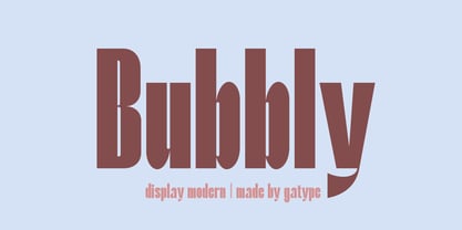 Stylish Bubbly Display with bold looking letters and Harmonious Impact to form a unique & elegant typography design. Perfect for branding projects, logos, wedding designs, social media posts, advertising, product packaging, product design, labels, photography, watermarks, invitations, stationery and any project. . uppercase and lowercase . multilingual symbol . number . punctuation . What will you get? Hope you enjoy our fonts and if you have any questions feel free to message & I'm happy to help
 - Extra Crunchy by Bogstav,
$18.00 Extra Crunchy is my handwriting when I am eating cookies while drawing! No, it's true! I did eat a whole box of cookies while drawing this font! :) The letters are a bit jumpy, and have no steady x-height, however, your text may look a bit off, but it is clear and legible. Fits perfect for a children's book, a postcard/poster design or something else that needs that extra crunch :)
 - Radial by A New Machine,
$19.00 Radial is a multi-line retro sans-serif font that is reminiscent of fonts from the 70s / disco era. It is all caps, but the lower case glyphs have rounded edges for a subtle difference if you are looking for a softer look. Use open type for some discretionary ligatures of common letter pairs (when set in all caps). Great for use on posters and in headline copy.
 - Bronze Script by Mans Greback,
$59.00 Let Bronze Script take you back. Back to the golden age of vintage when hand drawn scripts appeared in every form of publication. A different time when everything moved slower, lettering was done with expertise, and every detail awarded care and attention. In our age of cold digital creations, you can rest assured that Bronze Script will give you that tailor made flare only a nostalgic font can offer.
 - Broodim by Twinletter,
$18.00 The Broodim Groovy font is unique, stylish, and fun. Having an anatomical shape between thin and thick lines makes it beautiful and visually unique from most other fonts. Your project can be made more stunning by adding this font. Not only that, but this font also features cool alternative letters and ligatures to add a unique flair to your projects. Make the most of your designs by using this font today.
 - Ordina Variable by Schriftlabor,
$600.00 Developed by Indonesian designer Fadhl Haqq, Ordina is a grotesque-style superfamily with no less than 90 styles to choose from. It supports Latin including Pinyin and Vietnamese, Greek and Cyrillic, complete with Bulgarian alternates. Choose from Ordina’s eight figure sets, fine-tune its appearance with stylistic alternates for key lowercase letters, and put the reliable yet stylish sans-serif workhorse to good use in virtually any typographic application.
 - Stropha by Tour De Force,
$25.00 Stropha is compact slab serif font family that comes with matching Italics. With distinctive differences between letter stems and with five weights only, Stropha is imagined as small, but "all you really need" family. It's original, with characteristic serifs, with deep ink traps, curvy top diagonal endings and gentle curvy touches in details. Contains Extended Latin character set. Fully applicable in any situation, from branding and editorial design to webfont usage.
 - Mystery Show JNL by Jeff Levine,
$29.00 Mystery Show JNL was modeled after the hand lettered titles found on various early episodes of the 1950s TV suspense program "Alfred Hitchcock Presents". The design emulates characteristics found in Frederic W. Goudy's Copperplate Gothic [a sans serif of equal stroke weights with tiny spurs added], but is considered a serif font by the addition of the spurs. Mystery Show JNL is available in both regular and oblique versions.
 - WILD2 Keetoowah by Fontry West,
$10.00 Keetoowah evolved from a just a few letters in a sketch for a sorority t-shirt design. They loved it and kept asking for more of the same. The only solution was to make a font. These characters were made to be broken up, two toned, rotated, merged and jammed together. But, Keetoowah has a serious side. It has a great Southwestern flavor like smokey BBQ and patterned blankets.
 - Lunar Outline by RagamKata,
$12.00 Lunar - Retro Serif Font Introducing Lunar, a charismatic font that seamlessly fuses playfulness with a touch of nostalgia. This unique typeface falls under the playful retro serif display category, offering not just one, but two distinctive personalities in its regular and outline versions. Features : - Regular & Outline - Ligatures & Alternates - Letters, numbers, symbols, and punctuation - No special software is required to use this typeface even work in Canva - Multilingual Support