10,000 search results
(0.1 seconds)
- Uncia Black by Greater Albion Typefounders,
$12.00 Greater Albion Has been toying with thoughts of a “unicase” typeface for a while. On the other hand we’ve always wondered just what practical use they are. It is also a while since we’ve introduced a ‘handwritten’ design. Therefore, It struck us that one answer was something ‘hand-lettered’. These days many people do write in a sort of informal unicase don’t they? But, at the same time, we wanted it to have a little character. So here it is, a bit calligraphic, with a touch of black-letter and a cunning mix of upper- and lower-case forms Uncia Black!
 - Hush Hush by Comicraft,
$49.00 If you thought you heard someone callin' your name just now, you might have caught the firm but soft spoken tones of Comicraft's classy balloon lettering font, HushHush. Created in the style of the newspaper strips of the 30s and 40s, HushHush captures the slick movements of the skilled hand letterers of that era. Gracing the pages of Jeph Loeb and Jim Lee's chart-topping BATMAN storyline -- which by a staggering coincidence was also called "Hush" -- these characters have brought to life the words of Two Face, The Joker, Scarecrow, Catwoman, Batman and Robin -- from every whisper to every scream.
 - AndrewAndreas by Ingrimayne Type,
$5.00 AndrewAndreas is a simple, clean, sans-serif font family that is highly legible and useful for both text and display purposes. The original three weights were designed in 1994 and three additional weights plus oblique styles were added in 2020. Also added were several OpenType features, including subscripts, superscripts, and fractions. The six oblique styles slant the upright styles but do not change the shape of the letters. However, three OpenType stylistic alternatives provide alternative letter forms for a, f, i, j, and l for five of the obliques and they can be used for a more traditional italics appearance.
 - TT Tangerine by Tropical Type,
$29.00 TT Tangerine made in 2017 has been a global hit. It's been used by the biggest performing artist in the world, luxury brands, designer packaging and more. Due to its popularity an italic style was added in Feb 2023. From the designer: I wanted to make a retro font with that 70's good vibes feel but i didn't want to just copy letters from that era. I decided to make new unique letters that had that groovy 70s feel. The bold curves pay homage to the big hair and bell-bottoms of the golden era.
 - Premis by Fenotype,
$20.00 Do you often find yourself looking for a font that is universal and neutral on the one hand, and distinctive and special on the other? Here's one for you. Premis is a fairly broad font family that is suitable for versatile use, but still has plenty of original details, such as straight endings in the letters r, t and f. Equally current and timeless, Premis is available in three different widths. In terms of features, Premis is sensibly designed to meet demanding use, including, for example, capital letters and several different number styles. Make Premis your premise.
 - Xotor by Typogama,
$19.00 Xotor is a double styled typeface family destined for use in titling and headlines. The main style, the Triline weight, is a modular typeface composed of three strokes and is best used in large sizes. For smaller bodies of text, the second Regular style is based on the same letter construction but in a simple, solid stroke. Both weights can either be used individually or combined to add extra effect to any layout. With an extended Latin language support, Xotor covers most Latin based scripts and equally features a range of Opentype features, from ligatures, alternative letters or different styles of numerals.
 - MVB Cafe Mimi by MVB,
$39.00Kanna Aoki was designing fabrics and dishware for several major manufacturers when she designed MVB Cafe Mimi. The design came from a few words Aoki painted as decoration for a set of cappuccino cups. Aoki created the Regular weight for MVB Fonts using a brush. The Bold was adapted after digitization. Using several double-letter ligatures, the fonts can feel as natural and spontaneous as the original hand-painted lettering. Despite its curlicues and free-flowing forms, great care was taken to keep this script balanced and legible. It skips and hops along the baseline but doesn't lose its step. - Ritz Slab Serif JNL by Jeff Levine,
$29.00 Ritz Slab Serif JNL is a bold display face which shares a lot of similar design traits to Stymie and other similar metal type of the 1930s and 1940s, but in actuality was modeled from only four letters. On the sheet music for the 1937 song "Sweet Varsity Sue" [from the 20th Century Fox Film "Life Begins in College"], there is a picture of the Ritz Brothers - a popular comedy team from 1925 through the late 1960s. The hand lettered name "Ritz" became the basis for Ritz Slab Serif JNL, which is available in both regular and oblique versions.
 - Go Home JNL by Jeff Levine,
$29.00 Sheet music for another one of those songs from the early part of the 20th Century with a wonderfully wordy hand lettered title was the model for the Art Nouveau flavored Go Home JNL, which is available in both regular and oblique versions. 1908's "I Used to be Afraid to Go Home in the Dark (Now I'm Afraid to Go at All)" is comprised of eighteen words. It may have been a mouthful to request from the local sheet music shop, but the lettering on its cover made it a great candidate for preserving as a digital typeface.
 - Dalgonis Brush by ijemrockart,
$15.00 Dalgonis Brush is handmade script font with stunning characters. Ideal for logos, name tag, handwritten quotes, product packaging, merchandise, social media & greeting cards. It contains a full set of lower & uppercase letters, a large range of punctuation, numerals, and multilingual support. The font also contains several alternatives for lowercase characters, accessible in the Adobe Illustrator Glyphs panel, or under Stylistic Alternates in the Adobe Photoshop OpenType menu. But If you don't have any opentype specific software, you can still use Collatin as is with its standard lowercase and uppercase letters. - Files Included Dalgonis Brush.otf Dalgonis Brush.otf Thank You.
 - Killomint by Keristyper Studio,
$15.00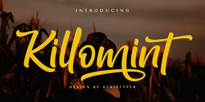 Introducing Killomint which has an elegant and natural hand lettering brush style like handmade. This font is good for logo design, Social media, Movie Titles, Books Titles, short text even long text letters, and good for your secondary text font with sans or serif. Featured: Standard Uppercase & Lowercase Numeral & Punctuation Multilingual : ä ö ü Ä Ö Ü ß ¿ ¡ Alternate & Ligature PUA encoded We recommend programs that support the OpenType feature and the Glyphs panel such as Adobe applications or Corel Draw. so you can use all the variations of the glyphs. Hope you enjoy our fonts!
 - Ristogea by Keristyper Studio,
$14.00 Proudly present Ristogea, a script font inspired by tattoo lettering with a swirl curvy. This font is good for logo design, Social media, Movie Titles, Books Titles, short text even long text letters, and good for your secondary text font with the script, sans, or serif. Featured: Standard Uppercase & Lowercase Numeral & Punctuation Multilingual : ä ö ü Ä Ö Ü ß ¿ ¡ Alternate & Ligature PUA encoded We recommend programs that support the OpenType feature and the Glyphs panel such as Adobe applications or Corel Draw. so you can use all the variations of the glyphs. Hope you enjoy our fonts!
 - Wild Heart by PeachCreme,
$19.00 Introducing you "Wild Heart", our new lovely script font. Featuring handwritten, refined flows, "Wild Heart" includes beautiful uppercase and lowercase letters, numerals, punctuation, and adorable heart swashes. Repeating every inch of it the ending heart swash is a mirrored replica of the beginning heart swash. Also, there is a connecting heart swash which serves to bind two words or letters together. The font characters are thick enough to fit perfectly for all types of printing techniques, especially Cricut, Silhouette, etc. "Wild Heart" can add a charming touch to your branding design, wedding invites, cards, monograms, and so many other projects.
 - Nipey by PizzaDude.dk,
$20.00 Every single character in Nipey is unique! Meaning that no characters is a copy of another. All accented characters therefore are hand-drawn and unique. For example, the letter "ñ" is not a copy of 'n' with a diacritical tilde - and this goes for all accented characters, as well as the ordinary ones! Besides that, Nipey has got autoligatures for doublelettered lower- and uppercase, as well as numbers. But that's not all! Nipey also has got a full set of alternate lower- and uppercase letters! Talk about a unique font, huh! You will need to use OpenType supporting applications to use the autoligatures.
 - Demiella by Keristyper Studio,
$14.00 Demiella is an elegant beauty sans serif. Simple letter shapes with playful swash & stylistic, keeping its legibility high. This font is good for logo design, Social media, Movie Titles, Books Titles, short text even long text letters, and good for your secondary text font with sans or serif. Featured: Standard Uppercase & Lowercase Numeral & Punctuation Multilingual : ä ö ü Ä Ö Ü ß ¿ ¡ Alternate & Ligature PUA encoded We recommend programs that support the OpenType feature and the Glyphs panel such as Adobe applications or Corel Draw. so you can use all the variations of the glyphs. Hope you enjoy our fonts!
 - Alasassy Caps by Leksen Design,
$19.00 Bring some sass to your signage! Alasassy is a font inspired from Sharpie pen drawings, featuring ink ball terminals. The lowercase letters are a mix of uppercase and lowercase letters that share the same cap height and baseline. There are several alternate characters with a mix of high and low crossbars as well as crossbar overhang options and language support for each. This display font will bring some zest to your logo, signage, packaging design or large titles on book covers or advertising. It is a great combination of an organic, hand drawn feel but still clean and crisp enough to look professional.
 - Dear Penpal Script by Giaimefontz,
$6.00 This is a fully connected script font, not calligraphic, but entirely designed to follow handwritten cursive ligatures rules as teached in schools. In order to correctly visualize it, you have to enable OpenType features (Contextual Alternates, Discretionary Ligatures, Standard Ligatues and Kerning). Trying to write All Capitals will generate Block Letters writings, since cursive style doesn't allow more than the first uppercase per word, however this font is not meant to be a Block Letters font. Using specific type combinations will generate special glyphs. All of these features are intended to reproduce a classic schoolboy or schoolgirl notebook.
 - HT Pavla Prospekt by Hype Type,
$34.00 A pure neo-grotesque typefamily inspired by the first typographies' old wooden characters, and by the marks soft and sometimes imprecise these left on the paper. All typographic elements are also influenced by the Cyrillic alphabet letter-form. -- HT Pavla Prospekt is inspired by ancient wooden typefaces and eastern-style letterform. This reference gives the letters unusual but characteristic proportions. The visual effect of the diffusion of the ink imprinted on the paper, which gives softness to the forms, is also very influential. The proportions of the bold and thin faces are visually balanced to ensure a more modern feeling. --
 - Solingen by Mysterylab,
$14.00 Solingen is an elegant display serif font well suited to logo design applications. The capital letter set features many unique double-letter pairings which serve as inspirational design features when creating posh, delicate, and luxurious logos. Suggested uses for Solingen might include high-end branding for boutique apparel, accessories, jewelry, or cosmetics; unique wedding invitation headlines; packaging for personal care items, and much more. In many applications, the ligatures feature is turned on by default as Standard Ligature alternates, but these can generally be easily overridden in the Glyphs panel when you prefer to use the standard characters instead.
 - Primaria by PeGGO Fonts,
$18.00 Primaria is a display font, inspired on the very first basic handwrite style teaching at primary school, designed in cursive and print styles in three weights each one: light, Regular and Bold, considering stylistic and typographic needs, it also contain OpenType initial lowercase alternative forms in order to get better links in those case where pairs of letters could be look better. Recommended playful and friendly design, teaching and learning stuff, children toys projects, food & drink and soft stuff.
 - Kardinal by Ani Dimitrova,
$30.00 Kardinal is a sans serif humanistic type family. The family has 16 weights, ranging from Thin to Black with extra drawn italics and small caps versions. The Kardinal type family is ideally suites for small text, books and magazines, branding, posters, as well as web and screen design, headlines and more. Kardinal comes in 16 styles with extended language support. All weights contain standard ligatures, proportional figures, tabular figures, old style figure, numerals and arrows, matching currency symbols and fraction. The construction of characters combines clean grotesque style and calligraphic features with humanist fragrance. Out standing for the designs are the small serifs. They are giving the letters movement and freshness, as well as contribute to a better readability in different volume texts and including lots of details that give it a unique personality. The Regular and Medium weights are perfect for body text while the italic give an interesting texture to the text. The range of styles give a good flexibility to this family. The fonts are carefully hinted and perfect for digital use.
 - Georgeanna MF by Masterfont,
$59.00 Renamed font (was Georgia) and refined outlines to make it stand out on your next book jacket or tatoo.
 - Compact Hebrew MF by Masterfont,
$59.00 This font family is your best choice when you want to effortlessly make your brochure or signs stand out!
 - Banque Gothique by Red Rooster Collection,
$45.00Based on the earliest ATF/M.F. Benton versions of the Bank Gothic typefaces. ‘Fleshed-out’ into a full family. - Supernett by FaceType,
$19.90 Supernett was originally created in 2013. Now we decided to upgrade it: more styles, more glyphs, more features, more everything. Have fun with Supernett 2019! Supernett 2019 super revised version Supernett is a versatile handmade text- and display-family and is perfect for space-saving headlines. All letters and numerics are available in three variants which alternate randomly with OpenType Contextual Alternates activated. One of Supernetts key features is Wiggling & jumping letters: letters jump around the baseline or tilt forward and backwards without a plan. Combine this with OpenType Contextual Alternates and let Supernett look truly hand-drawn with a maximum effect when applied to big typesetting. Further features include small caps, glyph alternates, case-sensitive forms, fractions, symbols and many more. Supernett is a hand-drawn / handmade / handdrawn Sans-Serif font-family. Supernett is available in three weights, two widths, Uprights and Italics. The handmade family is tailored for large font sizes but also impresses with seamless legibility in small type sizes. Due to its display origin and slightly condensed appearance, make sure to increase the spacing a little when used in text setting. The extensive character set supports 209 Central and Eastern European as well as Western European languages (for details, please see below). Supernett Font and Feature Guide Download it | View it online Supernett OpenType Features Alternating Letters Letters and numerics are available in three variants which alternate randomly → OpenType Contextual Alternates Small Caps Supernetts Small Caps mixes Upper- and Lowercase letter forms. Choose between »Small Caps« or »OpenType All Small Caps«. The latter replaces lower- AND uppercase letters, as well as the dotted i and activates punctuation to match the small caps’ height. Wiggling letters All glyphs tilt slightly and randomly forward and backwards → OpenType Swashes (or OpenType Stylistic Set 06) Jumping letters Each single glyph moves individually up or down → OpenType Titling Alternates (or OpenType Stylistic Set 07) → for a stronger effect, add OpenType Stylistic Set 08 (Jumping Baseline MORE) Case-Sensitive Forms This feature shifts various punctuation marks to a position that works better with all caps typography. → activated when an app’s all-caps styling is applied Slashed Zero Make clear what you’re talking about and work with a slashed zero → OpenType Zero with a Slash Fractions Figures separated by a slash are substituted by proper fraction glyphs. A date however, written like 10/12/2019 will remain unchanged. → OpenType Fractions Alternate Glyph Set 1 → OpenType Stylistic Set 01 Alternate Glyph Set 2 → OpenType Stylistic Set 02 Alternate Glyph Set 3 The default glyph set. Activate it to disable Alternating Letters within OpenType Contextual Alternates. → OpenType Stylistic Set 03 Y Alternate Choose between two different styles of Y → OpenType Stylistic Set 04 Underlined Uppercase O & ordinals → OpenType Stylistic Set 05 → activate OpenType Ordinals to substitute No. by № Uppercase I Alternate There’s an alternate for the isolated ›I‹ (I love you) → included in OpenType Contextual Alternates → or activate OpenType Positional Forms: Automatic Form → substitute every single ›I‹ with OpenType Stylistic Set 09 Bullet Alternate Choose between two different styles of bullet (•) → OpenType Stylistic Set 11 Squares and Circles Type a – z and out pop squares and circles. All symbols are PUA-encoded for easy copy and paste between different applications. → OpenType Stylistic Set 10 → or open your apps’ glyphs panel and double-click the desired symbols Supernett is an organic and decorative hand-drawn / handmade Sans Serif display-family for packaging, posters, book-covers, kids- (children-), food- and logo-design and will best stand out in huge grades. Its handmade / hand-drawn origin is subtle yet visible. Supernett supports 209 languages Abenaki, Afaan Oromo, Afar, Afrikaans, Albanian, Alsatian, Amis, Anuta, Aragonese, Aranese, Aromanian, Arrernte, Arvanitic, Asturian, Atayal, Aymara, Bashkir, Basque, Belarusian, Bemba, Bikol, Bislama, Bosnian, Breton, Cape Verdean, Catalan, Cebuano, Chamorro, Chavacano, Chichewa, Chickasaw, Cimbrian, Cofan, Corsican, Creek, Crimean Tatar, Croatian, Czech, Danish, Dawan, Delaware, Dholuo, Drehu, Dutch, English, Esperanto, Estonian, Faroese, Fijian, Filipino, Finnish, Folkspraak, French, Frisian, Friulian, Gagauz, Galician, Ganda, Genoese, German, Gikuyu, Gooniyandi, Greenlandic, Guadeloupean, Gwichin, Haitian Creole, Han, Hawaiian, Hiligaynon, Hopi, Hotcak, Hungarian, Icelandic, Ido, Ilocano, Indonesian, Interglossa, Interlingua, Irish, Istroromanian, Italian, Jamaican, Javanese, Jerriais, Kala Lagaw Ya, Kapampangan, Kaqchikel, Karakalpak, Karelian, Kashubian, Kikongo, Kinyarwanda, Kiribati, Kirundi, Klingon, Ladin, Latin, Latino Sine, Latvian, Lithuanian, Lojban, Lombard, Low Saxon, Luxembourgish, Maasai, Makhuwa, Malay, Maltese, Manx, Maori, Marquesan, Meglenoromanian, Meriam Mir, Mirandese, Mohawk, Moldovan, Montagnais, Montenegrin, Murrinhpatha, Nagamese Creole, Ndebele, Neapolitan, Ngiyambaa, Niuean, Noongar, Norwegian, Novial, Occidental, Occitan, Oshiwambo, Ossetian, Palauan, Papiamento, Piedmontese, Polish, Portuguese, Potawatomi, Qeqchi, Quechua, Rarotongan, Romanian, Romansh, Rotokas, Sami Inari, Sami Lule, Sami Northern, Sami Southern, Samoan, Sango, Saramaccan, Sardinian, Scottish Gaelic, Serbian, Seri, Seychellois, Shawnee, Shona, Sicilian, Silesian, Slovak, Slovenian, Slovio, Somali, Sorbian Lower, Sorbian Upper, Sotho Northern, Sotho Southern, Spanish, Sranan, Sundanese, Swahili, Swazi, Swedish, Tagalog, Tahitian, Tetum, Tok Pisin, Tokelauan, Tongan, Tshiluba, Tsonga, Tswana, Tumbuka, Turkish, Turkmen, Tuvaluan, Tzotzil, Ukrainian, Uzbek, Venetian, Vepsian, Volapuk, Voro, Wallisian, Walloon, Waraywaray, Warlpiri, Wayuu, Welsh, Wikmungkan, Wiradjuri, Wolof, Xavante, Xhosa, Yapese, Yindjibarndi, Zapotec, Zulu, Zuni View other fonts from Georg Herold-Wildfellner Sofa Serif | Sofa Sans | Mila Script Pro | Pinto | Supernett | Mr Moustache | Aeronaut | Ivory | Weingut
 - Broadside Text by Device,
$39.00 Broadside Text is a companion to Broadside, and is optimised for use at smaller sizes. More open counters, more generous letter-spacing and additional fractions increase legibility. The original Broadside family is suitable for headlines and larger sizes, and also comes with condensed and extended versions. Broadside is a versatile, authoritative and functional family inspired by the sans serifs seen on ’40s and ’50s patriotic posters and period advertising. It is available in seven weights across condensed, normal and extended widths, each with reweighed italics. The type from this period was very often hand-drawn, and so differs considerably from poster to poster. Many American examples of this period use a Photo-Lettering style called Murray Hill and its derivatives, although their UK counterparts, designed by such luminaries as Abram Games or Tom Eckersley, are more stylistically diverse. Even though no single model is available to base a digitisation on, there are certain recurring stylistic quirks that give the type its unique flavour, and so the most interesting examples from several sources were be combined for the final family. Alternate short descenders, allowing for tighter line spacing, can be toggled on or off in the Opentype panel of Indesign or Illustrator. Tabular and lining numerals and a single-story ‘a’ are also available in all weights and styles.
 - Vintage Monograms by Intellecta Design,
$16.00 A Monogram is a lettering character made up of the main letters of a name and sometimes all of them. It is a kind of design which dates from the earliest times of our history. It is a distinctive mark that everyone could have themselves, to apply to documents and many purposes. The signatures of ancient Kings were Monograms. Today this brand, for the people of taste, must have the cachet of this era or the evocative feelings of ancient times. Our predecessors knew how to create it by using the capital that preceded Gothic and the other characters. The Vintage Monograms collection contain hundreds of ready to use in alarge of shape of the letters, with styles from Victorian, to Art Nouveau and to mediaeval like in the old manuscripts. Ready to use fonts, Vintage Monograms collection is a classic that features elegant and intricate monograms perfect for branding and personalization. Its ornate designs evoke the timeless style of vintage logos and can be used to add a touch of sophistication to invitations, stationery, and packaging. Monogram brings an air of refinement and exclusivity to any project.
 - VTCTattooScriptTwo - Personal use only

- VTC-KomikaHeadLinerChewdUp - Personal use only

- Lubaline by Lián Types,
$39.00 Who haven't heard the phrase that ‘any past time was better’?. Although I sometimes find this phrase a little too pessimistic (because I try to think that the best is yet to come), it may be true regarding my passion, typography. I'm too young (29) unfortunately, and this means I did not have the pleasure of being contemporary with maybe the man who has influenced my work the most (1). The man that showed that letters are more than just letters to be read. Herb Lubalin (1918-1981), also called sometimes as ‘the rule basher’ (2), smashed the taboos and sacred rules of type design and gave it personality. He rejected the functionalist philosophy of europeans in favor of an eclectic and exuberant style. To him, letters were not merely vessels of form, they were objects of meaning. (3). Nowadays, when looking at his portfolio, who dares to deny that the term ‘typography’ and ‘beauty’ may go hand-in-hand without any problem? Ed Benguiat, one of Herb’s partners, still likes making jokes with the phrase “screw legibility, type should be beautiful” and what I understand of this is not to forget the rules, but to know and break them carefully. In an era of pure eclecticism, we, the lovers of flourishes and swashes, can't do nothing but admire all the legacy that Lubalin, this wonderful type-guru, left. My font Lubaline read as “the line of Lubalin” is my humble tribute to him. Those who know his work, may see the influences easily like in his ‘Beards’ (1976) and ‘The Sound of Music’ (1965) posters; the art-deco forms in many of his amazing logos and practically in all his creations where letters seem to be alive just like you and me. I really hope that the future finds me still learning more and more about type-design and letterforms, and like him, always willing to make innovations in my field: Because letters are not just letters to be read. NOTES (1) These are some of my fonts in which some of Lubalin’s influences can be seen (in order of creation): Reina, Aire, Erotica, String, Beatle, Heroe, Selfie, Model, Seventies, and many others that are still in progress. (2) (3) Steven Heller. Herb Lubalin: Rule Basher. U&lc (1998) http://www.printmag.com/imprint/my-favorite-lubalin/
 - Teeshirt by Typodermic,
$11.95 Hey there, so you want to look like a walking throwback to the 1980s? Well, lucky for you, Teeshirt is here to help you achieve that coveted slovenly appearance. If you’re looking for a typeface that screams, “I don’t care” then Teeshirt is your new best friend. It’s designed to mimic vintage t-shirt lettering, so you can rock that “I just rolled out of bed and put on the first thing I found on my floor” look. And if you’re worried about being too uniform with your letters, fear not! Teeshirt has got you covered with letter pair ligatures. Because who wants to look like they put any effort into their appearance, right? And if you’re feeling adventurous and want to shake things up a bit, you can always disable the “standard ligatures” feature in your application. Teeshirt comes in two styles: Regular and Pressed. The bouncy Regular style will make it look like your letters are ready to jump right off your shirt, while the orderly Pressed style will give you that crisp, just-ironed look (although let’s be real, who has time for ironing?). So what are you waiting for? Embrace your inner sloth and give Teeshirt a try. Because who needs effort and a polished appearance when you can look like a hot mess instead? Most Latin-based European writing systems are supported, including the following languages. Afaan Oromo, Afar, Afrikaans, Albanian, Alsatian, Aromanian, Aymara, Bashkir (Latin), Basque, Belarusian (Latin), Bemba, Bikol, Bosnian, Breton, Cape Verdean, Creole, Catalan, Cebuano, Chamorro, Chavacano, Chichewa, Crimean Tatar (Latin), Croatian, Czech, Danish, Dawan, Dholuo, Dutch, English, Estonian, Faroese, Fijian, Filipino, Finnish, French, Frisian, Friulian, Gagauz (Latin), Galician, Ganda, Genoese, German, Greenlandic, Guadeloupean Creole, Haitian Creole, Hawaiian, Hiligaynon, Hungarian, Icelandic, Ilocano, Indonesian, Irish, Italian, Jamaican, Kaqchikel, Karakalpak (Latin), Kashubian, Kikongo, Kinyarwanda, Kirundi, Kurdish (Latin), Latvian, Lithuanian, Lombard, Low Saxon, Luxembourgish, Maasai, Makhuwa, Malay, Maltese, Māori, Moldovan, Montenegrin, Ndebele, Neapolitan, Norwegian, Novial, Occitan, Ossetian (Latin), Papiamento, Piedmontese, Polish, Portuguese, Quechua, Rarotongan, Romanian, Romansh, Sami, Sango, Saramaccan, Sardinian, Scottish Gaelic, Serbian (Latin), Shona, Sicilian, Silesian, Slovak, Slovenian, Somali, Sorbian, Sotho, Spanish, Swahili, Swazi, Swedish, Tagalog, Tahitian, Tetum, Tongan, Tshiluba, Tsonga, Tswana, Tumbuka, Turkish, Turkmen (Latin), Tuvaluan, Uzbek (Latin), Venetian, Vepsian, Võro, Walloon, Waray-Waray, Wayuu, Welsh, Wolof, Xhosa, Yapese, Zapotec Zulu and Zuni.
 - Onick by Wordshape,
$- While researching the history of Onitsuka Tiger's branding and graphic design, I came across an odd, yet highly appealing piece of custom lettering on the company's ONICK ski boots from the 1970s. Reminiscent of aspects of the typeface Black-Out by Eli Carrico (released by my type foundry Wordshape), yet vertically compressed with razor-sliced counters and odd stencil element that makes up one of the legs of the "K", the ONICK lettering is a potential source for an intriguing modular font. I immediately thought of Ryoichi Tsunekawa as a potential collaborator to bring this piece of lettering to full-fledged life in the contemporary context. Based in Nagoya, Tsunekawa runs an independent type foundry called Dharma Type, including three specialized foundry sub-labels: Flat-It, devoted to display lettering; Prop-A-Ganda, a series of fonts inspired by and based on retro propaganda posters, movie posters, retail sign lettering & advertisements in the early 20th century; and Holiday Type, a series of decorative and retro scripts for holiday use. The past year has seen a flurry of notice of his work abroad, having been featured in both MyFonts' "Creative Characters" and YouWorkForThem's newsletter. As the work of most Japanese type designers is almost wholly unnoticed abroad, for Tsunekawa to be interviewed by two of the most popular type distribution companies in the world is definitely something beyond the norm. Perhaps it is because he works independently, or perhaps it is due to the charm and friendliness with which his typefaces are infused. Either way, this attention is both welcome and appreciated. Beyond mere charm, Tsunekawa's work is nuanced, detailed, and accessible due to its high level of finish. His fonts stand apart from his contemporaries in Latin typeface design in Japan due to his fascination with pop, vernacular and historical lettering from "non-pure" sources- whereas type designers like Kunihiko Okano and Akira Kobayashi have spent years analyzing the essence of Western letterform construction and unlocking the essence of Latin forms, Tsunekawa views surface and the awkward nature of his sources as being of value, as well. His irreverence for the formal doctrines of history imbue his typeface designs with a rugged inventiveness that would be missed by most- glyphs without source designs are guessed at and approximated, often in a manner wildly divergent from what Western eyes would assume. It is in these moments that I find sheer delight in Tsunekawa’s work and what make me most pleased to invite him aboard Neojaponisme and Onitsuka Tiger’s type development project. His assorted typefaces show an eclecticism in finish and as holistic systems- Tsunekawa's return email to me about the proposed type project showed a digital sketch of how a completed typeface family from the source lettering might look, rendered with an effortlessness and dedication to detail that belies a skilled craftsperson. Further development showed Tsunekawa’s rigor- the typeface in development rapidly featured glyphs ignored by many: a full set of fractions, Eastern European diacritics and accents, superior and inferior numerals, alternate characters, and custom ligatures - all designed with regulated, detailed spacing. ONICK is a typeface Tsunekawa should be proud of- an homage to a moment in history rendered in the absolute best fashion. We are proud to present it to the world! --Ian Lynam
 - Nixon Script by Barnbrook Fonts,
$30.00 NixonScript is a display typeface inspired by the typographic emancipation given voice by 1950s and '60s north American vernacular type. NixonScript's starting point was lettering found on a 1960s camera found in a Chicago junk shop, but its development saw it transformed from a punchy sans-serif to a more thoughtful serif, with a lowered x-height and a vibe of almost priestly piousness. Rather than a simple regular italic, a bold italic is offered. During its development, the regular version seemed almost placid but with the double emphasis of bold and italic, NixonScript gained an energetic, self-congratulatory form.
 - Hedge Backwards by Comicraft,
$39.00 You begged with us..! You pleaded with us..! But we decided to release the official Richard Starkings font anyway! Yes, I am Richard Starkings and you may remember my hand lettering from such comic books as THE KILLING JOKE, TRANSFORMERS and, um, THE KILLING JOKE! Yes, finally Comicraft is making available the font that started it all -- from the pages of MARVELS, SUPERBOY, GENERATION X and, um... MARVELS! The font that Kurt Busiek, writer/creator of ASTRO CITY, really, really likes but we've always refused to make available to him. Always leave your friends wanting more, that's my motto.
 - Ginger Style by Sensatype Studio,
$15.00 Ginger is a Modern Stylish Font. In a new generations, we analyze that any designer or brand owner need to make their brand standout. As our focus that analyze any typeface that helps to leverage any logo design to look more modern and unique. We prepared this font with any unique characters to help you create unlimited variations for your creative needs. Ginger font ready with: Any options to get creative variations with unique letters Preview as a inspirations that you can do with Ginger font Ready with Lowercase and Uppercase characters Wish you enjoy our font. :)
 - Chunky Dressing by Bogstav,
$14.00 A chunky dressing may not sound very delicate, but I remember my grandmother used make a very chunky dressing for the mashed potatoes. I really loved it - actually I wish I had the recipe so that I could reproduce that particular consistency. But instead I made this font in memory of that lovely chunky dressing! :) Chunky Dressing has got a little Garamond in it, Baskerville as well - and even a touch of Times... Each lowercase letter has 5 different versions and they magically cycles as you type, leaving your text very lively with a natural twist of energetic and organic look
 - East Variable by Tarallo Design,
$73.99 East Variable is a condensed sans serif typeface. It is timeless, but with a subtle nostalgia of vintage jazz albums, film titles, newspapers, and signage. The light weight has excellent legibility at small sizes. The Extra Bold weight will capture attention. East is versatile, but would be a good choice for film titles, labels, publications, or any context where space is limited. It has variable axes of weight and slant. The OpenType features include stylistic sets, a one-story 'a', hooked letters, seriffed uppercase 'I' and '1', a slashed zero, raised colon and punctuation (Spanish), German eszett, ligatures, and vertical fractions.
 - Admire Gustavo by Balpirick,
$15.00 Admire Gustavo is a Handbrushed Font. Our handwritten font takes inspiration from the fluidity and uniqueness of human handwriting, ensuring that each letter carries a sense of character and charm. With its graceful curves and delicate strokes, this font adds an intimate and personal feel to your written words. Perfect for creating notes, memos, journal entries, or beautiful quote designs, our handwritten font elevates your messages with a sense of authenticity and warmth. It transforms your ordinary words into a beautiful composition, breathing life into your writing. - also multilingual support Enjoy the font! Feel free to comment or feedback! Thank you!
 - Biscuits And Spam by Kitchen Table Type Foundry,
$10.00 I remember that my auntie once made a dish called ‘Macaroni and Smac’. It consisted of little ‘elbow’ macaroni, Spam (which in Holland was called Smac), cheese and ketchup. I am sure it didn’t contain on of your five a day, but it was delicious. As far as I know, I have eaten it only once, but it did make a lasting impression! Biscuits & Spam is a handmade ‘Western’ style font, which I found in my ‘unfinished fonts’ folder. It comes with multilingual support, a full set of alternates for the lower case letters and a really happy vibe.
 - Creative Wonder by Balpirick,
$15.00 Creative Wonder is a Modern Handwritten Font. Our handwritten font takes inspiration from the fluidity and uniqueness of human handwriting, ensuring that each letter carries a sense of character and charm. With its graceful curves and delicate strokes, this font adds an intimate and personal feel to your written words. Perfect for creating notes, memos, journal entries, or beautiful quote designs, our handwritten font elevates your messages with a sense of authenticity and warmth. It transforms your ordinary words into a beautiful composition, breathing life into your writing. - also multilingual support Enjoy the font! Feel free to comment or feedback! Thank you!

