10,000 search results
(0.015 seconds)
- FF Marselis Serif by FontFont,
$58.99FF Marselis crossbreeds geometric and humanistic forms, creating a freshly dynamic sans serif family. All of the counters in the typeface are open; this aids readers’ eyes quickly flow across lines of text, without experiencing hang-ups. Certain superfluous strokes have been eliminated – there are no spurs on the b or q, for instance. The alphabet’s diagonals all bow outwards slightly, adding flavor to the “A”, “K”, “R”, “V”, “W”, “X”, “Y” and “Z”. - Adget Sans by wearecolt,
$14.00 Adget Sans is a modern, strong statement typeface with clean lines and big curves. Inspired by classic geometric grotesque typefaces, this sans serif typeface is perfect for adding a striking title to your portfolio or website. This set includes ten individual weight fonts plus a variable weight font, Adget Sans consists of 328 glyphs across upper and lowercase, numerals, all European characters, linked letters and ligatures plus some bouns stylistic alternative characters.
 - Northunder by Alphabet Agency,
$23.00 Northunder (Nor/Thunder) is a vintage style font with a powerful presence. It can be used as an excellent display font as it possesses a unique serif style combination of slab serif and serif that create sharp points that really give the font its character. The slab serif elements help give the characters a strong look and balance across the font. The font includes uppercase, lowercase, number, international (basic Latin) letters and punctuation.
 - Heyho Miguelo by Arterfak Project,
$17.00 Meet Heyho Miguelo! This distinctive handwriting font effortlessly captures the natural flow of handwriting with a playful design and a subtle rough touch on the letterforms, adding a unique and cheerful vibe to your typography. Versatile and perfect for posters, flyers, quotes, merchandise, decals, and more, Heyho Miguelo! ensures your designs stand out with charm and individuality. Elevate your creative projects with this font, designed to leave a lasting impression across various applications.
 - Linotype Down Town by Linotype,
$29.99Linotype Down Town is part of the Take Type Library, chosen from the contestants of Linotype’s International Digital Type Design Contests of 1994 and 1997. The cheerful character of this fun font from German designer Critzler is perfect for comics or posters. The figures dance across the base line, swinging between thick and thin, big and small. Linotype Down Town is intended exclusively for headlines and short texts in at least 18 point. - Loophole by ArtyType,
$23.00 Loophole is a visually striking display typeface in 3 weights (Light, Regular & Bold), its DNA firmly rooted in the Cyclic Sans family which makes the perfect foil to this somewhat decorative font styling. The Loophole name is quite simply based on the ubiquitous hole motif, which is strategically deployed on each character across the 3 font styles. Each font contains an extended Latin character set covering Western & Central Europe, the Baltic States & Turkey.
 - P22 Festiva by IHOF,
$29.95 Festiva is based on lettering found on a 1960s kitchen appliance catalog. It evokes ’60s TV and pop culture while still having a contemporary feel. The fun exuberant flavor of this face is perfect for parties and celebrations. The letters dance across the baseline and the lower case wants to be an upper case but just can’t quite make it. P22 Festiva Regular includes a full unicode European Character set (Western, CE, Turkish, Romanian, etc).
 - Milescut by Tipos Pereira,
$14.00 Milescut is a display typeface inspired by some seminal covers the graphic designer and photographer Reid Miles created for the Blue Note Records between the 1950s and 1960s. Miles made almost 500 covers for Blue Note in this period, including some using the hand-cut technique that consists basically in doing vertical cuts in capital letters and numerals to create a unique style within the universe he created for Blue Note. Milescut is a tribute to this small “cut” 😬 in his trajectory within the greatest record label of all time. This idea came about while I was working on what will become soon a revival of a wood type that I fell in love with when flipping through a Specimen of the MACHINE CUT WOOD TYPE manufactured by The WM. H. Page Wood Type Co. Milescut has two extra sets of alternates that work cyclically when activated in your OpenType menu and lots of ligatures, pretty cool :)
 - Ongunkan Archaic Etrusk by Runic World Tamgacı,
$50.00 Etruscan was the language of the Etruscan civilization, in Italy, in the ancient region of Etruria (modern Tuscany, western Umbria, northern Latium, Emilia-Romagna, Veneto, Lombardy and Campania). Etruscan influenced Latin but was eventually completely superseded by it. The Etruscans left around 13,000 inscriptions that have been found so far, only a small minority of which are of significant length; some bilingual inscriptions with texts also in Latin, Greek, or Phoenician; and a few dozen loanwords. Attested from 700 BC to AD 50, the relation of Etruscan to other languages has been a source of long-running speculation and study, with its being referred to at times as an isolate, one of the Tyrsenian languages, and a number of other less well-known theories. The consensus among linguists and Etruscologists is that Etruscan was a Pre–Indo-European,and a Paleo-European language and is closely related to the Raetic language spoken in the Alps, and to the Lemnian language, attested in a few inscriptions on Lemnos. Grammatically, the language is agglutinating, with nouns and verbs showing suffixed inflectional endings and gradation of vowels. Nouns show five cases, singular and plural numbers, with a gender distinction between animate and inanimate in pronouns. Etruscan appears to have had a cross-linguistically common phonological system, with four phonemic vowels and an apparent contrast between aspirated and unaspirated stops. The records of the language suggest that phonetic change took place over time, with the loss and then re-establishment of word-internal vowels, possibly due to the effect of Etruscan's word-initial stress. Etruscan religion influenced that of the Romans, and many of the few surviving Etruscan language artifacts are of votive or religious significance.
 - Gold by FontMesa,
$29.00 Gold is all new for 2021, the complete family has been rebuilt using the multiple masters technique. In this new version we've removed any alternatives that could not be shared across all weights in the family and we've trimmed a few others that just were not practical in keeping a consistent look to the whole font. All the alternates now have matching accented glyphs across all weights. Case sensitive forms have also been added to all weights. With 14 weights the difference between weights are closer together which may give you the effect of a variable font where variable fonts are not supported. For technical reasons the original Gold family has now been split into two families with Gold having ten weights and the four heavier weights under the Gold Magnum family. The Gold and Gold Magnum font families support accented characters for western, central and eastern European countries. Gold comes with OpenType features to access the alternate glyphs however you will need an application such as Adobe Creative Suite to take advantage of alternate glyphs.
 - Ernie by Jim Ford,
$39.99 Ernie is a new animated typeface by Jim Ford, intended as a complimentary serif design to Freeman Craw’s fun retro hit, Ad Lib. The serif drawings mimic the behaviors of Ad Lib, on a Clarendon-esque structure. The application of Ad Lib’s behaviors to a serif design highlights it's quirky characteristics; notably in the added contrast, the bending of serifs and the translation to Ernie’s ball terminals. The lowercase g is probably the most extreme example of this "translation." Ernie has a savvy system of text animation built in; with dualing lowercase alphabets, 34 ligatures, and an extensive glossary of custom words, all programmed to automatically make intelligent pseudorandom wordshapes. It's called RMS, aka the Randomagic System. The glossary of “buzz” words is based on the most common and powerful words in marketing and advertising, as well as words that are specific to Ernie’s intended uses.. Additionally, Ernie Alt provides the opposite randomization effects in lowercase text, thus reversing the rhythm of the bounce. Ernie Sorts is a bonus font which includes fun printers fists, expandable banners and other graphic elements. The Ernie character and cartoons were created by Johnny Sampson, as a visualization of the typeface, it's character and it's unique features.
 - Sassoon Handwriting Starter by Sassoon-Williams,
$45.99 Sassoon fonts package for handwriting starters The three upright "infant" fonts developed to meet the demand for letters to produce pupil material for handwriting as well as for reading. Letters have extended ascenders and descenders ideal on screen and print. They facilitate word recognition. The exit strokes link words together visually, also crucially, they space the letters for improved legibility. The "joined" font puts the skills gained into practice producing joined-up handwriting. Together these typefaces provide a valuable resource for Teachers to create consistent material across the curriculum. Sassoon Infant Tracker B font: This font with its direction arrows helps pupils to start in the correct place. Motor movements can be refined by keeping inside the line. When starting and direction is no problem, the arrow font can be dropped and the Dotted font used. Sassoon Infant Dotted B font: Writing over the dots of this font refines motor skills. The aim here is to give confidence by reinforcing starting points, exits and to now encourage fluidity. Sassoon Infant font: With some words in this font and a baseline beneath to copy onto, pupils can use their learned starting points and exit strokes to write freely along the baseline - still unjoined. Once learned, this leads to spontaneous joins along the baseline leading logically to a joined-up hand. Sassoon Joined font: Having learned to write letters with correct starts and exits, this is when the joined font for teaching handwriting can be used. With some words in this font and a baseline beneath to copy onto, pupils can use their learned starting points and simply extend their exit strokes to make joined-up writing. The default joins the font provides are recommended, however there are alternative letterforms that are so important for some Teachers which can be accessed. Create ‘pen lifts’ anytime too! NOTE: Fonts display unjoined by default on this website and are delivered that way - joining is controlled by your text editing application such as Word or TextEdit, read more for instructions… Free to download PDF resources: Stylistic Sets and how to access the alternative letters feature in these OpenType fonts. Using the separate letter fonts Using the joined font Teachers copybooks using these fonts: How to teach pre-cursive Copybook How to teach cursive handwriting Copybook
 - Pekin by HiH,
$15.00 Pekin is an unusual design with an oriental flavor. It was originally designed by Ernst Lauschke and released by The Great Western Type Foundry of Chicago as “Dormer,” which is similar to the French verb ‘to sleep,’ not exactly a marketing triumph. Barnhart Bros. And Spindler (independently-operated subsidiary of ATF since 1911) bought Great Western in 1918. According to McGrew, AMERICAN METAL TYPEFACES of the TWENTIETH CENTURY, BB&S renamed the typeface prior printing their 1925 specimen book — guess they wanted something just a tad more exciting. Quirky, distinctive and fun. Pekin ML represents a major extension of the original release, with the following changes: 1. Added glyphs for the 1250 Central Europe, the 1252 Turkish and the 1257 Baltic Code Pages. Added glyphs to complete standard 1252 Western Europe Code Page. Special glyphs relocated and assigned Unicode codepoints, some in Private Use area. Total of 415 glyphs (compared to 218 glyphs in the original release). 2. 652 Kerning Pairs. Note: Ag, Aj and gj will cross unless kerned. Alternative A may also be used. 3. Added OpenType GSUB layout features: onum, salt, liga, dlig, hist, ornm and kern. 4. Revised vertical metrics for improved cross-platform line spacing. 5. Refined various glyph outlines, based on improved scans. 6. Added set of Tabular Numbers at cap height, based on original design; added Old-Style Numbers based on default design. 7. Added a bunch of alternative characters: 18 upper case letters, 10 lower case letters, 1 ampersand and 1 bullet. The alternate c is actually the original design, but I don't like it - easily confused with e. Alt E H M h m n r t are from the original design. I added the rest. 8. 7 Ligatures, 4 Ornaments, 18 Geometric Shapes, 6 Arrows and 12 Misc. Symbols. The zip package includes two versions of the font at no extra charge. There is an OTF version which is in Open PS (Post Script Type 1) format and a TTF version which is in Open TT (True Type)format. Use whichever works best for your applications.
 - Rocksane Display by Andrey Sharonov,
$30.00 Rocksane Display is a modern hybrid font with fantastic decorative uppercase and strong serif lowercase for impressive and powerful look. This typeface works fine in big sizes and more suits for example in short tittles, logotypes, names, movie posters, books and music album covers. Rocksane includes 84 beautiful uppercase alternates except of basic set. You can easy get it with special combination like A1, A2, A3 etc. (This hot keys works with activated Standard Ligatures option). In addition, there are 11 End-swashes which harmoniously underline the words. You can quickly get it by the same way with combination like _1, _2, _3 up to _11 (underscore+number). This features works fine in Adobe Photoshop or Illustrator. You can use Rocksane for following languages: Danish, Dutch, English, Estonian, Faroese, Finnish, French, German, Hungarian, Icelandic, Italian, Norwegian, Polish, Portuguese, Slovene, Spanish, Swedish, Turkish.
 - Bogie Bogie by Dumadi,
$20.00 Bogie Bogie – Logo Typeface A special font for the company logo and the logo of the project you are working on will certainly make it easier to create a logo. so for those of you who are still starting a business, this font will be very suitable for your identity and you will not bother anymore to create a logo. Bogie Bogie is perfect for logo designs, electronic logos, drone logos, smartphone logos, computer brand logos, camera logos, and other logo logos. What’s Included : + Standard glyphs + Multilingual Accent + Works on PC & Mac, Simple installations Accessible in Adobe Illustrator, Adobe Photoshop, Adobe InDesign, even work on Microsoft Word. PUA Encoded Characters – Fully accessible without additional design software. Fonts include multilingual support + Image used: All photographs/pictures/vectors used in the preview are not included, they are intended for illustration purposes only. Thanks
 - Jonquin by Greater Albion Typefounders,
$11.50 Jonquin was inspired by some hand lettering seen on a World -War One recruiting poster. It's a family of three faces for display work and headings designed to be used readily as an 'All-Capitals' face as well as in upper and lower case format. Regular and bold weights are offered, as well as an even more decorative incised form. The whole family is ideally suited for poster and advertising work, as well as book and record covers and period themed signage.
 - Rennie Mackintosh Hillhouse by CRMFontCo,
$20.00Derived from the world famous Rennie Mackintosh Font, the Hillhouse version gives a 3D look to the genius of Charles Rennie Mackintosh. The "Hillhouse" name comes from one of Mackintosh's most famous architectural works - the Hill House in Helensburgh, Scotland. This stunning conceptual design can be visited from April to October. - Prfecox by Rômulo Gobira,
$1.50 Prfecox is a stencil typeface inspired by some characteristics of wood type and blackletter. Works best in headlines and small passages of text. The family supports almost all Latin languages available and includes the following OpenType features: Small Caps, Fraction, Oldstyle Figures, Subscript and Superscript numbers, Standard and Discretional Ligatures.
 - Magic Story by Orenari,
$20.00 Welcome to Magic Story! Magic Story is a beautiful and magical font. It was made inspired by vintage magical story book. This will bring you to the world of fairy tales vibes. Touch your craft and design projects with this fantastic font and create a lovely works you're proud of.
 - ITC Digital Woodcuts by ITC,
$29.99ITC Digital Woodcuts font is the work of Timothy Donaldson. Although made on a computer, each character has the look of a block of wood with a character cut into it. The forms are made entirely of lines, typical of how the result would be if they were truly cut into wood. ITC Digital Woodcuts is a capital letter alphabet including both white letters on a black background and black letters on a whitish background which looks as though the bark of the piece of wood was chiseled away for the effect. Donaldson suggests alternating the black version with the white to create a three dimensional effect. - Migae by Jolicia Type,
$25.00 Migae is a versatile and elegant display font designed to captivate and engage audiences across a wide range of design applications. With 14 distinct weight variants spanning from delicate Light to commanding Black, and complemented by a refined set of italics, Migae offers a harmonious balance of strength and elegance to fulfill your typographic needs. Key Features: 1. 14 Weight Variants: Migae's extensive weight range, including Light, Regular, Medium, Semi-Bold, Bold, Extra Bold, and Black variants, allows you to choose the perfect weight for your design, whether it's a subtle headline or a bold statement. 2. Italics: In addition to its standard upright styles, Migae boasts a comprehensive set of italics that adds versatility to your typography, conveying an air of sophistication and style. 3. Strong to Elegant Styles: Migae's design philosophy seamlessly combines strength and elegance. Its strong weights provide a bold and impactful presence, while the lighter weights exude an effortless elegance, making it suitable for a wide array of creative projects. 4. Modern Aesthetic: Migae's clean, contemporary lines and carefully crafted details make it an ideal choice for modern graphic and web design, editorial layouts, branding, and advertising. 5. Legibility: Migae prioritizes legibility across all weights and styles, ensuring that your messages are communicated effectively, regardless of the chosen variant. 6. Versatile Applications: From branding and packaging to posters, editorial design, and web headings, Migae adapts to various design contexts, making it a versatile choice for graphic designers, typographers, and creative professionals. Design Inspiration: Migae draws inspiration from the harmony of nature, where strength and elegance coexist. Its name, derived from the Korean word "미래" (miraee), meaning "future," reflects its forward-thinking design approach that is equally rooted in tradition and innovation. Ideal Usage: Migae is an ideal choice for those seeking a display font that can effortlessly transition between bold and delicate, exuding confidence and refinement in every style. It's perfect for branding, packaging, advertising, editorial layouts, and any design project where typography plays a pivotal role. Migae is more than just a font; it's a design companion that empowers creatives to achieve a perfect balance between strength and elegance in their visual communications. Explore the world of Migae and let your design projects shine with its captivating charm and versatility.
 - Kernig Braille by Echopraxium,
$5.00 This font is the younger sister of HexBraille with which it may be combined to create new patterns. This also explains why their introductory text are similar. Introduction The purpose of this monospace font is to display braille in an original and "steganographic" way. The Kernig prefix means "Robust" in German, this is because of the crank shapes . The core of the glyph design is a flat hexagon which can be read as 3 rows of 2 dots (i.e. regular braille glyph grid). Even if within a glyph, braille dots ("square dots" indeed) are placed on the vertices of a flat hexagon, the difference with HexBraille is that edges connecting vertices are not straight lines but "crank shapes" instead. This can be summarized by saying that the whole glyph is a Hexcrank (a flat hexagon where vertice pairs are connected by a crank shape) NB: The initial design is illustrated by glyphs 'ç' (no dot) and 'û' (6 dots) as shown by poster 6. A. "Kernig Lattice" In KernigBraille, glyphs are connected to each other, thus for each Hexcrank glyph there are 6 connections: 2 on left/right and 4 on top/bottom. In the final design some cranks were removed for esthetical reason (i.e. leave empty space for allowing patterns diversity). In summary, a text using this font won't display a honeycomb but a lattice instead. NB: Please notice that in order to obtain the lattice without vertical gaps, you must set the interline to 0. The lattice is made from 3 kind of shapes: a.1. Hexcrank a.2. Square a.3. Irregular cross (mostly unclosed) The design favored squares over crosses. The whole slightly resembling a PCB. B. Text Frames It's possible to frame the text with 4 sets of frame glyphs (as illustrated by poster 2) b.1. Kernig { € ° £ µ § ¥ ~ ¢ } b.2. Rectangular-High { è é ê ï î à â ä } b.3. Rectangular-Low { Â ù Ä Ê Ë Ô õ ö } b.4. Mixed Kernig+High: a mix of Kernig and Rectangular-High frame glyphs When using frame glyphs, it is advised to show Pilcrow (¶) and Non Breaking Space, which are replaced by empty shapes in this font (e.g. in Microsoft Word, use CTRL+8 or use [¶] button in the ribbon).
 - Blue Jay Way NF by Nick's Fonts,
$10.00Modern Caps—and lowercase, too—was how Ross George described the pattern for this typeface in his Speedball Text Book. Not surprisingly, the design was used on the Beatles' original Magical Mystery Tour album, which suggested the current name. Art Deco meets Psychedelia! Both versions include the complete Unicode Latin 1252, Central European 1250 and Turkish 1254 character sets, with localization for Moldovan and Romanian. - Hacky Sack NF by Nick's Fonts,
$10.00Ross George in his numerous Speedball chapbooks called the pattern for this typeface Stunt Roman. A studious observer may discern that many of the wackier letterforms were tamed to produce the popular font University Roman; however, this version remains unapoligetically true to the original. All versions of this font include the Unicode 1250 Central European character set in addition to the standard Unicode 1252 Latin set. - Danielle Signature by Rometheme,
$18.00 Danielle Signature font. It has a elegant, classy look and beauty. It’s a great font for fashion, apparel projects, signature, album cover, logo, branding, magazine, social media, & advertisements, but also works great for other projects. Highlight : The perfect font choice for powerful projects – watermarks, signatures, photography, logos, business cards, quotes, album covers. No special software is required, The fonts can be opened and used in almost any program/software that can read standard fonts – even MS Word
 - Charllona by Yoga Letter,
$12.00 Charllona is a very beautiful and unique font. This font is perfect for all types of your work. This font is perfect for all wedding needs (wedding invitations, wedding photography, decorations, and other wedding designs), your business promotion (hotels, villas, vacation spots, products, services or promotion of snacks / beverage products. Also suitable for promo updates, logos, branding, posters, or status updates on social media, making romantic words, or quotes. This font is also equipped with swash, ligature and multilingual.
 - Rickslord by Nathatype,
$29.00 Rickslord is an uppercase display font that transports you back in the early 20th century. Some characters show high contrast between thick and thin strokes, creating a dramatic visual impact, while others maintain a more consistent weight for a balanced appearance. This blend of contrasts adds an unexpected dynamic quality to the text, making every word a work of art. Beautiful ornaments are included as a bonus. Rickslord fits in headlines, logos, branding materials, and many more.
 - Côte by TEKNIKE,
$45.00 Côte is a display monospace handwriting font. The typeface is a distinct hand drawn font using a felt marker. The Côte name is derived from the French word meaning "coast" and is also used to describe winemaking vineyards and regions throughout France. One of the most popular regions in the south of France is the French Riviera also known as the Côte d'Azur. Côte is great for display work, invitations, writing, architecture, posters, wine labels and headings.
 - Mystical Memories by Prestige Artsy Studio,
$19.99 Honoured to introduce Mystical Memories — a luxury timeless serif font. Make your work stand-out from the crowd with Mystical Memories' chic and elegant 82 Stylistic Alternates and 19 ligatures. that can be accessed automatically when using Open Type features. Mystical Memories was designed specifically for bold projects in mind — perfect for creating headlines, word mark logos, monograms, quotes, product packaging, invitations, magazines and more... I am excited to see what you can design with Mystical Memories! Happy designing!
 - Bushman by Gleb Guralnyk,
$14.00 Bushman a font with capitals and decorative foliage letters. It works pretty simply - just type a word as usual with first capital letter, and it will automatically make the first two letters with growing leaves. The second big part of this set is a supporting font Bushman Sans. It's a modern grotesque font with 7 weight variations. Basically this font is supposed to support a main decorative theme with some smaller text. Thank you and have a nice day
 - Air Castles JNL by Jeff Levine,
$29.00 The cover of the 1919 sheet music for "While Others are Building Castles in the Air I'll Build A Cottage for Two" had its title hand lettered in a wonderfully eccentric Art Nouveau serif design that typified the era. Also typical of the time was the habit of various songwriters to come up with wordy titles. This particular one checks in at fourteen words. Nonetheless, the sheet music's title inspired Air Castles JNL and its oblique counterpart.
 - Chatter Pro by Jonahfonts,
$35.00 Chatter Pro is a handwritten unconnected script face in four styles: Light, Regular, Semibold and Bold with Small-Caps. Chatter Pro is a Pro-version of my previous font 'Chatter'. A free style specifically designed for Packaging but still works well for Greeting cards, Magazines, Posters and Advertising Ads. Invoking the OpenType CONTEXTUAL ALTERNATIVE variant. A space after any lower-case glyph will produce the word terminal. (Opentype variants may only be accessible via Opentype-Aware applications.)
 - Dutche by Craft Supply Co,
$20.00 Dutche: Boldly Defined Meet Dutche – Display Serif, where boldness takes center stage. This thick, low-contrast serif font stands out. Added serifs on stems enhance its masculine aura. It’s eye-catching, making a statement with every word. Masculine Appeal Dutche offers a sturdy, masculine look to your text. The extra serifs bring a unique toughness. Its bold nature catches the eye immediately. This font doesn’t just say; it declares. Furthermore, it works great for headlines and logos.
 - Thalib by Omotu,
$18.00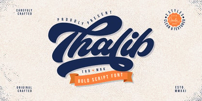 Thalib is an elegant bold script font with retro look. Comes with 2 styles, clean and textured. Suitable for logotype, branding, packaging design, poster design, website/display, editorial, headline, advertising, and more. Whats Include? Opentype support Multilingual support PUA encoded Features: Uppercase, lowercase, numerals, punctuations, alternates, contextual alternates, and stylistic sets Accessible in the Adobe Illustrator Glyphs panel, or under Stylistic Alternates in the Adobe Photoshop OpenType menu, Adobe InDesign, Corel Draw, even work on Microsoft Word
 - ITC Connectivities by ITC,
$29.99Some words from the designer... West coast artist Teri Kahan developed a "design font" of 68 pictographs capturing the sentiments of relationship, connection and synchronicity. Many of the characters were created with phrases in mind like, "handing you the world on a platter", "howling at the moon", and "message in a bottle". Others represent life experiences. The clean, simple illustration style originates from the look of hand-carved rubber stamps, and lends itself beautifully to logos and graphics. - Brushstrike by Zetafonts,
$39.00 The Brush Strike Family is an exercise in dynamic, gestural brush type design by Francesco Canovaro. The typeface contains no lowercase set, but it doubles the uppercase with a strikethrough alternate set to be used for dynamic logo design and unusual word highlighting. Two weights are available with consistent design: the light weight (Brushstrike Light aka Lightstrike) can work together with the heavier regular weight but can also be used in white on dark background for light effects.
 - Southside Fizz by Hanoded,
$15.00 Southside Fizz is a cocktail (made with gin, lime, mint and soda). Southside Fizz font was based on a single word in a 1930’s advertisement and my Palembang font. I did not have that many glyphs to work with, so I made most of them up. Southside Fizz became a very elegant all caps Art Deco font, quite useful for wedding invitations, books and posters. It comes with a roaring amount of diacritics as well.
 - Receptor by TEKNIKE,
$55.00 Receptor is a geometric monospace display font. The typeface is made from single basic square geometric units grouped together to form a whole. The name is derived from the word 'recept' meaning an idea formed by the repetition of similar or successive percepts of the same object; in science a receptor is a chemical structure that receives and converts signals. Receptor is great for display work, logos, structures, architecture, technology, biology, sports, monograms, quotes, headings and posters.
 - Double Take JNL by Jeff Levine,
$29.00Hey, what the hey! You'll have to look twice at this unusual typeface from Jeff Levine. Utilizing the sans serif lettering found in Trade Printer JNL, this novelty font combines two staggered outline versions that are blended together to give a double-image effect. This works best at large point sizes and with minimum word count. Use it for attention-getting phrases such as "You'll See Double" or "You Won't Believe Your Eyes" (or similar ad copy). - Polaris by AVP,
$10.00 Polaris is a rounded sans-serif family with four styles designed for easy reading. Perfect for print - brochures, posters, newsletters and stationery. For signage, Polaris comes with a variety of compatible arrows. Polaris is also great on-screen: use it on your website as an alternative to the over-used standards. Polaris works in the background, creating an atmosphere of harmony and modernity while your words deliver the message and your graphics and images achieve the prominence they deserve.