10,000 search results
(0.014 seconds)
- M Zhi Hei HK by Monotype HK,
$523.99 M Zhi Hei's design concept comes from M Stiff Hei , where horizontal and vertical strokes (橫、豎) are direct, dots (點) are short but forceful, downstrokes(撇、捺) are straight and sharp - everything bold and straightforward. One big difference between M Zhi Hei and M Stiff Hei, is the similar thickness of horizontal strokes (橫) across all font styles, so that there would be a strong contrast formed by the thin horizontal and thick vertical strokes (橫、豎) in the bold face. Still, remains bright, neat and beautifully crafted, it is a multi-purpose typeface that convince audiences and cater for different needs.
 - Sommerwerk Ink by Sommerwerk,
$29.00 This font is inspired by typography found on old German shop windows. It is a script font, but instead of imitating human handwriting and the gestures connected to it, the goal was to come up with a new writing flow and stroke order. As opposed to handwriting Latin script letters, which normally means drawing each character and then connecting it to the next one, the strokes of this font run across multiple glyphs. Intentionally, the design aims to achieve a flowing transition between each glyph without making use of contextual alternates, taking the limitations of classic machine lettering as a challenge.
 - Technojunk by Hanoded,
$15.00 I came across an article in which the author warned about the growing pile of technojunk. It appears we throw away 50 million tonnes of unwanted gadgets EVERY YEAR - and, yes, that number is growing as these are the figures for 2012. 50 million tonnes - just think of that! The new font I was working on had a squarish look - almost computer like, so I decided to call it technojunk. Hopefully you won't throw it away… Technojunk is a 3D font, every glyph was drawn by hand. It is fat, fun and very useful. Try it out!
 - Brokman by The Northern Block,
$32.00 Brokman is a contemporary sans serif designed to bring clarity and originality to brand related projects. The open apertures and large x-height help provide a fresh aesthetic with an easy, fluid texture across design layouts. While it's squarish proportions are balanced with subtle rounding achieving a carefully modulated and textured feel in longer text scenarios. Its weight-range allows great flexibility, making the typefaces suitable for a variety of media applications including apps, brand identities, broadcast, gaming and the web. Details include 430 characters, seven weights each with true italics, manually edited kerning and Opentype features.
 - Calps by Typesketchbook,
$55.00 Calps is a condensed sans serif font. An unfussy design, the font is designed to be consistent across such letters as a, b, d, q, p, g and C, G, O, Q, creating a uniformity for the set. Each corner of the line is carved to decrease its sharpness, adding a touch of friendliness. If the standard font is not sufficiently condensed, there is a slim variation offering narrower proportions. In addition to the slim variation, the font also comes in roman and italic versions in 9 weights, offering a total of 36 variations for the font.
 - M Zhi Hei PRC by Monotype HK,
$523.99 M Zhi Hei's design concept comes from M Stiff Hei , where horizontal and vertical strokes (橫、豎) are direct, dots (點) are short but forceful, downstrokes(撇、捺) are straight and sharp - everything bold and straightforward. One big difference between M Zhi Hei and M Stiff Hei, is the similar thickness of horizontal strokes (橫) across all font styles, so that there would be a strong contrast formed by the thin horizontal and thick vertical strokes (橫、豎) in the bold face. Still, remains bright, neat and beautifully crafted, it is a multi-purpose typeface that convince audiences and cater for different needs.
 - Neue Frutiger Vietnamese by Linotype,
$29.00 Neue Frutiger Vietnamese''' was developed by a team of designers and font engineers from the Monotype Studio under the direction of Monotype type director Akira Kobayashi. The family is available in 10 weights from Ultra Light to Extra Black, with matching italics. Neue Frutiger Vietnamese embodies the same warmth and clarity as Adrian Frutiger's original design, but allows brands to maintain their visual identity, and communicate with a consistent tone of voice, regardless of the language. It is part of the Neue Frutiger World collection, offering linguistic versatility across environments – suited to branding and corporate identity, advertising, signage, wayfinding, print, and digital environments.
 - Nuga by 38-lineart,
$24.00 The Nuga typeface embodies a commanding presence with its slab serif design, offering a versatile range across 9 distinct weights from thin to black. This extensive variety is further enriched by both regular and italic styles, totaling 18 distinct fonts. Its robust nature makes it an ideal choice for titles, headers, and subheaders, lending an authoritative air to any text. However, it doesn't stop there; Nuga's versatility extends to paragraphs, making it suitable for both display and body text. This font stands out effortlessly in branding, print materials, and logos, its powerful characteristics leaving a lasting impression on any design it graces.
 - Merel by Inhouse Type,
$33.78 Merel is a modern geometric typeface with humanist attributes. Geometry and logic are at the heart of this 6 weight font family. Humanist touches give it a number of distinctive characteristics, as well as aid legibility. Despite being rational and function driven in its nature, Merel has a soft and gentle touch. It was designed to tackle both print and onscreen challenges of the modern environment. Details include reduced x-height, mild stroke contrast and vertically sheared terminals with cushioned finish across the typeface. Merel features a number of alternative characters, manually edited kerning and Opentype features.
 - LoveYaHoney by Typadelic,
$14.95 Aw, aren't they sweet? This lettering is based on a 1950s note a husband wrote to his wife shortly after they were married. His beautifully controlled and strong handwriting knows no lowercase characters; he gets his point across in uppercase only. In today's world of email and internet writings, we know that uppercase means shouting and is considered quite rude, but he didn't know that when he wrote this letter to his lovely wife! Love Ya Honey is very legible and looks beautiful when used for headlines, titling or even long expanses of body copy. Perfect for scrapbooking too!
 - Data Error Vert AOE Pro by Astigmatic,
$24.00 The Data Error Vert AOE Pro family is another spinoff of my Data Error AOE Pro family. Quite simply, it takes on a slightly different feel than the original pin matrix grid by stroking across all vertical glyph lines. The vertical lines break up the readability somewhat of the original grid and lend a more tech vibe to the family. Check out the range of posters created to see the various Capitals, Lowercase, smallcaps and varying styles that the family has to offer and how it both differs from and compliments the original Data Error AOE Pro family.
 - Ciroke by Hazztype,
$16.00 Ciroke is a distinctive modern blackletter typeface that seamlessly fuses the classic elegance of blackletter with the clean and contemporary aesthetics of sans serif fonts. This unique fusion results in a visually striking and versatile typeface that effortlessly bridges tradition and modernity. Ciroke is an ideal choice for projects that demand a modern yet timeless aesthetic. It works well in branding, editorial design, packaging, and any application where a balance between tradition and contemporary style is desired. The font's versatility ensures that it can be used across various design platforms, from digital screens to print media.
 - Steradian by Emtype Foundry,
$69.00 Steradian is an exploration of the geometric genre and although it has a geometric base, the widths between letters are not much different across the weights. That is due to the process, in which the proportions of the heavier weights paved the way for the lighter ones. It also has a series of details that make Steradian stand out and gives it a special touch. Some of its main features are the double-story ‘a’, its closed apertures and some of the capitals have a distinct personality (such as the G and Q). Read more about the design process at the Emtype’s Blog.
 - Skarpa by Aga Silva,
$23.99 This is long awaited thorough revision to Skarpa family. The revision has inculded both another look at letter shapes as well as kerning and metrics of the files. The shapes encapsulated in this font stem from old time architectural drawings hand executed at drawing board with tracing paper and rapidographs. Think of lettering stencils sliding across the tracing paper and craftily exectuted drawing descriptions. The font is based on geometric forms devoid of excessive flourishing. Would suit modern designs either in fashion, technology or laboratory setting. Would look good on door plaques in pharmacy or simple drawer plaques - especially Medium or Bold specimen.
 - Ribeye Pro by Stiggy & Sands,
$29.00 The Ribeye Pro Family is reminiscent of a cartoon tattoo style of lettering, but exhibits a playfulness that breaks traditional weight distribution across its letterforms. An edgy attitude, friendly syncopation, and highly legible letterforms makes these fonts a real pair of charmers. The SmallCaps and extensive figure sets give the Ribeye Pro Family a more diverse design voice, ranging from slightly serious to downright ludicrous. Opentype features include: - SmallCaps. - Full set of Inferiors and Superiors for limitless fractions. - Tabular, Proportional, and Oldstyle figure sets (along with SmallCaps versions of the figures). - Stylistic Alternates for Caps to SmallCaps conversion.
 - Staple by Ajeet Mestry,
$50.00 Staple is a Display Font. Each letter and number is made up of a clever arrangement of staples. Together, they retain the simplicity and beauty of a perfectly folded stapler pin. This creates a font that provides very good readability, solid shape and simple elegance that makes it perfect for use as a display font. To add elegance to the font, the letters and numerals are designed to retain the pin identity across all characters. Care has been taken so that the pins do not overlap. Nor are the pins bent or twisted into unnatural shapes to create the characters.
 - Acrom by Inhouse Type,
$33.78 Acrom is a geometric sans serif typeface with a minimal stroke contrast. It was designed with a modern, contemporary context in mind. Acrom is not merely mechanical, it can also be recognised as a natural typeface with subtle geometric aesthetics. The humanist quality of the font aids legibility across both text and display work. Acrom’s main characteristics lie in the injection of stylistic forms that enhance its individuality without overpowering the font’s functional purpose and integrity. The font can be tamed utilising the set of alternative characters available within the typeface. Details include 500 characters, manually edited kerning and Opentype features.
 - Channel B by Just My Type,
$25.00 Channel B was derived from the logo for Channel B, a British entertainment internet channel, anchored by former Soccer AM presenter Tim Lovejoy at www.dailymotion.com/channelbee. I’m not sure what it was in 2008 when I first ran across the logo, but that elegant capital B seemed to cry out for a font to support it. Many of the capitals, numbers and other glyphs of Channel B are split into a top and bottom, but not all. The tall, condensed capitals are contrasted to the rounded lowercase (derived from the bottom half of the B, rotated 180°).
 - Neue Frutiger Arabic by Linotype,
$79.00 Neue Frutiger Arabic was created by Nadine Chahine and a team of designers and font engineers from the Monotype Studio, under the direction of Monotype type director Akira Kobayashi. The family is available in 10 weights from Ultra Light to Extra Black. Neue Frutiger Arabic embodies the same warmth and clarity as Adrian Frutiger's original design, but allows brands to maintain their visual identity, and communicate with a consistent tone of voice, regardless of the language. It is part of the Neue Frutiger World collection, offering linguistic versatility across environments – suited to branding and corporate identity, advertising, signage, wayfinding, print, and digital environments.
 - Roadie PB by Pink Broccoli,
$16.00 Roadie was inspired by a 1981 Hallmark card with lettering that was full of frolicking fun. Filled with a childish persona and a playful bounce, this Roadie has a lot to offer. As with some of my previous type designs, it is a typographic dance, wonderfully skipping across designs, surprising with each letter typed. With an extensive character set, and clean sharpie marker-like look, Roadie is a joy to typeset with, and it comes with a stylistic alternates feature that shuffles the Capitals and lowercase that share similar unicase forms that add to the quirky playfulness.
 - Nightclubber by Device,
$29.00 The late 70s and early 80s is sometimes considered to be the period when headline typography went off the rails. Growing up in that period, some designers may beg to differ. Many geometric designs were available in dry-transfer and for the typositor, and were used everywhere a youth-culture look was appropriate - annuals, comics, club flyers, high-street boutiques, TV-advertised compila tion albums. Nightclubber is a fond homage to the excesses of the period, and should be used back-lit in pink neon or at a rakish 45 degree slant across a blurred photograph of a glitter ball.
 - Duc de Berry by Linotype,
$29.99Duc de Berry is a part of the 1990 program Type before Gutenberg, which included the work of twelve contemporary font designers and represented styles from across the ages. Linotype offers a package including all these fonts on its web page, www.fonts.de. The design of Duc de Berry was influenced by those of typefaces created between the 13th and 16th centuries. The font was named after Duc de Berry, whose beautiful missals inspired typefaces of the 15th century. The capital letters are especially elegant and can be used either as initials or as contrast to the much more reserved lower case letters. - Barn Party by Missy Meyer,
$15.00 I'll admit right off the bat here -- I've never been to a party in a barn. I don't even know if they still do barn dances and parties, or if that's something out of the musical Oklahoma! or something. But this font gave me kind of a homey, rustic feel, so the name felt right! Like many of my fonts, this one has been refined with crafters in mind -- smoothed curves and reduced nodes, for easy cutting and printing. It's also packed with over 600 characters total! The usual alphabet, numbers, and punctuation, plus 30 double-letter ligatures, over 300 diacritics, and a full second alphabet coded in as Stylistic Alternates. Enjoy!
 - Rebus Script by Ascender,
$29.99 Rebus Script is a fun, lively font that lets you create rebus puzzles by automatically replacing certain words or syllables with pictures. This font is an advanced OpenType font that requires an application that supports Contextual Alternates. The font was created by Terrance Weinzierl and is based on the Louisville Script handwriting font designed by Steve Matteson. To use the font you simply type a word like 'sun' or 'son' and those letters will automatically be replaced by a picture of the sun. There are over 70 pictorial symbols in Rebus Script that make up the 'vocabulary' for automatic substitution based on over 300 different syllable/word combinations in various cases (lower, upper, titling) in the English language.
 - Rich Dingbats & Bursts by Enrich Design,
$24.95 Rich Dingbats & Bursts was created with graphic designers in mind. I worked for a weekly newspaper, and finding different bursts was a challenge. You either had to draw your own (and who has time for that under tight deadlines) or use the same dull bursts over and over. I wanted to give the people I worked with at the newspaper choices, and Rich Dingbats & Bursts was born. There are several uses for this font. It's great for adding graphic elements to your Photoshop artwork. In FreeHand, users can convert the burst and paste a photo inside the burst for an interesting effect. QuarkXPress users don't have to import or draw bursts, just type the appropriate character!
 - P22 FLW Midway by P22 Type Foundry,
$29.95 This font set is based on Frank Lloyd Wright's hand-lettering found on the Chicago Midway Gardens working drawings from 1913. This type of architectural lettering is a bit more casual than standard lettering found on most blueprints. It evokes the personality of Frank Lloyd Wright and complements the other fonts in the P22 FLW font series. Midway One and Midway Two can be used interchangeably to give a more naturalistic feeling of hand lettering. Midway Ornaments features over 100 decorative border elements that can be combined is many ways for surprising and effective decorative motifs. Midway One and Midway Two have been remastered and now contain over 400 characters including support for Western and Central European languages.
 - Sparhawk by Albatross,
$19.00 Sparhawk in its obvious form is a 3D layered display font, but it's packed with over 300 swashes, extremely rare in the 3D font world. Every single swash is hand-drawn for extreme organic realism. The lowercase are small caps and the swashes are designed to be used mostly with the lowercase letters (top and drop swashes), but the drop (bottom) swashes also work well with all caps. Sparhawk’s large character set and plethora of alternates makes it perfect for logo type, birthdays, weddings, bands… the list goes on. All features include: 8 Awesome Layer Styles, 15 sets of Stylistic Alternates (over 300+ Individually Drawn Swashes), Double-Letter Ligatures for upper and lowercase, and Contextual Alternates.
 - Goodbees by ZetDesign,
$15.00 Goodbees is built from a bold base, unique combinations, smooth curves, and sharp edges. Goodbees is best uses for headings, Logo types, quotes, apparel design, invitations, flyers, posters, greeting cards, product packaging, book covers, printed quotes, album covers, movies and more.
 - Racing Sunday by ahweproject,
$10.00 Racing Sunday is a modern techno display font and unique style that instantly add power and movement to your projects. Racing Sunday is very suitable for automotive magazine covers, racing game covers, logos & branding, product design, labels, and so on.
 - Alan Walker by Goodigital13,
$20.00 Perfectly suited to signature, stationery, logo, typography quotes, magazine or book cover, website header, clothing, branding, packaging design and more.perfectly suited to signature, stationery, logo, typography quotes, magazine or book cover, website header, flyer, clothing, branding, packaging design and more.
 - Dreadful by Aiyari,
$14.00 Introducing a new layered typeface called Dreadful. Inspired from classic horror movie and vintage comic. Dreadful typeface best uses for headings, Logo type, quotes, apparel design, invitations, flyer, poster, greeting cards, product packaging, book cover, printed quotes, cover album, movie, etc.
 - DARKMODE Helloween by WAP Type,
$15.00 Darkmode helloween was inspired from gothic, scary, protest, and horror nuance. Combine with hand drawn brush who make the typeface looks very instant and messy. Uses for film, quotes, cover book, title, cover album, logo, clothing, invitation, event, labels, poster, etc.
 - Arshin by madeDeduk,
$16.00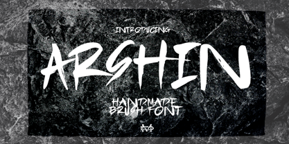 Arshin is a handmade brush font. This font is perfect for poster design, book covers, merchandise, fashion campaigns, newsletters, branding, advertising, magazines, greeting cards, album covers, and more. Features: - Uppercase & Lowercase - Numbers & Symbols - International Glyphs - Multilingual support - ligatures Enjoy it.
 - Pen Elegant JNL by Jeff Levine,
$29.00 A 1918 lettering instruction book by William Hugh Gordon presented a number of lettering styles that were geared toward sign and show card painters along with tips and tricks regarding the correct construction of such signs for maximum effect. One pen lettered Roman alphabet with a beautiful set of numerals has been recreated digitally as Pen Elegant JNL, which is available in both regular and oblique versions. To note, Gordon was the co-inventor of the Speedball lettering pen with Ross F. George in 1915.
 - By George Titling NF by Nick's Fonts,
$10.00By the time that the 13th edition of the Speedball Text Book appeared in 1938, silent movies were a thing of the past; nonetheless, intrepid author Ross F. George included this typeface, originally intended for title cards, in the volume. Elegant and inviting, the occasionally quirky letterforms feature subtle diamond-shaped accents that add just the right touch of sparkle. The PC Postscript, Truetype and Opentype versions contain the complete Latin language character set (Unicode 1252) plus Central European (Unicode 1250) languages as well. - Hebrew Dot III by Samtype,
$34.00 Beautiful font to use in Book covers and Posters.
 - Hebrew Dot by Samtype,
$34.00 Beautiful font to use in Book covers and Posters.
 - Hello Arson by Dismantle Destroy,
$19.00 This font is great for CD covers and posters.
 - Hebrew Dot II by Samtype,
$34.00 Beautiful font to use in Book covers and Posters.
 - Big Heroes by Typefactory,
$14.00 Big Heroes is playful font which puts a smile on your projects and will inspire you to create something fun and memorable. It is perfect for headings, flyer, greeting cards, product packaging, book cover, printed quotes, logotype, apparel design, album covers, etc