10,000 search results
(0.012 seconds)
- Verena by Autographis,
$39.50 Verena was written with a common felt marker pen, scanned and worked over, to keep just the right amount of roughness. The result is a very readable and usable handwritten font.
 - Shining Night by Gleb Guralnyk,
$15.00 Hi! Introducing a vintage style font Shining Night. This font has additional font file with round dots over the base glyphs, that immitates a lamp lights of a real cabaret signboard.
 - Text Tile by Tetradtype,
$25.00 TextTile is a system of heavy sans titling faces which can be utilized to carry a repeating chromatic pattern across words and letters. It stands apart from other chromatic faces, where layered effects typically interact only within each letter and do not carry through from one letter to another. The pattern repetition across letters of varying widths is achieved through OpenType substitution, using conditional alternates for each successive letter to allow for a seamless appearance across words, regardless of letter combinations. Though the pattern exists on a strict grid and the letters' widths and spacing must be highly regular in order to preserve the pattern repeat, the letterforms themselves are not rigid; rather, they appear organic, lively. The initial release includes patterns inspired by a classic buffalo plaid, separated into its horizontal and vertical components to maximize the creative possibilities for layering one-, two-, three-, and even four-color plaid patterns. Kits are available to produce the plaid pattern in detail—with overlapping diagonal hatching fully visible—or as a simplified version in which transparency can be used to simulate plaid or to create a checkered or striped effect. The TextTile family of fonts is a flexible canvas for mixing and matching a broad array of patterns to create a unique look. Check back for more pattern releases and take a look at the online specimen to see what is possible with the current offerings. Usage Notes For best results use an OpenType aware program. Enabling Contextual Alternates will ensure pattern alignment. For patterns that are made up of vertical stripes or columns using the Stylistic Alternate/Stylistic Set 1 will shift the columns. Stylistic Set 2 will change 1-0 into blocks of patterns.
 - Quarter Braille by Echopraxium,
$20.00 Presentation QuarterBraille (Abbreviated as "QB" thereafter) is a decorative, steganographic and lattice font. Its core design concept is that Braille dots are represented as "quarters of a square"[1]. This is illustrated by posters 1 and 2 (NB: these glyph parts will be called "QB dots" thereafter). The other glyph parts (see poster 3) are purely decorative and meaningless in terms of Braille dots encoding[2]. All glyph parts are meant to generate a wide variety of patterns from horizontal and vertical combinations of glyphs. There is also a graphic convention to differentiate uppercase from lowercase letters with the presence or absence of shape subparts (in the "endings", "quarter of a circle with a ring" and "quarter of a diamond with a small square in the middle") like shown by poster 4. This font is suitable for very short texts (e.g. logos, acronyms, quotes, ambigrams, pangrams, palindromes, etc...) but on the other hand it may be used for steganographic purpose like geocaching as well as fictive alphabets (e.g. Alien/SciFi/Fantasy/Antique civilizations). Posters 1. Font Logo: the displayed text is " Quarter " followed by " Braille". There's a rainbow layer above the text to highlight the "QB dots", this is achieved by A..Z glyphs with "only QB dots" (codes 230..255) 2. Anatomy of a Glyph (L) and "QB Dots" (quarters of a square) 3. Glyphs Parts: Square and Cross (Inverted square), Circle and Inverted Circle (with or without the small circle in the middle), Diamond (with or without the small square in the middle), Inverted Square and Circle, Shape combos, Ending 4. Uppercase vs Lowercase (tiny shape subparts are shown in red) 5. Sample 1: Bathroom sink with QB tiles on the credence 6. Sample 2: Hands knuckle tatoos: "LOVE/HATE"[4] 7. Sample 3: Poker Hand: pocket Aces. It's an Ace of Hearts (Ah) on the left and an Ace of Spades (As) on the right. Like in regular cards, the card value (e.g. Ah) is displayed twice: at the top and rotated by 180 degrees at the bottom. This poster also illustrates that QB could be used to print embossed playing cards with tactile and visual display of card values. 8. Sample 4: Pangram: "Adept quick jog over frozen blue whisky mix" 9. Sample 5: Latin Magic Square: "SATOR AREPO TENET OPERA ROTAS" (NB: for compensation of the 2/3 glyph ratio, letters on each line are separated by a space: "S A T O R", ...). 10. Sample 6: Quote of Mahatma Gandhi: "Learn as if you will live forever, live like you will die tomorrow.". This is also a demonstration of border glyphs combinations. 11. Sample 7: Steganography use case: the text is a sequence of 64 aminoacids (1 Letter notation), this protein was described in a research paper "The complete Aminoacid sequence of an amyloid fibril protein AA of unusual size (64 residues) 1975". 12. Sample 8: Border Glyphs with the provided styles and mixed styles. The words are the same than in poster 9 ("SATOR AREPO TENET OPERA ROTAS"). Despite the 2/3 glyph ratio, the "TENET cross" was achieved by both inserting spaces in horizontally ("T ENE T") and by using the "thin borders glyphs". Notes a. Border glyphs[3] are meant to enhance the esthetics of text samples displayed with QB b. Special characters (e.g. *$()[].,;:&@# ...) are provided and follow the NABCC (North American Braille Computer Code) convention. c. A..Z Glyphs with only the "QB dots" are provided as demonstrated by posters 1 and 2 (A/N: this was very useful to create them). d. Glyph Map: 32..64: Special characters - 161..187: "Thin variant" of Border glyphs, 192..229: Border glyphs, 230..255: A..Z with only the "QB dots" - Codes 176 an 181 are "regular SPACE" (empty glyph). Footnotes 1. There is indeed two shapes which represent the braille dot: the "quarter of a square" and the "quarter of a cross". It's because a cross may be considered as an "inverted square" because the square corners are merged in the center. 2. That's why the SPACE glyph is only made of decorative/meaningless glyph parts (i.e. no "QB dots"). 3. For other fonts with border glyphs, please take a look at my other "decorative Braille fonts" (GoBraille, HexBraille, KernigBraille, StackBraille, MaBraille, DiamondBraille, LorraineBraille). 4. LOVE/HATE knuckle tatoos are inspired by the anthology scene from "The Night of the Hunter" movie (Charles Laughton 1955), it also appearead in "Do The Right Thing" movie (Spike Lee 1989). Disclaimer This font is not appropriate and not meant to print text documents in Braille for the blind readers audience.
 - Phalang - Personal use only

- Mechanical Stencil JNL by Jeff Levine,
$29.00 For well over a century, stencil machines allowed manufacturers, shippers and even the military to quickly mark and identify objects. Mechanical Stencil JNL was created from examples from one of these machines.
 - Blazedale by Chank,
$99.00 Check out this new guy: he’s casual & elegant, jaunty and sharp. Fancy, but not over-the-top. Blazedale is an instantly likable new display face ready to send a funky upbeat message.
 - Castles&Shields by Deniart Systems,
$15.00For all your royal invitations. The Castles & Shields Series contains over 85 unique and decorative characters depicting numbers and alphabets in castle and shield silhouettes to give your documents a medieval feel. - Adobe Bengali by Adobe,
$29.00The Adobe Bengali typeface was designed by Neelakash Kshetrimayum, with Bengali script expert Fiona Ross consulting on the design. This type family was designed to harmonize with Adobe?s other Brahmic fonts, both in terms of apparent size and style, to ensure that this suite of typefaces families can be typeset together as a system. The primary intended usage ? for printed outputs, particularly continuous text settings ? guided the design direction. - Finura by DSType,
$26.00 Finura was inspired by American lettering from the 60s, specially the Stunt Roman for ruling pen and compass presented in the Speedball Textbook for Pen & Brush Lettering by Ross F. George, but also by looking carefully to University Roman characteristics. Finura is an experience on very thin poster typefaces and the possibilities to design extreme delicate typefaces, with plenty details, that sheer simplicity and readability to the classic forms.
 - Adobe Kannada by Adobe,
$29.00The Adobe Kannada typeface was designed by Erin McLaughlin, with Brahmic script expert Fiona Ross consulting on the design. This type family was designed to harmonize with Adobe?s other Brahmic fonts, both in terms of apparent size and style, to ensure that this suite of typeface families can be typeset together as a system. The primary intended usage ? for printed outputs, particularly continuous text settings ? guided the design direction. - Wanderer by FontMesa,
$25.00This font was inspired by the title logo of the TV show The Wild Wild West (season two). The font was named after the train in the TV show. Wanderer is a combination of my Classic Tuscan Rodeo Clown font and a Robust Slab Serif font. Wanderer is available as a stand alone font or with the optional fill fonts. Caution: Use of this font may cause the Wild Wild West theme song to play over and over in your head. Solution: Try temporarily using another FontMesa font such as Rough Riders. - Saxo Grammaticus by Jonas Stensgaard,
$8.00 Saxo Grammaticus is a beautiful and friendly family that works great with family themes, elegant & classy material and professional settings. It's so versatile you'll find yourself coming back to it over and over for your projects, and that's whether you're looking to create logos, quotes, poster designs, brochures, packaging, anything with big letters like headlines, wedding invitations, holiday cards, advertisements, signs and on and on and on... There is a total of 107 ligatures and 76 alternates! That's plenty of options for any designer wanting to give those big letters a little extra wham bam!
 - Moilgo by Fype Co,
$16.00 Moilgo is a beautiful bold typeface that was inspired by classic typefaces that are synonymous with luxury brands, beauty and elegant curves, high contrast and an all-round feel, perfect for art projects and typography across all platforms. Moilgo also has unique ligatures which makes it easy for you to create a logo for your personal branding and your business beautifully. Moilgo will be perfect for many project like logos, magazines, posters, branding, packaging, quotes, blog headers, advertisements, and more.
 - Sangkhamonthon by Jipatype,
$17.00 Sangkhamonthon, a distinctive headline typeface, captivates audiences with its enchanting and sacred essence, highlighted by a sharp 45-degree tip. This font is specifically crafted for use in headlines across a myriad of media platforms, where the emphasis lies in communicating messages related to belief and faith. Whether employed in digital or print media, Sangkhamonthon adds a touch of mystique and reverence, making it a compelling choice for content that seeks to evoke a sense of magic and spiritual significance.
 - Linotype Graphena by Linotype,
$29.99Linotype Graphena is part of the Take Type Library, selected from the contestants of Linotype’s International Digital Type Design Contests of 1994 and 1997. It is a handwriting font designed by the Italian artist Giancarlo Barison. Consciously irregular and erratic, the letters dance across a page, large and small, tilted and erect. Linotype Graphena could be described as angular, restless, even mischievous. It should be set in point sizes no smaller than 12 and is best used for headlines and displays. - Luminum JNL by Jeff Levine,
$29.00In hardware stores across the country are display racks with letters and numbers silk-screened onto self-adhesive aluminum "parallelograms". These handy and durable items have graced countless mailboxes, office doors, hallway signs and automobiles for years. My fellow font designing buddy [Harold Lohner] suggested that I make a font based on this form of lettering as a counterpart to my Mailbox Letters JNL (also based on self-adhesive signage product)... and now his suggestion takes shape as a digital font... Luminum JNL. - ITC Clover by ITC,
$29.99ITC Clover is the work of California designer Jill Bell. ITC Clover's design is even, rounded, and friendly. It has the look of the loopy cursive writing taught in grade school, although its shapes are much more controlled. Capitals are decorated with generous loops and curlicues, which combine with a lowercase alphabet that is only reserved in relation to the capitals. The letters almost dance across the page even when they are static, and they bring their own dynamism to any animation. - Xander by Monotype,
$29.99Based on the handwriting of the eminent Dutch typographer Alexander Verberne, Julius de Goede's Xander typeface manages to be both sophisticated and whimsical. This monoline connecting script dances across the page with the grace of a ballerina. An accomplished graphic designer and writer of more than 20 books on calligraphy, de Goede's lettering skills are evident in this careful translation of casual handwriting into a lighthearted, affable typeface family. Like a warm breeze on a spring day, Xander is fresh and welcome. - Vladimir Script by ITC,
$40.99Vladimir Script is a brush-style font, similar to the kind of lettering found on old hand-painted department store signs during the 1950s. The letters have a steep slant, and the uppercase letters and the numbers are rather informal. Many of the letters' strokes end in looped terminals, some with dynamic amounts of contrast. Vladimir Script is best used in larger point sizes, where its subtle details can dance across the page. The typeface looks fabulous on signs and cards. - Packing Heat by Hanoded,
$16.00 I came across a photo of Al Capone and some of his henchmen when searching the internet for something completely unrelated. We don’t have a history of notorious gangsters in Holland, so I was intrigued by Capone all of my life. Packing Heat is 1930’s slang for ‘carrying a gun’, which I thought befitted this handmade font with an early 20th century look. Packing Heat comes with multilingual support and a set of alternates for the lower case glyphs.
 - Toroka by Inhouse Type,
$44.55 Toroka is a geometric sans serif type family with an extensive selection of styles. Functional and highly legible, it has a friendly vibe due to the lack of extending stems on "b", "d", "p", "q", "u", and "r". Its distinctive personality comes across through the rounded apexes of "V", "W", "v", and "w". Stylised "g" and "y" add sugar and spice. The additional stylistic set offers an eccentric display alternative to the uppercase. Opentype features include ligatures, tabular figures and fractions.
 - Tavolga by Ivan Petrov,
$30.00 Tavolga have the mood of brushed feeling and come across as friendly and gentle. The harmony of organic and smooth shapes makes Tavolga uniquely appealing for display and titling where special expression is required. It has 6 weights, ranging from Thin to Black is ideally suited for advertising and packaging, festive occasions, editorial and publishing, logo, branding and creative industries, poster and billboards as well as web and screen design. Tavolga includes alternates for every uppercase letter, plus a handful of ligatures.
 - Sunrise Till Sunset by Comicraft,
$19.00 Between twilight and daybreak it is said that the dark side of the human psyche eclipses the sun that shines from the depths of our souls. Certainty turns to doubt, clarity becomes confusion, man turns into wolf, the dead wake, vampires seduce the young are restless and milk boils over on the stove. Those that seek only to bathe in the light of a romantic new moon often end their tragic lives soaked in nothing other than their own blood, and the milk spilt on the stovetop has no one left to cry over it. There are fifty shades of grey during those hours after sunset and I think just as many in my porridge this morning. Yes, okay, I admit it, I spoiled the milk! This porridge tastes like it was left in a graveyard overnight. Death warmed over. Gothic and lumpy. Just like the Buried weights of this font.
 - SKETCHUP FREE TRIAL - Personal use only

- ThinPen by Authentic,
$39.50 ThinPen is based on an ancestor of the German DIN-Schrift. The font was traced with a plastic template on transparent paper, scanned and worked over carefully to keep the handmade, authentic touch.
 - Norm Pen by Authentic,
$39.50 NormPen is based on an ancestor of the German DIN-Schrift. The font was traced with a plastic template on transparent paper, scanned and worked over carefully to keep the handmade, authentic touch.
 - Monsterific BB by Blambot,
$20.00 Monsterific BB was inspired by classic 70s horror magazine titles, and features a large complement of European characters and over 160 Opentype Autoligatures! Perfect for Halloween or any spooky time of the year!
 - Bold Pen by Authentic,
$39.50 BoldPen is based on an ancestor of the German DIN-Schrift. The font was traced with a plastic template on transparent paper, scanned and worked over carefully to keep the handmade, authentic touch.
 - Borealis by Elemeno,
$25.00Borealis has an over-bitmapped, whimsical quality, but retains the strength and lines of the underlying design. It's ideal for designs in which a grunge font might be desired, but legibility is crucial. - Kingthings Conundrum Pro by CheapProFonts,
$10.00 This pearl by Kevin King was the best faux chinese font I've ever come over, and now it can be used for setting themed text and menus in many more languages! :) Kevin King says: "I have said before you know - I can if I want to (Stamp! Scowl!). Cod Chinese of the worst kind, I wanted a "Chinese" font for a project and couldn't find what I wanted. I painted this font with a Chinese brush and imported the resultant mess - it's been a while since I did any Chinese calligraphy - add that to the fact that I don't read or speak Chinese..." ALL fonts from CheapProFonts have very extensive language support: They contain some unusual diacritic letters (some of which are contained in the Latin Extended-B Unicode block) supporting: Cornish, Filipino (Tagalog), Guarani, Luxembourgian, Malagasy, Romanian, Ulithian and Welsh. They also contain all glyphs in the Latin Extended-A Unicode block (which among others cover the Central European and Baltic areas) supporting: Afrikaans, Belarusian (Lacinka), Bosnian, Catalan, Chichewa, Croatian, Czech, Dutch, Esperanto, Greenlandic, Hungarian, Kashubian, Kurdish (Kurmanji), Latvian, Lithuanian, Maltese, Maori, Polish, Saami (Inari), Saami (North), Serbian (latin), Slovak(ian), Slovene, Sorbian (Lower), Sorbian (Upper), Turkish and Turkmen. And they of course contain all the usual "western" glyphs supporting: Albanian, Basque, Breton, Chamorro, Danish, Estonian, Faroese, Finnish, French, Frisian, Galican, German, Icelandic, Indonesian, Irish (Gaelic), Italian, Northern Sotho, Norwegian, Occitan, Portuguese, Rhaeto-Romance, Sami (Lule), Sami (South), Scots (Gaelic), Spanish, Swedish, Tswana, Walloon and Yapese.
 - Serena by Canada Type,
$24.95The story of Serena is a unique one among revivals. Serena was neither a metal face nor a film one. In fact it never went anywhere beyond Stefan Schlesinger’s 1940-41 initial sketches (which he called Saranna). A year later, while working with Dick Dooijes on the Rondo typeface, Schlesinger was sent to a concentration camp where he died, along with any material prospects for the gorgeous letters he'd drawn. The only sketches left of Schlesinger’s Saranna work are found in the archives of the Drukkerij Trio (the owner of which was Schlesinger’s brother-in-law). The sketches were done in pencil and ink over pencil on four sheets of paper. And now Hans van Maanen revives Schlesinger’s spirit as closely as the drawings permit, and elaborately expands the work to cover a multitude of codepages and languages. It took more than 65 years for Schlesinger’s drawings to see the light, so van Maanen made sure to bring them to life stylishly and respectfully. Serena embodies the peace and calm rarely ever found in mainstream calligraphy or other genres of display type. With upright elegance and a slight Eastern touch, this typeface expertly bridges the gracefully casual with the deeply spiritual. The light and soft letter forms add a pleasant, breezy element to anything they touch. When used sparingly in titling or display, Serena is like a sigh of desire, rare but quite memorable and very appreciated. - P22 Glaser Babyfat by P22 Type Foundry,
$24.95 Milton Glaser on designing Babyfat: “This is the first alphabet I ever designed. For some inexplicable reason I called it Babyfat. Because I’m not a type designer, most of my alphabets are actually novelties or graphic ideas expressed typographically. Here the idea was to take a gothic letter and view it simultaneously from two sides. It started out as a rather esoteric letterform; it ended up being used in supermarkets for ‘Sale’ signs.” This forced perspective 3-D font has appeared on many LP covers and posters from the mid 1960s onward. This revival includes the original lowercase for the first time in digital form. Besides the three original styles (Outline, Shaded, and Black) made for photo typesetting, the new P22 Glaser Babyfat introduces six additional variations to allow the user to easily colorize the type as Glaser envisioned. The Keyline, Fill, Glyph, Left, Right, and Down font styles give the user nearly infinite options to create dynamic chromatic effects. P22 Glaser Babyfat was based on original drawings and phototype proofs from the Milton Glaser Studios archives. Typographic punctuation and sorts were imagined by James Grieshaber to work with Glaser’s design, as well as diacritics to accommodate most European languages. Over the years there have been many typefaces that borrowed heavily from the Glaser designs, but these are the only official fonts approved by Milton Glaser Studio and the Estate of Milton Glaser.
 - Serling Galleria by Mans Greback,
$39.00 Serling Galleria is a classy, classic serif font that exudes an air of fine art and high-end creativity. With its clear, legible letterforms and modernist inventiveness, Serling Galleria brings a touch of strict creativity to your designs, making them stand out in sophistication. This versatile font family is perfect for projects that require a refined, elegant aesthetic. With its variable font feature, you have the flexibility to fine-tune the font to your specific needs and create a truly bespoke typographical experience, or use the pre-defined font styles: Thin, Thin Italic, Extra Light, Extra Light Italic, Light, Light Italic, Regular, Regular Italic, Medium, Medium Italic, SemiBold, SemiBold Italic, Bold, Bold Italic, Extra Bold, Extra Bold Italic, Black, Black Italic The diverse styles in the Serling Galleria font family provide unmatched versatility, allowing you to adapt your typography to various design contexts and moods seamlessly. With this array of weights and styles at your fingertips, you can effortlessly create a visual hierarchy, emphasize key elements, and establish a cohesive, engaging design language across your creative projects. Also includes a variable font! Only one font file, but the file contains multiple styles. Use the sliders in Illustrator, Photoshop or InDesign to manually set any weight and width. This gives you not only the predefined styles, but instead more than a thousand ways to customize the type to the exact look your project requires. Built with advanced OpenType functionality, Serling Galleria ensures top-notch quality and provides you with full control and customizability. It includes stylistic and contextual alternates, ligatures, and other features to make your designs truly unique and tailored to your needs. Serling Galleria offers extensive lingual support, covering all Latin-based languages, from Northern Europe to South Africa, from America to South-East Asia. It contains all the characters and symbols you'll ever need, including all punctuation and numbers.
 - Yahukimo by ErlosDesign,
$17.00 Yahukimo is a serif font with a modern style, perfect for posters, web design, magazine covers, album covers, branding, and many other creative ideas.
 - Santica by Aestherica Studio,
$12.00 Santica is a beautiful handwritten font. Santica is ideal for headings, flyers, greeting cards, product packaging, book covers, printed quotes, logotypes, and album covers.
 - Beautiful Things by Brittney Murphy Design,
$8.00 Beautiful Things is a wistful non-connecting script with sweeping ascenders and descenders and natural, flowing lines for an informal, yet elegant look. Contains over 700 glyphs, including foreign Latin characters, alternates and ligatures.
 - JH Zoya Cyrillic by JH Fonts,
$49.00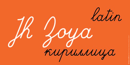 JH Zoya is an advanced Latin and Cyrillic script. It includes over 1500 characters to simulate school handwritten calligraphy. продвинутый кириллический курсивный шрифт. Он включает в себя множество персонажей для имитации школьной рукописной каллиграфии.
 - Killer Elephant by Fenotype,
$19.95 Killer Elephant is a heavy-as-hell all-caps font that'll trample all over your design. Killer Elephant is recommended to use in posters and flyers and in anything mutant, jungle or superhero related.
 - Cindy FA by Fontarte,
$39.00 Imelda Marcos, Cinderella - welcome to the club ... A picture font containing over sixty shoes, slippers and boots, fashionable yesterday, today and maybe tomorrow. Hand drawn by a designer Magdalena Frankowska. Not only for fetishists.

