4,584 search results
(0.031 seconds)
- Ephemera Shoemakers by Ephemera Fonts,
$30.00 Ephemera Shoemakers is a bold font with spurred serif & medium contrasted, vintage inspiration with letters in all caps. Traditionally this type of decorative font that emerged in Italy, France & England in the nineteenth century were used in large headlines and posters that were closely related to circus shows, carnival or environments of the Far West American. Perfect for signs, posters, handbills and other large format advertising. Ephemera Shoemakers Pdf Specimens
 - 1871 Dreamer 2 Pro by GLC,
$42.00 Like our first "1871 Dreamer Script" this script font was inspired from a lot of manuscripts, notes and drafts, written by the famous american poet Walt Whitman. However, it is a very different font, with a higher x-line, numerous different ligatures, alternates and twin letters, including fractions, and, as a real "Pro" font, usable not only for Western European, but also for Eastern and Central European, Baltic and Turkish.
 - Fitzronald by Cercurius,
$29.90 Fitzronald is a body text typeface with a strong personality combined with a good legibility in small sizes. It is an excellent book typeface, but it can be used in e.g. advertising and packaging as well. Due to its good legibility at low resolution, it is a superb website and e-book typeface. Fitzronald is based on Ronaldson, an American typeface originally cut by MacKellar, Smiths & Jordan in 1884.
 - Papyrus by ITC,
$40.99Papyrus is a roman calligraphic typeface with distinctive human touches like rough edges, irregular curves, and high horizontal strokes in the caps. It imparts a warm and friendly ambience to everything from restaurant menus to book covers. American Chris Costello created the popular font Papyrus in 1983 and counts it as one of his proudest accomplishments. In addition to designing type, Costello is a prolific graphic designer, illustrator, and web designer. - Candy Bits by Bitstream,
$30.99Candy Bits was originally designed at Bitstream as a custom project for a large printer manufacturer. Released in 1997, Candy Bits was designed by Jim Lyles. The typographic characters were fashioned after a well known American candy. The balance of the characters in the font are designed to enhance the 3D illusion by appearing to recede into the page. Soon after its completion, Mr. Lyles joined a local health club. - Alternate Gothic Pro Antique by Elsner+Flake,
$35.00 In 1903, the typeface family Alternate Gothic was developed for ATF (American Type Foundry) by Morris Fuller Benton. It was Benton’s intent to solve many diverse layout problems with the development of a narrow Sans with different width values. The Alternate Gothic enjoys great popularity to this day. Therefore, Elsner+Flake re-worked the typeface family, added all European fixed accents and complemented it with an Antique version.
 - Eden CT by CastleType,
$39.00 Eden Light, originally designed by the American type designer Robert H. Middleton in 1934, was commissioned by Publish magazine for a redesign in 1990. When I found a specimen of Eden Bold a couple years later, I decided to digitize it also. Subsequently, I created a Medium weight. Very squared and compact with thin slab serifs, Eden includes support of all European languages that use the Latin alphabet.
 - Finura by DSType,
$26.00 Finura was inspired by American lettering from the 60s, specially the Stunt Roman for ruling pen and compass presented in the Speedball Textbook for Pen & Brush Lettering by Ross F. George, but also by looking carefully to University Roman characteristics. Finura is an experience on very thin poster typefaces and the possibilities to design extreme delicate typefaces, with plenty details, that sheer simplicity and readability to the classic forms.
 - Kaufmann LT by Linotype,
$29.99Kaufmann font was designed in 1936 for the American Type Founders by Max R. Kaufmann, a letterer, typographer, and one-time art director for McCalls magazine. Kaufmann is a connecting script typeface with a smooth, slightly whimsical look. Its monoweight is unusual in a script type but allows for a nice texture on the page when it is combined with sans serif text type. The bold Kaufmann is fine display type. - AT Move Quipo by André Toet Design,
$39.95 QUIPO is a typeface based on my recent survey (Freeflow) on hand drawn logotypes used by American and English pop groups in the 60-70s. We thought it an interesting project and a free flow exercise to design this particular font just in capitals and well... yes it’s rather ‘bulky’. Needless to say it comes with numbers and the normal punctuations ! Concept/Art Direction/Design: André Toet © 2017
 - Gatlinburg Gossamer NF by Nick's Fonts,
$10.00 The original characters, and now-rarely-seen alternate characters, for Memphis, designed by Emil Rudolf Weiss for American Type Founders in 1930, provided the pattern for this wispy, ultralight typeface. Although intended primarily for headlines, this typeface can also be used for brief blocks of text, if set 18 pt. or larger. Both versions of the font include 1252 Latin, 1250 CE (with localization for Romanian and Moldovan).
 - Atonement by Hanoded,
$15.00 Atonement is a splattery, scratchy font. I made it with a steel nibbed pen, a brush and some Chinese ink. I based it on my fonts Ravenheart, Qilin and American Grunge - mostly because I really like them. Of course, all of these fonts are influenced by the work of the great Ralph Steadman - someone I greatly admire. Atonement comes with ligatures for double letter combinations and a stash of diacritics.
 - Etched Stencil JNL by Jeff Levine,
$29.00 The American Sign Museum in Cincinnati houses an amazing collection of vintage signage from all kinds of sources and covering many eras of retail advertising. Someone visiting the museum posted online an image of one particular piece of glass with hand lettering saying “gold leaf” in a bold Art Deco stencil style. Etched Stencil JNL was inspired by that image and is available in both regular and oblique versions.
 - His Nibs NF by Nick's Fonts,
$10.00 This swoopy, loopy script was inspired by an “American roundhand” presented by John M. Bergling in his Art Alphabets and Lettering, first published in 1914. Bergling’s unique talent crafted uppercase letters which manage, at the same time, to be both elegant and ostentatious. The PC Postscript, Truetype and Opentype versions contain the complete Latin language character set (Unicode 1252) plus support for Central European (Unicode 1250) languages as well.
 - VTC Tribal - 100% free

- VTC SeeJoBend - Unknown license

- VTC JoeleneHand - 100% free

- VTC JezzabelBimbo - Unknown license

- VTC FunkinFrat - Unknown license

- VTC SeeJoBreak - Unknown license

- VTCBelialsBlade - Unknown license

- VTC Optika - Unknown license

- VTC Anglika - Unknown license

- VTC Optika - Unknown license

- VTC JoeleneHand - Unknown license

- Metromedium #2 by Linotype,
$29.00American graphic designer William Addison Dwiggins' (W.A.D. for short) first typefaces were the Metro family, designed from 1927 onward. The project grew out of Dwiggins' dissatisfaction with the new European sans serif typefaces of the day, such as Futura, Erbar, and Kabel, a feeling he expressed in his seminal book Layout in Advertising. Urged by Mergenthaler Linotype to create a solution for the problem, Dwiggins began a professional relationship that would span over the next few decades. The first Metro family typeface to be released was Metroblack, brought to market by Linotype in 1929 (Metroblack #2™ the only one of the two versions that Mergenthaler Linotype eventually put into production which is available in digital form). With more of a humanist quality than the geometric styles popular in Europe at the time, Dwiggins drew what he believed to be the ideal sans serif for headlines and advertising copy. Metroblack has a warmer character than the Modernists' achievements, and the type is full of mannered curves and angled terminals (Metroblack also has an astoundingly beautiful Q). The other weights of the Metro family, Metromedium #2™ and Metrolite #2™, were designed by Mergenthaler Linotype's design office under Dwiggins' supervision. Despite having been created more than three-quarters of a century ago, the Metro family types have aged well, and remain a popular sans serif family. Although spec'd less often than other bestsellers, like Futura, Metro continues to find many diverse uses. The typeface has appeared throughout Europe and the North America for decades in newspapers and magazines, and can even help create a great brand image when used in logos and corporate identity. Dwiggins ranks among the most influential graphic designers and typeface designers of the 20th Century. He has several other quality fonts in the Linotype Originals, including the serif text faces Electra™ and New Caledonia™, as well as Caravan™, a font of typographic ornaments." - P22 Glaser Houdini by P22 Type Foundry,
$24.95 Milton Glaser commented about this type family: “The typeface is called Houdini after the famous American magician. I wanted to produce a letterform that would gradually disappear as one line after another was removed.” The various versions of Houdini presented by P22 include those originally offered as phototypesetting fonts, plus a solid and an outline version—a variation of which was used for Sesame Place children’s park in 1980. These Houdini variations can all be layered on top of each other for a range of chromatic effects. Each of the Houdini fonts contains over 375 characters for full European language coverage. The family is taken to its logical conclusion with the bonus font “P22 Glaser Houdini Vanished.” This font shares the same spacing and kerning as all of the Houdini font but lacks all visible outlines. Over the years there have been many typefaces that borrowed heavily from the Glaser designs, but these are the only official fonts approved by Milton Glaser Studio and the Estate of Milton Glaser.
 - Internacional by Los Andes,
$26.00 Internacional, inspired by the International Style, is a Latin American-flavored neo-grotesque sans serif typeface made with organic ingredients and sweetened with organic sugar and chocolate. Internacional is well-suited for corporate identity, branding, publishing projects, logotypes, magazines and advertising. Its large x-height and small difference between x-height and cap-height make it a high-impact font, ideal for powerful headings, while providing legibility. Internacional was designed for use with short and mid-length paragraphs that require a balanced type color. Internacional is an extended width font with rounded forms and angled terminal ends, in characters such as “c” or “a”, which make it suitable for use in advertising and branding. The proportional relation in height between uppercase and lowercase letters may be useful when composing text in German language. The Internacional font family comes in 7 weights with matching italics and includes an alternative version, with the same number of styles, yet it tastes differently. Special thanks to everyone in the Latinotype Team (especially to Rodrigo Fuenzalida) for their support, help with corrections and digital editing.
 - Afrikana by Mina Arko,
$18.00 Afrikana is based on various African letters and signs. The main inspiration for making this typeface was the book by Saki Mafundikwa, Afrikan Alphabets. Letters were designed based on signs and characters from African alphabets. They were than cut out of cardboard, scanned, traced and put in a font. You are free to modify the font in any way and have fun with it.
 - Gator by Canada Type,
$24.95 Cooper Black's second coming to American design in the mid-sixties, after almost four decades of slumber, can arguably be credited with (or, depending on design ideology, blamed for) the domino effect that triggered the whole art nouveau pop poster jam of the 1960s and 1970s. By the early 1970s, though Cooper Black still held its popular status (and, for better or for worse, still does), countless so-called hippie and funk faces were competing for packaging and paper space. The American evolution of the genre would trip deeper into psychedelia, drawing on a rich history of flared, flourished and rounded design until it all dwindled and came to a halt a few years into the 1980s. But the European (particularly German) response to that whole display type trend remained for the most part cool and reserved, drawing more on traditional art nouveau and art deco sources rather than the bottomless jug of new ideas being poured on the other side of the pond. One of the humorous responses to the "hamburgering" of typography was Friedrich Poppl's Poppl Heavy, done in 1972, when Cooper Black was celebrating its 50th anniversary. It is presented here in a fresh digitization under the name Gator (a tongue-in-cheek reference to Ray Kroc, the father of the fast food chain). To borrow the title of a classic rock album, Gator is meaty, beaty, big and bouncy. It is one of the finest examples of how expressively animated a thick brush can be, and one of the better substitutes to the much overused Cooper Black. Gator comes in all popular font formats, and sports an extended character set covering the majority of Latin-based languages. Many alternates and ligatures are included in the font.
 - Copperplate New by Caron twice,
$39.00 Imagine America in the 1930s. A gangster flick with Al Capone, a crime novel featuring Philip Marlowe. Our hero in a fedora sits in a classy bar, orders a double bourbon, lights a cigar and eyes the evening paper. He turns the pages, reading about a bank heist over on Third Avenue, a scandal involving a baseball player, a small ad for a general practitioner and a large spread about a famous law firm. What do the bottle of booze and the majestic facade of the bank have in common? The elegant baseball uniform and trustworthy attorneys? - Copperplate Gothic - When Frederick William Goudy created his legendary typeface in 1901, it went on to literally become the symbol of early 20th century America. Tiny serifs, characteristically broad letterforms, and particularly bold titles decorated calling cards at 6-point size, enormous bronze-cast logos, newspaper headlines, restaurant menus and more. This was the golden age of Copperplate, lasting up until the arrival of die neue Typografie and monospaced grotesques in the 1960s. Then the typeface almost completely disappeared. It made a partial comeback with the advent of the personal computer; digitizations of varying quality appeared, and one version even became a standard font in Adobe programs. This may have played a role in Copperplate later being used in DIY projects and amateur designs, which harmed its reputation. Copperplate New has been created to revive the faded glory of the original design. Formally, the new typeface expands the existing weight and proportional extremes. The slight serifs are reduced even further, making the typeface sans-like at smaller point sizes and improving readability. In contrast, at large point sizes it retains all of its original character. Decorative inline & shadow styles have been added and both have been created in all five proportions, making it easy to adapt the typesetting to the format you need. Despite these changes and innovations, Copperplate New remains true to Goudy’s original design and represents a snazzy way to evoke a golden era in American culture. Specimen: http://carontwice.com/files/specimen_Copperplate_New.pdf
 - Mister Slasher Halloween by Sipanji21,
$15.00 Hello, this is Mister Slasher, a Unique display font which is prepared to welcome Halloween. Mister Slasher comes with an awesome horror style, make it very perfect to use for quotes, logotypes, badges, labels, packaging, t-shirts, or simply use it in your next design project. Especially in Halloween celebrations.
 - Vampire Bloods Drip by Sipanji21,
$12.50 Vampire Bloods is an incredibly unique horror display font with 2 style Font are Dripping and solid style with jagged Outline. Add this font to your favorite Halloween themed ideas and notice how it makes them come alive. Vampire Bloods is perfect for posters, packaging, banners, advertising, apparel, and more.
 - Night Franklin by Sipanji21,
$18.00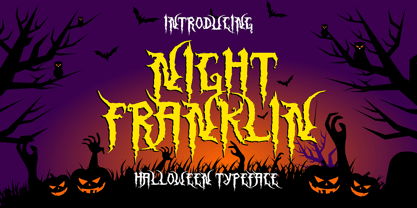 Hello, this is Night Franklin, a Unique display font which is prepared to welcome Halloween. Night Franklin comes with an awesome horror style, make it very perfect to use for quotes, logotypes, badges, labels, packaging, t-shirts, or simply use it in your next design project. Especially in Halloween celebrations
 - Dastardly Deeds SRF by Stella Roberts Fonts,
$25.00 This design from Ray Larabie (and adapted by Jeff Levine) is so unusual. The lettering lends itself to messages of sinister intent or horror movie titles. The net profits from my font sales help defer medical expenses for my siblings, who both suffer with Cystic Fibrosis and diabetes. Thank you.
 - Union Station by Matteson Typographics,
$19.95 Union Station is based on the transit scroll lettering displayed in Denver’s Union Station. The letter shapes are reminiscent of grotesque sans serif typefaces of the same era with quirky details left by the artist’s brush. The typeface gives a sense of rugged Americana and a handcrafted spirit.
 - Aklatanic TSO - Unknown license

- Irpin Type by Aronetiv,
$- Irpin Type is an original font dedicated to the city of Irpin. Intended for everyday use, for books, logos, corporate style. It can also be used in posters and presentations where a confident character is needed. This font suits a large size, but it has good readability even in a small one. This is a modern slab serif with geometric shapes, inspired by the Ukrainian avant-garde of the 20th century. It has characteristic alternates for "G", "a", "u", and "&". Irpin is a city of Ukraine in the suburbs of Kyiv. On March 24, 2022, by the Decree of the President of Ukraine in order to celebrate the feat, mass heroism and resilience of citizens, shown in the defense of their cities during the repulsion of the armed aggression of the Russian Federation against Ukraine, the city was awarded the honorary title "Hero City of Ukraine"
 - SdrawkcabTOC by Ingrimayne Type,
$9.95 SdrawkcabTOC allows one to create mirror writing, that is, writing which looks correct when viewed in a mirror. To understand why it is named as it is, print out the name “Sdrawkcab” using the typeface and hold it up to a mirror. It is derived from the font TiredOfCourier.
 - SdrawkcabJJ by Ingrimayne Type,
$9.95 SdrawkcabJJ allows one to create mirror writing, that is, writing which looks correct when viewed in a mirror. To understand why it is named as it is, print out the name “Sdrawkcab” using the typeface and hold it up to a mirror. It is derived from the font JetJane.


