445 search results
(0.006 seconds)
- Captain Tall Ship by Alphabet Agency,
$20.00 Captain Tall Ship is the clean version of Captain Tall Shipwreck. The font can be used in many project themes, from birthday party invitations to beer labels. The font could be potentially used is a number of design themes including bars, pubs, pirate, navy, seafarer, alcohol products, western/cowboy, card game/gambling, biker gang, tattoos, emblems and crests, old military & hunting to name a few.
 - Brasilica by CAST,
$45.00 Brasílica is a robust design, with wide proportions, that assimilates influences both from old style and modern types. This wide shapes, as well as the moderate contrast and sturdy serifs make it suitable to different conditions of printing. The sharp corners, as well as the abrupt connections and terminals are remarkable features of this typeface, that renders a sturdy and crisp texture, with a distinct aspect.
 - Diogenes by Ludwig Type,
$45.00 Diogenes is an elegant and crisp text typeface. While the skeletons of the individual characters are distinct and strong, the serifs are fine and sharp. This is especially true for the capitals with their comparatively strong horizontal strokes. The graceful appearance of Diogenes makes it an ideal choice for books, newspapers, and magazines, both at small text sizes and display sizes. See also this minisite.
 - Cafe De Paris by Studio K,
$45.00 Café de Paris is, clearly, inspired by all things French, especially the quirky typefaces that adorn French shopfronts from cafes to charcuteries and bistros to boulangeries. My intention was a fresh, crisp, modern take on a classic theme, with just a soupcon of Art Nouveau, which is characteristic of so much of French typography (See also Studio K’s Paris Metro font) C'est chic - n'est-ce pas?
 - Frozen Memory by Hanoded,
$15.00 Frozen Memory is a heavy-boned cartoon display font. Even though it was completely made by hand (using a roller ball pen and some quality paper), it has a clean look, crisp lines and generous curves. Frozen Memory comes in three distinct styles, helping you to create versatile designs. Frozen Memory urges you to eat more ice-cream, but just beware of that brain freeze!
 - ITC Veljovic by ITC,
$29.99ITC Veljovic was designed by Jovica Veljovic and displays an obvious calligraphic heritage. The designer was strongly influenced by German designer Hermann Zapf and Israeli designer Henri Friedlander. ITC Veljovic exhibits a crisp precision, as if the letters were cut in stone rather than drawn with pen and ink. In 2014 Veljovic revised this family and ITC New Veljovic was released with many more weights and styles - Sign Template JNL by Jeff Levine,
$29.00 Sign Template JNL is based on one of the many plastic lettering guides manufactured by the now-defunct Wright-Regan Instrument Company (also known as WRICO). Aside from their engineering and drafting templates and tools, WRICO had a line of "Sign-Maker" sets which featured various styles of lettering, special ink pens and metal alignment guides to assure clean, crisp lettering with little effort.
 - Haarlem Nights NF by Nick's Fonts,
$10.00A 1920 Dutch poster for Public Placement Services by Johan Dijsktra provided the inspiration for this crisp geometric typeface. Instead of the normal underscore (_), this font features a set of parallel lines flush to the tops of the caps and small caps, which offers some intriguing design possibilities. Both versions of this font include the complete Unicode 1252 Latin and Unicode 1250 Central European character sets. - Nadia by Type Innovations,
$39.00 Nadia is an original design by Alex Kaczun. It is a modern stencil interpretation of Granjon Oldstyle, highlighted by large elongated serifs, generous proportions and a large x-height. It is an elegant display for headlines as well as text. Named after his daughter, Nadia has a distinctively vibrant and baroque quality which some would even call sensuous. It’s a truly unique stencil treatment characterized by crisp, clean, rounded shapes.
 - Krupkrop by Jipatype,
$25.00 Krupkrop is a font that uses straight lines as the main structure of the font design. Rotate a little bit vertical line, give a feeling Informal, hard, crisp, fun, lively, suitable for headlines on various media such as billboards, packages. There are 9 weights and italics of each weight total, 18 styles. - ฟอนต์ กรุบกรอบ แบบอักษรที่ใช้เส้นตรงเป็นหลักในการออกแบบโครงสร้างอักษร มีการเอียงเส้นแนวตั้งเล็กน้อย ให้ความรู้สึกไม่เป็นทางการ แข็งกรอบ สนุกสนาน มีชีวิตชีวา เหมาะกับผาดหัวบนสื่อต่างๆ เช่น ป้ายโฆษณา แพ็คเกจ มีทั้งหมด 9 น้ำหนัก และตัวเอียงของแต่ละน้ำหนัก รวม 18 สไตล์
 - Kazootie by Chank,
$99.00 Kazootie was inspired by cut-paper shapes and named after the hand puppet character Rootie Kazootie in a 1950s children's television show. Kazootie is a light-hearted and fun display font with a big, strong voice and crisp confident stride. Best for headlines and larger text in picture books, Kazootie is all caps, but you can type your letters in uppercase or lowercase to access two different variants of the style.
 - Cruz Cantera BT by Bitstream,
$50.99 Cruz Cantera is a crisp and stylish yet informal sans serif typeface created by NYC type designer Ray Cruz. It is a slightly condensed design. The vertical strokes have rounded terminals, and there are some characters with serifs. Notable characters include the upper and lowercase E. There are three weights and each works equally well alone, or together for both display and text. Original design by Ramon Cruz completed in 2002.
 - Geometra by T4 Foundry,
$21.00 Geometra is a new font family from Swedish type designer Bo Berndal and the T4 font foundry. Somewhere between a slab serif and a sans it has a crisp, geometric feel and is both 20’s retro and modern. Its soft curves and openness makes it very readable in smaller print. The powerful serifs give the font lots of character in larger sizes. Geometra comes in three weights, regular, semibold and bold.
 - Rito by Wilton Foundry,
$19.00 Rito Regular and Italic is a clean, crisp and modern monospaced font ready to make your work shine. Its distinctive ink-trap inspired chiseled glyphs create a unique flavor that is more pronounced in the italics. Rito is not your typical monospaced boring font - from the outset the goal was to develop an exuberant, dynamic and contemporary mono-spaced font. Ideal for coding, writing and has plenty of attitude to stretch into display formats!
 - Yume by Thinkdust,
$10.00Yume is a fun loving font with a cruel streak that can sometimes turn laughter into daggers. This wicked personality can lead to some aggressive turns of phrase, but when it’s not being mean, Yume can use its strength and sense of humour to do a lot of good. Either way, Yume is sure to have a big impact on your audience, shocking them into paying attention through crisp, sharp lines and chunky, bold characters. - Graffix by Studio K,
$45.00 Graffix is best described as a modern classic. A crisp geometric sans serif with just a hint of Art Deco in the roll of the capital A, D & R, and the curvaceous lines of the capital M, V & W. The distinctive tear shaped counters of the lower case a, b, d, p & q give it its essential character, together with such quirky features as the angular descenders of the lower case g and j.
 - Deux Chasses NF by Nick's Fonts,
$10.00American Type Founders released the pattern for this typeface under the name "Thermotype". In the days of cast-metal foundry type, copyfitting headlines could prove problemmatic at times; this typeface, with a wide uppercase and narrower lowercase of exactly the same “color”, allowed stacked lines of type to be composed with uniform width. Clean, crisp and practical. Both versions of the font include 1252 Latin, 1250 CE (with localization for Romanian and Moldovan). - Decutto by Michael Rafailyk,
$15.00 Decutto is a neo-grotesque that packs the Marionette formula and some blackletter ideas into a low-contrast sans serif design. Its name plays on the phrases “off cut” and “cut to” which express the key feature – the contemporary legible letter shape is decorated with cut carved edges and counters, giving the typeface crisp and simplistic look, like that of an old minted coin. Scripts: Latin, Greek, Cyrillic, Hebrew. Hinting: Manual PostScript.
 - ITC Bette by ITC,
$29.99 ITC Bette is a particularly elegant calligraphic design from the hand of Patty King. Refined and friendly, this vertical script appears to be drawn with a brush held delicately at a right angle to the page. The unconnected letters and flared ascenders create a feeling of spontaneity, while the design's vertical stress produces a calming counterpoint. Many capital letters drop comfortably below the baseline, and terminals echo a flick of the wrist.
 - Contax Pro by Type Innovations,
$39.00 Contax Pro is a contemporary design based on generous proportions and clean, crisp lines. Forget about 'Helvetica'. Look out 'Univers'. Contax Pro is the new geometric sans typeface series for the 21st century. Contax Pro makes for easy reading and is ideal for long lines of copy. Contax Pro includes true drawn small capitals and old style figures. The family comes in 6 weights: ultra light, thin, light, regular, medium and bold.
 - Wolves Gothic by Chank,
$39.00 Make a little extra impact with this strong athletic font with big geometric muscles, clean lines and sharp teeth, too. Originally created for a local pro basketball team in Minnesota, this sporty and big-shoulder poster font is now available directly to you for the first time ever to add some punch to your printed or web designs. Crisp and clear and ready for action a concise variety of weights and styles!
 - Plaq by 066.FONT,
$9.99 Plaq is a display font whose appearance draws inspiration from the distinctive large raster effect that can be achieved with a riso machine. Plaq retains its varied and extravagant style, while its crisp and bold letters add creativity and expression to projects. It is ideal for creative applications such as posters, invitations or branding materials, where a striking and distinctive text finish is sought that catches the eye with its unique raster. Remastered in 2023.
 - Typewriter Revo by Matthias Luh,
$29.99 Typewriter Revo is based on Typewriter BasiX but it is completely redesigned: While Typewriter BasiX has dapples and grunge (which looks more realistic), the contours of Typewriter Revo crisp and clear. Typewriter Revo is more suitable for continuous text while Typewriter BasiX and Typewriter DirtY are suitable for large Pictures, logos or headings. In contrast to Typewriter BasiX, Typewriter Revo includes 11 more characters and is also available in a bold, italic and bold + italic version.
 - Dahliana by Luhop Creative,
$10.00 Dahliana is a humanist serif type family that has the heritage of classic Old Style and Transitional type while having the crisp lines and functionality of contemporary fonts. Its defining features include a high-contrast combined with diagonal stress, along with pinched stems and horizontals. There are 18 fonts altogether over 9 weights in roman and italic, you can also avail of one variable fonts which allow you to fine tune the weight to your exact liking.
 - ND Raster West by NeueDeutsche,
$9.00 A Pixel Font with Wild West Spirit inspired by the daring cowboys and classic MS DOS games. Immerse in the rustic landscapes of Deadwood saloons and tumbleweeds as you evoke the nostalgia of retro gaming graphics. ND Raster West delivers crisp and sharp letterforms, reminiscent of arcade games and early computer screens. Its authentic Western flair and rugged edges capture the essence of the Old West, perfect for titles, headings, or body text in various creative projects.
 - Deutschmeister by RMU,
$25.00 This crisp and constructed Ludwig Wagner, Leipzig, blackletter font in textura style had been originally designed by Berthold Wolpe. Freshly redrawn and redesigned, it adds now to the treasure trove of historic typefaces. This font contains a bunch of useful ligatures, and it is recommended to activate Discretionary Ligatures too. By typing 'N', 'o' and period plus activating Ordinals you get an oldstyle numbersign. As usual in my blackletter fonts, the # key is occupied by the 'round' s.
 - Raliscka by Maulana Creative,
$12.00 Raliscka is a modern casual cript font, With a high contrast stroke clean and fancy characters. It has Opentype features of ligatures, makes it a perfect choice for branding and digital designs. Use this font for logos, social media, websites, blogs, instagram, social media, business cards, branding, and more! Raliscka font support multilingual more than 100+ language. and good pair for your secondary text font with sans or serif. Make a stunning work with Raliscka script font. Cheers, MaulanaCreative
 - Glaschu by Braw Type,
$9.00 Glaschu is a modern, uppercase typeface which comes in 5 font weights with 2 additional outline styles. It’s clean, crisp edges and bold appearance makes it a perfect choice for headings, branding, signage, advertising, magazine layouts and more. Combine the outline styles with Glaschu ExtraBold to go even more creative with your lettering! FEATURES Uppercase Letters Numerals & Punctuation Multilingual Support Glaschu Inline is a bonus font which has been added to the Glaschu Font Family for free!
 - Argot by K-Type,
$20.00 Argot is inspired by condensed grotesque letterforms and would be a monolinear sans except for an unorthodox disparity between inner and outer shapes. Elegantly curved outlines contrast starkly with austere rectangular counters, suggesting a no-frills functionality, 20th century modernism, or an unsettling discordance. The squared off inner spaces also add clarity and crispness. Argot is available in three widths — Wide, Normal and Narrow. Each width is supplied in three weights — Regular, Bold and Black — with corresponding italics (obliques).
 - ITC Atelier Sans by ITC,
$29.99ITC Atelier Sans began as one of Curtis's renovations. His goal was to create a monoline design with Art Deco “sensibilities,” but without the geometric precision and relatively small x-height of faces like Futura or Kabel. Gentle curves and suggestions of serifs create a crisp, clean and open face that is at once sleek, sensuous and still affable. Available as a two-weight family with complementary italics, ITC Atelier Sans is another successful and usable revival from Nick Curtis. - Decorretro by Sorriso Design,
$18.80 Introducing a stunning geometric Art Deco style typeface, inspired by the retro aesthetics of 1930s Shanghai posters. This font design boasts clean, crisp lines and a modern look while still honoring the classic design elements of the past. Its carefully crafted curves and angles create a perfect balance between simplicity and sophistication, making it an excellent choice for a wide range of design projects. This typeface is sure to captivate and engage your audience, adding a touch of timeless elegance to any design.
 - Vigorous by Gerald Gallo,
$20.00 Vigorous is a clean and crisp, display font set. As their names imply, Vigorous Lower Case has a lowercase alphabet while Vigorous Small Caps has small caps in place of the lowercase alphabet. Both fonts have the same uppercase alphabet, numbers, accented characters, punctuation, symbols, and miscellaneous characters. The Vigorous fonts are ideal for headlines or titles - wherever a fresh, unique font is desirable. Vigorous Lower Case and Vigorous Small Caps are sold only as a set priced at $20.
 - Carat by Hoftype,
$49.00 Carat is a contemporary interpretation of a classic serif type. Fresh and clean in appearance. Straight, unsentimental and objective. Ideally suited for text but also with crisp details in display. Well-equipped for ambitious typography, the Carat family consists of 12 styles, comes in OpenType format with extended language support for more than 40 languages. All weights contain small caps, proportional lining figures, tabular lining figures, proportional old style figures, lining old style figures, matching currency symbols, fraction- and scientific numerals.
 - Jownsey by Maulana Creative,
$12.00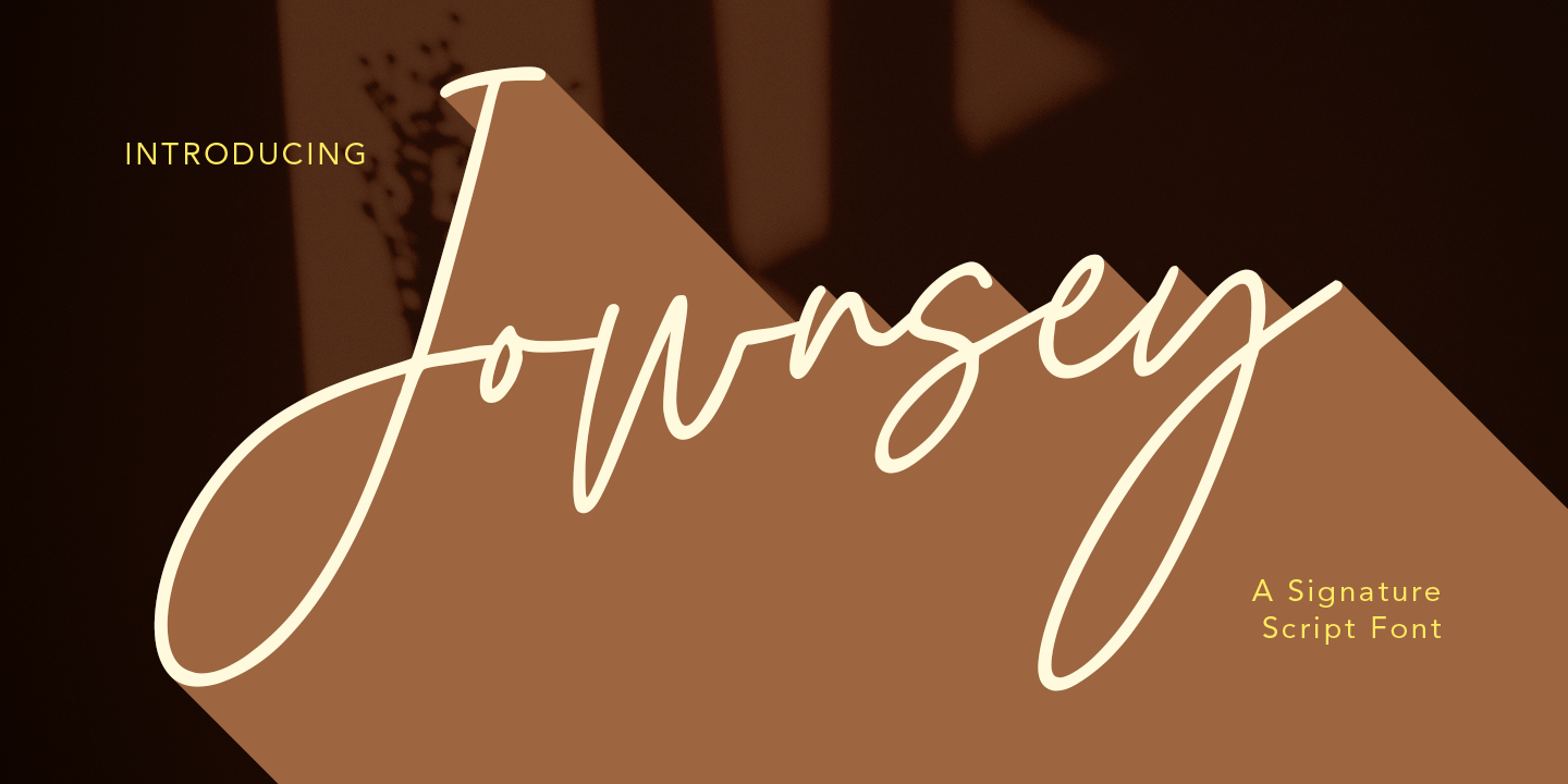 Jownsey is a casual signature cript font, with a light mono-line stroke, slant and fun character. It has Opentype features ligatures of character, To give you an extra creative work. Jownsey signature script font support multilingual more than 100+ language. This font is good for logo design, Social media, Movie Titles, Books Titles, a short text even a long text letter and good for your secondary text font with sans or serif. Make a stunning work with Jownsey font. Cheers, MaulanaCreative
 - DT Skiart by Dragon Tongue Foundry,
$30.00 Looking for something between a Serif and Sans Serif font? Try the DT Skiart font. This high quality, versatile font has the professional feel of a Serif, but has the open readability of a Sans Serif. A smart crisp font with smooth simple lines. It has a medium to strong stroke contrast, with the vertical line being heavier than the horizontal line, and no serifs. The DT Skiart family is made up of 5 weights in both italic and normal.
 - Trigomy by Markus Reiter,
$24.90 Trigomy is a proportional pixel font designed on a 5 pixel grid. It is intended for either very small text or as huge display font for posters and the like. To get a crisp look this font should be used at 10 pt or multiples of 10 pt. (A tip for Adobe Creative Suite applications is to change the standard anti-aliasing method from “sharp” to “crisp” and to align the text to whole pixels. Also avoid centered text.) To get started with type design I thought it was best to start with a pixel font because you don't have to focus much on the design itself, but rather have to focus on how kerning and spacing works and the various features you can implement with OpenType. And of course I wanted to have a pixel font that had all that I was missing from other pixel fonts. We were learning trigonometry at the time I started designing Trigomy, and most of the time I misspoke it “trigometry”. So, when I had to come up with a name for my first font I thought: "Why not go with Trigomy?"
 - Gabriel Bautista by Comicraft,
$29.00 Comix Gorilla GABRIEL BAUTISTA is the artist of John JG Roshell's CHARLEY LOVES ROBOTS series. His incredible watercolors graced the pages of ELEPHANTMEN #50. In some circles he is known as "Galvo" or "Gabo" and he has brought his brofu color skills to the pages THE SPIRIT, ALL STAR WESTERN and also illustrated JESUS CHRIST, IN THE NAME OF THE GUN. He is also the creator of comic battling site ENTERVOID.COM and indy press PULPOPRESS.COM. He loves his girl, his dog lulu and his font.
 - Chelsie Hilton by PeachCreme,
$19.00 We're excited to present to you our new font, "Chelsie Hilton"! A great thing about this font is that it is both chic and legible at the same time. You can confidently use it on such machines as Cricut since its edges are smooth enough and this font will fit just right. When creating this signature font, we took care to make it as crisp and modern as possible. "Chelsie Hilton" is perfect for logos, wedding designs, quotes, cards, stationery, signature, display text, and many more.
 - Tangent by Hoftype,
$49.00 Tangent provides a fresh new look on serif dominant typefaces. Its strict graphic outline makes it appear crisp, lively and unsentimental; and at the same time humanistic virtues have also been well taken into account. Tangentd consists of 18 styles. It comes in OpenType format and provides an extended language support. All weights contain standard and discretionary ligatures, proportional lining figures, tabular lining figures, proportional old style figures, lining old style figures, matching currency symbols, fraction- and scientific numerals, matching arrows and alternative characters.
 - Brenta by Ludwig Type,
$45.00 Brenta is a crisp typeface with open counters and compact proportions, its name referring to a range of mountains in northern Italy. Like its namesake, Brenta is characterized by sharp-edged and sturdy forms, but also by its clarity and elegance. Strong serifs, flat and bold shoulders and open terminals pronounce the horizontal and help to guide the eye along the line. Very fine junctures keep the characters sharply defined and create dynamic light traps. Visit this minisite to see the Brenta webfonts in action: http://brenta.ludwigtype.de