10,000 search results
(0.042 seconds)
- Personalization by Jeff Levine,
$29.00 In the 1960s it was a popular trend to personalize one’s possessions with your initials. From wallets and handbags to eyeglasses; from luggage to even cars, initial personalization was the fad of the time. The British division of Gulf Oil offered for sale a set of gold metallic stick-on initials for 25 pence, complete with two Gulf logos so the company could get some extra advertising mileage out of the promotion. These extra-wide, bold initials served as the idea model for Personalization JNL, which is available in both regular and oblique versions.
 - Kisik by Kisla,
$19.99 Kisik is a handwritten font. I got a request to put my handwriting into a font, so I decided to take the challenge and design a whole typeface with three different weights (light, regular, bold) and 638 glyphs to cover all 104 Latin languages. This is my first time making a font. Hope you'll enjoy it. I sure did making it. Check out the listing of glyphs if you can use this font in your work. Otherwise don’t hold back writing to tanjagawish@gmail.com and I’ll create them.
 - Artusi by Zetafonts,
$39.00 Pellegrino Artusi was a celebrated Italian food writer, who is credited with the creation of one of the most influential cookbooks in the history of Italian cuisine. Taking inspiration from his legacy, Francesco Canovaro decided to work on a typographic homage to the delicacy and finesse of Italian traditional cuisine. Aptly named Artusi, the typeface is an enchanting combination of traditional Italian style, contemporary refinement and a playful touch of innovation. It is a transitional serif typeface with both text and display versions, developed on a wide range of seven weights and including a huge range of alternates, OpenType features and ligatures. Each weight of Artusi works like a different course in a balanced meal. Lighter weights are our starters, with their high contrast between thicks and thins, delicate curves, balanced proportions and subtle spiky serifs. The main course are naturally the regular and bold weights, where traditional Italian old style is enriched with a peppery kick of modern details. For dessert, the heavy weights offer luscious curves, opulent calligraphic swashes and eye-catching details, suitable for packaging and logos. When it comes to typography, let Pellegrino Artusi’s legacy inspire you. From packaging to web pages, Artusi typeface will bring a feeling of tradition, craft and quality to any project. Because, as Pellegrino would say, “To make a great impression, you have to choose the finest ingredients”... Buon Appetito!
 - Gladysh by Sealoung,
$15.00 Introducing our latest font creation, a harmonious blend of elegance and boldness – Gladysh Elegant Condensed Serif Typeface. This unique font is meticulously crafted to cater to a diverse range of design needs, providing a versatile solution for both modern and classic projects. Key Features: Thin and Bold Styles: Strike the perfect balance between subtlety and prominence with our meticulously designed thin and bold variations. Whether you're crafting a sleek corporate logo or designing a minimalist poster, these styles offer the flexibility to express your creativity. Italic Grace: Elevate your design with the added touch of sophistication. The italic variations of ThinBold introduce a graceful slant, ideal for conveying a sense of movement, emphasis, and a touch of editorial flair. Perfect for fashion, editorial, or any project where a dynamic aesthetic is desired. Versatility in Application: From branding and advertising to web design and print materials, ThinBold Italic Typeface adapts seamlessly to various design contexts. Experiment with different weights and italics to achieve the visual impact you desire. Clean and Readable: Despite its stylish intricacies, ThinBold remains highly legible. Each character is meticulously crafted to ensure clarity and readability, making it an excellent choice for body text as well as headlines. Extensive Character Set: The font includes a comprehensive character set, encompassing a variety of accents and special characters to support multiple languages. This ensures that your design projects can maintain a consistent and professional look across diverse linguistic requirements. Elevate your design projects with the Gladysh Elegant Condensed Serif Typeface – where sophistication meets versatility. Download and incorporate this font into your toolkit for a sleek, contemporary, and dynamic visual identity.
 - Tavern by FontMesa,
$25.00 Tavern is a super font family based on our Algerian Mesa design, with Tavern we've greatly expanded the usability by creating light and bold weights plus all new for 2020 with the introduction of extra bold and black weights Tavern is now a five weight family. The addition of the bold weight made it possible to go further with the design by adding open faced shadowed, outline and fill versions. Please note, the fill fonts are aligned to go with the open faced versions, they may work with the outline versions, however you will have to apply them one letter at a time. The Tavern Fill fonts may also be used a stand alone font, however, the spacing is much wider than the regular solid black weights of Tavern. In the old days of printing, fill fonts rarely lined up perfect with the open or outline font, this created a misprinted look that's much in style today. To create that misprinted look using two different colors, try layering the outline fonts offset over the top of the solid black versions. Next we come to the small caps and X versions, for a font that's mostly seen used in all caps we felt a small caps would come in handy. The X in Tavern X stands for higher X-height, we've taken our standard lowercase and raised it for greater visibility in small text and for signage where you want the look of a lowercase but it needs to be readable from the street. In August of 2016 I started the project of expanding this font into more weights after seeing the font in use where someone tried creating a bold version by adding a stroke fill around the letters. The result didn't look very good, the stroke fill also caused the shadow line to merge with the serifs on some letters. This lead me to experiment to see if a new bold weight was possible for this font and I'm pleased to say that it was. After the bold weight was finished I decided to type the regular and bold weights together in a first word thin second word bold combination, however the weight difference between the two wasn't enough contrast. This lead me to wonder if a lighter weight was possible for this font, as you can see yes it was, so now for the first time in the history of this old 1908 type design you can type a first word thin second word bold combination. So why the name change from Algerian to Tavern? Since the original font was designed in England by the Stephenson Blake type foundry I decided to give this font a name that reminded you of the country it came from, however, there were other more technical reasons. During the creation of the bold weight the engraved shadow line was sticking out too far horizontally on the bottom right of the serifs dramatically throwing the whole font off balance. The original font encountered this problem on the uppercase E, L and Z, their solution was a diagonal cut corner which was now needed across any glyph in the new bold weight with a serif on the bottom right side. In order to make the light and regular weights blend well with the bold weight diagonal cut offs were needed and added as well. This changed the look of the font from the original and why I decided to change the name, additional concerns were, if you're designing a period piece where the font needs to be authentic then this font would be too new. Regular vs. Alt version? The alternate version came about after seeing the regular version used as a logo and secondary text on a major product label. I felt that some of the features of the regular version didn't look good as smaller secondary text, this gave me the idea to create an alternate version that would work well for secondary text in an advertising layout. But don't stop there, the alternate version can be used as a logo too and feel free to exchange letters between both regular and alternate versions. Where are the original alternates from Algerian? Original alternates from Algerian are built into the regular versions of Tavern plus new alternates have been created. We're excited to introduce, for the first time, all new swash capitals for this classic font, you're going to love the way they look in your ad layout, sign or logo. The best way to access alternate letters in Tavern is with the glyph map in Adobe Illustrator and Adobe InDesign products, from Adobe Illustrator you can copy and paste into Photoshop as a smart object and take advantage of all the text layer style features Photoshop has to offer. There may be third party character maps available for accessing alternate glyphs but we can't advise you in that area. I know what you're thinking, will there be a Tavern Condensed? It takes a lot of hours to produce a large font family such as this, a future condensed version will depend on how popular this standard version is. If you love Tavern we're happy to introduce the first weathered edge version of this font called Bay Tavern available in February 2020.
 - Langó - Unknown license

- Antaviana - Unknown license

- Esta Pro by DSType,
$26.00The multi award winning ESTA is back, renewed and improved in OpenType format. Now named Esta Pro, is available in Regular, Italic, Bold, Bold Italic, Display and Swashes. Includes plenty of features, like SmallCaps, Alternates, Ligatures and CE characters. - Sometype Mono by Dharma Type,
$- Sometype Mono is a free monospaced font family for coding and tabular layout which can be used for commercial purpose for free. So far, Sometype Mono consists of 6 style. Regular, Italic, Medium, Medium Italic, Bold and Bold Italic.
 - 612KosheyLinePL - Unknown license

- andregestauchtbold - Unknown license

- Gorlock - Unknown license

- Littler Serifada by Intellecta Design,
$21.90a bold sans serif family with many variants - Margit by Schriftlabor,
$44.00 Margit is a condensed display typeface that includes Latin and Cyrillic scripts, supporting over 200 languages. Margit's letterforms have a contemporary style with pointy edges and friendly curves inspired by old wood-type specimens. Its bold and unapologetic design will be great to use in poster design, giving the content a stronger voice. This font family can bring a unique look to your packaging projects and modern branding solutions. Explore the extensive range of styles and weights that make this typeface ultra-versatile.
 - Million Smiles by Subectype,
$17.00 Introducing our newest font, "Million Smiles", a casual bold script font with hand-letterred style. Million Smiles is an upgraded version of our previous font, "Billion Dreams". In this new version, we've rounded the edges a bit for a softer look, compared to the sharp edges of the old one. This enchanting font is the perfect choice for design projects that aim for a fun, urban, and classy vibe. It adds a touch of cool to your creativity without losing its elegant charm.
 - Letraflex by Art Grootfontein,
$19.00 Letraflex is a bold retro-inspired typeface with a slightly futuristic style. The family is based on old computer lettering and Magnetic Ink Character Recognition, with a little contemporary twist including ink traps. Letraflex layered fonts provide users with a wide range of choices for any design project. This family is an excellent pick for eye-catching designs, including Headline, Poster, Branding, Logos, Concert, and any other heavy design! Take a look at this video to see Letraflex in motion!
 - PiS LIETZ Lindham by PiS,
$38.00 LIETZ Lindham is based on letters taken from an old type specimen folder from 1936 featuring handdrawn sans-serif ABC's. It's kinda bauhausy and straight but also shows the wonderful lively unevenness of hand-drawn letters. Being made for the use in large-scale advertisements and posters, LIETZ Lindham fits perfectly for pro-communist propaganda posters, but also features legibility in smaller sizes, so you can use it for your Neue Typographie manifesto too, Jan. Go grotesk! Go bold! Go neu!
 - NTF Fragma by Noble Type Foundry,
$20.00 A futurist headline typeface exploring the concept of sub-baseline interconnectivity and flow. Boasting over 450 glyphs, this typeface comes with an enormous amount of ligatures to achieve optimum flow between letterforms. Its sources of inspiration are endless (old science fiction, Arabic letterforms and 90s UK garage/rap album artwork featuring futurist custom type.) The typeface is best suited to headlines and larger type. Currently available in Bold with an Italic version coming in the not too distant future. Enjoy!
 - Ceramika by Santi Rey,
$25.99 Ceramika is a modern tribute to Old Style typefaces. This design is inspired by the letterforms of the serif faces found in history books from the beginning of the 20th-century. Its sturdiness and generous X-Height makes it bold and compact; while the high-contrast strokes and recognisable shapes makes it extremely readable. All this makes Ceramika a really versatile font, perfect for logos, headlines and even body copy. It comes in 6 different weights and 2 styles — Standard and Italic.
 - Astonice by Asritype,
$26.00 Astonice is a beautiful calligraphy font family with 3 weight variants: Regular, Semibold and Bold. Astonice has more than 1100 glyphs each, has opentype feature such as stylistic sets, stylistic alternatives, and old number form. Astonice supports a wide range language: Latin plus Greek and Cyrillic. Astonice is suitable for most typing and design such as cards, logos, banner, posters and others as you intended. Beautiful glyphs, OpenType features and 3 weight, Astonice provide you the right choice for your best design.
 - Easytype by Vitalik B. Old,
$5.00 Easytype is the first font family released by Vitalik B. Old. Yet simple, handwritten type feels in title as good as in a middle size paragraph. Both italic and italic bold styles got 999 characters in a set, including Latin, Cyrillic and Greek symbols. Full set of Basic, Additional, Extended and Advanced Latin symbols [452]; Full set of Basic and Extended characters in Cyrillic script [256]; Basic Greek character set [73] Font family was designed by y/y behance.net/youryourich
 - Diablo by Solotype,
$19.95Diablo Light was originally called Fabric and was issued by the Farmer, Little & Co. foundry in New York. We liked everything about this font except for the lowercase 'g'. So we changed the offending letter, but for purity kept the orginal as an alternate. We created a bold version of Diablo Light, with minor changes to accomodate the bolder stroke weight. Although the original design is over a century old, the style seems to have an up-to-date look. - UA Map by 2D Typo,
$- Font allows one to quickly make a schematic map of Ukraine. To separate individual regions use color or uppercase characters. The font contains the Trident emblem of Ukraine. This font may be useful to illustrate materials about Ukraine.
 - Christmas Queen by Sakha Design,
$12.00 Christmas Queen is a dazzling script font. This font is neatly crafted and highly detailed. Whatever the topic, Christmas Queen will be a wonderful asset to your font library, as it has the potential to enhance any creation.
 - Gracelyn by Sipanji21,
$10.00 Gracelyn is a whimsical script font with a relaxed theme, featuring a lovely style. No matter the topic, this font will be an incredibly asset to your fonts’ library, as it has the potential to elevate any creation.
 - Bisalir by Aga Silva,
$24.99 Bisalir is a beautiful display font, so you can create beautiful headings or signature looks. Open type features 1000+ glyphs including stylistic alternates so you can fine tune your creations (this option works well also for other languages)
 - Spooky Adventure by AEN Creative Studio,
$15.00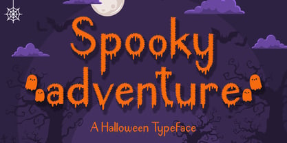 Spooky Adventure is a cool-lettered and spooky decorative font. It is perfectly suitable for any Halloween-related project or crafty idea. Add it confidently to your favorite creations and let yourself be amazed by the outcome generated!
 - Somewhat by PintassilgoPrints,
$24.90 Somewhat retro, somewhat amusing, somewhat handsome, totally handy! This hand-drawn family counts 4 fonts plus a whimsical set of ornaments. Suitable for both display and text sizes, it will bring an extra charming feel to your creations.
 - Gheamarker by Sipanji21,
$15.00 Gheamarker is a Natural Handwritten font with a relaxed theme, featuring a lovely style. No matter the topic, this font will be an incredibly asset to your fonts’ library, as it has the potential to elevate any creation.
 - Shopia Modern Calligraphy by IbeyDesign,
$17.00 Sophia Modern Calligraphy Font is a stylish handwritten font that inspires friendliness and elegance. It is perfect to use for any of your wonderful creations such as branding projects, logos, brochures, business cards, wedding invitations, and many others.
 - Alaturka by Bülent Yüksel,
$19.00 ABOUT FAMILY: What makes "Alaturka" elegant, friendly and contemporary is its very rounded curves with very open terminals. "Alaturka" has been designed with a higher "x-height" than other fonts in its class to make tiny readability more obvious in any use situation. It will be ideal for use in small sizes such as business cards or mobile applications. This typeface is also equipped with powerful OpenType features to satisfy the most demanding professionals. It has solid features like case sensitivity, small, true capitals, full ligatures, tabular figures for tables, old-style figures to elegantly insert numbers into your sentences, and more alternative characters to give personality to your projects. FEATURE SUMMARY: - 2 style: 1From 1923 To 2023 - 8 weights: Thin, Extra Light, Light, Regular, Medium, Bold, Extra Bold, and Black. - 3widths: Normal, Narrow, and Condensed. - Matching italics (12º) for all weights and widths. - Matching small caps for all weights and widths. - Lining and old-style figures (proportional and tabular). - Some alternate characters - Unlimited fractions. - Automatic ordinals (1st, 2nd, 3rd, etc.). - Extended language support: Most Latin-based scripts - Extended currency support. You can enjoy using it.
 - Humanist 521 by ParaType,
$30.00 Humanist 521 is a Bitstream digitized version of Gill Sans typeface. The font was designed by Eric Gill and released by Monotype circa 1928-1930. Gill’s design is based on the typeface of Edward Johnston, the innovative British letterer and teacher, designed in 1916 for the signage of the London Underground. However, it has more classical proportions close to those of old style serifs, and thus is more suitable for text setting. With distinct roots in handwritten scripts, Gill’s typeface is classified as a humanist sans serif and is very legible and readable in text and display work. Having been released more than 80 years ago, it’s still very popular and in fact is an icon of British typographic style. The Cyrillic version of Ultra Bold weight was designed by Tagir Safaev in 1997. Six text styles and Extra Bold style in Cyrillic were designed later by Vladimir Yefimov and Isabella Chaeva. The Cyrillic version, in addition to the original Bitstream implementation of Humanist 521, has an alternative numeral 1 with the traditional shape and a set of old-style figures. Rereleased by ParaType in 2013.
 - Bakemono by Zetafonts,
$39.00 Francesco Canovaro created Bakemono as a way to explore the design space around the duality of fixed/proportional width. He was also interested in the concept of monowidth design, inherent in monospaced typefaces, that can bring flexibility and ease of use also to proportional type - allowing you to change the weight of a word without losing the text alignment. In his research on fixed width type design he mixed the lessons of mechanical typewriter technology with the intuitions of eastern brush calligraphy, which has been dealing with for centuries with fixed space grids. The name of the typeface comes from the Japanese shape-shifter yokais that could change their form freely between human and animal, and aptly describes the metamorphic nature of this wide superfamily coming in proportional, monospace and intermediate subfamilies. With a design mixing the expansion principles of the brush with the sharp technicality of typewriter and system fonts, Bakemono can both excel at text size in its regular widths optimized for legibility as well as owning the page at display size with its uncommon design details. Bakemono reflects its multicultural nature with its extended latin + cyrillic charset, soon to be expanded with Bakemono Arabic (exploring the fascinating world of monospaced arabic script) and Bakemono Kana (our first experiment in cjk scripts). • Suggested uses: born to allow you to change the weight of a word without losing the text alignment, Bakemono can both excel at text size in its regular widths optimised for legibility as well as owning the page at display size with its uncommon design details. Perfect for contemporary branding, web design, packaging and countless other projects; • 21 styles: 7 weights x 3 different styles + 1 variable font; • 839 glyphs in each weight; • Useful OpenType features: Access All Alternates, Contextual Alternates, Case-Sensitive Forms, Glyph Composition / Decomposition, Denominators, Fractions, Localized Forms, Mark Positioning, Mark to Mark Positioning, Alternate Annotation Forms, Numerators, Ordinals, Scientific Inferiors, 7 Stylistic Sets, Subscript, Superscript, Slashed Zero • 217 languages supported (extended Latin and Cyrillic alphabets): English, Spanish, Portuguese, French, Russian, German, Javanese (Latin), Vietnamese, Turkish, Italian, Polish, Afaan Oromo, Azeri, Tagalog, Sundanese (Latin), Filipino, Moldovan, Romanian, Indonesian, Dutch, Cebuano, Igbo, Malay, Uzbek (Latin), Kurdish (Latin), Swahili, Hungarian, Czech, Haitian Creole, Hiligaynon, Afrikaans, Somali, Zulu, Serbian, Swedish, Bulgarian, Shona, Quechua, Albanian, Catalan, Chichewa, Ilocano, Kikongo, Kinyarwanda, Neapolitan, Xhosa, Tshiluba, Slovak, Danish, Gikuyu, Finnish, Norwegian, Sicilian, Sotho (Southern), Kirundi, Tswana, Sotho (Northern), Belarusian (Latin), Turkmen (Latin), Bemba, Lombard, Lithuanian, Tsonga, Wolof, Jamaican, Dholuo, Galician, Ganda, Low Saxon, Waray-Waray, Makhuwa, Bikol, Kapampangan (Latin), Aymara, Ndebele, Slovenian, Tumbuka, Venetian, Genoese, Piedmontese, Swazi, Zazaki, Latvian, Nahuatl, Silesian, Bashkir (Latin), Sardinian, Estonian, Afar, Cape Verdean Creole, Maasai, Occitan, Tetum, Oshiwambo, Basque, Welsh, Chavacano, Dawan, Montenegrin, Walloon, Asturian, Kaqchikel, Ossetian (Latin), Zapotec, Frisian, Guadeloupean Creole, Q’eqchi’, Karakalpak (Latin), Crimean Tatar (Latin), Sango, Luxembourgish, Samoan, Maltese, Tzotzil, Fijian, Friulian, Icelandic, Sranan, Wayuu, Papiamento, Aromanian, Corsican, Breton, Amis, Gagauz (Latin), Māori, Tok Pisin, Tongan, Alsatian, Atayal, Kiribati, Seychellois Creole, Võro, Tahitian, Scottish Gaelic, Chamorro, Greenlandic (Kalaallisut), Kashubian, Faroese, Rarotongan, Sorbian (Upper Sorbian), Karelian (Latin), Romansh, Chickasaw, Arvanitic (Latin), Nagamese Creole, Saramaccan, Ladin, Kaingang, Palauan, Sami (Northern Sami), Sorbian (Lower Sorbian), Drehu, Wallisian, Aragonese, Mirandese, Tuvaluan, Xavante, Zuni, Montagnais, Hawaiian, Marquesan, Niuean, Yapese, Vepsian, Bislama, Hopi, Megleno-Romanian, Creek, Aranese, Rotokas, Tokelauan, Mohawk, Onĕipŏt, Warlpiri, Cimbrian, Sami (Lule Sami), Jèrriais, Arrernte, Murrinh-Patha, Kala Lagaw Ya, Cofán, Gwich’in, Seri, Sami (Southern Sami), Istro-Romanian, Wik-Mungkan, Anuta, Cornish, Sami (Inari Sami), Yindjibarndi, Noongar, Hotcąk (Latin), Meriam Mir, Manx, Shawnee, Gooniyandi, Ido, Wiradjuri, Hän, Ngiyambaa, Delaware, Potawatomi, Abenaki, Esperanto, Folkspraak, Interglossa, Interlingua, Latin, Latino sine Flexione, Lojban, Novial, Occidental, Old Icelandic, Old Norse, Slovio (Latin), Volapük
 - nevis - Unknown license

- Kremlin Menshevik - Unknown license

- Roamer by Loreley Design,
$56.00 The Roamer is big, bold and ready to be used by designers all over the globe. The appearance is quite rough and used like weathered wood or paint on concrete. It is perfect for big headlines or bold text passages.
 - Chuckl by Ayca Atalay,
$18.00 Chuckl | A Bold Display Typeface Chuckl is a bold display typeface that is both fun and powerful, amusing yet impactful. It is visually striking and unique; unforgettable and un-ignorable. Excellent for brand identities, logos, packaging, posters and the like.
 - Collect Em Now BB by Blambot,
$10.00 Collect Em Now BB is the sentence-case companion typeface to the uppercase Collect Em All BB! It includes four fonts: regular, italic, bold and bold italic, double letter opentype ligatures, contextual alternate barred-I correction, manga glyphs, and more!
 - Shinn by Red Rooster Collection,
$45.00 Designed by Nick Shinn. Digitally engineered by Steve Jackaman. Humanist sans serif with a calligraphic cut and tall ascenders. Light, Medium and Extra Bold designed by Nick in 1985 for Typsettra; Steve added the Book and Bold weights, and the Italics.
 - Expressway Free - 100% free


