10,000 search results
(0.116 seconds)
- MFC Haute Monde Monogram by Monogram Fonts Co.,
$19.95 The source of inspiration for Haute Monde Monogram is the 1934 "Book of American Types" by American Type Founders. Found in that specimen book was a wonderfully elegant traditional smallcap-Capital-smallcap monogram alphabet known as “Elite Monogram Initials”. This elegant typeface is now digitally remastered and updated for modern use with functionality beyond its original intentions. Download and view the MFC Haute Monde Guidebook if you would like to learn a little more. MFC Haute Monde Monogram comes complete with Pro format fonts. You will require with programs that can take advantage of OpenType features contained within the Pro fonts.
 - Typewalk Mono 1915 by Typocalypse,
$49.00 Typewalk Mono 1915, the vintage typewriter grotesque that is branded by history. It is a tribute to the European sign painter and lettering tradition of the early 20th century. Typewalk Mono 1915 also speaks in the proto-rational and graphical language of the Werkbund Objectivity which was used around 1915. It works great for cultural, editorial and branding purposes. It is versatile in small printing sizes and works great on the web. Speaking with its unique voice. Typewalk Mono 1915 is the debut release by Sven Fuchs and was designed between 2012 and 2016. It has 8 distinctive weights from thin to bold.
 - Naraba by Flawlessandco,
$9.00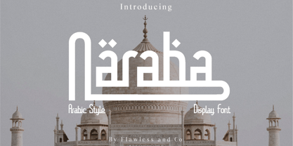 Introducing "Naraba," a stunning Arabic font inspired by the elegant Kufi style. This meticulously crafted typeface seamlessly merges tradition and modernity, making it perfect for a wide range of design applications. There's some connected letters and some alternates that suitable for any graphic designs such as branding materials, t-shirt, print, business cards, logo, poster, t-shirt, photography, quotes .etc This font support for some multilingual. Also contains uppercase A-Z and lowercase a-z, alternate character, numbers 0-9, and some punctuation. If you need help, just write me! Thanks so much for checking out my shop!
 - Amasis by Monotype,
$40.99 Amasis is a slab serif design which has been drawn with a humanist approach, rather than the traditional geometric construction associated with this style of letter. The result is a typeface that has an affinity with the Ionics, although in character it belongs to the latter decades of the twentieth century. The Amasis italic fonts, rather than being sloped roman or cursive in nature, are related more to the Old Style italics. Amasis works particularly well in small sizes where readability is important. Amasis has proved excellent for use on low resolution printers and for facsimile transmissions.
 - AndrewAndreas by Ingrimayne Type,
$5.00 AndrewAndreas is a simple, clean, sans-serif font family that is highly legible and useful for both text and display purposes. The original three weights were designed in 1994 and three additional weights plus oblique styles were added in 2020. Also added were several OpenType features, including subscripts, superscripts, and fractions. The six oblique styles slant the upright styles but do not change the shape of the letters. However, three OpenType stylistic alternatives provide alternative letter forms for a, f, i, j, and l for five of the obliques and they can be used for a more traditional italics appearance.
 - Beeching by Greater Albion Typefounders,
$14.95 Beeching is a family of six typefaces designed to combine extreme legibility with a hint of retrospective character. It is inspired by the lettering used in the Leslie Green designed stations of the London Underground and is as up to date today as it was the day those stations opened. The Beeching faces (Regular, Bold, Small Capitals, Small Capitals Bold, Shadowed and Small Capitals Shadowed) are ideal for use in large scale signage that needs to be seen over long distances. We feel the family provides a clear demonstration that traditional details, such as serifs and ligatures serve to enhance legibility.
 - Noris Script by Linotype,
$29.99Drawn by master German calligrapher Hermann Zapf in the 1970s, Noris Script captures the magic of the irregularities of pen strokes. The idea behind Noris Script was to bring the spontaneity of a quick handwritten script using a broad-edged pen into the modern typesetting environment. Noris is the Latin name for the German city of Nuremberg, where Hermann Zapf was born and raised. Nuremberg has something special about it, aside from Hermann Zapf, it has a great tradition of writing masters, such as Johann Neudörffer (1497-1563), Wolfgang Fugger (1515-1568), and Rudolf Koch (1876-1934). - Hub by ParaType,
$25.00Designed by Gennady Fridman and released by ParaType in 2008. Hub represents so called block letter handwriting style, which becomes more and more usual and nowadays replaces traditional cursive handwriting. One of the reasons for these changes is an often requirement in official forms to write in block letters. Some forms contain even stricter rule – to write in capital letters. Hub was designed to meet these requirements and includes small caps instead of lower case letters. It’s recommended for use in advertising and display typography and especially when you need to show a sample of properly filled bureaucratic form. - Belfast Grotesk by TypoBureau Studio,
$17.00 Belfast Grotesk™ 9 weights, 18 uprights and Oblique. Each typeface contains over 700+ glyphs with latin extensive Western, Central and Eastern European language support, Free updates and feature additions. Belfast Grotesk™ influenced by the grotesk typefaces developed in the early 20th century. Attempts to follow the best traditions of Grotesk typefaces. A good amount of contrast between the stroke thickness of each weight. Belfast Grotesk™ was developed with unique glyphs to offer best flexibility. a good legibility in short texts. OPENTYPE FEATURES Including tabular figures, alternate characters, ligatures, fractions, case-sensitive forms, superscripts, subscripts etc.
 - Stannard by Greater Albion Typefounders,
$12.95 Stannard speaks to us of the happy days of the inter-war period, of enamel advertising 'street-jewelry' as seen on the railways and in all the best shops, of youngsters' train set boxes and toy catalogues, of traditional magazine mastheads, of a simpler, happier and just maybe better era, when summers lasted for ever and all was well with the world. It's a great family of faces for use in nostalic poster design, for nostalgic packaging design or signage or book covers, or even just for making a bold statement anywhere. Four decorative faces are offered.
 - Dare by Device,
$39.00 Dare is a bold, single-weight titling font in capitals only. It is built from flat-pen strokes, with looping bowls and sharp, incised darts. It borrows a pinch of the hand-drawn swagger of Bauer's Cartoon (designed in 1936 by H. A. Trafton), used as Dan Dare's signature logo in the British boy's comic Eagle, and also the upward-pointing serifs of machine-moderne typefaces such as Dynamo (designed by K. Sommer for Ludwig & Mayer in 1930). Suitable for book covers, magazines, branding, packaging – any place where an impactful, contemporary statement is required, but still with an undertone of 20th century tradition.
 - Naerya by IbraCreative,
$17.00 Naerya, a modern stylish serif font, effortlessly blends sophistication with contemporary design elements. With its sleek and clean lines, Naerya exudes a sense of timeless elegance, making it an ideal choice for projects that demand a touch of class. The font’s well-crafted serifs add a distinctive flair, striking a perfect balance between tradition and modernity. Naerya’s letterforms showcase a harmonious interplay of curves and straight lines, resulting in a balanced and refined aesthetic. Whether used for editorial design, branding, or digital applications, Naerya stands out as a versatile and visually pleasing serif font that lends a touch of sophistication to any project.
 - Bokena by IbraCreative,
$17.00 Bokena is a remarkably elegant serif font that exudes timeless sophistication and grace. Its beautifully crafted letterforms feature delicate, elongated serifs that effortlessly convey a sense of refinement and luxury. With a perfect balance between thin and thick strokes, Bokena achieves a harmonious and legible appearance, making it an ideal choice for conveying a sense of sophistication and tradition in various design projects, from high-end branding to elegant invitations and editorial layouts. This typeface’s inherent grace and versatility make it a standout choice for those seeking to add a touch of timeless elegance to their visual creations.
 - Peter by Vibrant Types,
$33.00 Peter started as a sketch in the static sans-serif tradition of Helvetica®. Then slight references to the calligraphic origin of type were added, giving it a more distinct character. This neo-grotesque sans has rational and clear basic letterforms, while in its details it unfolds attributes of humanist type. As a neo-grotesque sans it claims a very modest design, yet being a bit wider than its relatives and offering the warmth of humanist drafts. The early sketch grew to a type family of 18 fonts and now supports 700+ glyphs with pro opentype features.
 - Tupã by Just in Type,
$19.00 Tupã is the Brazilian indigenous word for thunder, that is worshiped like God in their mithology (in Tupi language). The typeface was developed to be strong and with great impact. The UPPERCASE was carefully designed with a lot of different features, and the lowercase is a mix of small caps and traditional forms, which brings a lot of personality and uniqueness to the design. Tupã familly is composed by two weights and four styles: Regular, Italic, Bold and Bold Italic. It’s a project recommended for titles, logos, posters and everything else you think it works. Take a look at the complete Specimen here.
 - Rams by TipografiaRamis,
$30.00 RAMS is a Sans Serif type family of four weights with matching italics. The typeface’s design was influenced by the geometric style of Sans Serif faces of the 30s. The letter shapes – based on geometric forms – have been optically corrected for better legibility, thus enabling geometric concepts to be adapted by typographic tradition. While the typeface is intended for use in display sizes, it is also quite legible in text and is well suited for editorials. Rams is released in OpenType format with extended support for most Latin languages and includes some opentype features – proportional/tabular figures, slashed zero, ligatures, fractions...
 - Culebra by Mysterylab,
$18.00 Culebra is a neo-traditionalist small-caps font designed in the tradition of high-end metalwork craftspeople and Western & Victorian sign-painting styles. With a bit of a nod to the standard of perennial favorites like Copperplate Gothic font, Culebra brings some eye-catching design touches and a more condensed structure for more economical use of horizontal space. It's a font that is as readable as they come, and would hardly be out of place in any design context, as it truly takes on a complementary vibe to almost any font style you want to pair it with.
 - Ribeye Pro by Stiggy & Sands,
$29.00 The Ribeye Pro Family is reminiscent of a cartoon tattoo style of lettering, but exhibits a playfulness that breaks traditional weight distribution across its letterforms. An edgy attitude, friendly syncopation, and highly legible letterforms makes these fonts a real pair of charmers. The SmallCaps and extensive figure sets give the Ribeye Pro Family a more diverse design voice, ranging from slightly serious to downright ludicrous. Opentype features include: - SmallCaps. - Full set of Inferiors and Superiors for limitless fractions. - Tabular, Proportional, and Oldstyle figure sets (along with SmallCaps versions of the figures). - Stylistic Alternates for Caps to SmallCaps conversion.
 - English Script by Linotype,
$40.99English Script Regular is a typeface made in the manner of English Copperplate, a kind of writing that was very popular in England during the 18th Century. Also referred to as English Round Hand, the style was promulgated by various writing masters, who published copybooks of their handwriting for students to use as guides. The style has remained popular to this day, and almost no sort of font is more readily identifiable with the ideas of formal," "old fashioned," "traditional," or "high society." English Script Regular is the perfect choice for use on wedding invitations and other announcements." - Conglomerate by Typetanic Fonts,
$39.00 Sans or serif? Square or rounded? Calligraphic or geometric? Conglomerate is both all and none of these things — a subtle yet unorthodox blend of typographic traits resulting in a clean, unique, and versatile font family with large, open counters for legibility in text yet crisp, sharp details that sparkle at display sizes. Conglomerate is sturdy but never stiff, crisp but never stark — perfect for projects that require a more contemporary feel than either a traditional serif or geometric sans might bring. Conglomerate received a PRINT Magazine Best in Class award, and was one of Typographica’s Favorite Typefaces of 2016.
 - Cavita Rounded by Underground,
$9.90 Cavita Rounded typeface is a mix between both grotesque and calligraphic models: regulars have a rough grotesque spirit, while the italics where inspired in calligraphic gestures. All of these details are reinforced with an inverted modulation (horizontals strokes are thicker than usual). The italics seem to move away from the traditional concept of type system, but work very well alongside. This typeface has very particular shapes and rhythm, itís different and identifiable from the rest, making it a very good option to use on any piece of design. Cavita Rounded is designed as an upgrade Cavita.
 - Killer Garbage by PizzaDude.dk,
$19.00 Killer Garbage is a grunge version of my Spitzenklasse font. It's worn and torn real bad - but not more than the font is still legible even at very small sizes. I don't fancy grunge fonts that only has one or two versions of each letter available. The text usually gets very static and predictable, because the same letters are repeated again and again. That's why I have included 6 different versions of each letter in this font! And the great thing about this is that the letters automatically cycles as you type! Forget everything about repeating the same letters all the time!!!
 - Rostema by RagamKata,
$16.00 Rostema - Display Serif Introducing Rostema, a captivating blackletter serif display font that seamlessly bridges the gap between tradition and modern design. This typeface is a testament to the timeless beauty of blackletter fonts, infused with a contemporary twist that makes it perfect for a wide range of creative applications. Whether you're designing posters, branding materials, invitations, or any other creative endeavor that demands a bold and distinctive typeface, Rostema is your go-to font. Its blackletter serif display style adds a touch of drama and sophistication to your designs, setting them apart and leaving a lasting impression.
 - Elvishwild by Allouse Studio,
$16.00 Proudly Presenting, Elvishwild a Traditional Tattoo Typeface with 6 styles to fullfil your projects. Elvishwild is perfect for any titles, logo, product packaging, branding project, megazine, social media, wedding, or just used to express words above the background. Elvishwild also come with alternates, ascender swash, descender swash and Multi-Lingual Support. We highly recommend using a program that supports OpenType features and Glyphs panels like many of Adobe apps and Corel Draw, so you can see and access all Glyph variations. Enjoy the font, feel free to comment or feedback, send me PM or email. Thank You!
 - Urbana by César Puertas,
$24.00 Urbana is a contemporary, naturally condensed sans-serif typeface inspired by the traditional lettering found in Colombian city buses. A mixture of influences reminiscent of modernism, hand lettering, cluttered spaces and improvisation are the source of its unique forms. Urbana was designed to save space and catch the reader’s attention while keeping a high legibility in virtually all situations. Urbana is recommended for setting headlines and short paragraphs in newspapers and magazines or wherever graphic designers need to save space. Its distinctive shapes also help designers to produce easy-to-recognize logos and work as an ideal companion of visual identity systems.
 - Humber by Fettle Foundry,
$10.00 Humber is a rational sans serif typeface designed with a large X-height to provide clarity at both text and display sizes – with subtle features that really shine at larger sizes. Inspired by 20th century typefaces and modern European designs, Humber is suitable for a wide range of projects and audiences looking for a typeface that feels professional – without being overly familiar. Featuring seven weights and matching italics, discretionary ligatures, lining, old-style, and tabular figures, and conditional kerning for accented characters, Humber is truly versatile. With over 738 glyphs, Humber supports over 339 latin-based languages.
 - Portello by Greater Albion Typefounders,
$14.50 Portello is a display family in the tradition of Tuscan advertising and display faces. It's a family of three 'all capital' faces. A perpendicular regular form is offered, along with an italic form (a true italic - with purpose designed glyphs-NOT merely an oblique) and a basic form for small text - which dispenses with the family's characteristic outlined look. It offers the spirit of the Victorian era with ready and distinctive legibility. It's ideal for poster work, especially at large sizes, and for signage with a period flair. Why not give your work the flair of colorful 19th century commercial design today?
 - Dog Eared by Andy Babb,
$19.20 Each character of Dog Eared began its life as a half-inch wide strip of paper, folded and Scotch-taped into formation, and then scanned and recreated digitally. Dog Eared is distinguished from other folded paper style typefaces by its robustness and versatility: each numeral and upper- and lowercase letter has a stylistic alternate. Dog Eared Striped is a traditional single color font, while Dog Eared Solid is a chromatic variant that can be used for a two-toned effect. Layer and multiply Dog Eared Striped and Dog Eared Solid together to achieve even more color variety.
 - Audela by Fontfabric,
$40.00 Surpassing traditional Antiqua, our new collaborative font family Audela emerges after overcoming time, national borders, language differences, cultural gaps, and professional challenges. Starting off as an exercise project of our very first intern Léa Bruneau in 2018, Audela slowly shaped into a full-fledged elegant serif typeface of 14 styles under the watchful eye of Plamen Motev, Fontfabric’s Type Director. Three years later, Audela is internally regarded as a breaker of limits earning its name from the French “au-delà,” meaning “beyond.” This new rising star features sharp serifs, flowing letterforms, advanced OpenType features, Extended Latin and Cyrillic support, to name a few.
 - GEOspeed SC - Personal use only

- Report by Typodermic,
$11.95 We’re excited to introduce Report, a geometric sans-serif typeface with rounded ends that takes inspiration from handwriting practice worksheets. Report is designed with legibility in mind, making it an excellent choice for students and educators alike. With its simple yet distinctive letterforms, Report prioritizes readability over austere geometry, making it a top choice for educators looking to create instructional materials that are both engaging and informative. One of the most exciting features of Report is its ability to access alternate characters using OpenType-savvy tools like InDesign, Illustrator, or Photoshop. With these tools, you can access lowercase “q” with a curl, lowercase “f” and “j” with tighter curls, capital “J” with a serif, and a “9” with a tilted stem. These stylistic alternates add personality and flair to your designs, making them stand out from the crowd. For even more versatility, check out Report School, a square-ended version of the typeface, and Sweater School, a more casual version with playful strokes. With three weights and italics included, you’ll have everything you need to create beautiful, engaging educational materials that your students will love. So why settle for boring, hard-to-read typefaces when you can choose Report? Whether you’re creating handouts, worksheets, or other instructional materials, Report’s legible letterforms and stylistic alternates make it the perfect choice for educators who want to create beautiful, engaging designs that inspire their students. Most Latin-based European writing systems are supported, including the following languages. Afaan Oromo, Afar, Afrikaans, Albanian, Alsatian, Aromanian, Aymara, Bashkir (Latin), Basque, Belarusian (Latin), Bemba, Bikol, Bosnian, Breton, Cape Verdean, Creole, Catalan, Cebuano, Chamorro, Chavacano, Chichewa, Crimean Tatar (Latin), Croatian, Czech, Danish, Dawan, Dholuo, Dutch, English, Estonian, Faroese, Fijian, Filipino, Finnish, French, Frisian, Friulian, Gagauz (Latin), Galician, Ganda, Genoese, German, Greenlandic, Guadeloupean Creole, Haitian Creole, Hawaiian, Hiligaynon, Hungarian, Icelandic, Ilocano, Indonesian, Irish, Italian, Jamaican, Kaqchikel, Karakalpak (Latin), Kashubian, Kikongo, Kinyarwanda, Kirundi, Kurdish (Latin), Latvian, Lithuanian, Lombard, Low Saxon, Luxembourgish, Maasai, Makhuwa, Malay, Maltese, Māori, Moldovan, Montenegrin, Ndebele, Neapolitan, Norwegian, Novial, Occitan, Ossetian (Latin), Papiamento, Piedmontese, Polish, Portuguese, Quechua, Rarotongan, Romanian, Romansh, Sami, Sango, Saramaccan, Sardinian, Scottish Gaelic, Serbian (Latin), Shona, Sicilian, Silesian, Slovak, Slovenian, Somali, Sorbian, Sotho, Spanish, Swahili, Swazi, Swedish, Tagalog, Tahitian, Tetum, Tongan, Tshiluba, Tsonga, Tswana, Tumbuka, Turkish, Turkmen (Latin), Tuvaluan, Uzbek (Latin), Venetian, Vepsian, Võro, Walloon, Waray-Waray, Wayuu, Welsh, Wolof, Xhosa, Yapese, Zapotec Zulu and Zuni.
 - Madriz by SilverStag,
$14.00 Introducing Madriz, a slab serif font with a retro feel that's perfect for any project that needs a touch of old-school charm. With over 32 fonts in one font family, Madriz offers a wide range of styles to suit any need. You can choose from Thin to Black weights and Regular to Extra Expanded widths to create your perfect look. Madriz is inspired by the old-school signage of Madrid, Spain. The name "Madriz" is actually the affectionate nickname that Madrileños, the people of Madrid, gave to their city. The font's bold, blocky letters capture the essence of Madrid's vibrant and historic streets. Madriz's versatile nature makes it a great choice for a wide range of projects. Its bold, retro style is perfect for showcasing heritage brands or giving a modern touch to classic designs. Madriz can also be used to create a sense of nostalgia, making it ideal for retro-themed projects or campaigns. Here are some of the ways you can use Madriz: Titles and headings: Madriz's bold, eye-catching style is perfect for titles and headings. Text blocks: Madriz's wide range of weights and widths makes it suitable for text blocks, from body copy to large paragraphs. Logos and branding: Madriz's retro charm makes it a great choice for logos and branding. With its 32 font styles and support for over 90 languages, Madriz is an incredibly powerful tool for any designer. It can be used to create a variety of looks, from classic and elegant to modern and edgy. Whether you're working on a print project, a web design, or an app, Madriz has the potential to make a lasting impression. Madriz is the perfect font for anyone who wants to add a touch of old-school charm to their designs. With its wide range of styles and features, Madriz is sure to make a statement in any project. Would you like to get 5 completely free fonts worth over $75? No tricks, no hidden words, terms or anything. Just subscribe to my newsletter, make sure to check your email to approve the subscription, add me to your contacts so that the emails don't end up in spam folder and you will get 5 fonts for free. The fonts are packed with alternates, ligatures and some even come with extra goodies. Happy creating everyone!
 - Snowa by Typodermic,
$11.95 Welcome to the winter wonderland of typography, where the letters are as crisp and chilly as the winter breeze! Introducing Snowa, the perfect typeface for your holiday projects. Whether you’re designing a greeting card, creating an advertisement for a winter resort, or simply adding some frosty flair to your designs, Snowa is the perfect choice. With its snow-capped letterforms, Snowa captures the essence of the winter season. The elegant curves of each letter are topped with a layer of shimmering snow, making your text stand out like a snowflake in a blizzard. It’s perfect for creating a festive and inviting atmosphere for your audience. But that’s not all—Snowa comes with a snowless version as well as independent layers for constructing your own layered snow effects. You can customize your designs to suit your needs and create the perfect snowy effect. Whether you want a light dusting of snow or a heavy blizzard, Snowa has you covered. So don’t let your designs be as dull as a snowless winter day. Add some winter magic with Snowa. Let the snowy letters create a wonderland of typography, and let your imagination take you to a winter wonderland of your own. With Snowa, your designs will be as cool as ice and as dazzling as freshly fallen snow. Happy Holidays! Most Latin-based European writing systems are supported, including the following languages. Afaan Oromo, Afar, Afrikaans, Albanian, Alsatian, Aromanian, Aymara, Bashkir (Latin), Basque, Belarusian (Latin), Bemba, Bikol, Bosnian, Breton, Cape Verdean, Creole, Catalan, Cebuano, Chamorro, Chavacano, Chichewa, Crimean Tatar (Latin), Croatian, Czech, Danish, Dawan, Dholuo, Dutch, English, Estonian, Faroese, Fijian, Filipino, Finnish, French, Frisian, Friulian, Gagauz (Latin), Galician, Ganda, Genoese, German, Greenlandic, Guadeloupean Creole, Haitian Creole, Hawaiian, Hiligaynon, Hungarian, Icelandic, Ilocano, Indonesian, Irish, Italian, Jamaican, Kaqchikel, Karakalpak (Latin), Kashubian, Kikongo, Kinyarwanda, Kirundi, Kurdish (Latin), Latvian, Lithuanian, Lombard, Low Saxon, Luxembourgish, Maasai, Makhuwa, Malay, Maltese, Māori, Moldovan, Montenegrin, Ndebele, Neapolitan, Norwegian, Novial, Occitan, Ossetian (Latin), Papiamento, Piedmontese, Polish, Portuguese, Quechua, Rarotongan, Romanian, Romansh, Sami, Sango, Saramaccan, Sardinian, Scottish Gaelic, Serbian (Latin), Shona, Sicilian, Silesian, Slovak, Slovenian, Somali, Sorbian, Sotho, Spanish, Swahili, Swazi, Swedish, Tagalog, Tahitian, Tetum, Tongan, Tshiluba, Tsonga, Tswana, Tumbuka, Turkish, Turkmen (Latin), Tuvaluan, Uzbek (Latin), Venetian, Vepsian, Võro, Walloon, Waray-Waray, Wayuu, Welsh, Wolof, Xhosa, Yapese, Zapotec Zulu and Zuni.
 - Tolyer by Typesketchbook,
$25.00 Tolyer font is an extra large super family of 50 fonts! In many cases quantity doesn’t mean quality but here we have such a big abundance of contrast, styles, weights and special effects in one place that it actually doesn’t pay attention to the fact this is an all caps family. When it comes to strong headlines, titles, posters, masculine brand names Tolyer type family is probably one of the best choices in sans serif typography. You could easily pick from low to high contrast outlines, uprights and obliques, 3D effects or different artistic textured styles to make your work diverse, expressive and attractive. Tolyer font offers you maximum readability even in poor display conditions like low quality printing or low resolution monitors. In some cases poor print quality could even add more value to the final result, because Tolyer has a lot of potential to be used in difficult conditions. Letterpress and high embossing are one of those print effects that really suit Tolyer best. Use it in high contrast with background environment, higher ink flow, don’t think about the dot gain and you should definitely use a textured paper – this is what Tolyer really likes and deserves. It will thank you for this with authentic look, classic vintage style and strong but attractive presence.
 - Alvito Nova by JAM Type Design,
$24.00 Introducing our newest serif typeface – Alvito Nova - a timeless, sophisticated font that embodies elegance and refinement. Crafted with care, this type family is perfect for those seeking to add a touch of class to their designs. With its classic and traditional appearance, this typeface is sure to impress and stand the test of time. Designed for professionals, this serif typeface exudes authority and gravitas, making it the perfect choice for high-end brands, legal documents, and academic publications. Its clean and precise lines give it a professional edge, while the serif elements add a touch of personality and warmth. Whether you’re designing a business card, a book cover, or a website, this font will give your project a touch of prestige and sophistication. One of the key features of Alvito Nova is its versatility. While it’s perfect for formal and traditional designs, it also has a contemporary edge that makes it ideal for modern applications. Its unique blend of classic and modern elements makes it a standout choice for any design project. Whether you’re designing for print or digital, this font family will make your work stand out from the crowd. So why settle for a bland and generic font when you can elevate your designs with Alvito Nova? Try it today and experience the difference for yourself!
 - Kunstler Grotesk by HiH,
$12.00 Künstler Grotesk ML is one of a number of typeface designs that attempts to reconcile Germany’s blackletter tradition with the international familiarity of roman letterforms in a simple, robust design suitable for meeting the demands of a modern industrial economy, while rejecting the extraneous ornamentation of the departing Victorian era. It is an all-cap design with a number of playful ligatures. It has an appealing boldness that reverses well. Künstler means ‘artist’ in German. I had always assumed it was a person’s name until I came across the translation. Lesson: conjecture is not fact. Grotesk refers to a sans serif letterform tradition. Kunstler Grotesk was originally released by Bauer'sche Giesserei of Frankfurt am Main circa 1900. Künstler Grotesk ML represents a major extension of the original release, with the following changes: 1. Added glyphs for the 1250 Central Europe, the 1252 Turkish and the 1257 Baltic Code Pages. Added glyphs to complete standard 1252 Western Europe Code Page. Special glyphs relocated and assigned Unicode codepoints, some in Private Use area. Total of 350 glyphs, 260 kerning pairs. 2. Added OpenType GSUB layout features: pnum, salt, dlig (19) and hist. 3. Revised vertical metrics for improved cross-platform line spacing. 4. Redesigned mathematical operators. 5. Included tabular (std) & proportional (opt) numbers. 6. Refined various glyph outlines. 7. Made CcNnOoSsZz-kreska available (salt). 8. Incorporated alternate glyphs in lower case.
 - Wingdings by Microsoft Corporation,
$29.00The Wingdings™ 1 font was designed by Kris Holmes and Charles Bigelow in 1990 and 1991. Wingdings 1 originally named Lucida Icons, Arrows, and Stars to complement the Lucida text font family by the same designers. Renamed, reorganized, and released in 1992 as Microsoft Wingdings(TM), the three fonts provide a harmoniously designed set of icons representing the common components of personal computer systems and the elements of graphical user interfaces. There are icons for PC, monitor, keyboard, mouse, trackball, hard drive, diskette, tape cassette, printer, fax, etc., as well as icons for file folders, documents, mail, mailboxes, windows, clipboard, and wastebasket. In addition, Wingdings includes icons with both traditional and computer significance, such as writing tools and hands, reading glasses, clipping scissors, bell, bomb, check boxes, as well as more traditional images such as weather signs, religious symbols, astrological signs, encircled numerals, a selection of ampersands and interrobangs, plus elegant flowers and flourishes. Pointing and indicating are frequent functions in graphical interfaces, so in addition to a wide selection of pointing hands, the Wingdings fonts also offer arrows in careful gradations of weight and different directions and styles. For variety and impact as bullets, asterisks, and ornaments, Windings 1 also offers a varied set of geometric circles, squares, polygons, targets, and stars. Character Set: Picture/Symbol - Hukiran by SSI.Scraps,
$10.00 Hukiran is a Victorian font that features carefully engraved characters. There is beautiful crafting in every glyph. You can use it will to your design look vintage awesome. It is an authentic style of Jepara's crafting font. For a Hukiran bonus package with editable SVG files, click here.
 - Music Ad Stencil JNL by Jeff Levine,
$29.00 An ad appearing in the January 5, 1952 edition of Billboard Magazine promoted the then-new releases from Capitol Records. The headline copy was set in a bold, condensed sans serif stencil typeface. This inspired Music Ad Stencil JNL, which is available in both regular and oblique versions.
 - Metral by The Northern Block,
$19.30 A geometric sans serif with a precise fabricated appearance. Smooth corners are mixed with subtle angles to form a strong, legible typeface ideally suited for a wide range of applications. Details include 6 weights with italics, an extended European character set, manually edited kerning, stylistic alternatives and Opentype features.
