10,000 search results
(0.035 seconds)
- WL Lunatrix by Writ Large,
$12.00 Lunatrix is a conceptual type face for futuristic or fantastic treatments. Ideal for suggesting strange new worlds of science-fiction, it can also evoke a land of fantasy or even hint at the occult. In its lighter weights, Lunatrix is well suited for applications such as posters, album covers, video games, and graphic novels, while in its heavier weights, it’s appropriate for titling and more complex type treatments.
 - Emosia by Gatype,
$14.00 Emosia is an elegant serif typeface inspired by a vintage type specimen I found recently at an art fair. Thin to thick contrasting lines and elegant curves make Beginta the perfect font for this type of logo and display purposes. Hope you enjoy it Feel free to contact you with any questions or concerns you may have and I will get back to you as soon as I can.
 - Necia Stencil by Graviton,
$20.00 Necia Stencil font family is the stencil version of Necia font family, it has been designed for Graviton Font Foundry by Pablo Balcells in 2014. Necia Stencil consists of 16 styles. The 8 “Stencil 1” styles contain a narrow stem for big sizes type and/or rigid materials printing, and the 8 “Stencil 2” styles contain a wide stem for small sizes type and/or light materials printing.
 - Aguda Stencil by Graviton,
$20.00 Aguda Stencil font family is the stencil version of the Aguda font family and has been designed for Graviton Font Foundry by Pablo Balcells in 2014. Aguda Stencil consists of 16 styles. The 8 “Stencil 1” styles contain a narrow stem for big sizes type and/or rigid materials printing, and the 8 “Stencil 2” styles contain a wide stem for small sizes type and/or light materials printing.
 - Tinman Pro by No Bodoni,
$35.00 TinmanPro is a mildly stressed humanist sans serif type based on the University of California Oldstyle type designed by Frederick Goudy. The design captures the warmth and friendly character of Goudy�s original in a monotone sans. Broad Latin support along with small caps, fraction support and other typographic niceties are included in the ten font family. Weight range includes Regular, Medium, DemiBold, Bold and ExtraBold with matching italics for each.
 - Breakfast Script by Fenotype,
$35.00 Breakfast Script is an elegant connected script family of three weights. Breakfast Script is equipped with Contextual Alternates that helps to keep connections smooth. Every standard character also has Swash Alternate for more funky letters. In addition there’s 26 ending swooshes placed in a-z that you can access from Stylistic Alternates. Breakfast Script is a great display type that works as a logotype or fancy headline type.
 - Radon by Sensatype Studio,
$15.00 A Classy Elegant Display Font that we created special for elegant and Fashion branding needs that we created special for elegant branding needs, with extra ligature and alternates in unique shape will be ready to add value of your brand. It so nice to leverage designer or product owner that need solutions to make their design look more classy and modern. And specially for this font, We prepared any ligatures, and any alternate characters to help you create unlimited variations for your creative needs. Radon Display font ready with: Any options to get creative variations (combination of Alternate and Ligatures) Preview as a inspirations that you can do with Radon font Ready with Lowercase and Uppercase characters Wish you enjoy our font. :)
 - Animal Paws by Beary,
$14.00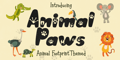 Animal Paws embodies fun, quirkiness and authenticity. This enchanting handwritten font features gorgeous animal-themed characters that will turn any creative idea into a true standout. Get inspired by its unique look and create gorgeous crafting projects!
 - Scratoon by ZetDesign,
$14.00 Scratoon is our latest font created for cartoon and comic-themed design work. This font is perfect for displaying posters, banners, flyers, and also suitable for cloothing. I hope this font really helps your creative working.. ... Thanks ...
 - Onick by Wordshape,
$- While researching the history of Onitsuka Tiger's branding and graphic design, I came across an odd, yet highly appealing piece of custom lettering on the company's ONICK ski boots from the 1970s. Reminiscent of aspects of the typeface Black-Out by Eli Carrico (released by my type foundry Wordshape), yet vertically compressed with razor-sliced counters and odd stencil element that makes up one of the legs of the "K", the ONICK lettering is a potential source for an intriguing modular font. I immediately thought of Ryoichi Tsunekawa as a potential collaborator to bring this piece of lettering to full-fledged life in the contemporary context. Based in Nagoya, Tsunekawa runs an independent type foundry called Dharma Type, including three specialized foundry sub-labels: Flat-It, devoted to display lettering; Prop-A-Ganda, a series of fonts inspired by and based on retro propaganda posters, movie posters, retail sign lettering & advertisements in the early 20th century; and Holiday Type, a series of decorative and retro scripts for holiday use. The past year has seen a flurry of notice of his work abroad, having been featured in both MyFonts' "Creative Characters" and YouWorkForThem's newsletter. As the work of most Japanese type designers is almost wholly unnoticed abroad, for Tsunekawa to be interviewed by two of the most popular type distribution companies in the world is definitely something beyond the norm. Perhaps it is because he works independently, or perhaps it is due to the charm and friendliness with which his typefaces are infused. Either way, this attention is both welcome and appreciated. Beyond mere charm, Tsunekawa's work is nuanced, detailed, and accessible due to its high level of finish. His fonts stand apart from his contemporaries in Latin typeface design in Japan due to his fascination with pop, vernacular and historical lettering from "non-pure" sources- whereas type designers like Kunihiko Okano and Akira Kobayashi have spent years analyzing the essence of Western letterform construction and unlocking the essence of Latin forms, Tsunekawa views surface and the awkward nature of his sources as being of value, as well. His irreverence for the formal doctrines of history imbue his typeface designs with a rugged inventiveness that would be missed by most- glyphs without source designs are guessed at and approximated, often in a manner wildly divergent from what Western eyes would assume. It is in these moments that I find sheer delight in Tsunekawa’s work and what make me most pleased to invite him aboard Neojaponisme and Onitsuka Tiger’s type development project. His assorted typefaces show an eclecticism in finish and as holistic systems- Tsunekawa's return email to me about the proposed type project showed a digital sketch of how a completed typeface family from the source lettering might look, rendered with an effortlessness and dedication to detail that belies a skilled craftsperson. Further development showed Tsunekawa’s rigor- the typeface in development rapidly featured glyphs ignored by many: a full set of fractions, Eastern European diacritics and accents, superior and inferior numerals, alternate characters, and custom ligatures - all designed with regulated, detailed spacing. ONICK is a typeface Tsunekawa should be proud of- an homage to a moment in history rendered in the absolute best fashion. We are proud to present it to the world! --Ian Lynam
 - HWT Konop by Hamilton Wood Type Collection,
$24.95 HWT Konop is a monospaced (fixed-width) typeface that is also square! Designed by Mark Simonson (Proxima Nova) as square characters that can be arranged vertically or horizontally and in any orientation. To a traditional letterpress job printer, a font like this wouldn’t make much sense. But to a modern letterpress printer it is an unusual and creative design toolkit. The bold gothic style is reminiscent of gothic wood types but more geometric. Since the characters are meant to be used in any orientation, the usual optical adjustments, such as making verticals thicker than horizontals and making tops smaller than bottoms are set aside. This results in a quirky but charming design. To provide more design options, Simonson came up with a modular system consisting of three sizes: 12-line, 8-line, and 6-line. These three sizes can be used together like Lego® bricks, with endless arrangements possible. And the sidebearing match so that characters always align when different sizes are used together. The digital version of Konop replicates the wood type version as much as possible, including the three different size designs. It includes OpenType stylistic sets that allow most characters to be rotated in place, 90° left, 90° right, or 180°, just like the wood type version. Extra characters not available in the wood type version are included with the digital fonts. The set of 3 is priced just $5 more than one single font, so order via "Package Options" HWT Konop is named for Don Konop, a retired Hamilton Manufacturing employee, who worked from 1959 to 2003. In addition to serving on the Two Rivers Historical Society Board from 2004 to present-day, he was also instrumental as a volunteer in helping with the museum’s move to its current home in 2013.
 - Amosis Technik - Unknown license

- Mardi Gross - Unknown license

- ReBucked - Unknown license

- West Fork JNL by Jeff Levine,
$29.00 West Fork JNL is based on the classic wood type Latin Extended (Hamilton, 1888) and is available in both regular and oblique versions.
 - Patri LG by LGF Fonts,
$12.00 Patri is an original type LGtypes, modern with style that recalls the belle epoque, combines a wide and a thin line, elegantly finished.
 - Caslon Openface by Bitstream,
$29.99A small x-height typeface, originating with engravers near the start of the twentieth century, appearing in type in the 1923 ATF specimen. - Axplat by Hackberry Font Foundry,
$24.95Axplat is the first in a family of grunge, deconstructed, messed-up type faces. It has Euro and almost all the special characters. - Lenorah JNL by Jeff Levine,
$29.00Lenorah JNL is a block-like design with spur serifs and is one of a number of wood type revivals by Jeff Levine. - Peerless 131 Bold by Wooden Type Fonts,
$15.00 A revival of one of the popular wooden type fonts of the 19th century, suitable for display, or text, closely related to Latin.
 - Antique Condensed by Wooden Type Fonts,
$15.00 A revival of one of the popular wooden type fonts of the 19th century, suitable for text or display, medium and bold weights.
 - Aston by Fontfabric,
$40.00 Aston is a custom sans serif font which is applicable for any type of graphic design - web, logo, print, motion graphics, and more.
 - Peerless by Wooden Type Fonts,
$15.00 A revival of one of the popular wooden type fonts of the 19th century, suitable for display, or text, closely related to Latin.
 - Antique Sans by Wooden Type Fonts,
$15.00A modified remake of one of the popular wooden type fonts of the 19th century. An extra bold sans serif suitable for display. - Morepling by Forberas Club,
$16.00 This font can use in any media like tees design, poster, banner or movie logo type. Let's try ! Awesome font be with you !
 - Washington Heights JNL by Jeff Levine,
$29.00 Washington Heights JNL is a sans serif type design based on a vintage hand-made directional sign for the New York subway system.
 - Daily Tabloid JNL by Jeff Levine,
$29.00 Daily Tabloid JNL was redrawn from a set of wood type that was popularly used for newspaper headlines, posters, broadsides and the like.
 - Woodlawn JNL by Jeff Levine,
$29.00 Woodlawn JNL is based on an open face wood type. A bold outline sans, this design is excellent for headline and titling applications.
 - Unique Wood by Solotype,
$19.95Wood type maker W. H. Page designed this in 1870. Caps, figures and points only. A great decorative for old-timey poster work. - Nouveau Impression JNL by Jeff Levine,
$29.00 Inspired by an image of some Art Nouveau wood type spotted online, Nouveau Impression JNL is available in both regular and oblique versions.
 - Echophonic by Rocket Type,
$14.00 Try new Echophonic today! It's hi-fidelity sound you can actually see! Another miracle of modern science in several weights by Rocket Type.
 - Tribalism by Intellecta Design,
$19.90 Tribalism is a dingbat/flourish font inspired by tattoos and more. Use these ornaments to decorate your type settings and or design work.
 - Unicorn Fold by Attype Studio,
$10.00 Unicorn Fold inspired by fairytail creature "Unicorn". Comes with display font, this layered font make a shiny effect for typography that you creates. Unicorn Fold is perfect for branding, logo, invitation, stationery, social media post, product packaging, merchandise, blog design, game titles, cute style design, Book/Cover Title and more. Features : - Multilingual Support
 - Mencken Std by Typofonderie,
$59.00 An American Scotch remixed in 27 fonts Mencken has twenty seven styles, divided into three widths, three optical sizes, romans and italics. Generally, optical size typeface families belong to a same common construction. It falls into the same category of type classification, while presenting different x-heights or contrasts. Mencken is unique because it is designed according to different axis and optical sizes. Firstly, Mencken Text is a low-contrast transitional typeface, designed on an oblique axis, asserting horizontal with featuring open counters. Its capitals follow Didots to better harmonize the rest of the family. On the other side of the spectrum, Mencken Head (and narrow variations) is designed on a vertical axis, high contrast, in a contemporary Didot style. The Mencken is therefore a typeface answering to different sorts of uses, whose design is different according to its uses: from oblique axis in small size to vertical axis in large sizes. Vertical proportions (x-height, capitals height, etc.) were calibrated to be compatible with many Typofonderie typeface families. Lucie Lacava and I followed the idea launched by Matthew Carter few years ago for some of his typefaces intended for publications. From Baltimore Sun’s project to Typofonderie’s Mencken It is a bespoke typeface for American newspaper The Baltimore Sun started at the end of 2004 which marks the beginning of this project. The story started with a simple email exchange with Lucie Lacava then in charge of redesigning the American East Coast newspaper. As usual, she was looking for new typeface options in order to distinguish the redesign that she had started. At the time of its implementation, a survey of the newspaper’s readers has revealed that its previous typeface, drawn in the mid-1990s, was unsatisfactory. The Mencken was well received, some reader responses was particularly enjoyable: “It’s easier to read with the new type even though the type is designed by a French.” Why it is called Mencken? The name Mencken is a tribute to H. L. Mencken’s journalistic contributions to The Sun. According to the London Daily Mail, Mencken ventured beyond the typewriter into the world of typography. Because he felt Americans did not recognize irony when they read it, he proposed the creation of a special typeface to be called Ironics, with the text slanting in the opposite direction from italic types, to indicate the author’s humour. Affirming his irreverence, the Mencken typeface does not offer these typographic gadgets. Henry Louis Mencken (1880 — 1956) was an American journalist, satirist, cultural critic and scholar of American English. Known as the “Sage of Baltimore”, he is regarded as one of the most influential American writers and prose stylists of the first half of the twentieth century. He commented widely on the social scene, literature, music, prominent politicians and contemporary movements. Creative Review Type Annual 2006 Tokyo TDC 2018
 - Neue Plak by Monotype,
$57.99 Originally designed in 1928, Plak is something of a lost gem in the type world. Despite being drawn by Futura creator Paul Renner, it never achieved the same popularity and spent decades lacking a much-needed digital revival. Monotype designers Linda Hintz and Toshi Omagari have taken its existing three weights and, after extensive research into the original wood type, extended them into the vast Neue Plak family. The typeface is available in 60 weights that stay true to Renner’s intentions, and offer the same blend of “quirky” details and “German stiffness” – as Hintz describes it. The design is an unusual mixture, bringing together a defiant outer appearance that’s counteracted by more playful details found in the lowercase r, and the large dots of the lowercase i. Other distinctive details include open or strikethrough counters, and a set of hairline widths that reduce Renner’s original design to its bare bones. Neue Plak’s display weights are crying out to be used in editorial, on packaging or in logos, while its text weight works well in both print and digital environments. Neue Plak Text Variables are font files which are featuring one axis and have a preset instance from Thin to Black
 - Midkaiser by Konstantine Studio,
$19.00 Behold the allure of Midkaiser – where innovation converges with design mastery, creating an experience that transcends the ordinary. Prepare to be captivated by the future of typography! Midkaiser is not just a font; it’s a testament to visionary design. Elevate your creations with a futuristic allure that has already earned accolades across the design universe. Crafted with precision, Midkaiser boasts a seamless blend of boldness and sophistication. Empowers your brand to stand out, leaving an indelible imprint on your audience’s perception. Covers a wide variety of languages, included Vietnamese. See the details in the preview images. Ignite your creativity, transform your designs, and leave a lasting impression with Midkaiser – Your Gateway to Futuristic Tech Fonts!
 - Elyzabeth Pro by moriztype,
$15.00 Elyzabeth Pro is a very elegant and practical sans serif font family and precise in its creation. clean fonts that stand upright elegantly that are soft and familiar and easy to read, Not boring to the reader. This type of font is great to use for very large writing purposes, ranging from notes on daily activities, magazines, newspapers, logos, posters, product compositions, product descriptions to be sold and indications of any product composition that requires writing shadows. Elizabeth Pro contains eight fonts. Broadly speaking, this font has two models, namely Regular and Italic. (Thin, Thin Italic, Regular, Regular Italic, Semi Bold, Semi Bold Italic, Bold and Bold Italic. They all support Latin, Greek, and Cryillic characters. This font will be a great asset to your font library, as it has the potential to enhance your next project creation.
 - Wellsbrook Initials SG by Spiece Graphics,
$39.00 These four sets are based on the elegant and beautiful work of the German graphic designer Emil Rudolf Weiss. The initials were made to complement Weiss’ text fonts and were cast in the 1920s by the Bauer Type Foundry of Frankfurt. Also known as Weiss Initials Series I, II, II Bold, and III, the lettering has a distinct antique quality. These extremely hard-to-find digital versions look superb in large sizes and remain huge favorites among book designers. Wellsbrook Initials are now available in the OpenType Std format. Some new characters have been added to this OpenType version as Stylistic Alternates. This advanced feature works in current versions of Adobe Creative Suite InDesign, Creative Suite Illustrator, and Quark XPress. Check for OpenType advanced feature support in other applications as it gradually becomes available with upgrades.
 - Arched Gothic Condensed SG by Spiece Graphics,
$39.00 Like a bright star shimmering on a still and quiet summer night, Arched Gothic Condensed is a glowing example of Victorian type. Thin in the middle with clumpy wedges on top and bottom, it truly bears the spirit of a bygone era. Originally known as Concave Extra Condensed, this typeface has shed its waist-high spur notches and gained new figures and lowercase letters. Developed around 1885 by the James Conners & Son Foundry (New York), Arched Gothic Condensed is a marvel of sparkle and glitter in nineteenth century typeface design. Arched Gothic Condensed is also available in the OpenType Std format. Some new characters have been added to this OpenType version. Advanced features currently work in Adobe Creative Suite InDesign, Creative Suite Illustrator, and Quark XPress 7. Check for OpenType advanced feature support in other applications as it gradually becomes available with upgrades.
 - Space Traveler JNL by Jeff Levine,
$29.00 The 1990s was a time of creativity, experimentation and exploration into the world of digital typography by amateur and professional alike. Ray Larabie [through his Larabie Fonts] offered dozens upon dozens of wide-ranging (and often most unusual) freeware fonts. Ray was the driving force of encouragement and a behind-the-scenes “mentor” who helped Jeff Levine Fonts get underway in January of 2006. As his focus changed to high-quality commercial type with the launch of Typodermic, Inc., many of Ray’s “less than perfect” font experiments were withdrawn. He eventually turned those typefaces into a bundled zip archive released into the public domain through Creative Commons. “Webster World” resembles a fusion of Techno and Western styles. With Ray's permission, the original characters have been cleaned up and re-made as Space Traveler JNL, which is available in both regular and oblique versions.


