10,000 search results
(0.046 seconds)
- Emely and Peter by Letterhend,
$19.00 Emely and Peter is a beautiful modern calligraphy script with love theme. The swashes and love ornaments makes this font looks suitable for romance, wedding, feminine theme. This type of font also perfectly made to be applied especially in logo, and the other various formal forms such as invitations, labels, logos, magazines, books, greeting / wedding cards, packaging, fashion, make up, stationery, novels, labels or any type of advertising purpose. Features : uppercase & lowercase numbers and punctuation multilingual alternates and ligatures swashes PUA encoded We highly recommend using a program that supports OpenType features and Glyphs panels like many of Adobe apps and Corel Draw, so you can see and access all Glyph variations.
 - Mochest Romantic by Ergibi Studio,
$20.00 Mochest Romantic, these fonts are of two types serif and script. This typeface has been made carefully to make sure its premium quality and luxury feel. The ligatures on script makes this typeface unique and stands out rather than the regular serif font, perfectly for headlines, logos, posters, packaging, T-shirts,coffee shops, restaurants, magazine’s headers, signs or gift/post cards,cafe’s and weddings or any type of advertising purpose. What's Included Mochest Romantic Script Mochest Romantic Serif Mochest Romantic include, numbers, punctuation,alternates, and it also supports other languages Mochest Romantic it also supports multilingual If there is a problem, question, or anything about my fonts, don't hesitate to ask! Ergibi Studio
 - Glico Prime by Letterhend,
$17.00 Glico Prime is a heavy, bold, standout sans serif with futuristic theme. It has few styles with 3 stylistic, This type of font perfectly made to be applied as a headline, logo, title, quotes which is need a standout font, and the other various formal forms such as invitations, labels, logos, magazines, books, greeting / wedding cards, packaging, fashion, make up, stationery, novels, labels or any type of advertising purpose. Features : Regular, inline & outline 3 stylistic set numbers and punctuation multilingual ligatures PUA encoded We highly recommend using a program that supports OpenType features and Glyphs panels like many of Adobe apps and Corel Draw, so you can see and access all Glyph variations.
 - Thousand Brights by Letterhend,
$19.00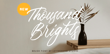 Thousand Brights is a script font based on authentic hand writing with natural signature style. This type of font perfectly made to be applied especially in logo, and the other various formal forms such as invitations, labels, logos, magazines, books, greeting / wedding cards, packaging, fashion, make up, stationery, novels, labels or any type of advertising purpose. Features : uppercase & lowercase numbers and punctuation multilingual alternates and ligatures swashes PUA encoded We highly recommend using a program that supports OpenType features and Glyphs panels like many of Adobe apps and Corel Draw, so you can see and access all Glyph variations. How to access opentype feature : letterhend.com/tutorials/using-opentype-feature-in-any-software/
 - Entog by Twinletter,
$12.00 This font offers beautiful abstract typographic harmony for a wide variety of design projects, including natural handwriting in digital form for designs, quote designs, for social media business designs, advertisements, trademarks, promotional banners, posts, posters, signatures, and all. the design requires handwriting or whatever design you want. This font is equipped with uppercase, lowercase, numbers, punctuation marks, swhases and several variations on each character including multi-language. This font is best suited for open type friendly applications. How to get alternative glyphs from open type fonts: http://adobe.ly/1m1fn4Y PUA Character Code - Fully accessible without additional design software. We hope you enjoy this font. Feel free to send whatever message you want to convey. Thank you Regards Twinletter
 - Shopie Minclair by Letterhend,
$19.00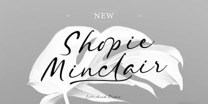 Shopie Minclair is a script font based on authentic hand writing with natural signature style. This type of font perfectly made to be applied especially in logo, and the other various formal forms such as invitations, labels, logos, magazines, books, greeting / wedding cards, packaging, fashion, make up, stationery, novels, labels or any type of advertising purpose. Features : uppercase & lowercase numbers and punctuation multilingual alternates and ligatures swashes PUA encoded We highly recommend using a program that supports OpenType features and Glyphs panels like many of Adobe apps and Corel Draw, so you can see and access all Glyph variations. How to access opentype feature : letterhend.com/tutorials/using-opentype-feature-in-any-software/
 - Xylo by ITC,
$29.99Xylo is a rugged, no-nonsense typeface that was originally designed in 1924 by the Benjamin Krebs type foundry in Frankfurt am Main, Germany. Even back then, Xylo must have been very popular; the design made it at least as far as England. In 1995, after finding its design in an old London printer's reference book, the Letraset Type Studio faithfully converted Xylo into digital format. A time-proven display face, Xylo will convey a feeling of power and strength in any application. Best used big in headlines or logos; Xylo exudes an expressionistic and art deco spirit that just as much at home today as it was during the roaring 20s! - Alternate Gothic by Linotype,
$20.99 Alternate Gothic was designed by Morris Fuller Benton for American Typefounders Company in 1903. All three weights of Alternate Gothic are bold and narrow. In fact, this face is essentially a condensed version of Benton’s other well-known sans serif types, Franklin Gothic and News Gothic. In the early twentieth century, the modern concept of type “families” had not yet been formed — and though Benton designed these sans serifs to harmonize with each other, the foundry gave them different names. Robust, dark, and coolly competent, Alternate Gothic is a good choice when strong typographic statements must fit into tight spaces. As a modern usage, it is currently the font of YouTube’s homepage logo.
 - Caslon 540 by ParaType,
$30.00 The Bitstream version of Caslon 540 of the American Type Founders, 1902. Based on William Caslon I's first English Old Style typefaces of 1725. Caslon modeled his designs based on late 17th century Dutch types, but his artistic skills enabled him to improve those models, bringing a variety of forms and subtlety of details. Strokes in Caslon fonts are somewhat heavier than in earlier Old Style fonts, serifs are thicker and a bit stubby. Italic letters have uneven slope. A text set in Caslon looks legible and aesthetically appealing. Caslon is a favorite font of English printers for setting of classical literature. Cyrillic version was developed for ParaType in 2002 by Isay Slutsker and Manvel Shmavonyan.
 - Stay Strong by Letterhend,
$15.00 Stay Strong is a hand drawn dry brush script which is purposely made for headline, display or logotype, and signature. This type of font perfectly made to be applied especially in logo, and the other various formal forms such as invitations, labels, logos, magazines, books, greeting / wedding cards, packaging, fashion, make up, stationery, novels, labels or any type of advertising purpose. Features : uppercase & lowercase numbers and punctuation multilingual alternates & ligatures PUA encoded We highly recommend using a program that supports OpenType features and Glyphs panels like many of Adobe apps and Corel Draw, so you can see and access all Glyph variations. How to access opentype feature : letterhend.com/tutorials/using-opentype-feature-in-any-software/
 - Fortuita by Typographias,
$28.00 Fortuita is a versatile sans fit for text or display. The name carries some of its history as it was born from logo sketches that fortuitously grew into a type family over eight years. It comes with a tall x-height, rendering it readable at smaller sizes. It has sixteen weights, eight regular ones, and their italics, each with small caps, something you may not see very often with sans serifs. It counts with old-style numbers that can switch to its lining, small caps, or tabular versions through open-type features. The family carries a distinct personality in its design that will lend itself to its subject, all the while without becoming distracting or detracting from it.
 - Bouldster by Letterhend,
$19.00 Introducing, Bouldster - a standout bold script with a touch of nostalgic look and feel. Inspired by 50s 60s signages, this font made to bring back the good ol' days. This type of font perfectly made to be applied especially in logo, headline, signage and the other various formal forms such as invitations, labels, logos, magazines, books, greeting / wedding cards, packaging, fashion, make up, stationery, novels, labels or any type of advertising purpose. Features : uppercase & lowercase numbers and punctuation multilingual alternates / swashes and ligatures PUA encoded We highly recommend using a program that supports OpenType features and Glyphs panels like many of Adobe apps and Corel Draw, so you can see and access all Glyph variations.
 - ALS Gross Kunst by Art. Lebedev Studio,
$63.00 Gross Kunst is a humanist sans-serif with an open aperture, sharp outlines, and eye-catching details that make this full of character typeface very recognizable. The type family has three fonts based on wide pen strokes. Depending on its purpose the styles differ in expressiveness and the level of ornamentation. Regular style—low-contrast and neutral—is the most natural choice for body-text. The display face is more dynamic and gets higher contrast. It's very legible from a distance and would do its best on navigational and warning signage, plates, and such. Eloquent straight italics will adorn titles, announcements, and pages with ads. This typeface was acknowledged at the international type design competition Modern Cyrillic '99.
 - Regent Pro by Storm Type Foundry,
$39.00 This modernized rustic Baroque Roman face paraphrases freely its model from the first half of the 18th century. The shape of the letters has been cleared from all unevenness and softness, but has retained its lively expression. It is deliberately rather cooler than the reverently digitized Baroque Roman type faces, since it was necessary to adjust it with regard to the visual experience of the contemporary reader. In addition, it has bold designs and aligning figures, which also considerably extends the range of its application. It is an entirely reliable text type face for the most demanding extensive works. Thanks to its calm expression and excellent legibility it is widely used when printing series of professional literature.
 - Journal by ParaType,
$25.00 Journal type family is a low-contrast text face of the Ionic-Legibility group. It was designed at the Polygraphmash Type Design Bureau in 3 styles in 1951–53 by Lev Malanov and Elena Tsaregorodtseva. The fonts were based on Cyrillic version of Excelsior that was developed in 1936 in Moscow by professor Michael Shchelkunov, Nikolay Kudryashev et al., that in its turn was based on Excelcior by Chauncey H. Griffith, 1931, Mergenthaler Linotype. Digital version was developed in ParaGraph (ParaType) in 1991. In 2012–13 designer Natalia Vasilyeva made some corrections in original digital data, extended character set and add bold italic style. The family was rereleased in ParaType in 2013.
 - Derlina Script by Nk Studio,
$14.00 Modern font Derlina Script is a modern typeface, each letter has been carefully crafted to make your text look beautiful. With a modern script style, this font will suit a wide variety of projects, for example: weddings, invitations, greeting cards, posters, business cards, quotes, blog headers, branding, logos, fashion, clothing, letters, stationery, etc. The modern Derlina Script font includes alternative glyphs and a beautiful swirl in fonts including style sets, ligatures, etc. The Open Type feature can be accessed using smart Open Type programs such as Adobe Illustrator CS, Adobe Indesign & CorelDraw X6-X7 and Microsoft Word. And this Font has provided PUA unicode (custom coded font). so that all stunts are fully accessible to the craftsman or designer.
 - DangeR NighT by Absonstype,
$19.00 DANGER NIGH is the horror display typeface with high contrast all caps style looks and feel nice balanced. Honestly it works perfectly for headlines, logos, posters, packaging, T-shirts and much more. Recommended to use in Adobe Illustrator or Adobe Photoshop with opentype feature. Ligatures feature is default setting in Adobe Illustrator or Adobe Photoshop in Uppercase character. So when you want not to use the ligatures. Open glyphs panel : In Adobe Photoshop choose tool Window Character and then please click fi symbol In Adobe Illustrator choose tool Window Type Open Type and then please click fi symbol If you have questions, just send me a message and I’m glad to help. Have a great day, Absonstype
 - Linka Stencil by Vanarchiv,
$42.00 This font family is display stencil sans-serif with different stylistic layers available as open type font. The main characters are geometric and neutral but when we change the contextual alternates open type feature the letterforms activate the cursive stylish set. The word composition is divided by initial, medial and final forms, available for all uppercase and lowercase, the diacritics for Latin encodings (Western and central Europe and Baltic countries) are available. However the contextual alternate features (cursive mode) can only work on Adobe CS Indesign and Illustrator softwares. This typeface also has uppercase swash and stylish alternates. A large group of discretionary ligatures are also available to improve better legibility and readability on specific characters combinations.
 - Aldo New Roman by Indian Summer Studio,
$45.00 Aldo New Roman (1000+ glyphs, incl. medieval Latin, Cyrillic, some Greek, ornaments, small capitals, nut fractions...) Renaissance antiqua · Venetian types · Venetian serif · Humanist serif · Old style antiqua A modern version of the typeface cut by Francesco Griffo for Venetian printer Aldus Manutius around 1490 AD. Intentionally not the original Griffo / Aldus / Bembo — but the part of the large project on revival and further development (by drawing many additional glyphs, sometimes over 1000) of the 20th century's typewriters’ fonts. Triple pun here :: :: #1 Aldine Roman type; #2 Since it is equalized, modernized version — the parallel to the Times New Roman; #3 He called himself Aldus Pius Manutius Romanus — he was a new Roman during his Renaissance times.
 - Typesetter Ornaments JNL by Jeff Levine,
$29.00 The pages of vintage type foundry catalogs yield so much wonderful type design and artwork. Found within their pages are hundreds of classic text and display faces alongside delicately engraved cuts as well as print shop borders, ornaments and embellishments. These books are treasure troves of their respective times, and Typesetter Ornaments JNL preserves some of that art in digital form. Redrawn from this source material are twenty-six basic design elements that include corner pieces, end pieces, pointing hands, spot illustrations and other designs. Also included are old style parentheses, brackets, an Rx (prescription symbol), two cent signs and a few extra elements located on the number keys and their caps shift counterparts.
 - Realtime Stencil by Juri Zaech,
$30.00 Realtime Stencil is part of the Realtime type family which draws inspiration from information displays. The result is a technical yet friendly design with details that serve function and visual impact alike. As a monospaced typeface it lends itself to tabular designs, sturdy columns and tidy layouts. Nevertheless Realtime Stencil comes with a feature for setting continuous text — a proportional design employable through OpenType — it further comes in five weights, from light to black, and with a character set that covers over 200 latin languages. Please see the Realtime Stencil Type Specimen PDF in the gallery. A soft version of Realtime Stencil is available separately: Realtime Stencil Rounded. Its soft edges apply warmth to the otherwise rather technical appearance.
 - TG Frekuent Mono by Tegami Type,
$30.00 TG Frekuent Mono a new modern geometric sans serif with monospaced style. This typeface is made with precise calculations so that it displays a beautiful and modern appearance. Besides this new typeface is also equipped with six different styles, ranging from ultra light to extra bold plus variable font. This typeface also has various alternative characters that can be used according to the needs in the design. Alternative characters that exist in this type of font have a touch of script typeface so that it makes the alternative character of this type of letter a little quirky and different but still fits well with the combination of modern main characters. And supports approximately 100 languages.
 - Dry Erase by Zap Studio,
$20.00 This font is my first attempt at typeface design. It is based on my own handwriting and I tried to maintain the natural quality, where the letters are quite loose, some going in different directions, thickness and position. It has Open Type features including contextual alternatives, stylistic sets and ligatures. Trying to maintain natural quality of handwriting each glyph has four styles which randomly appear when you type. For example, when there are double letters, the two letters are slightly different. You may also switch off the random feature and use the four styles on their own. The many alternates are best activated in OpenType-aware programs, such as Word 2010, Illustrator CS4+, InDesign CS4+ and QuarkXpress 7+.
 - Wednesday Island by Letterhend,
$19.00 Looking fresh and chic font? Introducing, Wednesday Island - an authentic handwritten script. This font is made for perfect handwriting. This type of font perfectly made to be applied especially in logo, and the other various formal forms such as invitations, labels, logos, magazines, books, greeting / wedding cards, packaging, fashion, make up, stationery, novels, labels or any type of advertising purpose. Features : uppercase & lowercase numbers and punctuation multilingual alternates and ligatures PUA encoded We highly recommend using a program that supports OpenType features and Glyphs panels like many of Adobe apps and Corel Draw, so you can see and access all Glyph variations. How to access opentype feature : letterhend.com/tutorials/using-opentype-feature-in-any-software/
 - Istoria by Hooper Type,
$12.00 New foundry on the block, Hooper Type, kicks off it's catalogue with a versatile, story-telling serif font. With a love of the magical and a yearning for adventure, Istoria pushes away from the static, drawing in whisps and whirls that entice and excite, without distracting. Unassuming in it's long form, with delicate strokes that draw the eye, it commands attention when used in short punchy titles, or set in caps. Istoria (meaing both history and story in Greek) delights in having unusual curves, curvy straights and twisty feet which emulate those adventures and myths from days gone by. Type shouldn't interfere with the content, but it absolutely can enhance it. Hope you enjoy it!
 - The Moon Milter by Letterhend,
$19.00 Introducing, The Moon Milter is a vintage sans serif font. Inspired by 50s 60s signages, this font made to bring back the good ol' days. This type of font perfectly made to be applied especially in logo, headline, signage and the other various formal forms such as invitations, labels, logos, magazines, books, greeting / wedding cards, packaging, fashion, make up, stationery, novels, labels or any type of advertising purpose. Features : numbers and punctuation multilingual -PUA encoded We highly recommend using a program that supports OpenType features and Glyphs panels like many of Adobe apps and Corel Draw, so you can see and access all Glyph variations. How to access opentype feature : letterhend.com/tutorials/using-opentype-feature-in-any-software/
 - Omerta by Anomali Creative,
$15.00 Omerta Blackletter Font Blackletter fonts have letters that are very bold and ornate. It is a Western calligraphy style that was used in Europe from 1100s to the 1600s. Blackletter is also known as Old English or Gothic script. During the 20th century, blackletter type styles were adopted by new audiences and came to be associated with punk, street art, and heavy metal. Omerta Blackletter Font Specifically developed to be suitable for perfect for tattoos clothing, labels and packaging, branding, or any Gothic-themed projects. Omerta Blackletter Font are great for Classic Calligraphic type projects and convey a sense of what’s to come. This font can be used with all software that can read standard fonts.
 - Khamden Script by Solidtype,
$16.00 Khamden is a thick handmade font of beautiful bold type with an authentic touch. This includes OpenType features with encoded PUA such as alternatives and ligature. This font is perfectly made to be applied especially in logos, and various other formal forms such as invitations, labels, logos, magazines, books, greeting / wedding cards, packaging, fashion, makeup, stationery, novels, labels, or any type from advertising purposes. Feature: uppercase & lowercase letters numbers and punctuation marks multilingual PUA is coded We highly recommend using a program that supports OpenType features and the Glyphs panel like many Adobe and Corel Draw applications, so you can see and access all Glyph variations. Thank you! - Don't hesitate to ask me
 - Distoniare by Letterhend,
$19.00 Distoniare is a pretty script font based on authentic hand writing with natural signature style. This type of font perfectly made to be applied especially in logo, and the other various formal forms such as invitations, labels, logos, magazines, books, greeting / wedding cards, packaging, fashion, make up, stationery, novels, labels or any type of advertising purpose. Features : uppercase & lowercase numbers and punctuation multilingual alternates and ligatures swashes PUA encoded We highly recommend using a program that supports OpenType features and Glyphs panels like many of Adobe apps and Corel Draw, so you can see and access all Glyph variations. How to access opentype feature : letterhend.com/tutorials/using-opentype-feature-in-any-software/
 - Marina Bullock by Letterhend,
$19.00 Marina Bullock is a script font based on authentic hand writing with natural signature style. This type of font perfectly made to be applied especially in logo, and the other various formal forms such as invitations, labels, logos, magazines, books, greeting / wedding cards, packaging, fashion, make up, stationery, novels, labels or any type of advertising purpose. Features : uppercase & lowercase numbers and punctuation multilingual alternates and ligatures swashes PUA encoded We highly recommend using a program that supports OpenType features and Glyphs panels like many of Adobe apps and Corel Draw, so you can see and access all Glyph variations. How to access opentype feature : letterhend.com/tutorials/using-opentype-feature-in-any-software/
 - ITC Panache by ITC,
$29.99Typefaces, like most other works of art, provide a small window into the personalities and sensibilities of the artists who create them. ITC Panache not only provides this window, it is also aptly named. Mr. Edward Benguiat the dreator of ITC Panache, has all the dash, verve (and panache) hinted at in the design, Creative, capable and prolific, Ed Benguiat has drawn hundreds of exciting and popular typeface designs. Benguiat's design goal was to create a sans serif typestyle that is versatile, utilitarian - and distinctive. We think he has succeeded admirably. ITC Panache's three weights mix exceptionally well to complement each other or provide emphasis where necessary. Extensive testing at text sizes and design fine-tuning has produced a typeface family which is remarkably homogenous and consistent in color. Text set in ITC Panache is inviting without dissapointment. It is exceptionally easy to read, even in long text blocks of copy or small point sizes. When set in larger sizes or used for headlines, ITC Panache's character traits becomes more apparent and pronounced to the reader. They help to create graphics with distinction and style. Big or small. a little or a lot. it's hard not to use ITC Panache well. If you could pigeonhole ITC Panache, it would probably be classified as a stressed sans", but this would not completely describe, or do justiceto, the design. There is a slight contrast in stroke weight, which becomes more pronounced as the familiy weight increases; but there is a more to distinguish ITC Panache from ather sans serifs. Perhaps most obvious is its high waist and correspondingly slight condensation of the top half of the "round" capitals. Both of these traits link ITC Panache with the sensuous forms of art nouveau creations. In contrast are the typicall old style "e" found in designs like Cloister and ITC Berkeley Old Style, and the two storied "g" common to the early 20th century sans serif designs. The capital "A" even has the cupped top found in Caslon designs. Part of the beauty of ITC Panache is that all of these seemingly unrelated desig traits are melded into a design of exceptional continuity." - Banknote 1948 by Ingo,
$39.00 A very expanded sans serif font in capital letters inspired by the inscription on a bank note Old bank notes tend to have a very typical typography. Usually they carry decorative and elaborately designed markings. For one thing, they must be practically impossible to forge and for another, they should make a respectable and legitimate impression. And in the days of copper and steel engravings, that meant nothing less than creating ornate, shaded or otherwise complicated scripts. Designing the appropriate script was literally in the hands of the engraver. That’s why I noticed this bank note from 1948. It is the first 20 mark bill in the then newly created currency ”Deutsche Mark.“ All other bank notes of the 1948 series show daintier forms of typography with an obvious tendency toward modern face. The 1949 series which followed shortly thereafter reveals the more complicated script as well. For whatever reason, only this 20 mark bill displays this extremely expanded sans serif variation of the otherwise Roman form applied. This peculiarity led me in the year 2010 to create a complete font from the single word ”Banknote.“ Back to those days in the 40’s, the initial edition of DM bank notes was carried out by a special US-American printer who was under pressure of completing on time and whose engravers not only engraved but also designed. So that’s why the bank notes resemble dollars and don’t even look like European currency. That also explains some of the uniquely designed characters when looked at in detail. Especially the almost serif type form on the letters C, G, S and Z, but also L and T owe their look to the ”American touch.“ The ingoFont Banknote 1948 comprises all characters of the Latin typeface according to ISO 8859 for all European languages including Turkish and Baltic languages. In order to maintain the character of the original, the ”creation“ of lower case letters was waived. This factor doesn’t contribute to legibility, but this kind of type is not intended for long texts anyway; rather, it unfolds its entire attraction when used as a display font, for example on posters. Banknote 1948 is also very suitable for distortion and other alien techniques, without too much harm being done to the characteristic forms. With Banknote 1948 ingoFonts discloses a font like scripts which were used in advertising of the 1940’s and 50’s and were popular around the world. But even today the use of this kind of font can be expedient, especially considering how Banknote 1948, for its time of origin, impresses with amazingly modern detail.
 - Keratine by Zetafonts,
$39.00 The letterforms that we now accept as the historical standard for printing latin alphabets were developed in Italy around the end of 1400. Deriving from Roman capitals and from italic handwriting, they soon replaced the blackletter letterforms that were used a few years before by Gutenberg for his first moveable types. Between these two typographical traditions there's an interesting and obscure middle ground of historical oddballs, like the Pannartz-Sweynheym Subiaco types, cut in Italy in 1462. Keratine is the result of Cosimo Lorenzo Pancini's exploration of that territory. Like our Kitsch by Francesco Canovaro it explores the impossible territory between antiqua and blackletter, not as a mere historical research, but rather as a way to re-discover and empower an unexpected and contemporary dynamism. Using contemporary digital aesthetics to combine the proportions of humanistic type with the gestural energy of Fraktur letterforms, Keratine develops a "digitally carved", quasi-pixelated appearance (clearly stressed in Keratine's italics) that allows an unexpected balance between small-size readability and display-size personality. Keratine also relies heavily on a variable identity as the letterforms change dynamically with weight, developing from a contrasted, text-oriented light range to more expressive and darker display range, for a total of 8 weights with italics. Open type features and glyph alternates further enrich the usage possibility of this typeface that embodies our contemporary swap culture by embracing the contradictory complexity at the crossroads between Gothic and Humanist styles, while playfully empathising with a digital, brutalist spirit.
 - Tchig Mono by Eclectotype,
$30.00 This is Tchig Mono, a monospaced type family that doesn't take itself too seriously. Why make a monospaced font? For coding, sure, but display? It’s my humble opinion that it’s the aesthetic choices driven by the constraints of the monospaced environment that makes them attractive. It’s a challenge for the type designer to squash and expand glyphs into a rigid bounding box, and the more unorthodox shapes that spring from this have a feel about them which lends them to postmodernist layouts and hipsterish anti-design. And the payoff for the type designer - no kerning! Yay. So what’s different about Tchig? Like I said before, it doesn't take itself too seriously. Even the name Tchig is just a stupid, fun sound (although it does show off that nice g!). There are a selection of playful alternates that give text a slightly alien feel. Stylistic set 1 chops off ascenders and descenders of lowercase letters, giving it a kind of small caps meets unicase feel (it is also accessible using the small caps feature). The other sets (or stylistic alternates if you don't have access to stylistic sets) make certain letters more twirly, more square, more “experimental”. Automatic fractions use a half-width numerator and denominator so fractions like one half and five eighths have the same width as figures (and every other glyph). There you go then - a monospaced type family not initially intended for use in the usual ways monospaced families are intended to be used. Give it a try. You could even do some coding with it if you like.
 - Moliere by Eurotypo,
$44.00 The life of Molière is a story of struggle, hard work, domestic unhappiness, death and burial in obscurity and almost in shame. Molière left behind a body of work that not only changed the face of French classical comedy, but has also come to influence the work of other dramatists from around the world. Despite his own preference for tragedy, which he had tried to further with the Illustre Théâtre, Molière became famous for his farces, which were generally in one act and performed after the tragedy. Both the comic and the serious drama were powerfully affected by the work of Molière, not only in his own age and country but everywhere and up to the present time. Didot is a name given to a group of typefaces named after the famous French printing and type producing family. The classification is known as modern, or Didone. The typeface we know today was based on a collection of related types developed in the period 1784–1811. Firmin Didot cut the letters, and cast them as type in Paris. Along with Giambattista Bodoni of Italy, Firmin Didot is credited with establishing the use of the "Modern" classification of typefaces. The types that Didot used are characterized by extreme contrast in thick strokes and thin strokes, by the use of hairline serifs and by the vertical stress of the letters. As in the extreme contrasts of the literature of Molière, in Didione's typefaces, thick and thin strokes, straight and curved, are the most relevant characteristic for an era marked by the changes.
 - Duepuntozero Pro by Zetafonts,
$39.00 Created as a logo typeface in 2004 by Francesco Canovaro, Duepuntozero is one of Zetafonts classic typefaces. A monolinear sans serif typeface with rounded corners and condensed proportions, strictly based on modular geometric design, it was at first designed in five weights to be used as a condensed companion typeface to the rounded display family Arista. In 2019 the family was completely redesigned by the Zetafonts Team, expanding the original character set to include cyrillic and greek glyphs and adding four extra weights and italics to the original weight range. This restored and revamped version, named Duepuntozero Pro, also includes full Open Type features for positional figures, fractions and Small Caps. With his rounded, minimal aesthetic, Duepuntozero embodies the desire for simplicity and playfulness of contemporary mobile applications, making it a perfect choice for gaming and app interface design. Its compact design allow for maximum space saving on mobile screens when used as a text typeface, while the strictly geometric design and the extreme range of weights (including thin and black) make it excel in display, logo and editorial use. A complementary set of free icons in the same range of weights of the font is provided to help designers build consistent branding through pictograms in infographics, interfaces and editorial products.
 - Anface by Andfonts,
$17.00 Anface is a bold, square font with a playful, creative letters. This font is unique because of its bold and strong letterforms that evoke a feeling of confidence and strength. The square shapes add a modern, geometric element that gives it a cool and contemporary look. In terms of functionality, Anface offers a range of styles, including regular and bold, as well as a full character set that supports multiple languages. Its special features include a full range of punctuation and symbols, making it a versatile choice for a variety of design projects. The design concept behind Anface was to create a font that was both bold and playful, making it perfect for a variety of creative projects: headlines, logos, and other design elements that required a strong and confident visual impact. Its unique square shape and bold letterforms make it a fresh and exciting addition to any designer's toolkit. Here are a few ideas for where Anface could be used: Tech companies: The geometric design of Anface could be a good fit for technology or software companies, as it has a modern and futuristic feel. Sports teams: The bold, strong letterforms of Anface could be used for sports team logos, jerseys, and other branding materials. Its square shape gives it a sporty and athletic look. Architecture firms: The clean, modern lines of Anface make it a great choice for architecture firms or any businesses related to construction or design. Art and design studios: Anface's playful, creative design would be well-suited for art and design studios, or any business related to the creative industries. Music industry: Anface's bold, attention-grabbing design could be used for music album covers, posters, or other promotional materials. Cafes and restaurants: Anface's square shape and bold design could be a good fit for cafes or restaurants that want to create a modern and unique brand identity. Its playful and creative look could help businesses stand out and create a unique visual identity.
 - Tavern by FontMesa,
$25.00 Tavern is a super font family based on our Algerian Mesa design, with Tavern we've greatly expanded the usability by creating light and bold weights plus all new for 2020 with the introduction of extra bold and black weights Tavern is now a five weight family. The addition of the bold weight made it possible to go further with the design by adding open faced shadowed, outline and fill versions. Please note, the fill fonts are aligned to go with the open faced versions, they may work with the outline versions, however you will have to apply them one letter at a time. The Tavern Fill fonts may also be used a stand alone font, however, the spacing is much wider than the regular solid black weights of Tavern. In the old days of printing, fill fonts rarely lined up perfect with the open or outline font, this created a misprinted look that's much in style today. To create that misprinted look using two different colors, try layering the outline fonts offset over the top of the solid black versions. Next we come to the small caps and X versions, for a font that's mostly seen used in all caps we felt a small caps would come in handy. The X in Tavern X stands for higher X-height, we've taken our standard lowercase and raised it for greater visibility in small text and for signage where you want the look of a lowercase but it needs to be readable from the street. In August of 2016 I started the project of expanding this font into more weights after seeing the font in use where someone tried creating a bold version by adding a stroke fill around the letters. The result didn't look very good, the stroke fill also caused the shadow line to merge with the serifs on some letters. This lead me to experiment to see if a new bold weight was possible for this font and I'm pleased to say that it was. After the bold weight was finished I decided to type the regular and bold weights together in a first word thin second word bold combination, however the weight difference between the two wasn't enough contrast. This lead me to wonder if a lighter weight was possible for this font, as you can see yes it was, so now for the first time in the history of this old 1908 type design you can type a first word thin second word bold combination. So why the name change from Algerian to Tavern? Since the original font was designed in England by the Stephenson Blake type foundry I decided to give this font a name that reminded you of the country it came from, however, there were other more technical reasons. During the creation of the bold weight the engraved shadow line was sticking out too far horizontally on the bottom right of the serifs dramatically throwing the whole font off balance. The original font encountered this problem on the uppercase E, L and Z, their solution was a diagonal cut corner which was now needed across any glyph in the new bold weight with a serif on the bottom right side. In order to make the light and regular weights blend well with the bold weight diagonal cut offs were needed and added as well. This changed the look of the font from the original and why I decided to change the name, additional concerns were, if you're designing a period piece where the font needs to be authentic then this font would be too new. Regular vs. Alt version? The alternate version came about after seeing the regular version used as a logo and secondary text on a major product label. I felt that some of the features of the regular version didn't look good as smaller secondary text, this gave me the idea to create an alternate version that would work well for secondary text in an advertising layout. But don't stop there, the alternate version can be used as a logo too and feel free to exchange letters between both regular and alternate versions. Where are the original alternates from Algerian? Original alternates from Algerian are built into the regular versions of Tavern plus new alternates have been created. We're excited to introduce, for the first time, all new swash capitals for this classic font, you're going to love the way they look in your ad layout, sign or logo. The best way to access alternate letters in Tavern is with the glyph map in Adobe Illustrator and Adobe InDesign products, from Adobe Illustrator you can copy and paste into Photoshop as a smart object and take advantage of all the text layer style features Photoshop has to offer. There may be third party character maps available for accessing alternate glyphs but we can't advise you in that area. I know what you're thinking, will there be a Tavern Condensed? It takes a lot of hours to produce a large font family such as this, a future condensed version will depend on how popular this standard version is. If you love Tavern we're happy to introduce the first weathered edge version of this font called Bay Tavern available in February 2020.
 - Nordlig by Prominent and Affluent,
$35.00 A Timeless Revival of 70s Vintage Typography. In the realm of design, where trends ebb and flow, emerges Nordlig—a serif font meticulously crafted to pay homage to the enduring charm of 70s retro typography. Each character carries the essence of an era defined by deliberate lines and distinctive serifs, offering a contemporary take on a classic aesthetic. An Ode to Nostalgia: Nordlig transports you to a bygone era, infusing your projects with the unmistakable allure of 70s design. It’s a font that whispers of nostalgia while maintaining a fresh, relevant appeal. A Bridge Between Eras: Nordlig seamlessly marries the timeless charm of the 70s with the demands of modern design. It’s more than a font; it’s a conduit through which the past and present converge, enabling you to create designs that resonate across time. Elevate your designs with Nordlig, a serif font that not only pays homage to a rich design legacy but also sets a new standard for modern elegance. Embrace the spirit of the 70s with a font that transcends eras, and let your creativity soar. Experience Nordlig today and witness the magic of vintage typography reimagined for the contemporary creator.
 - Kyboshed - 100% free

