10,000 search results
(0.033 seconds)
- FF Stargate by FontFont,
$41.99 Dutch type designer Donald Beekman created this display FontFont in 1999. The family contains 2 weights: Regular and Italic and is ideally suited for music and nightlife. FF Stargate provides advanced typographical support with features such as ligatures and case-sensitive forms. It comes with proportional lining figures.
 - FF Cavolfiore by FontFont,
$41.99 Italian type designer Alessio Leonardi created this display FontFont in 1994. The font is ideally suited for festive occasions, music and nightlife as well as software and gaming. FF Cavolfiore provides advanced typographical support with features such as ligatures and case-sensitive forms. It comes with proportional lining figures.
 - Minah by Afkari Studio,
$17.00 Minah - Handwriting Script Font Minah is the latest modern handwriting Script font made as naturally as possible, minah modern script font is perfectly made to be applied in logo brands, invitations, labels, magazines title, books, greeting cards, wedding cards, packaging, fashion, makeup, stationery, novels, labels or any type of advertising purpose. Minah Handwriting Script font was simple and casual that contained Open Type features such as Stylistic Sets, Stylistic Alternates, Contextual Alternate, and ligatures. This modern script font also contains begin, middle, and ending swash which makes it very easy to use, it will help you to create your own customized design. Just rely on your creativity! Features; - Uppercase, Lowercase, Number, and Punctuation - Special alternates and ligatures - Works on PC & Mac - Simple installations - Accessible in Adobe Illustrator, Adobe Photoshop, Adobe InDesign, and even work on Microsoft Word - Fully accessible without additional design software. - Mültîlíñgúãl Sùppört for; ä ö ü Ä Ö Ü ß ¿ ¡ Hope you enjoy our font and this font is a useful font for your projects!
 - Scribonius GTSLB by Intellecta Design,
$30.00 Blackletter typefaces, also known as Gothic, Fraktur, or Old English, have been used in the headings and initial chapters of books. This style of typeface is recognizable by its dramatic thin and thick strokes, and in some fonts, the elaborate swirls on the serifs. Blackletter typefaces are based on early manuscript lettering and evolved in Western Europe from the mid twelfth century. They are best used for headings, logos, posters, and signs, as they are not easy to read in body texts. Blackletter was type that emulated the most common handwritten scripts of the era and was used for books of hours and initial chapters of books Brazilian type designer Paulo W created this font ideally suited for advertising and packaging, festive occasions, editorial and publishing, logo, branding and creative industries as well as poster and billboards. An elegant and clean typeface, with two harmonic blackletters styles, the bold lowercases with beaufitul ornamented initials. A classic decorative design around an antique theme: The headings of gothic texts, this font works great in display purposes. ENJOY
 - Endbuster - Unknown license

- Shank - Unknown license

- Pea Breathe Easy - Unknown license

- Heather Flourish by Krntype Studio,
$18.00 Introducing Heather Flourish font Heather Flourish is a signature font created to impress an elegant and luxurious look Heather Flourish is perfect font for branding & logo projects, such a photography studio, clothing/fashion studio, also suitable for Product Packaging, Title on your article or book cover, Stationary, and many more. this font has a ligature and swash which you can access by typing the letters a-g You can try it first by typing the name you want below, I hope you can create amazing custom personal signature or logo with this font you can buy this font at https://www.myfonts.com/foundry/krntype-studio/ Enjoy the font, feel free to comment or feedback, send me PM or email at krntype@gmail.com. Thank you!
 - Aiger by HansCo,
$15.00 Aiger is a slab type font with rounded characters on each side. Use this display slab font to add that special retro vintage touch to any design idea you can think of! Very suitable for logotype, Stickers, Packaging design, Cricut Project, headlines, brand identity, t shirt or apparel industry, posters, magazines, books, YouTube, Instagram, websites, or any of your creative design projects. Enjoy!
 - PM Outpost by Paper Moon Type & Graphic Supply,
$17.00 Part pirate, part BBQ, all fun. Our new adventure inspired retro showcard font. Outpost was inspired by retro hand-lettered type used on vintage movie tiles, midnight movie posters, and pulp adventure magazines. But don't let that limit your creativity. Part pirate, part BBQ, all fun. Outpost is perfect for gaming titles, casual food packaging, and of course, Halloween projects.
 - Playthings by Fikryal,
$23.00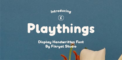 Playthings Handwritten Display Font is a type of font designed by hand to provide a unique and personal touch to your design projects. With its cheerful and gentle handwriting style, this font brings about a relaxed yet captivating ambiance, making it suitable for various creative endeavors. With its soft line details and natural characteristics, the Playthings Handwritten Display Font exudes warmth and familiarity.
 - Telecom by Jan Estrada-Osmycki,
$30.00 Telecom is a new, experimental typeface designed by Jan Estrada-Osmycki. Inspired by space-age, science-fiction and the work of Wim Crouwel. It's design combines mechanical, modular approach to type and elegance of letterforms. It's super-high contrast, thin hairlines and close attention to detail makes it a font to be set in greater sizes. Comes in four weights.
 - Coronard by Greater Albion Typefounders,
$7.95 Coronard is another of Greater Albion's explorations of 'Evolutionary' type. In this case we imagine a transition from Blackletter to Roman forms. Coronard shows that posited transition in all its simple calligraphic splendor, providing a beautifully legible face for invitations and certificates, as well as for lettering and signage that needs to be readable but to have a gothic flair.
 - Kong Gulerod by PizzaDude.dk,
$16.00 Kong Gulerod is handmade, yet digitally remastered. I did my best to keep the whimsical and childlike looks, and keep the legibility. Use Kong Gulerod for massive amounts of text or for product labelling, maybe even educational materials for kids or creative minds. I have added 4 different versions of each lowercase letter, and they automatically change as you type!
 - Hello good old style by Studio Hello Good,
$12.00 HELLO GOOD OLD Is A Modern Family Font Serif. It has a modern style with a touch of creative ideas that is very suitable to be applied anywhere that requires creative ideas. Is an elegant, authentic and thin lettered serif font. It will add a luxury spark to any design project that you wish to create!
 - FF Signa Correspondence by FontFont,
$68.99 Danish type designer Ole Søndergaard created this sans FontFont in 2002. The family contains 4 weights: Regular, Italic, Bold, and Bold Italic and is ideally suited for logo, branding and creative industries and small text. FF Signa Correspondence provides advanced typographical support with features such as ligatures, alternate characters, case-sensitive forms, fractions, super- and subscript characters, and stylistic alternates. It comes with a complete range of figure set options – oldstyle and lining figures, each in tabular and proportional widths. As well as Latin-based languages, the typeface family also supports the Cyrillic writing system. This FontFont is a member of the FF Signa super family, which also includes FF Signa, FF Signa Serif, FF Signa Serif Stencil, and FF Signa Stencil.
 - FF Tisa by FontFont,
$68.99 Slovenian type designer Mitja Miklav?i? created this serif FontFont between 2008 and 2010. The family has 14 weights, ranging from Thin to Black (including italics) and is ideally suited for advertising and packaging, book text, editorial and publishing, logo, branding and creative industries, poster and billboards, small text as well as web and screen design. FF Tisa provides advanced typographical support with features such as ligatures, small capitals, alternate characters, case-sensitive forms, fractions, and super- and subscript characters. It comes with a complete range of figure set options – oldstyle and lining figures, each in tabular and proportional widths. In 2007, FF Tisa received the TDC2 award. This FontFont is a member of the FF Tisa super family, which also includes FF Tisa Sans.
 - Gucina by Yukita Creative,
$11.00 Introducing the elegant and modern Gucina Geometric Font Family - a versatile typeface that will add a touch of sophistication to your designs. With its clean lines and geometric shapes, this font type is perfect for creating minimalistic logos, advertisements, web designs, and branding materials. The Gucina Geometric Font Family comes in a variety of weights, making them ideal for a variety of design projects. Whether you need a bold and impactful font for titles, or a light and airy font for body text, Gucina has you covered. Its timeless design ensures that your creations will remain relevant and stylish for years to come. Don't settle for plain fonts - improve the quality of your designs with the Gucina Geometric Font Family.
 - FF Milo Serif by FontFont,
$83.99 American type designer Michael Abbink created this serif FontFont between 2009 and 2010. The family has 12 weights, ranging from Regular to Black (including italics) and is ideally suited for advertising and packaging, book text, editorial and publishing, logo, branding and creative industries as well as small text. FF Milo Serif provides advanced typographical support with features such as swashes, ligatures, small capitals, alternate characters, case-sensitive forms, and fractions. It comes with a complete range of figure set options – oldstyle and lining figures, each in tabular and proportional widths. FF Milo Serif received several awards: the ISTD award in 2011 and the Letter.2 award in 2011. This FontFont is a member of the FF Milo super family, which also includes FF Milo.
 - FF Celeste by FontFont,
$79.99 British type designer Chris Burke created this serif FontFont in 1994. The family has 10 weights, ranging from Regular to Black (including italics) and is ideally suited for book text, editorial and publishing as well as logo, branding and creative industries. FF Celeste provides advanced typographical support with features such as ligatures, small capitals, alternate characters, case-sensitive forms, fractions, and super- and subscript characters. It comes with a complete range of figure set options – oldstyle and lining figures, each in tabular and proportional widths. As well as Latin-based languages, the typeface family also supports the Cyrillic and Greek writing systems. This FontFont is a member of the FF Celeste super family, which also includes FF Celeste Sans and FF Celeste Small Text.
 - FF Absara by FontFont,
$68.99 French type designer Xavier Dupré created this serif and slab FontFont in 2004. The family has 10 weights, ranging from Thin to Bold (including italics) and is ideally suited for advertising and packaging, editorial and publishing as well as logo, branding and creative industries. FF Absara provides advanced typographical support with features such as ligatures, small capitals, alternate characters, case-sensitive forms, fractions, and super- and subscript characters. It comes with a complete range of figure set options – oldstyle and lining figures, each in tabular and proportional widths. In 2005, FF Absara received the TDC2 award. This FontFont is a member of the FF Absara super family, which also includes FF Absara Headline, FF Absara Sans, and FF Absara Sans Headline.
 - FF Kievit by FontFont,
$99.99American type designer Michael Abbink created this sans FontFont in 2001. The family has 9 weights, ranging from Thin to Black (including italics) and is ideally suited for advertising and packaging, book text, logo, branding and creative industries, small text, wayfinding and signage as well as web and screen design. FF Kievit provides advanced typographical support with features such as ligatures, small capitals, alternate characters, case-sensitive forms, fractions, and super—and subscript characters. It comes with a complete range of figure set options—oldstyle and lining figures, each in tabular and proportional widths. As well as Latin-based languages, the typeface family also supports the Cyrillic and Greek writing systems. FF Kievit received several awards: the Bukva:raz award in 2001 and the ISTD award in 2001. - Beshkasteh by Si47ash Fonts,
$17.00 An innovative combination between Persian Nastaliq calligraphy and Bannai script. Beshkasteh is designed so that the letters are attached to each other while going up the baseline. In result it creates an experience of typing a Kufic Bannai script like it is a Nastaliq or Tahriri calligraphic font. This inventive approach to Persian And Arabic calligraphy scripts is what a creative designer wants for his artistic projects. Shahab Siavash, the designer has done more than 30 fonts and got featured on Behance, Microsoft, McGill University research website, Hackernoon, Fontself, FontsInUse,... Astaneh text and headline font which is one of his latest designs, already got professional typographers, lay-out and book designers' attention as well as some of the most recognizable publications in Arabic/Persian communities.
 - FF Fago by FontFont,
$79.99 German type designer Ole Schäfer created this sans FontFont in 2000. The family has 30 weights, ranging from Regular to Black in Condensed, Normal, and Extended (including italics) and is ideally suited for advertising and packaging, editorial and publishing, logo, branding and creative industries, small text as well as wayfinding and signage. FF Fago provides advanced typographical support with features such as ligatures, small capitals, alternate characters, case-sensitive forms, fractions, and super- and subscript characters. It comes with a complete range of figure set options – oldstyle and lining figures, each in tabular and proportional widths. This FontFont is a member of the FF Fago super family, which also includes FF Fago Correspondence Sans, FF Fago Correspondence Serif, and FF Fago Monospaced.
 - FF Karbid by FontFont,
$58.99 German type designer Verena Gerlach created this display and sans FontFont between 1999 and 2011. The family has 10 weights, ranging from Light to Black (including italics) and is ideally suited for advertising and packaging, editorial and publishing, logo, branding and creative industries, small text as well as web and screen design. FF Karbid provides advanced typographical support with features such as ligatures, alternate characters, case-sensitive forms, fractions, super- and subscript characters, and stylistic alternates. It comes with a complete range of figure set options – oldstyle and lining figures, each in tabular and proportional widths. This FontFont is a member of the FF Karbid super family, which also includes FF Karbid Display, FF Karbid Slab, and FF Karbid Text.
 - FF Tisa Paneuropean by FontFont,
$69.00 Slovenian type designer Mitja Miklavcic created this serif FontFont between 2008 and 2010. The family has 14 weights, ranging from Thin to Black (including italics) and is ideally suited for advertising and packaging, book text, editorial and publishing, logo, branding and creative industries, poster and billboards, small text as well as web and screen design. FF Tisa provides advanced typographical support with features such as ligatures, small capitals, alternate characters, case-sensitive forms, fractions, and super- and subscript characters. It comes with a complete range of figure set options – oldstyle and lining figures, each in tabular and proportional widths. In 2007, FF Tisa received the TDC2 award. This FontFont is a member of the FF Tisa super family, which also includes FF Tisa Sans.
 - Generis Slab by Linotype,
$29.00The idea for the Generis type system came to Erik Faulhaber while he was traveling in the USA. Seeing typefaces mixed together in a business district motivated him to create a new type system with interrelated forms. The first design scheme came about in 1997, following the space saving model of these American Gothics. Faulhaber then examined the demands of legibility and various communications media before finally developing the plan behind this type system. Generis’s design includes two individually designed styles; each of with is available with and without serifs, giving the type system four separate families. Each includes at least four basic weights: Light, Regular, Medium, and Bold. Further weights, small caps, old style figures, and true italics were added to each family where needed. The Generis type system is designed to meet both optical criteria and the highest possible measure of technical precision. Harmony, rhythm, legibility, and formal restraint make up the foreground. Generis combines aesthetic, technical, and economic advantages, which purposefully and efficiently cover the whole range of corporate communication needs. The unified basic form and the individual peculiarity of the styles lead to Generis’ systematic, total-package concept. The clear formal language of the Generis type system resides beneath the information, bringing appropriate typographic expression to high-level corporate identity systems, both in print and on screen. The condensed and aspiring nature of the letterforms allows for the efficient setting of body copy, and the economic use of the page. A range of accented characters allows text to be set in 48 Latin-based languages, offering maximal typographic free range. This previously unknown level of technical and design execution helps create higher quality typography in all areas of corporate communication. Optimal combinations within the type system: Generis Serif or Generis Slab with Generis Sans or Generis Simple. - Generis Serif by Linotype,
$29.00The idea for the Generis type system came to Erik Faulhaber while he was traveling in the USA. Seeing typefaces mixed together in a business district motivated him to create a new type system with interrelated forms. The first design scheme came about in 1997, following the space saving model of these American Gothics. Faulhaber then examined the demands of legibility and various communications media before finally developing the plan behind this type system. Generis’s design includes two individually designed styles; each of with is available with and without serifs, giving the type system four separate families. Each includes at least four basic weights: Light, Regular, Medium, and Bold. Further weights, small caps, old style figures, and true italics were added to each family where needed. The Generis type system is designed to meet both optical criteria and the highest possible measure of technical precision. Harmony, rhythm, legibility, and formal restraint make up the foreground. Generis combines aesthetic, technical, and economic advantages, which purposefully and efficiently cover the whole range of corporate communication needs. The unified basic form and the individual peculiarity of the styles lead to Generis’ systematic, total-package concept. The clear formal language of the Generis type system resides beneath the information, bringing appropriate typographic expression to high-level corporate identity systems, both in print and on screen. The condensed and aspiring nature of the letterforms allows for the efficient setting of body copy, and the economic use of the page. A range of accented characters allows text to be set in 48 Latin-based languages, offering maximal typographic free range. This previously unknown level of technical and design execution helps create higher quality typography in all areas of corporate communication. Optimal combinations within the type system: Generis Serif or Generis Slab with Generis Sans or Generis Simple. - Generis Simple by Linotype,
$39.00The idea for the Generis type system came to Erik Faulhaber while he was traveling in the USA. Seeing typefaces mixed together in a business district motivated him to create a new type system with interrelated forms. The first design scheme came about in 1997, following the space saving model of these American Gothics. Faulhaber then examined the demands of legibility and various communications media before finally developing the plan behind this type system. Generis’s design includes two individually designed styles; each of with is available with and without serifs, giving the type system four separate families. Each includes at least four basic weights: Light, Regular, Medium, and Bold. Further weights, small caps, old style figures, and true italics were added to each family where needed. The Generis type system is designed to meet both optical criteria and the highest possible measure of technical precision. Harmony, rhythm, legibility, and formal restraint make up the foreground. Generis combines aesthetic, technical, and economic advantages, which purposefully and efficiently cover the whole range of corporate communication needs. The unified basic form and the individual peculiarity of the styles lead to Generis’ systematic, total-package concept. The clear formal language of the Generis type system resides beneath the information, bringing appropriate typographic expression to high-level corporate identity systems, both in print and on screen. The condensed and aspiring nature of the letterforms allows for the efficient setting of body copy, and the economic use of the page. A range of accented characters allows text to be set in 48 Latin-based languages, offering maximal typographic free range. This previously unknown level of technical and design execution helps create higher quality typography in all areas of corporate communication. Optimal combinations within the type system: Generis Serif or Generis Slab with Generis Sans or Generis Simple. - Generis Sans by Linotype,
$29.00The idea for the Generis type system came to Erik Faulhaber while he was traveling in the USA. Seeing typefaces mixed together in a business district motivated him to create a new type system with interrelated forms. The first design scheme came about in 1997, following the space saving model of these American Gothics. Faulhaber then examined the demands of legibility and various communications media before finally developing the plan behind this type system. Generis’s design includes two individually designed styles; each of with is available with and without serifs, giving the type system four separate families. Each includes at least four basic weights: Light, Regular, Medium, and Bold. Further weights, small caps, old style figures, and true italics were added to each family where needed. The Generis type system is designed to meet both optical criteria and the highest possible measure of technical precision. Harmony, rhythm, legibility, and formal restraint make up the foreground. Generis combines aesthetic, technical, and economic advantages, which purposefully and efficiently cover the whole range of corporate communication needs. The unified basic form and the individual peculiarity of the styles lead to Generis’ systematic, total-package concept. The clear formal language of the Generis type system resides beneath the information, bringing appropriate typographic expression to high-level corporate identity systems, both in print and on screen. The condensed and aspiring nature of the letterforms allows for the efficient setting of body copy, and the economic use of the page. A range of accented characters allows text to be set in 48 Latin-based languages, offering maximal typographic free range. This previously unknown level of technical and design execution helps create higher quality typography in all areas of corporate communication. Optimal combinations within the type system: Generis Serif or Generis Slab with Generis Sans or Generis Simple. - HAZMAT by Little Fonts,
$15.00 Inspired by a love of geometry, combined with an obsession with all things stencil type! HAZMAT is a distinctive stencil, using angular characters to give the font an energetic look and feel. Created with the intention to be different from other stencils, the cut of the font has been designed to create eye catching and intriguing displays. HAZMAT works very well at small sizes for legible and detailed typesetting and is equally successful when used at bigger sizes for creating large format, powerful graphics. The font is available in two styles - Regular & Oblique.
 - Endellia by Sealoung,
$12.00 Endellia is a bold and thick lettered display font, created with the help of a brush pen. Add it to your most creative ideas and notice how it makes them come alive!
 - LDJ Fadoodle by Illustration Ink,
$3.00Do a little digital doodling with this creative font. Download this font and create out of the ordinary lettering for scrapbooking and desktop publishing. It's the perfect choice for adding handwritten appeal. - FF PicLig by FontFont,
$41.99 FF PicLig is a smart OpenType font that makes it possible to create symbols out of typed characters. While OpenType’s “discretionary ligatures” usually connect two or more characters to create a typographic ligature, designer Christina Schultz used this feature of the technology to combine several characters into an icon, a “picture ligature.” The automatic substitution of certain character combinations allows the direct integration of icons into text, enabling users to communicate more expressively.
 - Atocha by Sudtipos,
$49.00 It was expected that Joluvian’s third type font would be inspired by the city where he currently resides: Madrid, Spain. His previous creations had originated in Venezuela (Zulia) and The Philippines (Salamat), both, places where he had once lived. Joluvian believes “now is the time to pay tribute and show gratitude towards a city that has bestowed me with so many fortunes.” He considers that Madrid’s people, streets, scents, flavor and sounds are gift enough to awaken the creative urgency in any artist. This time around, it is being expressed through the crafts of the Typographic industry. Since his arrival in Spain, Joluvian has been attached to the city’s central area, specifically to the renowned Atocha Street and its railroad station. It was precisely on that street that Joluvian and Mauco Sosa, his friend and partner, decided to establish the Patera Studio: a charming creative space that birthed the concept for this new font which they proudly named Atocha Script. The artists where still in the final phases of their previous script, Salamat, when the idea for Atocha came about. This dynamic is actually very typical of the artistic process, in which every finished product spawns the need to create its next level offspring. “Working on Atocha and Atocha Caps has been a very pleasant journey. We have given our best efforts, for we wanted to offer a typeface that was both versatile and user-friendly on a number of applications, showing a wide scope of alternatives in our glyphs,” says the artist. The illustrations were created by Mauco, to ensure visual integration that would showcase the work of both members of the Patera Studio and their complementing aesthetic voices. Atocha, as Salamat and Zulia before, was digitized by Alejandro Paul.
 - Sorean by Grezline Studio,
$18.00 Hello creative people! Let me introduce you my latest font creation called Sorean! Sorean is a groovy retro font with a lot of alternate glyphs. This font has expressive and cheerful characteristics, perfectly match for groovy and retro design. Sorean font is also usable in a wide range of works such as logos, covers, posters, quotes, product packaging, merchandise, social media and much more! Happy creating with this expressive font! Feature : Ligature & Alternate glyphs Multilingual Language Works on PC & Mac Simple installations Accessible in the Adobe Illustrator, Adobe Photoshop, Adobe InDesign, even works on Microsoft Word. Thank you so much for your support! Grezline Studio - Akhmad Reza Fauzi
 - Funky Muskrat - Unknown license

- Favourite by Fidan Fonts,
$18.60 Favourite is a hand-lettered font. Mix it up with uppercase and lowercase and you'll get a different vibes from it. It's works perfectly for headlines, pull quotes, wordmark logos, posters and many more. Latin-based Language Support (You can check your language typing characters in text box below). Happy creating!
 - FF Masterpiece by FontFont,
$41.99 Slovakian type designer Peter Bil'ak created this script FontFont in 1996. The family contains 2 weights and is ideally suited for festive occasions. FF Masterpiece provides advanced typographical support with features such as ligatures, alternate characters, case-sensitive forms, and stylistic alternates. It comes with proportional lining and proportional oldstyle figures.
 - LAKESTER by Decade Typefoundry,
$10.00 Lakester is a layered type family. It comes with 4 font systems that can be layered to create different effect (regular,shadow,inline,inline 2) . Inspired by vintage american west poster, it's loaded with 300 glyphs. This family works best for logotype, gig poster, letterhead, dropcap, titles, and any artworks.


