10,000 search results
(0.041 seconds)
- Amina by Wayne Fearnley,
$40.00 Amina was created using the DNA of Metrik. A neutral grotesque sans serif, chopped and remixed to create Amino. The ink traps have been raised to create a dynamic typographic language that makes Amina contemporary and dynamic. Amina works great for bold, typographic treatments and still maintains readability in body copy. Includes language support, stylistic alternates.
 - Rorschach by Kenn Munk,
$15.00How to use The Rorschach dingbat: q,w,e,r,t,y,u,i,o,p create the start of an inkblot a,s,d,f,g,h,j,k,l create a middle, you can use any number of middle-elements z,x,c,v,b,n,m create the ending. Your Rorschach is now finished, get analysing! - FETTECKE - 100% free

- Quickie - 100% free

- GemFont One - Personal use only

- DB Family Tree by Illustration Ink,
$3.00DB Family Tree is a great DoodleBat with plenty of style rooted in strong genealogy. Makes a great adornment to any creative project. - LD Eleanor Rae by Illustration Ink,
$3.00Use elegant LD Eleanor Rae to add formal or shabby chic accents to your scrapbook layouts, handmade greeting cards and other creative projects. - Della Robbia by Bitstream,
$29.99Thomas Maitland Cleland’s careful and scholarly creation of a typeface from 15th Century Florentine inscriptional capitals; designed for the Bruce division of ATF. - Buttersoy by Maulana Creative,
$15.00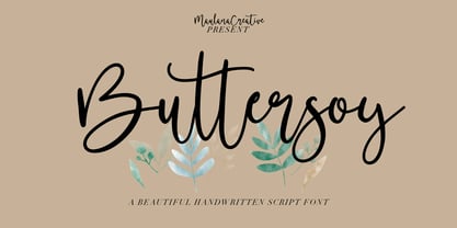 Give your designs an authentic handcrafted feel. Buttersoy Beautiful Handwritten Script Font is perfectly suited to stationery, logos and much more. Maulana Creative
 - Vako Mave by Nirmana Visual,
$24.00 Vako Mave a modern, contemporary of serif font. Ideally suited for advertising and packaging, festive occasions, editorial and publishing, creative industries and posters .
 - TXT Altius by Illustration Ink,
$3.00Add a unique, stylish touch to your creative lettering. Download this TrueType font to add interest to scrapbook journaling and greeting card captions. - Pocket Initials JNL by Jeff Levine,
$29.00Pocket Initials JNL contains twenty-six initials inside of a white-into-black pattern for monograms, page headers, stationery and other creative projects. - Zamaica by WNGSTD,
$5.00 Zamaica is a thin and modern display font. Add it to your most creative ideas and notice how it makes them come alive!
 - SoulMission - Unknown license

- KG A Little Swag by Kimberly Geswein,
$5.00 Cute bunting style lettering. Best when used with multiple layers to create a stacked, dimensional look. Use the parentheses to create end pieces and _ (underscore) to connect the end pieces.
 - Rolling Brush by Ditatype,
$29.00 Rolling Brush is a script font that gives handwriting appearance with original and personal brush details. This font is made beautifully so that the letters are connected to each other, creating a continuous and flowing look. Each letter is attached to the previous letter and continues to the next letter, creating beauty in writing unity. This font shows brush details on each letter. Brush strokes displays a rough, organic texture to the edges of the letters, adding dimension and visual life. These details give a unique impression to this script font. On the other hand, even though it has a rough border, this script still maintains a natural and elegant aesthetic touch. Some letters may have dramatic twists, while others are simpler. This flexible shape creates an expressive and creative look to the lettering. Because it is designed with a rough border, it would be better if you use this font at a large text size so it is more easy to read. Enjoy the various features available in this font as well. Features: Alternates Ligatures Multilingual Supports PUA Encoded Numerals and Punctuations Rolling Brush is suitable for any designs that want to convey a warm, personal and alluring impression. You can use this font in the design of greeting cards, invitations, logos, labels, and many other design projects that want to create uniqueness through a natural, handwritten touch. Find out more ways to use this font by taking a look at the font preview. Thanks for purchasing our fonts. Hopefully, you have a great time using our font. Feel free to contact us anytime for further information or when you have trouble with the font. Thanks a lot and happy designing.
 - Linotype Funny Bones by Linotype,
$29.00Linotype Funny Bones is part of the Take Type Library, chosen from the contestants of the International Digital Type Design Contests of 1994 and 1997. The font was designed by the German artist Ingo Preuss and is available in two weights, one and two. Linotype Funny Bones one consists of two different alphabets containing only capital letters and offers a variety of interesting combinations. Weight two and one set of capitals of weight one are somewhat light and delicate, while the other set of capitals of weight one are of a strongly constructed nature, which makes for a good contrast. The carefully constructed details of the font detract from its legibility, but Linotype Funny Bones is perfect for short texts and headlines in point sizes larger than 12. - Nafigat Script by stiplinestudios,
$13.00 Nafigat Script goes with Romantic and Modern Calligraphy, ready to give your design project with Fresh and Fabulous Style. This font have an 264 Standard Glyph + 408 Glyph Alternate in Open Type Standard Format. Perfect for wedding, branding and romantic invitation and Also Suitable for various purpose such as digital lettering, headings, logos, wedding invitation, t-shirt, letterhead, signage, lable, news, posters, badges, branding materials, t-shirt, print, business cards, quotes, logo, poster, and suitable for any graphic design project. Nafigat Script comes as a single font file packed full of great features. It contains a full set of lower & uppercase letters, a large range of punctuation, numerals, and multilingual support. The font also contains several swashes and stylistic alternates for those who have open type capable software (e.g. Photoshop/Illustrator).
 - Linotype Scrap by Linotype,
$29.00Linotype Scrap is part of the Take Type Library, chosen from the entries of the Linotype-sponsored International Digital Type Design Contests of 1994 and 1997. The font is available in two weights and was designed by German artist Ingo Preuss. It is as though the forms of the basic weight were cut with scissors out of pieces of paper. There are no inner contours, only the outer silhouettes. The capital letters which make up Scrap Bonus are set on black rectangular backgrounds and are white and framed with a white contour. This weight includes a number of different pictograms which were also not spared the scissors. The decorative Linotype Scrap embodies the comic style of the 1990s and is meant exclusively for headlines of points sizes 18 and larger. - Aphrosine by ParaType,
$30.00 Aphrosine is a font based on pointed pen script. A huge lot of alternatives and smart OpenType features allow it to look almost indistinguishable from real live handwriting. Aphrosine is something between handwriting and calligraphy: it took too much effort for being “just handwriting” but lacks seriousness and regularity comparing to true calligraphic fonts. That’s why it was called after a peculiar character from a children’s book: a witch who was very fond of dressing, makeup and writing letters. Aphrosine has three faces. But unlike most other type families, the glyphs from one face do not match exactly the glyphs from another one. The faces are based on writing with different nibs but by the same hand. The type is designed by Alexandra Korolkova and Alexander Lubovenko and released by ParaType in 2015.
 - Foretelling Script by Letterhend,
$17.00 Introducing, Foretelling Script. A condensed script typeface. A fun, playful and casual script made by natural hand writing. This type of font perfectly made to be applied especially in logo, and the other various formal forms such as invitations, labels, logos, magazines, books, greeting / wedding cards, packaging, fashion, make up, stationery, novels, labels or any type of advertising purpose. Available in 3 styles : Reguler, Rough and Stamps Features : uppercase & lowercase numbers and punctuation multilingual swashes and ligatures alternates PUA encoded We highly recommend using a program that supports OpenType features and Glyphs panels like many of Adobe apps and Corel Draw, so you can see and access all Glyph variations. How to access opentype feature : letterhend.com/tutorials/using-opentype-feature-in-any-software/ Email us to letterhend@gmail.com if you need something! Happy Designing!
 - Envoy by Tim Rolands,
$20.00 Envoy is a serif type inspired primarily by Garalde oldstyle types like those of Claude Garamond. As such, it is particularly well suited for book and magazine text. Characteristic details more typical of Venetian oldstyle faces serve to give Envoy just a bit more personality. The base family includes regular, italic, bold, bold italic and small capitals. Expert sets add ligatures and alternate letterforms. Display sets include letterforms customized for titling. Originally designed in 1995 and 1996, for the 1996 Morisawa International Typeface Design Competition, Envoy was later revived, completed and publicly released in 1998. During the initial design, the family was known as Truman in honor of Northeast Missouri State University becoming Truman State University, but the name was changed to Envoy prior to entry in the competition.
 - ITC Cinderella by ITC,
$29.99Some typefaces are staid, somber design tools. Then again, there's ITC Cinderella from Patricia Lillie: a typeface that's light-footed as a ballerina and joyful as a child at play. “There is a group of display faces that I simply love. Type that just seems to dance, type that makes me smile, designs that, when I see them, I say, "Boy, do I wish that was one of mine" says Lillie. “Although I never wanted to imitate these designs, when Cinderella started to emerge, I felt like it was the closest I've come to that quality.” ITC Cinderella projects gaiety and freedom. Capitals harmonize with a lowercase that bounces along with a lively, carefree attitude. Stroke weight stress is, well, all over the place. Curlicues abound. This delightful design is just that: brimming with delight. - One Night Stand by T4 Foundry,
$21.00Torbjörn Olsson's experimental type One Night Stand deserves a longer relation. Use it for drop caps or quotes, to add drama in dull surroundings and to spice up bland editorial content. One Night stand is also the perfect way to seduce readers of advertisments, as well as delivering contrast in headlines. Do you want to show the world in stark black and white? The One Night Stand is for you! One Night Stand is an OpenType typeface for both PC and Mac. Swedish type foundry T4 releases new fonts every month. One Night Stand is our twelfth introduction. Note: The underlying sans-serif font for One Night Stand is Esans Bold, also designed by Torbjörn Olsson. Esans is a fine sans, excellent for headline use, inspired by Granby, Tempo, Gill and others. - Wood Bonnet Grotesque No.4 by astype,
$46.00 After release of Wood Bonnet Antique No.7 some of my clients asked for a sans serif version. So I printed my second batch of old wood type. I transferred these wood type into a digital font and tried to preserve the warm vintage look. » pdf specimen « The font offers up to four glyph variations of all the Latin base letters, figures and some additional letters - It has an build in letter randomizer. Please check you have turned on contextual alternates in your application. If you prefer a more common look and need more weights or to use the font in smaller text sizes I have done clean and sharp font family called Bonnet Grotesque Nr. It’s the preferred version for all the usages on websites, apps or ebooks. Have fun!
 - Rhetoric by Monotype,
$25.00 Rhetoric is a friendly display typeface that’s full of personality. The fonts are defined by their roman characters which could be described as “upright italic” – the style traditionally associated with a cursive character set has been applied to the roman glyphs. Rhetoric embraces its curves –exemplified by the voluptuous caps for /A/M/U/V/W/X/Y/ which further enhance this typeface’s quirky nature. This 18-font type family has weights from Hairline to Ultra in both roman and italic. Western European languages are covered in its basic character set, but there are a number of alternates and discretionary ligatures that allow you to embellish your typographic designs. Designed for branding purposes, headlines and short runs of text, Rhetoric will be a worthy addition to your type collection.
 - Glamour Absolute by Nicky Laatz,
$42.00 Introducing "Glamour Absolute" - A brand new "two-faced" bold serif with both modern and vintage curves. A Two-faced beauty : Modern or Vintage If you are going Vintage Retro : Access your OpenType features to access the large selection of alternate letters and ligatures, select the letters you like from the large variety to get the vintage look you are after. Vary between a light and heavy vintage look based on how many letters you alter. If you are going Modern Chic : Just type with regular letters :) Play with your letter spacing to add even more class to your designs. Due to its split personality , Glamour Absolute is a very versatile font, covering a wide range project types, from bold magazine imagery , to wedding invitations, to branding, poster design and so much more.
 - Jano Round by Craceltype,
$37.00 Jano Round™ is a sans serif type family with a friendly and synergetic profile. Designed with rounded forms, low contrast and a somewhat techie feel, Jano Round™ is a highly legible typeface suited for any text application and typographic reproduction. Jano Round™ has 18 styles and its a workhorse type system. It covers 290+ languages, including extended latin, cyrillic and greek writing systems. With over 1800 glyphs per style, its Opentype features include alternative shapes, small caps, standard and discretionary ligatures, localized forms in latin and cyrillic, case sensitive forms, numerators and denominators, proportional and tabular figures, slashed zero, fractions and more. The engaging personality and the huge set of features and glyphs makes Jano Round™ an excellent choice for branding, editorial, web and broadcast.
 - Fleischman BT by Bitstream,
$50.99Charles Gibbons' Fleischman BT Pro revives J.M. Fleischman's quirky and elegant text faces of the 1730s. Born in Germany, Fleischman worked in Holland, primarily at Enschedé en Zonen where he cut dozens of faces. His types represent some of the earliest examples of the Transitional style, predating and influencing the work of Fournier, Baskerville, and Bodoni. They were wildly popular in their day, used for everything from newspapers to currency, and Fleischman himself has enjoyed a renaissance of late. Fleischman BT Pro preserves the feel of the printed metal types while expanding the original to include four OpenType fonts: roman, italic, bold, and bold italic. They all include small caps, old style and lining figures, discretionary and historical ligatures, ornaments, and superiors. Fleischman Pro also supports Western, Central European, and Eastern European languages. - Vistaria Notes by Letterhend,
$19.00 Introducing, Vistaria Notes - A beautiful script based on manual hand writing. Inspired by old-fashioned calligraphy script, so classy and classic! This type of font perfectly made to be applied especially in logo, and the other various formal forms such as invitations, labels, logos, magazines, books, greeting / wedding cards, packaging, fashion, make up, stationery, novels, labels or any type of advertising purpose. Features : uppercase & lowercase numbers and punctuation multilingual swash and ligature alternates PUA encoded We highly recommend using a program that supports OpenType features and Glyphs panels like many of Adobe apps and Corel Draw, so you can see and access all Glyph variations. How to access opentype feature : letterhend.com/tutorials/using-opentype-feature-in-any-software/ Email us to letterhend@gmail.com if you need something! Happy Designing!
 - Hollow House by Letterhend,
$19.00 Hollow House is a font which will looks great in dark / horror / spooky / scary theme. This type of font perfectly made to be applied especially in movies or storybook children which is need a standout font, and the other various formal forms such as invitations, labels, logos, magazines, books, greeting / wedding cards, packaging, fashion, make up, stationery, novels, labels or any type of advertising purpose. Features : numbers and punctuation multilingual alternates ligatures PUA encoded We highly recommend using a program that supports OpenType features and Glyphs panels like many of Adobe apps and Corel Draw, so you can see and access all Glyph variations. How to access opentype feature : letterhend.com/tutorials/using-opentype-feature-in-any-software/ Email us to letterhend@gmail.com if you need something! Happy Designing!
 - Benson Script by Kyle Wayne Benson,
$10.00 Benson Script is a script that is desperately trying to be anything but a script. With 3 contrast levels, and 2 styles, the six styles of Benson Script are an experiment in the diversity of a single stem width. Modernism’s desire to fit all elements within geometric constraints and adhere to strong verticals has spread throughout type design, but has had little to do with the frills and ornaments of script. Cutting a script down to its bare bones is an offensive idea to many—almost seeming insulting to its genre. Benson Script bridges that genre gap between frill and function. As a matter of genre Benson Script errs on the side of modernism, and adds flair as a last resort. Read more about her open type features, and the development process here.
 - Srikandy by Picatype,
$15.00 Srikandy looks bold and straight forward. Srikandy comes in three types, ordinary and special. The special type has unique small slices that provide more personal touch and make the font look customizable. This font is suitable for use as logos, clothing, wedding invitations, signage, sports clubs, motorbikes / cars, etc. This font has many opentype features such as binder, alternative style, contextual alternative, swash, etc. and supports multiple languages. To enable the OpenType Stylistic alternates, you need a program that supports OpenType features such as Adobe Illustrator CS, Adobe Indesign & CorelDraw X6-X7, Microsoft Word 2010 or later versions. We hope you enjoy the font, please feel free to comment if you have any thoughts or feedback. Or simply send me a PM or email me at picatypestudio@gmail.com. Thanks for purchasing and have fun!
 - Excelsor Script by Storm Type Foundry,
$32.00Excelsor Script is inspired by lithographically produced scripts. It is softer and simpler than, for example, engraved Splendid Script, because its designer used pens and lithographic needles. The graver for steel is held in a quite different way and this has an influence on the shape of the letter. Similar type faces were in use from Neo-Classicism until the beginning of Art Nouveau, when they were pushed aside by a completely different view of festive typography. It has, in contradistinction to other scripts, slightly narrowed letters, which signifies a distinctive elegance without wasting space on the line. For practical reasons it was not possible to encircle the bottle with too long a label. It is, therefore, a suitable type face for labels. Its two optical grades cover a wide range of sizes. - Norvin by Letterhend,
$19.00 Norvin is a strong and bold sans serif with a touch of vintage look and feel. Comes with 38 bonus hand drawn illustration in vector and free 12 premade logo. This type of font perfectly made to be applied especially in logo, headline, signage and the other various formal forms such as invitations, labels, logos, magazines, books, greeting / wedding cards, packaging, fashion, make up, stationery, novels, labels or any type of advertising purpose. Features : Regular & Stamp version uppercase & lowercase numbers and punctuation multilingual alternates / swashes and ligatures PUA encoded We highly recommend using a program that supports OpenType features and Glyphs panels like many of Adobe apps and Corel Draw, so you can see and access all Glyph variations. How to access opentype feature : letterhend.com/tutorials/using-opentype-feature-in-any-software/
 - Ciutadella by Emtype Foundry,
$69.00 Ciutadella was originally commissioned by Mario Eskenazi’s studio. It is a versatile geometric sans serif, a simple, clean and direct family. Its power resides in an overhaul simplicity that reflects an “open” personality, easily suitable to be used across a wide range of applications, from identity systems to publications. Although it has been conceived to be used as a display typeface, it performs well in intermediate length texts mostly because of some specific characteristics such as the alternate two-story ‘a’. It is available in Open Type format and includes Alternate Characters, Ligatures, Tabular Figures, Fractions, Numerators, Denominators, Superiors and Inferiors. It supports Central and Eastern European languages. The type family consists of 10 styles, 5 weights (Light, Regular, Medium, SemiBold and Bold) plus italics. See also Ciutadella Rounded and Ciutadella Slab. Ciutadella PDF.
 - Campora by W Type Foundry,
$25.00 This year we attended the Bologna Children’s Book Fair in Italy. In our days off, we went to Piazza Maggiore to see what the city had to offer and luckily for us we saw an incredible store sign saying CAMPORA. We took some pictures of the typed font and later back in the studio we discovered that it was Dynamo. Immediately our minds were blown away by its beauty and thus we decided to design a new font inspired by its sharp and geometric design adding new weights and OpenType features. In the process we realized that both Dynamo and one of our favorite fonts Avant Garde, share a similar structure, so we made a type mashup between these beauties, including the sharpness of Dynamo and the revolutionary ligatures of Avant Garde.
 - Pompeijana by Linotype,
$29.99Pompeijana is a part of the 1990 collection Type before Gutenberg 2’, which includes twelve contemporary typefaces each representative of a particular era. Pompeijana is Adrian Frutiger’s contribution to the project Type before Gutenberg’. He based the forms of this capital typeface on the writing of the Romans in Pompei. The decorative look of the alphabet is achieved by purely graphic means, placing the emphasis of the top and foot of the letters with heavy horizontals and diamond-shaped serifs. Frutiger completed his typeface with the weight Borders, a font consisting of numerous ornaments true to the style of the alphabet. The ornaments can be combined to form different borders and offer an optimal addition to the elegant Pompeijana. Pompeijana is best combined with modern sans serif typefaces. - Havin Delight by Letterhend,
$19.00 Havin Delight is a beautiful signature script based on manual hand writing. The natural flow make this font looks like a real hand writing. This type of font perfectly made to be applied especially in logo, and the other various formal forms such as invitations, labels, logos, magazines, books, greeting / wedding cards, packaging, fashion, make up, stationery, novels, labels or any type of advertising purpose. Features : uppercase & lowercase numbers and punctuation multilingual alternates and ligatures PUA encoded We highly recommend using a program that supports OpenType features and Glyphs panels like many of Adobe apps and Corel Draw, so you can see and access all Glyph variations. How to access opentype feature : letterhend.com/tutorials/using-opentype-feature-in-any-software/ Email us to letterhend@gmail.com if you need something! Happy Designing!
 - Efiles by Absonstype,
$17.00 EFILES is the playful display typeface with high contrast combine uppercase and lowercase looks and feel nice balanced. Provide the ligatures font in variant style make the design letter looks nice. Honestly it works perfectly for headlines, logos, posters, packaging, T-shirts and much more. Recommended to use in Adobe Illustrator or Adobe Photoshop with opentype feature. Ligatures feature is default setting in Adobe Illustrator or Adobe Photoshop in Uppercase character. So when you want not to use the ligatures. Open glyphs panel : In Adobe Photoshop choose tool Window Character and then please click fi symbol In Adobe Illustrator choose tool Window Type Open Type and then please click fi symbol If you have questions, just send me a message and I’m glad to help. Have a great day, Absonstype


