10,000 search results
(0.102 seconds)
- Chivertta by Eurotypo,
$38.00 Chivertta combines elements of casual and modern aesthetics. The font is inspired by a logo discovered on the streets of Buenos Aires. One of Chivertta’s distinctive features lies in its careful design and its wide repertoire of ligatures and stylistic alternatives. This extensive collection offers a wealth of options, allowing designers to enhance their creative output, imbuing their designs with a greater sense of authenticity and realism. In essence, Chivertta transcends convention, offering a powerful tool for designers and resulting in designs that come out with authenticity and contemporary style.
 - Sabor by Intellecta Design,
$59.90 Sabor is a voluptuous upright connected display font with mixed taste of script fonts. There were many inspirations for Sabor, but all started with a book from the 1950s about the battles of World War II. To that first sketches of a naive dense display typeface we, day by day, start to create a mixed style evolving some lettering concepts from 1950s, some calligraphy notions and the first display ideas. The feeling of this font is good to be used in many artworks, like logos, packaging, party invitations, layouts for t-shirts, magazine headings, and much more, since websites to and all kind of printed jobs. That font is not really a script, but, like the scripts we strongly recommends to use the caps only in the beginning of words and sentences, to contrast with the lower cases : it’s not designed for all-caps settings, so avoid that kind of use. This font has almost 700 glyphs and supports the most important Latin-based languages. We works hard in a tour-de-force kerning: over 12.000 kerning pairs soft adjusted handily. Its OpenType features include final forms, initial forms, special sets (upper and lowercase's), hundreds of contextual alternates ligatures providing letter-form variations and connections that make your designs really special, and ornaments (tails). Because of its high number of alternate letters and combination's, we suggest the use of the glyph palette to find ideal solutions to specific designs. The sample illustrations will give you an idea of the possibilities. You have full access to this amazing stuff using InDesign, Illustrator, QuarkXpress and similar software. However, we still recommend exploring what this font has to offer using the glyphs palette: principally to get all the power of the Contextual Alternates feature. You can get an idea of the power of this font looking at the “Sabor User Guide”, a pdf brochure in the Gallery section. Also available two sister fonts easy to use : SaborWords and SaborRasgosEscritura Sabor has original letters designed by Iza W and overall creative direction plus core programming by Paulo W.
 - Hurricane by TypeSETit,
$44.99 A storm has been brewing. It’s Hurricane. A complete redesign of a popular style. New flair and excitement abounds with this fast moving spirited brush script. This updated version of Hurricane was created with high end advertising in mind but can also be used for designs outside of commercial uses— greeting cards and social expression, or even scrap-booking projects. There are three regular styles and a PRO version of the script styles, plus a graphics font to add an extra breeze to your work. Hurricane Regular is straight forward with the more Roman capital forms. The Script version swaps the caps out for the more flourished uppercase. And finally, the Swash version contains many of the alternate letter forms found in the PRO version. Hurricane Pro offers the features of all three of the regular Hurricane versions with added OpenType programming and additional alternate glyphs. The Contextual feature of Hurricane swaps out the regular forms for more flashy characters along with necessary ligatures and alternates that give perfect flow to the words. Access the stylistic sets for even more creative options. In addition, see GLORY— a sans serif spin-off (pun intended) to complement the script styles. The Glory styles contrast to Hurricane’s slanted, brushy speed. In addition, an inline font has added to complete the pro package. I sincerely hope you enjoy this exciting update to a font I have always found to have huge potential.
 - Salden by Canada Type,
$40.00 The Salden fonts are our tribute to the man who was dubbed the face of the Dutch book, and whose work is considered essential in 20th century Dutch design history. Helmut Salden’s exquisite book cover designs were the gold standard in the Netherlands for more than four decades. His influence over Dutch lettering artists and book designers ranges far and wide, and his work continues to be used commercially and exhibited to this very day. At the root of Salden’s design work was a unique eye for counter space and incredible lettering skills that never failed to awe, regardless of category or genre. This made our attention to his lettering all the more focused within our appreciation to his overall aesthetic. Though Salden never designed alphabets to be turned into typefaces (he drew sets of letters which he sometimes recycled and modified to fit various projects), we thought there was enough there to deduce what a few different typefaces by Salden would have looked like. The man was prolific, so there were certainly enough forms to guide us, and enough variation in style to push our excitement even further. And so we contacted the right people, obtained access to the relevant material, and had a lot of fun from there. This set covers the gamut of Salden’s lettering talents. Included are his famous caps, his untamed, chunky flare sans serif in two widths, his unique Roman letters and an italic companion and, most recognizable of all, his one-of-a-kind scripty upright italic lowercase shapes, which he used alongside Roman caps drawn specifically for that kind of combination titling. All the fonts in this set include Pan-European glyph sets. They’re also loaded with extras. Salden Roman (908 glyphs) and Salden Italic (976 glyphs) each come with built-in small caps (and caps-to-small-caps), quite a few ligatures, and two different sets of alternates. Salden Black and Salden Black Condensed (636 glyphs each) come with a set of alternates, and both lining and oldstyle figures. Salden Caps (597 glyphs) comes with a set of alternates, and Salden Titling (886 glyphs) comes with a quite a lot of swashed forms and alternates (including as many six variants for some forms), a few discretionary ligatures, and two sets of figures. There are also some form alternates for the Cyrillic and Greek sets included in all six fonts. These alphabets were enjoyably studied and meticulously developed over the past ten years or so. We consider ourselves very fortunate to be the ones bringing them to the world as our contribution to maintaining the legacy of a legendary talent and a great designer. The majority of the work was based on Salden’s original drawings, access to which was graciously provided by Museum Meermanno in The Hague. The Salden fonts were done in agreement with Stichting 1940-1945, and their sale will in part benefit Museum Meermanno.
 - Liebelei Pro by Wannatype,
$29.90 “Liebelei” – dalliance, flirtation, hanky-panky; kind of diminutive of “Liebe” (German for love) The typeface Liebelei has its roots back in 1932, when Vienna-based painter Rudolf Vogl created the poster for a movie called Liebelei after the popular play by Arthur Schnitzler. Only the title letters existed of that typeface. I loved the letters from first sight and proceeded by adventurously interpreting the missing characters. The goal was to create letterforms that fit to the original from the 1930s and represent a modern multi-purpose font. It should be an easy-to-use italic font with warm and friendly details and a huge variety of alternates and languages. The characteristic curled ends of most letters provide a script touch to the Liebelei. The first font entirely designed was the bold one which corresponds to the original poster lettering, although I tweaked the proportions a tiny bit to a more contemporary shape. Liebelei covers Western, Central European, and Central Eastern European Languages and contains also complete Greek and Cyrillic character sets. Liebelei is best for poster design as well as detailed usage, for example handsome tables, since it supports small caps, different kinds of numerals and fractions.
 - Weekly by Los Andes,
$29.00 Weekly: a slab serif that wants to be a sans. The font was created under the premise that it can be used as a sans: a fresh design without that retro feel typical of slab fonts. As a result, we developed an Egyptienne font—more simple compared to others of its kind, a feature that gives it its unique personality. Weekly was based on fonts with humanist proportions, such as ‘Oficina’ and ‘Caecilia’, both created in the ’90s. Typefaces like these give designers the possibility to use them in books or magazines, in contrast to geometric slab fonts or early 20th century fat faces, which are mainly used for advertising or display text. Another feature that reminds us of humanist sans fonts is the small difference between x-height and cap-height. Some characters in Weekly like ‘a’ or ‘g’ lack serifs and some like ‘c’ or ’s’ have short serifs, giving it a semi-serif air. Weekly comes in both light and heavy weights. The heavier ones bear resemblance to Egyptienne slab serif typefaces with strong personality. These variants are ideal for use in posters and big, powerful headings.
 - Argo Supernova by Eliezer Grawe,
$9.00 Argo Supernova is a sans serif font, inspired by science fiction titles. Delicate on the thinest weights, strong on the thickest ones, it is perfect for modern branding and logo design, editorial design, web design, packaging and various other projects. Argo Supernova has a geometric and open structure, with shapes that create a solid texture on the page. Its large x-height produces good reading in long texts and its peculiarities, such as curved bars and endings, generate a strong presence in titles. The Argo Supernova family consists of 8 weights with matching italics, with Extended Latin character set. The italics makes use of more curves and smoothness, creating an interesting variation in design. • 16 styles: 8 weights + 8 italics; • 602 glyphs in each weight; • Special SS02 feature: "bend" alternates for majority of caps characters with curved details; • OpenType features: Access All Alternates, Stylistic Alternates, Standard Ligatures, Discretionary Ligatures, Numerators, Denominators, Fractions, Superior and Inferior Numbers, Kerning, Localized Forms, Lining Figures, Oldstyle Figures, Proportional Figures, Tabular Figures, Slashed Zero, Stylistic Set 1 to 6. • Supporting 219 latin based languages, which are spoken in different 212 countries.
 - Mariachi by FontMesa,
$25.00 Mariachi is a new condensed version of our Maison Luxe font which is a revival of an old 1800's classic ornate French font. This new 2021 condensed version takes this old classic to an all new level by adding small caps, italics and a new solid black version. Mariachi is perfect for headlines and logos from advertising to product labels, t-shirt lettering and restaurant menus. Fill fonts are also part of this family, new to this font style is the half fill font for creating a two color effect on the letters, you'll need an application that works in layers to use the fill fonts in Mariachi. The regular fill font for Mariachi isn't meant to be used as a stand alone font so we've created a solid black version with thicker serifs on top and adjusted outlines throughout for a better appearance as a solo font. The difference between Mariachi and our Mi Casa font is that Mariachi has a squared off shadow on the top half of the letters. We hope you enjoy Mariachi as much as we did making it. Mariachi is a trademark of FontMesa LLC
 - Hollenbeck JNL by Jeff Levine,
$29.00Hollenbeck JNL is the Art Deco, all-caps cousin of Jeff Levine's Hallandale JNL typeface. This version utilizes the thick-and-thin stroke weights so popular during the Art Deco era, while retaining the look of hand-lettered copy. Best suited at larger point sizes, this font is a nice alternative to the over-used display faces reminiscent of that time period. - Maxwell Sans by Kimmy Design,
$12.00 Maxwell is a clean condensed san serif typeface inspired by similar retro fonts from the 1950's. It comes in regular and small caps versions, includes stylistic alternatives and via the glyph panel you can access scientific inferiors, fractions, oldstyle numerals, Cyrillic, Greek, Latin and other Western and Central European languages. It can be used as a headline font or paragraph text.
 - Korpus Serif Pro by RMU,
$50.00 Inspired by Timeless, Korpus Serif Pro is a completely fresh redesign of this former Typoart font family. All four styles - Regular, Italic, Demibold and Demibold Italic - contain besides the West and Central European glyph tables also those of Greek and Cyrillic as well as Small Caps and Oldstyle figures. All these features make this font family a highly versatile one.
 - Shibe by Linecreative,
$16.00 Shibe - Bold italic font, has a strong, sharp character, and is combined with the font graffiti styles, To make a beautiful combination, simply mix upper and lower case and mix with alternative glyphs Shibe offers you: Shibe- A clean Bold italic font including Upper & Lowercase characters(ALL CAPS), Stylistic alternates Character (2 Character) Supports Multi linguage (Latin Western Europe), Numbers and Punctuation
 - Neo Neo by ITC,
$29.99Neo Neo is the work of British designer Timothy Donaldson, a type style straight out of a 1950s time capsule. It can be set in all caps or a mixture of capitals and lowercase. The casual, slightly condensed forms with their smooth, soft lines are reminiscent of highway diners and motel ads of the time and convey a bright, inviting mood. - Bold Display Sans JNL by Jeff Levine,
$29.00 Bold Display Sans JNL is loosely based on one of the classic alphabets found within a Speedball Lettering Textbook of the 1940s; itself called "Bold Display". The original featured a stippled texture and inline curves placed in random patterns throughout the letters. This more simplified, all-caps version is for titling requirements where a strong, yet casual design is needed.
 - Samsheriff by Ingrimayne Type,
$5.00 Samsheriff is a large sans-serif family with a touch of quirkiness. It contains an eclectic mix of letter styles but is very legible. The origin of this typeface was in the caps-only letters used for the novelty font Coffinated. Adding lower-case letters, additional widths, additional weights, and italics resulted in the 30 styles that make up the Samsheriff family.
 - Kirschwasser NF by Nick's Fonts,
$10.00An unannotated photocopy tucked inside the leaves of an old lettering book yielded this unusual and exuberant Art Deco face. The caps feature a simple “bubbly” pattern that makes this offering pack a punch, not unlike the German cherry brandy for which it is named. Both versions of the font include 1252 Latin, 1250 CE (with localization for Romanian and Moldovan). - Komsomol by Hanoded,
$15.00 Komsomol (short for Kommunisticheskii Soyuz Molodyozhi) was the youth division of the Communist Party of the Soviet Union. Komsomol font was modeled on several Soviet propaganda posters which all had one thing in common: a very loud message in a very clear typeface. Komsomol is an all caps typeface which comes with extensive language support in order to educate the masses.
 - Quartz Grotesque by Hustle Supply Co,
$18.00 Quartz was originally published on the shop Font Forestry, but they are planning on closing - So now Quartz will live on Hustle Supply Co. Quartz is a minimalist All-Caps Sans Serif typeface that comes in 7 different weights. It's perfect for projects looking for that minimalist / clean aesthetic. Quartz includes regular, oblique, thin, bold & outlined versions. Western European Characters are included. Thanks!
 - Sansdiego by Sealoung,
$15.00 Introducing our new exploratory Sansdiego, this typeface inspired by European empire-era forms of writing. Sansdiego typeface is perfect for classic Victorian themed designs, beer packaging, whiskey, barbershop, pomade, tattoo studio logos and so on. This font comes with additional effects: Normal - style - double - Shadow, packaged as a layered font. Sansdiego is an all caps font, carefully crafted with a great ornamental taste.
 - Lille Snemand by Hanoded,
$15.00 Lille Snemand, in Danish, means Little Snowman - like the Little Mermaid, but then colder… Lille Snemand is kin to the original Snemand font, which is an all caps typeface, but unlike its big brother, Lille Snemand comes with lowercase glyphs. It is a very legible font and has that 'unevenish' look - making it a great typeface for packaging and books.
 - Stibium by Noir Typo,
$25.00 Stibium is a mix between a garalde character and a transitional character. It is inspired by the humanist calligrahy of the Renaissance, the axis is oblique but with more compact proportions and pointed serifs inspired by the pen drawing. It has 7 different styles with the italics. Each contains 685 glyphs with an alternate "A", small caps, Old Style numbers and symbols.
 - Uniman by The Northern Block,
$19.30 A clear and simple sans serif typeface. Straight lines are combined with precision curves to form a functional and versatile font best suited for a wide range of applications. Developed to meet the needs of the professional user, details include 9 weights with italics, 540 characters, 5 variations of numerals, small caps, stylistic alternatives, manually edited kerning and Opentype features.
 - Glitter by Aga Silva,
$10.00 The fonts in this family of six files contain 62 original dingbats in 5 variants, and 26 original dingbats in 2 variants plus 10 tilable patterns (Glitter Medley). For best results use layered. Note: Please be aware that you may need to prepare those patterns in order to work with them in CAD-CAM or if you intend them for bolt cutter etc.
 - Red Letter by Ingrimayne Type,
$9.00 In late 1988 or early 1989 I noticed that the circular form of the sickle and the linear form of the hammer could be used to form all the letters of the alphabet. The result of that realization was RedLetter, a novelty or letterbat font. It is caps-only with the lower-case letters containing smaller versions of upper-case letters.
 - Los Alamos by Red Rooster Collection,
$60.00 Although Los Alamos was originally designed as a complementary sister typeface to Grand Canyon, it evolved into a comprehensive and unique type family in its own right. It incorporates a unicase that is fully interchangeable with the caps, and vice versa, giving the user many different options and looks. Los Alamos Pro includes over 800 glyphs and ligatures, and supports 131 languages.
 - Saloon Girl by FontMesa,
$25.00 Saloon Girl is a revival of an old classic font used by sign painters and includes the rarely seen lowercase. Saloon Girl comes with extra fill fonts, you will need an application that works in layers in order to use the fill fonts that come with FontMesa fonts. In this all new 2020 version we've added case sensitive form, small caps and italics.
 - Canoe Handwriting by Angie Makes,
$10.00 Canoe is a fun, all-caps font with a delightfully hand-written feel. It comes “water ready” to be used in the wild on the web, save the dates, and other design projects that need a homemade touch. Its characters are wiry and tall with crossbars that hit at varying heights. Canoe also includes 1st, 2nd, 3rd ordinal capabilities as well as fractions.
 - Ye-As-Ta by Grummedia,
$20.00Ye-As-Ta is a unique interpretation of traditional brush drawn oriental calligraphy. A caps only font, the characters type English style left to right but appear laid on their side. When the text box is rotated 90 degrees clockwise the text reads top right to bottom left, oriental style. A fun typeface, though reading can require a little practice! - Glovy by RagamKata,
$12.00 Present to you new handwriting font, Glovy! Glovy - Made from my own actual handwriting. It’s not supposed to be neat... because I don’t write neat. It doesn’t align and it’s annoyingly all in caps (but it's kinda charming right?). Glovy - Includes 2 font styles for both regular and bold (A-Z and numerals), as well as standard and accented characters.
 - Necia by Graviton,
$20.00 Necia font family has been designed for Graviton Font Foundry by Pablo Balcells in 2014. It is a modular, geometric and slightly condensed typeface which has been conceived to be primarily a display typeface, but given its clarity it can also be used for composing short and intermediate length texts. Necia consists of 8 styles. Each containing small caps and several alternate characters.
 - PiS Konzert by PiS,
$36.00 PiS Konzert is a bulky quirky all caps headline sans, inspired by letters found on a hand drawn polish poster from the 1960s. Its slightly shaky mid-century style makes it perfect for concert posters, movie intros or any other applications that need to evoke that bold, loud and still a little classy feeling of staggering inebriatedly through a murky jazz club.
 - Centrifuge by Midwest Type,
$12.00 Originally inspired by manufacturer badges on old laboratory equipment, Centrifuge sports soft geometric shapes, wedge serifs, and sharply-angled terminals. Quirky but versatile, Centrifuge can appear anywhere from formal and elegant to funky and chunky depending on how it’s set. Centrifuge is suitable for short-form text and headlines but really sings in an all-caps setting with generous tracking.
 - Sol Supremo by Prestige Artsy Studio,
$19.00 Introducing "Sol Supremo," a stunning all caps serif font that combines elegance and modernity with a touch of nostalgia. With its clean lines and confident curves, this aesthetic typeface brings a fresh perspective to any design project. Whether it's for a sleek logo, striking headlines, or stylish print materials, Elevate adds a touch of sophistication, elevating your visuals to the next level.
 - Whortle by Katsia Jazwinska,
$19.00 Bold, free-flowing and confident, Whortle is guaranteed to add an eye-catching appeal to your designs. Irregular shapes and dancing baseline make it feel much more personal. It looks great in both all-caps as well as lowercase. Whortle comes with upper and lowercase characters, large set of punctuation glyphs, numerals, and supports international languages. Hope you like it!
 - Material Boy by PizzaDude.dk,
$15.00 Yes, it is a clear reference to one of my all-time favourite movies: “The Wedding Singer”, but it is also a handmade, rough, organic looking ALL CAPS font. The letters are simple and legible, but vary in roughness and because of the Contextual Alternates, you get 5 different versions of each letter - leaving the text more lively and organic!
 - Emilia Fraktur by RMU,
$35.00 Based upon Emil Rudolf Weiss’ Fraktur, first released in 1913, Emilia Fraktur was redrawn and extended not only with its engraved initial caps but also with various ornaments and border elements. To get access to all ligatures, it is recommended to activate both Standard and Discretionary Ligatures. The quickest way to the long s is by typing the integral sign.
 - Big Gorilla by Aminmario Studio,
$20.00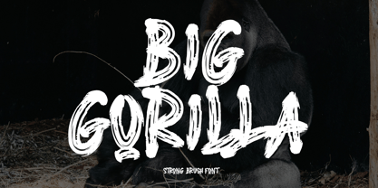 INTRODUCING This is a supercharged font, with natural brush, quick strokes and sharp details. Contains ALL CAPS, numbers, some punctuation and ligature. Perfect for challenging jobs, titles, movie,logos, apparel, t-shirts, hoodies, quotes, product packaging, or anything that needs a typographic turbo-boost and a typographic unique style. Thanks for checking out this font. I hope you enjoy it! AminMario
 - Sniff by Type-Ø-Tones,
$50.00 Joan Barjau used the pseudonym “Sniff” while working as a cartoonist for the Spanish satirical magazine “El Papus”, and Sniff is also the typeface based on the style of lettering he used for the balloons. Sniff is back in our catalog with a new impetus and an extra style: Open. The four styles incorporate Small Caps, Numerals, ornaments and various OpenType features.
 - Nightmark BB by Blambot,
$12.00 Nightmark BB is a roman-inspired, all-caps calligraphy typeface, hand lettered by Nate Piekos. Intended for comic book dialogue lettering, it features contextual alternates for six versions of each letter, three versions of each number, exclamation point, and question mark, serif-I correction, manga-specific characters, bouncy baselines for three or more consecutive letters, and a ton of European characters!
 - Hennepin by Josh Grzybowski,
$24.99 Hennepin derives from a bridge, a street and a county that share the same name in Minneapolis, MN. It is a serif font comprised of three agile weights: regular, light, and extra light. The character set contains typical OpenType features in addition to small caps, and old style numbers, but most importantly, it embraces stylistic alternatives that unite and complete this font.