10,000 search results
(0.044 seconds)
- Merciful by Create Big Supply,
$17.00 Introducing Merciful, a charming and playful sans serif font that brings a touch of fun and uniqueness to your designs. With its cute and lively style, Merciful adds a playful and vibrant element to any project. Whether you're designing greeting cards, children's books, party invitations, or any other creative work, Merciful is sure to capture attention and spread joy. This font features both uppercase and lowercase letters, making it versatile for various design purposes. It also includes numbers and punctuations, allowing you to create engaging typography and eye-catching headlines. Merciful supports multilingual characters, enabling you to express your creativity in different languages. With the added convenience of PUA encoding, accessing all the font's glyphs and swashes is effortless. You can unlock a world of creative possibilities by exploring the various ligatures and alternate characters available in Merciful.
 - Zebramatic by Harald Geisler,
$14.99 Zebramatic - A Lettering Safari Zebramatic is a font for editorial design use, to create headlines and titles in eye-catching stripes. Constructed to offer flexible and a variety of graphical possibilities, Zebramatic type is easy to use. The font is offered in three styles: POW, SLAM and WHAM. These styles work both as ready-made fonts and as patterns to create unique, individualized type. The font design’s full potential is unleashed by layering glyphs from two or all three styles in different colors or shades. Working with the different styles I was reminded of the late Jackson Pollock poured paintings—in particular the documentation of his painting process by Hanz Namuth and Paul Falkernburg in the film Jackson Pollock 51. In Pollock’s pictures the complex allure arises from how he layered the poured and dripped paint onto the canvas. Similar joyful experience and exciting results emerge by layering the different styles of Zebramatic type. Texture In the heart of the Design is Zebramatics unique texture. It is based on an analog distorted stripe pattern. The distortion is applied to a grade that makes the pattern complex but still consistent and legible. You can view some of the initial stripe patterns in the background of examples in the Gallery. Zebramatic POW, SLAM and WHAM each offer a distinct pallet of stripes—a unique zebra hide. POW and WHAM use different distortions of the same line width. SLAM is cut from a wider pattern with thicker stripes. The letter cut and kerning is consistent throughout styles. Design Concept Attention-grabbing textured or weathered fonts are ideal for headlines, ads, magazines and posters. In these situations rugged individuality, letter flow, and outline features are magnified and exposed. Textured fonts also immediately raise the design questions of how to create alignment across a word and deal with repeated letters. Zebramatic was conceived as an especially flexible font, one that could be used conveniently in a single style or by superimposing, interchanging and layering styles to create a unique type. The different styles are completely interchangeable (identical metrics and kerning). This architecture gives the typographer the freedom to decide which form or forms fit best to the specific project. Alignment and repetition were special concerns in the design process. The striped patterns in Zebramatic are carefully conceived to align horizontally but not to match. Matching patterns would create strong letter-pairs that would “stick out” of the word. For example, take the problematic word “stuff”. If Zebramatic aligned alphabetically, the texture of S T and U would align perfectly. The repeated F is also a problem. Imagine a headline that says »LOOK HERE«. If the letters OO and EE have copied »unique« glyphs - the headline suggests mass production, perhaps even that the designer does not care. Some OpenType features can work automatically around such disenchanting situations by accessing different glyphs from the extended glyph-table. However these automations are also repeated; the generated solutions become patterns themselves. Flip and stack To master the situation described above, Zebramatic offers a different programmatic practice. To eliminate alphabetic alignment, the letters in Zebramatic are developed individually. To avoid repetition, the designer can flip between the three styles (POW, SLAM, WHAM) providing three choices per glyph. Stacking layers in different sequences provides theoretical 27 (3*3*3) unique letterforms. A last variable to play with is color (i.e. red, blue, black). Images illustrating the layering potential of Zebramatic are provided in the Gallery. The design is robust and convenient. The font is easily operated through the main font panel (vs. the hidden sub-sub-menu for OpenType related features). The process of accessing different glyphs is also applicable in programs that do not support OpenType extensively (i.e. Word or older Versions of Illustrator). International Specs Zebramatic is ready for your international typographic safari. The font contains an international character set and additional symbols – useful in editorial and graphic design. The font comes in OpenType PostScript flavored and TrueType Format.
 - Rijk by Wilton Foundry,
$39.00 The font name comes from the Dutch word "Rijk" meaning "rich". I'd like you to consider Rijk as a good Pinot Noir: medium bodied, offering succulent juicy berry flavors, accentuated by delicate aromas of coffee and vanilla oak. Ruby red in color, it boasts of velvety tannins and a long fulfilling fruity aftertaste. Rijk has a structure that is delicate and fresh. The aromatics are very fruity like cherry, strawberry, and plum, often with notes of tea-leaf, damp earth, or worn leather… My intent was to create a script that is rich, while not overbearing. It will serve many noble and useful purposes because of its fresh and lively texture. It is also very legible because it has a slightly more upright angle. Use Rijk for headlines, packaging, identities, advertising and online. Available in OpenType, it includes a range of ligatures as well as a full range of class kerning.
 - All Is Quiet by Kitchen Table Type Foundry,
$15.00 The year 2022 went and 2023 came. I can honestly say that last year was a horrible year and I am happy it ended a couple of days ago. The first week after New Year’s Eve always fills my head with the U2 song ‘New Year’s Day’ - so I named this font after a line from the lyrics. I also happened to watch a fantastic movie called ‘Im Westen Nights Neues’, directed by Edward Berger, but based on a book by Erich Maria Remarque, which, in English, was published as ‘All Quiet On The Western Front’. So there you have it: naming a font in 2 easy steps! ;-) All Is Quiet is a lovely brush font, which I created using my father in law’s Chinese pencil and ink. I can suggest some uses here, but I am convinced you can come up with that yourself.
 - Sunshine by Chank,
$49.00 Sunshine is the unlikely alphabet collision of Gobbler and Liquorstore. Chank's napkin scrawl smashed into the letters commonly found on signage at the neighborhood liquor store. Gobbler's blotchy textures fragmented Liquorstore's uniform stroke. It began as a hideous lumpy thing with random vector points everywhere. Chank came to the rescue with his Alphabetician's first aid kit. He smoothed the blunt corners with a few hammer blows. He wrapped the font in extra strokes, in a sans serif Roman style, to increase its contrast. His industrial influence helped stabilize Gobbler's gloppy qualities and his grunge aesthetic softened Liquor store's checkerboard rigidity. The end result is a font with a solid structure and a painterly wiggle that creates a dirty display or a slightly clumsy text face. Because of its many detailed strokes, it tends to look a little better in print than on the web. All organic. Earthy.
 - Hand Scribble Sketch Times by TypoGraphicDesign,
$19.00 CHARACTERISTICS A state-of-the-art OpenType-Feature (like Contextual Alternates (calt) and Stylistic Alternates (salt)) of “Hand Scribble Sketch Times” is, that each uppercase and each lowercase letter has automatically alternated two variations to bring humanly-random characteristics of handwriting to life. The character of the rough, ruggend and raw handwritten classic serif typeface is a very unique warmly atmosphere. An pro-version of the font “Hand TIMES”. APPLICATION AREA warmth, love, handmade. For support of human warmth. Of cooking recipes, menus in the restaurant across party flyer, music cover Art to logo (word marks), headings in magazines and websites. TECHNICAL SPECIFICATIONS ? Font Name: Hand Scribble Sketch Times ? Font Weights: Regular, Rough, Invert ? Font Category: Grunge Serif Display for Headline Size ? Font Format: OTF (OpenType Font for Mac + Win) ? Glyph coverage: 601 ? Language Support: Basic Latin/English letters, Central Europe, West European diacritics, Baltic, Romanian, Turkish ? Specials: Alternative letters, Standard & Discretionary Ligatures, extras like symbols, dingbats, Old-style Digits, Lining Figures, accents & €, incl. OpenType-Features like Contextual Alternates (calt), Glyph Composition/Decomposition (ccmp), Discretionary Ligatures (dlig), Kerning (kern), Standard Ligatures (liga), Numerators (onum), Ordinals (ordn), Stylistic Alternates (salt), Stylistic Set 01 (ss01), Stylistic Set 02 (ss02), Stylistic Set 03 (ss03), Slashed Zero (zero), Lining Figures (lnum), Tabular Figures (tnum), Old Style Figures (onum), Proportional Figures (pnum) ? Design Date: 2013 ? Type Designer: Manuel Viergutz
 - Essay Text by TypeTogether,
$49.00 Essay is an elegant serif typeface intended for setting books, with many stylistic alternates and other typographic goodies, designed by Stefan Ellmer. It is a highly legible text face with a natural flow of reading. This is enhanced by a slight slant of the roman, the combination of open and closed apertures and the amalgamation of organic strokes and counters with a static, fully straight baseline. Essay Text Regular looks back to the spirit of the french Renaissance, when the roman typographic letterforms came to full emancipation. Departing from that historical reference, Essay Text gets rid of all sentimental antiquity and becomes a contemporary interpretation of the “archetypes” of that period. Essay Text Italic refers to that more vaguely, resulting in a formalised look with fairly upright and open shapes and little cursiveness. As in the Renaissance, before the mating of roman and italic, Essay Text Italic works as a separate text face and a perfect secondary type. The name Essay derives from the literary meaning of the word, attempt or trial. Therefore, the typeface Essay can be seen as an attempt to express an opinion about reading, the omnipresence of history, the importance of calligraphy and the importance to deviate from that calligraphic source; as well as an attempt to crystallise lettershapes in balance between convention and the designer’s personal idiom.
 - Calm by RainBomb Studio,
$20.00 Calm Handmade is a versatile slab font family with a touch of serenity and modernity. It strikes a perfect balance between elegance and sophistication, making it a delightful addition to any project. Its fancy and playful style adds a touch of creativity, while the cool and understated shapes elevate its visual appeal. Calm Handmade proves to be an ideal choice for a variety of design projects, creating captivating signatures, eye-catching album covers, and distinct logos and branding. Moreover, its readability and adaptability ensure seamless integration into magazines, social media posts, advertisements, and an array of other design ventures, showcasing its versatility across diverse creative endeavors.
 - Cartia by Letterara,
$24.00 Indulge in the timeless allure of Cartia, a captivating serif typeface that effortlessly combines modernity with classic charm. With its unique style and contemporary look, this font is the perfect choice for a wide range of projects. From modern designs to retro vintage aesthetics, from branding to crafting, from wedding invitations to fashion and advertising, this font adds a touch of elegance to every creative endeavor. Let yourself be enchanted by its incredibly stylish and glamorous vibe, and unleash your creativity to create truly spectacular designs! With its PUA encoding, accessing all the enchanting glyphs is a breeze, allowing you to unlock endless possibilities for your artistic expression.
 - Melango by IbraCreative,
$27.00 Melango is a captivating and artistic brush signature font that exudes a sense of flair and personality. With its handcrafted and expressive strokes, Melango captures the essence of a genuine signature, as if written with a brush. Each letter carries a unique and fluid charm, adding an element of authenticity to any design. The brush-like texture and varying thicknesses create a natural and dynamic appearance, making Melango an ideal choice for logos, branding, and creative projects seeking a touch of artistic elegance. Whether used for invitations, greeting cards, or social media graphics, Melango effortlessly infuses designs with a sense of warmth and creativity, making it a standout brush signature font.
 - Roaster SS by Sensatype Studio,
$15.00 Roaster is a Stylish Elegant Font In a new generations, we analyze that any designer or brand owner need to make their brand standout. As our focus that analyze any typeface that helps to leverage any logo design to look more modern and unique. We prepared this font with any unique characters to help you create unlimited variations for your creative needs. Roaster font ready with: Any options to get creative variations with unique letters 5 Styles Font (Black,Bold,Reguler,Thin,Light) Preview as a inspirations that you can do with Roaster font Ready with Lowercase and Uppercase characters Wish you enjoy our font. :)
 - Times Eighteen by Linotype,
$29.00In 1931, The Times of London commissioned a new text type design from Stanley Morison and the Monotype Corporation, after Morison had written an article criticizing The Times for being badly printed and typographically behind the times. The new design was supervised by Stanley Morison and drawn by Victor Lardent, an artist from the advertising department of The Times. Morison used an older typeface, Plantin, as the basis for his design, but made revisions for legibility and economy of space (always important concerns for newspapers). As the old type used by the newspaper had been called Times Old Roman," Morison's revision became "Times New Roman." The Times of London debuted the new typeface in October 1932, and after one year the design was released for commercial sale. The Linotype version, called simply "Times," was optimized for line-casting technology, though the differences in the basic design are subtle. The typeface was very successful for the Times of London, which used a higher grade of newsprint than most newspapers. The better, whiter paper enhanced the new typeface's high degree of contrast and sharp serifs, and created a sparkling, modern look. In 1972, Walter Tracy designed Times Europa for The Times of London. This was a sturdier version, and it was needed to hold up to the newest demands of newspaper printing: faster presses and cheaper paper. In the United States, the Times font family has enjoyed popularity as a magazine and book type since the 1940s. Times continues to be very popular around the world because of its versatility and readability. And because it is a standard font on most computers and digital printers, it has become universally familiar as the office workhorse. Times™, Times™ Europa, and Times New Roman™ are sure bets for proposals, annual reports, office correspondence, magazines, and newspapers. Linotype offers many versions of this font: Times™ is the universal version of Times, used formerly as the matrices for the Linotype hot metal line-casting machines. The basic four weights of roman, italic, bold and bold italic are standard fonts on most printers. There are also small caps, Old style Figures, phonetic characters, and Central European characters. Times™ Ten is the version specially designed for smaller text (12 point and below); its characters are wider and the hairlines are a little stronger. Times Ten has many weights for Latin typography, as well as several weights for Central European, Cyrillic, and Greek typesetting. Times™ Eighteen is the headline version, ideal for point sizes of 18 and larger. The characters are subtly condensed and the hairlines are finer. Times™ Europa is the Walter Tracy re-design of 1972, its sturdier characters and open counterspaces maintain readability in rougher printing conditions. Times New Roman™ is the historic font version first drawn by Victor Lardent and Stanley Morison for the Monotype hot metal caster." - Times Europa LT by Linotype,
$29.99In 1931, The Times of London commissioned a new text type design from Stanley Morison and the Monotype Corporation, after Morison had written an article criticizing The Times for being badly printed and typographically behind the times. The new design was supervised by Stanley Morison and drawn by Victor Lardent, an artist from the advertising department of The Times. Morison used an older typeface, Plantin, as the basis for his design, but made revisions for legibility and economy of space (always important concerns for newspapers). As the old type used by the newspaper had been called Times Old Roman," Morison's revision became "Times New Roman." The Times of London debuted the new typeface in October 1932, and after one year the design was released for commercial sale. The Linotype version, called simply "Times," was optimized for line-casting technology, though the differences in the basic design are subtle. The typeface was very successful for the Times of London, which used a higher grade of newsprint than most newspapers. The better, whiter paper enhanced the new typeface's high degree of contrast and sharp serifs, and created a sparkling, modern look. In 1972, Walter Tracy designed Times Europa for The Times of London. This was a sturdier version, and it was needed to hold up to the newest demands of newspaper printing: faster presses and cheaper paper. In the United States, the Times font family has enjoyed popularity as a magazine and book type since the 1940s. Times continues to be very popular around the world because of its versatility and readability. And because it is a standard font on most computers and digital printers, it has become universally familiar as the office workhorse. Times™, Times™ Europa, and Times New Roman™ are sure bets for proposals, annual reports, office correspondence, magazines, and newspapers. Linotype offers many versions of this font: Times™ is the universal version of Times, used formerly as the matrices for the Linotype hot metal line-casting machines. The basic four weights of roman, italic, bold and bold italic are standard fonts on most printers. There are also small caps, Old style Figures, phonetic characters, and Central European characters. Times™ Ten is the version specially designed for smaller text (12 point and below); its characters are wider and the hairlines are a little stronger. Times Ten has many weights for Latin typography, as well as several weights for Central European, Cyrillic, and Greek typesetting. Times™ Eighteen is the headline version, ideal for point sizes of 18 and larger. The characters are subtly condensed and the hairlines are finer. Times™ Europa is the Walter Tracy re-design of 1972, its sturdier characters and open counterspaces maintain readability in rougher printing conditions. Times New Roman™ is the historic font version first drawn by Victor Lardent and Stanley Morison for the Monotype hot metal caster." - Times Ten by Linotype,
$40.99In 1931, The Times of London commissioned a new text type design from Stanley Morison and the Monotype Corporation, after Morison had written an article criticizing The Times for being badly printed and typographically behind the times. The new design was supervised by Stanley Morison and drawn by Victor Lardent, an artist from the advertising department of The Times. Morison used an older typeface, Plantin, as the basis for his design, but made revisions for legibility and economy of space (always important concerns for newspapers). As the old type used by the newspaper had been called Times Old Roman," Morison's revision became "Times New Roman." The Times of London debuted the new typeface in October 1932, and after one year the design was released for commercial sale. The Linotype version, called simply "Times," was optimized for line-casting technology, though the differences in the basic design are subtle. The typeface was very successful for the Times of London, which used a higher grade of newsprint than most newspapers. The better, whiter paper enhanced the new typeface's high degree of contrast and sharp serifs, and created a sparkling, modern look. In 1972, Walter Tracy designed Times Europa for The Times of London. This was a sturdier version, and it was needed to hold up to the newest demands of newspaper printing: faster presses and cheaper paper. In the United States, the Times font family has enjoyed popularity as a magazine and book type since the 1940s. Times continues to be very popular around the world because of its versatility and readability. And because it is a standard font on most computers and digital printers, it has become universally familiar as the office workhorse. Times™, Times™ Europa, and Times New Roman™ are sure bets for proposals, annual reports, office correspondence, magazines, and newspapers. Linotype offers many versions of this font: Times™ is the universal version of Times, used formerly as the matrices for the Linotype hot metal line-casting machines. The basic four weights of roman, italic, bold and bold italic are standard fonts on most printers. There are also small caps, Old style Figures, phonetic characters, and Central European characters. Times™ Ten is the version specially designed for smaller text (12 point and below); its characters are wider and the hairlines are a little stronger. Times Ten has many weights for Latin typography, as well as several weights for Central European, Cyrillic, and Greek typesetting. Times™ Eighteen is the headline version, ideal for point sizes of 18 and larger. The characters are subtly condensed and the hairlines are finer. Times™ Europa is the Walter Tracy re-design of 1972, its sturdier characters and open counterspaces maintain readability in rougher printing conditions. Times New Roman™ is the historic font version first drawn by Victor Lardent and Stanley Morison for the Monotype hot metal caster." - Times Ten Paneuropean by Linotype,
$92.99In 1931, The Times of London commissioned a new text type design from Stanley Morison and the Monotype Corporation, after Morison had written an article criticizing The Times for being badly printed and typographically behind the times. The new design was supervised by Stanley Morison and drawn by Victor Lardent, an artist from the advertising department of The Times. Morison used an older typeface, Plantin, as the basis for his design, but made revisions for legibility and economy of space (always important concerns for newspapers). As the old type used by the newspaper had been called Times Old Roman," Morison's revision became "Times New Roman." The Times of London debuted the new typeface in October 1932, and after one year the design was released for commercial sale. The Linotype version, called simply "Times," was optimized for line-casting technology, though the differences in the basic design are subtle. The typeface was very successful for the Times of London, which used a higher grade of newsprint than most newspapers. The better, whiter paper enhanced the new typeface's high degree of contrast and sharp serifs, and created a sparkling, modern look. In 1972, Walter Tracy designed Times Europa for The Times of London. This was a sturdier version, and it was needed to hold up to the newest demands of newspaper printing: faster presses and cheaper paper. In the United States, the Times font family has enjoyed popularity as a magazine and book type since the 1940s. Times continues to be very popular around the world because of its versatility and readability. And because it is a standard font on most computers and digital printers, it has become universally familiar as the office workhorse. Times™, Times™ Europa, and Times New Roman™ are sure bets for proposals, annual reports, office correspondence, magazines, and newspapers. Linotype offers many versions of this font: Times™ is the universal version of Times, used formerly as the matrices for the Linotype hot metal line-casting machines. The basic four weights of roman, italic, bold and bold italic are standard fonts on most printers. There are also small caps, Old style Figures, phonetic characters, and Central European characters. Times™ Ten is the version specially designed for smaller text (12 point and below); its characters are wider and the hairlines are a little stronger. Times Ten has many weights for Latin typography, as well as several weights for Central European, Cyrillic, and Greek typesetting. Times™ Eighteen is the headline version, ideal for point sizes of 18 and larger. The characters are subtly condensed and the hairlines are finer. Times™ Europa is the Walter Tracy re-design of 1972, its sturdier characters and open counterspaces maintain readability in rougher printing conditions. Times New Roman™ is the historic font version first drawn by Victor Lardent and Stanley Morison for the Monotype hot metal caster." - Times by Linotype,
$40.99In 1931, The Times of London commissioned a new text type design from Stanley Morison and the Monotype Corporation, after Morison had written an article criticizing The Times for being badly printed and typographically behind the times. The new design was supervised by Stanley Morison and drawn by Victor Lardent, an artist from the advertising department of The Times. Morison used an older typeface, Plantin, as the basis for his design, but made revisions for legibility and economy of space (always important concerns for newspapers). As the old type used by the newspaper had been called Times Old Roman," Morison's revision became "Times New Roman." The Times of London debuted the new typeface in October 1932, and after one year the design was released for commercial sale. The Linotype version, called simply "Times," was optimized for line-casting technology, though the differences in the basic design are subtle. The typeface was very successful for the Times of London, which used a higher grade of newsprint than most newspapers. The better, whiter paper enhanced the new typeface's high degree of contrast and sharp serifs, and created a sparkling, modern look. In 1972, Walter Tracy designed Times Europa for The Times of London. This was a sturdier version, and it was needed to hold up to the newest demands of newspaper printing: faster presses and cheaper paper. In the United States, the Times font family has enjoyed popularity as a magazine and book type since the 1940s. Times continues to be very popular around the world because of its versatility and readability. And because it is a standard font on most computers and digital printers, it has become universally familiar as the office workhorse. Times™, Times™ Europa, and Times New Roman™ are sure bets for proposals, annual reports, office correspondence, magazines, and newspapers. Linotype offers many versions of this font: Times™ is the universal version of Times, used formerly as the matrices for the Linotype hot metal line-casting machines. The basic four weights of roman, italic, bold and bold italic are standard fonts on most printers. There are also small caps, Old style Figures, phonetic characters, and Central European characters. Times™ Ten is the version specially designed for smaller text (12 point and below); its characters are wider and the hairlines are a little stronger. Times Ten has many weights for Latin typography, as well as several weights for Central European, Cyrillic, and Greek typesetting. Times™ Eighteen is the headline version, ideal for point sizes of 18 and larger. The characters are subtly condensed and the hairlines are finer. Times™ Europa is the Walter Tracy re-design of 1972, its sturdier characters and open counterspaces maintain readability in rougher printing conditions. Times New Roman™ is the historic font version first drawn by Victor Lardent and Stanley Morison for the Monotype hot metal caster." - ATHEWE by Twinletter,
$17.00 Athewe is a display font with a strong and courageous superhero theme. Created specifically for projects that require a bold, impressive impression, this font is the perfect solution for creating bold and bold designs. With Athewe, you can bring an awesome superhero feel to any of your projects. This font brings strength and boldness to your designs, creating a look that is both impressive and full of character. Each letter expresses a strong and daring style, delivering a memorable message to your audience. With features such as ligature and alternate, Athewe provides unlimited flexibility and creativity. You can combine these font elements to create unique and interesting variations of the style. In addition, multilingual support allows you to use Athewe in multiple languages, so your project can reach a global audience. If you’re looking for an alluring, powerful, and superhero-themed font, Athewe is the right choice. With a striking style and features that allow for creative experimentation, this font will catch the eye and inspire your potential customers. What’s Included : - File font - All glyphs Iso Latin 1 - Alternate, Ligature - Simple installations - We highly recommend using a program that supports OpenType features and Glyphs panels like many Adobe apps and Corel Draw so that you can see and access all Glyph variations. - PUA Encoded Characters – Fully accessible without additional design software. - Fonts include Multilingual support
 - Citaro Voor (dubbele hoogte, midden/dubbel) - 100% free

- Bring Me The Horizon by Struggle Studio,
$20.00 BringMeTheHorizon is a modern handwritten display font. With Brush strokes, scribbled characters. To give you extra creative work. BringMeTheHorizon font supports multilingualism of more than 100+ languages. This font is great for logo designs, social media, Movie Titles, Book Titles, short text even long text letters and great for your secondary text font in sans or serif. Create stunning works with the BringMeTheHorizon font.
 - Jolly Angel by Stefani Letter,
$12.00 Jolly Angel is a cute and quirky display font. It embodies playfulness and authenticity and is the perfect choice for any children's activity, Christmas, thanksgiving, poster, logo, packaging, or school project. Fall in love with its incredibly adaptable style and use it to create amazing designs! Add this beautiful display font to each of your creative ideas and notice how it makes them stand out!
 - Billijanes by Maulana Creative,
$13.00 Billijanes is a modern calligraphy script font. It's a clean store with high contrast line. It readable in short text. Billijanes includes opentype features ligatures and lowercase. It support multilingual more than 100+ language. This font is good for logo design, Movie Titles, Books Titles and any awesome project you create. Make a stunning work with Billijanes script font. Thanks for use this font, Maulana Creative
 - Mianga by Differentialtype,
$10.00 Mianga is a versatile, stylish, and fun retro look font that's perfect for any design you're creating such as book covers, greeting cards, news headlines, and more! Mianga comes in 4 styles, regular, bubble, outline, and shadow, with italics in each style. Mix each style for the perfect result. Add it to any of your creative projects, and it will give off a retro and vintage feel.
 - Clarize Display by Seventh Imperium,
$24.00 Clarize Display is based on the Black style of Clarize. This version has lots of alternate characters. You can easily access them by opentype features (given PUA code). This font is perfect for designers who are working in fashion, magazine, blog, advertising, packaging, branding, etc. The family includes 2 styles: base and engraved and are multilingual. Be creative and create your best displays with those fonts.
 - Romalian by Balpirick,
$15.00 Romalian is a Modern Calligraphy Font. Romalian is a magical script font carefully created with a touch of elegance. Whether you’re looking for fonts for Instagram or calligraphy scripts for DIY projects, this font will turn any creative idea into a true piece of art! Romalian also multilingual support. Enjoy the font, feel free to comment or feedback, send me PM or email. Thank you!
 - Roughpen by Putracetol,
$28.00 Roughpen is a bold, hand-drawn brush typeface. With this font you can create stunning custom hand drawn brush looks. Roughpen also includes lots of binding characters which make the project even more amazing. You can use this font for making an awesome logos, header, titles, prints, apparel, logotype, quotes, packaging, flyer, poster, cover & other creative process possibilities. This font also support multi language.
 - Mates Malty by Typesketchbook,
$45.00 Mates Malty was created by mixing different styles of hand writing fonts that derived from various tools such as painting brushes, markers and inkpen in order to develop a new and diverse font styles. We also keep incomplete details and uneven textures that resulted from the writing process. We provide various font styles to help you mix and mach them to suit your creative work harmoniously.
 - Hegarown by Rvandtype,
$12.00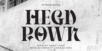 Introducing Hegarown Font, a captivating display font with a contemporary and cool aesthetic that makes it an ideal choice for a wide range of creative projects. Whether you're designing logos, establishing brand identities, crafting invitations, creating stunning stationery, shaping wedding designs, or producing eye-catching social media posts, Hegarown Font is your go-to solution. Features: Alternate Characters Numbers and punctuation Multilingual PUA encoded Thank You
 - Birthy by ZetDesign,
$20.00 Birthy is a serif font that comes with an alternate style for each letter unit, this allows you to choose the shape you want. This font is made to be used in every situation, both formal and informal and is available in 2 regular and italic styles with over 300 glyphs in each style. Make your creations more awesome with BIRTHY font ... have fun creating ...
 - Cambalache by JVB Fonts,
$35.00 The idea for Cambalache was conceived back in 2008 and was to create a geometrical font based on tangential modules into structure. The serif would be arranged, looking to approach to the lettering shapes. The creative concept has a feel from the mid-30s of last century, reaching a taste of retro and vintage style. Includes oldstyle numbers, slashed zero, standard and discretional ligatures.
 - Young Generation by Wildan Type,
$15.00 Young Generation is brush script font. The shape is modern and unique and the writing style is very natural. You can create many beautiful typographic designs in an instant like branding, web design and editorial, prints, crafts, quotes, It's great for logotypes, wedding invitations, romantic cards, labels, packaging, spelling of names and others. Add to your most creative ideas and watch how they bring them to life!
 - Garamond #3 by Linotype,
$40.99Opinion varies regarding the role of Claude Garamond (ca. 1480–1561) in the development of the Old Face font Garamond. What is accepted is the influence this font had on other typeface developments from the time of its creation to the present. Garamond, or Garamont, is related to the alphabet of Claude Garamond (1480-1561) as well as to the work of Jean Jannon (1580–1635 or 1658), much of which was attributed to Garamond. In comparison to the earlier Italian font forms, Garamond has finer serifs and a generally more elegant image. The Garamond of Jean Jannon was introduced at the Paris World’s Fair in 1900 as Original Garamond, whereafter many font foundries began to cast similar types. Morris F. Benton’s Garamond appeared in 1936 and is based on the forms of Jean Jannon, which already displayed characteristics of the Transitional style. - Glanlen by Bungletter,
$10.00 Glanlen Outline is a very Beautiful, elegant and unique Script font. Expertly designed to become a true favorite, this font has the potential to take your creative ideas to the highest level! Glanlen Outline is appealing because it's sleek, clean, feminine, sensual, glamorous, simple and highly readable, thanks to its many luxurious letter connections. I also offer a number of viable alternative styles for all letters. Classic style is very suitable to be applied in various formal forms such as invitations, labels, restaurant menus, logos, fashion, make up, stationery, novels, magazines, books, greeting cards/weddings, packaging, labels or all kinds of advertisements. for your purposes. . . . . . . Contains full set: -4 Type Font -Uppercase -Lowercase -Alternative -Ligature -Punctuation -Number -Multilingual support. Need help or have questions let me know. I'm happy to help. Thank you & Congratulations on the Design.
 - Anabella by RNS Fonts,
$33.00 Anabella is a typeface made for the Master’s Degree in Typography at the University of Buenos Aires. It is inspired by the posters of pizzerias located in Naples, Italy; in order to be used in the pizza franchise Giuseppe in Buenos Aires, Argentina. The font preserves and rescues gestural features of these posters, adding a vertical axis and high contrast, typical of the Italian types that arrived in the city product of the immigration. The stroke with brush provides a more organic quality to the sign and provides connotative features. The family has three variables for the different applications that may be required in a pizza place: Italic for bodies greater than 16 pt, Roman for short texts up to 14 pt, and Stencil for use in brands and titles. Anabella was selected to participate in the eighth typography biennial Tipos Latinos.
 - Radilen Aveline by Dora Typefoundry,
$18.00 Introducing a fancy serif font with italics. Radilen Aveline is a series of elegant serif fonts that give traditional design elements a modern feel with their clean lines, smooth curves and sharp details making them suitable for a variety of your design projects making them ideal for titles, headlines, editorial designs, monograms, branding, logos, poster designs, and more. The regular Radilen Aveline has 47 Ligatures and 28 Alternatives. WHAT'S INCLUDED: Radilen Aveline Regular Radilen Aveline Italic We highly recommend using a program that supports OpenType features and Glyphs panels like Adobe apps and Corel Draw, so you can see and access all Glyph variations. This type of family has become the work of true love, making it as easy and fun as possible.I really hope you enjoy it! Thank you Enjoy the font and go get creative :)
 - Garamond Classico by Linotype,
$29.99Opinion varies regarding the role of Claude Garamond (ca. 1480–1561) in the development of the Old Face font Garamond. What is accepted is the influence this font had on other typeface developments from the time of its creation to the present. Garamond, or Garamont, is related to the alphabet of Claude Garamond (1480–1561) as well as to the work of Jean Jannon (1580–1635 or 1658), much of which was attributed to Garamond. In comparison to the earlier Italian font forms, Garamond has finer serifs and a generally more elegant image. The Garamond of Jean Jannon was introduced at the Paris World’s Fair in 1900 as Original Garamond, whereafter many font foundries began to cast similar types. Garamond Classico is based on the forms of Jean Jannon, which already displayed characteristics of the Transitional style. - Dolego by Authentype,
$14.00 Dolego Display Font cool thin - black font for your retro designs. He is funny and wonderful with a brave personality. Perfect for a headline, logo, or anything your creativity calls for. Features Standard glyphs uppercase and lowercase letters Numerals, a large range of punctuation Lowercase letters Works on PC & Mac Simple installations, accessible in Adobe Illustrator, Adobe Photoshop, Adobe InDesign, even work on Microsoft Word. PUA Encoded Characters – Fully accessible without additional design software. Fonts include multilingual support for; ä ö ü Ä Ö Ü ß ¿ ¡ ____ PLEASE NOTE Most of the fonts require advanced graphic software that supports Open Type Features like Adobe (Illustrator, InDesign, Photoshop), Affinity (Photo, Designer, Publisher), Corel Draw, or similar software. Image used: All photographs/pictures/logo/vector used in the preview are not included, they are intended for illustration purposes only. Thank you Hope you enjoy our font!
 - Loominaire by IbraCreative,
$37.00 Introducing Loominaire - A Modern Futuristic Font! Step into the future with Loominaire, a captivating and cutting-edge font that embodies the essence of modernity and innovation. Designed to make your designs stand out and leave a lasting impression, Loominaire brings a touch of sleek sophistication to your creative projects. With its clean lines and geometric precision, Loominaire exudes an aura of futuristic elegance. Each letter is meticulously crafted to create a harmonious balance between contemporary aesthetics and legibility, ensuring that your message is conveyed with clarity and style. This font is perfect for those seeking to add a touch of modernity to their branding, advertisements, websites, posters, and more. Captivate your audience with Loominaire's versatility, whether you're creating a high-tech logo, a sci-fi movie poster, or a forward-thinking website interface. Loominaire unleashes your creative potential with its extensive character set, including uppercase and lowercase letters, numerals, punctuation marks, and a variety of special symbols. Its versatility extends beyond the confines of traditional design, allowing you to explore endless possibilities and push the boundaries of visual communication. Embrace the future of typography with Loominaire - a font that bridges the gap between contemporary design and futuristic aesthetics. Let your creativity soar and watch as your designs come to life with a touch of modern elegance. Unlock the power of Loominaire today and revolutionize your creative projects with this extraordinary modern futuristic font.
 - Spaza by Scholtz Fonts,
$15.00In parts of Africa, in the poorer, rural and peri-urban areas there are many small shops or convenience stores which are called "Spaza" shops. The owners of these shops often don't have access to commercial signwriting and write their signs themselves. The font "Spaza" is based on these hand-lettered signs. This lettering has a refreshing simplicity and spontaneity, yet retains great legibility. In the font "Spaza", there are three styles: - Spaza Regular - with normal upper and lower case; - Spaza Small Caps - in which the lower case is a true "small caps" and not a shrunken version of the upper case (generated by the operating system); - Spaza Double Caps - in which the lower case characters have been replaced by an alternate set of capital letters. The font thus contains two sets of differing upper case characters. You can use characters from both these sets to give a true feeling of randomness because if the same character occurs twice in a word, different versions of the character can be used. Spaza can be used with great effect in a great variety of applications such as advertisements, flyers, posters and in magazine pages. Spaza contains a full character set and has been carefully spaced and kerned. - Molhim by Ethar Elaagib,
$79.00 About Molhim: I first designed Molhim in 2016 as a personal project to digitalize my handwriting. Molhim 2016 was a static typeface, including two weights, and supported basic Arabic only. Since it was my first typeface to design, it had several issues regarding letterform design and aesthetics, good curve drawing, proportions, font programming, and correct OpenType features. So, in 2019 I started redesigning my handwriting font from the beginning to produce a neat Multi-lingual typeface suitable for diverse purposes. Arabic letterforms are redrawn with a focus on proportions and unity. Molhim Variable characteristics: Supports basic Arabic, and Arabic script-based languages, such as Persian and Urdu. Supports Basic and extended Latin characters. Includes 200+ ligatures and alternate styles for a natural flow of letters. Latin small letters have both separated and connected script forms. The variable font comes in two axes, Weight (wght) and Softness (SOFT): The Weight axis ranges from thin to bold, while Softness changes the stroke's cap from a round cap to a sharp projecting cap. Although I see the new Molhim Variable as a different typeface, I decided to keep the name 'Molhim' for the new typeface with the addition of 'Variable'. Molhim is an Arabic word that means 'inspiring'; this is how I hope people would perceive my handwriting.
 - Trump Gothic Pro by Canada Type,
$39.95 Trump Gothic is a reconception of ideas from Georg Trump's seminal 1955 Signum typeface and its later reworking (Kamene) by Czech designer Stanislav Marso. Originally cobbled together for a variety of film projects in the late 1990s and early 2000s, the Trump Gothic family was made available for the general public in 2005. Shortly thereafter, it became a common sight in movie credits, on posters and magazine covers, in fashion branding and on corporate web sites. Though countless attempts have been made to emulate it, its unique totality and attractiveness to layout designers was never really topped. Its appeal is largely due to its double-duty toolbox: An economic functionality that allows it to pack large amounts of information in small spaces, and a clear, modular aesthetic that gives it the ability to emphasize short text in large sizes, all without sacrificing legibility or giving in to dated or over-rehashed industrial gothic forms. The typeface was redrawn, refitted, optimized and greatly expanded in 2013, and the result is Trump Gothic Pro, a multiscript family of six fonts, each containing over 1020 glyphs and a wealth of OpenType features, including small caps, caps-to-small-caps, stylistic alternates, unicase/monocase alternates, fractions, ordinals, class-based kerning, and support for Latin, Cyrillic and Greek locales.
