10,000 search results
(0.041 seconds)
- Guinevere Pro by Canada Type,
$29.95 Guinevere Pro is a typeface designed by Icelandic art director Sigurdur Armannsson. It started in 2001 as simple hand-drawn sketches of a few letters built from modules, then became an experiment with four goals: - Construct an original alphabet from a specific set of predetermined modules. - See how certain letter forms built without said modules would behave within the totality of the module-constructed alphabet. - See if certain letters would actually enforce their own shapes to be drawn a certain way within the totality of the typeface. Likewise, see if the totality of the alphabet demands that individual letters be drawn in a specific way, and if so, how much room for variation would there be? - See how all of the above reacts/changes to implementing the alphabet across different weights. The experiment was finessed and re-worked over many years of technology changes, and Guinevere Pro is the final outcome, ten years later. The Guinevere Pro set is four cross-platform Open Type fonts, with built-in small caps, alternates, ligatures, and support for a wide range of Latin-based languages.
 - Sitcom by GroupType,
$19.00 If there was an American Typeface Hall of Fame, Bank Gothic, designed by the great Morris Fuller Benton would hold a place of special distinction considering this design has survived so many trends in typographic fashion since being introduced in 1930. It's just as desirable today as it was over eighty years ago; arguably more. Today, Bank Gothic is a very popular choice as a titling face for science fiction books, posters and countless television and movie titles. It is also a popular typeface for use in computer games and digital graphics. GroupType’s 2010 revival of this American classic is true to the design, the period, and Benton’s aesthetic. GroupType worked with some of the most talented and experienced type designers that were historically grounded and sensitive to this design project. Fortunately, Mr. Benton has left us a large selection of other great typefaces for insight and guidance. GroupType’s new revival includes the original three weights in regular and condensed style but also a new small cap and lowercase in each font necessary for 21st century typography.
 - Mr Gabe by Leksen Design,
$- Check out Mr Gabe in motion! Mr Gabe is a typeface designed to dance. Not that it’s a flamboyant display face, but that it has a liveliness, especially in its heavier weights, that dances across the page. And the letters include a selection of exuberant flourishes that can be used to kick up a ruckus or make a sweeping gesture. Mr Gabe is a high-contrast serif typeface with vertical stress, a “modern” face in traditional type terms. Even in the regular weight, the contrast between thick and thin strokes is very obvious. Designer Andrea Leksen has given many of the lowercase letters ball terminals, teardrop shapes that make Mr Gabe seem decorated even when most of its letter forms are conservative. If you need more bells and whistles, or perhaps revolving mirror balls and dancing shoes, you can explore the font’s collection of ornaments and decorative borders. Mr Gabe comes in four weights, from Regular to Black, with italics for each. Each font includes over 57 ligatures, 31 illustrations and borders, small caps and proportional oldstyle numerals.
 - Plantin by Monotype,
$29.99 Plantin is a Renaissance Roman as seen through a late–industrial-revolution paradigm. Its forms aim to celebrate fine sixteenth century book typography with the requirements of mechanized typesetting and mass production in mind. How did this anomalous design come about? In 1912 Frank Hinman Pierpont of English Monotype visited the Plantin-Moretus Museum in Antwerp, returning home with “knowledge, hundreds of photographs, and a stack of antique typeset specimens including a few examples of Robert Granjon’s.” Together with Fritz Stelzer of the Monotype Drawing Office, Pierpont took one of these overinked proofs taken from worn type to use as the basis of a new text face for machine composition. Body text set in Plantin produces a dark, rich texture that’s suited to editorial and book work, though it also performs its tasks on screen with ease. Its historical roots lend the message it sets a sense of gravity and authenticity. The family covers four text weights complete with italics, with four condensed headline styles and a caps-only titling cut. Plantin font field guide including best practices, font pairings and alternatives.
 - Bank Gothic by GroupType,
$29.00 If there was an American Typeface Hall of Fame, Bank Gothic, designed by the great Morris Fuller Benton would hold a place of special distinction considering this design has survived so many trends in typographic fashion since being introduced in 1930. Its just as desirable today as it was over eighty years ago; arguably more. Today, Bank Gothic is a very popular choice as a titling face for science fiction books, posters and countless television and movie titles. It is also a popular typeface for use in computer games and digital graphics. GroupType’s 2010 revival of this American classic is true to the design, the period, and Benton’s aesthetic. GroupType worked with some of the most talented and experienced type designers that were historically grounded and sensitive to this design project. Fortunately, Mr. Benton has left us a large selection of other great typefaces for insight and guidance. GroupType’s new revival includes the original three weights in regular and condensed style plus two new distressed fonts. All have a new small cap and lowercase in each font necessary for 21st century typography.
 - Antipol VF by phospho,
$75.00 With Antipol Variable, the reversed stress font was supplemented with Wide and Extended cuts in the Hairline weight. The ability to stretch single letters extremely wide is an exclusive goodie of the Variable version. Antipol is a Sans Serif design that reverses the conventions of a regular Latin Sans Serif. With a weight emphasis on the horizontals and its vertical terminals Antipol radiates a 1970s charisma known from the like of Antique Olive. Its modern and avantgardistic attributes are most pronounced in the Hairline weight, where ultra thin lines meet distinctive arrowhead-corners. This particular weight is meant for display settings, think full-page magazine titles or posters. Antipol Wide and Antipol Extended are a generous statement for graphic design with enough space to let the type breathe: art catalogs, lead texts, invitations, letterheads or brand identity. Any style comes with a wide range of OpenType features that goes beyond a standard display font: Small Caps, Proportional and Tabular Oldstyle Figures and Lining Figures, Fractions, and much more.
 - Omnipop by Fenotype,
$20.00 Omnipop is a potent display pack with three styles. All the fonts have firm yet clean and velvety character. Omnipop Brush is a forward leaning brush script with a somewhat heavy complexion. It has a large x-height and it makes nice smooth and even texts. Omnipop Brush is equipped with Standard Ligatures and Contextual Alternates that are automatically on as they should be kept. In addition it has Swash, Stylistic and Titling Alternates for extra show-off. Omnipop Script is a monoline connected script simulating a smooth felt-tip pen. Script is equipped with Standard Ligatures and Contextual Alternates to keep the connections smooth. In addition Omnipop Script has Swash, Stylistic and Titling Alternates and even more extra characters can be found in the glyphs window. Omnipop Sans is a sturdy rounded all caps sans with a sort of geometric vibe to it. Anything you type with Omnipop Sans will look cheery and approachable. Omnipop fonts rock on their own but they also play great together in any order.
 - Internacional by Los Andes,
$26.00 Internacional, inspired by the International Style, is a Latin American-flavored neo-grotesque sans serif typeface made with organic ingredients and sweetened with organic sugar and chocolate. Internacional is well-suited for corporate identity, branding, publishing projects, logotypes, magazines and advertising. Its large x-height and small difference between x-height and cap-height make it a high-impact font, ideal for powerful headings, while providing legibility. Internacional was designed for use with short and mid-length paragraphs that require a balanced type color. Internacional is an extended width font with rounded forms and angled terminal ends, in characters such as “c” or “a”, which make it suitable for use in advertising and branding. The proportional relation in height between uppercase and lowercase letters may be useful when composing text in German language. The Internacional font family comes in 7 weights with matching italics and includes an alternative version, with the same number of styles, yet it tastes differently. Special thanks to everyone in the Latinotype Team (especially to Rodrigo Fuenzalida) for their support, help with corrections and digital editing.
 - PF Adamant Sans Pro by Parachute,
$45.00 Adamant Sans on Behance. Adamant Sans: Specimen Manual PDF. Adamant Sans is a contemporary and very functional typeface. It stands out from the crowd with its uniquely designed rounded corners and beautiful italics. This carefully designed family consists of 18 fonts, including true italics. Its extreme weights, such as hairline and black are ideal for setting big and powerful headlines, while intermediate weights work very well in long texts at small point sizes. Weights are finely balanced so that they can be easily combined, depending on the type of paper and other conditions. Thanks to its proportions, high x-height and wide apertures, this typeface is very legible and suitable for setting books, magazines, newspapers, but is also valuable for use in large sizes, as well as for complex corporate projects. It supports advanced typographic features such as small caps, lining and oldstyle figures in proportional and tabular widths, fractions, ligatures, etc., and provides simultaneous support for Latin and Cyrillic as well as kerning for these languages. Adamant Sans is the ideal companion of the Adamant serif version.
 - Bushing by Hackberry Font Foundry,
$13.95 Bushing is a quick serif experiment going for open light display type. For years I have always stopped and really liked what I saw with fonts like the original Cushing from the turn of the 20th century. This time the desire for a font was stirred by Felici's article in CreativePro on fonts from the beginning of the 20th century, especially his captures of Cushing No. 2 and the version commissioned for Norwood press from ATF. I'm not interested in historically accurate reconstructions. My desire is for the general feel I get when I see a font. As a result, Bushing has little to do with Cushing (other than the last six letters). But it is a Serif font with small serifs and a huge x-height with a very open feel. I like it. I hope you do also. I made it into a limited display version of OpenType Pro. I added small caps and oldstyle figures, as I can hardly work without them. But ligatures seemed silly for this one.
 - Relato by Emtype Foundry,
$69.00 Relato has a low contrast and “a muscular” structure that makes it useful for setting longer text. In display sizes it has a variety of details that lends it a unique and personal expression. The formal principle of the serif, the variety of terminal strokes and the combination of curves and semi-straight lines gives the Relato a more “human” flavor. The inspiration for the design comes from different traditional calligraphic styles. The upper case letter, for example, is based on roman capitals from the Rennaissance, whereas the lower case relates to humanist handwriting. Even so, Relato is a decidedly contemporary typeface, proposing individual ideas on the design of type. The italic has a distinct typographic color thanks to the construction principle of broken lines. The bold weights have an increased contrast in the union of the strokes which helps improve legibility in small sizes and reinforce their personality in display sizes. The family consists of a Regular version, Italic, Small caps, Semibold and Bold. For a sans serif version of Relato, please see Relato Sans.
 - Microbrew Soft by Albatross,
$19.00 Microbrew Soft is the latest addition to the Microbrew family. Microbrew Soft includes a wide variety of textures while retaining soft edges and clean outlines. With 27 individual styles plus an eclectic set of ornaments and catchwords, the possibilities are limitless when it comes to how many faces the font family can wear in your design. Microbrew Soft sports a nice mix between wood type poster style and vintage letterpress. The more detailed styles work well at large sizes, and the cleaner styles add legibility at smaller sizes. Microbrew Soft is an all caps display font, but the lowercase act as alternates so adding variety to your letterforms is as easy as mixing uppercase and lowercase letters. To add to the realism, Microbrew Soft includes double-letter ligatures. Opentype features include automatic fractions, subscript numbers, superscript numbers, and double-letter ligatures. Don't let the name fool you, Microbrew Soft is very versatile and works great for almost any subject matter, including weddings, birthdays, restaurants, coffee shops, music, and many more.
 - RoglianoPro by Untype,
$25.00 RoglianoPro is a 70-font humanist slab serif super family (7 weights on 5 styles each plus matching italics) that while maintaining a strong and direct backbone, sustains a warm undertone that nods to the lettering and lithographic posters of the Victorian era when you take into account its multiple stylistic alternates, borders and decorative ornaments. Extremely legible for small text as well as finely-detailed enough to be very attractive when used in large settings, RoglianoPro is a versatile typeface that offers a wide range of voices that can move from mechanical to humanistic with absolute ease, and perform efficiently from branding to editorial design. Its Slab serif letterforms are strong, but gregarious and approachable – it’s friendly, but its solid presence is still a typographic force to be reckoned with. Rogliano includes a large set of over 900 glyphs, support for more than 200 latin script languages, a full complement of ligatures, small caps, swashes, William Morris-influenced borders and many Opentype features. In summary, a great addition to any multi-purpose type library.
 - Escalope by Antipixel,
$15.00 Escalope is a hand-drawn font with a quirky and unique personality: low midline, unicase, all-caps, matching icons, textures, and the playful Stylistic Sets. 'Escalope Soft' has smooth outlines and sharp terminals. 'Escalope Crust One' is relatively clean but rugged, with an ink stamp outcome. 'Escalope Crust Two' is harsh in texture, with large coarse grains in its jagged outlines. 'Escalope Crust Three' is rather heavy-built, stout, defined, and less grainy. This type family has three alternating alphabets that slightly differ from one another. Thanks to the Contextual Alternates, the alphabets are automatically replaced, in turn, repeatedly to avoid the same letterforms and textures appearing next to each other. Stylistic Sets are also available. SS01 has underlined characters, SS02 has double-underlined characters, and SS03 has a mixture of graphic ornaments. These Sets can be used separately or combined. If the Contextual Alternates are running, the Stylistic Sets will alternate automatically. Escalope includes a set of 150 icons consistent with the four styles of the typeface. They share weight, texture, and font characteristics for a perfect match.
 - Houschka Pro by G-Type,
$72.00 Houschka was named after Georg Houschka, a sadly defunct confectioner’s shop in Salzburg, Austria, which had a wonderful 1930’s frontage and distinctively rounded letterforms in the sign above the door. Houschka Pro is the follow up to the original Houschka type family which first appeared back in 1999. Character shapes have been improved, kerning and spacing refined, and OpenType features include CE, Baltic, Turkish & Cyrillic language support plus small caps, 3 stylistic sets, contextual alternates, ligatures and 4 sets of numerals. Houschka is a clean and legible modern sans serif typeface which shares the humanist qualities of Gill Sans and Johnston but retains a uniquely charming character of its own (particularly in signature glyphs A, G, Q, W, u & w). The monolinear structure, rounded corners and rolling curves give Houschka a soft and friendly appearance. Houschka Alt Pro is a carbon copy of the Houschka Pro family with one key difference: the rounded signature glyphs A & W on the default positions swap places with their straight alternates.
 - Mono To Go by buero bauer,
$20.00 Mono To Go is a monospace typeface with a constructed, grid-based body and a playful and quirky spirit. Built from circles and other simple geometric shapes, it sees itself as a contemporary interpretation of the early, consistently reduced typefaces of modernism. With its modular concept, the typeface invites you to "build" individually combined word pictures. Depending on your preference for the type of composition, stylistic alternatives and open typeface features offer you a wide range of possibilities. The rhythm of the glyphs and their distinctive ascenders and descenders give the typeface a confident character for bold designs. The typeface works best in larger sizes, e.g. for brands, poster and cover designs, film titles, exhibition displays or generally for striking headlines. The character set contains 600 glyphs, including full language support for Western, Central and Eastern Europe, digits and oldstyle figures, punctuation, currency and mathematical symbols, and the entire set as small caps. mono to go was designed by buero bauer (2019–2021). Special thanks to Franziska Weitgruber for her support.
 - Forum Titling by Red Rooster Collection,
$45.00An original design based on the Frederick Goudy design first shown in 1912. Originally a caps only design in one weight. Produced as a foundry face by Lanston Monotype 1924. Featured in: Best Fonts for Tattoos - Sveva by astype,
$58.00 Sveva Versal is a light swinging art nouveau caps only headliner, with swash like alternates and lots of special combinations. It's well suited to set a short and fancy block or line of text. PDF Specimen
 - Erasurehead by Aboutype,
$24.99A decorative display face suitable for short headlines, drop caps or banners. Erasurehead was designed for all media and can be used in a wide range of point sizes. Erasurehead requires subjective display kerning and compensation. - Quotes and Texts by Pixel Colours,
$24.00 Quotes and Texts is a sweet handwritten uppercase font designed to look clear and chic in small formats like texts, quotes, and social media posts. Includes: Uppercase and lowercase caps characters, numbers and punctuation Supports Language
 - Poisoni Pro by Otto Maurer,
$19.00 Old styled Brushwork-Font. Poisoni Pro comes with many OpenType-Features. Three Styles of Numbers, Three Styles of Caps, many Ligatures and alternate Ends with Swashes. Also Ligatures for the Glyphes "Th", Td, Tk and more.
 - Back Lot Stencil JNL by Jeff Levine,
$29.00 Back Lot Stencil JNL is a hand lettered slab serif stencil design based on the titles and credits from the 1954 film “Human Desire” and is available in both regular and oblique versions. Caps only Font.
 - Arwidie by Letterhend,
$16.00 Arwidie is a monoline script with a casual and classic theme. This type of font perfectly made to be applied especially in logo, headline, signage and the other various formal forms such as invitations, labels, logos, magazines, books, greeting / wedding cards, packaging, fashion, make up, stationery, novels, labels or any type of advertising purpose. Features : Uppercase & lowercase Numbers and punctuation Alternates & Ligatures Multilingual PUA encoded We highly recommend using a program that supports OpenType features and Glyphs panels like many of Adobe apps and Corel Draw, so you can see and access all Glyph variations.
 - Bulbatail by Letterhend,
$14.00 Introducing, Bulbatail - a cute hand writing with casual looks. This type of font perfectly made to be applied especially in logo, and the other various formal forms such as invitations, labels, logos, magazines, books, greeting / wedding cards, packaging, fashion, make up, stationery, novels, labels or any type of advertising purpose. Features : uppercase & lowercase numbers and punctuation multilingual PUA encoded We highly recommend using a program that supports OpenType features and Glyphs panels like many of Adobe apps and Corel Draw, so you can see and access all Glyph variations.
 - Braleno by Letterhend,
$19.00 Introducing, Braleno - a condensed brush typeface. This type of font perfectly made to be applied especially in headlines which is need a standout font, and the other various formal forms such as invitations, labels, logos, magazines, books, greeting / wedding cards, packaging, fashion, make up, stationery, novels, labels or any type of advertising purpose. Features : numbers and punctuation multilingual PUA encoded We highly recommend using a program that supports OpenType features and Glyphs panels like many of Adobe apps and Corel Draw, so you can see and access all Glyph variations.
 - Sadness by Floodfonts,
$29.00 Sadness is based on some experiments during Felix Braden’s stay at the Trier College of Design: "I played around with Fontographer’s blendfonts-feature (a type design tool to interpolate fonts and to minimize effort and expenditure of large families) with some files from a close designer. Since the basic elements derived from extremely varied fonts without any similarities, the concluding shapes first turned out to be rather fragmentary. From those fragments I chose the most characteristic elements and drew a whole new font." For a detailed type specimen have a look at: http://on.be.net/1CdAZlC
 - Jensen Arabique by CastleType,
$39.00 This elegant typeface was suggested to me by type critic Daniel Will-Harris. Jensen Arabique is based on a set of capital letters drawn by Gustav Jensen that included the word "ARABIQUE" at the top of the first page, therefore the name. Daniel Will-Harris has this to say about Jensen Arabique: "I found an example of this unexecuted Gustav Jensen typeface in a type sample book from 1933, and Jason Castle lovingly digitized it with all its rare and unusual curves intact." Uppercase with alternates, numerals and some punctuation.
 - MFC Voyeur Monogram by Monogram Fonts Co.,
$24.95 The source of inspiration for Voyeur Monogram is the 1934 "Book of American Types" by American Type Founders. Found in that specimen book was a charmingly sophisticated diagonal monogram alphabet known as “Broadway Monogram Initials”. This wonderful typeface is now digitally recreated, revived, and updated for modern use. Download and view the MFC Voyeur Guidebook if you would like to learn a little more. MFC Voyeur comes complete with Pro format fonts. You will require with programs that can take advantage of OpenType features contained within the Pro fonts.
 - Antique Trove by Letterhend,
$16.00 Antique Trove is a classic display font. This type of font perfectly made which is need a standout font, and the other various formal forms such as invitations, labels, logos, magazines, books, greeting / wedding cards, packaging, fashion, make up, stationery, novels, labels or any type of advertising purpose. Features : Lowercase & uppercase Numbers and punctuation multilingual ligatures PUA encoded We highly recommend using a program that supports OpenType features and Glyphs panels like many of Adobe apps and Corel Draw, so you can see and access all Glyph variations.
 - Blooming Bluster by Letterhend,
$19.00 Blooming Bluster is a textured Sans Serif typeface. This type of font perfectly made to be applied especially in headlines which is need a standout font, and the other various formal forms such as invitations, labels, logos, magazines, books, greeting / wedding cards, packaging, fashion, make up, stationery, novels, labels or any type of advertising purpose. Features : Solid version numbers and punctuation multilingual ligatures PUA encoded We highly recommend using a program that supports OpenType features and Glyphs panels like many of Adobe apps and Corel Draw, so you can see and access all Glyph variations.
 - Stacylia by Letterhend,
$19.00 Introducing, Stacylia - a bold handwritten script typeface. This type of font perfectly made to be applied especially in logo, and the other various formal forms such as invitations, labels, logos, magazines, books, greeting / wedding cards, packaging, fashion, make up, stationery, novels, labels or any type of advertising purpose. Features : uppercase & lowercase numbers and punctuation multilingual alternates and ligatures PUA encoded We highly recommend using a program that supports OpenType features and Glyphs panels like many of Adobe apps and Corel Draw, so you can see and access all Glyph variations.
 - Blue Jones by Letterhend,
$19.00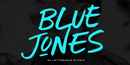 Introducing, Blue Jones - a display brush typeface. This type of font perfectly made to be applied especially in headlines which is need a standout font, and the other various formal forms such as invitations, labels, logos, magazines, books, greeting / wedding cards, packaging, fashion, make up, stationery, novels, labels or any type of advertising purpose. Features : numbers and punctuation multilingual ligatures PUA encoded We highly recommend using a program that supports OpenType features and Glyphs panels like many of Adobe apps and Corel Draw, so you can see and access all Glyph variations.
 - ITC Mudville by ITC,
$29.99ITC Mudville was Christopher Wolff's entry in the 1998 U&lc Type Design Competition, for which he won an Honorable Mention (Display). Mudville evolved from variations on hand-lettering that Wolff had done on a variety of projects over the years. The underlying shapes of the letters are formal roman letterforms, but the actual strokes retain the look of letters sketched casually on a layout. Mudville straddles the line between inline and outline type designs. It recalls some of the styles of popular lettering used in display advertising in the '20s. - Greybridge by Letterhend,
$19.00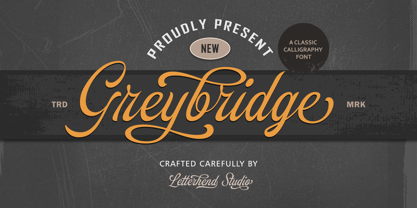 Introducing, Greybridge - Classic Calligraphy Typefce. This type of font perfectly made to be applied especially in logo, and the other various formal forms such as invitations, labels, logos, magazines, books, greeting / wedding cards, packaging, fashion, make up, stationery, novels, labels or any type of advertising purpose. Features : uppercase & lowercase numbers and punctuation multilingual alternates and swashes PUA encoded We highly recommend using a program that supports OpenType features and Glyphs panels like many of Adobe apps and Corel Draw, so you can see and access all Glyph variations.
 - Ryman Gothic by W Type Foundry,
$25.00 Ryman Gothic is inspired by American Wood Types and Gothic Typefaces, mainly in the work of Edwin Allen and Morris Fuller Benton. The result is a hybrid combining gothic proportions with the contrast of wood types. While drawing consonants guided by gothic proportions, vowels were designed slightly wider, making them not only more legible when it comes to long text designs, but also more attractive. Ryman Gothic comes in 8 weights plus its matching italics, ranging from Thin to Heavy. Each weight includes extended language support (Latin + Cyrillic + Greek), ligatures, arrows and more.
 - Breakshot by Letterhend,
$14.00 Break Shot is a bold display sans font. This type of font perfectly made which is need a standout font, and the other various formal forms such as invitations, labels, logos, magazines, books, greeting / wedding cards, packaging, fashion, make up, stationery, novels, labels or any type of advertising purpose. Features : regular & stamp numbers and punctuation multilingual ligatures PUA encoded We highly recommend using a program that supports OpenType features and Glyphs panels like many of Adobe apps and Corel Draw, so you can see and access all Glyph variations.
 - Stubby by Tipos Pereira,
$12.00 Stubby is a display type family with 11 styles, was made for titles, headlines and also packages, posters and everything that provide space for a rude, fat and widish type. You should try Stubby in your text blocks if you're looking for an informal shape with some handwriting taste, there are eleven styles mixing from a narrowed thin to a sloppy ultrabold. Stubby has a tight spacing made to fit in squeeze places, not so elegant or clean but definitely an original choice for your real life project.
 - Linotype Compendio by Linotype,
$40.99Linotype Compendio is a part of the Take Type Library, chosen from the contestants of the International Digital Type Design Contests from 1994 and 1997. Christian Bauer designed this font based on the basic forms of Transitional faces of the 17th century. The outer contours of the letters are purposely raw and irregular, much like alphabets printed on low-quality paper. The legibility of the font is thus reduced, making it necessary to use this font only for shorter texts or headlines, but it is exactly this characteristic which lends Linotype Compendio its distinctiveness. - Orleen Arabic by Zaza type,
$24.00 Orleen is an Arabic typeface from Lina type family, with an elegant and modern feeling. It's luxurious, strong, legible, Clear, Simple, and contemporary. With a handful set of OpenType features and alternatives. The design is inspired by the Kufic calligraphic style and influenced by the Naskh style. Lina type family consists of Lina soft, Lina sans, Lina round. and Orleen. Orleen has a wide range of use possibilities headlines, logotypes, branding, books, magazines, motion graphics, and use on the web and Tv. Orleen consists of 7-weight versions from thin to bold.
 - Romany by Ascender,
$50.99 The Romany™ typeface family is a delightful typographic confectionary that will bring affability and charm to both print and interactive design projects. Be it an online game, digital app, hardcopy packaging, or larger than life poster, Romany will deliver. When first designed by A.R. Bosco for American Type Founders in 1934, Romany was a single weight design. Relatively popular as hand-set type, Romany was not made into digital fonts – until now. The septuagenarian design was updated, reimagined and enlarged into a small family by Terrance Weinzierl.