10,000 search results
(0.036 seconds)
- Killarney by Fontdation,
$15.00 Introducing our new font Killarney. A bold and heavy display font that inspired by the vintage/classic letterforms used in old-advertisements. Mouse-crafted with high attention to details; clean lines, sharp edges and tempting curves. Its square and blocky letterforms make Killarney a great for headlines and space killer. Packed with 500+ glyphs, Killarney composed of slanted version, standard upper/lower case characters, numerals, punctuations, some multilingual letters, alternate characters, stylistic sets, ligatures, etc. This font is a must have item for your designing arsenal. Go get yours now while it's hot. :D
 - Braly Latoya by Ws Studio,
$15.00 Braly latoya Script is an elegant calligraphy font, including Regular and Italic. This font is casual and pretty with a doodle. Can be used for various purposes. such as logos, product packaging, wedding invitations, branding, headlines, signage, labels, signatures, book covers, posters, quotes, and others. The Braly latoya script featuring an alternative to OpenType styles, binders and International support for most Western Languages is included. To enable OpenType Stylistic alternates, you need a program that supports OpenType features such as Adobe Illustrator CS, Adobe Indesign & CorelDraw X6-X7, Microsoft Word 2010 or a later version. How to access all alternative characters using Adobe Illustrator: Braly latoya Script is coded with PUA Unicode, which allows full access to all additional characters without having to design special software. Mac users can use Font Book, and Windows users can use Character Map to view and copy any of the additional characters to paste into your favorite text editor / application. How to access all alternate characters, using the Windows Character Map with Photoshop:
 - Molandika Script by Great Studio,
$16.00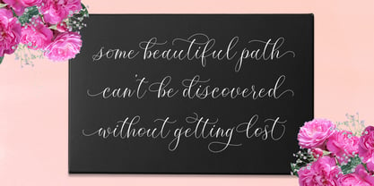 Molandika Script is elegant calligraphy font, designed to convey elegance and style. It is slender, feminine and friendly, This font is casual and pretty with swashes. Can used for various purposes. such as logos, product packaging, wedding invitations, branding, headlines, signage, labels, signatures, book covers, posters, quotes and more. Molandika Script features OpenType stylistic alternates, ligatures and International support for most Western Languages is included. To enable the OpenType Stylistic alternates, you need a program that supports OpenType features such as Adobe Illustrator CS, Adobe Indesign & CorelDraw X6-X7, Microsoft Word 2010 or later versions. How to access all alternative characters using Adobe Illustrator : https://www.youtube.com/watch?v=XzwjMkbB-wQ Molandika Script is coded with PUA Unicode, which allows full access to all the extra characters without having special designing software. Mac users can use Font Book , and Windows users can use Character Map to view and copy any of the extra characters to paste into your favourite text editor/app. How to access all alternative characters, using Windows Character Map with Photoshop : https://www.youtube.com/watch?v=Go9vacoYmBw
 - Feraldine Script by Gatype,
$8.00 Feraldine Script is sweet calligraphy font. This font is casual and pretty with swashes. Can be used for various purposes such as logo, product packaging, wedding invitations, branding, headlines, signage, labels, signature, book covers, posters, quotes and more. Feraldine Script features OpenType stylistic alternates, ligatures and International support for most Western Languages is included. To enable the OpenType Stylistic alternates, you need a program that supports OpenType features such as Adobe Illustrator CS, Adobe Indesign & CorelDraw X6-X7, Microsoft Word 2010 or later versions. How to access all alternative characters using Adobe Illustrator: https://www.youtube.com/watch?v=XzwjMkbB-wQ Feraldine Script is coded with PUA Unicode, which allows full access to all the extra characters without having special designing software. Mac users can use Font Book , and Windows users can use Character Map to view and copy any of the extra characters to paste into your favorite text editor/app. How to access all alternative characters, using Windows Character Map with Photoshop: https://www.youtube.com/watch?v=Go9vacoYmBw If you need help or have any questions, please let me know. I'm happy to help.
 - Kanote by Letterhend,
$15.00 Introducing, Kanote. A Whimsical display font. This typeface is have a playful and casual look, very suitable to use for headline, title, logo or anything especially related with fun themed design project. Features : uppercase & lowercase (alternates) numbers and punctuation multilingual PUA encoded We highly recommend using a program that supports OpenType features and Glyphs panels like many of Adobe apps and Corel Draw, so you can see and access all Glyph variations. How to activate opentype feature : https://letterhend.com/tutorials/using-opentype-feature-in-any-software/ Email us to letterhend@gmail.com if you need something! Happy Designing!
 - Lachrymose by Hanoded,
$15.00 Lachrymose is a word that stems from ‘lacrima’, the Latin word for tear. It means ‘tearful’, or ‘given to weeping’. Now, before y’all think I am depressed or so - I am not. I just like the sound of this word and the way it is written. All I needed to do was to build a font for it! Lachrymose is a handmade brush font. I used my fantastic Chinese ink and a cheap brush to create the glyphs. Lachrymose is a display font, so use it for anything display-ish.
 - Felbridge by Monotype,
$29.00 The impetus behind Felbridge was both ambitious and highly practical: to develop an ideal online" typeface for use in web pages and electronic media. Robin Nicholas, the family's designer, explains, "I wanted a straightforward sans serif with strong, clear letterforms which would not degrade when viewed in low resolution environments." Not surprisingly, the design also performs exceptionally well in traditional print applications. In 2001, to achieve his goal, Nicholas adjusted the interior strokes of complex characters like the M and W to prevent on-screen pixel build-up and improve legibility. Characters with round strokes were drawn with squared proportions to take full advantage of screen real estate. In addition, small serifs were added to characters like the I, j and l to improve both legibility and readability. "The result," according to Nicholas, "is a typeface with a slightly humanist feel, economical in use and outstanding legibility - even at relatively small point sizes. Most sans serif typefaces have italics based on the simple "sloped Roman" principle, but italic forms for Felbridge have been drawn in the tradition of being visually lighter than their related Roman fonts, providing a strong contrast when the italic is used for emphasis in Roman text. The italic letter shapes also have a slightly calligraphic flavor and distinctive "hooked" strokes that improve fluency. Felbridge is available in four weights of Roman - Light, Regular, Bold and Extra Bold - with complementary italics for the Regular and Bold designs. The result is a remarkably versatile typeface family, equally comfortable in magazine text copy or in display work for advertising and product branding. As a branding typeface, Felbridge works in all environments from traditional hardcopy materials to web design, and is even suitable for general office use. As part of a corporate identity, this no-nonsense typeface family will be a distinctive and effective communications tool." Felbridge™ font field guide including best practices, font pairings and alternatives.
 - Poppy Spoor by Yumna Type,
$15.00 Would you like a legible, professional, prominent font? Well, if that is what you want, you will probably have trouble finding one as it is a time-wasting process and is a hard challenge. Let us introduce you to a perfect font for any project, the Poppy Spoor. Poppy Spoor, unlike the other display fonts, is a display font with rather square letters to show you fun, soft, modern impressions due to the thin line designs in low contrasts. This font type, giving you a clipart as a bonus, is legible and is better applied for big text sizes. You can maximize your designs with Poppy Spoor’s features to remain the best in every design at any time. Features: Alternates Ligatures Multilingual Supports PUA Encoded Numerals and Punctuations Poopy Spoor fits best for various design projects, such as brandings, posters, banners, headings, magazine covers, quotes, invitations, name cards, printed products, merchandise, social media, etc. Find out more ways to use this font by taking a look at the font preview. Thanks for purchasing our fonts. Hopefully, you have a great time using our font. Feel free to contact us anytime for further information or when you have trouble with the font. Thanks a lot and happy designing.
 - TA Bankslab by Tural Alisoy,
$33.00 The building of the Northern Bank of St. Petersburg's Baku branch was built in 1903-1905. It was the first Art Nouveau-style building in Baku, Azerbaijan. Later the bank was transformed into the Russian-Asian Bank. After the oil boom in Baku in the 19th century, branches of many banks and new banks were opened in the city. The branch of the Northern Bank of St. Petersburg was among the first banks that was opened in Baku. N.Bayev was the architect of the building for the branch of the Northern Bank of St. Petersburg located at Gorchakovskaya 3 in 1903-1905. The building currently houses the Central Branch of the International Bank of Azerbaijan. My purpose in writing this is not to copy and paste the information from Wikipedia. What attracted me to the building was the word "Банкъ" (Bank) written in Cyrillic letters, which was also used in Azerbaijan during the Soviet era. The exact date of the writing is not known. Every time I pass by this building, I always thought of creating a font of this writing someday. I had taken a photo of the building and saved it on my phone. I did a lot of research on the font and asked a lot of people. However, some did not provide information at all and some said they did not have any information. I was interested in the history of this font but I do not know if this font really existed or it was created by the architect out of nowhere. If there was such a history of this font, I wanted to recreate this font and make it available. If not, I had to create it from scratch in the same way, using only existing letters on the building. Finally, I made up my mind and decided to develop the font with all letters I have got. It was difficult to create a font based on the word, Банкъ. Because in the appearance of the letters, the midline of the letters on A, H, K was very distinct, both in the form of inclination and in more precise degrees. The serif part of the letters, the height of the upper and lower sides, differed from each other. I don't know whether it was done this way when the building was constructed or it happened over time. I prepared and kept the initial version of the font. I took a break for a while. I started digging on the story of the font again. Meanwhile, I was researching and got inspired by similar fonts. Unfortunately, my research on the font's history did not yield any results. I decided to continue finishing up the font. After developing the demo, I created the font by keeping certain parts of these differences in the letters. In addition, I had to consider the development of letters in the Cyrillic, as well as the Latin alphabet, over the past period. Thus, I began to look at the appearance of slab-serif or serif fonts of that time. In general, as I gain more experience in developing fonts, I try to focus on the precision of the design for each font. In recent years, I specifically paid attention to this matter. YouTube channel and articles by Alexandra K.'s of ParaType, as well as, information and samples from TypeType and Fontfabric studios on the Cyrillic alphabet were quite useful. I gathered data regarding the Latin alphabet from various credible sources. I do not know if I could accomplish what I aimed at but I know one thing that I could develop the font. Maybe someday I'll have to revise this font. For now, I share it with you. I created the font in 10 styles. 7 weight from Thin to Extra Black, an Outline, Shadow, and Art Nouveau. The Art Nouveau style was inspired by the texture in the background used for the text on the building. The texture I applied to capital letters adds beauty to the font. If you like the font feel free to use it or simply let me know if your current alphabet doesn't support this font.
 - TA Bankslab Art Nouveau by Tural Alisoy,
$40.00 TA Bankslab graphic presentation at Behance The building of the Northern Bank of St. Petersburg's Baku branch was built in 1903-1905. It was the first Art Nouveau-style building in Baku, Azerbaijan. Later the bank was transformed into the Russian-Asian Bank. After the oil boom in Baku in the 19th century, branches of many banks and new banks were opened in the city. The branch of the Northern Bank of St. Petersburg was among the first banks that was opened in Baku. N.Bayev was the architect of the building for the branch of the Northern Bank of St. Petersburg located at Gorchakovskaya 3 in 1903-1905. The building currently houses the Central Branch of the International Bank of Azerbaijan. My purpose in writing this is not to copy and paste the information from Wikipedia. What attracted me to the building was the word "Банкъ" (Bank) written in Cyrillic letters, which was also used in Azerbaijan during the Soviet era. The exact date of the writing is not known. Every time I pass by this building, I always thought of creating a font of this writing someday. I had taken a photo of the building and saved it on my phone. I did a lot of research on the font and asked a lot of people. However, some did not provide information at all and some said they did not have any information. I was interested in the history of this font but I do not know if this font really existed or it was created by the architect out of nowhere. If there was such a history of this font, I wanted to recreate this font and make it available. If not, I had to create it from scratch in the same way, using only existing letters on the building. Finally, I made up my mind and decided to develop the font with all letters I have got. It was difficult to create a font based on the word, Банкъ. Because in the appearance of the letters, the midline of the letters on A, H, K was very distinct, both in the form of inclination and in more precise degrees. The serif part of the letters, the height of the upper and lower sides, differed from each other. I don't know whether it was done this way when the building was constructed or it happened over time. I prepared and kept the initial version of the font. I took a break for a while. I started digging on the story of the font again. Meanwhile, I was researching and got inspired by similar fonts. Unfortunately, my research on the font's history did not yield any results. I decided to continue finishing up the font. After developing the demo, I created the font by keeping certain parts of these differences in the letters. In addition, I had to consider the development of letters in the Cyrillic, as well as the Latin alphabet, over the past period. Thus, I began to look at the appearance of slab-serif or serif fonts of that time. In general, as I gain more experience in developing fonts, I try to focus on the precision of the design for each font. In recent years, I specifically paid attention to this matter. YouTube channel and articles by Alexandra K.'s of ParaType, as well as, information and samples from TypeType and Fontfabric studios on the Cyrillic alphabet were quite useful. I gathered data regarding the Latin alphabet from various credible sources. I do not know if I could accomplish what I aimed at but I know one thing that I could develop the font. Maybe someday I'll have to revise this font. For now, I share it with you. I created the font in 10 styles. 7 weight from Thin to Extra Black, an Outline, Shadow, and Art Nouveau. The Art Nouveau style was inspired by the texture in the background used for the text on the building. The texture I applied to capital letters adds beauty to the font. If you like the font feel free to use it or simply let me know if your current alphabet doesn't support this font.
 - Good Song by Ocha Puyaber,
$10.00 Good Song is a cursive font based on the USA's teaching script. It can be written in Carolinian, Sioux, Oʼodham, Southern Athabaskan, Hawaiian, and Samoan from USA. It can also be written in Dutch, Maltese, Aymara, Mapuche, Rapa Nui, and other languages. This font family is cute. The style is wide and rounded. It has wide and open loops. The strokes are drawn with a round cap tool, with no contrast. It is cursive and connected. The form is upright. It is easy to read in the USA. Part H has capitals with High starts. Part L has capitals with low starts.
 - Neutraface Slab Text by House Industries,
$33.00 From fine print and red ink in corporate annual reports to huge three dimensional signage, Neutraface has become the definitive designers’ workhorse. Now this geometric juggernaut boasts even more font firepower with the addition of the Neutraface Slab family. Neutraface Slab features five display weights, four text weights with italics plus a unique stencil style that work together like a typographic symphony or can stand alone like accomplished soloists. Just like its sans-serif counterparts, Neutra Slab Text includes small caps, seven figure styles and a host of other sophisticated OpenType features that have been integrated in a single seamless package. The complementary display weights afford an uncompromising statement that can range from thin and delicate to bold and bombastic. FEATURES: MORE ALTS: Neutraface Slab comes with several alternate characters, accessed through either OpenType stylistic sets or through the Stylistic Alternates feature. TITLING ALTERNATES: The distinctive lower crossbars of the original Neutraface are included in Neutraface Slab as the Titling Alternates OpenType feature. TEXT FIGURES: All variations of Neutraface Slab Text feature seven figure styles. Included are text figures for use in running text, lining figures for use with uppercase forms and small caps figures. Each of these styles is supplemented with tabular figures for use in columnar settings. Plus, superscript and subscript figures are included for use in fractions, footnotes, etc. NEUTRAFACE SLAB CREDITS: Typeface Design: Christian Schwartz, Kai Bernau, Susana Carvalho Typeface Production: Ben Kiel, Hannes Famira Typeface Direction: Christian Schwartz, Andy Cruz, Ken Barber Like all good subversives, House Industries hides in plain sight while amplifying the look, feel and style of the world’s most interesting brands, products and people. Based in Delaware, visually influencing the world.
 - Neutraface Slab Display by House Industries,
$33.00 From fine print and red ink in corporate annual reports to huge three dimensional signage, Neutraface has become the definitive designers’ workhorse. Now this geometric juggernaut boasts even more font firepower with the addition of the Neutraface Slab family. Neutraface Slab features five display weights, four text weights with italics plus a unique stencil style that work together like a typographic symphony or can stand alone like accomplished soloists. Just like its sans-serif counterparts, Neutra Slab Text includes small caps, seven figure styles and a host of other sophisticated OpenType features that have been integrated in a single seamless package. The complementary display weights afford an uncompromising statement that can range from thin and delicate to bold and bombastic. FEATURES: MORE ALTS: Neutraface Slab comes with several alternate characters, accessed through either OpenType stylistic sets or through the Stylistic Alternates feature. TITLING ALTERNATES: The distinctive lower crossbars of the original Neutraface are included in Neutraface Slab as the Titling Alternates OpenType feature. TEXT FIGURES: All variations of Neutraface Slab Text feature seven figure styles. Included are text figures for use in running text, lining figures for use with uppercase forms and small caps figures. Each of these styles is supplemented with tabular figures for use in columnar settings. Plus, superscript and subscript figures are included for use in fractions, footnotes, etc. NEUTRAFACE SLAB CREDITS: Typeface Design: Christian Schwartz, Kai Bernau, Susana Carvalho Typeface Production: Ben Kiel, Hannes Famira Typeface Direction: Christian Schwartz, Andy Cruz, Ken Barber Like all good subversives, House Industries hides in plain sight while amplifying the look, feel and style of the world’s most interesting brands, products and people. Based in Delaware, visually influencing the world.
 - ML Tokyo Aurora by Supfonts,
$18.00 Hi ! I just now launch my new font Family called "Tokyo Aurora". The Tokyo Aurora font is a simple font, comes with alternate symbols and some ligatures. I wanted this font looks elegant, readable, stylish, and catchy. You can use this font for watermark on photography, signature or signature logo design, quotes, album cover, business card, and many other design project.
 - Bodoni by Bitstream,
$29.99 Morris Fuller Benton started the Bodoni revival with this version for ATF in the early years of the 20th century. We consider it the first accurate revival of a historical face for general use. Sturdy and a little mechanical in the 19th century tradition, this is the Bodoni series familiar to us all.
 - Overseas by Hanoded,
$15.00 I traveled a lot: in the beginning on my own, later as a tour guide. I always used the English word ‘abroad’ to describe a trip to a foreign country, but I noticed that the English, Australians and New Zealanders preferred the word ‘overseas’. I then realised that they all lived on an island, so most of the foreign countries for them were across the sea. I had to think of that when I made this font! Overseas is a brush font with a certain rough elegance to it. I made it using poster paint and a brush. Use if for posters, product packaging and book covers.
 - Palsam Arabic by Abjad,
$45.00 Since the beginning, Palsam was intended to be a super multilingual family, with a real cursive Arabic companion, and a display cut. The typeface was designed to be used for setting text and titles of contemporary Arabic content, specially magazines, and websites. The Arabic and Latin scripts were designed at the same time, to make a true authentic bilingual typeface. Both scripts have affected each other in several ways through the entire design process, which happened within ten years. Palsam has an inviting, approachable, fashionable and humanist look. Thanks to its low contrast, open apertures, detailed calligraphic strokes, and smooth counters, which also make it easy to read at smaller sizes. The main highlight for Palsam was the Cursive companion. For the first time, the calligraphic Ijaza style was used as a model for designing the Arabic cursive. Since the Ijaza is a hyper combination of Naskh and Thuluth, which makes it perfect to be a companion for the upright Naskh. Moreover this script was used in margins, and to highlight specific content inside a paragraph in older manuscripts. With true cursive companions in five weights, and many opentype features, Palsam grants all the tools needed to set complex information and editorial designs applications. More than 1000 characters are included per weight, including small caps, fractions, old style and lining numbers, ligatures, contextual ligatures, and discretionary ligatures. It supports over 40 languages that use the Latin extended, as well as Arabic, Farsi, and Urdu Languages. PalsamArabic only covers the Arabic script. The latin script was designed in collaboration with the Slovenian type designer Alja Herlah.
 - Linex Sans by Monotype,
$29.99Linex Sweet was designed by Albert Boton in the late 1990s. It's a smallish family of three weights; the middle weight has an italic companion face. With its soft corners and slightly quirky head-serifs, Linex Sweet is a friendly design that sees much use. Several years later, Boton began sketching a new design, based on the original Linex Sweet but with a little more authority and grace. Linex Sans is the result. A mix of crisp angles and soft shapes, this new addition to the extended Linex family is both inviting and elegant. The subtle calligraphic overtones distinguish the design from more traditional sans serif designs. A three-weight family with a complementary italic for the Regular weight, Linex Sans is a versatile communications tool in both text and display sizes. It offers that mix of sophistication and joie de vivre that characterizes the designs of Albert Boton. Boton began his professional career as a carpenter. Fortunately for designers and typographers, he quickly turned from pounding nails to hammering out graphic design and constructing great letterforms as a profession. In his long career, he has created hundreds of distinctive, highly useful and award-winning designs. And even though he is now retired from active business, Boton continues to create fresh, new typeface designs. Add Linex Sans to the list. - Baby Script by Nk Studio,
$18.00 Baby Script includes changes to the OpenType language style, binding and international support for most Western languages. To activate the OpenType Stylistic alternative, you need a program that supports OpenType features such as Adobe Illustrator CS, Adobe Indesign & CorelDraw X6-X7, Microsoft Word 2010 or a later version. How to access all alternative characters using Adobe Illustrator: https://www.youtube.com/watch?v=XzwjMkbB-wQ Baby Script is coded with PUA Unicode, which allows full access to all additional characters without having to design special software. Mac users can use Font Book, and Windows users can use Character Map to view and copy any of the additional characters to paste into your favorite text editor / application. How to access all alternative characters, using the Windows Character Map with Photoshop: https://www.youtube.com/watch?v=Go9vacoYmBw If you need help or have any questions, let me know. I'm happy to help :) Thanks & Congratulations on Design!
 - Sync by Peter Huschka,
$28.99 The Sync font family is a layered system for chromatic typesetting. With its stylistic variety it enables a wide range of eye-catching combinations with colors and patterns. The very first sketches were inspired by some hand-painted characters on a weathered beach sign at the French Côte d’Argent and currently the font family comes with a total of 28 single fonts. The primary font »Sync Base« is a powerful, condensed Sans Serif. Sharp cut edges, narrow wedge-shaped counters and low ascenders and descenders make the compact character of the typeface. In perfect sync with the primary font, the family includes the retro styles Lines, Engravings, Stripes and Shadows and the texture styles Invisible and Jungle. Each one of them with multiple fonts. As all Sync fonts have the same metrics, they can easily be layered in different colors to create the desired effects by using graphic applications that allow utilizing layers. Sync fonts work especially well in larger sizes and were designed for large display purposes, covers, branding, packaging, headlines, editorials, advertising, posters and the like. Check the gallery for examples. By the way, the graphics in some of the visuals come from the Linotype »Picture Yourself™« collection designed by Karin Huschka and Peter Huschka. Sync & enjoy!
 - Goudy Text by Monotype,
$29.99The word Text" in Goudy Text™ is short for Textura, and textura is the style of blackletter or gothic writing developed in Northern Europe in the middle ages. The use of space in blackletter is quite different from what we know about Roman letterforms. Lowercase forms in blackletter writing and typefaces must be evenly textured with black and white elements, like the texture of weaving or fabric. Capital letters can provide either an integration of the even texture (by the use of decoration in their construction) or, if they are wide and open and filled with white, they provide bright spots of visual emphasis. Goudy, despite being an American in the twentieth century, understood well the fundamental texture of medieval blackletter and the importance of both density and light. He designed Goudy Text in 1928 for Lanston Monotype after studying the type in Gutenberg's 42-line bible; still one of the best models for designers of blackletter typefaces. The lowercase of Goudy Text has impact and medieval authenticity. The standard caps have some Victorian eccentricities but are mostly well drawn. The alternate, or "Lombardic" caps are spectacular - they set beautifully with the lowercase letters, providing the proverbial shafts of light through the Gothic cathedral's stained glass windows. Use this potent font in sizes 14 point or larger, for Christmas greetings, certificates, wedding invitations, advertising, or music collateral pieces." - Turquoise by Resistenza,
$59.00 Many calligraphers agree that Roman Capitals is one of the most beautiful yet difficult hands to master. Its beauty lies in its simplicity of form and structure, yet understanding and applying these skillfully can take years of mindful practice. My goal was to design Roman Capitals that were smoothly designed with a brush, not carved. The main concept was based on the fundamental strokes that are commonly studied when you practice Roman letters. That’s why many Serifs have these unfinished terminal serifs. I created the Turquoise typeface based on my Capitalis Romana practice with a flexible broad edged brush and gouache. During the lowercase process I was still following Foundational calligraphy with a flat brush. My Turquoise Capitals were then adjusted and redesigned at the Tipobrda calligraphy workshop in Slovenia. Turquoise contains small caps, many discretionary ligatures, ornaments, swashes as well as several brushy nature-inspired ornaments, accessible via OpenType. Ideally suited for headlines or body text in advertising, packaging and visual identities, its delicate shapes, curves and endings give projects a harmonious elegance and stylistic feel in unique Turquoise style. My inspiration for this font showcase is one of the richest islands in the Mediterranean, the place where my parents are from, Sicily. This southern Italian region has so many unique spots: Stromboli, part of the Aeolian Islands, and the Pelagie Islands is one of my favorite places in Sicily. The pictures I used were taken there this year. So enjoy the sun, the serifs, the water and its Turquoise colors. The brush is mightier than the sword. Opentype Features: https://www.rsztype.com/article/how-to-use-opentype-features-adobe-microsoft-pages Turquoise works very well with Nautica Check also Turquoise Inline
 - Tobi Greek Cyrillic by RodrigoTypo,
$40.00 Tobi Greek Cyrillic is a typography based on Tobi (2015), now much improved with alternative ligatures and better than containing the Greek in capital letters and also in Cyrillic. Tobi Greek Cyrillic is a very cheerful typography, especially fun for children’s titles, juvenile children’s clothing comics, this typography was designed with a lot of love. Authors: Rodrigo Araya https://www.behance.net/Rodrigotypo and Andrey Kudryavtsev.
 - Quase Display by DSType,
$40.00 Quase is a very free interpretation of the types found in the “Specimen of Printing Types” by William Caslon from 1785. We didn’t want to follow any of the models introduced in the Specimens, but rather gather a series of typographic aspects that we found useful and interesting from the several sizes and styles available and then give them consistency and new proportions so they could fit our very own purpose. We wanted to start with Caslon and then transform it into an editorial typeface, hence the increase of the x-height and the radical reduction of the ascenders and descenders. Despite the Display, Headline and Text fonts we also wanted to make a single weight Poster version with, inspired by the mechanical script introduced in the Double-Pica Script, to be used in magazines or as a complementary display typeface.
 - Quase Poster by DSType,
$40.00 Quase is a very free interpretation of the types found in the “Specimen of Printing Types” by William Caslon from 1785. We didn’t want to follow any of the models introduced in the Specimens, but rather gather a series of typographic aspects that we found useful and interesting from the several sizes and styles available and then give them consistency and new proportions so they could fit our very own purpose. We wanted to start with Caslon and then transform it into an editorial typeface, hence the increase of the x-height and the radical reduction of the ascenders and descenders. Despite the Display, Headline and Text fonts we also wanted to make a single weight Poster version with, inspired by the mechanical script introduced in the Double-Pica Script, to be used in magazines or as a complementary display typeface.
 - Quase Headline by DSType,
$40.00 Quase is a very free interpretation of the types found in the “Specimen of Printing Types” by William Caslon from 1785. We didn’t want to follow any of the models introduced in the Specimens, but rather gather a series of typographic aspects that we found useful and interesting from the several sizes and styles available and then give them consistency and new proportions so they could fit our very own purpose. We wanted to start with Caslon and then transform it into an editorial typeface, hence the increase of the x-height and the radical reduction of the ascenders and descenders. Despite the Display, Headline and Text fonts we also wanted to make a single weight Poster version with, inspired by the mechanical script introduced in the Double-Pica Script, to be used in magazines or as a complementary display typeface.
 - Quase Text by DSType,
$40.00 Quase is a very free interpretation of the types found in the “Specimen of Printing Types” by William Caslon from 1785. We didn’t want to follow any of the models introduced in the Specimens, but rather gather a series of typographic aspects that we found useful and interesting from the several sizes and styles available and then give them consistency and new proportions so they could fit our very own purpose. We wanted to start with Caslon and then transform it into an editorial typeface, hence the increase of the x-height and the radical reduction of the ascenders and descenders. Despite the Display, Headline and Text fonts we also wanted to make a single weight Poster version with, inspired by the mechanical script introduced in the Double-Pica Script, to be used in magazines or as a complementary display typeface.
 - Salloon by Ingrimayne Type,
$8.95 The original version of Salloon was what has become Salloon-Wide. It was designed a year or two before 1990. The narrower version, which is now the regular version of the face, was constructed a few years later. There never has been a true lower-case set of letters for these fonts, but the narrower version introduced a second set of caps by removing the side bumps from the letters. Although Salloon may look like an old font, no historic font closely resembles it. Fonts with bold, thick stems such as Salloon invite interior decoration. The five striped versions and the shattered version of the font were produced a year or two after the construction of the narrower Salloon when the arrival of a font distortion program made it easy to cracked and stripe fonts. In 2019 an outline style and two highlighter styles were added to be used in layers with the Salloon-Regular and one highlighter style was added to be used with Salloon-Wide.
 - ALS SyysScript by Art. Lebedev Studio,
$63.00 Handwriting of a strong Carelian personality revived: It’s autumn time once again, harvesting season, mushroom & berry time – the favourite season of my Karelian aunt Katri. A postcard she sent me more than twenty years ago had inspired me to SyysScript, “Script of Autumn” in Finnish. Katri had a very kind but also energetic personality, and I always thought her handwriting was a mirror of it. By making SyysScript I felt I could revive some of her unforgettable character. My Finnish autumn font has by now become a favourite for many and is branding fine food in both the Eastern and the Western hemisphere – even far beyond the arctic circle. “SyysScript“ is actually a growing family. For enhanced functionality in small sizes I added “SyysScript Eco” a year ago, a style with shortened extensions and simplified letterforms especially suited for packaging. And this autumn, a special one for Finland which is celebrating its 99th birthday, SyysScript grew again: Two long awaited newcomers, “SyysScript FeltTip” and “SyysScript FeltTip Eco” joined the family. They are bolder and softer than the previous styles but keep their positive, lighthearted feel. Use them to make a powerful individual mark on any background. – They are equally well suited for paper, packaging, a screen or even a concrete wall! Language support: Western and Central European, Extended Cyrillic.
 - Sleepy Time by Hanoded,
$15.00 Sleepy time… Ah, if only your kids would go to bed, close their eyes and drift off to sleep. This font was created when my son had some problems falling asleep: he'd cry, he wanted to sleep in a different bed, he wanted a different animal friend (he has Tij - a tiger, Meh - a sheep, Rafi - a giraffe, Moo - a cow, Woofy - a dog, Kikker - a frog). Sleepy Time font is an all caps typeface with uneven letters and a very different upper and lower case. It comes with all languages, including Cyrillic!
 - Alecko by Evolutionfonts,
$- Alecko is a distinctive didone-style typeface, which is strongly influenced by calligraphy, but is at the same time drawn with mathematical precision. Its advantages are summarized in its slogan: “One typeface, many possibilities”. Once you decide to use it, you can alter its look in a variety of ways: Should the contrast between the horizontal and vertical strokes of the glyphs be high or low? Is it appropriate to apply engraving to the letters (and what color?). Should the glyphs be connected to one another? Alecko is equipped with a lot of alternative characters, which are automatically inserted as you type, in order to achieve a “handwritten” look, however, it can also work without them. Each of these options is appropriate depending on the design context and we want to encourage you to explore every one of them, which is why we sell the whole family for a considerably smaller price, than the combined price of all weights. And If you don't feel like spending money at all, just download the free weight. Have fun.
 - 1906 Titrage by GLC,
$38.00 We have created this family as a complement to 1906 French News since the two type families were commonly in use in the same publications, including newspapers, popular books, calendars, almanacs and posters. This font, as its name suggests, was mainly used for titlings and subtitles. Small caps, included in the single file of the TTF and OTF versions, are added as a separate file in the MacTT version.
 - Klandestin by Dryy Type,
$18.00 Klandestin Typeface An aesthetic font that has a unique and elegant character to use. Klandestin is a beautiful and elegant serif Font with script for alternate. This font I created is meaningful & very versatile, it goes well with a variety of designs, elevating them to the highest level. Add this font to your favorite creative ideas and watch how it becomes real! Features : Uppercase, Lowercase, Numerical, Alternates, Ligatures & Multilingual Support There it is! I really hope you enjoy it
 - Nouveau Standard JNL by Jeff Levine,
$29.00 The hand lettering found on the cover of the 1912 sheet music for "Somebody Else is Getting It" featured a blockish Art Nouveau style with rounded corners and a very lurid title [although it likely had a more innocent meaning in those days than the casual observer might interpret today]. Now available as Nouveau Standard JNL, it is available in both regular and oblique versions.
 - Riquet by Lipton Letter Design,
$20.00 In the nineteen-twenties and early thirties, all display typography flourished in Europe. This was especially true in Germany, where poster design set a high creative standard, stimulating the design of a fantastic group of dramatic display letterforms. Richard Lipton designed Riquet after being inspired by a handful of freehand capital and lowercase letters on posters designed by lettering and poster artist Ludwig Hohlwein. He expanded this small group of display letterforms into a variable family with a weight axis. Riquet is a low contrast, delightfully casual typeface with 6 weights and the perfect selection of alternates. All of which gives an expressive look of precisely inked letters perfect for any packaging or branding project.
 - Afshid by Naghi Naghachian,
$88.00 Afshid is a sans-serif font family in three weights and tow width. Afshid Regular and Afshid ExpandedRegular, Afshid Bold and Afshid ExpandedBold, Afshid Heavy and Afshid ExpandedHeavy. This font family is a contribution to modernisation of Arabic typography, gives the font design of Arabic letters real typographic arrangement and provides more typographic flexibility. Afshid supports Arabic, Persian and Urdu. It also includes proportional and tabular numerals for the supported languages. Afshid design fulfills the following needs: A Explicitly crafted for use in electronic media fulfills the demands of electronic communication. B Suitability for multiple applications. Gives the widest potential acceptability. C Extreme legibility not only in small sizes, but also when the type is filtered or skewed, e.g., in Photoshop or Illustrator. Afshid’s simplified forms may be artificial obliqued in InDesign or Illustrator, without any loss in quality for the effected text. D An attractive typographic image. Afshid was developed for multiple languages and writing conventions. Afshid supports Arabic, Persian and Urdu. It also includes proportional and tabular numerals for the supported languages. E The highest degree of calligraphic grace and the clarity of geometric typography.
 - Migura Sans by Andrey Sharonov,
$15.00 Migura Sans Serif Family Migura is a high contrast Sans Serif family inspired by fashion and beauty world. Geometrically clean letterforms give elegant and luxury look when creating designs. There is different font styles from Light to Bold (+Italic version) what give enable wide use. In addition, Migura has several alternative characters, ligatures and more decorative Titling Alternates. You can see many examples how this font can be used. Migura is very good looking in Big Tittles, Magazine design, Branding, Logotypes, Posters, Wedding invitations, Romantic cards and others. Multilingual Support Migura support Western European characters and works with following languages: English, Danish, Dutch, Estonian, Faroese, Filipino, Finnish, French, German, Hungarian, Icelandic, Irish, Italian, Norwegian, Polish, Portuguese, Spanish, Swedish, Turkish. Opentype features doesn't work in Microsoft Word. Recommended to use in Adobe Illustratior or Photoshop.
 - Nagham by Arabetics,
$45.00 Nagham was designed using uniform glyph thickness throughout and exaggerated letter heights to offer a vertical look and feel. It supports all Arabetic scripts covered by Unicode 6.1, and the latest Arabic Supplement and Extended-A Unicode blocks, including support for Quranic texts. This font family includes two letter spacing flavors: isolated for small text and overlapped for large or display text. The two flavors come with two weights, regular and bold, each of which has normal and left-slanted Italic versions. The script design of this font family follows the Arabetics Mutamathil Taqlidi style utilizing varying x-heights. The Mutamathil Taqlidi type style uses one glyph per every basic Arabic Unicode character or letter, as defined by the Unicode Standards, and one additional final form glyph, for each freely-connecting letter of the Arabic cursive text. Nagham includes the required Lam-Alif ligatures in addition to all vowel diacritic ligatures. Soft-vowel diacritic marks (harakat) are selectively positioned with most of them appearing on similar high and low levels—top left corner—, to clearly distinguish them from the letters. Tatweel is a zero-width glyph.
 - Ring Legs by Ochakov,
$9.00 An integral part of Ring Family beauty are the Legs... Ring Legs! In addition, elegant and stylish. Ring font family even more so now. More opportunities, more ambitions, more likely! Ring Legs and all other is always prepared for any surprise. Comes in 8 weights, but so many combinations. The Ring Font Family continues to grow steadily!
 - Arlette by TypeTogether,
$49.00 Pilar and Ferran based Arlette on the fast stroke of one letter from a Roger Excoffon family, but along the way they abandoned that starting point in favour of experimentation. Many sans serifs are like a svelte black dress: functional, beautiful, and the unfussy outfit for a nice evening get together. The Arlette family isn’t like this. It’s a stunner — an incandescent reimagining of what defines a sans and how it can look. Arlette explores the boundaries of the sans serif landscape and returns with forms developed from gestural vigour. Thinking of it as “painterly” may at first seem to fit, but it underestimates Arlette’s ability to master an unseen world of countless emotions and physical applications: magazines, branding, editorial, teen and young adult works, book covers, and a host of products and packaging whose content will be amplified with Arlette’s voice. Not only does Arlette use its eight weights plus italics to speak in Latin-based scripts, it is also fluent in Thai and has six weights (hairline through bold) with which it meets that challenge, whether in text or display. Arlette Thai’s modern nature is seen in two features for the script. One is the decorative Thai characters that are based on original palm leaf manuscripts. Another is a version of the Latin numerals adapted to the height of the script due to their wide use in Thailand. Arlette Thai has been meticulously developed, including contextual kerning to avoid mark clashes. Arlette’s OpenType capabilities include mathematic and scientific figures, positional forms, pointers, arrows, and oldstyle, lining, and tabular lining numerals. In addition to all this, it’s packed with swashes and swash ligatures in both scripts for enthusiastic typesetting. Because it pushes experimentation without compromising readability, both Arlette Thai and Latin are surprisingly legible in small sizes and arrestingly beautiful when their details can be seen.